Featured Article · 12 min read
Fintech UI/UX Design: What the Best Financial Apps Get Right... and Wrong
There is no vertical where design stakes are higher than financial technology. You are asking people to hand over their money, their banking credentials, their investment portfolios, and in some cases their entire financial identity. A poorly designed interface does not just frustrate users. It costs them trust, and in fintech, trust is the product.
After 25 years designing interfaces across banking, payments, digital wallets, and financial services, the best fintech products share a set of principles that go well beyond visual polish. Here is what they get right, and what most still get wrong.
From the Article
How do you design data-dense financial interfaces without overwhelming users?
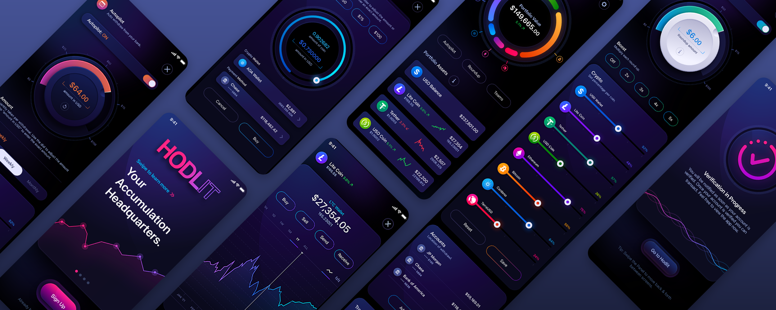
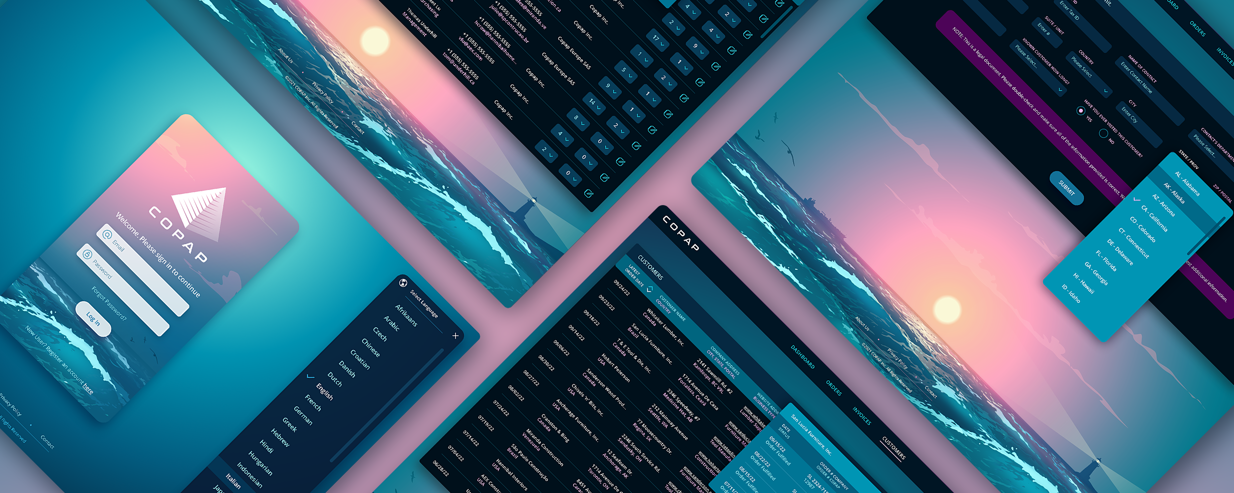
The benchmark for data-dense financial UI is not a stripped-down consumer app, it is a system where every pixel is accountable and hierarchy is earned by importance rather than decoration. You do not solve density by hiding numbers behind friendly visuals, you solve it by making numbers instantly legible, grouping information by context, and surfacing the right depth for the right user while cutting what they do not need. The goal is not simple or complex. It is legible.
Is friction always bad in fintech UX?
No. In most digital products friction is treated as the enemy, but in fintech some friction is a trust mechanism. A wire transfer confirmation screen with a brief pause and a clear summary is good UX, not bad. The mistake is never friction itself, it is where friction is applied. Slowing users down on high-stakes actions like transfers, account changes, and large purchases is correct. Adding friction to routine tasks like checking a balance or logging in is a failure.
How does color work differently in fintech interfaces?
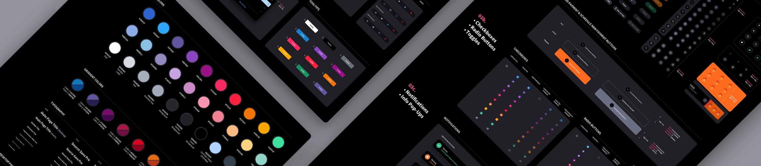
Color carries more weight in fintech than in almost any other product category. A red badge in a social app is noise, but a red number in a portfolio dashboard is a signal, and often a stressful one. Financial color systems have real meaning and cannot be treated as decoration. The common failure is overcorrecting: in trying to feel safe, products go flat, muted, and forgettable, with no hierarchy and no emphasis where it actually matters. Restraint is not the same as lifeless.























Learn how to simplify a complex fintech dashboard by prioritizing financial data, improving hierarchy, designing meaningful states, and making the next action clear.