We Design Extraordinary Things
The Fintech UI UX Design Guide Banner Image.png

The Definitive Fintech UI/UX Design Guide

The ultimate fintech UI/UX design guide covering onboarding, KYC, payments, dashboards, security, compliance, crypto, AI, and more.

The Skins Factory  ·  The Definitive Guide

The Fintech UI/UX Design Guide: Designing Financial Products People Trust With Their Money

Written by Jeff Schader, Founder, The Skins Factory. 25+ years designing trust-critical software for fintech, healthcare, cybersecurity, and enterprise SaaS. Clients include Bank of America, ACI Worldwide, and Heartland Payment Solutions. A practitioner guide, not a theory piece. Everything here comes from designing real payment platforms, banking apps, and financial software that shipped.

The Fintech UI/UX Design Guide banner image

A Working Guide Built From Real Projects

Designing Financial Products People Trust

Most fintech products do not underperform because the technology is broken. They underperform because a user hesitates at the wrong moment, does not understand what is about to happen to their money, and closes the tab. In consumer software a confusing screen costs you a click. In financial software, it can cost you a customer who may never return, because once financial trust is lost, people rarely give the product a second chance.

That is what makes fintech UX a different discipline from ordinary product design. A normal app asks users to learn an interface. A financial product asks users to hand over money, personal identity, and sensitive account access to a system they have known for ninety seconds. Every screen either builds the confidence to do that or quietly erodes it. There is very little middle ground.

In fintech, the interface is not a layer on top of the product. It is where the product either earns trust or loses it.

This guide covers how to design financial products that earn that confidence. It walks through the areas where fintech UX is genuinely harder than general product design: onboarding and identity verification, account linking, authentication, payment flows, failure and recovery, data-dense dashboards, the display of money itself, notifications, mobile, compliance-bound interfaces, accessibility, crypto and irreversible actions, trust signaling, AI features, enterprise and back-office fintech, and the design systems that hold all of it together. It is written for the people who own these decisions, heads of product, CTOs, founders, and design leads at companies building or rebuilding a financial product.

Guide Overview

What This Guide Covers

01 Why Fintech UX Is Different The constraints that separate financial products from ordinary apps. 02 Onboarding and Identity Verification (KYC) Getting users through verification without losing them. 03 Account Linking and Open Banking Consent Designing the scariest ask in consumer fintech. 04 Authentication and Security UX The front door users walk through every day. 05 Payment Flow Design Designing money movement people trust. 06 Errors, Declines, and Recovery What the product does when something goes wrong. 07 Data-Dense Financial Dashboards Making heavy financial data legible at a glance. 08 The Craft of Displaying Money The typography and formatting of the numbers themselves. 09 Notifications and Alerts Earning the right to interrupt people about their money. 10 Designing Fintech for Mobile The primary surface, with its own rules. 11 Compliance and Regulatory UX Designing within constraints without punishing the user. 12 Accessibility and Financial Inclusion Designing for every user, under every condition. 13 Crypto, Wallets, and Irreversible Actions Designing for consequences that cannot be undone. 14 Trust and Security Signaling Communicating safety without theater. 15 AI in Fintech Interfaces Designing automated decisions users can question and control. 16 Enterprise and Back-Office Fintech UX Organizing complex, high-volume financial operations. 17 Design Systems for Financial Products The system that keeps a financial product consistent and credible.
Also Included Ship-ready checklists for every section, an extended FAQ, and a glossary of fintech UX terms.

When Money Is on the Line

01. Why Fintech UX Is Different

Before getting into specific screens and flows, it is worth being precise about why financial products demand a different design approach. The stakes are higher, yes, but that is only part of it. Financial products carry a set of constraints most software never touches, and those constraints shape every design decision downstream.

The User Is Risking Something Real

When someone uses a note-taking app and the interface confuses them, they lose a few seconds. When someone uses a payment app and the interface confuses them, they might send money to the wrong person, miss a bill, expose account details, or abandon a transaction halfway through and never know whether it went through. The cost of a design mistake is measured in money and trust, not just friction. That changes the priority order. Clarity beats cleverness every time, and predictability beats delight.

Trust Has to Be Earned on the First Screen

Most products get to build trust gradually. Financial products do not have that luxury. A user deciding whether to link a bank account or enter card details is making a trust decision within the first minute, before they have seen what the product can do. The interface has to signal credibility, security, and competence immediately, through visual polish, plain language, clear structure, and the absence of anything that feels off. In fintech, looking trustworthy is a functional requirement, not a cosmetic one.

Regulation Shapes the Flow, Not Just the Fine Print

Financial products operate inside identity verification rules, disclosure requirements, and regulatory steps that a normal app never encounters. These are not footnotes. They are steps the user has to move through, and they are usually the least enjoyable part of the experience. Good fintech design treats compliance as a design problem to be solved gracefully, not a legal box to be bolted on at the end. How gracefully the product handles those steps often determines whether users complete them.

Some Actions Cannot Be Undone

Send money, confirm a trade, transfer crypto. Many financial actions are irreversible, and the interface is the last line of defense before a mistake becomes permanent. This raises the bar on confirmation design, on making consequences visible before commitment, and on matching the amount of friction to the stakes of the action. Too little friction and users make expensive errors. Too much and they abandon routine tasks. Calibrating that is a core fintech design skill.

The Core Principle

Financial products are built to function. The best ones are built to earn trust. Every technique in this guide serves that single goal.

Everything that follows, from onboarding to design systems, comes back to this. The job is not to make finance look pretty. It is to make a complex, high-stakes, regulated experience feel clear, controlled, and safe enough that a person will trust it with their money.

The First Trust Test

02. Onboarding and Identity Verification (KYC)

Onboarding is where many fintech products lose the largest share of potential users, and identity verification is often the steepest point of drop-off. Know Your Customer requirements mean financial products have to collect identity documents, verify them, and often connect funding sources before a user can do anything meaningful. Every one of those steps is a place where people give up. Designing onboarding well is largely about managing that reality, not pretending it away.

Why Fintech Onboarding Is Uniquely Hard

A typical app onboarding asks for an email and maybe a name. A fintech onboarding flow asks for a legal name, date of birth, government identification, sometimes a photo of a physical ID, a selfie for liveness checks, a Social Security number or equivalent, and bank credentials. Each additional field raises the chance a user stops. The work is not to skip these steps, which you legally cannot, but to sequence and frame them so the user stays motivated through each one.

Reach Value Before Hard Verification

One of the most effective structural moves in fintech onboarding is to let the user reach a point of real value, or at least a clear preview of it, before hitting them with full identity verification. When a user has seen what they are about to get, they are far more willing to push through the friction of uploading an ID. When you front-load verification before any value is visible, you are asking for maximum commitment at the moment of minimum motivation. Sequence matters as much as content.

From the Work

Designing the HODLIT Onboarding Experience

VIEW HODLIT PROJECT

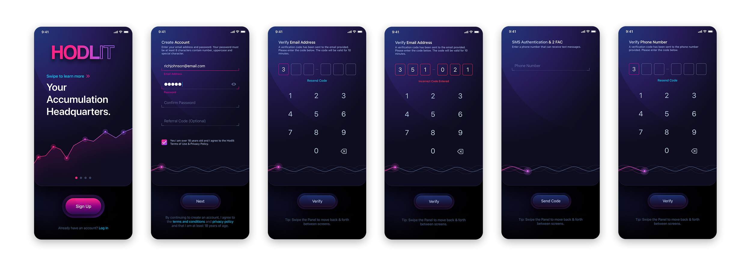
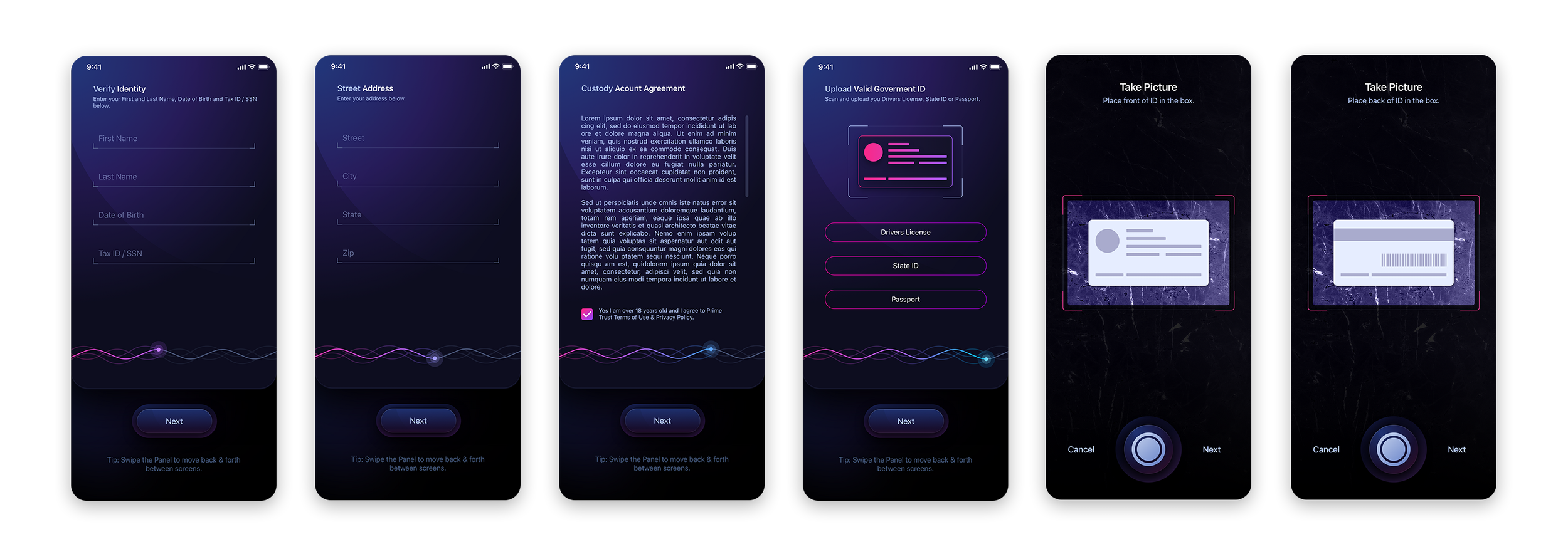
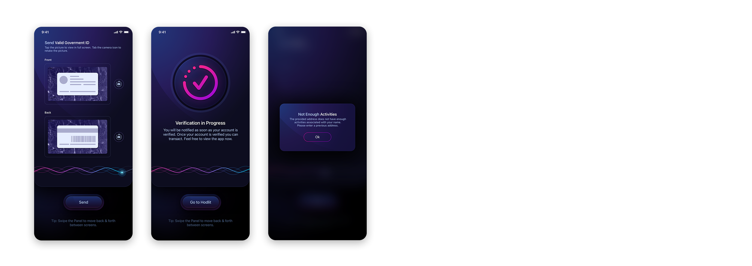
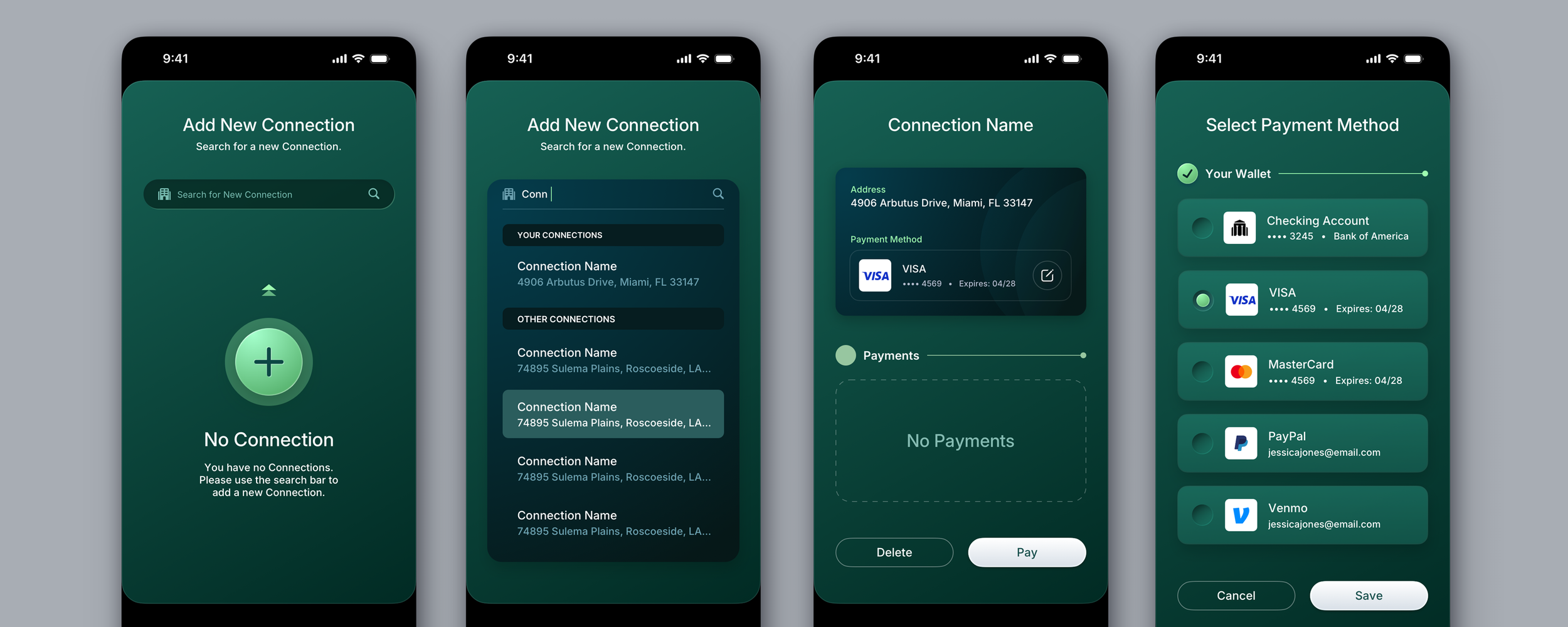
When The Skins Factory redesigned HODLIT, a mobile cryptocurrency exchange, we began with a complete refresh of its onboarding experience. Progress elements helped users understand where they were during sign-up and email verification, while the interface maintained the polished, high-trust visual character expected of a product handling money.

01 / 03

Stage the Flow and Explain the Why

Long verification and funding flows should be broken into clear, visible stages so users always know where they are and how much is left. A progress indicator that honestly reflects the steps ahead reduces the anxiety that drives abandonment. Alongside that, explain why each piece of sensitive information is needed at the moment you ask for it. A user asked for a Social Security number with no explanation feels alarmed. The same user, told plainly that it is required to verify identity under financial regulations and is encrypted, is far more likely to continue. Few moves in fintech onboarding pay off more than transparency at the point of friction.

Save State So Nobody Loses Their Place

Verification often stalls. A user does not have their ID handy, the document photo fails, they get interrupted. If the flow loses their progress, most of them do not come back. Saving state at every step, and letting users resume exactly where they left off across sessions and devices, recovers a meaningful share of users who would otherwise be lost. A stalled flow with no way back in is where drop-off spikes hardest.

Design the Failure States

Document scans fail. Faces do not match. Names come back mismatched against records. In identity verification, failure is routine. Yet these are the most commonly neglected parts of onboarding design. When verification fails, the interface has to tell the user clearly what went wrong, whether they can retry, and what to do differently, without making them feel accused of fraud. A hostile or cryptic failure state turns a recoverable moment into a permanent exit.

Common Questions

What Is a Good Onboarding Completion Rate for a Fintech App?

There is no single benchmark, because completion depends heavily on how much verification and funding a product requires before a user can do anything useful. A better way to judge your rate is by where users drop, not against an industry average. Map completion stage by stage across identity, funding, and the first meaningful action, then find the screen where the steepest drop occurs. That cliff is almost always a design problem you can fix, and moving it lifts the whole funnel more than chasing a generic target number.

Should a Fintech App Require KYC Before or After the First Session?

Wherever the regulation and risk model allow, let users experience value before full verification. Many products can offer a limited, view-only, or preview experience that requires minimal information, then introduce full KYC at the moment the user wants to do something that genuinely requires it, funding an account, making a payment, initiating a trade. Aligning the verification ask with the moment of peak motivation consistently outperforms demanding everything upfront.

The Front Door Users Walk Through Every Day

04. Authentication and Security UX

Authentication is the most used flow in any financial product. Whatever else the product does, every session starts at the front door, and the balance struck there between security and friction is something users feel every single day. Get it wrong in one direction and the product feels leaky. Get it wrong in the other and users dread opening the app. Authentication design is where security architecture becomes daily experience.

Biometrics First, Passwords as Designed Fallback

On devices that support it, biometric login should be the default path into a financial product: it is faster than a password, harder to phish, and it makes strong security feel like convenience instead of a toll. But the fallback path is part of the design, not an afterthought. Biometrics fail, devices change hands, gloves and lighting get in the way. The password or PIN route behind the biometric has to be just as considered, because it is the path users hit at exactly the moments things are already going wrong.

From the Work

Designing Biometric
Authentication for ACI Worldwide.

View Payments Unleashed Project

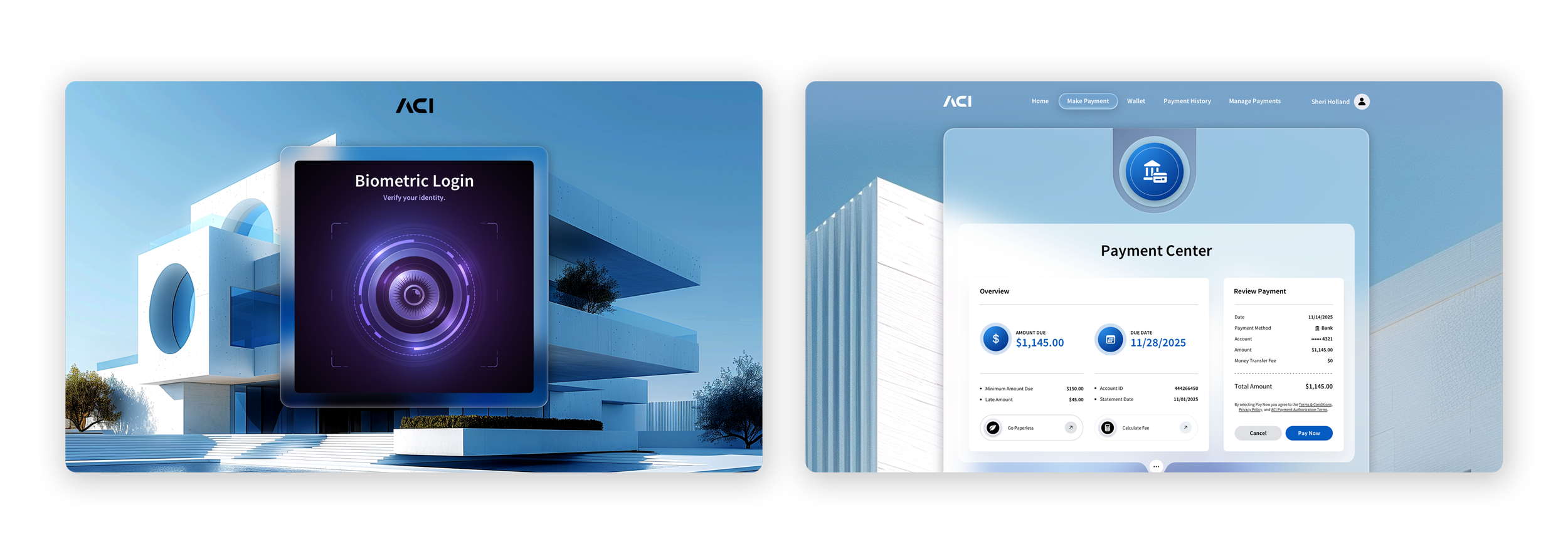
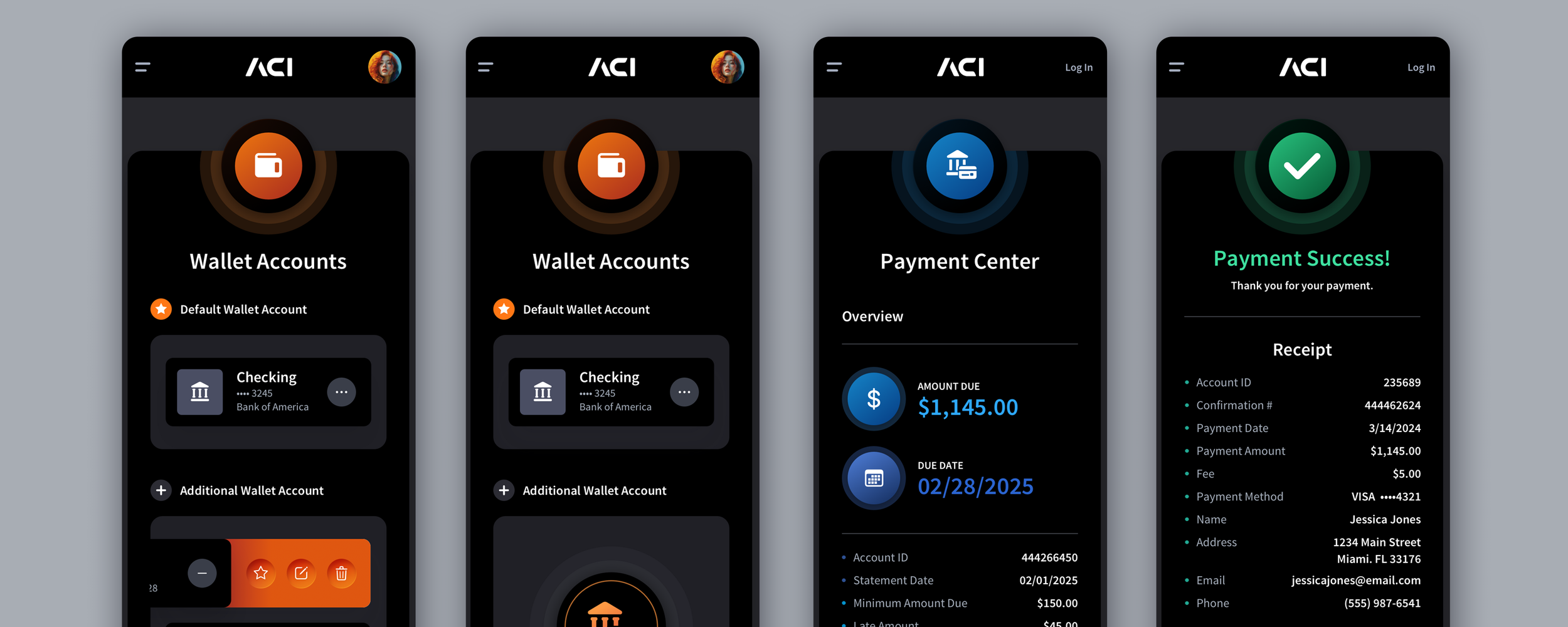
For ACI Worldwide’s Payments Unleashed event, The Skins Factory designed a light-mode biometric login concept and the authenticated transition into ACI’s Payment Center. The interface turns identity verification into a clear visual gateway, then carries the user directly into a familiar payment experience, making strong security feel integrated rather than bolted on.

Dark-mode biometric login and ACI Payment Center interface designed by The Skins Factory for ACI Worldwide

Step Up Friction With Risk, Not Uniformly

Checking a balance and changing a payout account are not the same action and should not carry the same security weight. Step-up authentication applies stronger verification only when the action or context warrants it: moving money above a threshold, changing credentials or destinations, logging in from a new device or location. Users accept, and even appreciate, extra verification when it clearly maps to risk. What they resent is uniform friction that treats reading a statement like wiring a down payment.

Make MFA Feel Protective, Not Punitive

A multi-factor challenge that appears without explanation feels like the product doubting the user. A multi-factor challenge that appears without explanation feels like the product is doubting the user. Explain that it was triggered by a new device, an unusual location, or a sensitive account change, and the same challenge feels protective instead of punitive. Offer more than one verification method where possible, and never let a single unavailable factor become a locked door with no handle. The emotional framing of MFA is almost entirely a language and sequencing problem, and it is solvable.

Session Timeout Is a Design Decision

Financial products time out sessions for good reason, but a timeout that destroys in-progress work converts a security measure into a punishment. If a user is halfway through a payment or an application when the session expires, the product should preserve their state, re-authenticate them, and return them exactly where they were. Security that costs the user their work teaches them to rush, and rushing is precisely the behavior a financial interface should never encourage.

Account Recovery Is Part of Security Design

Being locked out of a product that holds your money is a small emergency, and recovery flows are usually designed like nobody ever expected to need them. Recovery deserves first-class treatment: clear identity re-verification steps, honest expectations about how long each stage takes, visible status while checks happen, and language that treats the user as an owner reclaiming access rather than a suspect. How a product behaves when a user is locked out says more about it than how it behaves when everything works.

Common Question

What Does Good Authentication UX Look Like in a Fintech Product?

Good authentication UX makes strong security feel reasonable instead of frustrating. Biometric login should be the default when available, with a fallback that is just as carefully designed. Additional verification should appear only when the risk justifies it, and the interface should explain why it is being requested. Session timeouts should protect the account without erasing the user’s work, while account recovery should provide clear steps, realistic expectations, and a direct path back in. The goal is security that feels protective, not obstructive.

The Moment of Commitment

05. Payment Flow Design

In products that move money, payment is the moment where trust is most concentrated. Users are at their most alert and least forgiving because the consequences are real. The design job is to make every step feel predictable and transparent, so users understand exactly what will happen before they commit.

Predictability Over Cleverness

A payment flow is not the place for novel interaction patterns or surprising animations. Users moving money want to recognize what they are doing, follow a familiar rhythm, and feel in control. The best payment flows are almost boring in their clarity: here is who you are paying, here is how much, here is where it comes from, here is when it arrives, confirm. Every deviation from that clarity is a place for doubt to creep in, and doubt at the payment step is where transactions get abandoned.

Show the Full Picture Before Commitment

Before a user commits a payment, the interface should show the complete consequence of the action in plain terms: the exact amount, any fees, the source of funds, the destination, and the timing. Surprises after commitment, a fee the user did not see or a delay they did not expect, are one of the fastest ways to destroy trust in a financial product. The rule is simple: no surprises after the user commits. Everything material has to be visible before the button is pressed.

From the Work

Designing the ACI Pay Payment Experience

View ACI Pay Project

When The Skins Factory redesigned ACI Pay, ACI Worldwide’s consumer payment platform, the experience had to support a complex payment journey without making each stage feel like a separate system. The three image sets below follow that journey from finding a business and entering customer information, through choosing a payment method, to reviewing and completing the transaction.

Starting the Payment 01 / 03

Make Status Visible at Every Step

Money movement is anxiety-inducing precisely because it is invisible. The user cannot see their payment traveling. The interface has to compensate by making status explicit at every stage: initiated, processing, completed, or failed, with clear language and honest timing. A payment that silently succeeds leaves users refreshing and worrying. A payment that shows a clear confirmation with a reference and expected settlement time closes the loop and builds confidence for the next transaction.

Design Confirmations Proportional to Stakes

Not every payment deserves the same friction. A small, routine, reversible transfer should be nearly frictionless. A large, unfamiliar, or irreversible payment deserves a deliberate confirmation step that makes the user pause and verify. Matching the weight of the confirmation to the risk of the action is one of the most important calibrations in payment design. Uniform friction either annoys users on routine actions or under-protects them on dangerous ones.

Common Questions

How Do You Design Fintech Payment Flows That Users Trust?

Trust in a payment flow is built through clear money movement, plain language on every confirmation, visible status at each step, and no surprises after the user commits. Show the complete consequence of the action before commitment, keep the interaction predictable rather than novel, and match confirmation friction to the stakes of the transaction.

What Should Users See Before Confirming a Payment?

The confirmation step should state the exact amount, every fee, the source of funds, the recipient or destination, the delivery or settlement timing, and whether the action can be reversed. Nothing material should appear only after the confirmation button has been pressed.

When Trust Is Tested

06. Errors, Declines, and Recovery

Onboarding failure states were covered earlier, but failure does not stop at onboarding. It runs through the entire life of a financial product: declined cards, insufficient funds, failed transfers, rejected applications, and disputed charges. Every product fails sometimes. What separates trusted financial products from abandoned ones is how the interface behaves in that moment. Failure handling is where trust faces its hardest test.

A Decline Is a Conversation, Not a Verdict

The worst pattern in financial software is the unexplained failure: transaction declined, try again later. It tells the user nothing, resolves nothing, and leaves them to imagine the worst. A decline should say what happened, why, when disclosure rules and fraud controls allow it, and what to do next. Even when the full reason cannot be disclosed, the interface can still be specific about the path forward. The difference between a verdict and a conversation is whether the user leaves the screen knowing their next move.

Never Make the User Feel Accused

Failure language in financial products carries emotional weight that ordinary software never deals with. A message about insufficient funds, a flagged transaction, or a failed verification lands on someone who may already be stressed about money. The language has to be neutral and factual, never scolding and never implying carelessness or fraud. A user shamed by an interface does not try again. They close the app, and the product has converted a recoverable moment into quiet churn.

From the Work

When The Skins Factory designed the ACI Worldwide Biller App, we treated a declined payment as a recovery moment rather than a dead end. We wrote, “Your card was declined. It happens.” to soften the failure without obscuring what went wrong. We also introduced the customer service phone number directly into the failure message, something the previous version did not include, so users would not have to search through the web application or elsewhere for help. Along with a clear Try Again action and guidance to use another payment method, the screen gives users an immediate path forward at the exact moment they need it.

Every Failure Needs a Doorway Out

A failure state with no next step is a dead end, and dead ends are where users are most likely to leave. Every decline or error should offer at least one doorway: retry, switch funding source, verify information, or reach a human. The path to support matters most on exactly these screens, because a user staring at a failed payment is the user most in need of one. Hiding the contact option behind three menus at that moment is a design decision, and a bad one.

Disputes and Chargebacks Are User Experience, Too

When a user disputes a charge, they enter one of the longest and most opaque processes in financial services, and most products treat it as a black box. Designing the dispute experience means visible status at every stage, honest timelines even when they are long, clear document requests with easy upload paths, and proactive updates when the state changes. Few things build durable trust like a dispute handled transparently, because it proves the product stands with the user when money is contested.

Design the States Between Success and Failure

Financial operations live in in-between states: pending, processing, under review, and partially complete. Interfaces that only recognize success and failure leave users stranded in the ambiguity, and ambiguity about money generates anxiety, refresh loops, and support tickets. Every intermediate state needs a name the user can understand, an honest expected duration, and clarity about whether any action is needed. Much of a transaction’s visible lifecycle happens between those two endpoints, and that is where the design has to live too.

Common Question

How Should a Fintech Interface Handle Failed or Declined Transactions?

Tell the user what happened, why, as far as disclosure rules allow, and what to do next, in neutral language that never implies blame. Every failure should offer a doorway forward: retry, an alternative funding source, or a direct path to support. Disputes and chargebacks deserve the same design attention, with visible status, honest timelines, and easy document handling. Intermediate states such as pending, processing, and under review also need to be named and explained, because ambiguity about money is what actually drives users away.

Helping Users See What Matters Most

07. Designing Financial Dashboards for Clarity and Action

Financial products are among the most data-heavy interfaces in software. Balances, transactions, positions, risk metrics, trends, and forecasts all compete for attention on a single screen. The design challenge is legibility under load: making a dense field of numbers scannable, understandable, and actionable without overwhelming the user. This is where a lot of financial software quietly fails, drowning users in data they cannot parse.

Hierarchy Is the Whole Game

The single most important skill in financial dashboard design is deciding what matters most and making it visually dominant, then letting everything else recede into a clear supporting order. A dashboard where everything is emphasized is a dashboard where nothing is. Users should be able to glance at the screen and immediately absorb the two or three things that matter, then drill into detail on demand. Establishing that hierarchy through size, weight, position, and spacing is what separates a usable financial dashboard from a wall of figures.

Design for Scanning, Not Reading

People do not read dashboards. They scan them, looking for the number that changed, the metric that crossed a threshold, or the item that needs action. Good financial dashboard design supports that behavior with strong alignment, consistent number formatting, clear grouping, and visual cues that draw the eye to what needs attention. Dense tables should use alignment and whitespace to create scannable rows and columns rather than an undifferentiated grid. The goal is at-a-glance comprehension, not exhaustive display.

From the Work

A Look at a Fintech Consumer Dashboard

View ACI Biller Project

For ACI Worldwide’s Biller App, The Skins Factory designed a consumer dashboard that organizes upcoming payments, incoming bills, payment methods, account connections, and spending data into a clear visual hierarchy. The primary dashboard surfaces what needs attention now, while alternate and empty states show how the experience adapts as the user’s financial activity changes. The result is dense without feeling disordered, giving users a quick read on their activity and direct paths into the next action.

ACI Pay consumer dashboard interface designs by The Skins Factory

Progressive Disclosure for Depth

Financial users often need access to enormous depth: every transaction, every line item, and every historical data point, but not all at once. Progressive disclosure lets the top level stay clean and comprehensible while depth remains one click away. Summary first, detail on demand. A well-structured financial dashboard shows the shape of the situation immediately and lets the user dig into any part of it without cluttering the default view.

Charts That Clarify, Not Decorate

Data visualization in financial products has to earn its place. A chart should make a relationship faster to understand than a table would: comparison, trend, proportion, or distribution. When a chart is added for visual interest rather than comprehension, it takes up space that dense financial interfaces cannot spare. Choose the visualization that matches the question the user is actually asking, and make sure axes, scales, and labels are honest and legible. A misleading or purely decorative chart is worse than no chart.

Density Is Not the Enemy, Disorder Is

A common mistake is assuming that financial dashboards should be simplified by removing data. Professional financial users often want density. They want a lot of information available at once because switching screens costs them time. The answer is not less data, it is better-organized data. A dense dashboard with strong hierarchy, alignment, and grouping can be far more usable than a sparse one that forces constant navigation. The enemy is disorder, not density.

Common Question

How Do You Make a Data-Heavy Financial Dashboard Usable?

A usable financial dashboard starts with the role of the person looking at it. A finance leader, operations manager, and customer support lead should not be forced into the same default view because they monitor different information and make different decisions. Give each role a strong starting layout, then let users move, remove, expand, or prioritize modules so the information they rely on most appears first. Clear hierarchy, consistent number formatting, progressive disclosure, and carefully designed empty, partial, and data-heavy states keep the experience understandable as complexity grows. The dashboard should not merely report what is happening. It should show each user what matters now and make the next action obvious.

When Every Digit Matters

08. The Craft of Displaying Money

At its core, a financial interface is a system for presenting numbers. How those numbers are aligned, formatted, and distinguished as positive or negative directly affects how credible the product feels. Users may never consciously notice good number typography, but they immediately feel when financial figures look inconsistent or imprecise. In a category built on trust, the display of money deserves deliberate design.

Use Tabular Figures Wherever Numbers Align

Most typefaces default to proportional numerals, where a 1 is narrower than an 8. In running text that is fine. In a column of amounts it is a disaster: digits refuse to line up, magnitudes become hard to compare, and scanning breaks down. Any context where numbers stack, including tables, transaction lists, dashboards, and statements, should use tabular figures, where every digit occupies the same width. It is a one-line typographic decision that separates financial-grade interfaces from generic ones.

Format Currency Deliberately and Consistently

Symbol placement, thousands separators, and decimal precision should follow one documented convention across the entire product. Decide when large values may be abbreviated and when they never may be: an abbreviation is acceptable on a chart axis and unacceptable on a payment confirmation. Inconsistent currency formatting reads as carelessness, and users may assume that the same lack of precision extends to more important parts of the product.

Make Gains and Losses Unmistakable, and Never by Color Alone

Positive and negative amounts need to be distinguishable instantly, and by more than red and green. Color plus an explicit sign, an icon, or a label works for users with color vision deficiency and also survives poor screens, bright sunlight, and grayscale contexts. Professional financial contexts add their own conventions, such as parentheses for negatives, and the product should honor the conventions of its audience rather than invent its own.

Round for Display, Never for Truth

Interfaces often round amounts for readability, and that is fine, until the rounded number and the true number collide. A user who sees one figure on a dashboard and a slightly different figure on a statement immediately begins to question whether the product’s numbers can be trusted. Confirmations, receipts, and anything the user might reconcile must show exact amounts. Rounding is a display convenience, and the interface must never let it masquerade as the underlying truth.

Internationalize From the Start

Currencies, decimal separators, digit grouping, and date formats vary across markets, and retrofitting locale support into a financial product is far more painful than building with it. Even a product launching in a single market benefits from treating locale as a first-class formatting concern, because financial products expand, and money formatting is one place where a locale bug is not cosmetic. A misread decimal separator changes an amount by orders of magnitude.

Common Question

Why Does Number Formatting Matter So Much in Financial Interfaces?

Because users only trust a financial product when they trust the numbers it shows them. Amounts should align cleanly, currency formatting should remain consistent, and gains and losses should be unmistakable without relying on color alone. Rounded values should never conflict with the exact figures shown on confirmations, receipts, or statements. When the numbers look inconsistent, users begin questioning the product. When they are clear and precise, the interface feels credible.

Protecting the Privilege to Interrupt

09. Notifications and Alerts

A financial product holds a privilege almost no other software gets: permission to interrupt a person about their money. Used well, that channel is one of the most valuable trust instruments a product has, the tap on the shoulder that catches fraud, prevents an overdraft, or confirms a payment landed. Used carelessly, it trains users to swipe away everything the product sends, including the one alert that mattered. Notification design in fintech is the discipline of protecting that privilege.

Interrupt Only When Money Moves or Risk Appears

The interruption channel should be reserved for the things users granted it for: money moving in or out, risk to the account, and actions that need their decision. The moment marketing messages start arriving through the same channel as fraud alerts, the channel’s credibility collapses, and users either disable notifications entirely or stop reading them. Promotional content belongs in its own clearly separated stream, if it belongs anywhere. The transaction channel is sacred, and treating it that way is what keeps it working.

Make Fraud Alerts Unmistakable and Instantly Actionable

A fraud alert is the single most important notification a financial product will ever send, and it should be designed like it. It must be visually and verbally distinct from routine notices, state exactly what was flagged, and offer an immediate, one-tap resolution: this was me, this was not me. If the user confirms fraud, the next steps, such as freezing the card or securing the account, should begin instantly and visibly. The fraud alert is the moment the product proves it is standing guard. Nothing about it should require hunting.

From the Work

Designing Financial Notifications for the Wrist

View Payments Unleashed Project

For ACI Worldwide’s Payments Unleashed concept, The Skins Factory designed financial alert interfaces specifically for Samsung Watches. To draw immediate attention to critical alerts, we introduced an animated outer ring of text that slowly rotates in a clockwise motion, reinforcing the sense of urgency. The buttons were enhanced with subtle glassmorphic effects, adding depth and a modern, tactile aesthetic to the alert interface.

Samsung Watch financial alert interfaces designed by The Skins Factory for ACI Worldwide

Let Users Tune the Thresholds

A notification that is signal for one user is noise for another. A large-transaction alert set at a fixed amount will spam a business owner and never fire for a student. Letting users set their own thresholds, balance floors, transaction sizes, and the categories they care about turns the notification system from something done to them into something working for them. Control over the channel is what keeps users from shutting it off, and a channel that stays on is worth protecting.

Design the Notification and Its Destination Together

A notification is a promise about what the user will find when they tap. Breaking that promise, dropping them on the app home screen to go hunting for the transaction the alert mentioned, wastes the interruption and erodes the channel. Every notification should deep-link to the exact screen it refers to, with the relevant item in view and any needed action ready. The tap is the second half of the notification, and it deserves equal design.

Alert Fatigue Is a Slow Trust Leak

Every notification the user dismisses without reading teaches them to dismiss the next one faster. Fatigue builds silently until the day a genuinely important alert gets the same reflexive swipe as the noise that preceded it. The discipline is editorial: regularly review what the product sends, cut anything users consistently ignore, and treat each notification as spending from a limited account of attention. A product that interrupts rarely is a product whose interruptions get read.

Common Question

What Makes Financial Notifications Effective Instead of Annoying?

Financial notifications work when they are used sparingly and reserved for the moments that genuinely matter: money movement, account risk, and decisions the user needs to make. Fraud alerts should be unmistakable and actionable in a single tap. Thresholds should be configurable so alerts reflect the user’s financial reality, and every notification should deep-link to the exact place where the user can review or act on it. The goal is not to send more alerts. It is to make the few that matter timely, relevant, and easy to act on.

The Primary Surface, With Its Own Rules

10. Designing Fintech for Mobile

For most consumer financial products, mobile is not a companion surface. It is the product. Mobile fintech is not the desktop experience compressed onto a smaller screen. It has its own session patterns, hardware capabilities, failure modes, and constraints, while carrying every trust problem covered in this guide. Designing it well means designing for it specifically.

Design for One Hand and Stolen Moments

Mobile financial sessions are short and situational: checking a balance in a checkout line, confirming a transfer on a train, or glancing at an alert between meetings. The design should honor that reality. Primary actions belong within thumb reach, the most important information should be understandable within the first second, and common tasks should take only a handful of taps. A mobile flow designed for a desk-bound user with two hands and full attention will quietly fail the person actually using it.

Use the Hardware That Makes Trust Easier

The phone offers capabilities the desktop never had: biometric sensors for in-flow confirmation, cameras for document and card capture, and scanning for payments or form completion. Each can replace typing, one of the most error-prone forms of input in financial UX, especially for account numbers, card details, and addresses. A mobile fintech product that still asks users to type information the camera could capture, or re-enter a password where a fingerprint would work, is leaving both security and completion rates on the table.

From the Work

ACI Pay: Consumer Payment Portal

View ACI Pay Project

For ACI Pay, The Skins Factory translated a broad consumer payment platform into a focused mobile experience built around thumb-friendly navigation, compact visual hierarchy, and progressive disclosure. The mobile design preserves the full logic of the desktop application while restructuring screens and controls around how people actually use their phones, allowing users to manage payments, wallets, connections, and AutoPay without feeling like they are working through a compressed desktop interface.

01 / 03

Capture Flows Deserve Real Design

Photographing an ID, check, or card is one of the most failure-prone interactions in mobile fintech and one of the most frequently rushed during design. Good capture flows guide users with framing overlays, provide immediate feedback on lighting and focus, validate the result quickly, and make retakes effortless and blame-free. Every failed capture without useful guidance moves the user one step closer to abandonment, and the solution is almost entirely on-screen coaching.

Small Screens Cannot Mean Smaller Truth

The principle that everything material must be visible before commitment does not shrink with the viewport. A mobile payment confirmation still has to show the full picture: amount, fees, source, destination, and timing. The tools for presenting that information honestly on a small screen are hierarchy and progressive disclosure, never omission. When a detail would affect the user’s decision, burying it where it is unlikely to be seen or removing it for the sake of cleanliness is not simplification. It is a surprise deferred until after commitment, which is the one place surprises are forbidden.

Handle Interruptions and Dead Zones Honestly

Phones lose signal, calls arrive mid-payment, and apps get backgrounded at the worst moments. Mobile fintech has to be designed for interruption. Preserve state when the user is pulled away, and when a submission is interrupted, explain plainly whether the transaction succeeded, failed, or is still processing. A payment submitted into a dead zone with no clear result leaves the user wondering whether tapping again could pay twice. The interface must always answer the question: did it go through?

Common Question

How Is Mobile Fintech Design Different From Desktop?

Mobile fintech has to support short, interrupted sessions without reducing the amount of information users need before moving money. Core actions should be reachable with one hand, essential information should be understandable immediately, and biometrics, cameras, and scanning should replace typing wherever they reduce effort and errors. Capture flows need clear guidance and easy recovery, while confirmations still need to show the full consequence of the action. Most importantly, the experience must preserve state through interruptions and clearly tell the user whether a transaction completed, failed, or is still processing.

Designing Within Constraints Without Punishing the User

11. Compliance and Regulatory UX

Every financial product operates within compliance, security, and regulatory requirements: identity verification, disclosures, consent capture, permissions, recordkeeping, and audit obligations. Those requirements are not optional, but the experience users have moving through them is still a design decision. A compliant flow does not have to feel confusing, hostile, or buried in legal language. The difference between a requirement users complete and one they abandon is often how clearly it is explained, where it appears, and whether the interface makes its purpose understandable.

Translate Requirements Into Human Language

Legal and regulatory requirements usually arrive written for attorneys, risk teams, and auditors. Users should never have to interpret that language themselves. The design job is to preserve the meaning of the requirement while translating it into language a person can understand and act on. A disclosure users can actually read is more useful than a wall of legal text they immediately scroll past. Plain language does not weaken compliance. It makes the requirement visible instead of merely present.

Place Disclosures and Consent Where They Matter

Disclosures, permissions, and consent requests should appear at the moment they become relevant, tied directly to the action they govern. A permission requested in context, with a clear explanation of why it is needed, feels reasonable. The same request presented too early or without explanation feels intrusive. Dumping every disclosure at the beginning of a flow may technically place the information on the screen, but it does not mean the user understood it. Compliance steps should follow the user’s mental model, not the internal organization of the legal department.

Make Required Friction Feel Purposeful

Some compliance steps will always require effort. Users may need to verify their identity, acknowledge risk, review a disclosure, or confirm that they understand the consequences of an action. Do not disguise that friction or apologize for it. Explain why it exists. A user who understands that an additional step is protecting their money will experience it differently from someone who sees only another unexplained obstacle. Required friction should feel deliberate and protective, not bureaucratic.

Preserve the Audit Trail Without Punishing the User

Financial products often need a record of what the user saw, agreed to, and completed. That requirement should be built into the system rather than repeatedly pushed back onto the user. Capture versions, timestamps, consent records, and acknowledgments in the background wherever possible. Do not force users through redundant confirmations simply because the underlying system was not designed to preserve the evidence automatically. A strong compliance architecture creates a complete audit trail while keeping the visible experience focused and efficient.

Common Question

Can You Design Within Compliance, Security, and Regulatory Constraints?

Yes. Designing within those constraints is one of the defining skills of fintech UX. The work involves translating legal requirements into clear user flows, placing disclosures and permissions where they are relevant, making required friction understandable, and preserving the records the organization needs without filling the interface with repetitive acknowledgments. Done well, compliance becomes part of how the product earns trust instead of something that feels added after the design was finished.

Designing for Every User, Under Every Condition

12. Accessibility and Financial Inclusion

Money is one of the few product categories almost everyone must use. Financial interfaces serve people with low vision, motor or cognitive disabilities, older users, people under acute financial stress, and users with limited financial literacy. None of them can opt out of managing money. Accessibility in fintech is therefore not an enhancement. It is a baseline product, compliance, and trust requirement.

Accessibility Is a Compliance Requirement, Not a Courtesy

Financial services companies are frequent targets of digital accessibility complaints and legal action, while standards such as WCAG function as the practical baseline referenced by regulators, courts, and enterprise procurement teams. Treating conformance as a launch requirement is far less expensive than retrofitting a product under legal pressure. Accessibility belongs in the same category as security review: a condition of shipping a financial product responsibly.

Color Can Never Carry Meaning Alone

Financial interfaces rely heavily on red and green for gains and losses, alerts and confirmations, and valid and invalid states. For users with color vision deficiency, that information layer can disappear. Every meaning carried by color needs a second carrier: a sign, icon, label, pattern, or position. Amounts, states, and controls also need accurate assistive-technology labels. A portfolio screen announced as a wall of unlabeled numbers is not a portfolio screen for that user at all.

Design for Financial Stress and Low Literacy

Many users enter financial products without fluency in the vocabulary, often while under stress that narrows attention even further. Plain language is the accessibility feature that serves them: short sentences, common words, and jargon defined at the moment it appears. A user who does not understand a screen will either stop, which costs the product, or proceed without understanding, which can cost the user. Both outcomes are design failures, and both are preventable with clearer language.

Type, Contrast, and Targets Under Real Conditions

Financial products are used in sunlight, on cracked screens, by tired eyes, and by hands that are not steady. Text sizes, contrast, and touch targets should be chosen for those conditions, not for a designer’s calibrated monitor. In a financial interface, the numbers are the content, so their legibility is not a stylistic preference. Support for system-level text scaling, without layouts collapsing or controls disappearing, is part of the same obligation.

Test Assistive Technology on the Money Paths First

Accessibility testing budgets are always finite, so spend them where the stakes concentrate: onboarding, authentication, payment, and confirmation. A user relying on a screen reader, keyboard, or switch control must be able to complete the product’s core financial actions independently from beginning to end. An interface that is accessible everywhere except the payment flow has failed at the moment that matters most.

Common Question

Does Accessibility Really Matter for Fintech Products?

More than in almost any other software category. Financial products serve users with disabilities, older users, and people with limited financial literacy, all of whom still need to manage money. Accessibility is also a practical compliance and procurement requirement. The priorities are straightforward: never use color as the only carrier of meaning, label amounts and controls accurately for assistive technology, support text scaling, use readable language, and test onboarding, authentication, payment, and confirmation flows end to end with a screen reader and keyboard or switch control.

Designing for Actions That Cannot Be Reversed

13. Crypto, Wallets, and Irreversible Actions

Cryptocurrency products, digital wallets, and blockchain applications introduce design problems that traditional financial products rarely carry at the same intensity: transfers that cannot be reversed, destination addresses that must be exact, network choices users may not understand, and fees that can change before a transaction is submitted. Traditional payment systems may offer dispute or recovery mechanisms. Once a crypto transaction is confirmed, there is usually no one to call and no undo button. That makes the interface the user’s last meaningful safeguard before a mistake becomes permanent.

Address Accuracy Cannot Be Left to the User

Sending an asset to the wrong address, or across the wrong network, can mean losing it permanently. Address entry and verification are therefore among the highest-stakes moments in crypto UX. The interface should validate address format, confirm that the destination is compatible with the selected network, support scan-to-fill and paste where appropriate, and make the destination unmistakable before submission. Shortened addresses may help with scanning, but users must always be able to inspect the full destination. The design cannot assume users will catch every mistake themselves. It should catch as many as possible before the transaction reaches the network.

Match Friction to Irreversibility

An irreversible transfer deserves more deliberate confirmation than a routine, recoverable action. The review screen should clearly show the asset, amount, destination, network, fee, and expected timing before the user commits. That friction is not an inconvenience added by the design. It is protection. The challenge is making the consequence impossible to miss without surrounding every routine action with unnecessary warnings. Confirmation weight should scale with the value, risk, and permanence of the transaction.

From the Work

Holt Financial: Crypto Marketplace

View Holt Financial Project

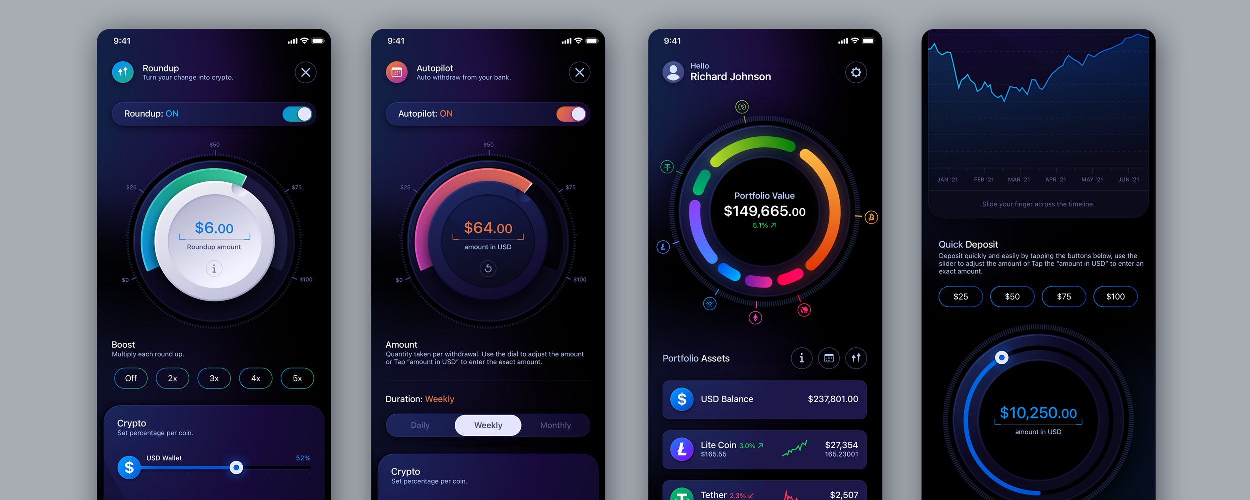
For Holt Financial, The Skins Factory designed a dark-mode cryptocurrency marketplace concept around the high information density of active trading. A collapsed sidebar preserves space for the candlestick chart and order book, while expanded navigation, search-as-you-type, movable dashboard modules, and supporting menus give users control without turning the interface into visual noise.

Holt Financial cryptocurrency marketplace web application UI and UX design by The Skins Factory

Explain Network Concepts at the Moment They Matter

Crypto introduces unfamiliar concepts such as network fees, gas, chains, confirmations, wallet addresses, and transaction hashes. Users need enough information to make a safe decision, but they do not need a blockchain lecture every time they move an asset. Explain the concept when it becomes relevant, in plain language, and connect it directly to the decision on the screen. Tell the user why a fee changed, why one network cannot be used with a particular destination, or why a transaction is still awaiting confirmation. The goal is progressive education: enough understanding to act safely, exactly when it is needed.

Do Not Call a Transaction Complete Before the Network Does

Crypto transactions move through meaningful intermediate states: prepared, submitted, broadcast, confirming, completed, or failed. Collapsing those states into a generic spinner leaves users unsure whether the transaction went through or whether submitting it again could create another transfer. Each state should have a clear name, an honest explanation, and guidance on whether the user needs to do anything. When useful, provide the transaction hash and a path to inspect the activity externally. A submitted transaction is not necessarily a settled transaction, and the interface should never imply certainty the network has not yet provided.

Common Question

How Is Designing Crypto and Wallet Products Different From Other Fintech?

The defining difference is irreversibility. Crypto flows require exact destination and network accuracy, clear explanations of unfamiliar concepts, and confirmation design strong enough to catch mistakes before they become permanent. Users should see the asset, amount, complete destination, selected network, fees, and expected timing before committing. After submission, the interface must distinguish clearly between broadcast, confirming, completed, and failed states. In crypto UX, preventing the error is often the only meaningful form of recovery.

Communicating Safety Without Theater

14. Trust and Security Signaling

In fintech, users are always asking one question, even when they never say it aloud: can I trust this product with my money? They answer that question by watching how the product behaves. Clear language, predictable actions, accurate status reporting, visible control, and consistent execution all signal competence. Trust and security signaling is the work of making safety and control visible without relying on badges, pressure tactics, or reassuring language that outruns reality.

Trust Is Built Through Accumulated Detail

No single element makes a financial product feel trustworthy. Trust grows from hundreds of small things working as expected: language that is clear, layouts that remain consistent, numbers that reconcile, actions that behave predictably, and status messages that accurately describe what is happening. A broken layout, typo in a confirmation, contradictory amount, or unexplained error can undermine confidence far beyond the size of the mistake. Users reasonably assume that visible carelessness may reflect deeper problems they cannot see. In fintech, polish is not decoration. It signals competence.

Demonstrate Security Through Behavior

Users do not trust a product simply because it says it is secure. They trust it when the interface behaves securely in ways they can understand. That includes confirming consequential actions, protecting sensitive information, explaining why verification is required, showing when a session will expire, providing clear recovery paths, and giving users control over connected accounts, devices, and permissions. Security certifications and recognizable providers can support credibility, but they cannot replace secure behavior. The strongest signal is a product that consistently shows users what it is doing with their money and data.

Be Honest When the System Is Uncertain

Pending, delayed, and under-review states are part of financial software. The trustworthy response is to name them clearly, explain what is happening, and provide a realistic expectation for what comes next. A transfer that is still processing should not be presented as complete simply because a reassuring message looks better. False certainty creates confusion, repeated submissions, and support calls when reality catches up with the language. Trust grows when the interface tells the truth, especially when the truth is inconvenient.

Never Trade Long-Term Trust for a Short-Term Conversion

Pressure tactics, hidden costs, manipulative defaults, preselected options, and false urgency may improve a short-term conversion metric. In a financial product, they also teach users that the interface is working against them. The honest and safe option should be easy to understand and easy to choose. Fees should appear before commitment. Optional products should look optional. Declining an offer should not require more effort than accepting it. Financial products survive on relationships built over time. A conversion extracted through manipulation is rarely worth the trust it consumes.

Common Question

How Does an Interface Build Trust in a Financial Product?

Trust is built through clear language, consistent execution, accurate numbers, predictable behavior, and honest reporting of what the system is doing. Security should be demonstrated through visible actions and meaningful user control rather than claimed through badges alone. Pending and uncertain states should be described truthfully, fees and consequences should appear before commitment, and the safe choice should never be hidden behind manipulative defaults. Users trust financial products that repeatedly prove they are competent, transparent, and working in the user’s interest.

Designing for Uncertainty, Review, and Human Control

15. AI in Fintech Interfaces

AI is moving quickly into financial products: fraud detection, risk scoring, automated approvals, spending insights, transaction categorization, and copilots embedded inside banking and payment applications. But AI in fintech carries a burden that most AI features do not. When an automated system affects someone’s money, access, or financial standing, the user needs to understand what happened, question the result, and know how to reach a human. Explainability is not merely a feature of good design. Depending on the decision and jurisdiction, it may also be a compliance requirement.

Communicate Uncertainty Without Inventing Precision

AI outputs should not all appear equally certain. A recommendation supported by strong evidence should not look identical to one based on incomplete information or an unusual pattern. The interface should communicate the system’s level of certainty and its limitations in language the user can understand: strong match, review recommended, incomplete information, or unable to determine. Avoid presenting an exact confidence percentage unless that number is meaningful, tested, and useful to the person making the decision. The goal is not to make the AI appear confident. It is to help the user judge how much confidence the output deserves.

Design Human Review Into Consequential Decisions

Automated decisions that freeze an account, decline a payment, flag activity as fraud, or restrict access need a clear path to human review. The interface should identify when automation influenced the result, explain what the user can do next, and provide a direct way to contest or escalate the decision. Human review cannot be treated as a support article buried three levels deep. It is part of the primary flow. A consequential AI decision presented as a final verdict with no visible recourse is both a trust failure and a product risk.

Show the Evidence Behind the Result

Users do not need a technical explanation of the model. They need to understand the evidence that affected the outcome. Show the relevant transaction, account activity, source data, rule, or decision factor in plain language. Translate internal reason codes into information the user can act on. Where the AI summarizes or recommends something from financial data, let the user open the records behind the answer and verify it. Explainability should help the user make a better decision, not overwhelm them with technical detail or ask them to trust another opaque paragraph.

Keep the Human in Control of the Consequence

The strongest role for AI in financial products is assistance with clear boundaries. AI can summarize activity, categorize transactions, surface unusual patterns, draft forms, and prepare an action for review. It should not quietly complete a consequential action simply because it can. The amount of control should scale with risk and reversibility. A transaction category may be changed with a quick undo. An outgoing payment, frozen account, or denied application needs explicit review, confirmation, and a durable record of what happened. The goal is a system users direct, not one that acts on them without a clear stop, review, or recovery path.

Common Question

How Should AI Features Be Designed in a Financial Product?

Design them so users can understand, question, and control the automated decisions that affect their money. Communicate uncertainty honestly rather than presenting every output as certain. Show the evidence, sources, and decision factors behind approvals, denials, recommendations, and fraud flags in plain language. Consequential decisions need a visible human-review and contest path, while actions involving money or access should require explicit approval and leave a clear audit trail. AI should make financial decisions easier to understand and manage, not remove the user from them.

Organizing Complex, High-Volume Financial Operations

16. Enterprise and Back-Office Fintech UX

Consumer fintech gets most of the design attention, but much of the financial system runs through software the public never sees. Payment operations teams, treasury departments, risk analysts, compliance officers, administrators, and customer service teams use back-office platforms to approve transactions, investigate exceptions, reconcile accounts, and keep money moving. These users work with dense information, repeat critical tasks throughout the day, and often share responsibility for actions with serious financial consequences. The goal is not to make professional software resemble a simplified consumer app. It is to organize complexity so experts can work quickly without losing accuracy, visibility, or control.

Professional Users Need Organized Density

Enterprise users often need balances, transaction details, risk indicators, approval history, and supporting records visible at the same time. Removing too much information may make a screen look cleaner while forcing users to navigate constantly. Strong hierarchy, alignment, grouping, filtering, and saved views make dense interfaces scannable without taking away the depth professionals need. In back-office fintech, density is not the enemy. Disorder is.

Make Roles, Approvals, and Ownership Visible

Enterprise financial platforms rarely have one universal user. One person may create a payment, another may approve it, and a third may release it. The interface should show what each user can do, why an action is restricted, who owns the next step, and what is preventing the workflow from moving forward. A status such as Pending is not enough. Users need to know pending with whom, for what reason, what is blocking it, and what happens next.

Design Around Exceptions and Bulk Actions

For many operations teams, exceptions are the work: failed validations, mismatched records, unusual activity, missing information, and transactions that require review. Queues should make priority clear through risk, age, amount, ownership, and service-level deadlines. Each item should explain what happened, why it needs attention, and which action resolves it. Bulk actions need even stronger safeguards because one mistake can affect hundreds or thousands of records. Before commitment, show the number of affected items, the total financial value, validation failures, and the complete consequence of the action. Confirmation friction should scale with the risk and value of the batch.

Audit Trails Should Answer Questions

A usable audit history should show who did what, when it happened, what changed, and why. When a value is edited, show the previous and new values. When approval is required, show the full chain of responsibility. The history should be searchable by user, account, transaction, action, and date, using language an operations or compliance professional can understand without decoding system events.

Common Question

How Is Enterprise Fintech UX Different From Consumer Fintech UX?

Enterprise fintech serves professional users completing complex, repeated, and often high-volume financial operations. They need organized information density, role-based permissions, multi-party approvals, exception queues, bulk actions, and searchable audit histories. Routine work should be efficient, while consequential actions receive friction proportional to their risk. The goal is not consumer-style simplicity. It is controlled complexity.

Building Consistency Into the Product

17. Design Systems for Financial Products

Everything covered in this guide, payment flows, dashboards, compliance moments, trust signals, and failure states, has to remain coherent across a product that may span web and mobile, light and dark modes, consumer and administrative interfaces, and years of ongoing development. That consistency does not happen by accident. It comes from a design system: the documented components, patterns, states, content rules, and governance that keep a financial product understandable and credible as it grows.

Why Financial Products Need a System More Than Most

Consistency is a trust signal in fintech. When similar actions look and behave predictably throughout a product, users learn the system once and carry that confidence forward. When payment buttons, confirmations, status messages, or security patterns change from screen to screen, users have to stop and reinterpret the interface. That hesitation appears at exactly the moments when a financial product should feel most dependable. A design system creates the predictability financial products rely on, ensuring that the same action remains familiar wherever the user encounters it.

Cover Complete States, Not Just Components

A component library can show what a button, field, or card looks like. A financial design system must also define what happens before, during, and after an action. That includes loading, disabled, pending, processing, completed, failed, declined, reversed, under-review, and settled states. It also includes the language, icons, color semantics, and available actions attached to each state. Financial interfaces spend much of their life between success and failure. A system that documents only the happy path leaves the most trust-critical moments open to improvisation.

Treat Light, Dark, Web, and Mobile as Deliberate Environments

Platform and mode parity does not mean making every screen identical. It means preserving the same meaning, hierarchy, and behavioral rules while allowing the interface to adapt to its environment. Dark mode is not the light interface inverted. Contrast, emphasis, data visualization, disabled states, alerts, and financial gains and losses all need to be resolved and tested independently. Mobile also requires different decisions about navigation, information density, touch targets, and progressive disclosure. The system should define what must remain consistent and what is allowed to adapt.

Govern the System So It Survives the Product

A design system begins to fragment the moment teams create exceptions without a shared process for reviewing them. The system needs a clear owner, contribution rules, versioning, a record of design decisions, and a process for updating or retiring components. Design and engineering libraries should also use the same names, states, and behavioral definitions so the documented system and the shipped product do not drift apart. A design system is not a finished deliverable. It is product infrastructure that has to be maintained.

From the Work

ACI Worldwide Biller Design System - Light Mode

View Light Mode Design System

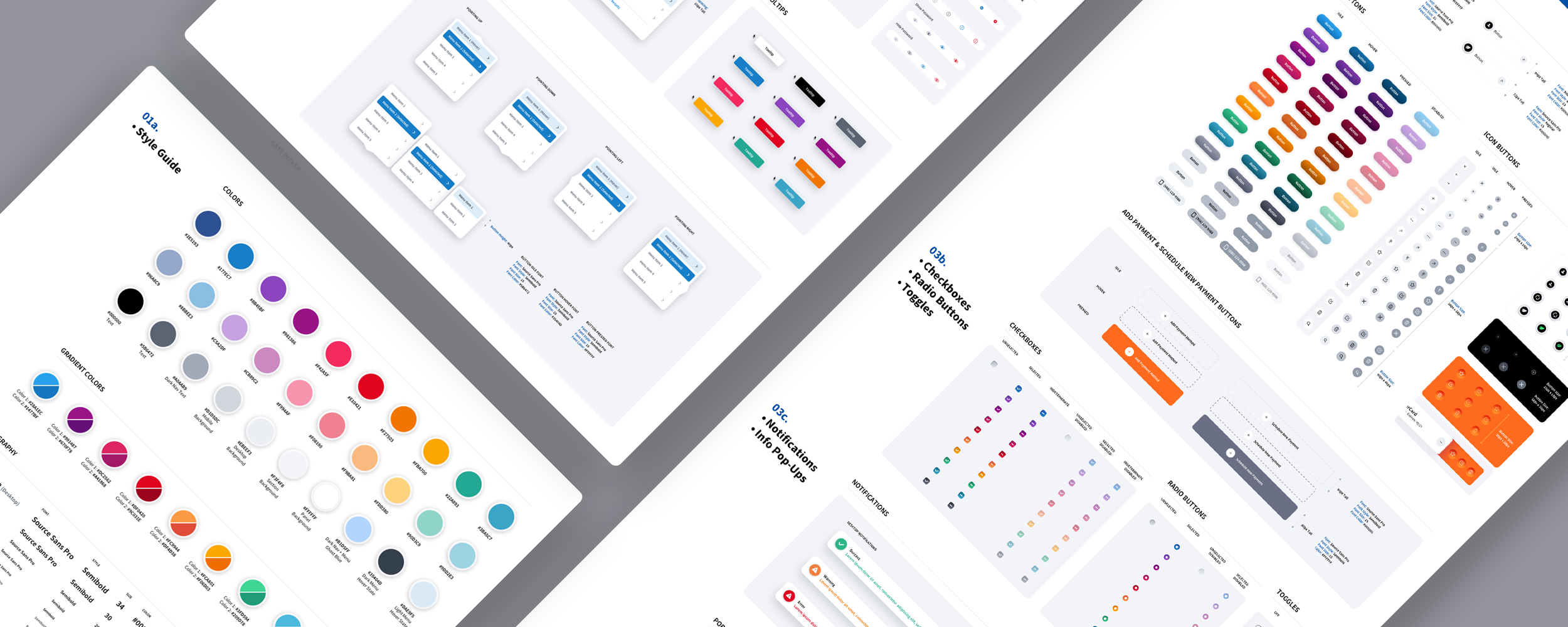
For ACI Worldwide’s Biller payment platform, The Skins Factory created a light-mode design system spanning web and mobile. It establishes shared component logic, interaction patterns, status conventions, and structural rules while resolving hierarchy, contrast, data legibility, and color for bright environments.

01 / 02

Common Question

Why Does a Fintech Product Need a Design System?

Because consistency is part of how a financial product earns trust. A design system standardizes components, payment patterns, confirmations, status language, and failure states across platforms and modes, while still allowing the interface to adapt appropriately to mobile, desktop, light, and dark environments. It also gives design and engineering teams a shared source of truth as the product grows. Without that system, small inconsistencies accumulate until users have to reinterpret familiar actions and the product begins to feel less dependable.

Frequently Asked Questions

The questions above appear throughout the guide alongside the sections they belong to. These are the ones that come up when companies are deciding whether and how to invest in fintech UX itself.

How much does fintech UI/UX design cost?

Cost is driven by scope more than anything else: how many flows and platforms are involved, how much regulatory complexity shapes the work, whether a design system needs to be built or extended, and how much research and validation the product warrants. A focused engagement on one trust-critical flow is a very different investment from a full product design across web and mobile with a delivered design system. The practical advice is to scope around the flows where trust and money concentrate first, onboarding, payments, and confirmations, because that is where design investment returns fastest.

How long does a fintech product design engagement take?

It depends on whether the work is a targeted redesign of specific flows or a full product effort, and on how quickly compliance and stakeholder review cycles move, which in financial organizations is often the real schedule driver. Well-run engagements move through discovery and audit, flow and structure design, detailed interface design, and design system documentation, with development able to begin on early flows while later ones are still being designed. Scoping the trust-critical flows first also shortens the path to visible results.

Do we need a designer with fintech experience specifically?

A strong general product designer can learn fintech, but the learning happens on your users and your timeline. A designer fluent in the constraints, KYC and verification, compliance-shaped flows, irreversible actions, proportional friction, and financial data density starts at the second conversation instead of the tenth, avoids designs that legal or risk will reject, and recognizes the failure modes before they ship. In a category where a single eroded trust moment costs customers permanently, that fluency is usually the difference between a redesign that converts and one that merely looks better.

Should we redesign the whole product or improve it incrementally?

It depends on how sound the foundation is. If the information architecture and core flows are healthy, incremental improvement focused on the highest-stakes screens is faster and less disruptive. If the product's structure, trust signaling, or design infrastructure is fundamentally dated, incremental patches produce a visibly inconsistent product, and in fintech inconsistency is itself a trust penalty. A common middle path is to rebuild the design system and the trust-critical flows first, then migrate the rest of the product onto that foundation in planned stages.

How do you measure whether fintech UX is working?

Watch the funnel at the moments this guide is about: completion rates through verification, funding, and first transaction, and abandonment at confirmation screens. Watch support volume and its themes, because questions like whether a payment went through are direct measurements of design failure. And watch the trust behaviors: account linking rates, repeat transaction rates, and whether users return after a failure. Improvement in those numbers after a design change is the clearest evidence the design is doing its job.

Can good design actually reduce fraud losses and support costs?

Yes, through mechanisms that are easy to trace. Clear confirmations and proportional friction reduce mistaken and manipulated transactions before they happen. Visible status at every stage removes the largest single driver of support contact in financial products: the user asking whether their money moved. Well-designed fraud alerts get answered faster, which shortens the window fraud has to run. And humane failure states recover users who would otherwise abandon and escalate. Design quality in these moments is an operational cost lever, not just a brand one.

Should we design for web or mobile first?

Start where your users transact. Consumer financial products are overwhelmingly used on mobile, which argues for designing the mobile experience as the primary one rather than adapting a desktop design downward. Professional and operational tools often remain web-first because their users work in long sessions with large screens and keyboards. Either way, the design system should span both from the beginning so the product stays coherent as it extends to the other surface.

How do you design for regulations that keep changing?

Separate the principle from the rule. Requirements change, but the principles they express, informed consent, clear disclosure, verified identity, explainable decisions, and auditable actions, are stable. A product designed around those principles adapts to new rules with adjustments rather than rebuilds. Practically, that means building compliance moments as modular, documented components in the design system so they can be updated in one place, and involving legal and compliance partners early in design rather than at final review.

What is the biggest mistake teams make in fintech UX?

Designing only the happy path. The demo flows where everything works get the attention, while verification failures, declines, pending states, disputes, and lockouts, the moments where trust is actually decided, are left to whatever the system defaults to. A financial product spends much of its life in those in-between and failure states. Teams that design them deliberately build products users forgive and return to. Teams that neglect them build products that work beautifully right up until the moment it matters.

What should we prepare before engaging a fintech UX partner?

Whatever funnel data exists, especially drop-off points through onboarding, funding, and payment. The compliance and regulatory requirements the product operates under, in whatever form they exist. Existing design assets and any design system or component library. The themes coming through support tickets, which are a map of design failures. And a ranked sense of which flows matter most to the business right now, because the fastest engagements start where the stakes concentrate rather than trying to boil the whole product at once.

Glossary of Fintech UX Terms

Short, working definitions of the terms used in this guide, written for product and engineering leaders rather than compliance officers.

KYC (Know Your Customer)
The regulatory requirement that financial products verify who their users are, typically through identity documents, personal information, and liveness checks. It is one of the largest sources of onboarding friction and drop-off.
KYB (Know Your Business)
The business-account equivalent of KYC, verifying a company’s identity, ownership, and legitimacy. It adds document, ownership, and multi-party complexity to business fintech onboarding.
AML (Anti-Money Laundering)
The body of rules requiring financial products to monitor, flag, and report suspicious activity. It is frequently the unseen reason behind holds, reviews, and account restrictions that interfaces must explain clearly.
Liveness Check
A verification step, usually a selfie or short video, confirming that a real, present person is completing identity verification rather than using a photograph or recording.
Account Aggregator
A third-party service that connects a fintech product to a user’s accounts at other institutions, enabling account linking, balance retrieval, and access to transaction data.
Open Banking
A framework, formalized to varying degrees across markets, that lets consumers share financial data with third-party products through secure, consent-based connections.
PCI DSS
The security standard governing how products handle payment-card data. It shapes interface decisions such as hosted card fields, masking, and what a product may display or store.
PSD2
A European payments regulation that, among other requirements, mandates strong customer authentication. It is a major driver of step-up verification patterns in products serving European users.
MFA (Multi-Factor Authentication)
A security method requiring more than one form of verification, such as something the user knows, owns, or is, to authenticate a user or approve an action.
Step-Up Authentication
Applying stronger verification only when the risk of an action warrants it, such as a large transfer, credential change, or sign-in from a new device, rather than applying the same friction everywhere.
Passkey
A cryptographic, phishing-resistant replacement for a password that is typically unlocked through device biometrics or a device PIN.
Tokenization
Replacing sensitive data, such as a card number, with a non-sensitive token so a product can reference the payment instrument without exposing or storing its real details.
Gas / Gas Fee
The fee paid to process a transaction or smart-contract action on Ethereum and other compatible blockchain networks. The amount can change depending on network demand and the complexity of the action.
ACH
The United States bank-to-bank transfer network. Its settlement delays are one reason financial interfaces need honest pending and processing states.
Settlement
The point at which transferred funds actually and finally move between institutions. Settlement may happen later than the user-facing confirmation, and the interface must communicate that gap honestly.
Chargeback
A card-transaction reversal initiated through the user’s bank, triggering a formal dispute process between financial institutions and merchants.
Dispute
The user-initiated process of contesting a transaction. It is one of the longest-running and most opaque flows in financial products, and a major trust moment when designed transparently.
Reason Code
A standardized code explaining why a transaction was declined, flagged, or reversed. The interface must translate that internal code into language the user can understand and act on.
Maker-Checker
An enterprise control pattern requiring one authorized person to initiate a financial action and a different authorized person to approve it before execution.
Dark Pattern
An interface pattern that manipulates users into actions serving the business at their expense, such as hidden costs, pressure tactics, deceptive defaults, or false urgency. In financial products, dark patterns directly consume trust.
Progressive Disclosure
Showing summary information first and revealing greater depth on demand. It is a core technique for keeping dense financial interfaces understandable without removing information users need.
Tabular Figures
Numerals designed to occupy equal width so digits align in columns. They are essential for scannable financial tables and one of the quiet markers of financial-grade typography.
WCAG
The Web Content Accessibility Guidelines, widely used as the practical baseline for digital accessibility in financial services, procurement, and compliance review.

Working With a Fintech UX Specialist

The through-line of this entire guide is that fintech UX is a distinct discipline. It sits at the intersection of high stakes, hard regulation, irreversible actions, and first-minute trust decisions, and it rewards experience in exactly those constraints. A designer who has moved money through a real payment platform, navigated identity verification flows that had to convert, and built design systems for financial products brings judgment that general product design experience does not automatically provide.

The Skins Factory has spent 25 years designing trust-critical software, including consumer payment platforms, biller and banking applications, cryptocurrency exchanges, and financial dashboards and portals, for clients including Bank of America, ACI Worldwide, Heartland Payment Solutions, and many others. The principles in this guide come from that work, not from observing the fintech space from the outside.

The Really, Really Short Form

Have a fintech project in mind? Let’s talk.

Thank you for reaching out.

We will be in touch within one business day.