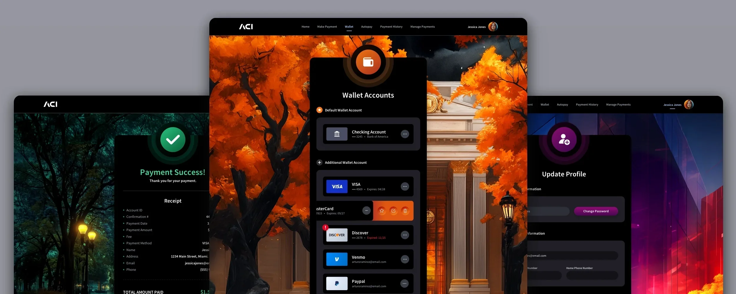
ACI Worldwide Biller Design System
Fintech UI/UX Design Web + Mobile Design System
The Skins Factory created a complete design system for ACI Worldwide’s Biller platform, combining a comprehensive UI kit with a detailed style guide for browser and mobile experiences. By defining the visual language, component behavior, spacing, interface states, and interaction patterns, the system ensures visual consistency, accelerates product development on screens The Skins Factory didn’t design, and enables teams to deliver trustworthy, accessible, and resilient experiences across web applications at scale.
The Challenge
Scaling a fintech platform without fragmenting the experience
ACI Biller required a unified system capable of supporting browser and mobile payment workflows, multiple navigation contexts, complex forms, data tables, status indicators, security prompts, notifications, overlays, and transactional dialogs. Without clearly documented standards, new screens and product states could begin to diverge, creating inconsistent interactions, unnecessary design debt, and a less cohesive experience as the platform evolved.
Our Approach
Turning the application into a reusable system of standards
We documented the complete color system, typography, spacing, layouts, panels, navigation, buttons, form controls, notifications, labels, icons, tables, slide-in panels, overlays, and dialog boxes. Components were defined across relevant sizes, states, hierarchies, and feedback conditions so future screens could be assembled from the same proven patterns. Built in Sketch, the system provided ACI’s teams with a clear framework for maintaining consistency at scale.
The Design System
The Design System includes a full color palette with primary, secondary, neutral, semantic, and gradient colors, each defined for consistent usage across UI states and contexts. Typography is standardized using Source Sans Pro with clearly defined hierarchy, weights, and sizes for desktop and mobile, ensuring readability and visual rhythm. The system also documents core layout components, including desktop and mobile panels, section backgrounds, base containers, titles, icons, and status indicators, all with precise spacing, elevation, and shadow rules.
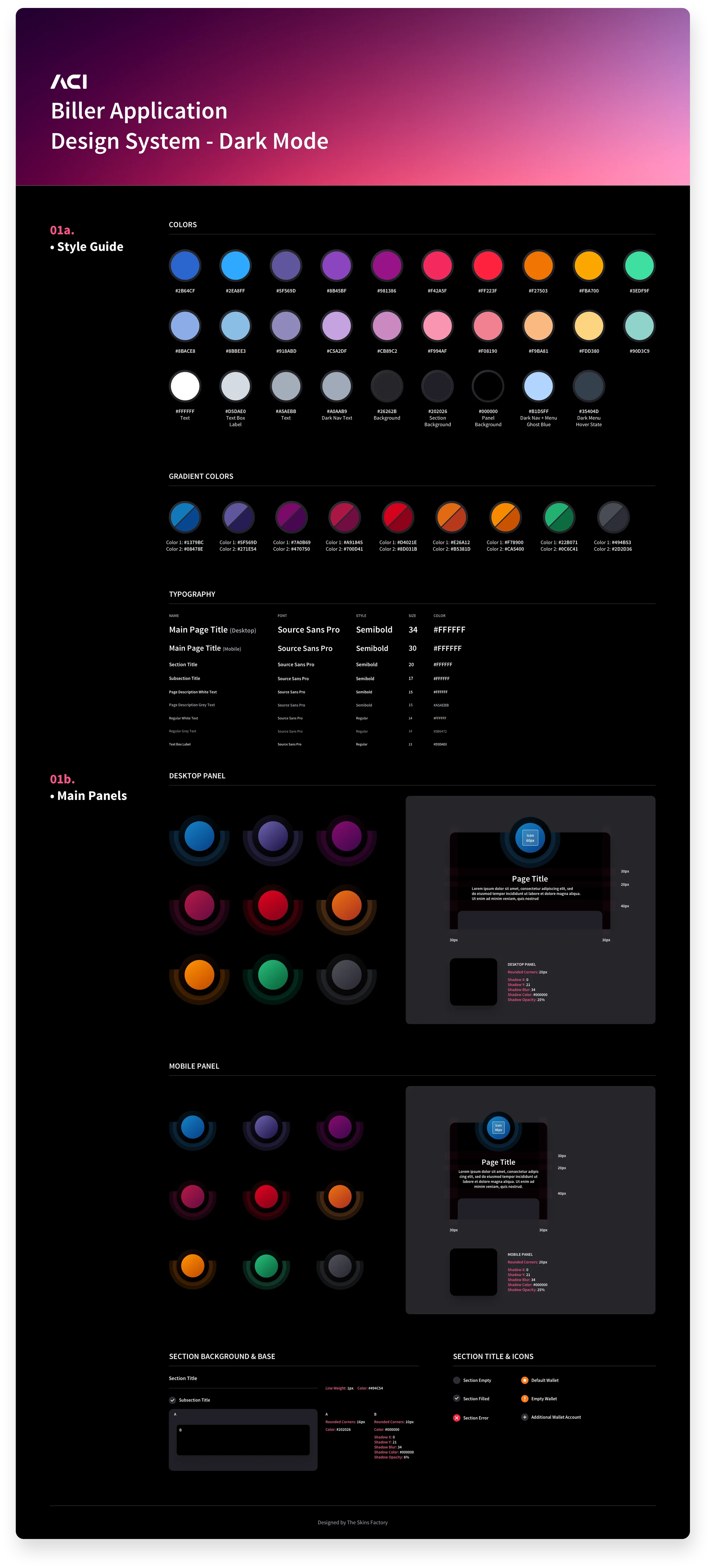
Style Guide + Main Panels
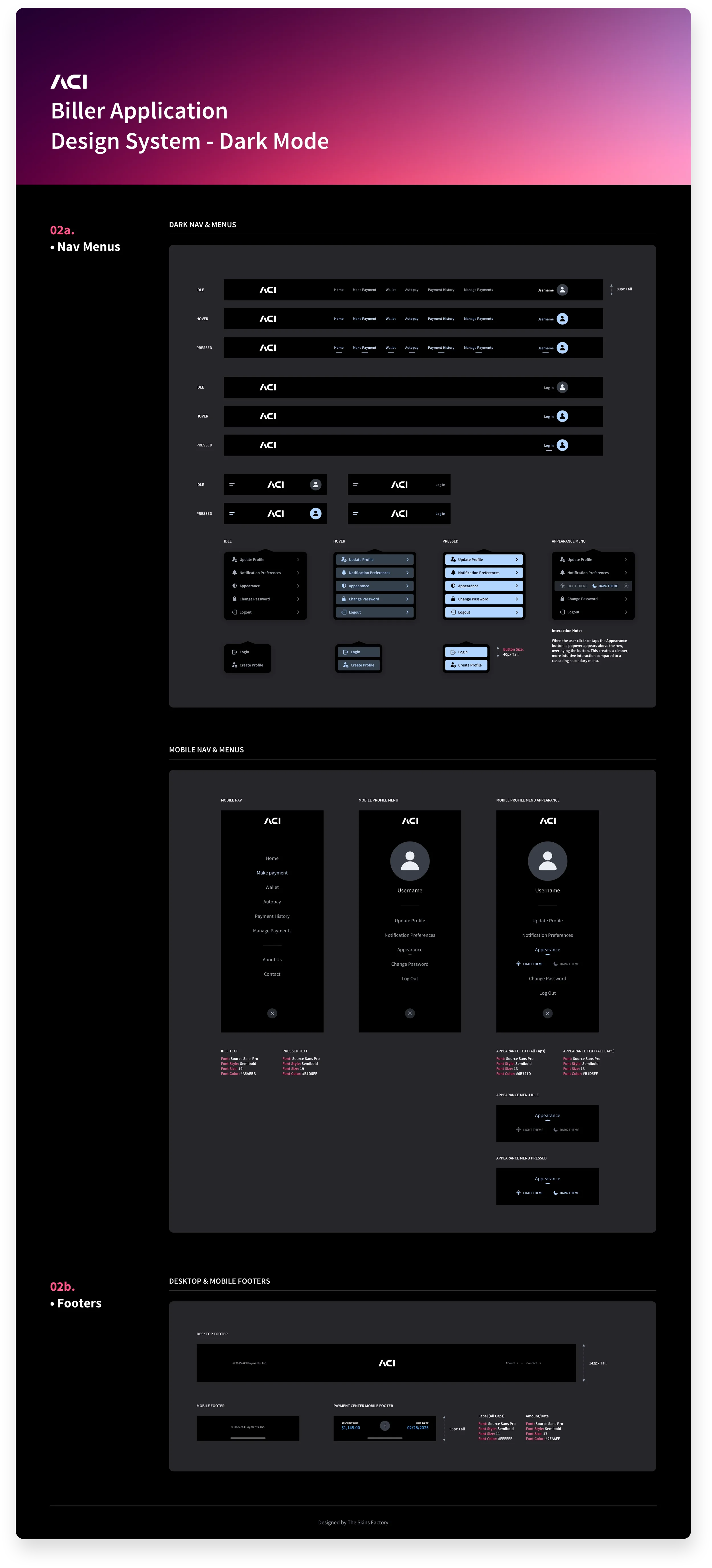
Navigation Menus + Footers
These Design System sections below provide detailed specifications for buttons, text buttons, and icon buttons across all states, along with size, typography, color, and elevation rules to ensure consistent behavior and accessibility. Form controls are fully standardized, including text fields, dropdowns, search patterns, tooltips, checkboxes, radio buttons, and toggles, each shown in multiple states with associated icons and validation feedback.
The system also includes structured patterns for notifications, info pop-ups, and security prompts, as well as navigational elements such as menus, date pickers, and wallet/payment selection menus optimized for both desktop and mobile. Together, these components form a robust, production-ready UI kit that enables predictable interactions, reduces design debt, and ensures a cohesive user experience (UX) across the entire billing application.
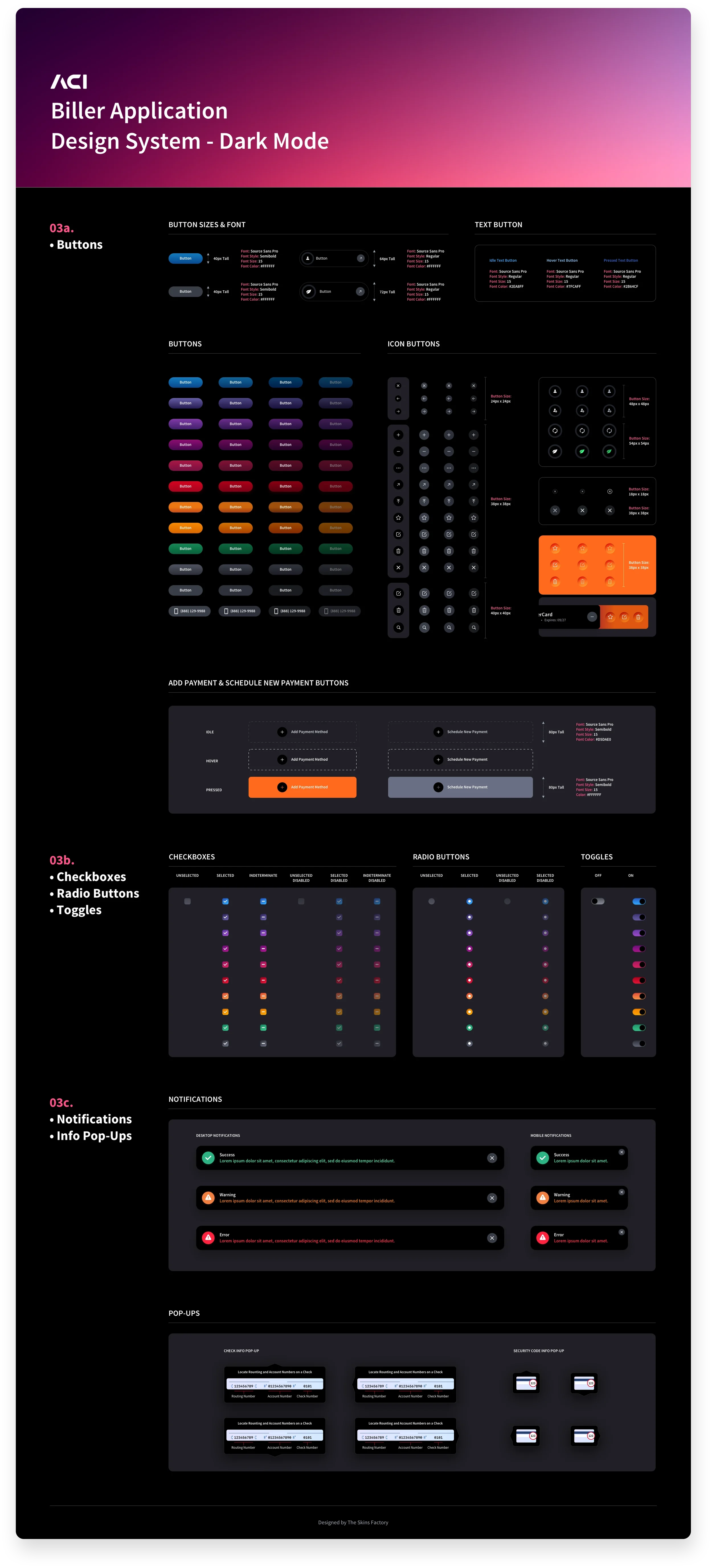
Buttons + Checkboxes, Radio Buttons & Toggles + Notifications & Info Pop-Ups
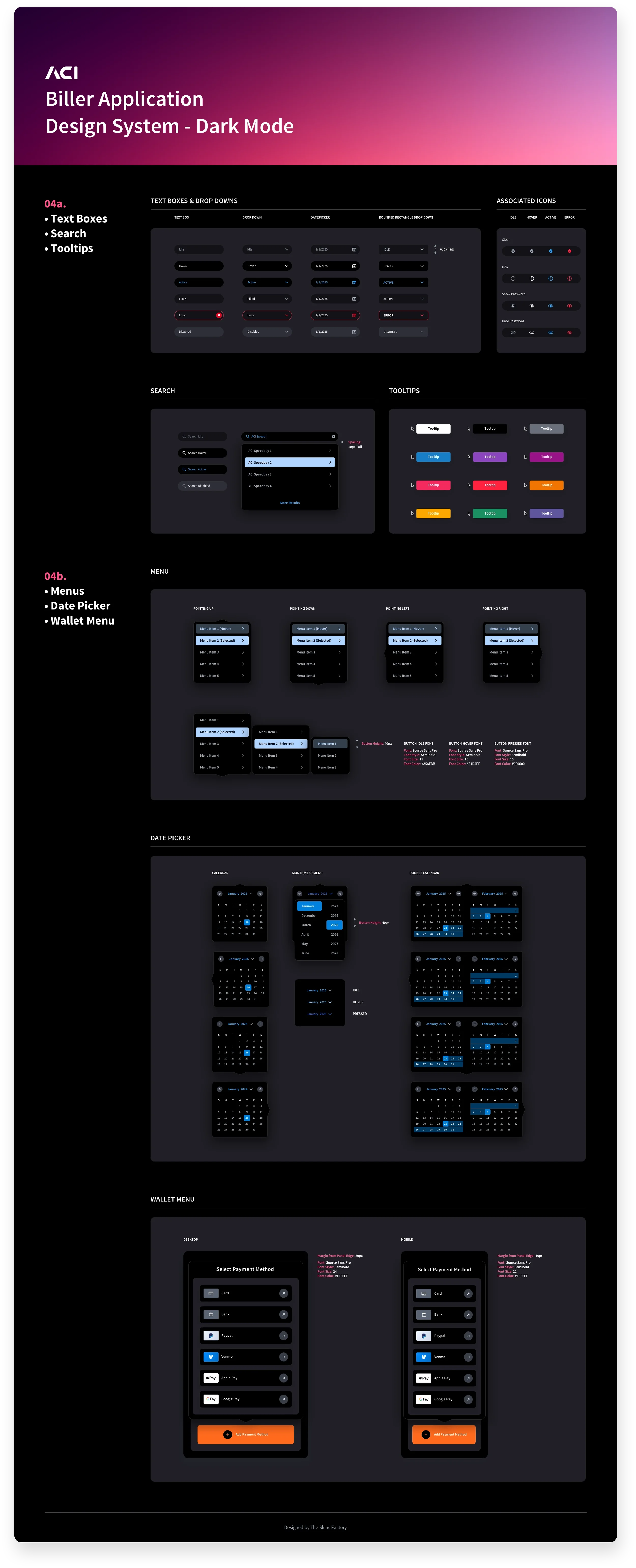
Text Boxes, Search, & Tooltips + Menus, Date Pickers & Wallet Menu
These sections capture advanced navigation, data presentation, and system feedback patterns. They define higher-order components such as tab bars, sliders, tree views, breadcrumbs, and list styles, establishing consistent navigation cues and hierarchical clarity across complex billing flows.
The system also standardizes labels, status indicators, payment icons, and a comprehensive icon library designed for desktop, mobile, and slide-in panels, ensuring semantic clarity and visual consistency at every touchpoint. In addition, these sections offer full-page table layouts for both light and dark navigation contexts, along with slide-in panels, overlays, and dialog boxes used for confirmations, warnings, errors, and transactional actions. Together, these patterns demonstrate how foundational UI elements scale into complete, production-ready page layouts, enabling predictable interactions, clear data visualization, and a cohesive enterprise user experience across the entire application.
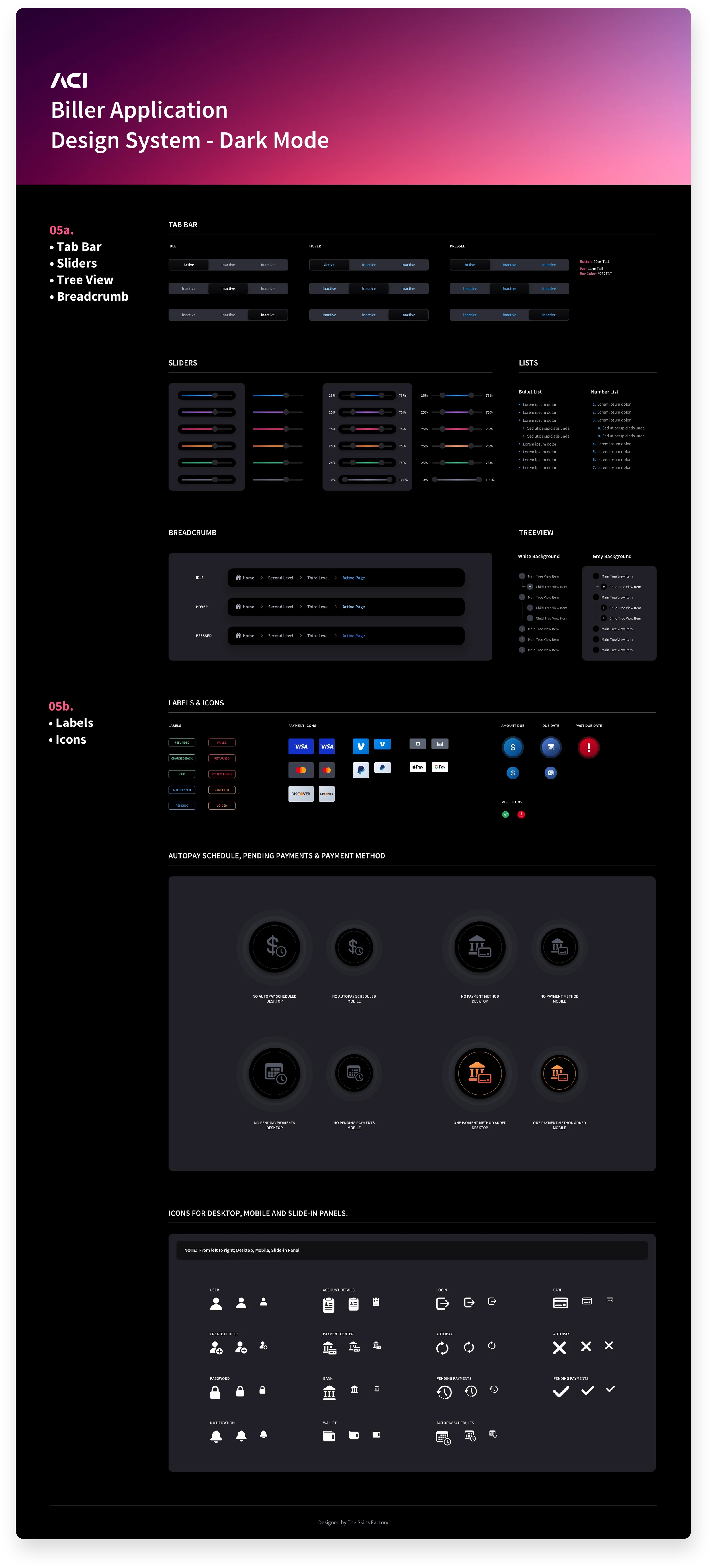
Tab Bar, Sliders, Tree View & Breadcrumb + Labels & Icons
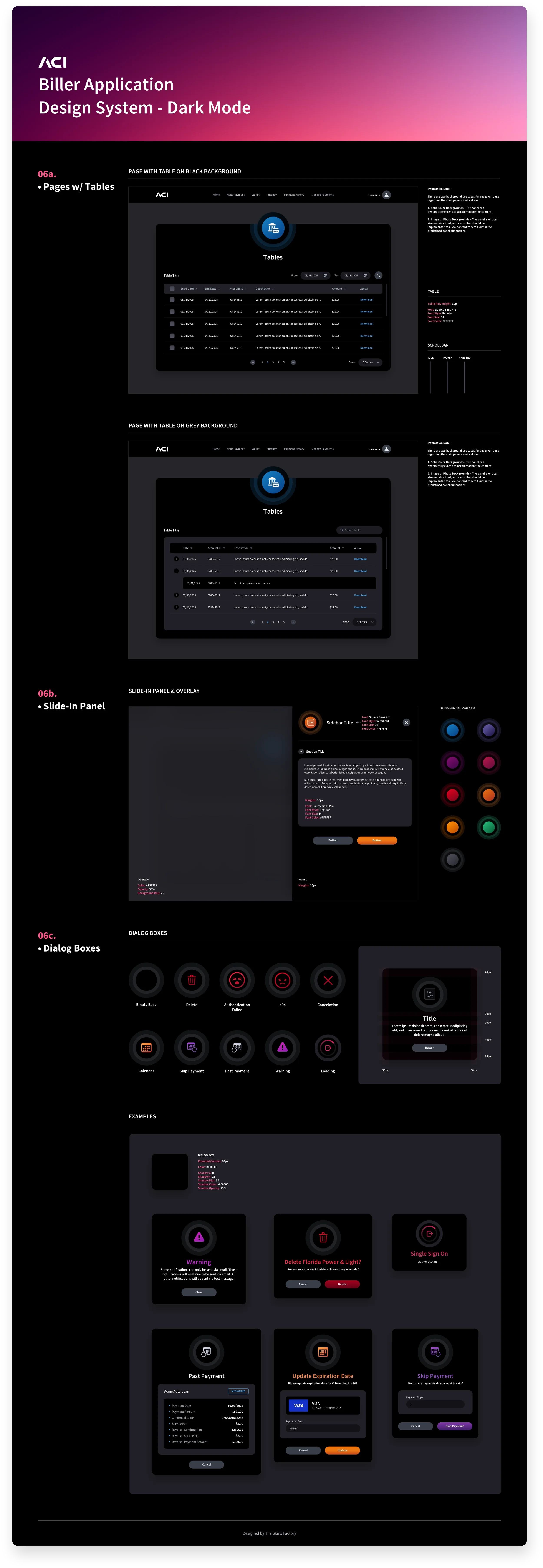
Tables + Slide-In Panel + Dialog Boxes
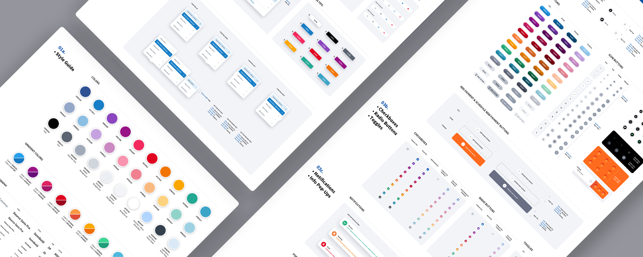
Light Mode Version
Have a project in mind? Let's talk.
Thank you for reaching out.
We will be in touch within one business day.