We Design Extraordinary Things
Enterprise+Dashboard+UI+UX+Design+Banner.webp

Enterprise Dashboard UI/UX Design Agency | Design or Redesign

Enterprise dashboard design and redesign that fixes structure, not just style. We build data-heavy SaaS, fintech, and healthcare dashboards users rely on.

Enterprise Dashboard UI/UX Design  ·  SaaS, Fintech, Healthcare & Cybersecurity

Enterprise Dashboard Redesign:
What It Takes to Fix an
Underperforming Dashboard

Role-Based Experiences Data-Heavy Enterprise Platforms 25+ Years Designing Complex Software

If you are here, something about your dashboard is not working.

Adoption is soft. Support tickets keep coming. Every feature your team ships makes the screen busier and the thing users actually need harder to find. That is not a coat of paint problem. It is structural, it gets worse as you grow, and it is exactly what we fix.

The good news: we have been doing this for 25 years, and we can tell you what is wrong with yours. the user, not the other way around.

Enterprise dashboard UI UX design and redesign by The Skins Factory
The Dashboard Mandate

Empower the User. That Is What a Dashboard Is Built to Do.

A dashboard should point users toward what matters first.

Most enterprise dashboards do not underperform because they look bad. They underperform because they show everything without prioritizing anything. We design and redesign complex dashboards around the information each user needs, the decisions they have to make, and the actions they need to take next.

Back in 2016, we designed a 150-screen digital banking web and mobile application for ACI Worldwide called Universal Banker. The modular dashboard we created allowed users to move the modules they cared about most to the top and expand most panels into larger, more detailed views.

The dashboard bent to the user, not the other way around.

Empower the user. That is a dashboard’s mandate, and most miss it.

They show everything but fail to prioritize anything, leaving the user to do the sorting. Instead of immediately seeing what matters, they are forced to scan a screen full of widgets to find the few pieces of information they need right now.

The data is all there. The dashboard simply has not done the one thing it was built to do: point the user toward what matters first.

A dashboard should not stop at telling the user what is happening. Wherever possible, it should make the next action obvious, whether that means investigating a threat, approving a payment, opening a project, or resolving an exception. Information without a clear path forward is still friction.

We solved that for ACI’s users.

The ACI banking application was one of many. We have designed data-dense dashboards across fintech, cybersecurity, DevOps, and healthcare, four domains with almost nothing in common except that each one punishes a bad interface harder than the last.

This is what we have learned about getting them right.

Role-Based Dashboards

A Dashboard Should Support the Role, Not Try to Do Everything.

Here is the part almost every dashboard gets wrong.

A CFO, a product manager, and a customer success lead all log in and see the same screen. But they did not come looking for the same information.

Financial Oversight

The CFO

Revenue trends, burn rate, runway, and the financial metrics that shape the company’s next decisions.

Product Performance

The Product Manager

Activation, engagement, retention, drop-off, and the signals that reveal how the product is actually being used.

Customer Health

The Customer Success Lead

Ticket volume, resolution time, CSAT, account health, and the issues that require attention before they become churn.

One generic layout serves all three badly.

It becomes a jack of all trades and a master of none, forcing each person to spend the first minute of every session hunting for the handful of things that actually matter to their job.

The most durable way to solve that problem is to hand control over to the user.

Instead of guessing at the one layout that works for everyone, let each person choose the widgets they need, remove the ones that do not apply to their role, and arrange what remains so the things they check first sit where their eyes land first.

That does not mean handing every user a blank canvas. The right experience starts with a role-based default, then gives the user enough control to refine it without letting the dashboard become a free-for-all.

The CFO keeps the financial metrics up top and clears away the noise. The customer success lead does the same with the numbers that run their day.

This is customization as a core part of the experience, not a settings page buried three menus deep.

It is the difference between a dashboard someone is handed and one they make their own. And it is exactly what we built for ACI’s banking users.

Dashboard Design Portfolio

A Look at Dashboards Across Four Industries

New colors and rounded corners do not solve a structural dashboard problem. A general agency can make a marketing site look beautiful. But a dashboard has to be read under pressure by different people who need different things. Designing for that requires an entirely different discipline. Here is what getting it right looks like across four real projects.

01. Healthcare - Research Before Vectors: InnovaMD

Healthcare Provider Portal Complete Dashboard Rebuild
View the InnovaMD Case Study

When we redesigned the provider portal for InnovaMD, an Anthem company, we did not open a design tool on day one. We spent the first two weeks interviewing the people who actually used it, including physicians, clinic administrators, and office staff.

We had also designed the previous version of the portal, so the research was less about fixing a fundamentally broken user experience. The interviews were more valuable for uncovering the features users wanted, any pain points they were experiencing, the information they needed faster, and the ways their day-to-day workflows had evolved since the original platform was designed.

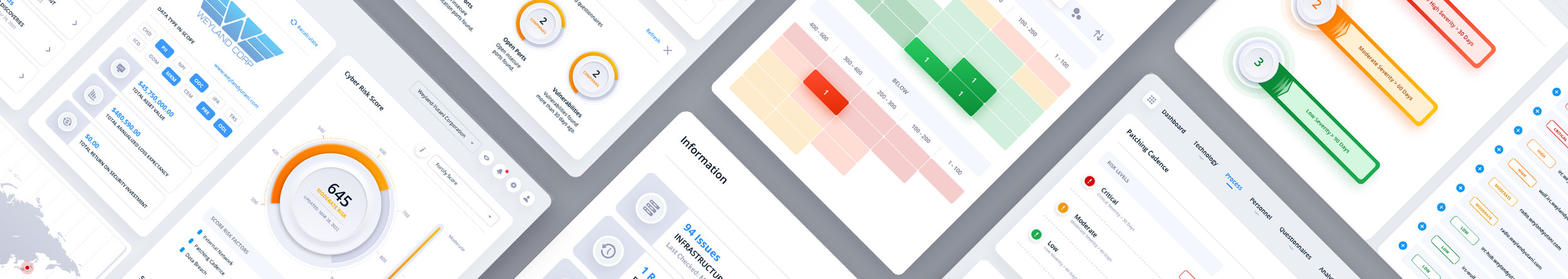
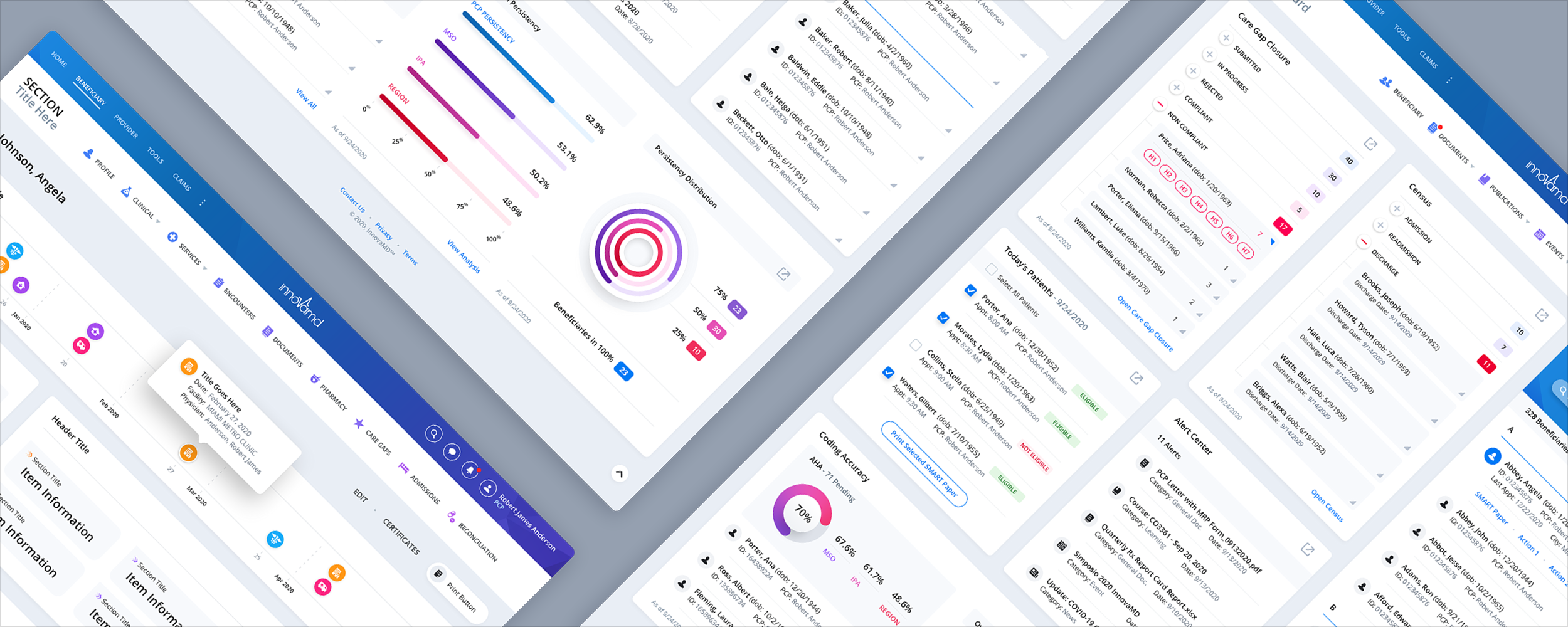
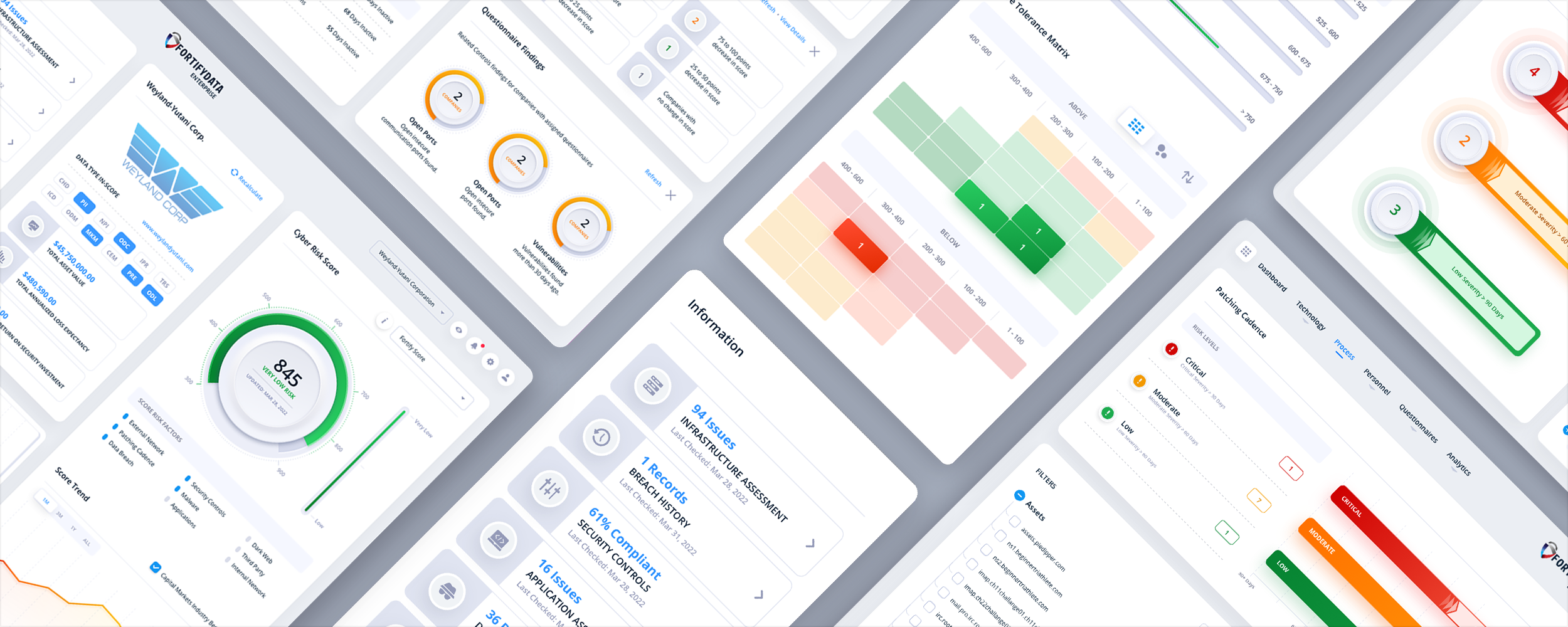
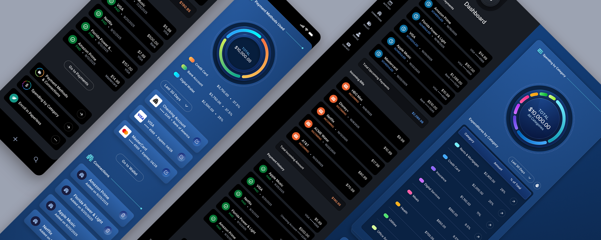
The dashboard was a complete rebuild.

It brings genuinely dense information together in one place, including care-gap closure, patient census data with admissions and discharges, coding accuracy, persistency distribution, and a beneficiary directory containing hundreds of records.

Then we did something a standard dashboard does not do. We created a modular layout in which any individual module can expand into a slide-out panel, letting a user open a full, detailed view without leaving the dashboard or losing sight of the surrounding data. It adds a layer of depth to the interface without forcing a healthcare professional to navigate to another screen every time they need a closer look.

That was not a styling choice. It was a new way to use a dashboard module, a pattern we invented specifically for InnovaMD that makes the interface do more than a conventional dashboard can. It is one we have carried into other complex, data-heavy platforms since.

This is what separates a redesign from a reskin. We did not rearrange the widgets and pick new colors. We changed what a dashboard module was capable of, so healthcare professionals could spend more time caring for patients and less time fighting the software. That is the kind of result you can only design toward after speaking with the people who use it.

02. Cybersecurity - Killing the Outdated Gauge: FortifyData

Cybersecurity Risk Management Platform 40+ Screen Redesign
View the FortifyData Case Study

FortifyData is a cybersecurity risk management platform that helps clients identify and manage risk exposure across their entire attack surface. They brought us in to redesign the core platform, more than forty screens in total.

Cybersecurity interfaces are unforgiving.

The user is often under pressure, the data carries real consequences, and one misread number can send someone chasing the wrong threat. Two changes show what a dashboard redesign should actually accomplish, and only one of them is visible at a glance.

The visible one was the Cyber Risk Score. The original used an old gasoline-gauge-style meter, the kind of skeuomorphic dial that looked dated and did a poor job of communicating information quickly. We replaced it with a clean neumorphic score that was modern, immediately legible, and easier to read at a glance under the exact conditions in which the platform gets used.

The deeper work was structural, and it is the change that mattered most. On the Risk Modeling view, the original interface split a single task across two separate screens. We converged them into one, speeding up the workflow while putting more useful information in front of the user at once. The redesign did not add capability by adding screens. It added it by removing one.

That is the unglamorous heart of enterprise dashboard redesign, and it is the part a general agency almost never sees. The win is not a prettier gauge. It is collapsing the screens that should never have been separate in the first place, so the person under pressure has fewer places to look and less chance to misread.

03. DevOps - Reclaiming Space Without Losing Control: Iguana Solutions

DevOps Infrastructure Management Cloud and Hybrid Environments
View the Iguana Solutions Case Study

Iguana Solutions USA is a managed services and hosting company that designs and runs complex, critical infrastructure across physical, cloud, and hybrid environments. Its platform allows engineers to spin up projects, configure infrastructure, and monitor everything that is running.

The design challenge with a tool like this is controlled density.

It is one of the hardest problems in enterprise UX. Power users want a great deal of information on screen, but they cannot tolerate clutter or excessive scrolling that hides what they need. Give them too little and the tool feels weak. Give them too much and it feels unusable. The whole job is finding the line between the two and holding it.

Two details show how we held it. On the infrastructure grid, we made the sidebar collapsible, reclaiming horizontal space for the drag-and-drop infrastructure icons, and added zoom controls so the workspace could adapt to whatever display a developer was using.

On the project list, the filter dropdown was sized to match a single row. When expanded, it pushed the rows beneath it down immediately rather than relying on animated motion, keeping the interface fast and predictable instead of flashy.

None of that is decoration. Each choice is a deliberate answer to the density problem, and together they are the difference between a DevOps dashboard an engineer has to fight and one that gets out of the way. That is the level of precision this work takes, and enterprise users feel it within minutes, even when they cannot tell you exactly what changed.

04. Fintech - Where Empty Space Is a Design Decision: ACI Pay

Fintech Consumer Payments Platform Three Dashboard States
View the ACI Pay Case Study

Global payments leader ACI Worldwide contracted us to design the interface for ACI Pay, its next-generation consumer payment platform. This was not our first project with ACI. We had already designed their Universal Banker platform years earlier, and they came back to us for this one, the kind of return an enterprise client does not make unless the first engagement delivered.

The dashboard gives users an at-a-glance view of payment activity, payment methods, connections, and account status the moment they log in. Across most of the application, we treated empty space as an opportunity to onboard the user. Every blank area became a way to guide them toward a clear next action.

The dashboard was the deliberate exception.

Unlike the rest of the application, users cannot manually populate the dashboard panels. The data appears automatically as activity accumulates. So an empty panel was not an unintentional omission or a gap to fill with a prompt. It was a signal that nothing had happened yet, and treating it as a problem to solve would have made the interface lie to the user.

To handle that honestly, we designed three distinct states for the dashboard: a brand-new account, a partially active account, and a fully populated experience. Each one communicates clearly at its stage of the user's journey, so the screen always tells the truth about where the account actually is.

That is the kind of judgment a general agency does not bring. A dashboard has to establish trust and reduce the time it takes to read the screen, both at once. Knowing when an empty state is a problem to solve and when it is information in its own right is exactly the sort of decision that separates a real dashboard redesign from a reskin, and it is a large part of why ACI keeps coming back.

Dashboard Redesign Warning Signs

Signs Your Enterprise Dashboard Needs a Redesign

Not every dashboard needs to be rebuilt. But a few patterns reliably signal that the interface, not the data, is the problem.

01

The Dashboard Gets Skipped

Users land on it and click straight past to the report, the export, or the one screen they actually trust. The page built to orient them has become a thing to get through.

02

Real Data Breaks the Interface

It looks clean in a demo full of sample data, then falls apart the day a real, high-volume account loads. The layout was designed for the mockup, not the customer.

03

Work Happens in a Spreadsheet

Users export the data and finish the actual job in Excel, because the dashboard shows the numbers but will not let them work with them. When the real work leaves your product, the interface has already failed.

04

One Task, Too Many Screens

A single job is spread across screens or tabs that should have been one. Every switch is another click, another load, and another chance to lose the thread.

05

One Layout for Every Role

A CFO, a product manager, and a support lead all open the same screen, so each one spends the first minute of every session hunting past information that was never meant for them.

06

Adoption Is Quietly Dropping

Logins slip, support tickets climb, and power users build their own workarounds instead of trusting the dashboard. The interface is losing the one argument that matters: whether people rely on it at all.

If two or three of those sound familiar, the problem is usually structural.

Structural problems do not resolve themselves with another feature. They get worse as more data, more functionality, and more users arrive.

Dashboard Redesign Process

How an Enterprise Dashboard Redesign Actually Works

Every project is different, but the shape of a serious enterprise dashboard redesign is remarkably consistent.

01

Understand the Users and Their Tasks

The work starts by understanding who uses the dashboard, what each role needs to accomplish, and which information matters most when decisions have to be made quickly.

02

Audit the Existing Interface

The current dashboard is examined to uncover where the structure, hierarchy, workflows, and information architecture are falling short, not simply where the styling looks dated.

03

Redesign the Dashboard Structure

The redesign determines what belongs on the default view, how the experience changes by role, and how workflows can be consolidated so users spend less time searching and navigating.

04

Design Every Data State

Empty, partial, loading, delayed, error, and data-heavy states all have to be designed deliberately. Users should never have to guess whether information is current, incomplete, or missing.

05

Ship a System That Can Grow

The finished dashboard has to use consistent components, interaction patterns, and design-system rules that engineering teams can maintain as new modules, features, roles, and data requirements are introduced.

The thread running through all four projects is the same.

We did not start by asking how the dashboard should look. We started with what the person using it needed to do, then designed backward from there.

That is what an enterprise dashboard redesign actually is. It is also why a generic UI pass rarely solves the problems these products have.

The Future of Dashboard Design

What’s Next for Enterprise Dashboards

The next generation of enterprise dashboards will not be a return to clutter, excessive effects, or interface decoration for its own sake. But they are moving away from the overly sterile flatness that made so many products feel lifeless over the last several years.

We are already seeing more depth return to product design through glassmorphism, layered cards, softer shadows, and interface elements that feel more tactile and spatial. Used well, those techniques help users separate information more quickly and understand hierarchy without having to stop and think about it.

Depth has to serve clarity, not compete with it.

In a dashboard, that matters more than following a visual trend. A translucent panel, floating summary card, or raised module can improve the reading experience when it helps the eye understand what is primary, what is secondary, and where the user should act next. The moment those same treatments become visual noise, they stop being useful.

That is why the future of dashboard design is not flat versus dimensional. It is disciplined dimensionality.

We have been designing this way since before the industry had a name for it. The InnovaMD slide-out panel added a layer of depth to the interface, but only because that depth let a user see more without losing their place. The dimensionality was in service of clarity. That is the discipline, and it is the part most teams chasing the trend will miss.

Enterprise users do not need decorative interfaces. They need interfaces that help them think faster. If depth helps that happen, use it. If it does not, leave it out.

ACI Pay fintech proof-of-concept interfaces exploring dimensional dashboard UI design
Enterprise Dashboard FAQ

Frequently Asked Questions About Enterprise Dashboard Redesign

What is an enterprise dashboard redesign?

It is the process of rethinking a data-heavy enterprise interface so it helps users make decisions rather than simply display information. It addresses structure, information hierarchy, role-based views, data states, empty states, and legibility, not just the visual style.

How is dashboard redesign different from regular UI design?

Regular UI work often centers on visual presentation. A dashboard redesign has to account for live data constraints, multiple user roles, missing or delayed information, and what happens when a real account loads far more data than a polished mockup. The hardest decisions are usually structural, not stylistic.

How do I know if my dashboard needs to be redesigned?

Common signs include users immediately clicking away from the default view, a single task being spread across multiple screens, every role seeing the same layout, the interface breaking under real data volume, and low adoption paired with high support volume. When two or three of those appear together, the problem is usually structural.

Does an enterprise dashboard have to be completely rebuilt?

Not always. Some dashboards need a ground-up redesign because the underlying structure is working against the user. Others can be improved by reorganizing the default view, consolidating workflows, introducing role-based experiences, or rebuilding only the parts creating the most friction. The right answer usually becomes clear during the UX audit.

Should different user roles see different dashboards?

In most enterprise products, yes. A CFO, product manager, operations lead, and customer success manager rarely need the same information in the same order. Role-based views, configurable modules, and user-controlled layouts keep each person focused on what matters to their job, without forcing the product team to maintain a separate application for every role.

How do you redesign a dashboard without disrupting current users?

The work begins by understanding which parts of the current experience users depend on, even when the overall interface is underperforming. A strong redesign preserves useful mental models, improves the areas creating friction, and introduces larger changes deliberately. Prototypes, usability testing, and phased implementation help prevent the redesign from becoming an unfamiliar replacement that users have to relearn overnight.

Do you build the dashboard, or only design it?

Our focus is design. We deliver engineering-ready files, component libraries, and design-system documentation that your development team can build against directly. When a client does not have the engineering resources in place, we can refer a trusted development partner we have worked with for years. Either way, the design work is prepared to hand off cleanly rather than thrown over a wall. You can see how that works on our UI/UX Development Services page.

How long does an enterprise dashboard redesign take?

It depends on how many modules and roles the dashboard has to serve, the number of workflows and data states involved, whether it is being redesigned or built from scratch, and the condition of the existing design system. A focused redesign may take several weeks, while a complex platform with many modules, role-based experiences, and heavy data requirements takes longer. The number of modules matters, but the amount of structural thinking required usually matters more.

How does an engagement typically start?

Most engagements begin with a conversation about the product, the users, and where the current dashboard is falling short. From there, the work is usually scoped as either a UX audit of the existing interface or a full redesign, depending on how deep the structural problems run. The audit is often the right first step, since it surfaces what actually needs to change before anyone commits to a larger rebuild.

What do you need from our team before the redesign begins?

Access to the current product, key stakeholders, representative users, existing research, support feedback, analytics, and an understanding of the technical and data constraints. Perfect documentation is not required. In many cases, part of the engagement is uncovering what has never been properly documented.

What should we receive at the end of the project?

The final work may include user flows, wireframes, high-fidelity interface designs, interactive prototypes, responsive states, empty and error states, component libraries, design-system documentation, and source files prepared for the engineering team. The goal is to deliver a system that can grow with the product, not a set of one-off concepts.

How do you measure whether a dashboard redesign worked?

The right measurements depend on what the dashboard was built to help users accomplish. Useful indicators include faster task completion, fewer clicks, increased feature adoption, fewer support requests, reduced user error, improved retention, and less time spent searching for information. A dashboard is successful when users can understand what matters and act on it faster.

What industries benefit most from dashboard redesign?

Any domain with dense, high-consequence data. We have designed dashboards for fintech, cybersecurity, DevOps and infrastructure, and healthcare, where the cost of a confusing interface is high and the value of a clear one compounds over time.

Fix the Dashboard, Not the Complaints

If Users Complain About It,
or Quietly Avoid It.

If your dashboard is the part of your product users complain about, or quietly work around, it is worth fixing properly. See our enterprise and SaaS UI/UX design work, or start a conversation with us about redesigning yours.

Start a Conversation

Let's Redesign Your Dashboard.

Thank you for reaching out.

We will be in touch within one business day.