We Design Extraordinary Things
The UI UX Design Guide Banner Image.png

The Definitive UI/UX Design Guide

The definitive UI/UX design guide: research, user flows, wireframing, prototyping, visual design, design systems, and AI interfaces.

The skins factory  ·  The Definitive Guide

The UI/UX Design Guide: How Great Digital Products Actually Get Designed

25+ years designing UI/UX for complex digital products. Clients include Microsoft, Disney, the NFL, Intel, Bank of America, and Warner Bros. This is a working guide built from real projects, not a glossary of definitions. Where it shows a technique, it shows the actual work behind it.

The Definitive UI/UX Design Guide — The Skins Factory
A Working Guide Built From Real Projects

What Strong UI/UX Design Actually Involves

There is no shortage of articles that define UI and UX design. Most of them stop at definitions: here is what a wireframe is, here is what a persona is, here is a glossary of terms. They read like a vocabulary list because that is what they are. They are thrown together for search engine purposes, not to actually show and tell. What they rarely show is the part that actually matters, how the work gets done, what decisions get made and why, and what separates design that looks finished from design that genuinely works.

This guide takes the harder path. It walks through the full arc of a real UI/UX design engagement, from the first user interview to the final design system, and it grounds each stage in actual project work rather than theory. The Skins Factory has been designing digital products since 2000, for clients ranging from Microsoft and Disney to Bank of America and healthcare platforms serving physicians. The techniques here come from that work, not from watching the industry from the sidelines.

It is written for the people who own product decisions, heads of product, CTOs, founders, and design leads, who want to understand what strong UI/UX design actually involves before they commission it, evaluate it, or attempt it themselves. By the end, you should be able to tell the difference between design that follows a rigorous process and design that just decorates a screen.

The difference between a product that works and one that merely looks good is almost never visible on the surface. It's in the process nobody sees.

THE INDEX

What This Guide Covers

01
What UI/UX Design Actually Is The real distinction between user experience design, user interface design, interaction design, and user-centered design, and why each discipline matters.
02
The UX Design Process, Start to Finish The complete UI/UX design process, from discovery and user research through wireframes, prototyping, visual design, and engineering handoff.
03
Discovery, User Research and User Interviews How product discovery, user research, and user interviews uncover real workflows, pain points, business requirements, and opportunities for improvement.
04
User Flows and Journey Mapping How user flows and customer journey maps define task paths, decision points, edge cases, and the moments where users become confused or abandon a process.
05
Information Architecture and Wireframing How information architecture, navigation, content hierarchy, low-fidelity wireframes, and high-fidelity mockups create the structure behind a usable digital product.
06
Prototyping and Usability Testing How interactive prototypes and usability testing validate product flows, expose friction, and identify design problems before development begins.
07
UI Design: The Layer Users Actually Touch How visual hierarchy, typography, color, spacing, controls, interface states, accessibility, and bespoke UI artwork shape the finished product experience.
08
Design Systems How reusable components, design tokens, interaction patterns, and documented interface rules keep complex products consistent, scalable, and easier to build.
09
Engineering Handoff and Design QA How design specifications, component behavior, responsive rules, developer collaboration, and design QA ensure the product that ships matches the approved interface.
10
Designing for AI Interfaces How to design AI copilots, generative features, and agentic workflows that communicate uncertainty, explain decisions, and keep users in control.
11
Measuring Design: Before and After How to measure a UX redesign through task completion, error reduction, abandonment, feature adoption, support requests, and user satisfaction.
12
Choosing a UI/UX Design Partner What to look for when hiring a UI/UX design agency, including process, relevant product experience, systems thinking, collaboration, and the ability to challenge a weak brief.
01 · Foundations

What UI/UX Design Actually Is

UI and UX are used interchangeably all the time, and the conflation causes real problems, because it leads teams to treat a UX problem as if it were a UI problem, then wonder why a fresh coat of visual polish didn't fix anything. I can't tell you how many times a prospective client tells me on a call that they need UX work done, when in fact they want UI work in the form of a visual refresh. Given our long history redesigning existing applications, we naturally address UX problems during a UI refresh, but they are not the same discipline.

UX is the experience. UI is the interface. Interaction design is how the interface behaves. And user-centered design is the philosophy that governs all three.

UX is the experience

User experience design is concerned with the entire experience a person has while interacting with a product. It is the broader discipline, encompassing every touchpoint in the journey, from the moment someone first arrives to the moment they complete what they came to do. It is about understanding human needs, behaviors, and pain points, and building a structure that serves those needs before a single visual decision gets made.

The clearest way to think about it is architecture. Before a building goes up, there are structural plans, load calculations, and decisions about where people enter and where they need to go. You do not pour concrete until the structure is sound. UX is that blueprint phase: the flows, the hierarchy, the logic, and the clarity that determine whether a person can actually accomplish their goal.

It is also the most intensive phase of designing an application. It is slower, more ambiguous, and more research-dependent than the visual work that follows, and it pays dividends in every phase after it, because every interface decision downstream is built on the foundation UX creates. When the structure is wrong, no amount of surface polish can rescue it.

UI is the interface

User interface design is what people actually see and touch. It is the visual and interactive layer of a product: the buttons, icons, typography, color systems, spacing, motion, and layout that make a product feel like something rather than nothing. UI is a part of UX, not a synonym for it, and it is where a product's competitive advantage becomes visible.

If UX is architecture, UI is the interior design and finish work. The same floor plan can feel sterile and institutional or warm and considered depending entirely on the finish choices. A thoughtfully designed interface turns a functional product into an experience, something people remember, recommend, and return to.

Good UI is not decoration. In serious enterprise software it does real work: a color system that communicates risk rather than just looking clean, a typography hierarchy that keeps dense data readable under pressure, iconography that stays legible at the compact sizes a data-heavy interface demands. The craft is in making complexity feel effortless.

IxD is how the interface behaves

Between the experience and the visual surface sits interaction design, or IxD, the discipline most people forget to name. Interaction design determines how the interface responds to the user: the transitions, feedback, control states, and small behaviors that confirm an action was registered and something is happening.

Consider a single progress indicator. UX decides that the user needs to track progress through a multi-step task. UI decides what the indicator looks like. Interaction design decides how it behaves: what animates, how progress is confirmed, and what happens the moment a step is completed.

When we describe our work as UI/UX/IxD, interaction design is the behavior layer. It is where an interface begins to feel alive and responsive rather than static.

UCD is the philosophy behind all of it

Underneath UX, UI, and interaction design is a single governing principle: user-centered design. It means designing around the real needs, goals, and behaviors of the people who will actually use the product, discovered through research, rather than around what the team assumes, prefers, or finds interesting to build.

User-centered design is not a stage in the process. It is the philosophy that shapes every stage, from the first user interview to the final visual polish. When a design decision is made because research showed that users needed it, that is user-centered design at work. When a decision is made simply because someone on the team liked it, that is the opposite, and it is where products begin to drift away from the people they are supposed to serve.

Why the distinction is not academic

When a product is struggling, the instinct is often to make it prettier. But if users are dropping off during onboarding, getting lost in the navigation, or failing to complete a core task, the problem is usually in the experience, flow, hierarchy, logic, or interaction behavior, not solely in the visual layer.

Diagnosing which layer is actually broken is the first act of real design. Treating every problem as a visual one is why so many redesigns change how a product looks without changing how it performs.

User-Centered Design The governing philosophy the three layers sit beneath.
UX The experience: flow, structure, logic, and clarity that determine whether a user can accomplish what they came to do.
IxD The behavior: feedback, transitions, and interaction states that confirm an action registered and keep the interface responsive.
UI The visible surface: controls, typography, color, spacing, and layout, the tactile layer the user actually touches.
Common Question

What is the difference between UX, UI, interaction design, and user-centered design?

UX design is the entire experience of using a product: the user's goals, the path they take, the logic behind the experience, and the way the product handles mistakes. UI design is the visible interface layer the user touches, including typography, color, layout, controls, and visual states. Interaction design, or IxD, is the behavior layer: how the interface responds through transitions, feedback, animation, and state changes.

User-centered design is the philosophy that guides all three. It means designing around real user needs discovered through research rather than around team assumptions or personal preferences.

A product can be visually beautiful and still fail as an experience. That is why determining whether a problem lives in the flow, the behavior, or the visual surface is the starting point of good design.

02 · ThE Process

The UX Design Process, Start to Finish

Strong UI/UX design is not a burst of inspiration. Well, sometimes the UI artwork is, but overall, it is definitely a process.

It is a sequence of stages, each one reducing risk for the next, so that by the time anyone begins designing a beautiful screen, the hard questions about what that screen needs to do have already been answered. Skipping those stages is one of the most common reasons products ship broken experiences beneath attractive surfaces.

The 13 Stages of a Real UI/UX Engagement

A complete UI/UX engagement generally moves through the following stages. The process is not always perfectly linear, but each stage informs and strengthens the next:

01
Discovery Discovery establishes what the product needs to accomplish, which business outcomes matter, and what constraints shape the work. We review the current product, technical environment, analytics, stakeholder priorities, regulatory requirements, and known pain points. This gives the team a shared definition of the problem before design decisions begin.
02
User research and user interviews User research replaces assumptions with evidence from the people who use, or will use, the product. Interviews reveal real workflows, workarounds, frustrations, expectations, and the context surrounding each task. Those findings help the team prioritize the problems that matter rather than the ones that are merely easiest to see.
03
User flows and journey mapping User flows map the steps, decisions, branches, and outcomes involved in completing important tasks. They expose unnecessary steps, missing paths, edge cases, and places where users are likely to hesitate or abandon the process. Journey mapping adds the broader context around those flows, including motivations, emotions, and touchpoints beyond a single screen.
04
Information architecture Information architecture organizes content, features, and navigation into a structure users can understand. It defines naming, grouping, hierarchy, relationships, and how users move between different parts of the product. A strong structure reduces cognitive load and prevents the interface from becoming harder to use as the product grows.
05
Interaction design Interaction design defines how the interface behaves when users take action. It covers feedback, transitions, controls, states, confirmations, errors, and the timing of each response. These details make the product feel predictable, responsive, and trustworthy rather than static or uncertain.
06
Wireframing Wireframing establishes screen structure, hierarchy, functionality, and content placement before visual styling begins. Low-fidelity layouts make it easier to challenge weak ideas and revise the experience without wasting time polishing the wrong solution. They also give stakeholders and engineers a concrete model for discussing what each screen needs to do.
07
High-fidelity wireframes and mockups High-fidelity wireframes and mockups refine the approved structure into a more complete representation of the product. They resolve detailed layout, content, states, controls, and functional behavior before final visual artwork is applied. This stage reduces ambiguity and gives the team a reliable blueprint for the finished interface.
08
Prototyping Prototyping connects screens and interactions into a clickable model that simulates how the product will work. It allows the team to evaluate flows, behavior, and usability before development begins. Not every engagement requires a prototype, but it is especially valuable when the workflow is complex, unfamiliar, or expensive to change later.
09
Usability testing and iteration Usability testing puts the design in front of representative users and observes what actually happens. It reveals confusion, hesitation, missed cues, and incorrect assumptions that internal teams often overlook. The design is then refined based on evidence, and testing may be repeated at several points during the engagement.
10
Marker comps Marker comps test visual direction on top of the approved mockups before the full interface is designed. They explore typography, color, depth, imagery, iconography, and the overall character of the product. This gives the client a focused way to approve the visual language without committing to every screen at once.
11
UI and visual design UI and visual design turns the approved structure and behavior into the finished interface users will see and touch. It defines typography, color, spacing, controls, icons, imagery, data visualization, responsive behavior, and every required state. The goal is not decoration, but a cohesive visual system that makes complex tasks clearer and gives the product a distinct identity.
12
Design system development Design system development converts the finished interface into reusable components, patterns, tokens, and documented rules. It ensures that the product remains consistent as new screens, features, and teams are added. A strong system also reduces design debt, speeds engineering, and makes future changes easier to manage.
13
Engineering handoff, collaboration, and design QA Engineering handoff prepares the specifications, assets, behaviors, and responsive rules developers need to build the product accurately. Designers remain involved during implementation to answer questions, resolve edge cases, and prevent small deviations from becoming larger inconsistencies. Design QA then compares the build against the approved work so the final product reflects the intended experience.

Why the order matters

Each stage exists to answer questions the next stage depends on. Research reveals what users need and where the current experience is failing. User flows define how people should move through the product. Information architecture and wireframes establish structure, hierarchy, and layout. Prototyping and usability testing allow the team to evaluate whether those decisions work before investing heavily in the finished interface.

Visual design can then develop on top of a foundation that has already been considered and tested. The process is not always perfectly linear, and some stages overlap, but the sequence matters. When teams begin with polished screens and attempt to reverse-engineer the logic later, they often produce products that look resolved but behave badly.

It should also be noted that, in our 25-plus years of experience, not every engagement requires every stage at the same depth. Some clients already have established research, user flows, or a mature product structure. Others need a focused visual refresh rather than a ground-up redesign. Scope and budget also affect how extensively each stage can be explored.

Our job is to determine what the project genuinely needs, identify the stages that will have the greatest impact, and build the engagement around the client's goals and available resources. Even when the assignment is primarily a UI refresh, we still look for UX and interaction problems that should be addressed rather than simply placing a new visual surface over them.

What this looks like in practice

When we designed the InnovaMD healthcare portal, a responsive browser-based application, the engagement began with discovery before any interface work started. InnovaMD was later acquired by Anthem, now known as Elevance Health.

Our user experience designers spent the opening phase interviewing the physicians, clinic administrators, and office staff who used the previous version of the product, which we had also designed. What we learned from those interviews shaped the user flows, structure, interaction behavior, and visual design decisions that followed.

The rest of this guide walks through each stage of the process using real-world examples, primarily InnovaMD for the research and structural work, and Recognize Me, a social mobile app we designed from a single concept, for the visual and interface craft.

03 · Research

Discovery, User Research and User Interviews

Every engagement starts with discovery, before anyone opens a design tool.

Discovery before research

User research is a critical part of discovery, but it is not the whole of it. Discovery also means understanding the business goals behind the project, the technical environment the product has to operate within, the existing analytics and support data, stakeholder priorities, regulatory requirements, and the limitations of the current system. The purpose is to understand the complete problem before deciding which part of it design needs to solve.

This is especially important because it shows that you are not designing only from user requests. You are balancing users, business requirements, and engineering reality.

User research: understanding the people

Within that broader discovery, user research is where you understand the people who will actually use the product: what they are trying to do, where the current experience fails them, and what they genuinely need. It is the part of the stage that most clearly separates rigorous design from decoration. A team that skips it is designing for an imagined user instead of a real one.

Why research comes first

Design decisions made without research are guesses. They might be educated guesses, but they're still guesses, and in a complex software application, a wrong guess made early compounds into hundreds of wrong decisions downstream. Research replaces assumptions with evidence. It tells you which pain points are real, which features matter, and where users are actually struggling, so that design effort goes toward fixing what's broken rather than polishing what already works.

How user interviews actually work

The most direct form of user research is talking to users. In a well-run interview process, the designer sits with the people who use, or will use, the product and draws out their real experience: what they're trying to accomplish, what frustrates them, what they wish existed, and where the current tools get in their way.

We used the Yale Usability and Web Accessibility interview guide as the foundation for our line of questioning, then adapted it to InnovaMD. We asked how often people logged in and what they did first to understand their actual workflow, what they struggled to find to expose navigation and structural problems, and what they would change first if they were running the redesign.

The goal isn't to ask users to design the product. It's to understand their world deeply enough to design it for them. Good interviews surface pain points the team didn't know existed and kill assumptions the team didn't know it was making.

From the InnovaMD research

A sample of the questions we asked

Six representative questions from the larger interview framework.

What’s the first thing you do after you login?
On the dashboard, what module do you use the most?
How often do you use the application? Every day? Multiple times per day? A few times per week?
Is there a feature you would like to see on the dashboard that is not currently there?
What could be done to improve the Dashboard overall?
What are the most important tasks you or other people need to perform when using the application?

What this looked like on InnovaMD

The InnovaMD engagement opened with a two-week research phase. InnovaMD is based in Puerto Rico, and since I run the studio from South Florida while my senior designer Javier is based in Puerto Rico, we conducted the interviews over Zoom. The calls included me, my senior designer, and the physicians, clinic administrators, and office personnel who lived in the prior version of the portal every day.

Because the participants were healthcare workers in Puerto Rico, the sessions were conducted partly in English and partly in Spanish, which let people describe their frustrations in whichever language was more natural to them. The interviews focused on the pain points they were hitting with the existing application and the features they wanted in the new version.

One recurring theme was that the dashboard delivered too much information at once in a way users found overwhelming, and that finding led directly to the slide-out panel approach we used to manage density. That research pinpointed where the usability and interaction-design changes actually needed to happen. The redesign wasn't driven by what we found interesting. It was driven by what the people using the software told us was broken.

The through-line from that research is worth naming because it shaped everything: the overriding goal became helping users work more efficiently and giving them faster access to pertinent information, so healthcare workers could spend more time caring for patients and less time fighting the software. That priority came directly from listening to the people who did the work.

Research does not tell you what you want to hear. It tells you what users need, which is the only thing worth designing for.

Common Question

Why is user research important in UX design?

Because it changes what gets built. Research reorders priorities, features the team assumed were critical turn out to matter less than a small point of friction nobody noticed, and it settles internal debates with evidence instead of opinion or seniority. On the InnovaMD portal, our bilingual Zoom interviews with physicians and clinic staff surfaced that information overload on the dashboard was a bigger problem than any missing feature, which is what led directly to the slide-out panel solution. Without that research, we'd have built what we assumed they needed, not what they actually needed.

04 · Flows

User Flows and Journey Mapping

Once you understand the users, the next question is how they move through the product to get things done. This is where user flows and journey mapping come in, and it is one of the most underappreciated stages of design. We design the journey, not just the destination. A product is not a collection of screens. It is a set of paths a person takes to accomplish something, and those paths have to be deliberately designed.

What a user flow is

A user flow is the mapped sequence of steps a user takes to complete a task: every screen, decision point, and branch along the way. Mapping it out before designing screens forces the hard questions into the open: What is the shortest path to the goal? Where might a user get confused or drop off? What happens when something goes wrong? A flow makes the structure of an experience visible and reviewable before anyone commits to layouts.

Why mapping flows prevents expensive mistakes

When you design screens without mapping flows first, you end up with beautiful individual screens that do not connect into a coherent journey. Users hit dead ends, get bounced back to the start, or lose their place in a multi-step process. Mapping user flows catches these problems while they are still cheap to fix on paper, rather than after they are built. It is the difference between designing a set of rooms and designing a building people can actually navigate.

Designing for the moments in between

The strongest flow design pays special attention to the transitions and edge cases: the error state, the empty state, the interruption, and the moment a user has to leave and come back. These in-between moments are where many products fail because they are the parts nobody thinks to design until a user falls into them. Mapping the full journey, including the unhappy paths, is what makes an experience feel considered rather than fragile.

What this looks like in practice

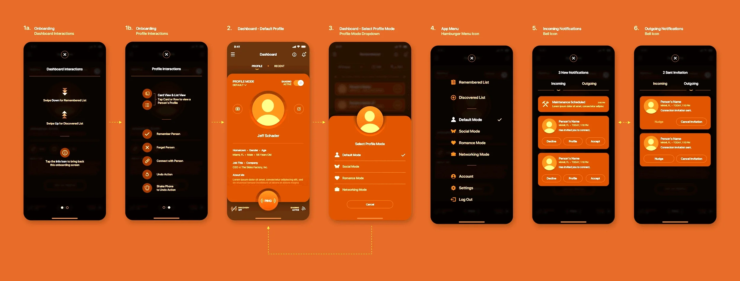
On Recognize Me, a social discovery app, we mapped the flow around a core mechanic: users discover other people nearby, and can add anyone they meet to a Remembered list that acts as a personal repository. We designed decision branches for every path that mechanic created: what a user sees when they tap into a Discovered profile versus a Remembered one, what happens when someone accepts or declines a connection request, and what the dashboard shows when there is nothing nearby to discover yet. In a later iteration we added a Ping feature, a button that sends out a pulse to pull in nearby users on demand, which meant mapping an entirely new flow branch for an action that did not exist in the original scope.

One flow rule came directly out of that mapping: a user can only appear in someone else's proximity feed if their own location sharing is turned on. That is not a visual decision, it is a flow decision, reciprocity has to be designed into the logic of the discovery mechanic itself, or the feature stops making sense to the people using it.

User-flow maps

Mapping the complete product journey

Fig. 1 Broad Overview UX Account Access & Creation
Fig. 2 Broad Overview UX Dashboard-Centered App
Fig. 3 Broad Overview UX User “Modes” and Profile
Common Question

What is the difference between a user flow and a wireframe?

A user flow maps the sequence of steps and decision points a user moves through to complete a task: the path itself. A wireframe lays out an individual screen within that path in low fidelity. Flows generally come first. They define the journey and expose where users might get confused or drop off, so that when you wireframe individual screens, you're placing them into a structure that already makes sense. Designing screens without mapping the flow first is how products end up with attractive screens that don't connect.

05 · Structure

Information Architecture and Wireframing

With users understood and flows mapped, the next job is structural: organizing the product's content and functionality into a coherent system, and laying out individual screens in low fidelity before high-fidelity visual design begins. This is information architecture and wireframing, the stage where the skeleton of the product takes shape.

Information architecture: organizing for how users think

Information architecture is the practice of structuring and labeling a product's content and functionality so users can find what they need and understand where they are. It governs navigation, grouping, hierarchy, and naming. Good IA reflects how users think about the product, not how the internal team happens to organize it. When the architecture is wrong, users cannot find things, and no amount of visual polish makes a poorly organized product feel usable. When it is right, the product feels obvious, which is the highest compliment IA can earn.

Wireframing: structure before surface

A wireframe is a low-fidelity layout of a screen, deliberately stripped of color, imagery, and visual styling, so that attention stays on structure: what goes where, what is emphasized, how the screen is organized, and how it supports the task. Working in low fidelity first is a discipline. It keeps the team focused on whether the layout works before anyone gets attached to how it looks. It is far cheaper to move a block in a wireframe than to rework a finished visual design.

On Recognize Me, once the user flows were mapped, we moved straight into low-fidelity wireframes of the Dashboard and the screens that branched off it. The wireframes existed to work out functionality, not appearance: how the Discovered list and the Remembered list would each be laid out, where the Ping control would sit, and what the dashboard should look like with nothing to show yet. Rules that would later govern the interface got written directly onto the wireframes as annotations rather than left to memory, for instance, that a user is only visible in someone's proximity feed while their own location sharing is active. Settling that logic in wireframes, before a single color or icon was chosen, is what let the later visual design stay focused purely on how things looked rather than re-litigating how they worked.

Designing for density and clarity together

Complex applications, especially in fields like healthcare, have to present a great deal of information without overwhelming the user. On the InnovaMD dashboard, this tension was resolved structurally. Rather than cram every module's full detail onto the main view, most dashboard modules included a pop-out control that expanded the module into a slide-out panel, providing more space and functionality on demand without disrupting the layout or forcing the user to leave the dashboard.

That is an information-architecture decision as much as an interface one: it keeps the default view clean and comprehensible while deeper detail remains one interaction away.

High-fidelity wireframes and mockups

Low-fidelity wireframes settle structure. The next step refines that structure into something closer to the finished product without yet committing to final UI artwork. High-fidelity wireframes and mockups exist to refine the design, functionality, and user experience before the final artwork is produced. They include precise layouts, spacing, and detailed content, sometimes with preliminary color or typography, but they remain working design documents rather than the finished visual interface.

On Recognize Me, this stage produced detailed mockups of the Dashboard, the Remembered and Discovered lists, and the different profile modes. They were refined well beyond the original low-fidelity wireframes but still stopped short of final artwork.

Getting this stage right matters because structural and functional changes are still relatively inexpensive to make. Once final UI artwork begins, changes to layout or functionality require considerably more rework than adjustments to color or typography.

High-fidelity mobile app mockups for the Recognize Me social discovery application
Common Question

What is information architecture in UX design?

Information architecture is how a product's content and functionality are structured, labeled, and organized so users can find what they need and always understand where they are. It governs navigation, grouping, hierarchy, and naming, and it should reflect how users think about the content rather than how the internal team categorizes it. When IA is wrong, users cannot find things and no amount of visual polish fixes it. When it is right, the product simply feels obvious to use.

06 · Validation

Prototyping and Usability Testing

A wireframe shows structure, but it is static. Prototyping is the stage where you make the design tangible enough to walk through, so stakeholders and users can react to something closer to the real thing than a flat screen. A prototype is primarily a communication and validation tool, a way to demonstrate the intended experience to stakeholders and test key flows with users before engineering invests real time and money.

Not every project needs a fully interactive, animated prototype either. Plenty of strong products are built from well-considered static screens, and the right level of fidelity depends on what the project, the stakeholders, and the testing objectives actually require.

It is worth being clear about what a prototype is not. A prototype is not the only way to evaluate an experience, and it is not the final proof that the product will work under real conditions. Prototyping and usability testing help validate the intended experience before development. Beta testing happens later, with a functioning product, and shows how it performs with real users in the wild.

Prototyping: making the design testable

A prototype turns static screens into something you can move through: a click-through that stands in for the real experience closely enough to react to. Prototypes range from rough, clickable wireframes to high-fidelity simulations that feel close to the finished product. The purpose is to make the design real enough that stakeholders can see the intended experience and users can test key tasks before anything gets built.

A prototype answers questions a flat mockup cannot, such as whether a flow feels coherent, whether a control is discoverable, and whether the sequence of screens makes sense from beginning to end. How much fidelity you invest depends on what the audience needs to see to provide useful feedback.

Usability testing: letting users find the problems

Usability testing is the practice of watching representative users attempt realistic tasks and learning from where they hesitate, become confused, make mistakes, or fail. A walk-through of a prototype can reveal whether a flow is clear, whether a control is discoverable, and whether users understand what to do next without being guided through it.

Additional usability problems may surface later, once actual users encounter the functioning product under real conditions during beta testing. They may behave differently in their own environment, with real data, real distractions, and real consequences. But beta testing should not be the first time users are asked to validate the experience.

Wherever testing happens, the point is the same. It is not to confirm that the design is good. It is to find the places where it is not while they are still cheaper to fix than to leave in. Every problem caught this way is a problem that does not ship as a surprise.

Designing feedback into the experience

Testing does not just catch problems. It reveals where users need reassurance. A recurring problem in complex flows is that users lose track of where they are in a multi-step process and abandon it.

On the InnovaMD Create Service flow, we addressed exactly this with a fixed vertical progress sidebar. As the user moved through each section, a checkmark appeared beside completed sections, and the sidebar remained visible while scrolling so users were always reminded of their position in the overall progression.

That kind of decision, giving users constant, visible confirmation of progress, is the sort of thing that comes from understanding where users get lost and designing the reassurance into the experience.

Common Question

What is the difference between prototyping and usability testing?

A prototype is a click-through version of the design that stands in for the real experience, allowing stakeholders to understand the intended flow and users to test key tasks before engineering builds anything. Usability testing is the practice of watching representative users attempt realistic tasks and learning from where they hesitate, become confused, or fail.

The prototype is the thing being evaluated. Usability testing is the method used to evaluate it. Beta testing happens later, with a functioning product, and provides additional evidence about how the experience performs under real-world conditions.

07 · Visual Design

UI Design: The Layer Users Actually Touch

With the experience researched, mapped, structured, and validated, the visual layer can now be fully developed. UI design is where the product gets its actual interface: the buttons, icons, controls, cards, and other components users see and interact with in the application, along with the typography, color, spacing, imagery, and finish that give it a look and feel. But strong UI design isn't decoration laid over a finished structure. It's the visual expression of that structure, and it carries real functional weight.

Aesthetics and function are not opposites

A beautifully designed interface with poor functionality is as flawed as an ugly one that works. Both are failures. The goal is not to choose between looking good and working well. It is to achieve both because, in a real product, they reinforce each other. Visual hierarchy guides the eye to what matters. Consistent styling makes the product learnable. Polish signals credibility and care. Aesthetics, done right, are functional.

Marker comps: the first pass at final art

Before final art is locked, there is usually a round of marker comps: an early exploration of color and style applied directly to the approved mockups. This is where the visual direction actually gets tested, not merely theorized about. It is a working stage, not a finished one, and it is where some of the best decisions in a project get made, often by cutting something that looked fine on paper but does not hold up once rendered.

On Recognize Me, the early marker comps for the light-mode version isolated color to the elements that needed emphasis: the Ping button, the hero text, and the iconography. The base panel remained white, while the header and footer carried the contrast.

One early comp wrapped the profile photo in a heavy black ring. It looked fine in isolation. Once it sat inside the full comp, next to everything else competing for attention, it clearly had to go. Removing it allowed the final light mode to land on a cleaner, more minimal direction.

That is the actual value of the marker-comp stage: it surfaces the decisions that look correct in theory but wrong in practice while they are still easy to change.

Design the states, not just the screen

A screen is not one static image. It's a collection of states that must each be designed: default, hover, active, selected, disabled, loading, empty, error, warning, success, and confirmation. Every one of those states requires its own visual decisions, artwork, messaging, and behavior.

On InnovaMD, the Create Service flow was designed with its error and confirmation states as first-class parts of the work, not afterthoughts. In a healthcare application, the moment something goes wrong is exactly when the interface has to be clearest. The user needs to understand what happened, what information needs attention, and what to do next.

A screen may look finished in its default state, but if its loading, error, empty, and success states haven't been designed with the same level of care, it's not actually finished.

The tools behind the work

UI design is not just the selection of typefaces, colors, and spacing. It's the hands-on work of building the visual language of a product, often from the ground up. We labor in Sketch, Figma, or Adobe Photoshop to create the bespoke artwork that becomes the actual interface: navigation systems, buttons, icons, form controls, data visualizations, cards, panels, illustrations, image treatments, textures, shadows, and every other visual element the user sees and interacts with.

Typography establishes hierarchy and voice. Color communicates meaning, state, and brand. Spacing and whitespace organize information and make complex screens easier to understand. But those principles still have to be translated into finished visual components, refined pixel by pixel, and assembled into a system that can scale across the product.

The best UI design may eventually feel effortless to the user, but it's rarely effortless to create. Every element has to be drawn, adjusted, tested, compared, and refined until the interface feels coherent, distinctive, and intentional. These tools aren't used to decorate the UX after the fact. They're used to give the product its visible form.

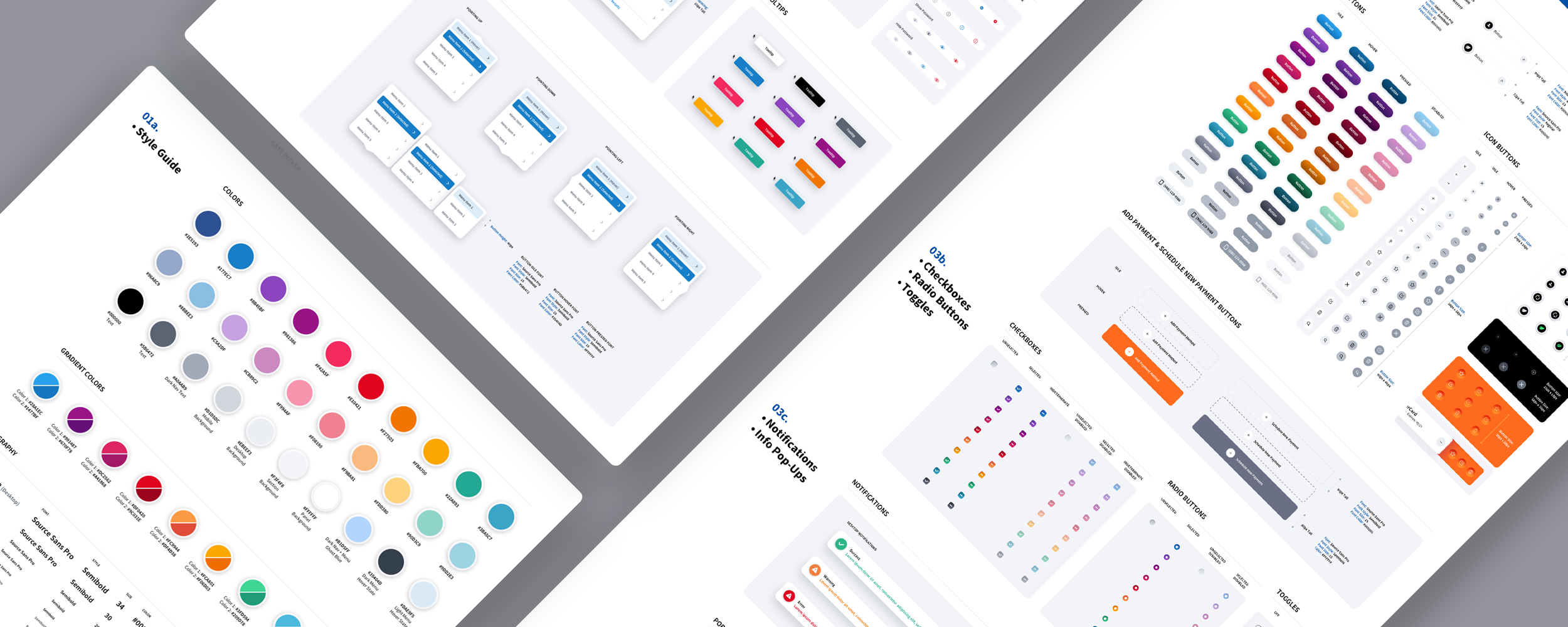
The source files shown below are only a partial view of the light-mode version of Recognize Me. They show what finished UI design actually involves: not one polished screen, but a connected collection of layouts, controls, components, variations, and interface states that all have to carry the same visual language and interaction logic.


Partial Sketch source files for the light mode version of the Recognize Me social discovery mobile app

Accessibility is part of the interface

An interface is not successful if a significant portion of its users cannot operate it. Accessibility has to be designed into the product through sufficient color contrast, readable typography, visible focus states, keyboard navigation, meaningful labels, clear error messaging, appropriate touch targets, and support for assistive technologies. These are not finishing touches added after the visual design is approved. They affect component design, interaction behavior, content, and the design system from the beginning.

Accessible design usually improves the experience for everyone. Clearer hierarchy, stronger feedback, more legible text, and controls that are easier to identify and operate make the product more usable whether someone has a permanent disability, a temporary limitation, or is simply working under difficult conditions.

What this looks like in practice

When we designed Recognize Me, a social mobile app, the visual design was its own long journey, separate from the structural work that preceded it. We built the interface from a single concept outward, and the light and dark modes were each developed as distinct visual problems rather than one being a simple inversion of the other. Each mode shipped with five color themes, which meant every component had to hold up across ten different visual treatments without losing its hierarchy or clarity.

The decisions were specific and deliberate. We isolated color to the elements that needed to draw the eye, the primary action buttons, the hero text, and the iconography, while keeping the base panels neutral so those accents could carry the visual weight. An early version wrapped the profile photo in a heavy black ring, and we cut it, because it fought the cleaner, more minimal direction the design was moving toward. Neumorphic touches added a tactile, subtly three-dimensional quality without tipping into decoration. None of these were arbitrary style choices. Each one was made in service of a clearer, more confident interface, which is what visual design is actually for.

Finished light mode UI design for the Recognize Me social discovery mobile app in tangerine orange
Common Question

Is UI design just about making things look good?

No. A beautiful interface that functions poorly is as much a failure as an ugly one that works. Strong UI design uses typography, color, spacing, and consistency to do functional work, establishing hierarchy, communicating state, grouping related elements, and making the product learnable, while also giving it polish and credibility.

08 · UI Kits and Style Guides

Design Systems

A single well-designed screen is an achievement. A product with hundreds of screens that all feel consistent, behave predictably, and can evolve without falling apart is a different kind of achievement, and maintaining that coherence at scale requires a design system. This is the stage where the design work becomes an asset that scales rather than a set of one-off screens.

What a design system is

A design system is the documented, reusable set of components, patterns, and rules that govern how a product looks and behaves: buttons, forms, navigation, colors, typography, spacing, and the states each of them moves through. It is a shared language between designers and developers. The component library is the visible output, but the system is the thinking behind it: the agreed-upon rules for how the product expresses itself, so that anyone building a new screen produces something that belongs to the same product.

Why products need systems

Without a system, consistency decays. Different screens get built by different people at different times, and the product slowly fragments: slightly different buttons, inconsistent spacing, and navigation that behaves one way here and another way there. Every inconsistency makes the product harder to learn and quietly less trustworthy. A design system enforces coherence at scale, so the product feels like one considered thing rather than an assembly of parts. It also makes building faster because recurring design decisions have already been made and documented.

Systems across modes and platforms

Mature design systems account for more than a single default appearance. They specify how the product works across light and dark modes, across web and mobile, and across every component state. The design systems The Skins Factory has built, including a complete light- and dark-mode system for the ACI Worldwide Biller payment platform, exist precisely so that a complex product can stay coherent and credible across every screen, mode, and state as it grows. In trust-critical software, that consistency is not cosmetic. It is what lets a user learn the product once and trust it everywhere.

ACI Worldwide Biller App light-mode UI and UX design system preview
Common Question

What is a design system and why does a product need one?

A design system is the documented set of reusable components, patterns, and rules that governs how a product looks and behaves: buttons, forms, colors, typography, spacing, and their states. It is a shared language between design and engineering. Products need one because, without it, consistency decays as different people build different screens over time, and every inconsistency makes the product harder to learn and less trustworthy. A design system enforces coherence at scale and makes building faster because recurring design decisions are already made and documented.

09 · Implementation

Engineering Handoff and Design QA

A design is not finished when the final screen is approved. It still has to survive implementation. Engineering handoff is where the design team provides the specifications, assets, component behavior, responsive rules, and states developers need to build the product accurately. But a handoff should not be the end of the relationship between design and engineering.

Strong implementation requires collaboration. Questions emerge during development, technical constraints become clearer, and decisions sometimes need to be adjusted without compromising the experience. Once the interface is built, design QA compares the working product against the approved design and identifies inconsistencies in layout, typography, spacing, behavior, responsiveness, and states.

Without design QA, small deviations accumulate until the product that ships no longer feels like the product that was designed.

Common Question

What is design QA and why does it matter?

Design QA is the process of comparing the working product against the approved design and identifying inconsistencies in layout, typography, spacing, behavior, responsiveness, and interface states. It matters because small implementation differences accumulate quickly. Without a final design review, the product that ships can gradually stop looking and behaving like the product that was originally designed.

10 · Trust and Control

Designing for AI Interfaces

A guide to UI/UX design in this era that treated AI as a footnote would not be worth reading. AI has moved from a novelty into the core of how many modern products behave, and it introduces design problems that the disciplines earlier in this guide do not fully cover on their own. Designing an AI feature is not the same as designing a conventional one because the system underneath behaves differently, and the interface has to account for that difference honestly.

Many of the hardest parts of integrating AI into a product are not solely machine-learning problems. They are also design problems. Whether a user trusts an AI feature, understands what it did, catches it when it is wrong, and stays in control of the outcome is heavily influenced by the interface. That makes AI squarely a UI/UX concern, not something to hand off to the data team and hope for the best.

Design for probability, not certainty

Most conventional software interactions are designed around predictable rules. Given the same conditions, the system is generally expected to behave the same way, and the interface can be designed around that reliability. AI is different. Its output is probabilistic and may be wrong, incomplete, inconsistent, or confidently mistaken.

An interface that presents AI output as if it were fact, with the same finality as a calculated total, sets the user up to trust something that may not deserve unqualified trust. Designing for AI means designing for a system that can produce useful results without guaranteeing that every result is correct, and making that distinction visible rather than hiding it behind a confident tone.

Communicate confidence and uncertainty

Because AI output varies in reliability, the interface should help users understand how much weight to place on a result rather than presenting everything with equal authority. An answer supported by clear evidence and a speculative suggestion should not necessarily look identical on screen.

Surfacing uncertainty through wording, source attribution, visual treatment, limitations, or meaningful confidence signals gives users the context to rely on the system when the evidence is strong and scrutinize it when it is not. Confidence indicators should only be used when they are meaningful and properly calibrated. Hiding uncertainty to make the product feel smarter is a short-term trick that erodes trust the first time a confident-looking answer turns out to be wrong.

Keep a human in control of consequential decisions

The more consequential the action, the more important it is that the interface keeps a person in control. AI can suggest, draft, summarize, flag, and surface, but for decisions that materially affect the user, the design should position AI as an assistant that informs a human decision rather than an authority that makes it unilaterally.

That means building clear paths to review, edit, override, and reject what the AI produces. An interface that automates a consequential decision and gives the user no visible way to question or reverse it is a design failure, not a technical achievement, however capable the underlying model is.

Make AI decisions explainable

When an AI system makes or recommends a decision, users increasingly expect to understand the basis for it. An interface that renders an AI verdict with no supporting factors, sources, limitations, or way to understand how the result was produced asks users to trust a black box, which erodes confidence over time.

Good AI design explains the outcome in terms a person can understand: what information the system considered, which factors influenced the result, where the supporting evidence came from, what limitations may apply, and what the user can do next. Explainability is not a technical afterthought. It is an interface responsibility, and it is what turns an opaque system into one people are more willing to rely on.

Design the new interaction patterns carefully

AI brings interaction models that traditional UI patterns were not built for: conversational input, generative output, and agentic behavior in which the system takes multi-step actions on the user's behalf. Each of these needs deliberate design.

Conversational interfaces have to handle ambiguity, misunderstanding, and correction gracefully. Generative features need clear ways to guide, refine, and reject output. Agentic flows, where the software takes actions on the user's behalf, demand the strongest design discipline of all. The user has to be able to see what the system is doing, interrupt it, review its actions, and trust that it will not take a consequential step without appropriate confirmation.

These are new problems, and pretending they are just ordinary screens with an AI label is how products ship experiences that feel unpredictable and untrustworthy.

Everything else in this guide still applies to AI features. They have states, flows, error conditions, and edge cases like any other part of a product, and often more of them because there are more ways for a probabilistic system to behave unexpectedly. Designing AI well is not a separate discipline bolted onto UI/UX. It is UI/UX applied with extra care to a system that does not behave with the certainty designers are used to.

Common Question

How is designing for AI different from designing a normal feature?

The core difference is certainty. Conventional software is deterministic, so the interface can be built around reliable outputs. AI is probabilistic: it is usually right and sometimes wrong, which means the interface has to communicate confidence and uncertainty honestly, keep a human in control of consequential decisions, and make the system's reasoning explainable rather than presenting it as an unquestionable verdict. AI also introduces new interaction patterns, conversational, generative, and agentic, that need careful design so users can guide, correct, and interrupt the system. Most of the hard parts of AI in a product are design problems, not machine-learning problems, which puts them squarely in the domain of UI/UX.

11 · Outcomes

Measuring Design: Before and After

Design is not simply art. It is problem-solving, which means it can be judged by whether it solved the problem. The final discipline of good UI/UX work is being honest about outcomes: comparing where a product started with where it ended and being able to point to what actually improved. This is where design proves its value rather than merely asserting it.

The before-and-after test

The clearest way to see the value of design work is to put the old experience next to the new one. A genuine redesign is not just a change in appearance. It is an evolution in how the product works: tasks that were confusing become clearer, flows that were inefficient become more direct, and screens that were cluttered become easier to scan. When the before and after are shown side by side, the value of the work becomes visible rather than remaining purely a matter of opinion.

What actually improved

On the Hospital 340B Contract Pharmacy Management Application, the redesign went beyond replacing an outdated visual style. The interface was rebuilt to make better use of widescreen space, improve the usability of extremely wide data tables, and keep secondary workflows accessible through slide-in panels rather than disruptive modal windows.

Colored vertical columns visually separated dense table data, while a Column Edit feature gave users more control over which columns appeared and where they were positioned. Those are functional improvements expressed through interface design, not decoration added after the underlying experience was finished.

Before and after

Hospital 340B Contract Pharmacy Management Application

Before
After
Common Question

How do you measure whether a UX redesign was successful?

By outcomes, not appearance alone. A successful redesign should eventually show up in measurable improvements such as faster task completion, fewer errors, lower abandonment, reduced support requests, stronger feature adoption, or higher user satisfaction.

A before-and-after comparison can clearly show improvements in hierarchy, clarity, information density, and usability, but production data is what proves whether those changes improved performance under real conditions. The visual comparison shows what changed. Measurement shows whether it worked.

12 · Hiring

Choosing a UI/UX Design Partner

If you are commissioning UI/UX design rather than doing it in-house, the choice of partner will have an enormous effect on the result. The market is full of firms that can make a screen look clean. Far fewer can do the harder work this guide describes: research, flow design, architecture, validation, and systems thinking that actually improves how a product works. Knowing how to tell them apart is critical.

Look for process, not just portfolios

A beautiful portfolio proves a firm can produce attractive screens. It does not prove they can solve a product problem. The more revealing question is how they work, which a clearly defined design process and FAQ should make easy to understand. Do they start with research or with visual concepts? Can they show you the flows, wireframes, and thinking behind a finished design, not just the polished result? A partner who can only show you the destination and not the journey that got there may be decorating rather than designing.

Look for experience in your kind of problem

Design judgment is built by solving specific kinds of problems. A firm that has designed dense, workflow-heavy enterprise software brings judgment that a firm specializing in marketing sites does not automatically have, and vice versa. Ask whether a prospective partner has worked with the kind of complexity and in the kind of domain your product operates in. Relevant scars are worth more than a broad reel.

Look for partners, not order-takers

The strongest design relationships are collaborative. The right UI/UX design partner does not just execute what you tell them. They push back, suggest better approaches, and improve on the brief. We are not “yes” men. If we believe a decision will hurt the product, we will explain why and recommend a better direction. In the end, the final decision always belongs to the client, but part of our job is making sure that decision is fully informed.

“They don't just do what we tell them. Instead, they suggest ways to make things better.”

Souren Ohanian, Co-Founder of GameIn

A firm that simply does exactly what it is told, without questioning whether it is the right thing to build, is a vendor, not a design partner. The difference shows up directly in the quality of the result.

Common Question

What should I look for when hiring a UI/UX design agency?

Look for process, not just a pretty portfolio. Ask whether they start with research or with visual concepts, and whether they can show you the flows, wireframes, and thinking behind a finished design rather than only the polished result. Look for relevant experience in the kind of complexity and domain your product lives in, since design judgment is built by solving specific kinds of problems. And look for a genuine partner who pushes back and improves on the brief rather than an order-taker who simply executes instructions.

Comprehensive UI/UX Design FAQ

These are the practical questions companies usually need answered before beginning a UI/UX design engagement, including timelines, costs, deliverables, ownership, scope changes, collaboration, and development.

How long does a UI/UX design project take?

A focused UI/UX design project may take several weeks. A complex enterprise platform involving multiple user roles, workflows, dashboards, modules, states, and a new design system can take several months.

The timeline depends on the condition of the existing product, whether the work begins from scratch or involves a redesign, how much research is required, how quickly stakeholders provide feedback, and how many parts of the experience have to be designed and validated. The number of screens matters, but the amount of structural and interaction thinking behind those screens usually matters more.

How much does professional UI/UX design cost?

Professional UI/UX design is normally priced according to scope, complexity, research requirements, deliverables, number of workflows, user roles, platforms, and the condition of the existing product. A small, focused engagement will cost considerably less than the redesign of a mature enterprise application with hundreds of components and states.

Screen count alone is not a reliable pricing method. A single complex dashboard may require more design thinking than several simple marketing screens. A responsible studio should review the product and requirements before providing an estimate rather than offering a generic price that ignores the actual work involved.

What should a company prepare before starting a UI/UX design project?

Begin with a clear explanation of the product, the people who use it, the problems that need to be solved, and the business outcomes the project is expected to support. Existing research, analytics, customer feedback, support tickets, product requirements, brand materials, screenshots, and access to the current application are all useful.

The company should also identify the primary decision-makers and the product, engineering, marketing, compliance, or subject-matter experts who need to participate. The design team does not need every answer on day one, but it does need access to the people and information required to find those answers.

What deliverables should be included in a UI/UX design engagement?

Deliverables vary by project, but they may include research findings, user flows, journey maps, information architecture, wireframes, high-fidelity interface designs, interactive prototypes, responsive layouts, component states, custom artwork, design systems, UI kits, style guides, specifications, exported assets, and final source files.

The agreement should clearly identify which deliverables are included, which platforms and screen sizes are covered, and whether the engagement includes usability testing, engineering handoff, design QA, or continued support during implementation.

Can an existing product be redesigned without rebuilding the entire application?

Often, yes. A product can frequently receive a substantial UI/UX redesign while retaining much of its existing backend, data structure, and application logic. The design team can improve workflows, navigation, hierarchy, interaction patterns, components, and visual design without automatically requiring a complete technical rebuild.

However, the feasibility depends on the quality and flexibility of the existing codebase. Some design improvements may expose technical limitations that need to be addressed by engineering. The design and development teams should review those constraints together before deciding how much of the product can remain intact.

Can UI/UX design work be completed in phases?

Yes. Large products are often better handled in planned phases rather than attempting to redesign everything simultaneously. A project may begin with discovery and research, move into the highest-priority workflows, establish the design system, and then continue through additional modules or platforms over time.

Phasing can help control budgets, reduce implementation risk, and allow the company to begin developing approved areas while design continues elsewhere. The phases still need to be planned as parts of one coherent product so that early decisions do not create inconsistencies later.

How involved should the client’s product and engineering teams be?

They should be involved throughout the engagement, but they do not need to attend every internal design session. Product leaders and subject-matter experts provide requirements, operational knowledge, user context, and business priorities. Engineers help identify technical constraints, reusable functionality, data limitations, and implementation considerations.

The most effective model uses scheduled reviews and clear decision points. That keeps the design moving while giving the people responsible for the product enough visibility to correct assumptions before they become expensive.

Can a UI/UX studio work with an existing brand or design system?

Yes. An existing brand or design system does not need to be discarded simply because the product is being redesigned. A design studio can audit the current materials, identify what remains useful, correct inconsistencies, create missing components and states, and extend the system to support new workflows or platforms.

When an existing system is strong, working within it can protect brand consistency and accelerate the project. When it is incomplete or outdated, the studio can evolve it without unnecessarily replacing every established element.

Who owns the final source files and design system?

Ownership and usage rights should be clearly defined in the project agreement before work begins. At The Skins Factory, the final approved source files and agreed project deliverables are provided to the client according to the terms of the contract and payment schedule.

Third-party materials such as commercial fonts, licensed photography, stock assets, plugins, or software remain subject to their original licensing terms. Those items cannot be transferred beyond the rights provided by their respective owners.

What happens when the project scope changes during the engagement?

New requirements are reviewed and priced before they are added to the project. The additional work can be documented through an Addendum Agreement that defines the new scope, cost, and any effect on the schedule. Once approved and signed, the added requirements become part of the engagement.

For work that is harder to define in advance, prepaid blocks of time may also be used. The time is tracked transparently, and any unused project time can be handled according to the terms of the agreement. The goal is to accommodate legitimate changes without allowing the project to expand indefinitely without clear approval.

Can a company hire a UI/UX studio solely for a visual refresh?

Yes, when the underlying structure and workflows are already sound. A focused visual refresh can modernize typography, color, spacing, components, imagery, states, and the overall design language without changing how the product fundamentally works.

However, a visual refresh should not be used to disguise structural problems. When navigation is confusing, workflows are inefficient, or information is poorly organized, repainting the interface will not solve the real issue. A responsible studio should identify whether the product needs visual refinement, deeper UX work, or both.

Does The Skins Factory provide software development services as well as UI/UX design?

The Skins Factory leads the product experience, UI/UX design, interaction design, custom artwork, and design system. When engineering is needed, one trusted development partner can bring the approved work to life across web, mobile, SaaS, enterprise, cloud, and other software environments.

This allows design and engineering to work together without pretending they are the same discipline. Companies that already have an engineering team can engage The Skins Factory solely for design. Code-only requests can also be introduced to the development partner when appropriate.

Working With The Skins Factory

Everything in this guide, the research, the flows, the architecture, the validation, the visual craft, and the systems, reflects how The Skins Factory has designed digital products for more than 25 years. Since 2000, we have applied this process to work for Microsoft, Disney, the NFL, Intel, Bank of America, ACI Worldwide, and healthcare platforms serving physicians and clinicians, along with a long list of mid-sized companies and startups that needed a product that did not just look right but worked.

Explore Our UI/UX Design Specialties

Much of our work involves products where complexity, trust, usability, and clear decision-making carry real consequences. Explore how we approach UI/UX design for SaaS and enterprise platforms, fintech and digital banking, cybersecurity products, and healthcare and healthtech applications.

Not Ready for a Redesign? Start With a UX Audit.

An enterprise UX audit identifies usability problems, workflow friction, interface inconsistencies, accessibility concerns, and opportunities for improvement before your company commits to a larger redesign.

If you are building or rebuilding a digital product and want it designed with this kind of rigor, from real user research through a complete design system, we would be glad to talk. If you are simply looking for a UI refresh, that is great too.

Reach out at hello@theskinsfactory.com or +1 954.821.2966.