
ACI Worldwide Biller App Design
Transforming Transactions into a Visual Experience for Web & Mobile
LIGHT MODE VERSION
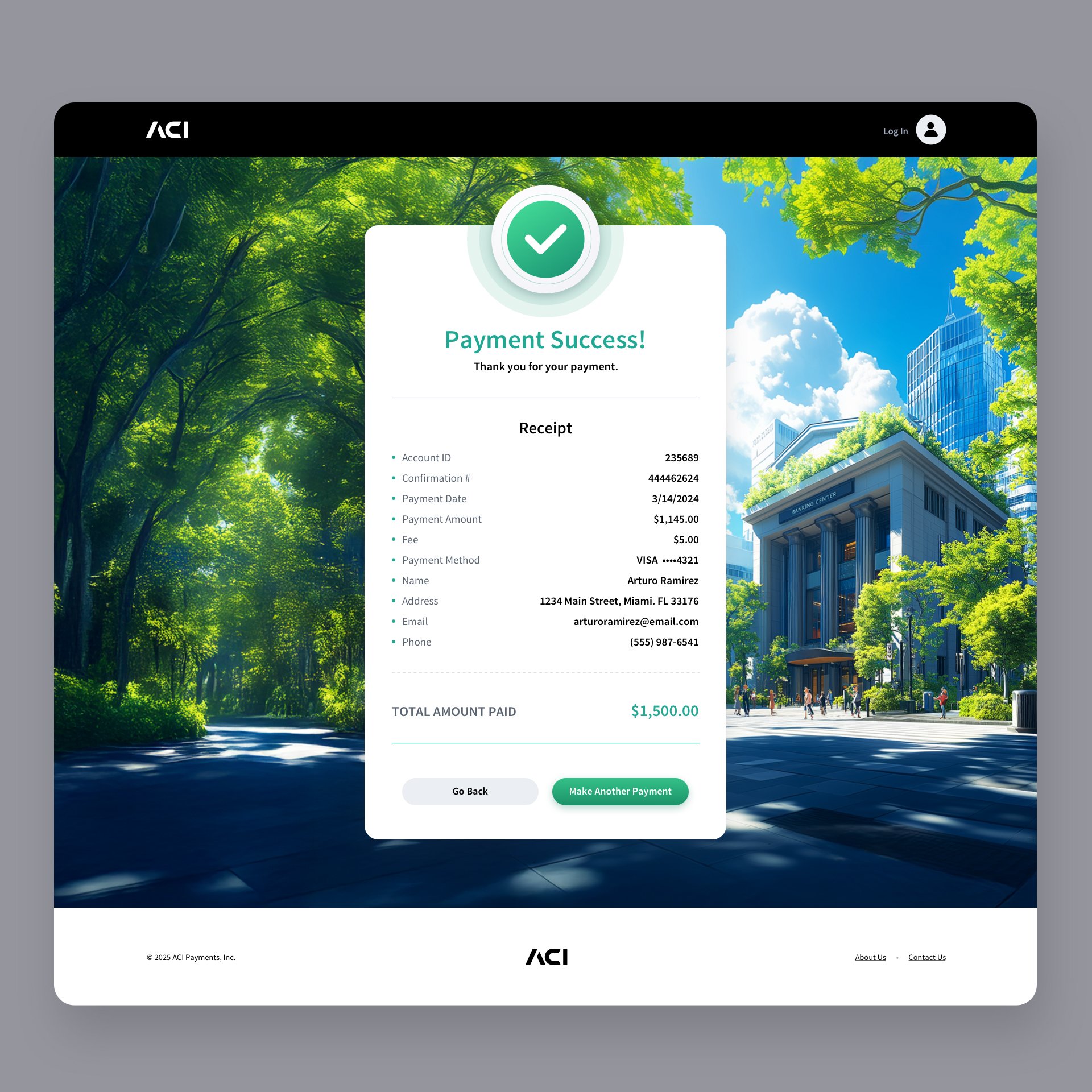
Our UI/UX design team redesigned ACI’s Biller App in a way that reimagines the digital payment experience across web and mobile. This modernized concept blends clean 2D interface design with tactile, dimensional elements to create a more intuitive and visually engaging user journey. Each screen, from account verification, wallet, user profile to payment completion, emphasizes clarity, trust, and ease of use, supported by a cohesive visual language and immersive background imagery that shifts with the payment process. Using generative AI artwork created in Midjourney and modified in Adobe Photoshop brings a playful, illustrated design language to the application. The result is a forward-thinking, aesthetically rich experience that humanizes financial interactions through thoughtful design.
As users ourselves, we understand that paying bills is necessary, but rarely enjoyable. Our goal was to make the experience more approachable and engaging by imbuing the interface with vibrant colorways and playful, illustrated imagery. The visual concepts spanned from banking centers to shopping districts, reflecting the diverse moments that shape everyday financial life.
Web Application Version
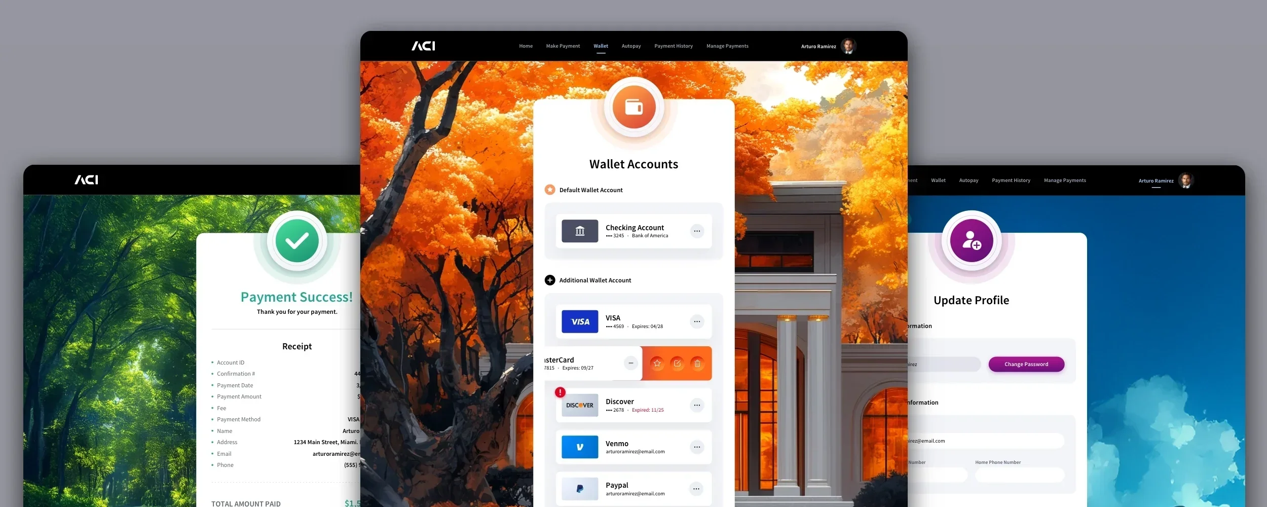
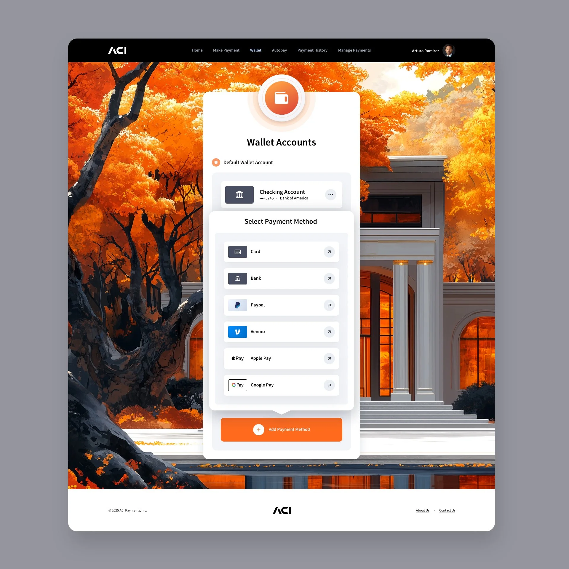
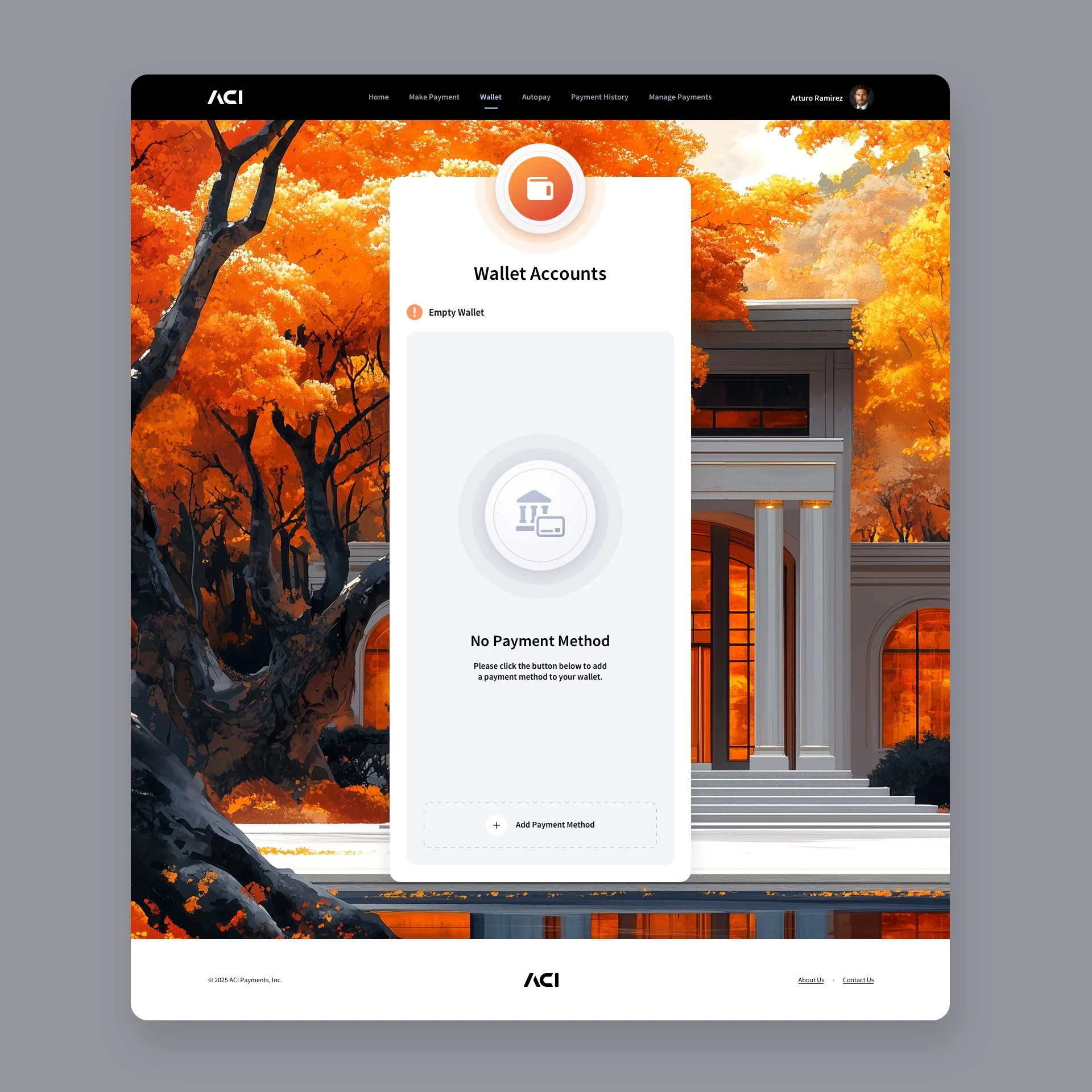
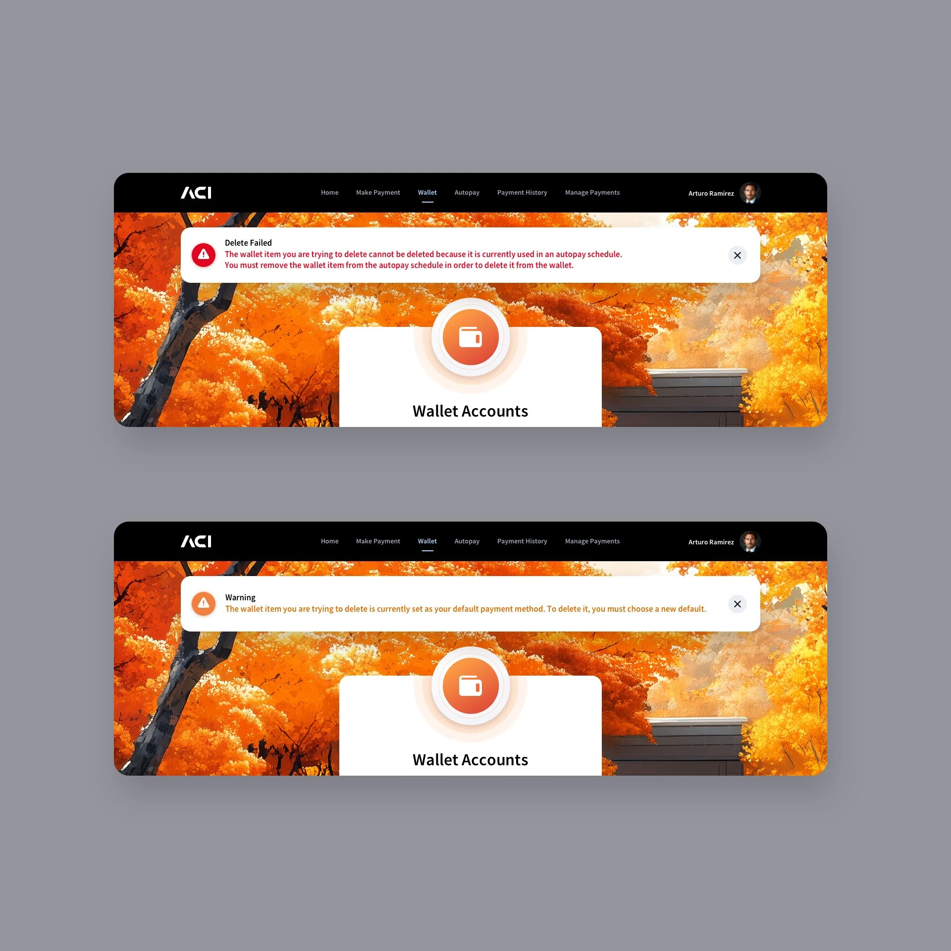
Digital Wallet Screens
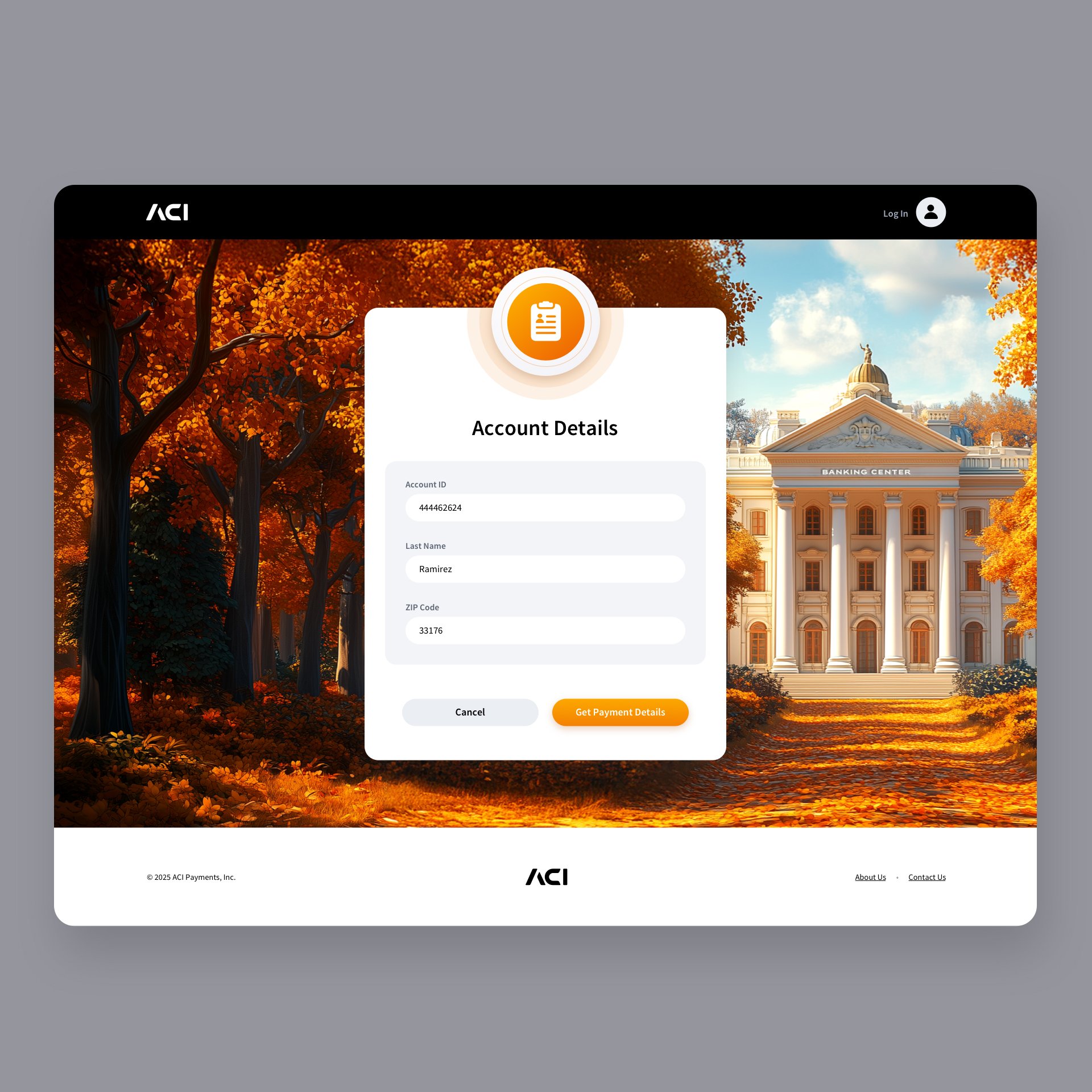
Blending clean 2D design with subtle tactile elements brings the user interface into a more modern visual space. A vibrant orange colorway defines the hero elements, while complementary shades of orange within the background banking illustration create a cohesive and balanced visual language. We chose to implement a slide-in panel rather than utilizing modal windows for the large form content. Side-anchored panels provide a less distracting, more seamless experience than modals surrounded by background content. To further focus user attention, a soft white overlay subtly mutes the background, guiding the eye toward the active task. We did implement standard center modals when the content was an interactive notification and didn’t warrant a full sidebar slide-in panel. This is a truncated view of the screens as many were derivative in design.


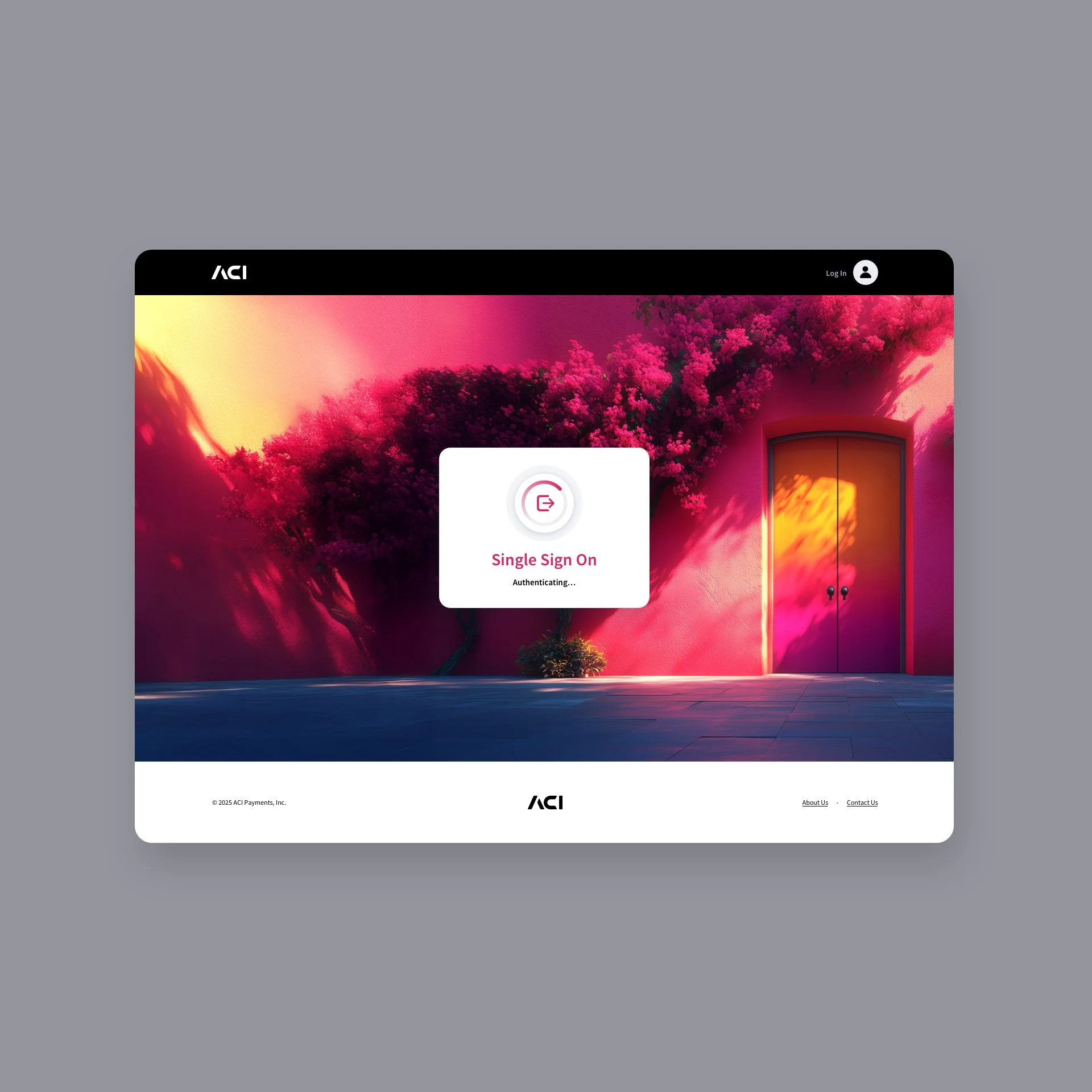
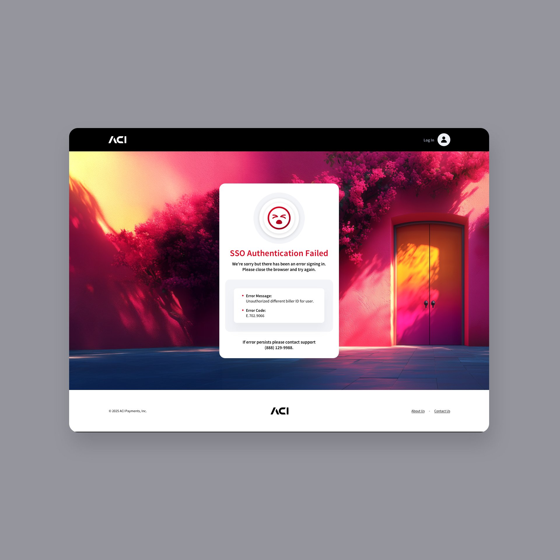
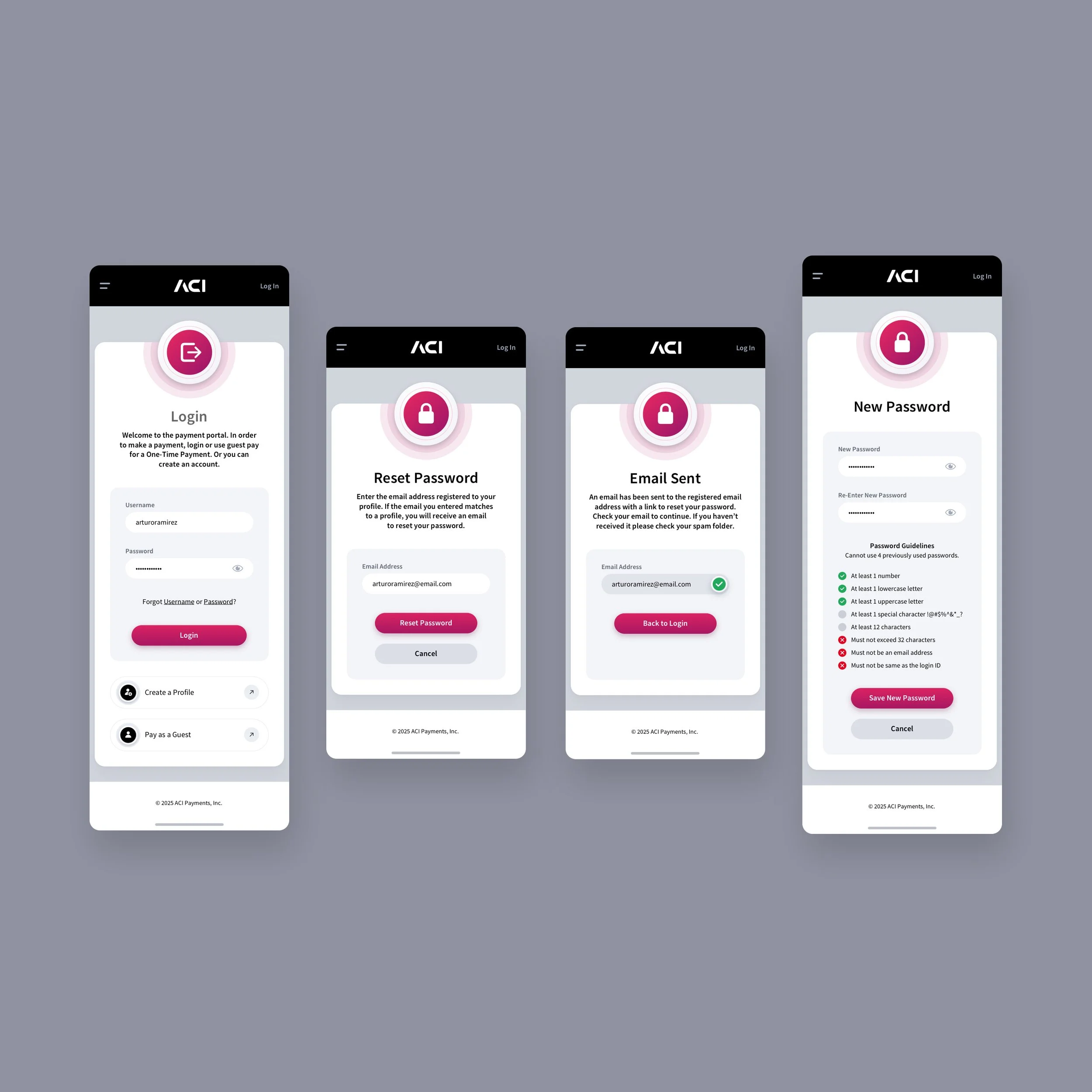
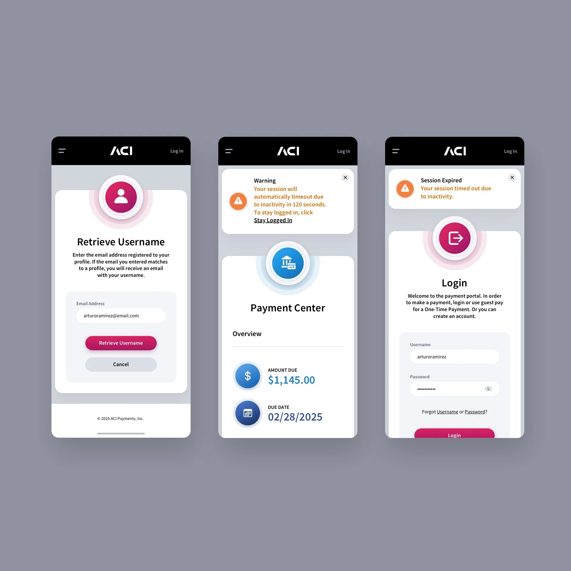
Login Screen + Single Sign-on Modals
Set against a warm, dreamlike backdrop that blends vibrant magentas, deep violets, and golden light, the design uses a doorway as a symbolic invitation—an entry point into the app experience. The clean white login card sits prominently at the center, balancing the vivid background with a minimalist layout that guides the user’s attention to essential actions such as logging in, resetting a password, and other key functions. The result is a visually striking yet approachable interface that feels both modern and welcoming.


SINGLE SIGN-ON NOTIFICATION MODALS
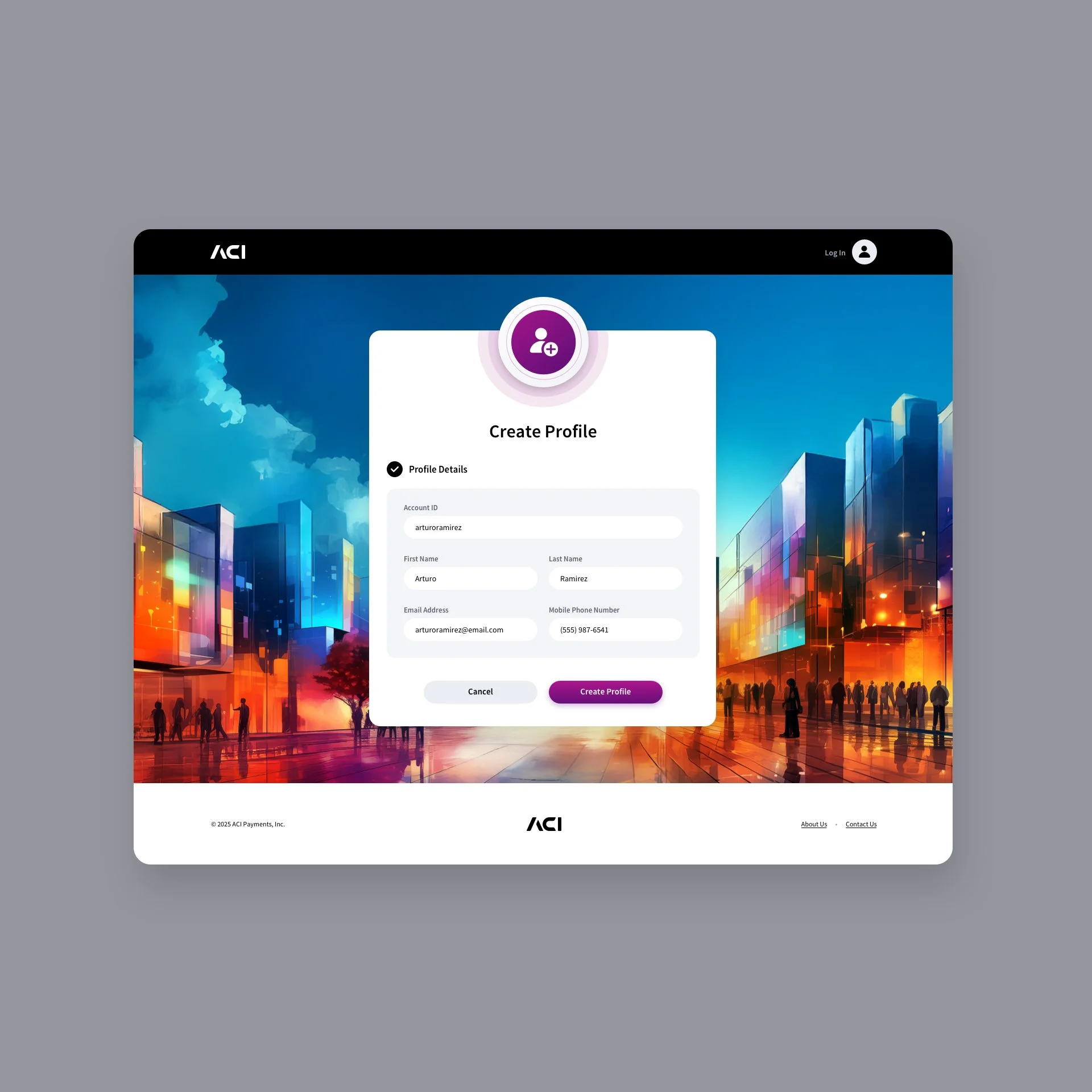
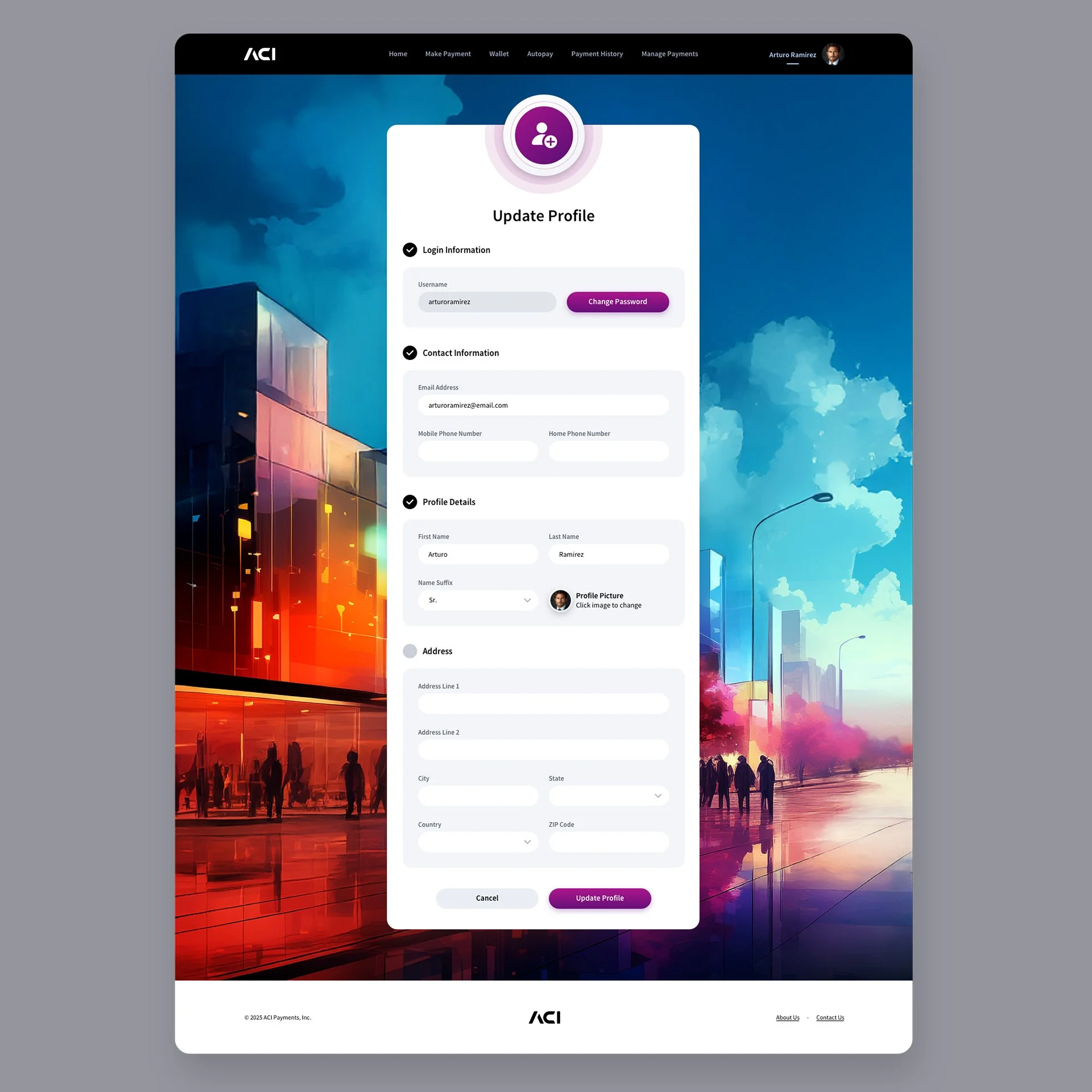
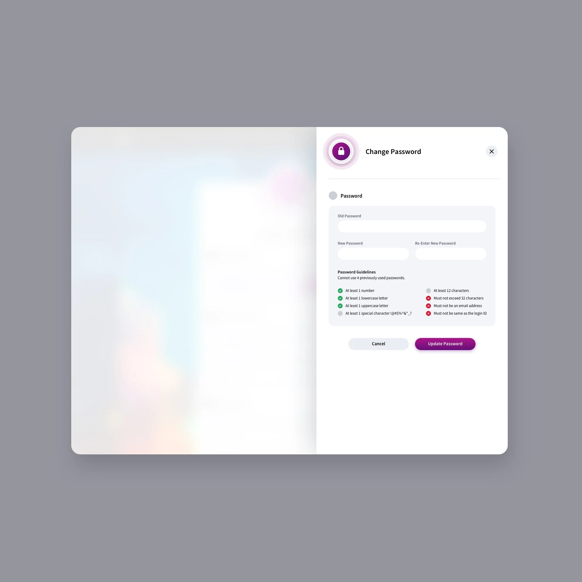
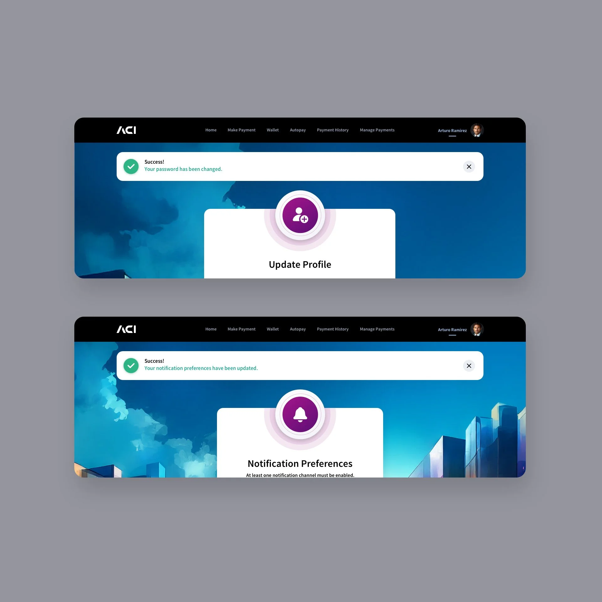
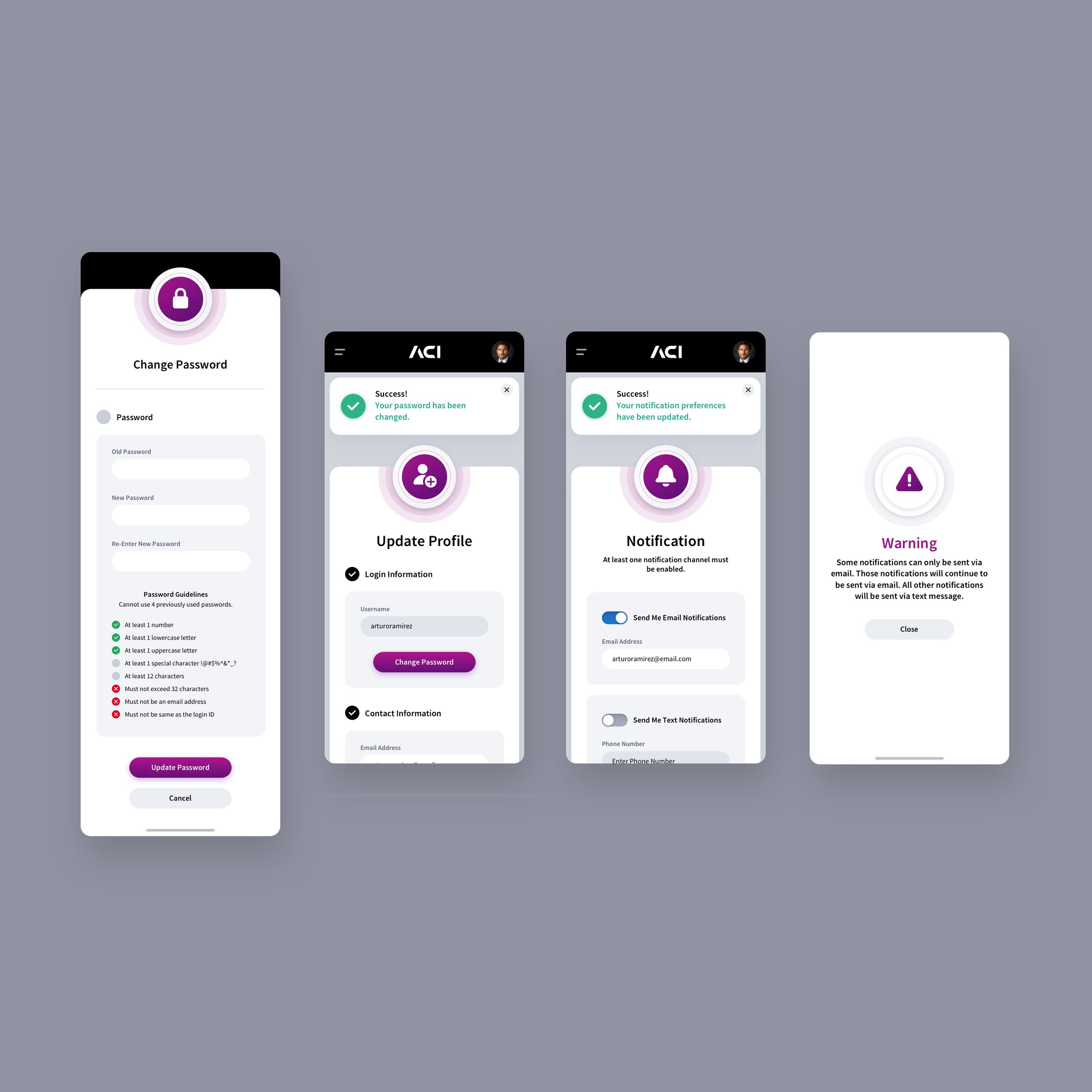
Profile Screens
Our design team crafted the profile screens & notification preferences for the biller app, focusing on a seamless blend of functionality and visual appeal. The modern card layout makes key actions like updating details, uploading profile pictures, and setting a secure password, intuitive for users. Attention to detail is evident in the clear separation of profile and login information, password guidelines with real-time feedback, and prominent calls to action. The vibrant, colorful background echoes dynamic outdoor shopping centers, reinforcing the app’s energy and forward-thinking ethos, while keeping users engaged.


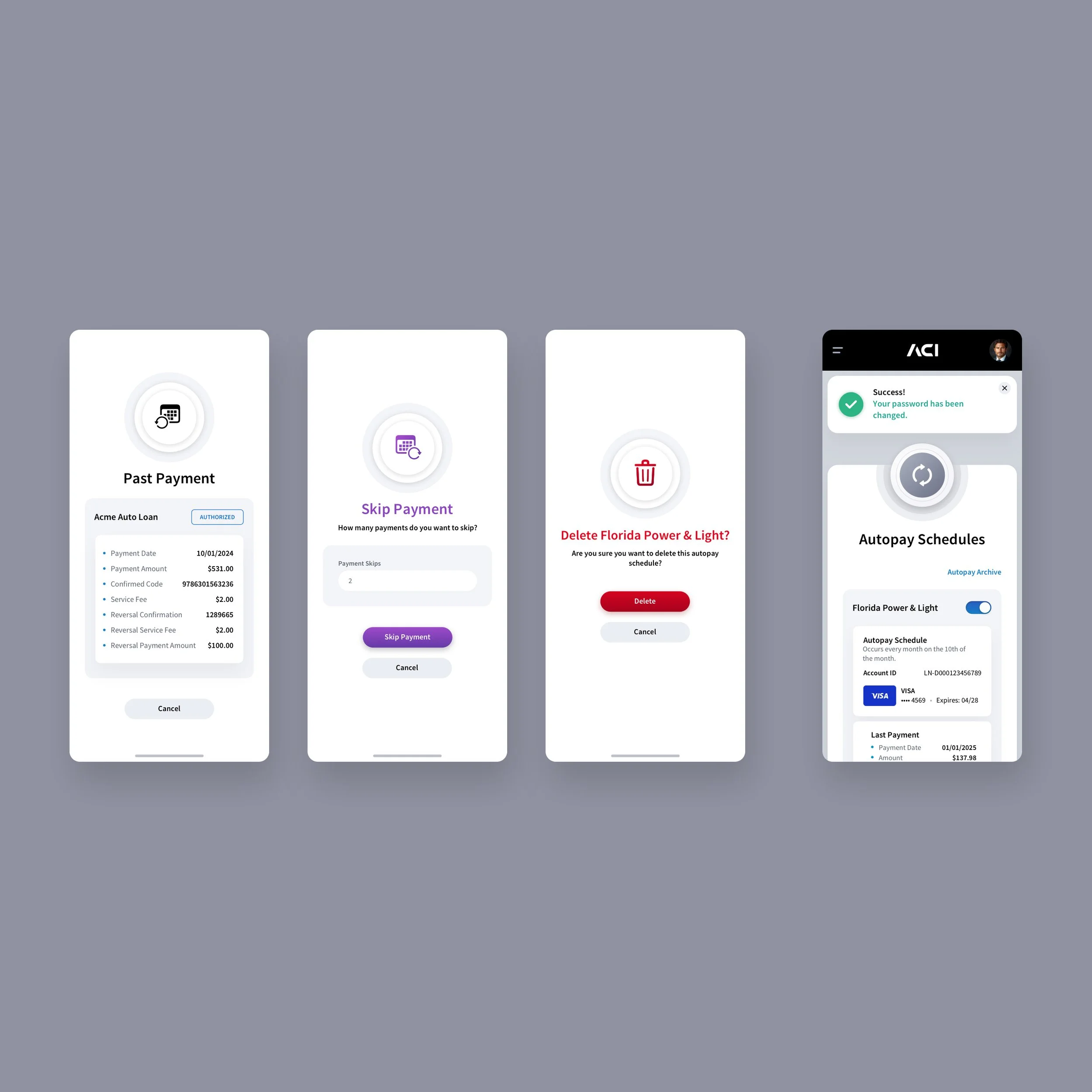
MANAGE PAYMENTS SCREENS
We designed the Manage Payments screens to give users a clear, consolidated view of their upcoming and completed payments while maintaining a refined sense of visual hierarchy. Each payment card organizes key details - payment amount, payment date, and the ability to edit or cancel a payment, into a streamlined, easily scannable layout. The result is an interface that feels organized, approachable, and responsive to user actions. The whimisical background piggy bank imagery adds a gentle, symbolic nod to saving, spending and financial mindfulness, enhancing the overall aesthetic without distracting from the core functionality.


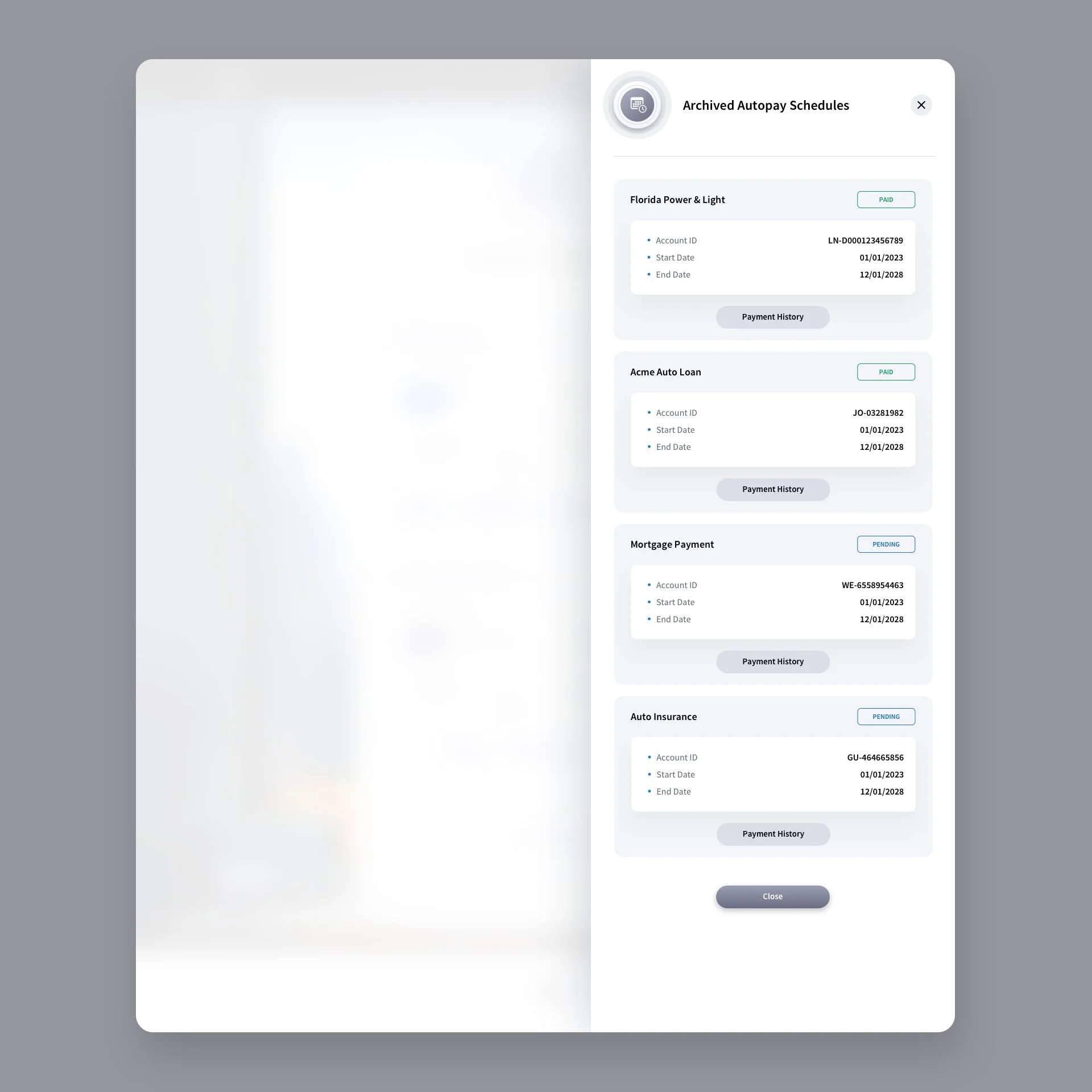
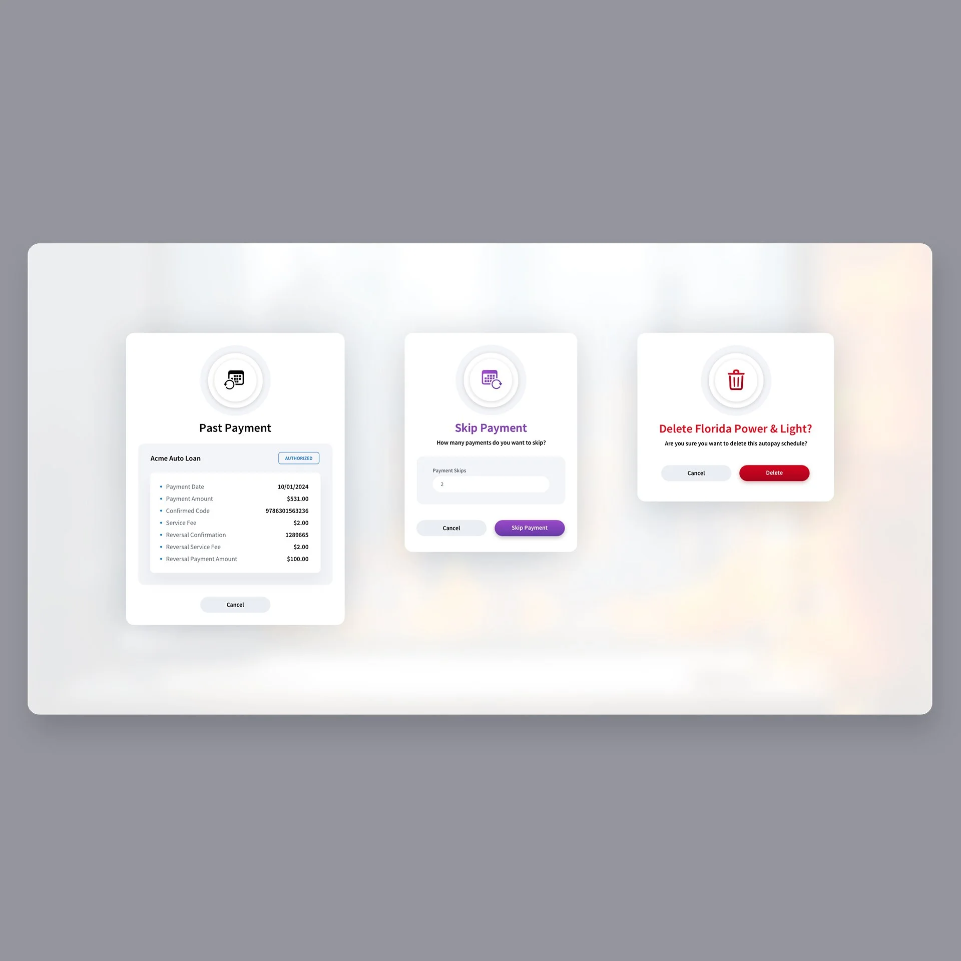
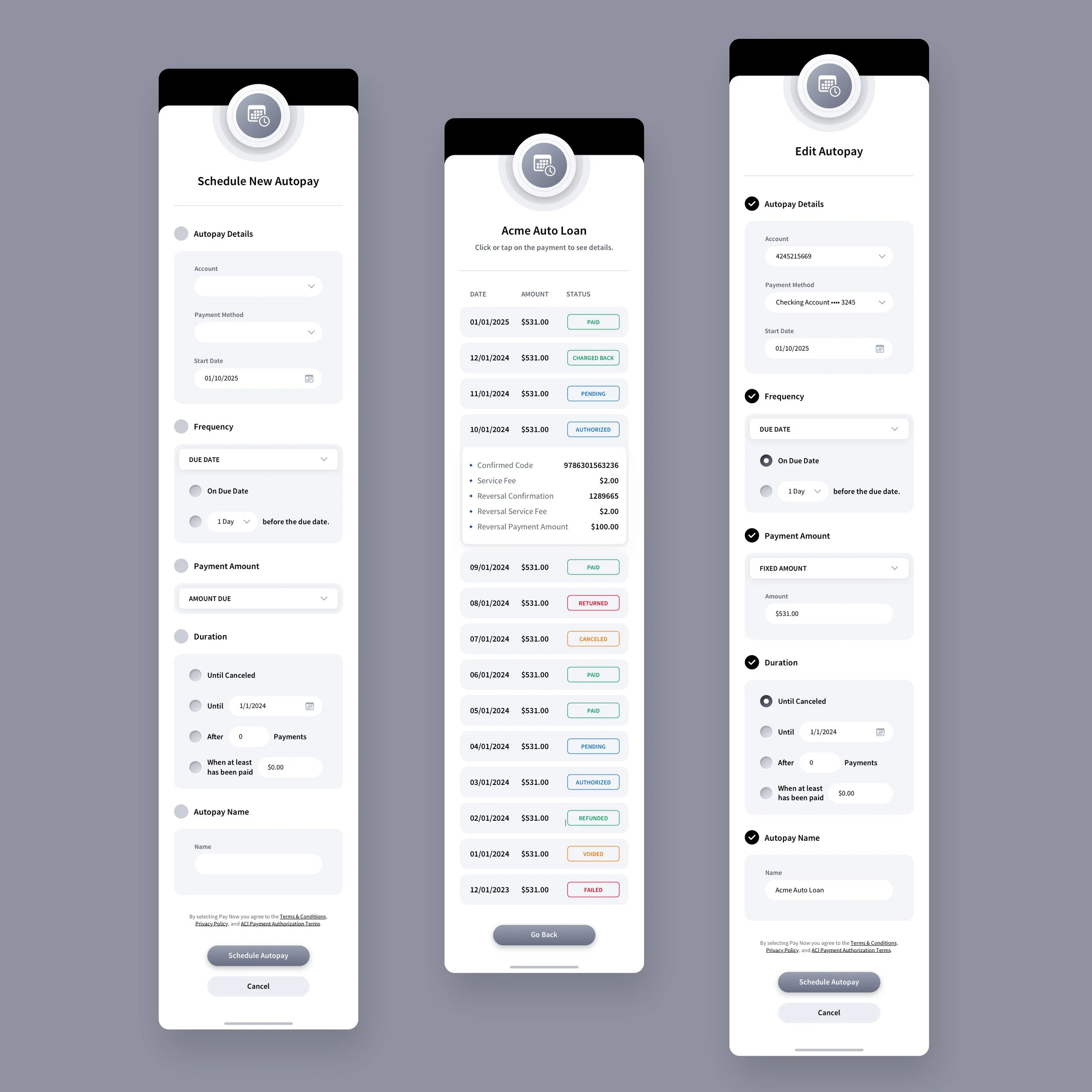
AUTOPAY SCHEDULING SCREENS
Our design team designed the Autopay Scheduling screens to transform what’s typically a mundane utility function into an elegant, intuitive experience. Each schedule module presents essential information, payment method, status, and transaction details, through a balanced card-based layout that feels both structured and approachable. We used subtle lighting, depth, and tactile design cues to guide the user’s attention and create a sense of hierarchy without visual clutter. The overall composition, framed by a serene cityscape and warm ambient tones, evokes trust and calm, helping users feel confident as they manage their recurring payments.


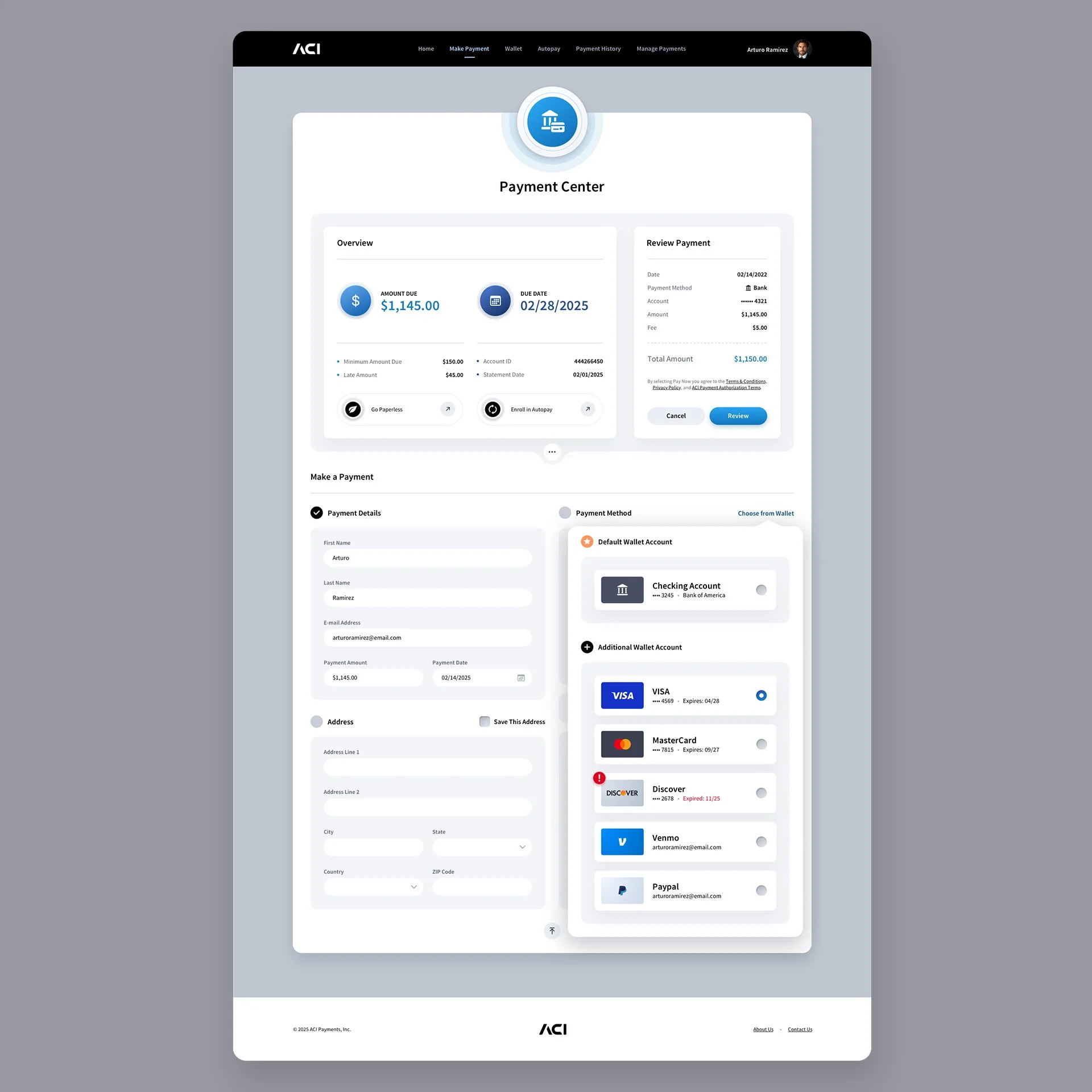
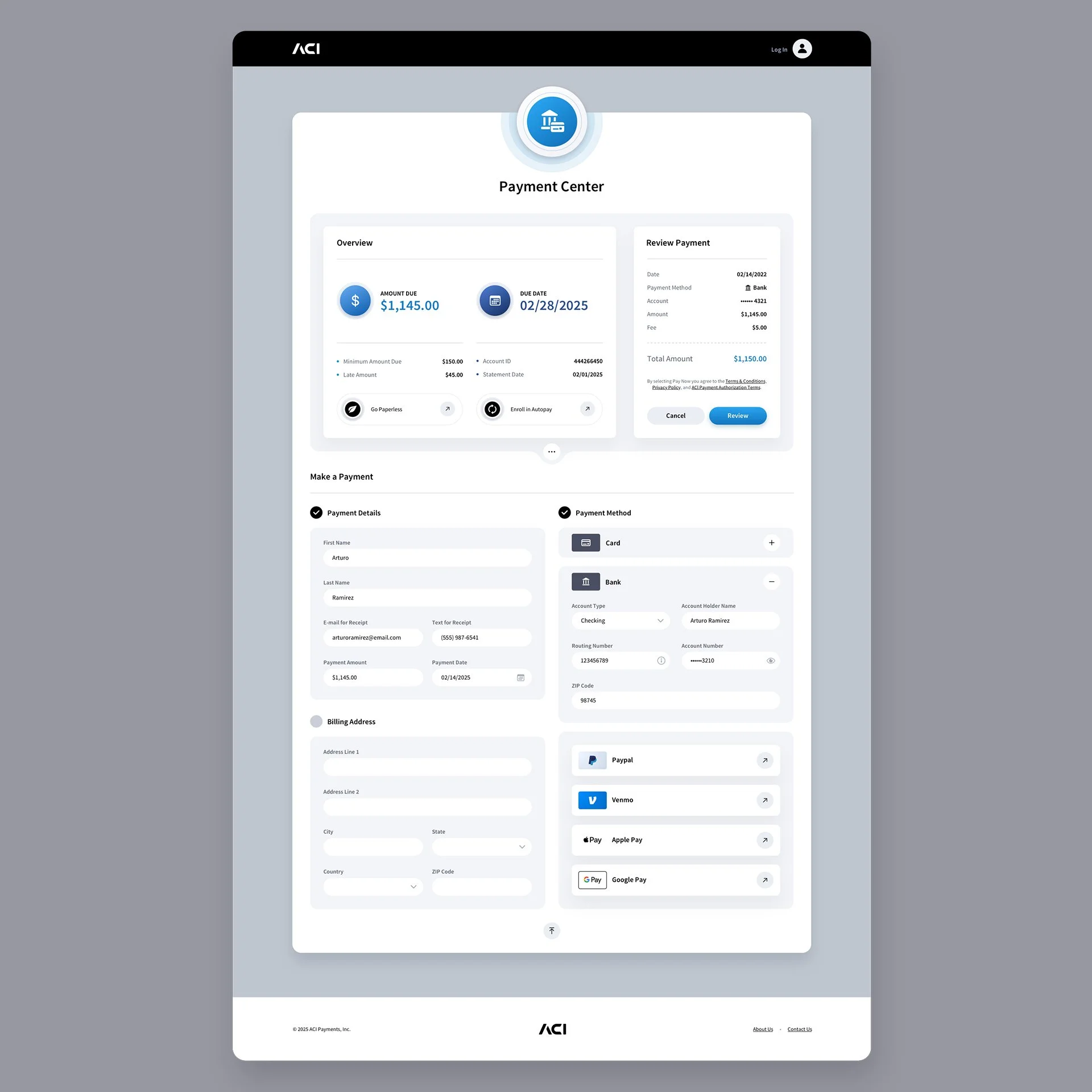
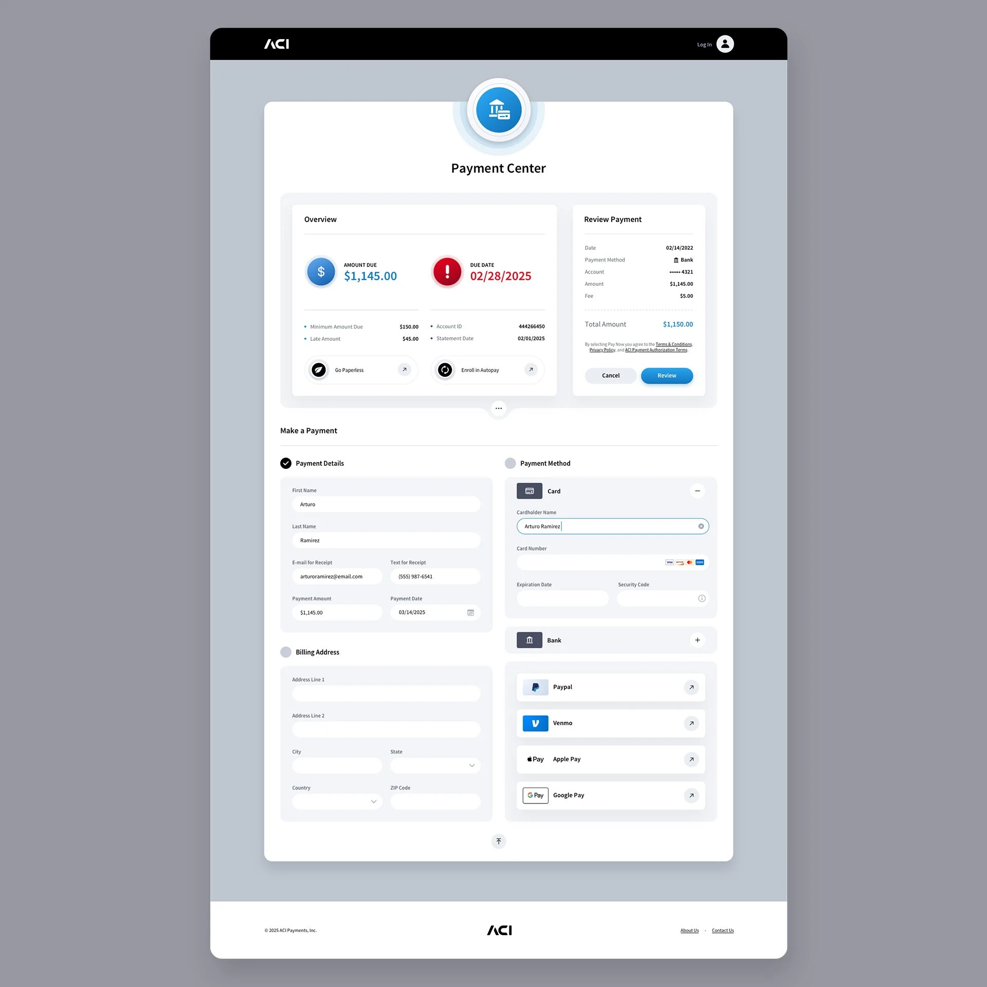
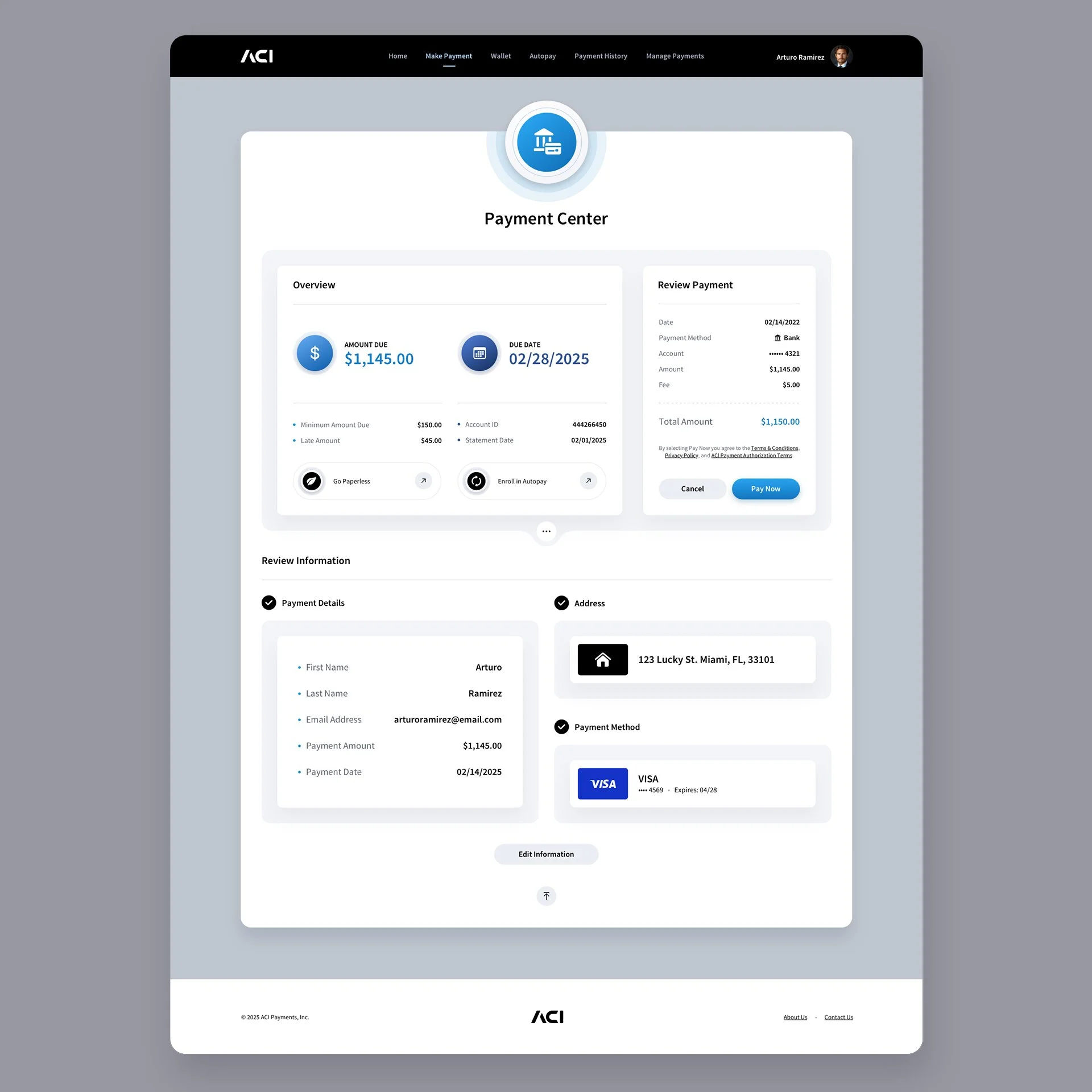
Make a Payment Screens
We designed numerous screens for this section, but since many share similar layouts, we’re showcasing a select few representative examples. The Payment Center screens are the only screens without illustrated backgrounds. With such limited margin space, too little of the image would have been visible to add real value. Rather than forcing the design into a single-column layout, we chose to keep the experience clean and highly usable.

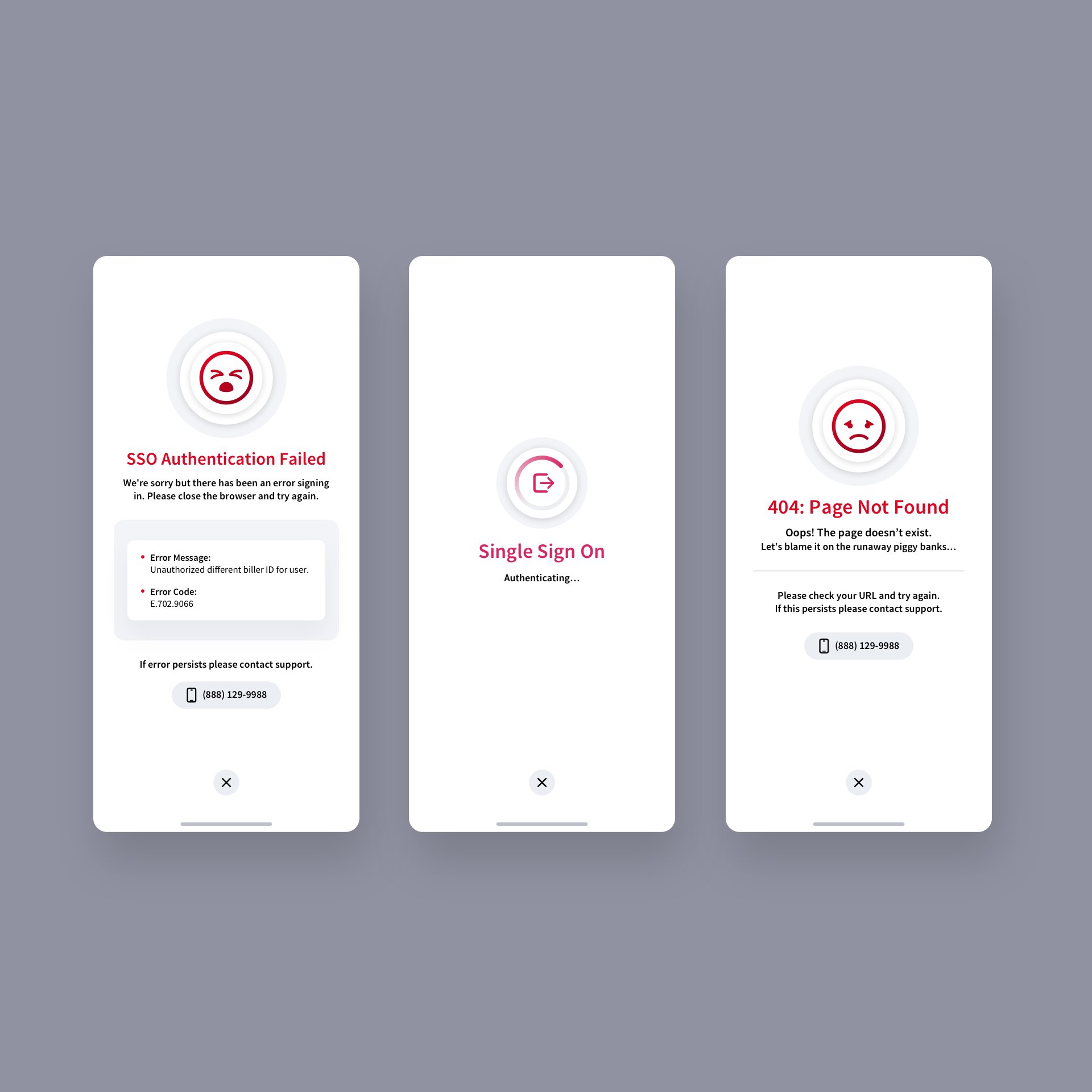
Custom 404: Page Not Found Screen
We created a whimsical visual of piggy banks running wild and spilling their coins, which ultimately became the perfect fit for the app’s 404: Page Not Found screen. Paired with a simple sad-face emoji, the design adds a touch of lighthearted charm to an otherwise frustrating moment.
Mobile Application Version
For the mobile versions, due to the limited screen real estate, we opted not to deploy background images as we did in the browser application. Instead, we focused on a clean, streamlined interface that prioritizes essential content and key user interactions, ensuring that functionality and usability remain intuitive even on smaller screens. This approach allows users to navigate the app effortlessly without visual distractions, maintaining the design’s consistency and clarity across devices.
Digital Wallet Mobile App Screens


Login Screen + Single Sign-on Modals
AUTOPAY SCHEDULING Mobile App SCREENS
Profile Mobile App Screens

Manage Payments Mobile App Screens


Make a Payment Mobile App Screens


Dark Mode Version

Have a project in mind? Let's talk.
Thank you for reaching out.
We will be in touch within one business day.