The 2026 B2B SaaS AI Design System Playbook
What Design Systems
Are Morphing Into
in the Age of AI.
For decades a design system meant roughly the same thing, and the component list inside it barely moved. Then AI arrived, and products started to "think." The list that had been stable for years was suddenly missing half of what the product needed to communicate.

The Shift
The new library does not replace the old one. It extends it. The old component list handled what the product shows. The new categories handle what the product "thinks," recommends, and does, and how a human stays in control of it.
The component list that never moved.
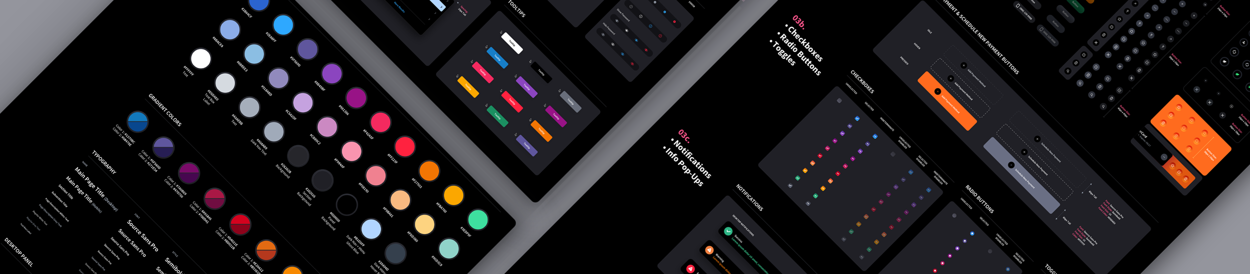
It was a library of reusable interface parts and the rules that governed them. Buttons, tables, forms, modals, a color palette, a type scale. A set of components that let a product team build screens fast and keep them consistent. If you have ever scoped one, you know the inventory by heart, because it looked nearly identical from one enterprise product to the next. And if you are the Head of Product, Project Manager, CTO, or senior software architect, you know it because this lands on your desk.
Then products started to "think." Or at least that is the word everyone uses. They do not actually think, they react, but the effect on the interface is the same: the product began interpreting data, making recommendations, drafting content, and acting on the user's behalf. And the list that had been stable for two decades was suddenly missing half of what the product needed to communicate.
This is a post about that shift. What a design system was, what it is morphing into for AI enabled products, and the new component library you now have to add. The key word is add. The new library does not replace the old one. It extends it. If you are layering intelligence onto a platform that was designed without it, this is the part nobody scoped.
The Design System of the Past (and Present)
Strip a mature B2B design system down to its parts and you find a remarkably consistent inventory. We have built these libraries for enterprise clients for years, including builds like the ACI Biller platform, and the core almost always looks like this.
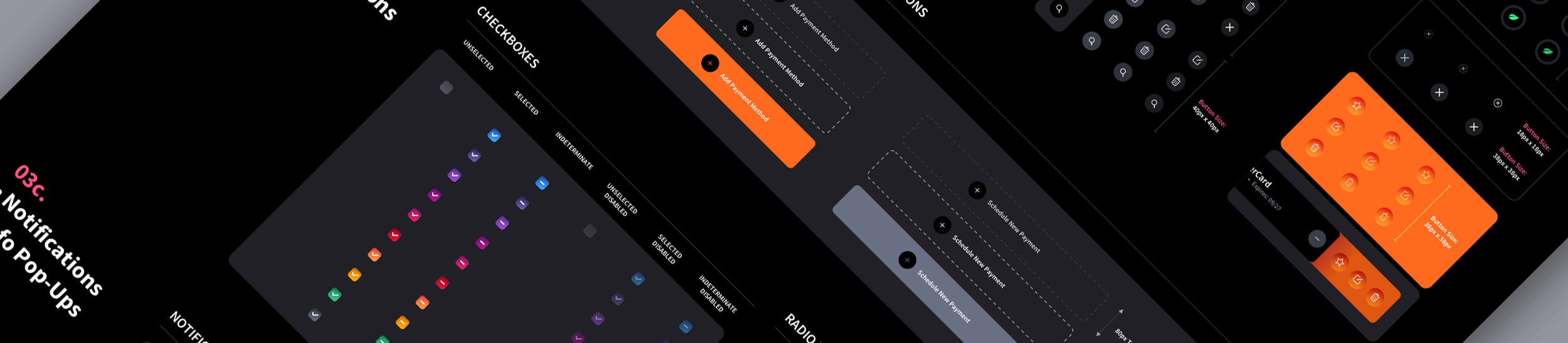
- Buttons, including associated states
- Radio buttons, including associated states
- Check boxes, including associated states
- Toggles
- Dropdown list box (type box with dropdown)
- Search type bar with button and type box, plus live search dropdown
- Dropdown menu, including associated states
- Generic modal base and confirmation panel
- Notification and tooltip panel / container
- Navigation header and footer components
- Form text entry boxes (input fields), including associated states
- Table with scroll bar mechanism
- Table entries with expansion panels
- Table with tree-view elements
- Tab bar, including associated states and basic footprints
- Slide-in panel
- Date picker with time range down to hours, minutes, seconds
- Tag popup
- Breadcrumb bar
- Iconography library of existing icons
- Slider bar with scrubber
- Master color palette with values
- Font and typography guide
- Sample line height for text sections, forms, and tables
- Interaction guidelines
That is a complete, professional design system. It does exactly what a design system was invented to do: keep a product consistent and accessible, speed up developer handoff, and let a team scale screens without re-solving the same interface problem twice.
Look closely at that list and you notice something. Every component on it assumes one thing about the product. The product waits.
A button waits to be clicked. A table waits to be sorted. A form waits to be filled. A modal waits to be confirmed. The whole library is built for a deterministic product that shows data, presents tools, and responds to input. For twenty years that assumption held, because that is what software did.
AI broke the assumption.
The Product Stopped Waiting
An AI enabled product does not wait. It interprets data, makes recommendations, predicts outcomes, summarizes records, drafts content, prioritizes work, and in some cases takes action on the user's behalf.
The interface is no longer a passive environment. It is a decision support layer, and a decision support layer has to communicate things the old library has no vocabulary for. A button can tell a user what a control does. It cannot tell them how confident the system is. A table can show data. It cannot show why the AI ranked one row over another, that a row is waiting on a human to approve it, or that the system already acted on three rows without asking.
So the moment a product adds intelligence, the design system has to grow new components to answer a new set of questions on every screen that touches AI. How does the product show confidence? How does it communicate uncertainty? How does it explain a recommendation? How does it show an action is pending review? How does it let a user override the system? How does it preserve a decision trail?
What follows is the new component library that answers those questions. We define what each component is and why it is needed in the full The AI Design System Glossary. Here is the library itself, grouped the way it should live inside the system.
The Design System Is What Keeps AI On-Brand
There is a second reason this matters, and it has nothing to do with confidence states or review queues. It is consistency.
When AI generates, assembles, or adapts interface at runtime, something has to constrain what it produces. Left unconstrained, an AI feature will invent its own buttons, its own cards, its own spacing, its own way of showing a status. The result is a product that looks like it was designed by ten different teams, because in a sense it was. The model is improvising UI with no shared vocabulary to pull from.
A design system is that vocabulary. It is the boundary that says: when the product surfaces a recommendation, it uses this card. When it flags risk, it uses this state. When it asks for approval, it uses this pattern. The AI does not get to draw something new. It draws from the system the designers already built, so its output matches the rest of the interface instead of fighting it.
This is about more than consistency for its own sake. An inconsistent interface breeds distrust, and not only in the AI feature that generated it. It erodes confidence in the entire product. When a screen looks stitched together, users assume the thinking behind it is too. In fintech, healthcare, and cybersecurity, where the product is asking people to trust it with money, patient outcomes, or security decisions, an interface that looks improvised is a liability. The visual inconsistency becomes a credibility problem, and credibility is the whole product.
This is why the new components have to live inside the design system rather than being bolted on per feature. The system is not only how a human team stays consistent. It is how the machine stays consistent too. Every AI surface in the product has to speak the same visual language as the screens a designer built by hand, and the only thing that guarantees that is a system the AI is required to use.
The old library handled what the product shows.
The new one handles what it thinks, recommends, and does.
The New AI Component Library
These are the component categories an AI enabled design system now has to include. Each is an addition to the old library, not a replacement for any part of it. We define what each individual component is and why it is needed in the full The AI Design System Glossary. Each category below links straight to its full definitions in the glossary.
Pending Review States
AI outputs should not always move straight into action. Many recommendations, alerts, summaries, flagged items, and automated decisions need a clear pending state that tells the user something is waiting on a human. The job is to make it instantly clear what needs attention, why, and what to do next. In an AI enabled product, pending is not just a status. It is a trust checkpoint.
- Pending review badges
- Review-required status labels
- AI recommendation cards
- Approval queue rows
- Pending action panels
- Confidence indicators
- Reviewer assignment chips
- Due date / SLA indicators
- Priority and risk tags
Approved / Rejected States
Once a user reviews an AI output, the interface has to communicate the outcome with more than a green or red label. These components carry context, ownership, timing, and often the reasoning behind the decision. Approval states should not just confirm an action. They should preserve the decision trail.
- Approved status badges
- Rejected status badges
- Decision summary cards
- Approval confirmation modals
- Rejected recommendation panels
- Decision timestamp labels
- Reviewer attribution
- Before / after comparison views
- Comment or note fields
- Decision reason dropdowns
Escalation States
AI workflows need escalation paths. When confidence is low, risk is high, data is incomplete, or an action requires higher authority, the interface has to make escalation visible and actionable. Escalation is where complex workflows break down, so these states need to make risk, ownership, and next steps impossible to miss.
- Escalation banners
- High-risk alert states
- Needs supervisor review labels
- Escalation queue cards
- Permission-based action locks
- Escalate to reviewer buttons
- Urgency indicators
- Blocked action messages
- Escalation history timelines
- SLA countdowns
Assigned Reviewers
AI review workflows usually involve several people: an analyst reviews, a manager approves, compliance signs off, a specialist investigates. These components make ownership unmistakable, because in enterprise UX accountability cannot be vague. AI may surface the recommendation, but humans still need ownership of the decision.
- Reviewer avatar groups
- Assigned reviewer chips
- Role-based reviewer labels
- Reassign reviewer controls
- Reviewer status indicators
- Review handoff panels
- Owner / secondary owner fields
- Team assignment dropdowns
- Reviewer availability indicators
- Mention and notification patterns

Reason Codes
When users approve, reject, override, or escalate an AI recommendation, the system should capture why. This is the category most teams miss entirely. Reason codes make a workflow structured, searchable, and auditable, and they show the product team exactly where users disagree with the model. A good AI interface does not just capture the decision. It captures the reasoning behind it.
- Reason code dropdowns
- Multi-select reason fields
- Required reason modals
- Contextual reason prompts
- Freeform note fields
- Predefined decision categories
- Override reason selectors
- Compliance reason fields
- Risk classification inputs
- Feedback-to-AI controls
Status History
Users need visibility into the full lifecycle of an AI assisted item. Was it created by the system, flagged by AI, edited by a user, escalated, approved, rejected, reopened, or automatically resolved? That history has to be visible without overwhelming the user. Status history turns AI activity from a black box into a traceable workflow.
- Status timelines
- Activity feeds
- Decision history panels
- Audit trail drawers
- Change logs
- Reviewer action logs
- AI action history
- Expandable event rows
- Timestamped workflow steps
- Before / after state comparisons

Bulk Review Patterns
In complex products, users may face dozens, hundreds, or thousands of AI-generated items, and one-by-one review is not always practical. These components support bulk action while protecting users from risky mistakes. If a user approves hundreds of recommendations at once, the interface has to make scope, risk, and consequences extremely clear. Bulk review should increase speed without removing judgment.
- Bulk selection controls
- Batch approval buttons
- Batch rejection buttons
- Grouped recommendation cards
- Risk-based filtering
- Confidence-based sorting
- Review queue tables
- Bulk action confirmation modals
- Exception handling panels
- Mixed-confidence warnings
- Undo / rollback controls
Human Override Controls
Human override is one of the most important component categories in any AI enabled product. Users need a clear way to stop, reverse, edit, reject, or modify what the AI recommends or does. The interface should never make users feel trapped. The more autonomy a product gives to AI, the more visible the override controls need to be.
- Override buttons
- Cancel automation controls
- Edit AI recommendation controls
- Manual approval toggles
- Pause automation switches
- Revert action buttons
- Override reason modals
- Permission-based override states
- Emergency stop controls
- Confirmation and consequence dialogs

An Addition, Not a Replacement
Notice what did not happen in that library. Not one of the old components went away. You still need the buttons, tables, forms, modals, and the type scale. The deterministic product underneath the intelligence is still there, and it still has to be consistent and accessible.
The AI library sits on top of that foundation. It is an addition, an extension of the system you already have, not a teardown of it. The work for a Head of Product is not rebuilding the design system from scratch. It is recognizing that the system has to morph: the old library handled what the product shows, and the new categories handle what the product thinks, recommends, and does, and how a human stays in control of it. This is especially true once you move from AI that assists to AI that acts on its own, where the interface becomes a layer for governing autonomous behavior. We break that shift down in AI Agent UX Design: What the Interface Needs to Get Right, covering the trust, control, and override patterns autonomous systems demand.
The biggest risk along the way is sprawl. A chatbot in one corner, a recommendation card in another, a summary feature on a third screen, an automation panel on a fourth. Each is useful alone. Together, without a shared system, they teach users a different pattern for confidence, review, approval, and control on every screen, and that inconsistency is exactly what erodes trust in an AI product. Extending the design system to cover these new categories is what keeps new intelligence consistent, understandable, and scalable instead of re-solved feature by feature.
The smarter the product gets, the more structured the system underneath it has to be. The old component list was never wrong. It was built for a product that waits, and your product stopped waiting. For complex SaaS, fintech, healthcare, cybersecurity, and enterprise products, the design system, old library plus new, becomes the operating layer between machine intelligence and human decision-making.
Scope Decides What Gets Built
None of this is a checklist. Not every AI enabled product needs every component here. A product that only surfaces recommendations needs confidence and review states but may never touch bulk actions or escalation paths. A product that automates inside strict limits leans hard on override and audit components and lighter on the rest.
The right system is scoped product by product. We design only the components your workflows actually call for, not the full catalog for its own sake. The point is not to build all of it. It is to know what exists, so the parts you do build fit together as a system instead of a pile of one-off patterns.
Your system already covers what your product shows.
The question is whether it covers what your product now thinks, recommends, and does.
Buttons, tables, forms, modals. Built for a product that waits for input and responds. Still essential. Still the foundation.
Confidence, review, reason, escalation, audit, and override. Built for a product that interprets, recommends, and acts on its own.
The two together become the operating layer between machine intelligence and human decision-making. Scoped to what your product actually needs.
Building AI into your product?
The Skins Factory designs and extends custom design systems for complex SaaS, fintech, healthcare, cybersecurity, and enterprise products, including the AI component categories above. Read The AI Design System Glossary for what each component is and why it is needed. Click below to complete our product inquiry form. In a rush? Use the quick form below, and we'll take it from there.Need a Design System? Let's chat.
Thank you for reaching out.
We will be in touch within one business day.