
Copap Customer Portal
Supply Chain & Trade Finance UI/UX Design · Responsive Web Application
Copap selected The Skins Factory to design its online customer portal and management platform for supply-chain and trade-finance operations. Beginning with collaborative user flowmaps, we created a responsive application spanning registration, dashboards, orders, invoices, customers, search, notifications, live chat, and company-profile workflows. Custom transportation illustrations, saturated color, and section-specific visual themes transformed a business productivity platform into a distinctive and highly memorable experience.
The Challenge
Giving a complex business portal a clear structure and distinct identity
Copap needed to bring registration, customer management, orders, invoices, dashboards, search, notifications, chat, and account tools into one connected application. These workflows shared common navigation and interface controls, but each represented a different stage of the supply-chain experience. The challenge was to maintain consistency across the platform without allowing every section to feel visually interchangeable or reducing the product to another conventional enterprise interface.
Our Approach
Creating a different visual journey for each part of the supply chain platform
We used the transportation of goods by air, sea, rail, and truck as the foundation for a series of custom illustration environments. Each major section received its own theme, with shared elements such as the application chrome, navigation, search, notifications, chat, profile controls, menus, and dropdowns changing appearance to match its environment. For the multi-step registration process, a panoramic illustration, animated panel transitions, parallax movement, and persistent pagination gave users a clear sense of motion and progress from one step to the next.
★★★★★
“The Skins Factory’s design work was a breath of fresh air.”
VP, Risk Management, Copap
Designing the User Flowmap
We started with a basic flowmap which evolved to a more advanced, targeted User Flowmap, once the scope of work was defined through collaboration with the client’s team.
Basic User Flowmap
Advanced User Flowmap
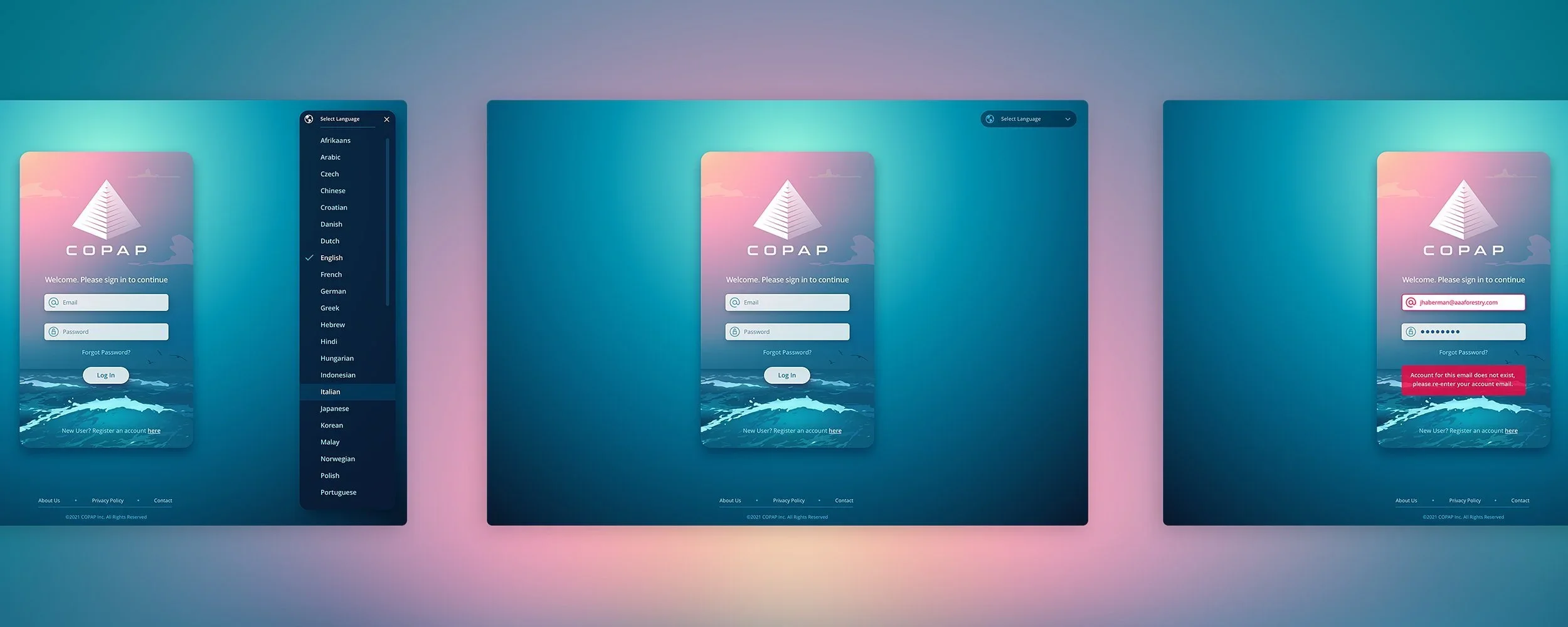
The Login Screens
From the onset, we wanted to do something different for Copap. Illustrations have been more prevalent lately and the idea to fuse them into a browser productivity app was appealing to both us and our client. Because Copap deals with supply chains, we used the transportation of goods as the basis for the illustrations. We used the 4 main modes… Air, Sea, Train & Trucking.


THE Registration SCREENS
Because this was going to be a series of screens the end-user had to fill out, we created a super wide illustration and had the modal advance from right to left as the background swept across, so did the content at a different speed creating a parallax effect. The animation progression was designed in Adobe After Effects. Progress was tracked by using pagination circles so the user knew when the end point was. Logo, Registration title, pagination circles and back remain in place, Next fades out. Simultaneouly, the new step’s content slides in from right while fading up ito full opacity while completed step’s content slides to the left while fading down to zero opacity - the movement of this content correlates with the movement of the panel background illustration.


THE Dashboard SCREENS
Dark mode UIs are all the rage these days, so we created a dusk scene that was transitioning to night time. Deep blues and purples with the soft pink to purple sunset as the silhouette of a freight train fulfills its supply chain duties riding on its tracks.


