
SaaS UI/UX Design Agency
for Enterprise Software
Innovative Designs for Powerful Software Solutions.
The Skins Factory is a U.S.-based SaaS UI/UX design agency specializing in complex B2B and enterprise software. We take a user-centered approach to ensure that every element of our design not only looks great but also enhances usability and efficiency. By focusing on the unique needs of SaaS applications, we deliver designs that are scalable, adaptable, and perfectly aligned with our clients' business objectives. Our commitment to excellence and innovation makes us the go-to choice for businesses looking to elevate their software solutions to new heights. And your sales team will love us, we make their job easier. Here is a look at a few of them:
SaaS UI/UX Design Services
SaaS products are built to scale. The best ones make complexity feel effortless.
We design UI/UX for SaaS, enterprise software, dashboards, portals, workflow tools, analytics platforms, and complex business applications, creating web, mobile, and desktop experiences that help users navigate complex products with greater clarity and confidence. Whether you need to design a SaaS product from scratch, modernize a legacy interface, or improve a poorly performing application, we provide UI/UX design services that reduce friction, increase adoption, and turn complex software into better digital product experiences.
What Does Your SaaS Product Need?
Whether you are building a new SaaS product, modernizing an existing platform, expanding a design system, or adding ongoing design support, we adapt the engagement to the stage and complexity of your product.
Design a New SaaS Product
Turn an idea, requirements document, or early concept into clear user flows, polished interfaces, interactive prototypes, and developer-ready product design.
Redesign an Existing SaaS Product
Modernize outdated interfaces, simplify complex workflows, improve onboarding, and fix the friction hurting adoption, retention, and growth.
Scale the Product and Design System
Add new features without creating more design debt. We refine existing patterns, expand component libraries, and keep the product consistent as it grows.
Add Fractional SaaS Design Support
Bring senior UI/UX expertise into your product team for ongoing feature design, UX improvements, design-system maintenance, and roadmap support without another full-time hire. Explore our Fractional UI/UX Design Services.
The SaaS Problems We Fix
SaaS products rarely struggle because they lack features. They struggle because complexity has accumulated faster than the experience has evolved. We identify the friction holding users back, then redesign the product around clarity, adoption, and long-term scalability.
Confusing Onboarding and Low Activation
We identify the first meaningful user outcome, remove unnecessary steps, and introduce guidance only where it helps users reach value faster.
Features Users Cannot Find or Understand
We improve navigation, naming, hierarchy, and contextual discovery so important features appear within the workflows where users actually need them.
Overloaded Dashboards
We separate what requires immediate attention from what can wait, then organize data around decisions, user roles, and frequency of use.
Feature Bloat and Bolted-On Workflows
We identify redundant, poorly placed, or rarely used functionality and reorganize the product so years of additions feel like one coherent system instead of accumulated patches.
Developer-Designed Interfaces
We preserve the underlying product logic while rebuilding the layout, interaction patterns, and visual hierarchy around the people using the software.
Inconsistent UI Patterns and Fragmented Design Systems
We audit recurring components, behaviors, and styles, standardize what works, and create reusable patterns that prevent future features from introducing more inconsistency.
Growing UX and Design Debt
We prioritize the friction creating the greatest business and user impact, fix it methodically, and establish patterns that prevent it from returning.
Legacy Software That Feels Outdated
We modernize the interface without disrupting familiar workflows, preserving what users rely on while improving clarity, speed, and usability.
Complex Workflows That Create Support Tickets
We identify where users get stuck, redesign unclear states and instructions, and reduce the questions the interface forces support teams to answer.
AI Features Bolted Onto an Existing Interface
We integrate AI around clear use cases, transparent system feedback, and human control instead of adding another disconnected chat box.
Selected Work
Featured SaaS UI/UX Design Projects
In SaaS and enterprise software, every interaction has to reduce friction, support adoption, and help users move through complex workflows with clarity. Dashboards, portals, analytics tools, admin systems, and business applications need to feel intuitive from the first click, even when the product itself is dense, technical, or workflow-heavy. Our approach focuses on making SaaS products easier to understand, easier to use, and more valuable to the teams that rely on them every day.
Below are selected SaaS and enterprise software projects that show how The Skins Factory brings clarity, usability, visual polish, and product thinking to complex digital products. For a broader look at our work across SaaS, fintech, healthcare, cybersecurity, enterprise software, and more, explore our Main UI/UX Design Portfolio .
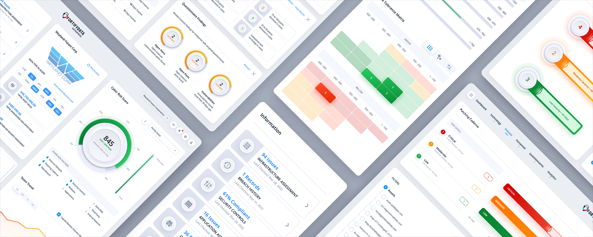
FortifyData
Cybersecurity SaaS Platform UI/UX Design. Web App.
The Skins Factory and FortifyData: A Winning Collaboration in Cybersecurity Risk Management UI/UX Design
FortifyData, a world-leading Cybersecurity Risk Management platform that enables their clients to identify and manage risk exposure across the entire attack surface, brought The Skins Factory in to redesign their core platform's UI/UX design. Our team refined the existing UI and UX over 40 screens, while modernizing the visual design, weaving neumorphic elements into the analytics' visual design, and turning complex security requirements into intuitive, human-centered experiences.
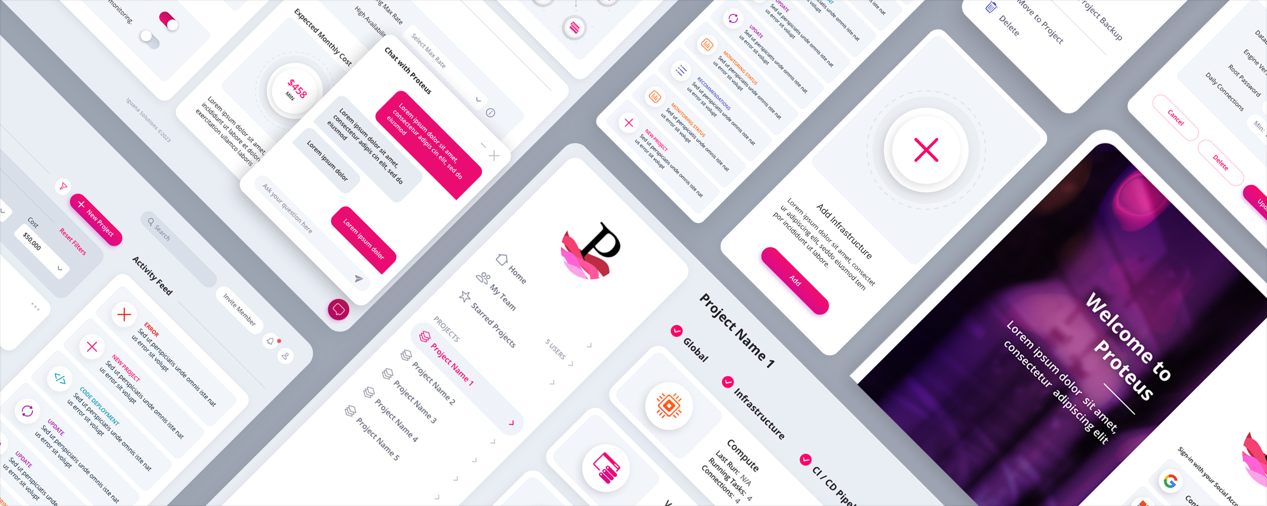
Iguana Solutions USA DevOps Platform
DevOps/IT UI/UX Design. Web App.
When Expertise Meets Excellence: How Our Collaboration with Iguana Solutions Transforms Complex Infrastructures
The Skins Factory was thrilled to work side-by-side with Iguana Solutions USA, a world-class managed services and hosting company that designs, creates and manages complex and critical infrastructures on physical, cloud or hybrid platforms. This collaboration brought together our deep industry knowledge of user-centered and user experience design with Iguana Solutions' unmatched technical prowess and innovation, to deliver transformative solutions for their clients facing intricate infrastructural challenges.
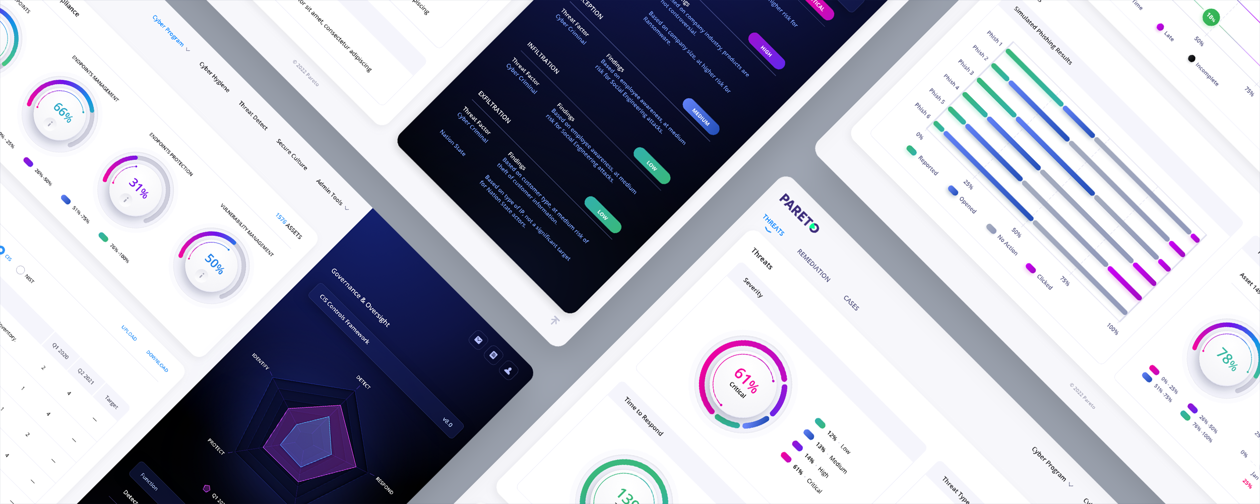
Pareto Cyber
Cybersecurity SaaS. Web App UI/UX Design.
Redefining Cybersecurity UI/UX for the Enterprise: Inside The Skins Factory's Pareto Cyber Web App Design
Pareto Cyber, a leader in cyber prevention & defense, contracted The Skins Factory to redesign their secure, scalable, forward-thinking cybersecurity program for mid-market and enterprise. In an effort to forge new ground, our design team broke the paradigm of red, yellow & green and designed an alternative color scheme to denote critical, high, medium and low risks.
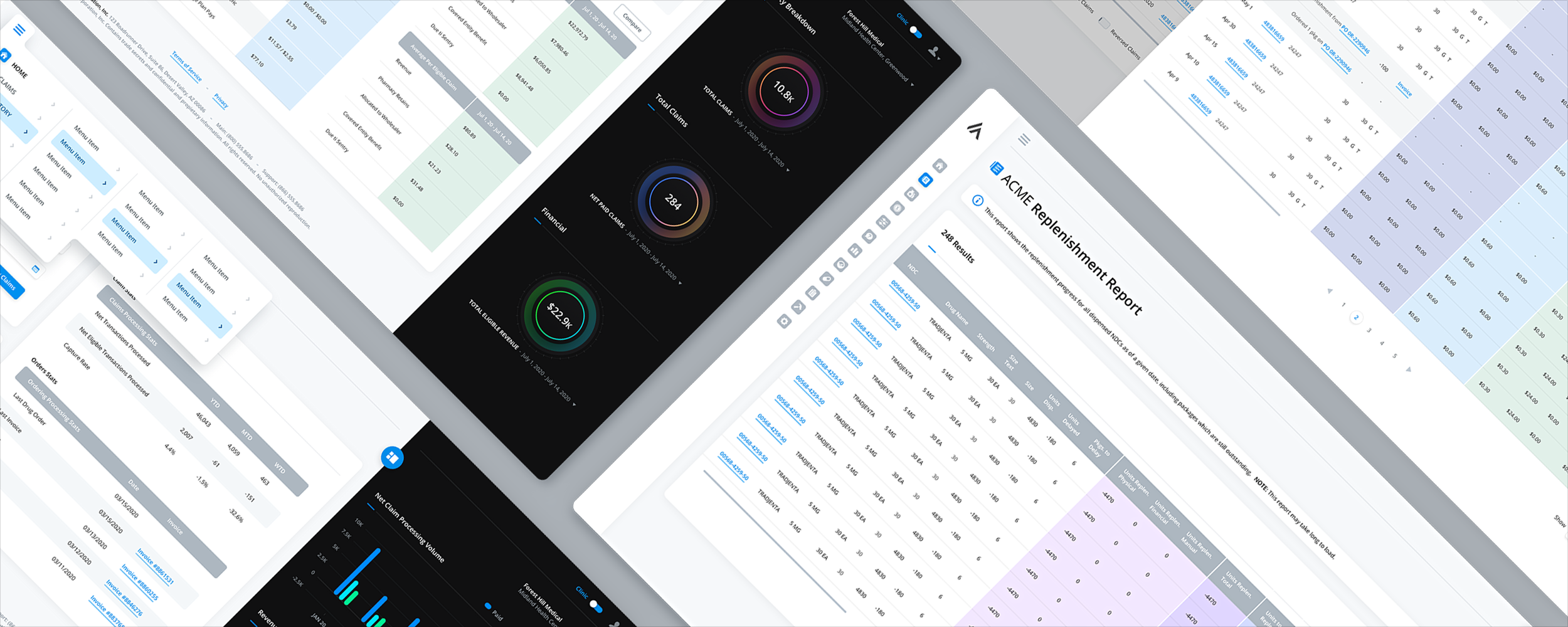
Hospital 340B Contract Pharmacy Management
Healthcare SaaS Web App UI/UX Design
From Ordinary to Extraordinary: The Skins Factory's Impactful UI/UX Redesign for Acme's Inventory Application
Phase 2 of 2 for two UI/UX redesign projects by Acme, client name changed by request to maintain confidentiality, focused on redesigning their responsive browser applications. We created a crisp, modern design language that amplified usability compared to the previous iterations, using slide-in panels instead of a traditional modal system and visually breaking up super-wide horizontal tables with colored vertical columns.
Two Ways to Work With Us
Some SaaS products need a complete design engagement. Others need senior UI/UX expertise integrated into an active product roadmap. We offer both, so the engagement can match the scope, pace, and stage of your product.
Full Engagement
Complete SaaS Product Engagement
Best for new SaaS products, major redesigns, legacy modernization, complex workflow restructuring, and complete design-system initiatives. We guide the product from discovery and early concepts through high-fidelity UI/UX design, prototypes, reusable components, and developer-ready source files.
Ongoing Support
Fractional SaaS Design Support
Best for ongoing feature design, onboarding improvements, dashboard refinement, UX debt, design-system maintenance, and product teams that need senior support without another full-time hire. Priorities can shift as the roadmap evolves, giving your team experienced design capacity where it is needed most.
From Startups to Fortune 100/500 Companies
and All Points in Between.
This is a brief list of the clients that have relied on our commitment to excellence for over 25 years. What it doesn't show is how often they've come back after we exceeded their expectations… 60+ projects for Microsoft, 13+ for The Walt Disney Company, 8 for Warner Bros. Entertainment, 7 for Alienware… you get the idea. Repeat business powered solely by word-of-mouth, our ability to set trends, and the strength of our deliverables. While we have worked for some of the world's largest brands, our client list is filled with amazing mid-size companies and extraordinary startups.









SaaS UI/UX Design Services Reviews
We think we're awesome, but don't take our word for it, see what our clients are saying.
"The journey and ultimately the results of their work provided us what we were looking to achieve."
"Reaction from clients has been tremendous; many existing customers want to upgrade."
"We are extremely happy with the new look and functionality. Skins did a great job."
"We spoke with a dozen companies before selecting The Skins Factory. We had a great experience."
"The Skins Factory's design work was a breath of fresh air. We found it outstanding."
"The new design is a vast improvement and far superior to that of competitors."
Clutch Reviews
"The design they delivered was incredibly well done; it was visually awesome."
"They were accessible, and their work was good."
"The Skins Factory valued our goals, and that was apparent in the quality of work they delivered."
"The range of UI/UX work they have done and the companies they have designed things for - very impressive."
"They know how color, texture, and design aesthetics work together to visually grab the viewer's attention."
"The design they delivered was incredibly well done; it was visually awesome."
Practitioner Perspectives
The Methodology Behind the Work
We don't believe in black-box design. Our work in SaaS and enterprise software is built on 25 years of designing complex, high-stakes products for SaaS, fintech, healthcare, cybersecurity, and enterprise teams. These articles aren't marketing content; they are the technical playbooks and design system audits we use on our own active projects. We share them ungated because we believe the best way to demonstrate authority is to show exactly how we solve the hard problems.

Featured Article
SaaS UI/UX Design: Best Practices for Enterprise Apps in 2026
SaaS products are not marketing sites. They are environments people work inside every day. The interface cannot just look polished. It has to think clearly, reduce friction, and make complexity feel manageable.
Most SaaS companies invest aggressively in engineering, infrastructure, and features, then underinvest in the experience layer that decides whether any of that value is actually felt by the user. This is our practitioner thinking on how to design SaaS products people adopt, stay in, and rely on.
From the Article
How is SaaS UX different from designing a website or a mobile app?
A landing page can afford to be beautiful and shallow, because it only has to make a quick impression. SaaS products are tools people rely on daily to complete workflows, manage data, and make decisions under pressure. That changes the whole job. SaaS UX is about creating an experience that stays clear, fast, and intuitive over repeated use, not one that impresses once and frustrates every day after.
Why do most SaaS products actually fail?
Most SaaS products don't fail because of bad code. They fail because nobody wants to use them. Confusing navigation lowers adoption, overloaded dashboards weaken comprehension, weak onboarding slows time to value, and inconsistent patterns create hesitation and support burden. The experience layer is not a thin coat on top of the product. It is the product experience, and it determines whether the engineering underneath is ever felt.
What are the signs a SaaS product is ready for a UX fix?
The signals are usually obvious once they are real. Users hesitate or drop off early. Feature adoption is weak. The interface feels dated or inconsistent. The same support questions keep repeating. New functionality is getting harder to add cleanly, and the product feels more complex than it should. These are not isolated annoyances. They are signs that the experience layer is now limiting the product, and at that point improving UX becomes a growth decision, not a cosmetic one.

Featured Article · 17 min read
Redesigning Legacy Software Without Disrupting What Works
Legacy software redesign is not just a visual refresh. It is a strategic modernization effort that protects mission-critical workflows, reduces user friction, and helps enterprise products feel current without sacrificing the depth and power users rely on.
An enterprise application that has been in production for years carries real weight. People have built their work around it, revenue flows through it, and compliance depends on it. A poorly handled redesign does not just frustrate users. It creates business risk. This is how we modernize mature products without breaking the trust users place in them.
From the Article
Should you redesign a legacy product all at once or screen by screen?
A legacy redesign does not have to happen all at once. The most effective approach is usually working through the product methodically, screen by screen, modernizing the visual design, tightening layouts, improving hierarchy, and making subtle UX refinements as you go. When a pattern needs to change, it changes everywhere for consistency. You are not redesigning in the abstract, you are looking at real screens with real content, real data, and real user workflows.
Can a legacy redesign be too minimal?
Yes, and it is a common and costly mistake. A team takes a complex application and tries to make it feel clean by hiding information, cutting visible controls, or over-simplifying dense workflows. It looks elegant in a mockup and fails in real use. Enterprise users need context, status, real-time and historical data, and advanced controls close at hand. A minimalist interface that hides too much creates uncertainty, and in enterprise environments uncertainty is a productivity killer. The goal is not minimalism, it is clarity within density.
What does it cost to do nothing and leave legacy software as is?
The cost of inaction compounds. Support costs rise as users keep hitting the same usability walls. Onboarding takes longer because new users cannot figure the product out without hand-holding. Churn increases as competitors with cleaner interfaces start looking more attractive. Sales cycles slow because buyers judge products by what they see. And engineering velocity drops because a tangled UI makes new features unpredictable to add. The longer a company waits, the more expensive the eventual redesign becomes.
Featured Article · 12 min read
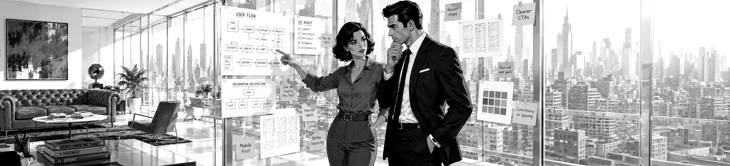
Enterprise UX Audit: What Most Product Teams Overlook
You want to redesign your enterprise product. Good. But if you skip the audit, you are redesigning blind.
A UX audit gives you a structured, evidence-based assessment of what is actually broken, what is working, and where the highest-impact opportunities are hiding. It turns gut feelings into prioritized action items, and it makes sure your redesign budget goes toward the issues that will actually move adoption, retention, and revenue. This is what a thorough enterprise audit should cover before a single screen gets touched.
From the Article
What should an enterprise UX audit evaluate first?
Before you evaluate anything, get alignment on what better means. That sounds obvious, but in practice the VP of Product wants higher activation, the CTO wants fewer support tickets, and the CEO wants the product to feel more modern, which are three different problems with three different solutions. Nail down the product type, the primary business outcome, the part of the product that matters most right now, and a concrete definition of success in six months. If you cannot define it, you cannot measure it.
How many reviewers do you need for a heuristic evaluation?
Run the evaluation with at least three reviewers independently. A single evaluator typically catches only about a third of usability problems, so one person auditing alone will miss most of what is actually there. Three to five independent evaluators, each assessing the interface against established usability heuristics and then comparing findings afterward, will surface the majority of the issues that matter.
How do you prioritize findings after a UX audit?
An audit that produces a long list of problems with no prioritization is not useful, it is overwhelming. Score every finding on two axes, business impact and implementation effort, which sorts the work into three tiers. Quick wins are high impact and low effort, fix them immediately to build stakeholder confidence. Development-required items are significant but need engineering resources, so plan them into sprints. Strategic changes are high impact and high effort, and they inform the roadmap. This is what separates an audit that drives a redesign from one that sits in a folder.
Featured Article
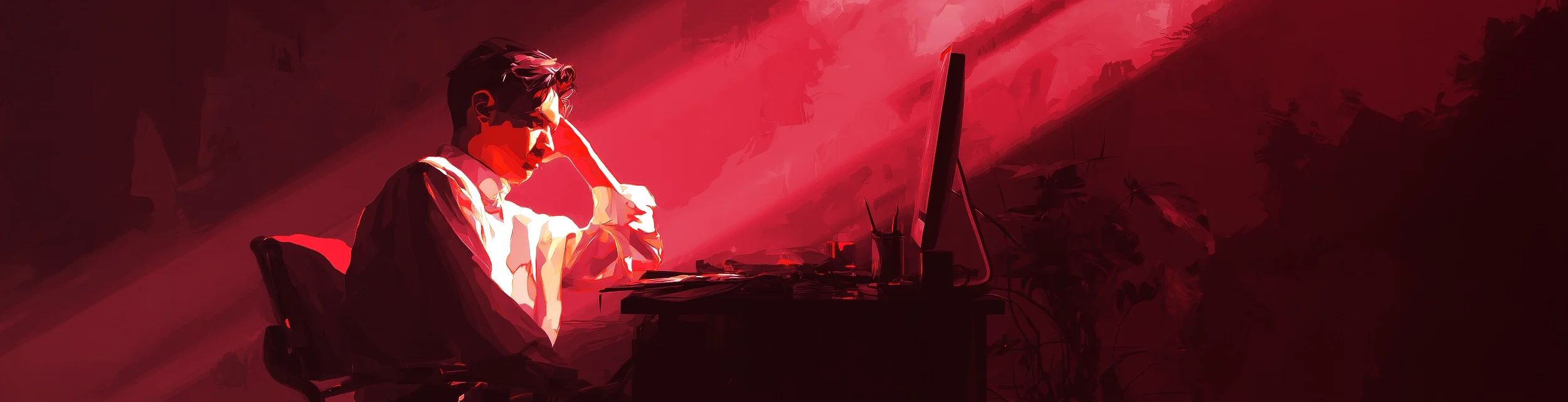
The 5 Most Common UX Mistakes in Enterprise SaaS
After 25 years designing SaaS and enterprise software, you would think certain UX mistakes would have disappeared by now. They haven't.
The same core usability problems keep surfacing in modern platforms, just dressed up in newer design trends and shinier components. These are the five we still see every day, drawn straight from real client work, including the ACI Worldwide banking redesign where customizable navigation became one of the most praised features we shipped.
From the Article
What is the most common UX mistake in enterprise SaaS?
Feature overload disguised as value. There is a common belief that more features equal more value, and in practice the opposite is often true. When users log in and are immediately faced with dense navigation, too many options, unfamiliar terminology, and crowded dashboards, they don't feel impressed. They feel overwhelmed. Strong SaaS UX uses progressive disclosure, revealing the right capabilities at the right time based on where the user is in their journey, so power lives one level deeper instead of all at once.
Should navigation be organized by feature or by user task?
By task. A frequent failure is navigation built for the org chart, not the user. The product team is organized into departments, the departments name features after internal terminology, and the nav ships looking like a corporate directory. Users don't think in org charts, they think in tasks, and when the nav doesn't match that mental model they hunt, ask support, or give up. The fix is a rename and restructure based on how users describe their own goals, often uncovered through card sorting.
Why does designing only for the power user backfire?
Every SaaS product has a champion, the person who pushed for the purchase and knows it cold. Product teams love this person, demo with them, and take feedback from them. But the other hundreds of seats on that enterprise license belong to people who just need to get something done and get out. Good SaaS UX serves both. Core workflows should be obvious, fast, and forgiving, while advanced functionality stays accessible without being in the way. That is progressive disclosure again.
Common Questions
SaaS & Enterprise UI/UX FAQ
Straight answers about onboarding, legacy modernization, reducing churn, product-team collaboration, developer handoff, timelines, pricing, and designing across desktop and mobile.
How do you improve onboarding and feature adoption in a SaaS product?
Activation is about getting a user to a real win fast, not touring every feature. We design interfaces that reduce friction, clarify the user journey, improve onboarding completion, and surface features at the moment they are relevant. Increasing adoption and conversion helps reduce churn. This is core work across SaaS clients like Brillium, ScreenPal, DocPanel, Iguana Solutions, and SonarVision.
Can you modernize a confusing or outdated SaaS or enterprise application?
Yes. Legacy modernization is one of our core capabilities. We take applications that are confusing, visually outdated, or burdened by years of bolted-on features and redesign them into clear, modern, purpose-built interfaces. We preserve the workflows users rely on while improving hierarchy, usability, consistency, and overall product value.
How does good UX design actually reduce SaaS churn?
When users struggle with onboarding, cannot find important features, or find the interface frustrating, they are more likely to leave. We reduce friction, clarify user journeys, improve onboarding completion, increase feature adoption, and make complex workflows easier to understand. We design for the realistic state of the product, not the tidy demo.
What types of SaaS and enterprise software have you designed?
We design UI/UX for SaaS, ERP, CRM, BI, SCM, HRM, and LMS platforms, plus DevOps tools, cybersecurity products, data analytics dashboards, workforce management software, assessment platforms, healthcare applications, and complex operational systems. With over 25 years designing enterprise interfaces, our clients include Microsoft, RedPrairie, ACI Worldwide, Brillium, ScreenPal, FortifyData, and Iguana Solutions.
Do you design for both desktop and mobile SaaS products?
Yes. We design SaaS interfaces for desktop browser applications, desktop software, mobile iOS and Android apps, and responsive web platforms. We recommend designing each platform around its actual use case rather than relying solely on responsive scaling, because a dense desktop dashboard and a focused mobile workflow rarely need the same interface stretched to fit.
Can you work alongside our product managers, developers, and internal design team?
Yes. We regularly collaborate with product managers, developers, executives, subject-matter experts, and internal design teams. We can lead the UI/UX process or integrate into an established product workflow. Our goal is to give engineering clear, practical designs that account for technical constraints without allowing those constraints to dictate the user experience.
What does our development team receive when the design is complete?
Your team receives organized, developer-ready source files, finalized interface designs, reusable components, interaction states, responsive layouts where required, and supporting documentation appropriate to the project. We also remain available during implementation to answer questions, clarify behavior, and help ensure the finished product reflects the approved design.
How long does a SaaS UI/UX design or redesign take, and what does it cost?
It depends on the number of modules, user roles, workflows, data states, and the condition of the existing product. It also depends on whether we are designing from scratch or modernizing an established platform. A focused engagement may take several weeks, while a complex SaaS or enterprise product can take several months. Pricing is based on the actual scope and structural complexity of the work, not a predetermined number of screens.
Deeper Answers
Q&A: Go Deeper Into SaaS & Enterprise UX
Explore practical answers to common SaaS and enterprise UX questions, from redesigning complex dashboards and simplifying workflows to modernizing legacy software, deciding between a UX audit and full redesign, and building design systems that can scale with the product. Each answer draws from the kinds of challenges we encounter designing SaaS platforms, enterprise applications, dashboards, portals, workflow tools, and complex business software.



Have a SaaS Project in Mind? Let's talk.
Thank you for reaching out.
We will be in touch within one business day.
Learn how to simplify complex enterprise workflows by reducing unnecessary steps, preserving context, clarifying decisions, and supporting real user roles.