Why Your Dark Mode Looks Bad: A UI/UX Guide
5 Mistakes That Kill
Readability
Dark mode is standard now. Users expect it. Product teams ship it. And most of them get it wrong. Not catastrophically wrong. Just wrong enough that text is harder to read, contrast feels off, and the whole interface has this murky, unfinished quality that nobody can quite articulate.

MISTAKE 01
Pure Black Backgrounds
This is the most common one. Teams default to #000000 because it seems like the obvious choice. Black is dark. Dark mode should be dark. Makes sense.
Except it doesn't work. Pure black creates too much contrast against white text, which causes a visual vibration effect called halation. The text appears to glow and bleed into the background. It's physically harder to read for extended periods.
Pure black creates halation against white text. The characters glow, edges blur, and extended reading becomes physically uncomfortable.
A very dark grey is still unmistakably dark but eliminates the harshness. Your eyes can actually settle on it. The difference is subtle on a color picker and obvious on screen.
MISTAKE 02
Same Colors, Just Inverted
You can't simply invert a light palette and call it dark mode. Colors that work on a white background rarely translate straight to a dark one. Saturation levels shift. Contrast ratios break. Accent colors that felt balanced in light mode turn garish or washed out against dark surfaces.
And dark mode doesn't have to mean dark grey. When we designed the dark mode for Recognize Me, a social media mobile app, we built it around deep, rich colors instead of the standard charcoal palette. The fintech biller we designed for ACI Worldwide took a similar approach, combining deep color with dark grayscale panels to create something that felt premium and intentional rather than like someone just turned the lights off.
Dark mode needs its own color system. Not an inversion of the one you already have.
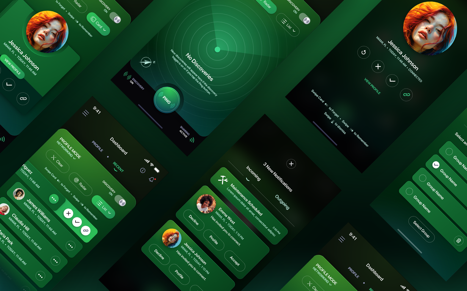
Recognize Me Mobile App, Dark Mode, Deep Emerald Colorway
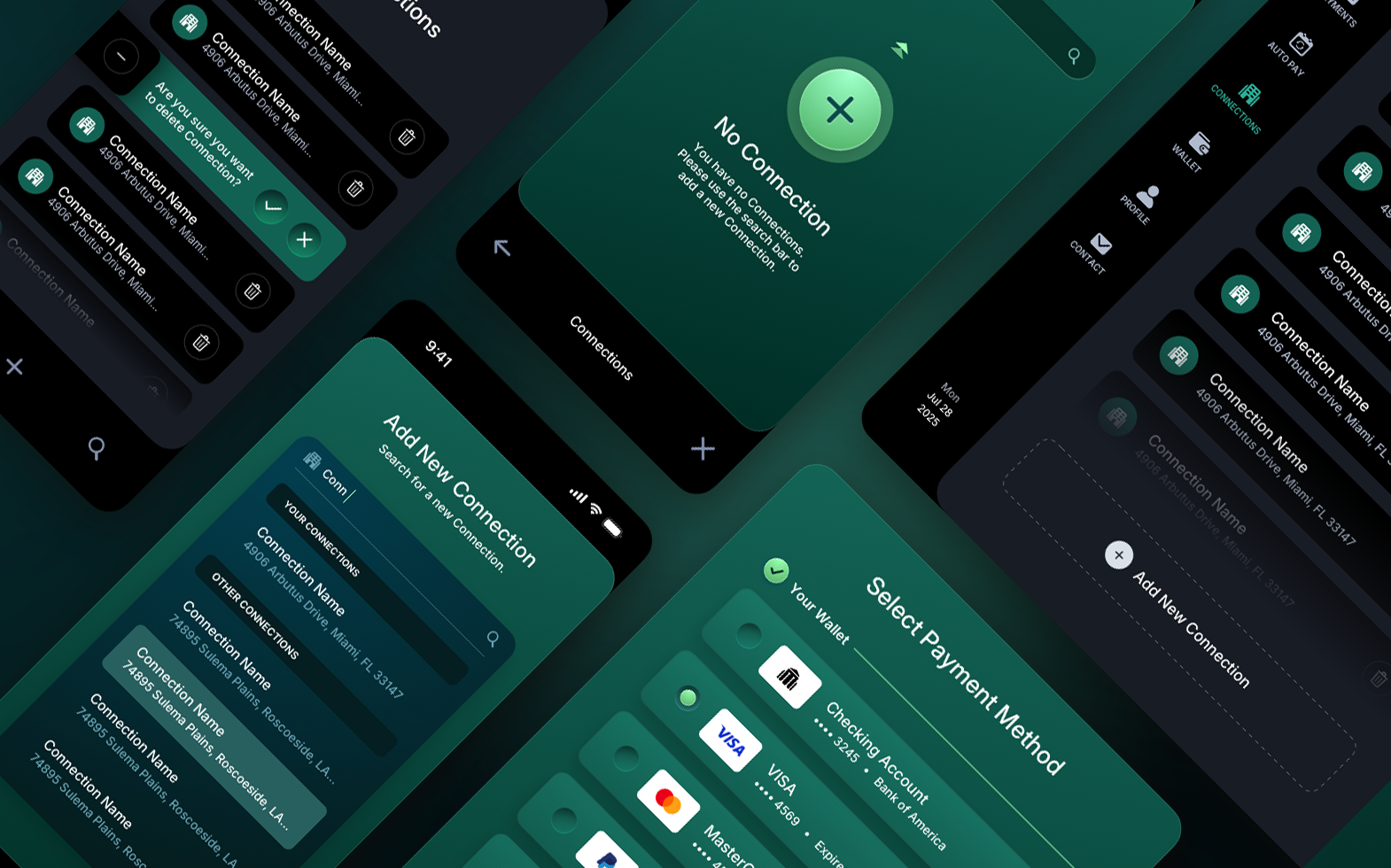
ACI Pay Web & Mobile App, Dark Mode, Deep Forest Green Colorway
Dark mode doesn't have to mean dark grey. It means dark. The color is up to you.
MISTAKE 03
Not Enough Contrast Between Surface Layers
In light mode, you can get away with subtle differences between background layers because shadows do most of the work. In dark mode, shadows are almost invisible. A card sitting on a dark background with only a slight shade difference just disappears.
Dark mode needs clear tonal separation between layers. Your base background, your card surfaces, your elevated elements, all need enough contrast to be visually distinct. The hierarchy has to come from the surfaces themselves, not from shadows.
A good test: squint at your screen. If you can't tell where one surface ends and another begins, your layers are too close. This is where a well-built design system pays for itself, defining surface tokens that maintain hierarchy across both modes.
MISTAKE 04
White Text at Full Opacity
#FFFFFF on a dark background is too bright. It creates the same strain as pure black backgrounds, just from the other direction. Your primary text should be slightly muted. Something like #e2dfd8 or #f4f2ed reads as white but doesn't blast the reader's retinas.
Secondary text should step down further, somewhere around #a9a9ab to #888888, depending on the background. This creates a natural reading hierarchy that feels comfortable over long sessions.
Primary text: Off-white like #f4f2ed or #e2dfd8. Reads as white without the glare.
Secondary text: Muted grey around #a9a9ab. Clear enough to read, quiet enough to stay in the background.
Tertiary/disabled text: Something around #666 to #777. Visible but clearly de-emphasized.
MISTAKE 05
Ignoring Image and Media Treatment
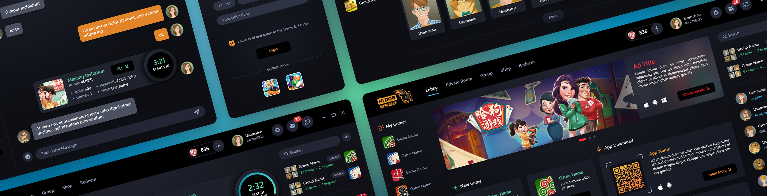
Bright, full-color images on a dark interface are jarring. A product screenshot captured in light mode, dropped onto a dark background without any treatment, looks like a flashlight pointed at your face.
Images need context. A subtle border, a slight border-radius, a soft box shadow to lift the image off the background. Some teams add a faint dark overlay or reduce brightness slightly in dark mode. The goal isn't to hide the image. It's to make it feel like it belongs in the environment rather than being pasted on top of it.
A light-mode screenshot on a dark background looks like a flashlight pointed at your face.
ADDITIONAL INSIGHT
Ignoring WCAG Contrast Ratios
Dark mode doesn't exempt you from accessibility. WCAG 2.1 requires a minimum contrast ratio of 4.5:1 for body text and 3:1 for large text. In light mode, most teams clear those numbers without thinking about it. In dark mode, muted greys on dark backgrounds fail the check constantly.
If you're designing for government or financial services, this isn't optional. Section 508 mandates it for federal agencies. Fintech platforms face the same scrutiny. Failing contrast standards in these sectors is a compliance risk, not just a design problem.
But blindly cranking every color to maximum contrast will flatten your visual hierarchy and destroy the design language. The goal is making the interface readable for the sight-impaired without sacrificing the experience for everyone else. That takes judgment and experience. Hit the minimums, but make intentional decisions about where you push higher and where you hold the line.
Worth noting: iOS and Android both offer system-level accessibility settings that can override your dark mode entirely. High contrast mode, bold text, increased font sizes. You can't prevent that, and you shouldn't try. Build with semantic color tokens and scalable type so the OS-level adjustments work with your design instead of against it.
QUESTIONS, ANSWERED
Dark Mode Design FAQs
Should dark mode backgrounds be pure black?
No. Pure black (#000000) creates excessive contrast against white text, causing a visual vibration effect called halation where characters appear to glow and bleed into the background. A very dark grey in the #0e0e0e to #1a1a1a range still reads as unmistakably dark but is far more comfortable for extended reading.
Can I create dark mode by inverting my light mode colors?
No. Colors that work on a white background rarely translate to a dark one. Saturation levels shift, contrast ratios break, and accent colors that felt balanced in light mode turn garish or washed out against dark surfaces. Dark mode needs its own color system, built and tuned specifically for dark surfaces, not an inversion of the palette you already have.
Does dark mode have to be grey?
No. Dark mode means dark, not charcoal. Deep, rich colors can serve as the foundation of a dark interface. We built the dark mode for the Recognize Me social app around deep emerald tones, and the ACI Worldwide consumer biller combined deep forest green with dark grayscale panels. Both feel premium and intentional rather than like someone turned the lights off.
What color should text be in dark mode?
Not pure white. #FFFFFF at full opacity on a dark background creates the same eye strain as pure black backgrounds, just reversed. Primary text should be a slightly muted off-white like #f4f2ed or #e2dfd8, secondary text a mid grey around #a9a9ab, and tertiary or disabled text around #666 to #777. This creates a natural reading hierarchy that stays comfortable over long sessions.
Why do cards and panels disappear in dark mode?
Because shadows are almost invisible on dark backgrounds. In light mode, shadows carry most of the elevation hierarchy. In dark mode, surface contrast has to do that work instead. Your base background, card surfaces, and elevated elements each need enough tonal separation to be visually distinct. If you squint at the screen and can't tell where one surface ends and another begins, the layers are too close.
How should images be handled in dark mode?
Carefully. Bright, full-color images look jarring against a dark interface, and a light-mode screenshot dropped onto a dark background reads like a flashlight pointed at your face. Images need context to belong in the environment: a subtle border, a slight border-radius, or a soft shadow to lift the image off the background. Some teams add a faint dark overlay or reduce brightness slightly in dark mode. The goal is integration, not concealment. The image should feel like it lives in the interface rather than being pasted on top of it.
Does dark mode need to meet WCAG accessibility standards?
Yes. WCAG 2.1 requires a minimum contrast ratio of 4.5:1 for body text and 3:1 for large text, and dark mode does not exempt you from either. Muted greys on dark backgrounds fail these checks constantly. For government platforms, Section 508 mandates compliance, and fintech faces similar scrutiny. The skill is hitting the minimums without flattening your visual hierarchy, which takes deliberate judgment about where to push contrast higher and where to hold the line.
Dark mode isn't a toggle. It's a second design system.
Your light mode with the lights off
is not dark mode.
Pure black causes halation. Very dark grey eliminates it. The difference is invisible on a color picker and obvious on screen.
Your light mode palette inverted is not a dark mode palette. Saturation, contrast, and surface hierarchy all need to be rethought.
Shadows disappear in the dark. Surface contrast has to carry the hierarchy on its own. If you can't tell where one layer ends and another begins, neither can your users.
Your Dark Mode Deserves Real Design
The Skins Factory has spent 25 years designing interfaces for enterprise SaaS, fintech, and healthcare platforms. Let's talk about what yours should look like. Click below to complete our product inquiry form. In a rush? Use the quick form below, and we'll take it from there.Have a project in mind? Let's chat.
Thank you for reaching out.
We will be in touch within one business day.
About Jeff Schader
Jeff Schader is the founder and CEO of The Skins Factory, a UI/UX design studio he started in 2000, based in the Miami/Fort Lauderdale area. He has designed software for some of the biggest names in tech and entertainment, including Microsoft, Disney, the NFL, Bank of America, and Intel, along with SaaS, fintech, healthcare, cybersecurity, and enterprise platforms. Jeff runs The Skins Factory lean and stays hands-on across client work, strategy, and design. He writes about UI/UX, AI interfaces, and what actually makes software usable.
Have a project in mind? Schedule a 30-minute call with Jeff. Jeff also publishes The Product Design Insider on Substack.