
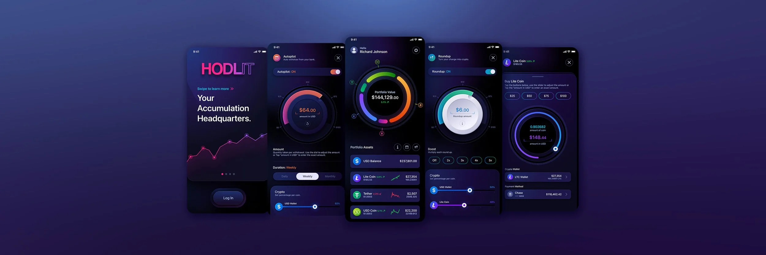
HODLIT
Fintech UI/UX Design Cryptocurrency Exchange Mobile App
The Skins Factory completely redesigned HODLIT’s cryptocurrency exchange mobile application, rebuilding the experience from onboarding through portfolio management, automated investing, cryptocurrency trading, account settings, and referral workflows. The result combined a dark, high-contrast visual system with tactile interaction cues and highly differentiated feature states. Explore more of our fintech UI/UX design work across banking, payments, investing, and financial software.
The Challenge
Making a complex crypto platform feel immediate and intuitive
Users needed to move confidently between onboarding, portfolio balances, individual coin data, buying, selling, sending, automated investing, Roundup features, settings, and referral activity. Each workflow carried financial consequences, so the interface had to feel engaging without obscuring values, actions, system states, or what would happen next.
Our Approach
Using interaction, color, and tactility to clarify every action
We established a panther-black foundation with deep-purple undertones, allowing vibrant gradients, coin colors, and active states to stand apart from the interface. Progress indicators, interactive segmented rings, swipeable asset rows, contextual information panels, and tactile neumorphic controls helped users understand where they were, what they could interact with, and how each action affected their accounts.
★★★★★
“The Skins Factory’s work exceeded my expectations.”
Drew Optebeke, Founder, HODLIT
Sign Up + Login Screens
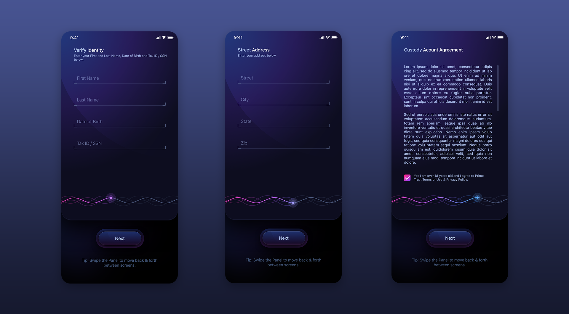
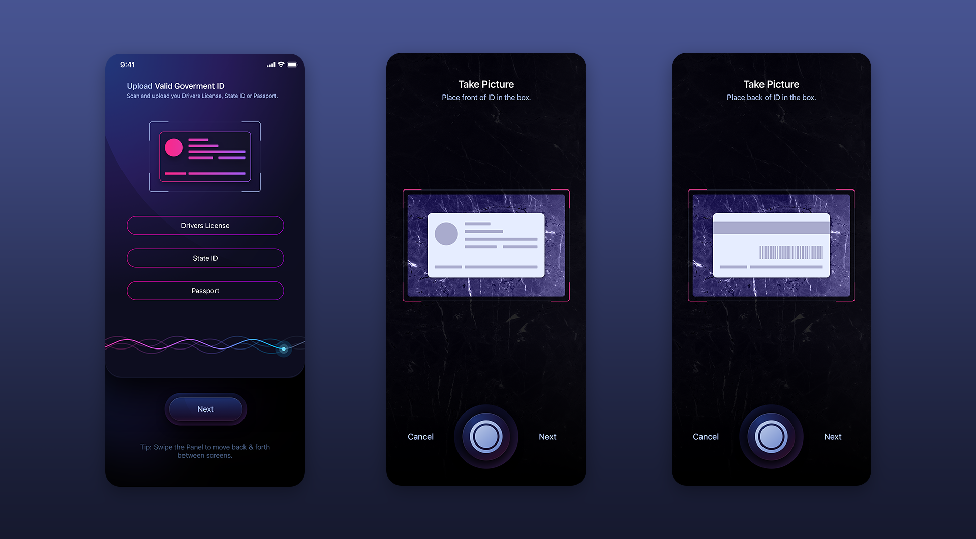
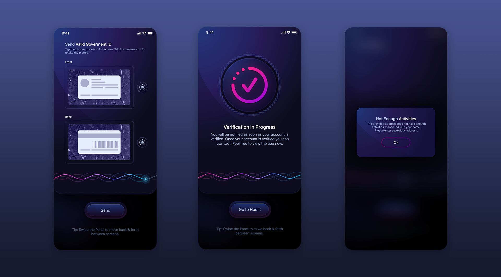
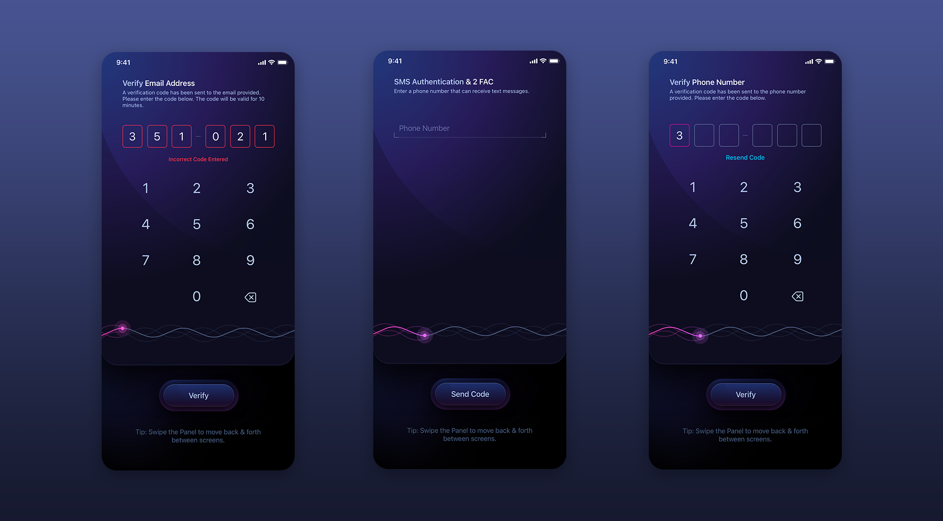
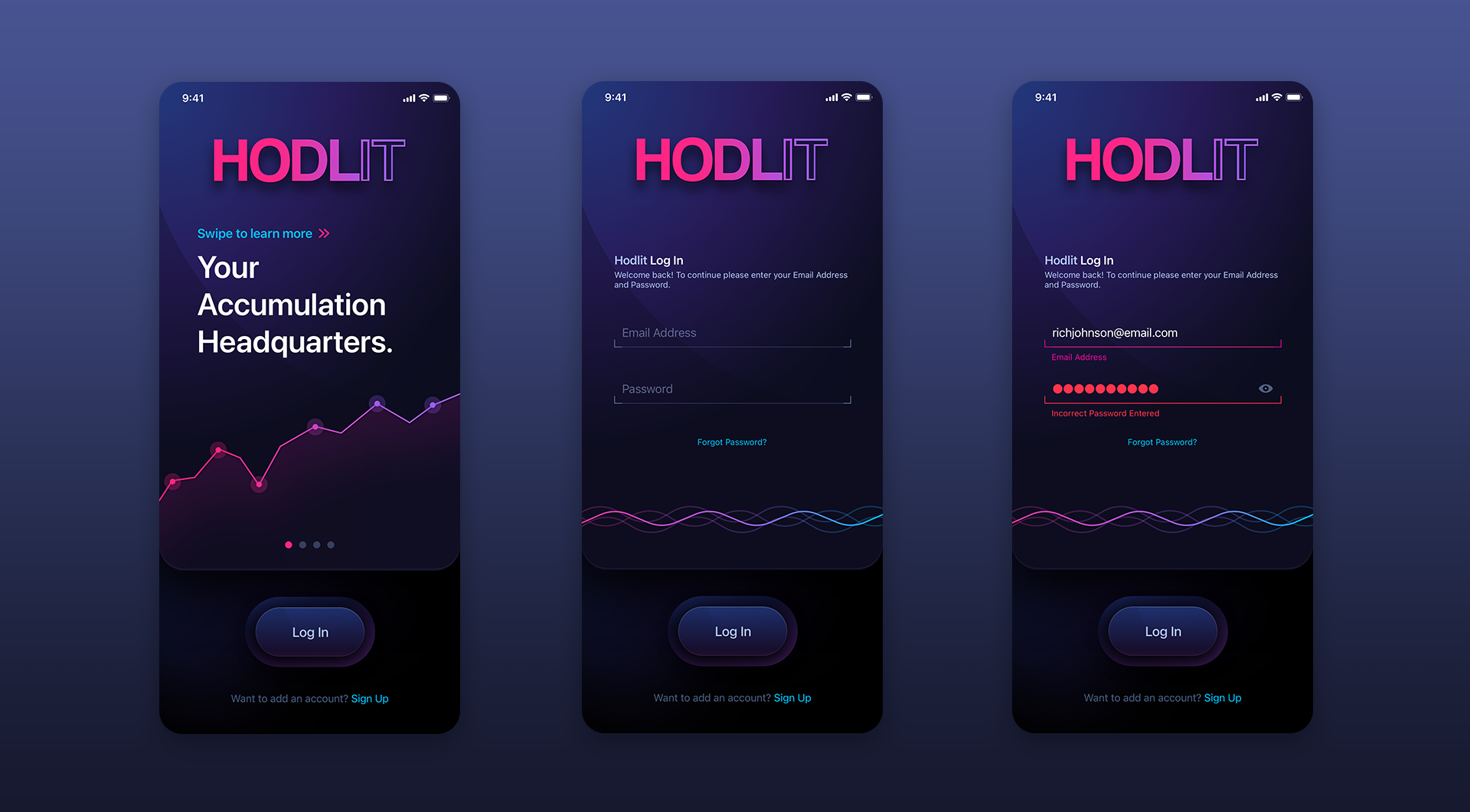
Whenever possible we used progress UI elements to let the user know where they were in the onboarding process - whether it was pagination circles for the “Learn More” elements on the main “Sign Up” screen or the triple, wavy line progress bar at the bottom of each screen.
SIGN UP
Login Screens
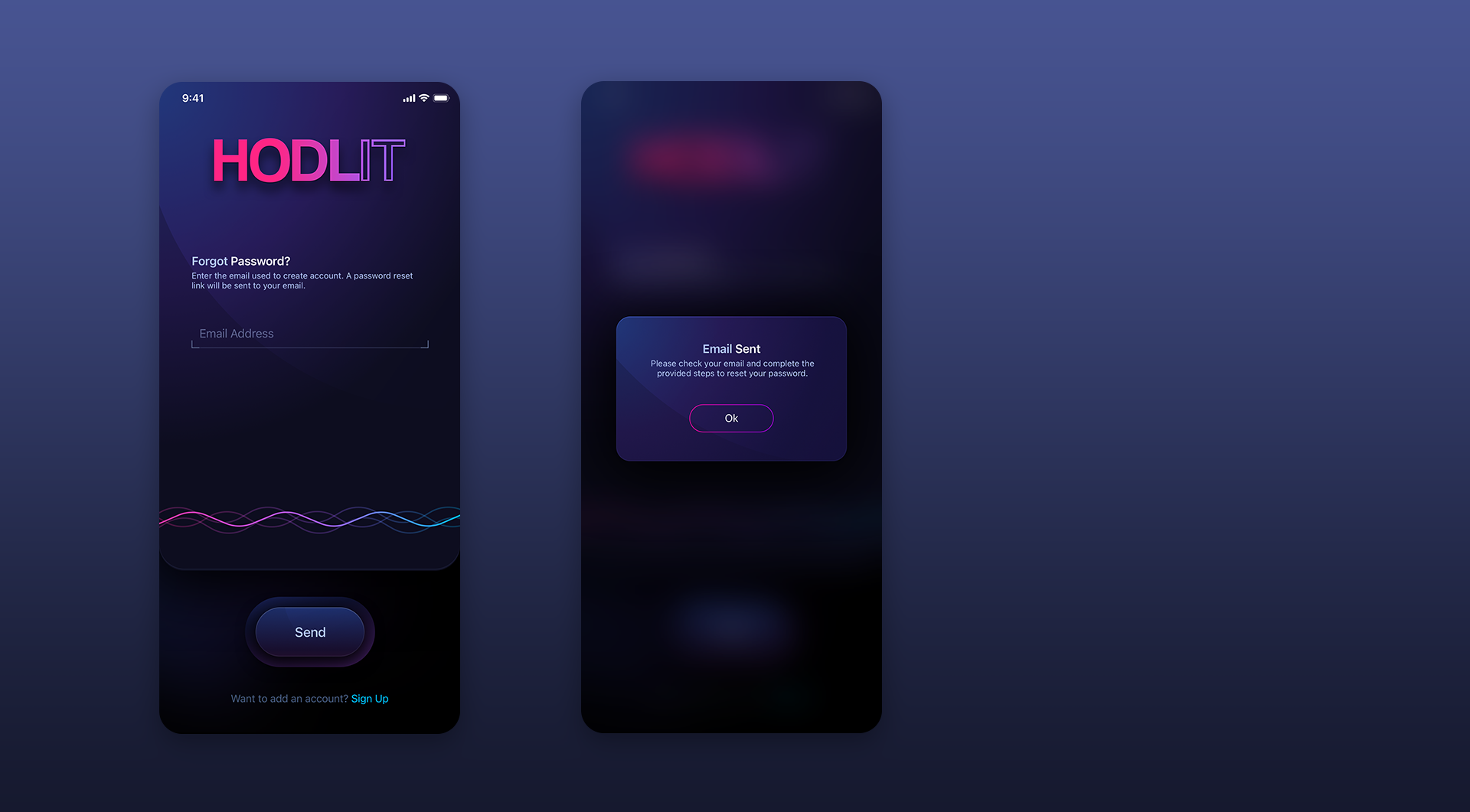
Because Sign Up and Login share a common upper panel design and a similarly shaped “enter” button, the Sign Up button utilizes a pink / purple gradient while Login (below) uses the default deep blue, tactile button to denote that you are already integrated into the application.
Dashboard Screens
Super vibrant colors & gradients greet the user once they complete the onboarding experience.
More than just a “pretty face,” the upper, segmented rings and their coin icons are completely interactive. When a cryptocurrency segmented ring is tapped, the center values change giving the user pertinent information for that coin. We kept the segmented rings solid in their inactive state. Once tapped, the ring becomes an outline. This denotes that the ring’s content has been “emptied” and has moved to the center area.
In the Portfolio Assets section, each row is tappable and swipeable yielding different functionalities depending on how the user interacts with them. To make sure the user experience was intuitive, we included an “i” button that when tapped, releases an info panel explaining to the user how to interact with the content.
Autopilot + Roundup Screens
These automated features allow the user to auto withdraw from their bank (Autopilot) or turn expenditures into additional crypto (Roundup). We designed neumorphic, tactile jog wheels for the users to interact with that really add fantastic visuals while still being functional elements. We used different colors for both the progress rings and jog wheels to discern one from the other.
USD + Bitcoin + Cryptocurrency:
Expanded Information Screens
These screens show the information after a user taps either the USD Balance or Cryptocurrency Coin rows on the Main Home screen.
Expanded Cryptocurrency Coin Info Screen
Expanded USD + Referral Screen
Buy + Sell + Send:
Expanded Information Screens
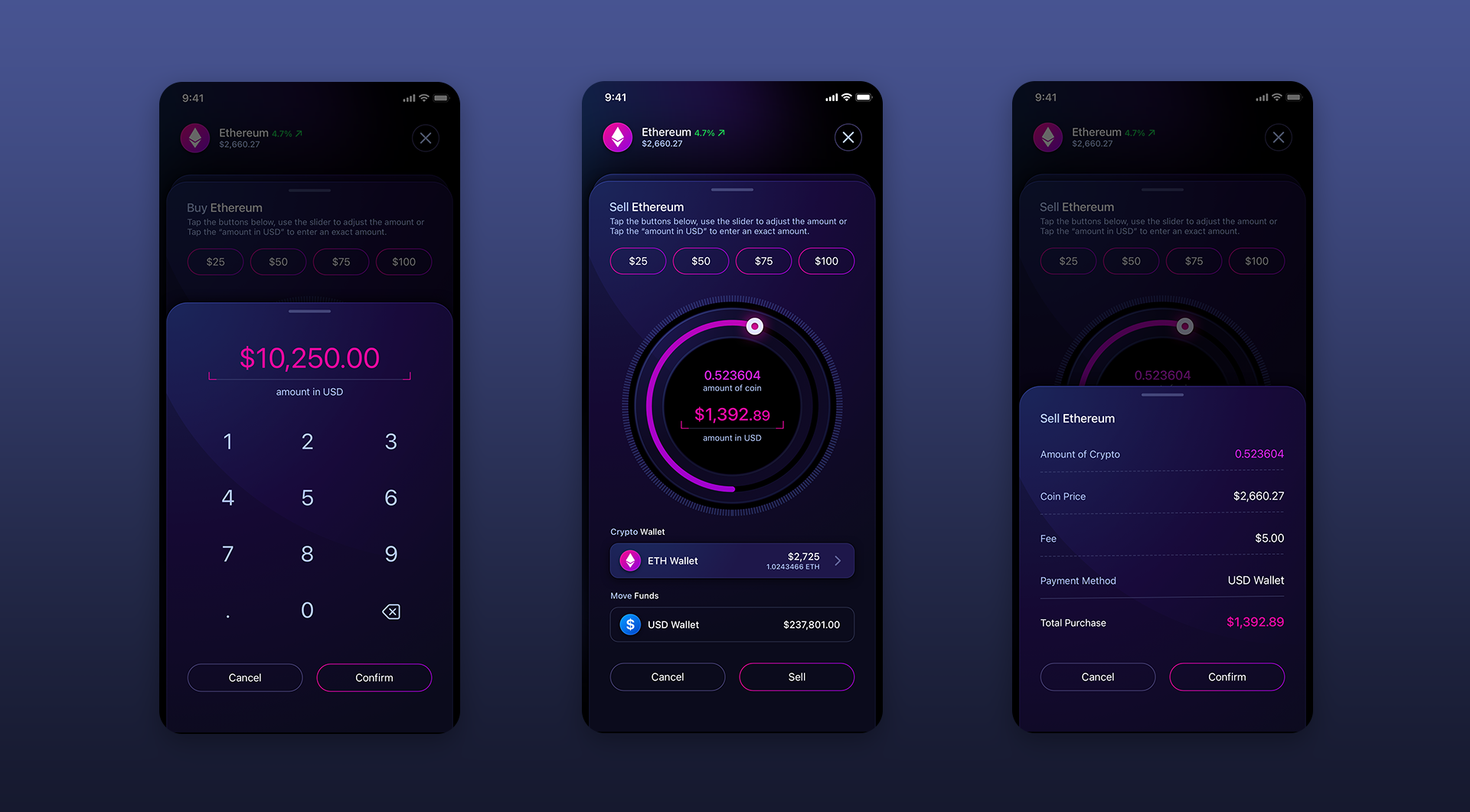
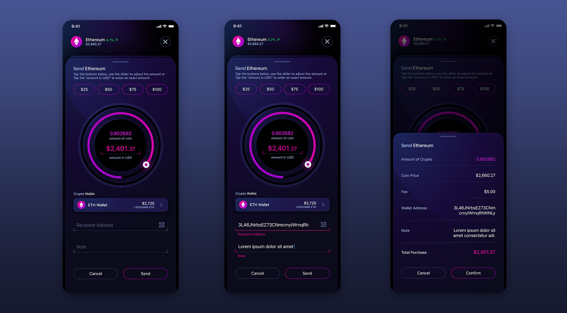
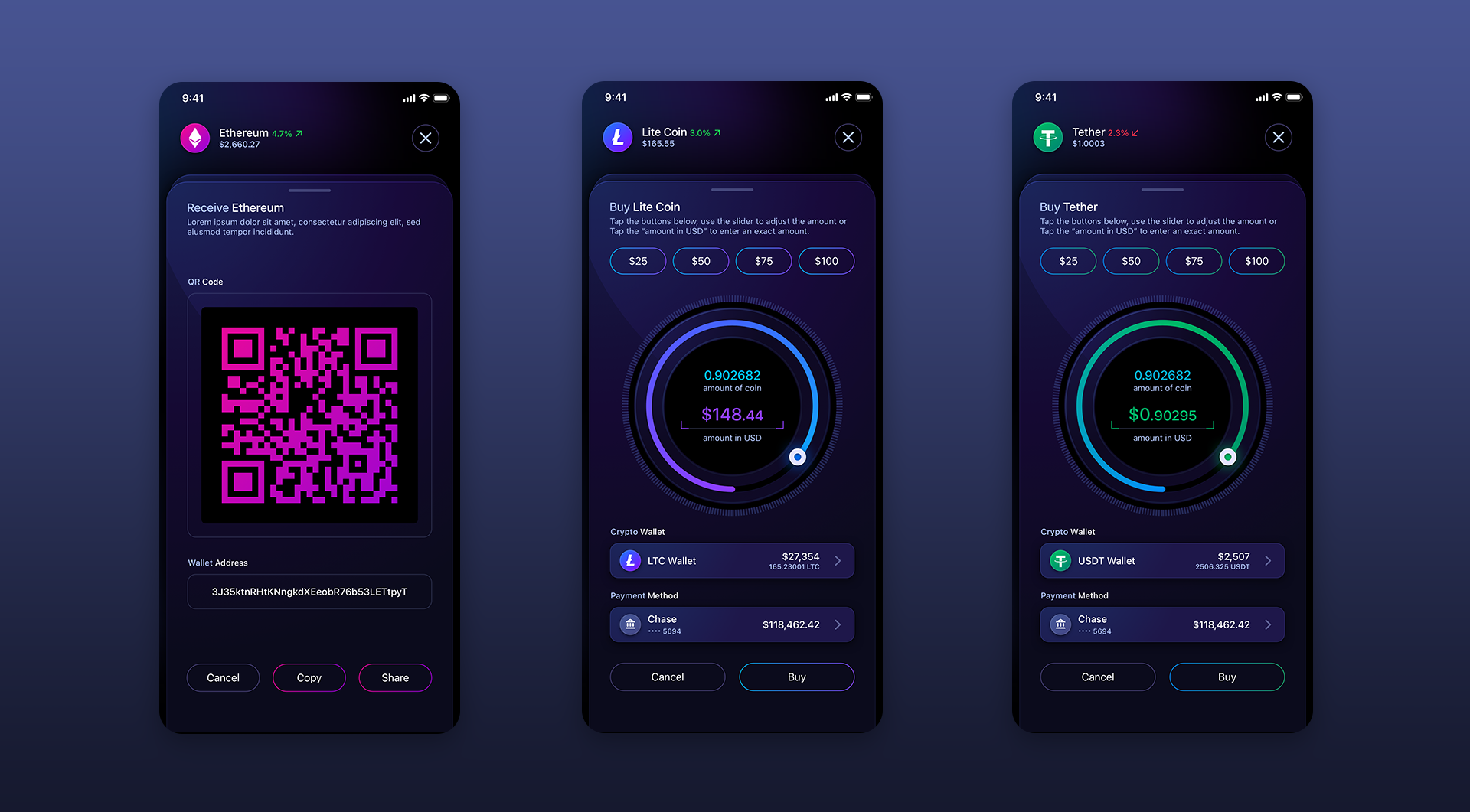
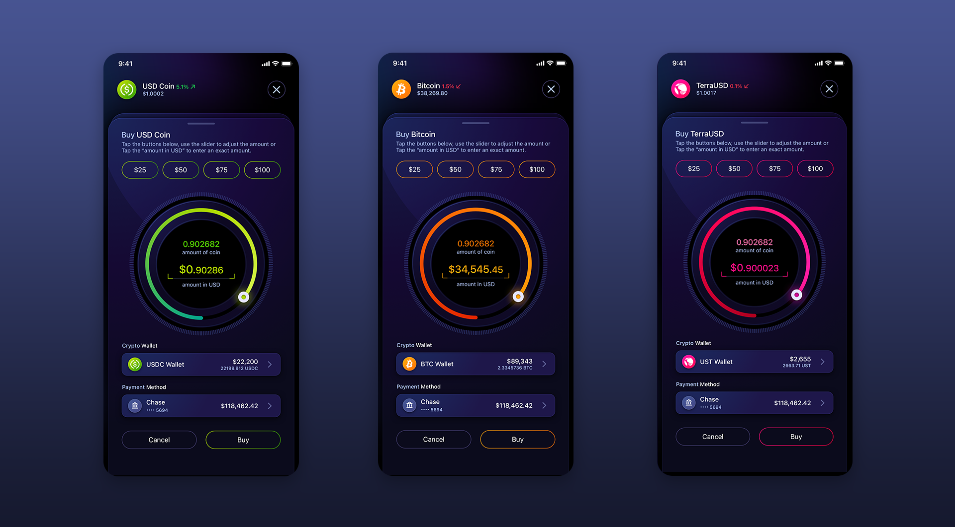
As discussed previously, tapping and swiping rows on the Main Home screen yield different functionalities. The ability to buy, sell and send are as easy as swiping a finger. We used Ethereum for the main design template and designed a few other cryptocurrencies for the client to use.
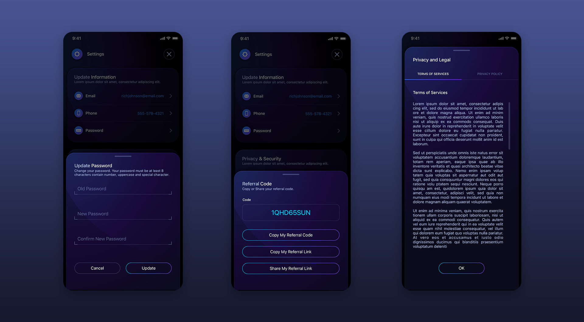
Settings Screens
Referral Program Screens:
Drafted + Passive
These were a 2nd & 3rd design addendum to the project we did for HODLIT as they branch out with their new feature sets. We inverted the interaction design with this ring system to differentiate it from the main dashboard. By default all rings are emptied into the Total Earned data. Tapping a coin segment signals the app you can transfer funds for that specific coin earnings.
Have a project in mind? Let's talk.
Thank you for reaching out.
We will be in touch within one business day.