Design Systems Component Design, Built to Order
Build Once, Scale Forever

The Cost Benefits, Time & Visual Symmetry of a Design System
With our bespoke Design Systems, we can create a comprehensive set of UI component libraries and guidelines that will not only streamline your development process but also ensure consistency and efficiency across all screens and platforms. By implementing a Design System, you can save valuable time and resources by reusing pre-designed components and styles. This eliminates the need to reinvent the wheel for every screen, allowing you to focus on the unique aspects of your application while maintaining a cohesive and visually appealing design language.
Our team of experienced user interface designers will work closely with you to understand your specific requirements and goals. We will then create a Design System that encompasses all the necessary components, including buttons, forms, navigation elements, typography, and more. Furthermore, our Design Systems are designed to be scalable and adaptable, allowing for future growth and expansion of your application without compromising the visual design language. This ensures that your application will continue to look and feel cohesive and polished as it evolves well into the future.
As AI plays a larger role in how products are built and experienced, having a custom Design System matters more than ever. AI-driven interfaces need a defined visual language to draw from, and a well-crafted system ensures that everything your product generates stays on-brand, consistent, and polished. We can help you get there.
What is a Style Guide?
A Style Guide serves as a comprehensive set of standards or guidelines for code developers, providing them with essential information about the project's primary color palette, typography, including font weights and sizes, as well as crucial details on spacing and margin. It is important to note that Brand Style Guides and UI Style Guides have slight distinctions. The UI Style Guide is usually incorporated into the UI Kit. However, for the purpose of this discussion, we will separate them into distinct entities.
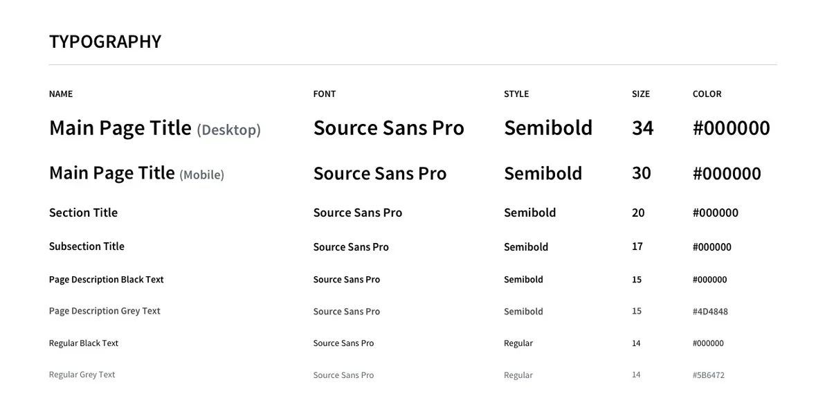
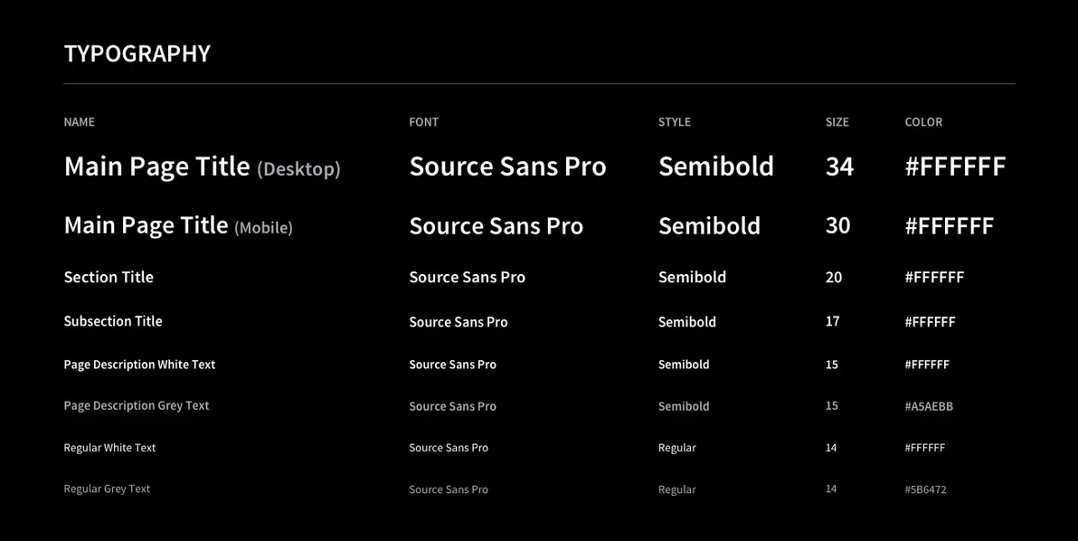
Typography Samples in Light + Dark Mode
Light and dark mode are no longer optional features, they're now a standard expectation across modern user interfaces. With operating systems and applications increasingly defaulting to user-selected themes of "Day" or "Night", interfaces must perform seamlessly in both environments. A comprehensive style guide should reflect this reality by including typography samples for light and dark modes, ensuring that type choices, contrast levels, and hierarchy translate consistently across each. What works in light mode doesn't automatically hold up in dark mode, so defining both prevents inconsistencies, accessibility issues, and visual breakdowns during development. By accounting for both from the outset, design systems become more adaptable, future-proof, and aligned with how users actually experience today's interfaces.
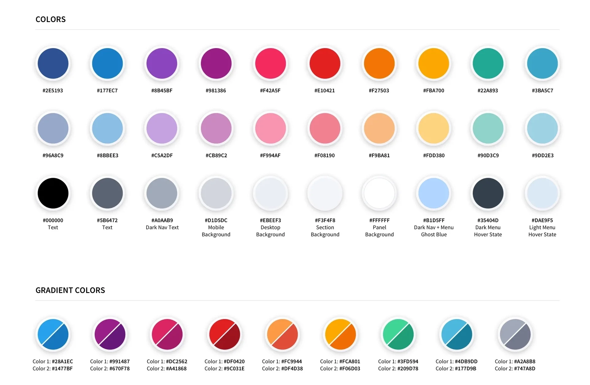
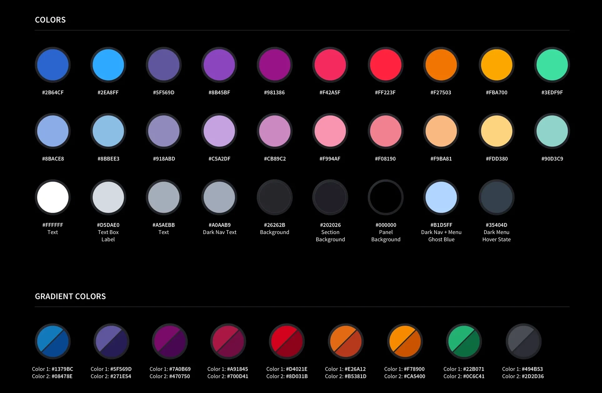
Color Palette Samples in Light + Dark Mode
A design system's color palette is more than a set of swatches, it's the emotional and functional language of the entire product. This particular palette shown below, spans 30 solid colors organized across three tiers: a vibrant primary row of saturated hues (navy, sky blue, purple, magenta, crimson, orange, amber, teal) for brand-forward elements; a softer secondary row of their tinted counterparts for supporting UI states, hover effects, and clicks; and a carefully considered neutral tier covering everything from pure black text to ghost whites and nav-specific dark modes.
Together, they give designers and developers a complete, intentional toolkit, one where every color choice is documented, purposeful, and ready to scale.

Margin & Spacing Guides Samples in Light + Dark Mode
Consistent spacing is the invisible backbone of a well-crafted interface. This margin guide defines the precise padding and layout rules for both desktop and mobile panels — ensuring every component breathes uniformly across breakpoints. The result is a system that doesn't just look consistent, it is consistent, by design.
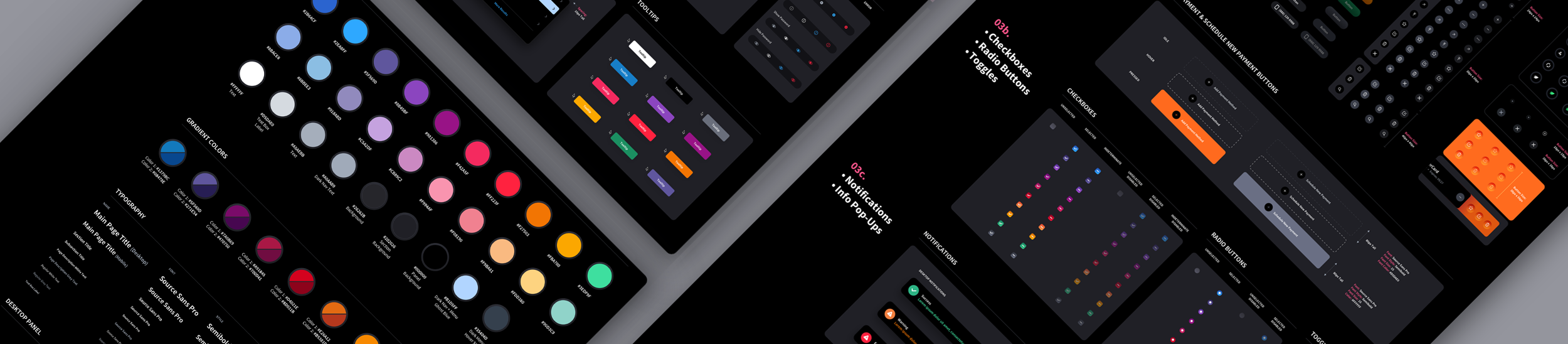
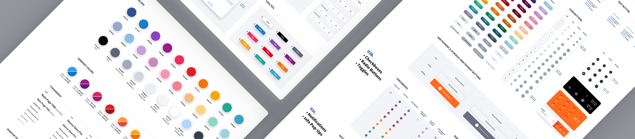
What is a UI Kit?
A UI Kit serves as a comprehensive library of user interface components that are essential for any UI/UX design project. It includes all necessary interface elements, such as control states, icons, modals, menus, and standard navigational elements. Additionally, it may also contain extra assets to ensure future scalability while maintaining visual quality & consistency. Our team has compiled a list of the most commonly used UI components. During the project, we extract completed components from the final source file (Sketch or Adobe Photoshop PSD files) and organize them into Master Source Files. Any components not initially designed during production will be created and included in the Master Source File. Furthermore, if there are specific components that our clients require but are not on our list, we can create them to meet their needs. The entire process typically takes about two weeks to complete.

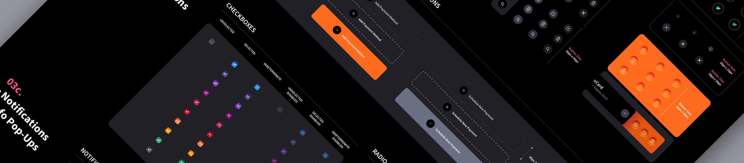
Table Samples in Light + Dark Mode
The design system's table component demonstrates how thoughtful theming can serve both clarity and brand cohesion across radically different environments. What's particularly notable is the expandable row pattern, where nested sub-rows reveal additional detail without breaking the visual rhythm of the table. This kind of multi-mode flexibility is a deliberate system for placing the same data-dense component inside pages with varying background imagery or color weight, ensuring legibility and visual hierarchy are preserved whether the table sits on white, charcoal, or pitch black. The result is a component that feels native to its context rather than dropped in, which is the hallmark of a mature design system.
A custom design system offers a plethora of benefits, particularly for organizations looking to establish a strong brand identity and streamline their design processes. Here are the Top 7 advantages:
A custom design system ensures visual and functional consistency across all digital products and platforms. This consistency helps in building brand recognition and trust among users.
By providing a set of reusable components, patterns, and guidelines, a design system accelerates the development process. Designers and developers can quickly iterate on designs and build new features without reinventing the wheel each time.
As the organization grows and introduces new products or features, a well-designed system can scale effectively. It allows teams to maintain coherence and coherence in design even as projects become more complex.
Design systems encourage collaboration between design and development teams. They provide a shared language and reference point, reducing miscommunication and ensuring everyone is on the same page.
While there's an upfront investment in creating a custom design system, the long-term benefits outweigh the initial costs. By streamlining processes, reducing development time, and minimizing design debt, organizations can save money in the long run.
A custom design system can be tailored to suit the specific needs and branding requirements of an organization. Unlike off-the-shelf solutions, a custom system offers flexibility and can adapt to evolving design trends and business goals.
Design systems help in reinforcing brand identity by ensuring that every interaction with users reflects the organization's unique style and values. Consistent branding across all touchpoints fosters brand loyalty and recognition.
Now that you have some knowledge about UI Kits & Style Guides, it's important to note their limitations. They won't magically transform your developers into UX design experts. However, they will assist in the creation of new screens based on the same design language used in your project. For example, if The Skins Factory designs a form screen for your software application and you require 6 additional form screens, as long as there are no user experience tasks involved, we can bypass designing them and entrust your development team to handle it using our bespoke design system to build out the subsequent screens. This approach can significantly reduce product design costs since UI/UX designers typically command higher rates than developers.
Interested in building a custom design system for your product? The Skins Factory specializes in bespoke UI kits and style guides designed to scale with your product, whatever the future brings.

View Project: ACI Worldwide Biller Design System in Dark Mode
View Project: ACI Worldwide Biller Design System in Light Mode
There's a quiet assumption that AI will eventually generate interfaces on its own, making a structured design system feel like overhead. The opposite is true. AI tools are only as consistent as the system they draw from. Hand a model a loose collection of screens and it will produce loose, off-brand output. Give it a documented design system, a defined component library, a fixed color palette, real spacing rules, and named interactive states, and every interface it touches inherits that discipline. The system becomes the guardrail that keeps AI-assisted work on-brand instead of approximately on-brand.
This is where a bespoke UI component library earns its keep. Design tokens, button states, table patterns, and typography scales are not just developer convenience anymore. They are the source of truth an AI references when it builds, fills, or extends a screen. A product with a mature system can move faster with AI because there is something authoritative to point at. A product without one inherits the model's guesswork. The teams winning right now are not the ones who skipped the system. They are the ones who invested in it early and now have a foundation that AI can actually build on.
We're publishing a deeper look at AI design systems for B2B SaaS, including a full playbook and a companion glossary of the terms that matter. Those resources are on the way. In the meantime, if you're weighing whether to build a custom design system before leaning harder into AI-assisted development, the short answer is that the system should come first.
Read the Article: The 2026 B2B SaaS AI Design System Playbook
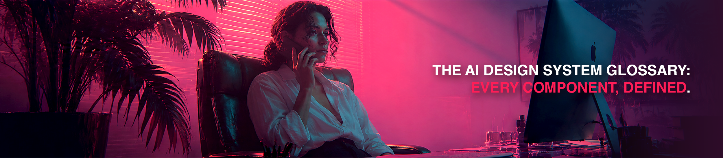
Read the Article: The 2026 Glossary of AI Design System Components for B2B SaaS
Need a Design System? Let's chat.
Thank you for reaching out.
We will be in touch within one business day.