
Before & After: Comparing 5 UI/UX Design Projects
5 UI/UX Design Projects:
Before & After Comparisons.
Good design is not invisible. It is the difference between software people use and software people avoid. These five real-world redesigns show exactly what changes when a product finally gets the design investment it deserves.
Side by side. No spin. Just the work.
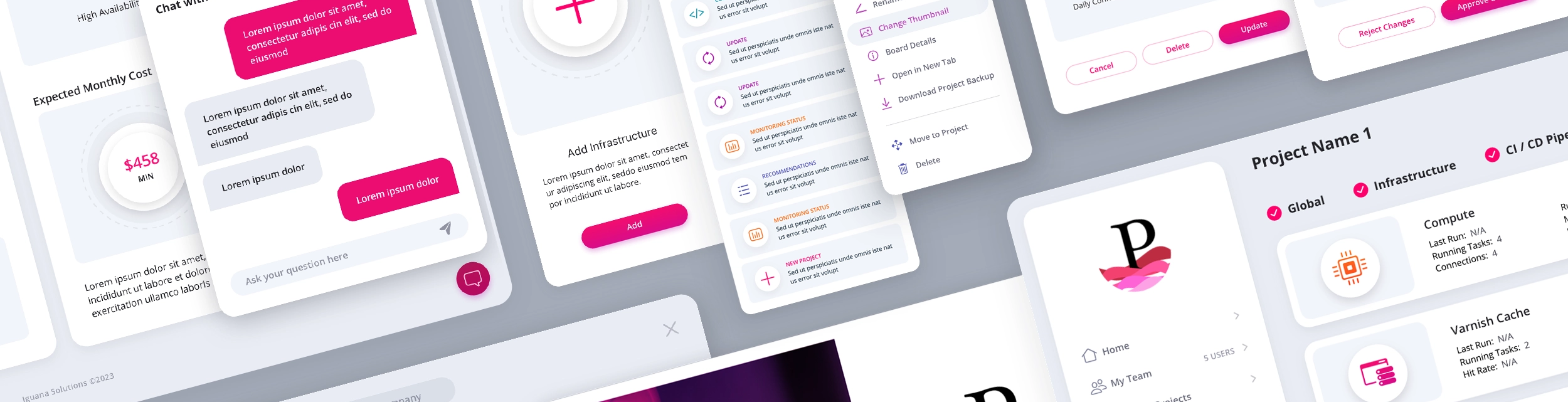
Before and After: The Skins Factory Effect
The transformative impact of The Skins Factory's UI/UX design is vividly captured in the before-and-after shots of our projects, showcasing not just a change in appearance but an evolution in user experience. Let's delve into the differences we make when we take on a design project.
FortifyData
Cybersecurity UI/UX Redesign · Risk Management Web Application
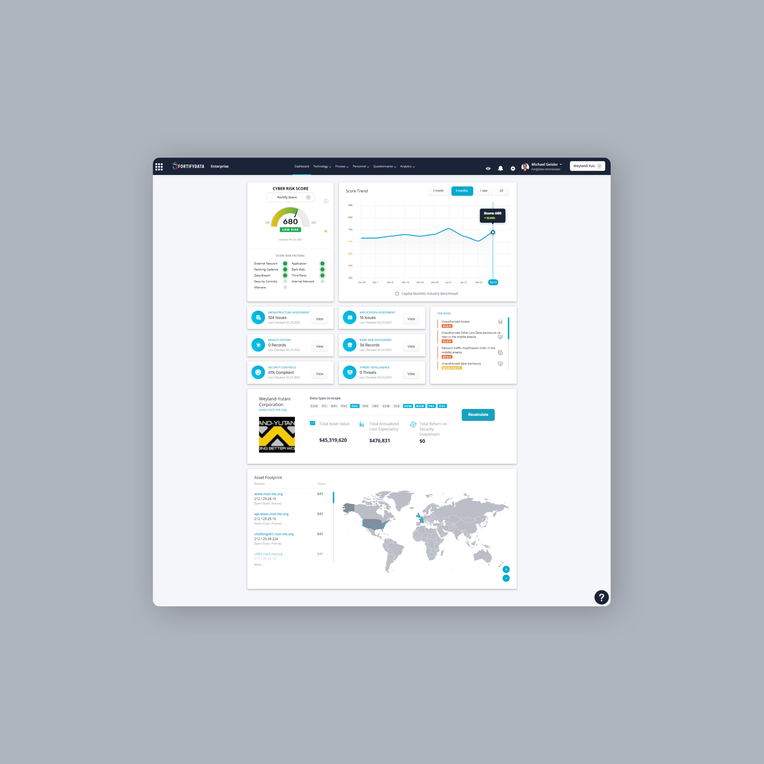
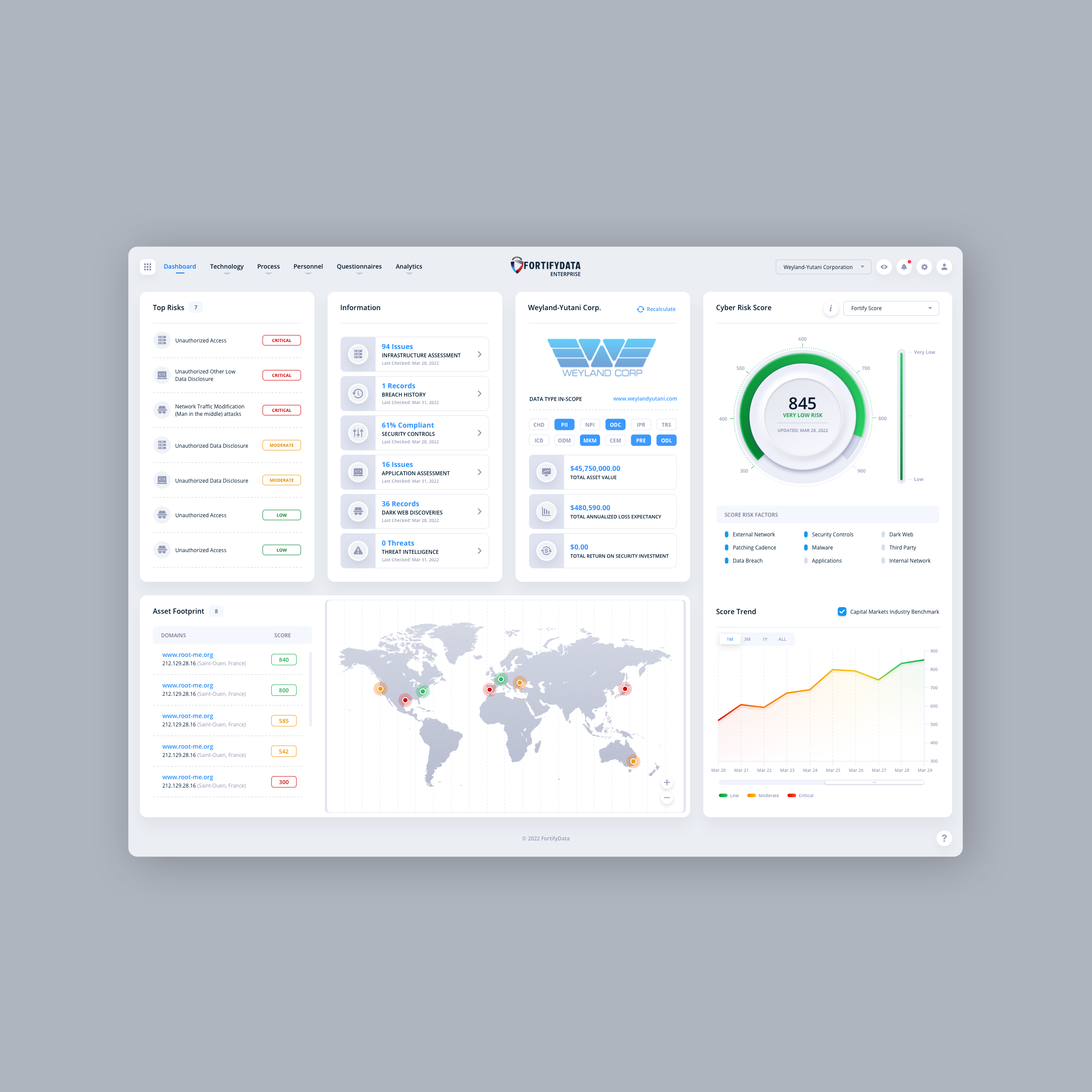
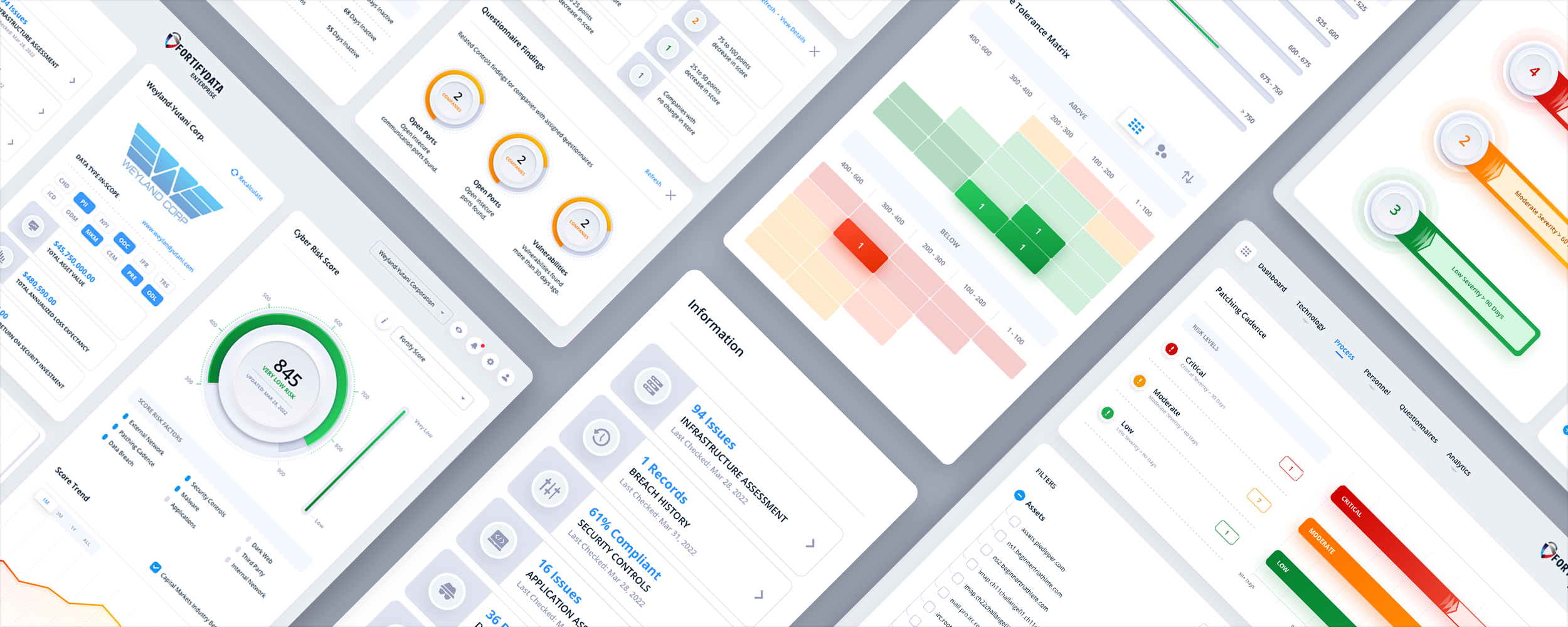
The Skins Factory redesigned FortifyData’s cybersecurity risk management platform across more than 40 screens, creating a clearer, more modern experience for teams managing exposure across the full attack surface. The work spanned enterprise risk and third-party risk management, bringing complex security data, analytics, and workflows into one cohesive product experience.
The Challenge
Making the entire attack surface easier to understand
FortifyData had to present risk scores, threat events, infrastructure data, asset inventories, vendor assessments, and due-diligence workflows without overwhelming expert users or stripping away the detail they rely on. The existing experience needed stronger hierarchy, faster scanning, and a more consistent way to move through data-dense tasks.
Our Approach
Turning complex risk data into a decision-making system
We organized the experience around the questions security teams needed to answer: where exposure was increasing, what was driving the risk score, which assets or vendors required attention, and what action should happen next. Risk scores became entry points into the findings beneath them, while contextual slide-in panels let users review, filter, and act on information without losing their place in the platform.
Iguana Solutions USA
DevOps Platform UI/UX Design · Web Application
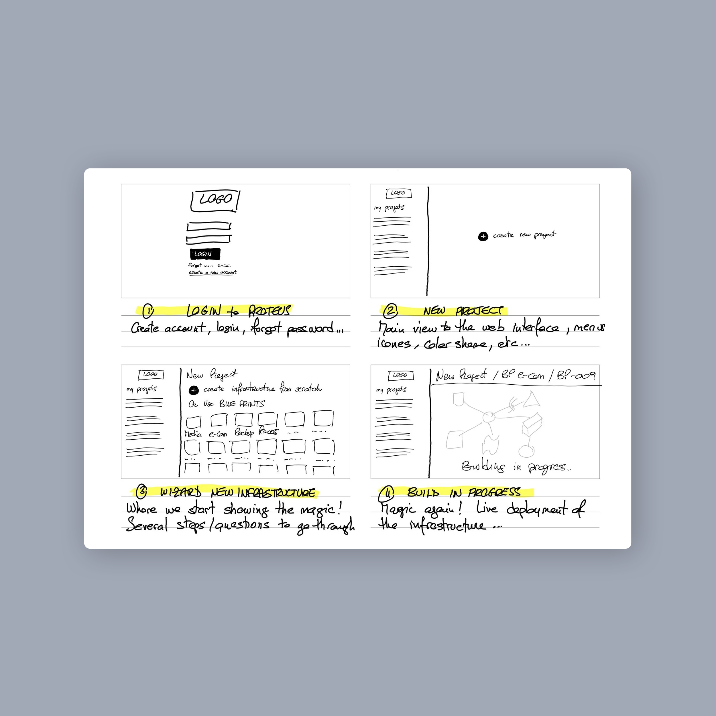
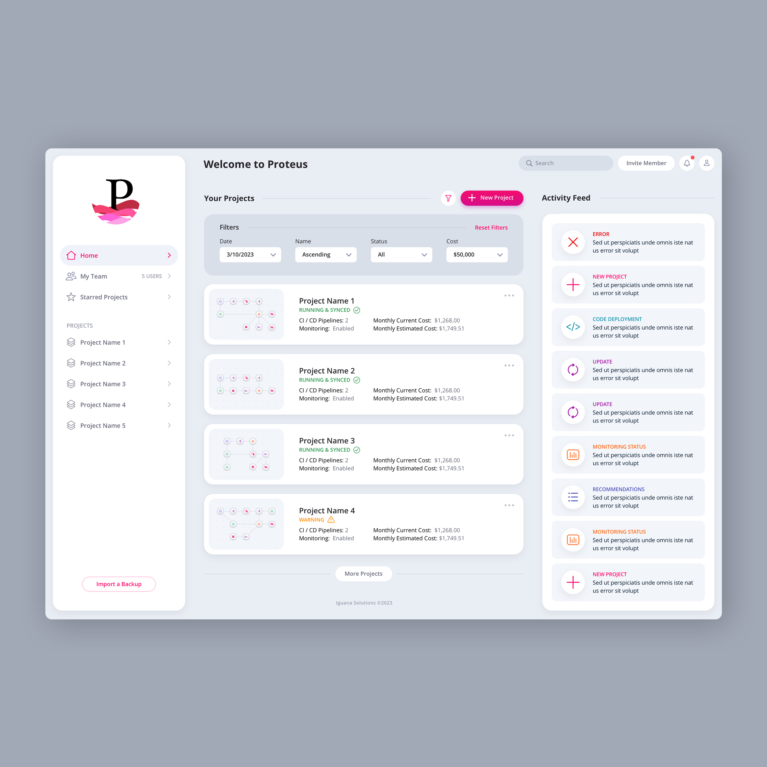
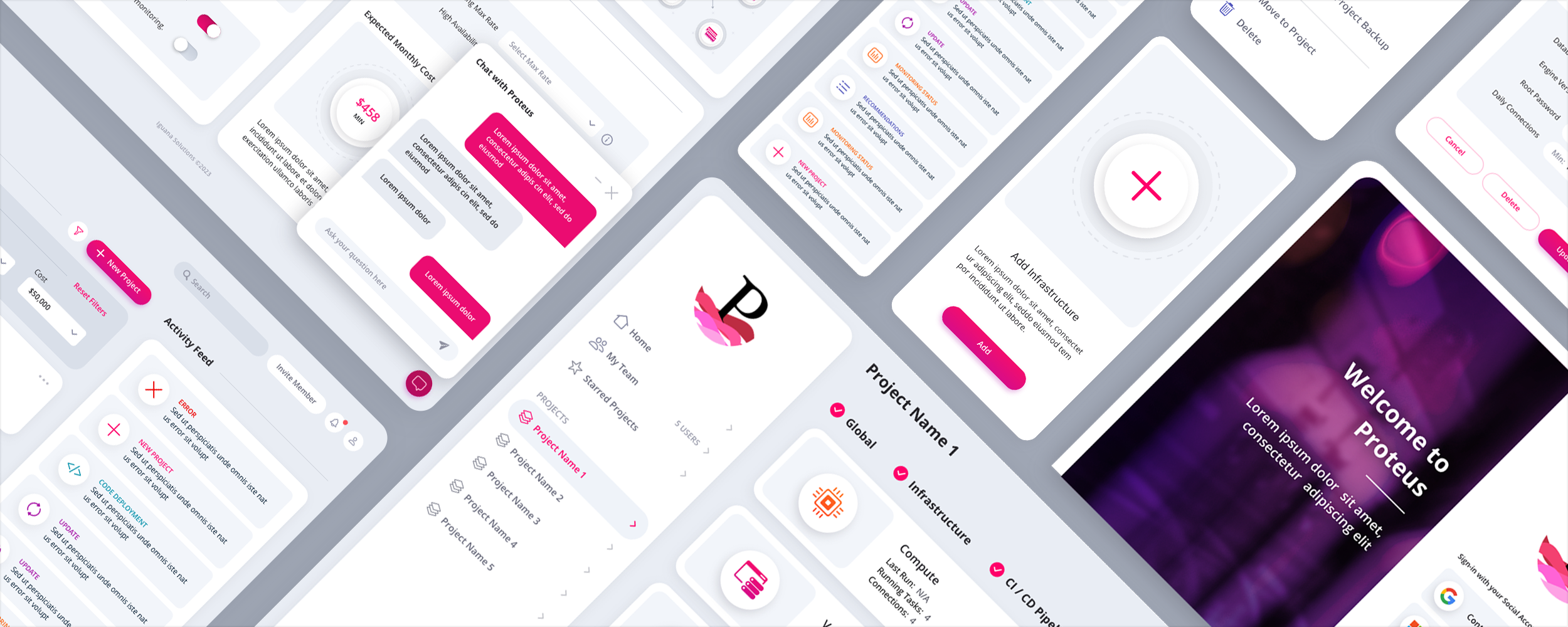
The Skins Factory designed the complete UI/UX for Iguana Solutions USA’s DevOps and managed services platform, transforming low-fidelity wireframes into a polished application for creating projects, configuring infrastructure, deploying environments, and monitoring complex systems across physical, cloud, and hybrid platforms.
The Challenge
Making complex infrastructure easier to build and manage
Engineers needed to move quickly between project status, infrastructure configuration, deployment progress, monitoring data, filters, and activity feeds. The platform had to support dense, highly technical workflows while avoiding excessive scrolling and keeping critical controls, system states, and project information easy to find.
Our Approach
Turning infrastructure configuration into a visual workflow
We organized the experience around the full infrastructure lifecycle, from creating a project and selecting a blueprint to configuring, deploying, and monitoring the environment. A collapsible sidebar reclaimed space for the Infrastructure Grid, while zoom controls, tactile drag-and-drop components, illuminated placement guides, and explicit deployment states made complex technical actions easier to understand and control.
HODLIT
Fintech UI/UX Design · Cryptocurrency Exchange Mobile App
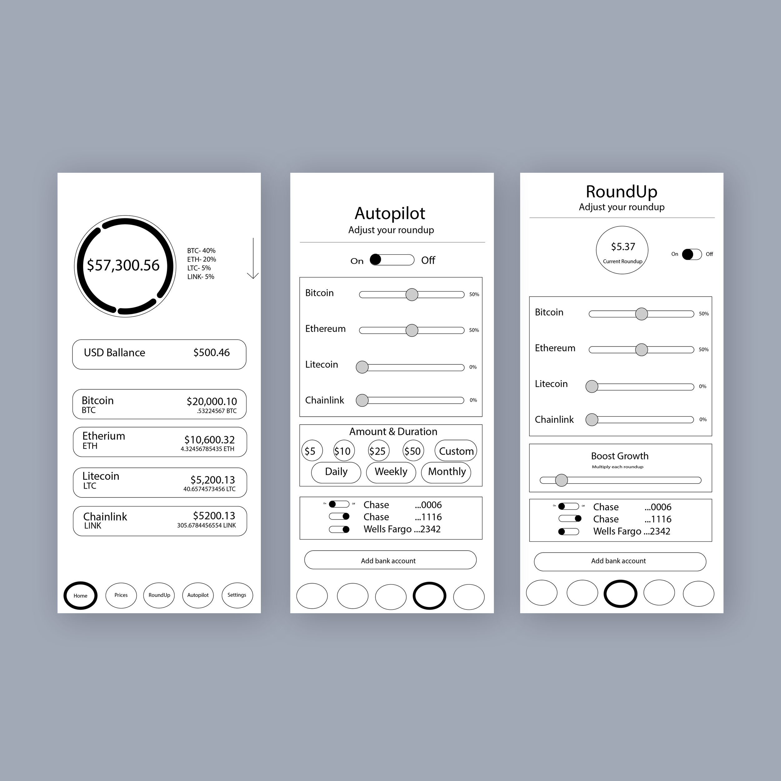
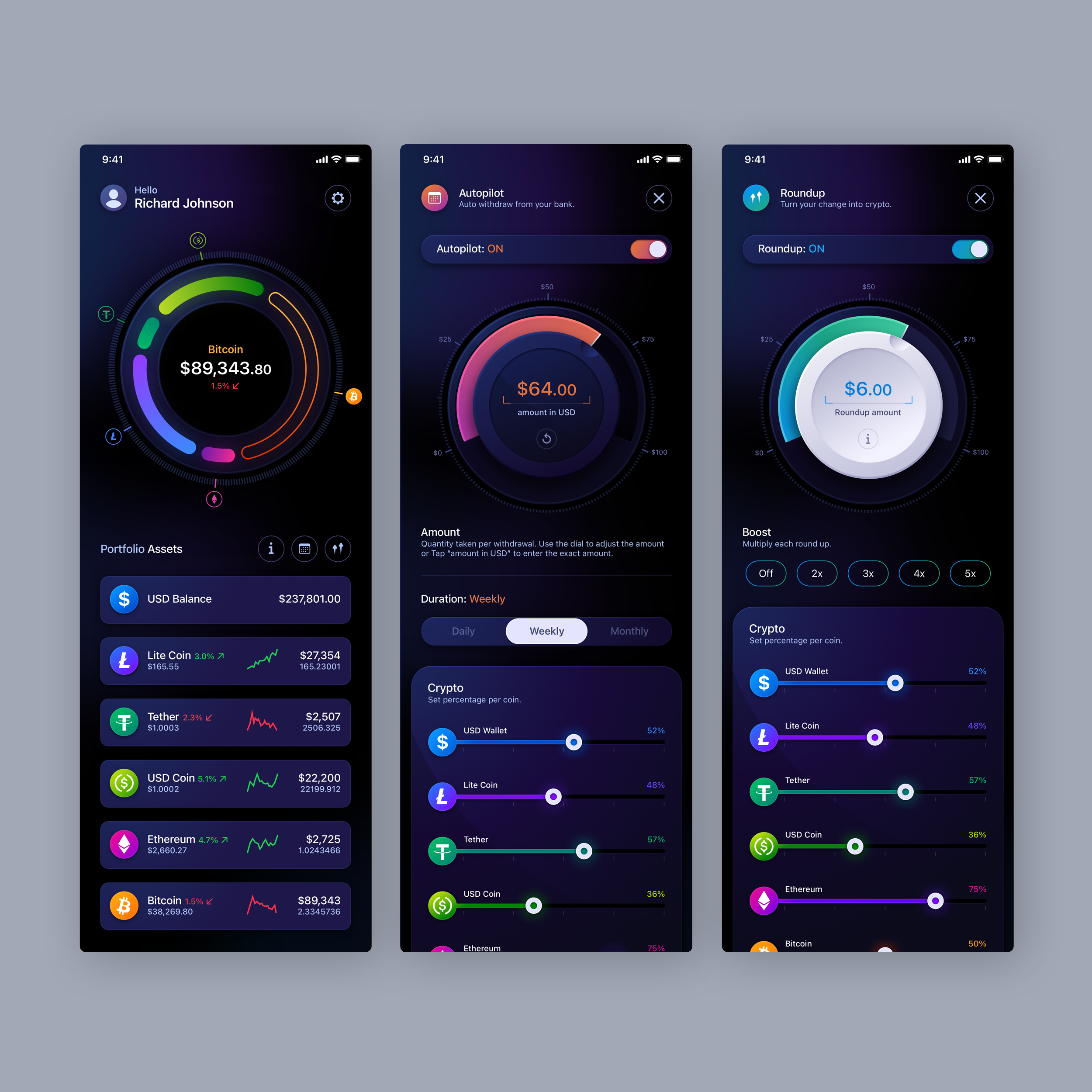
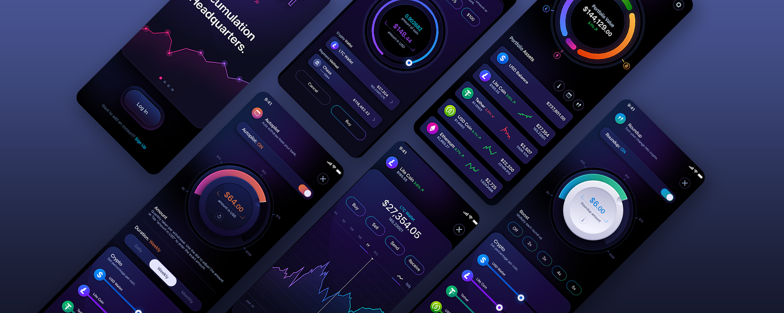
The Skins Factory completely redesigned HODLIT’s cryptocurrency exchange mobile application, rebuilding the experience from onboarding through portfolio management, automated investing, cryptocurrency trading, account settings, and referral workflows. The result combined a dark, high-contrast visual system with tactile interaction cues and highly differentiated feature states.
The Challenge
Making a complex crypto platform feel immediate and intuitive
Users needed to move confidently between onboarding, portfolio balances, individual coin data, buying, selling, sending, automated investing, Roundup features, settings, and referral activity. Each workflow carried financial consequences, so the interface had to feel engaging without obscuring values, actions, system states, or what would happen next.
Our Approach
Using interaction, color, and tactility to clarify every action
We established a panther-black foundation with deep-purple undertones, allowing vibrant gradients, coin colors, and active states to stand apart from the interface. Progress indicators, interactive segmented rings, swipeable asset rows, contextual information panels, and tactile neumorphic controls helped users understand where they were, what they could interact with, and how each action affected their accounts.
★★★★★
“The Skins Factory’s work exceeded my expectations.”
Drew Optebeke, Founder, HODLIT
Hi Dog Gaming Platform
Gaming UI/UX Design · Windows Desktop Client Application
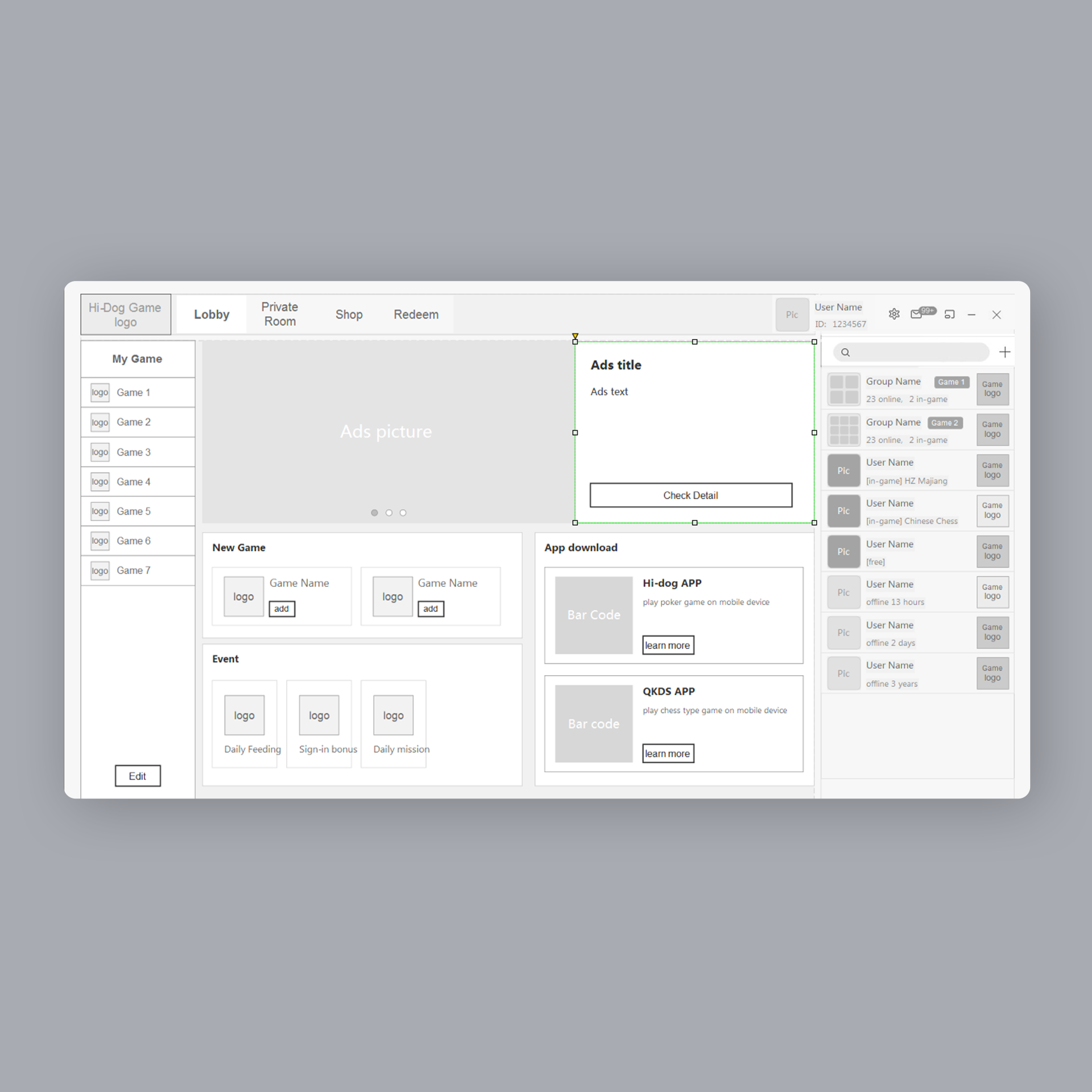
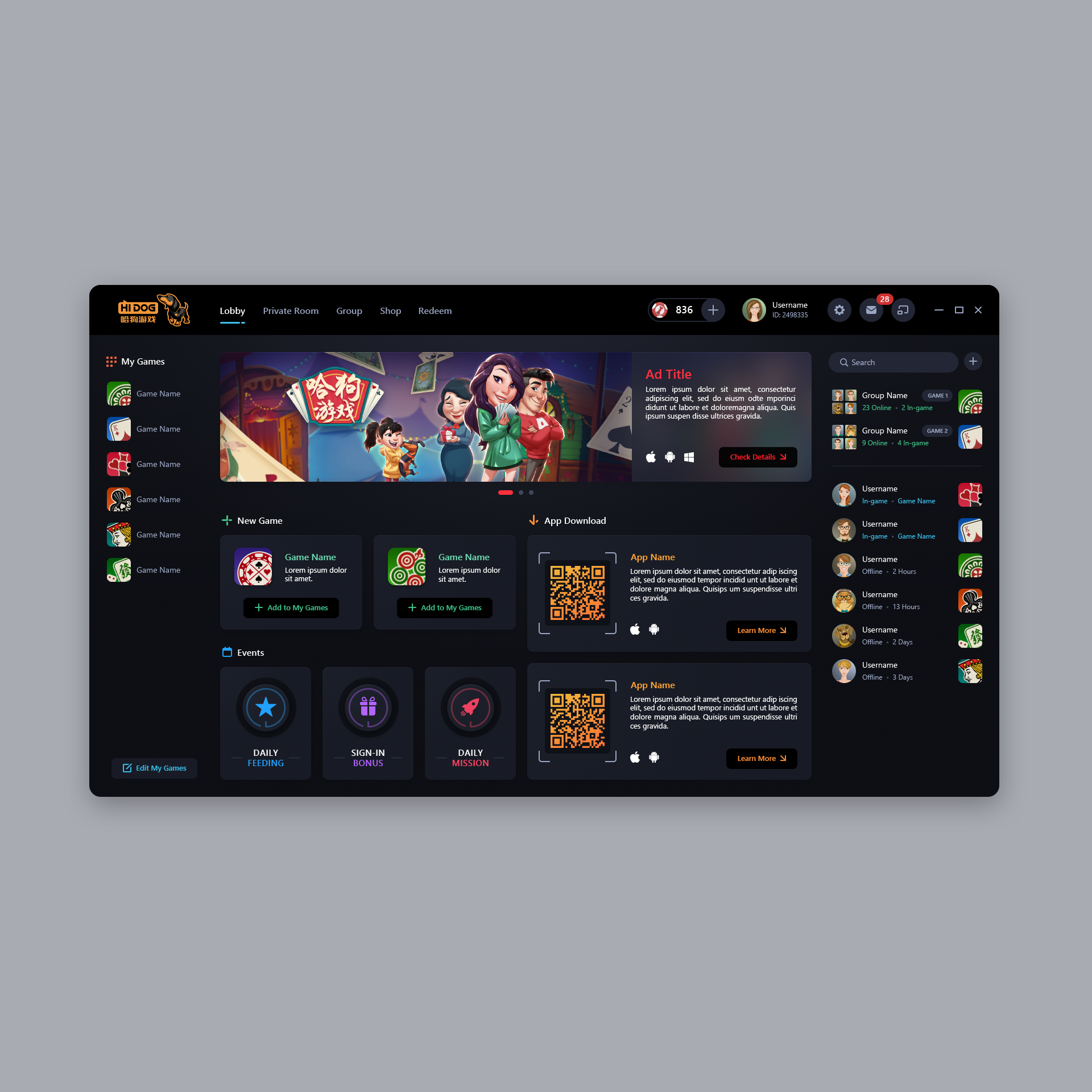
The Skins Factory designed the UI/UX for Hi Dog’s Windows desktop gaming client application, transforming a series of low-fidelity wireframes into an immersive platform for discovering games, joining matches, interacting with other players, creating private rooms, and managing in-game achievements.
The Challenge
Bringing an entire gaming ecosystem into one client
The application had to support game discovery, match preparation, player profiles, chat, invitations, groups, private rooms, billing, and in-game currency without feeling fragmented or difficult to navigate. Each area needed its own purpose and energy while still feeling like part of one cohesive desktop gaming experience.
Our Approach
Designing around discovery, competition, and community
We created a restrained charcoal foundation that allowed Hi Dog’s colorful avatars, game artwork, banners, and interactive states to command attention. The interface established clear paths between the lobby, game library, match experience, social features, and player account areas, while distinctive progress indicators, invitations, panels, and room controls kept fast-moving actions easy to understand.

340B Contract Pharmacy Management
Healthcare SaaS UI/UX Design · Responsive Web Application
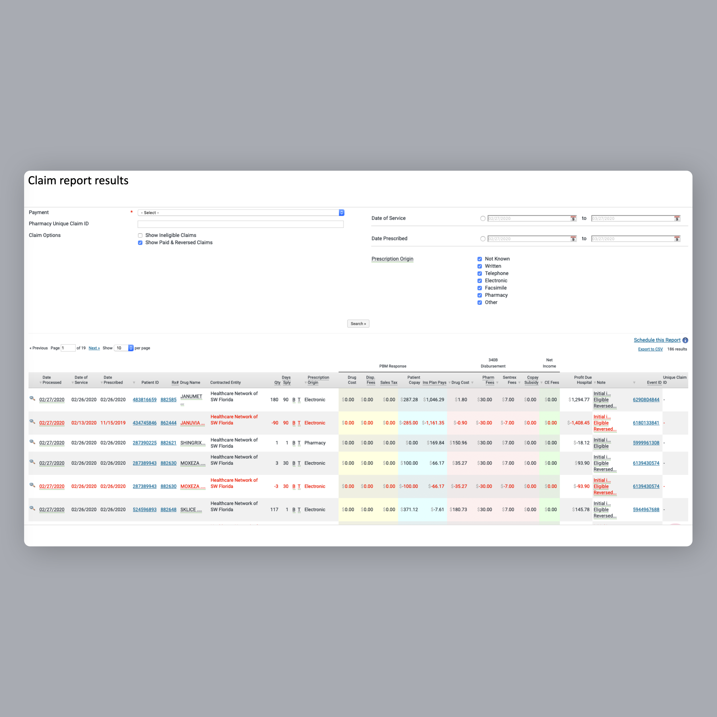
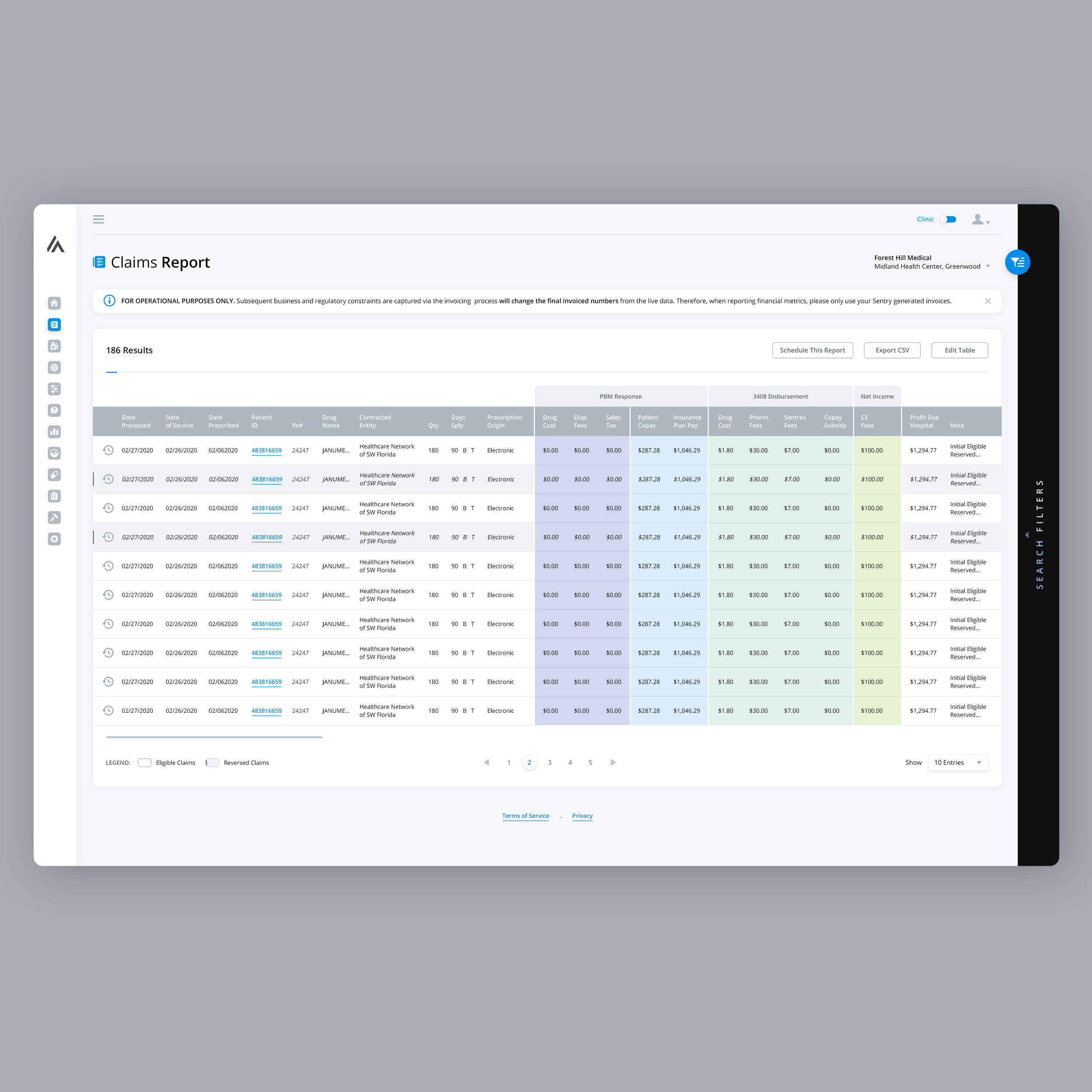
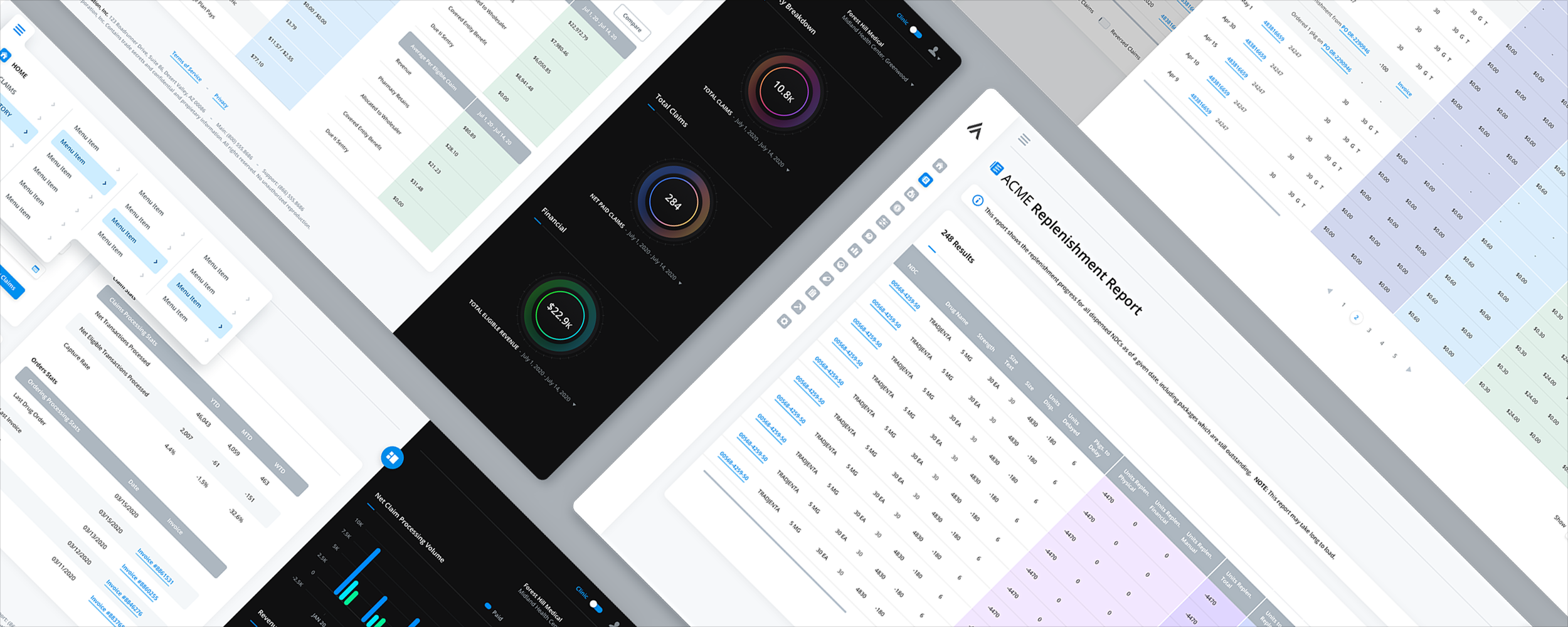
The Skins Factory redesigned a responsive 340B contract pharmacy management application spanning dashboards, replenishment and claims reports, blacklisted drugs, financials, general setup, and patient and provider tools. The work focused on making exceptionally wide, data-heavy workflows easier to navigate while preserving the detailed information hospital and pharmacy teams needed to manage their day-to-day operations.
Confidentiality notice: The client and service names presented in this project have been changed to protect the client’s identity.
The Challenge
Designing around tables too wide for conventional enterprise layouts
Replenishment, claims, financial, and inventory workflows required users to work with unusually large numbers of columns, extensive search filters, secondary details, and related actions. Conventional table layouts would have produced excessive horizontal scrolling and page height, while opening each secondary workflow in a separate screen or modal could interrupt the user’s work and make it harder to maintain context.
Our Approach
Giving dense information more room while keeping users in context
We designed key table views at 3840 pixels wide and used colored vertical column groups to visually break apart long horizontal datasets. A Column Edit feature allowed users to select and reposition the information displayed in each table, while search filters were contained in collapsed overlay sidebars. Secondary workflows opened in responsive slide-in panels instead of modals or separate pages, and compact, expandable navigation preserved additional space for the application’s data.
Common questions about redesigning software.
What does a UI/UX redesign improve besides the way software looks?
A real UI/UX redesign improves how people understand, navigate, and use a product. Visual modernization is only part of the work. A redesign can also improve information architecture, workflow clarity, screen hierarchy, interaction patterns, accessibility, and the way complex information is presented. The goal is not simply to make the software look better. It is to make the entire product experience work better.
What is the difference between a UI redesign and a UX redesign?
A UI redesign changes the visual layer: typography, color, spacing, components, iconography, and overall visual style. A UX redesign changes how the product works: navigation, information architecture, workflow sequence, form structure, error handling, and how a user moves toward completing a task. Most real projects involve both, but the distinction matters when scoping the work. A product with sound workflows and a dated appearance needs something very different from a product that looks acceptable but confuses users at every step.
How do you know when software needs a UI/UX redesign?
Software may need a redesign when users struggle to find important features, workflows require too much explanation, screens feel crowded, the experience has become inconsistent, or the UI simply looks dated. The business signals can be just as important: rising churn, low engagement, poor activation, weak feature adoption, abandoned workflows, and increasing support requests. A strong UI/UX redesign should reduce friction, improve engagement, retain more users, and contribute to measurable product growth.
Can legacy software be redesigned without disrupting the workflows users already know?
Yes. A successful redesign should preserve the workflows that already make sense while improving the parts that create confusion or unnecessary friction. Changing familiar layouts and interactions simply to make the product look different can create a steep learning curve and frustrate experienced users. The goal is for the product to feel better and more modern without making users feel as though they have been dropped into an entirely unfamiliar application.
Does a UI/UX redesign require rebuilding the entire product?
Not necessarily. A redesign can preserve the product's core functionality and underlying business logic while improving the interface around them. It can also be completed methodically, screen by screen, rather than replacing the entire product at once. The scope should be based on what is actually broken, what is still working, and which changes will create the greatest benefit for users and the business.
How long does a UI/UX redesign take?
Timelines follow scope rather than a fixed schedule. A focused redesign of a single product area can move in a matter of weeks. A full application redesign covering onboarding, dashboards, reporting, settings, and administrative tools takes considerably longer. The HODLIT cryptocurrency exchange application shown above was a twenty-one week engagement spanning onboarding, trading, portfolio management, automated investing, and referral workflows. The only reliable way to get a real timeline is to count the actual screens, roles, and workflows that need rework.
What determines the cost of a UI/UX redesign?
Cost tracks scope and complexity: the number of screens, the number of user roles, how much of the information architecture changes, whether responsive or multi-platform states are required, whether a design system is being built alongside the work, and how much of the existing interface can be preserved rather than rebuilt. A phased redesign spreads the investment over time and lets a team validate improvements before committing to the full application. Any agency should be able to price the work against a defined scope rather than quoting a flat number before understanding the product.
Can a product be designed when there is no finished interface yet, only wireframes?
Yes. A great deal of design work begins from low-fidelity wireframes, a feature list, or a rough functional prototype rather than a finished product. The Hi Dog gaming platform shown above started as a set of low-fidelity wireframes and became a complete Windows desktop client covering game discovery, match preparation, player profiles, chat, groups, private rooms, billing, and in-game currency. Starting from wireframes often produces a cleaner result, because there is no legacy interface to design around.
Can a complex enterprise dashboard be easier to use without removing important information?
Yes. Simplifying an enterprise dashboard does not mean stripping away the information professionals need to do their jobs. It means creating a clearer hierarchy within the dashboard through better grouping, spacing, navigation, tables, filters, status indicators, and interaction patterns. The goal is clarity, not emptiness. Data-dense healthcare, financial, cybersecurity, and operational applications often need substantial information on screen, but that information should still be organized so users can understand it quickly.
Why is a design system important during a software redesign?
A design system prevents the newly redesigned product from becoming inconsistent again as more screens and features are added. It establishes shared rules for components, typography, spacing, colors, tables, forms, and interaction patterns across the application. It can also make future engineering work faster and more maintainable by reducing one-off interface decisions and unnecessary custom code.
Does a redesign affect accessibility and compliance requirements?
It should improve them. Contrast, focus states, keyboard navigation, form labeling, error messaging, and text sizing are all settled at the design stage, which makes a redesign the natural moment to bring an interface toward WCAG conformance. Regulated products carry additional constraints. Healthcare software has to account for how protected health information appears on screen and inside design artifacts, and financial and security products carry their own rules around permissions, audit trails, and role-based access. Those constraints should shape the design from the start rather than get retrofitted after launch.
What does a design agency actually hand off to the engineering team?
A complete handoff usually includes final designs for every screen and state, responsive or adaptive breakpoints, component specifications, spacing and typography rules, interaction notes, exported assets, and an organized design file the engineering team can inspect directly. Many teams also want a documented design system so future screens stay consistent. Some studios can take the work further and handle front-end implementation rather than stopping at the design file.
Can AI design tools replace a UI/UX design agency for a redesign?
AI tools are useful for generating variations, drafting layouts, and moving quickly through early exploration. What they do not do well is make judgment calls about a specific product's users, workflows, compliance constraints, and business goals. Enterprise redesigns are won or lost on decisions like which information belongs on which screen, which workflows must not change, and which parts of the interface carry the most risk if they change. That work still requires someone who understands both the product and the people who use it every day. Worth noting that designing AI and agentic interfaces is a separate discipline from using AI to produce a design.
What kind of design support is available after the redesign ships?
Products keep changing after a redesign, and new screens tend to drift away from the original design language when no designer is involved. Ongoing support generally takes one of three forms: a design system that gives the engineering team rules to follow, a periodic UX audit that catches drift and usability problems before they compound, or fractional design where a studio stays engaged on a recurring basis instead of being re-engaged from scratch for every new feature.
What should a company look for when choosing a UI/UX design agency for a redesign?
Look for experience with products that have a level of complexity similar to yours. A strong redesign partner should understand enterprise workflows, data-dense interfaces, role-based access, compliance requirements, design systems, and the risks involved in changing software that people already depend on. Before-and-after comparisons are useful because they show whether the agency improved the product's hierarchy, usability, and clarity rather than merely applying a new visual style.
Have a project in mind? Let's talk.
Thank you for reaching out.
We will be in touch within one business day.
About Jeff Schader
Jeff Schader is the founder and CEO of The Skins Factory, a UI/UX design studio he started in 2000, based in the Miami/Fort Lauderdale area. He has designed software for some of the biggest names in tech and entertainment, including Microsoft, Disney, the NFL, Bank of America, and Intel, along with SaaS, fintech, healthcare, cybersecurity, and enterprise platforms. Jeff runs The Skins Factory lean and stays hands-on across client work, strategy, and design. He writes about UI/UX, AI interfaces, and what actually makes software usable.
Have a project in mind? Schedule a 30-minute call with Jeff. Jeff also publishes The Product Design Insider on Substack.
