
Hi Dog Gaming Platform
Desktop Client APPLICATION UI/UX DESIGN
Revolutionizing Gaming Experiences: The Skins Factory's Super Sleek UI/UX Design for Hi-Dog Network and Technology Company
Hi Dog Network and Technology Company, a leading game publishing studio, brought in The Skins Factory to design the UI/UX for their new gaming platform. Our design team was furnished a series of low-fidelity wireframes that we used as the foundation to build a sleek, intuitive interface. We chose a dark charcoal and black color theme so that Hi Dog’s vibrant avatars, in-game assets, game banners and other IP, would jump off the visual foundation.
In collaboration with Hi Dog, we designed a truly immersive user interface that takes gaming to a whole new level. By seamlessly merging stunning visuals with intuitive design, together we’ve crafted an experience that captivates players from the moment they enter the gaming platform. From sleek menus to dynamic visual elements, every aspect of the UI/UX design has been meticulously crafted to enhance gameplay, speed up progression, cultivate community and ensure a seamless user journey. So let’s look at the user interface…
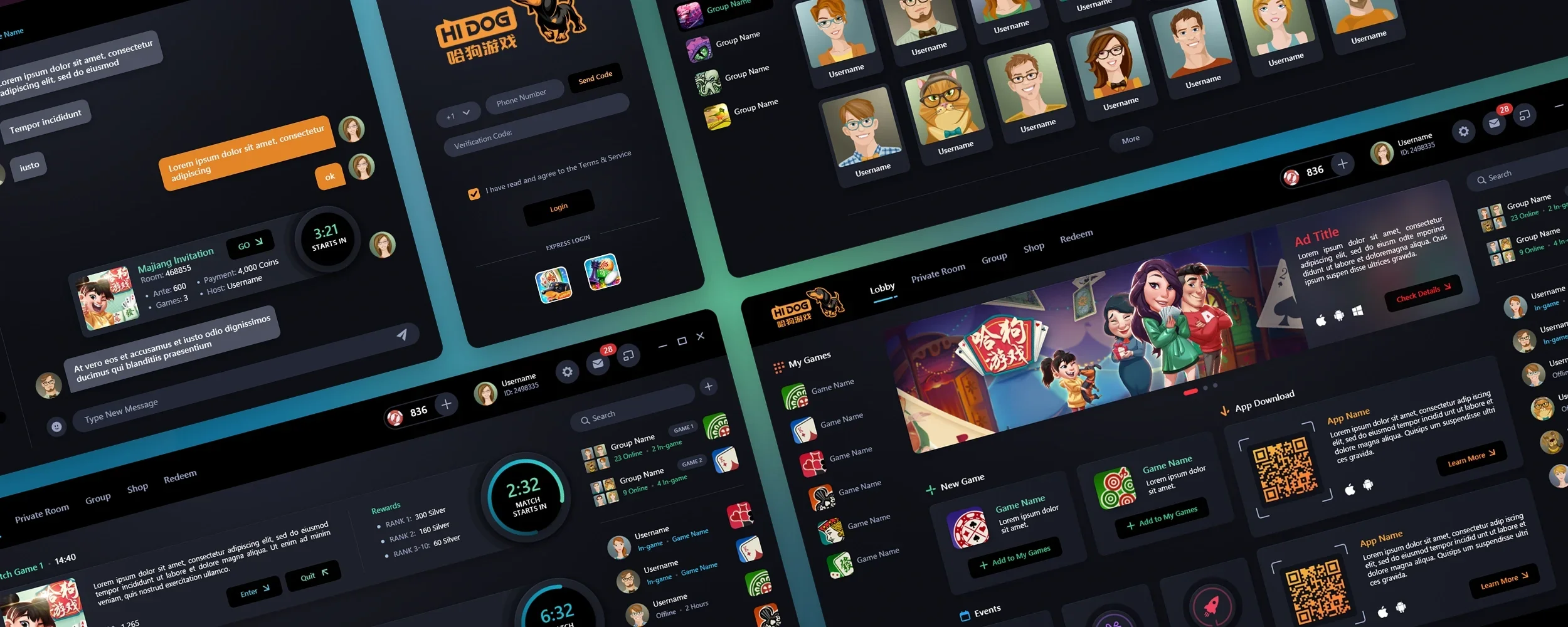
Initial Comp Layouts
Our design team was given low fidelity wireframes, which served as a guide for the content layout. Below, you will find a glimpse of some of the initial layouts we created. These layouts share a common foundation but also incorporate subtle variations. From the onset, we had a clear vision of the design language we wanted to pursue. We populated the comps with some content to show our intent.


Login
We designed a simple, sleek login modal, with a deep charcoal grey that perfectly compliments the orange of their brand identity.
The Lobby Screen
With it’s dark, neutral design foundation and a combination of vibrant colors and ample white space, the design creates a visually stimulating environment. The intuitive layout ensures that gamers can navigate the space effortlessly.
The vibrant colors used in the Lobby were carefully chosen to create a lively, fun atmosphere. Bold hues such as electric blue, fiery orange, and a cool, mint green are strategically incorporated into the layout. These pops of color add energy and excitement, making the Lobby an inviting and dynamic area.
The Main Lobby
Notification Dropdown Menu
Settings Dropdown Menu
Match Page + More Games + Chat Windows
Match Page
We stuck fairly close to the original wireframe layout while implementing visual embellishments and subtle user experience tweaks. The wireframes had an old school time ticker, but we opted for a more modern progress ring. We came up with the idea of including a 2-minute warning alert which changes the color of the progress track to let players know the games are about to begin.

Match Page w/activated 2-minute warning progress bar.
More Games
This is the main hub for the game library. A variety of games are available here for players to choose from.
Chat Windows
The original wireframes had a simple Room Invitation card. We brought in the dynamic design we created for the Match Page.
Personal Center + Group Screens
The Personal Center serves as a player's profile, showcasing various gamification attributes such as badges, in-game monetary assets, and records set by the player. It is a comprehensive screen that provides users with a quick overview of their achievements and progress within the application. Beyond the individual user experience, the Personal Center also promotes community building within the application via the Group screen. Users can create or join a Group, further enhancing the community aspect of the application.
Personal Center

Group

Private Room + Bill Total + Time Dropdown
Private Room

Players can access their Private Room, join existing rooms and pay their bill.
The Bill Total is a slide-up panel. Given how little information there is, we felt that by having it focused and isolated on the bottom of the screen, it would be less distracting to view.
Date Picker modal.
Date Picker modal showing multiple weeks selected.
Create Room + Redeem
Create Room
We used a gradient from top to the bottom where each horizontal section shifts color. We did this by creating a gradient and sampling the color incrementally.
Redeem
This is where players will be able to redeem and exchange in-game currencies.
Have a project in mind? Let's talk.
Thank you for reaching out.
We will be in touch within one business day.