
FortifyData
Cybersecurity UI/UX Design
The Skins Factory and FortifyData: A Winning Collaboration in Cybersecurity Risk Management UI/UX Design
FortifyData, a world-leading Cybersecurity Risk Management platform that enables their clients to identity and manage risk exposure across the entire attack surface, brought The Skins Factory in to redesign their core platform UI/UX design. Our team refined the existing UI and UX over for 40 screens, while modernizing the visual design, and weaving neumorphic elements into the analytics’ visual design. The Skins Factory user experience designers are cybersecurity design experts, as we continue to design interfaces that guide users through secure practices across the attack surface.
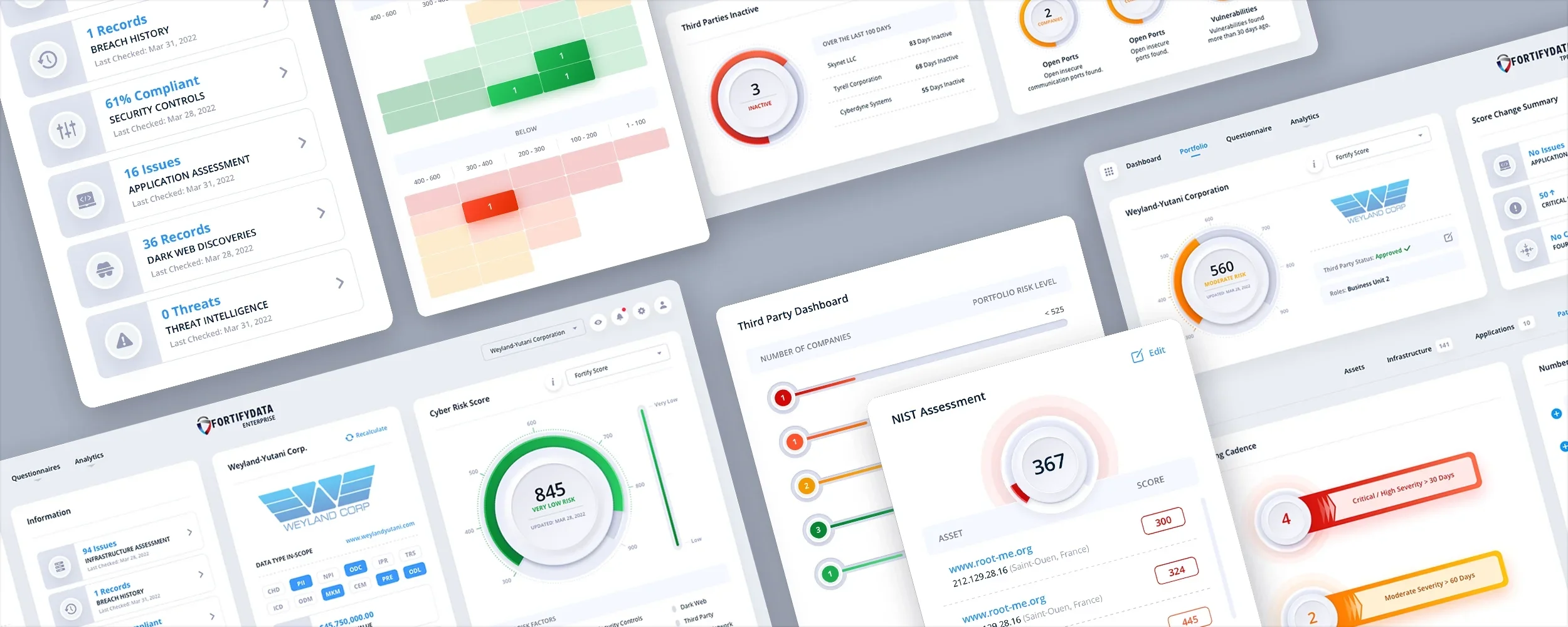
Here’s a look at most of the prominent project screens. Images have been shrunk down for presentation purposes. Some screens have been altered due to their proprietary nature or withheld because they were visually redundant.
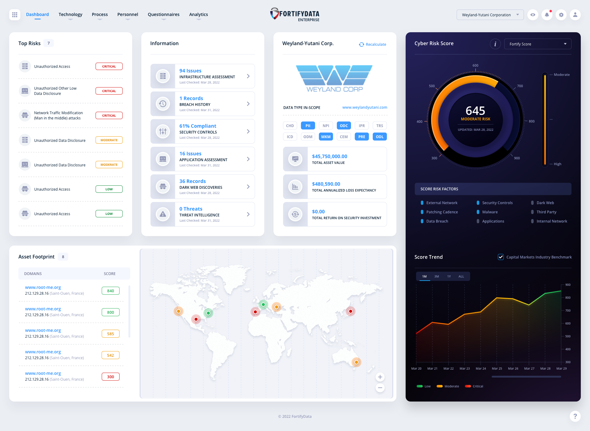
Enterprise Dashboard: Default Design
Our UI/UX design team spent ample time redesigning the dashboard’s design language. The original dashboard was modular in nature, as most are, but the look and feel of the UI design was updated with subtle tweaks to the user experience. We also purged the UI of the archaic “Gasoline gauge” style of Cyber Risk Score and created a neumorphic design that has both a modern and sleek look.
The Alternate Sidebar
During any initial comp phase our design team experiments with various design languages. We always have a ton of ideas floating around. CyberSecurity applications are typically dark in nature. In this alternative version, we brought in a dark sidebar to offer contrast to the white panels and so the colors could pop for the Cyber Risk Score. FortifyData selected the clean, all-white design, but loved the contrasting dark bar as well.

Enterprise Screens
A look at the various screen designs for the Enterprise section of the application. From Risk Modeling to Infrastructure Threat Events. Click an image to view it larger.
Risk Modeling: Originally this was two separate screens. Our team decided to converge them to increase speed and information output.
Infrastructure External Threat Events
Patching Cadence
Internal Assets
Assets Domains
Infrastructure Ports
Asset Groups
TPRM (Third-Party Risk Management) Screens
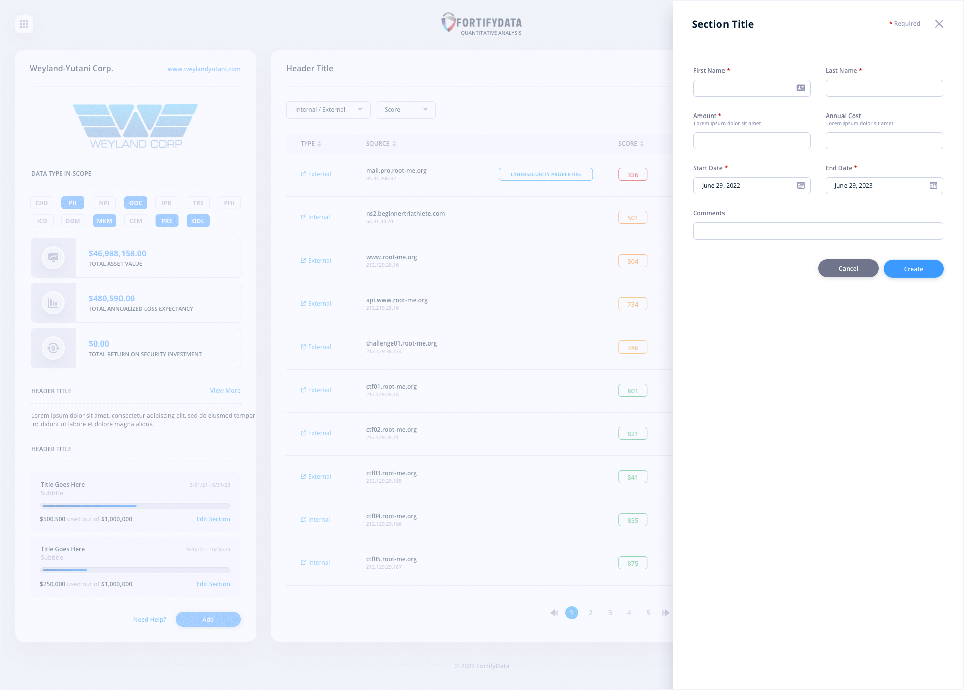
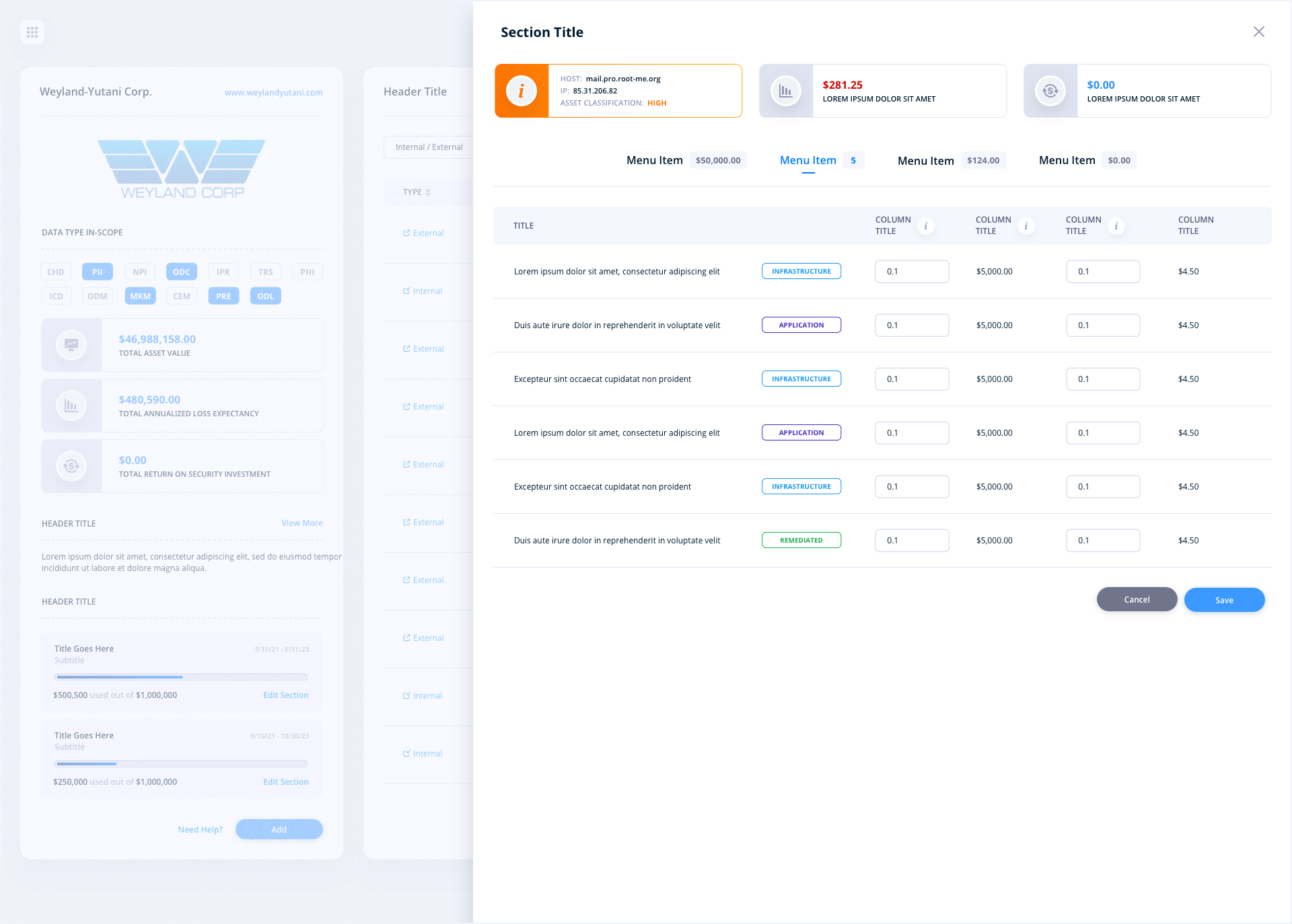
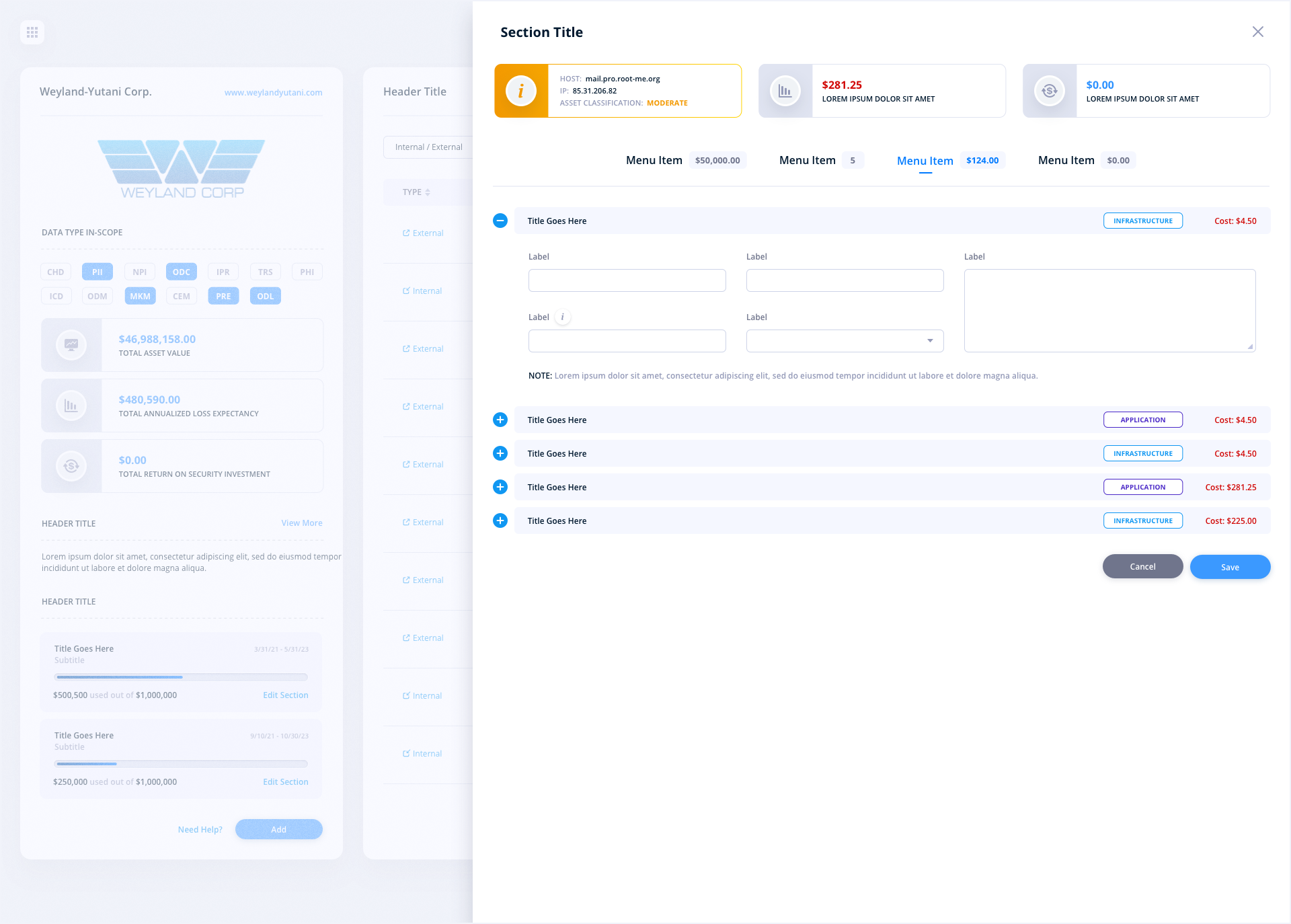
Forgoing the use of modals, we utilized slide-in panels for extending the user interface. Slide-in panels are the perfect solution as they focus the users’ attention to one part of the screen, while blocking out the noise of the background of the page on 3 sides. They are also size agnostic which means they can be short in width or even take over the entire screen without ever taking the user off the main screen.
TPRM Dashboard
TPRM Dashboard: Filters
TPRM Dashboard: Add a Questionnaire
TPRM Due Diligence: Assets
TPRM Due Diligence: Questionnaire
TPRM Due Diligence: Questionnaire Details
TPRM Questionnaire Status
TPRM Due Diligence: Patching Cadence
TPRM Due Diligence: Infrastructure
TPRM Due Diligence: Dark Web
TPRM Portfolio
TPRM Portfolio - Edit
TPRM Portfolio: Filters
TPRM Questionnaire Dashboard
TPRM Due Diligence Questionnaire: Third-Party Approval Status
TPRM Due Diligence Questionnaire: Update Vendor In-Scope Assets
TPRM Questionnaire Status: Custom Questionnaire
Additional Screens
Because of the proprietary nature of these screens and certain feature sets, effort has been made to keep core functionality intentionally vague. This was done to protect our client’s intellectual property.


Have a project in mind? Let's talk.
Thank you for reaching out.
We will be in touch within one business day.