Designing a Mobile App from the Ground Up
User Experience Design:
Social Media Mobile App
By Jeff Schader | Originally published January 24, 2024 — Updated March 2026 | 8 min read


Where We Started
The Process Behind Designing a Mobile App from Scratch
The process began with a spreadsheet. We wrote down all the features we wanted to include, figured out which screens needed to be designed, what content would be displayed on those screens, and came up with future features to include in later iterations. There were ongoing internal and external discussions regarding the functionality as we fine-tuned the scope of work.
One thing we've learned in our over two decades of UI/UX design experience - not every idea or feature needs to make it into the first version of the software application. Too often we've watched software companies push back release dates unnecessarily because they were constantly adding new features that weren't important enough to hold back the launch of their software.
Our next step was to design low-fidelity user flow maps once we had refined the initial scope of work.
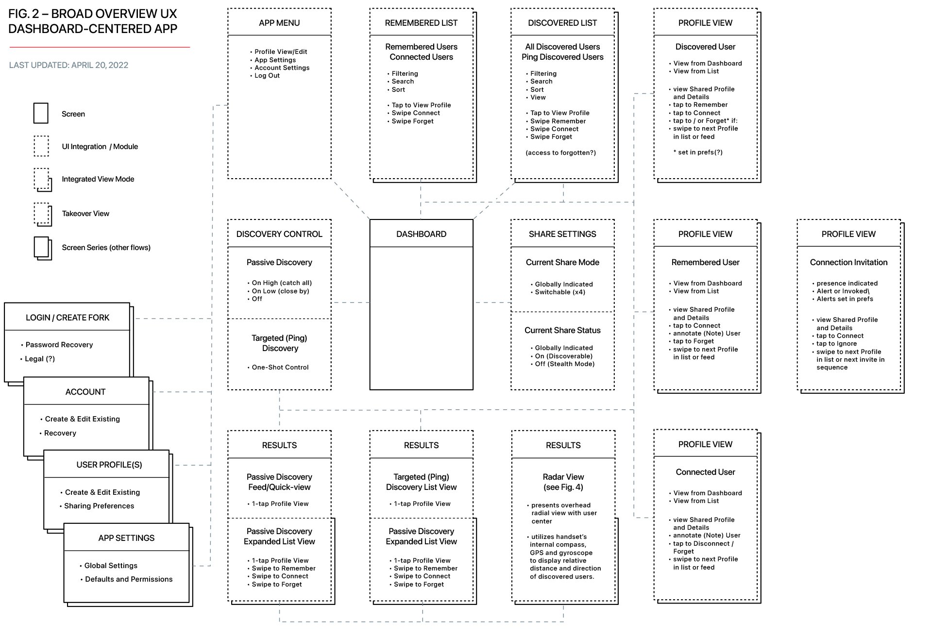
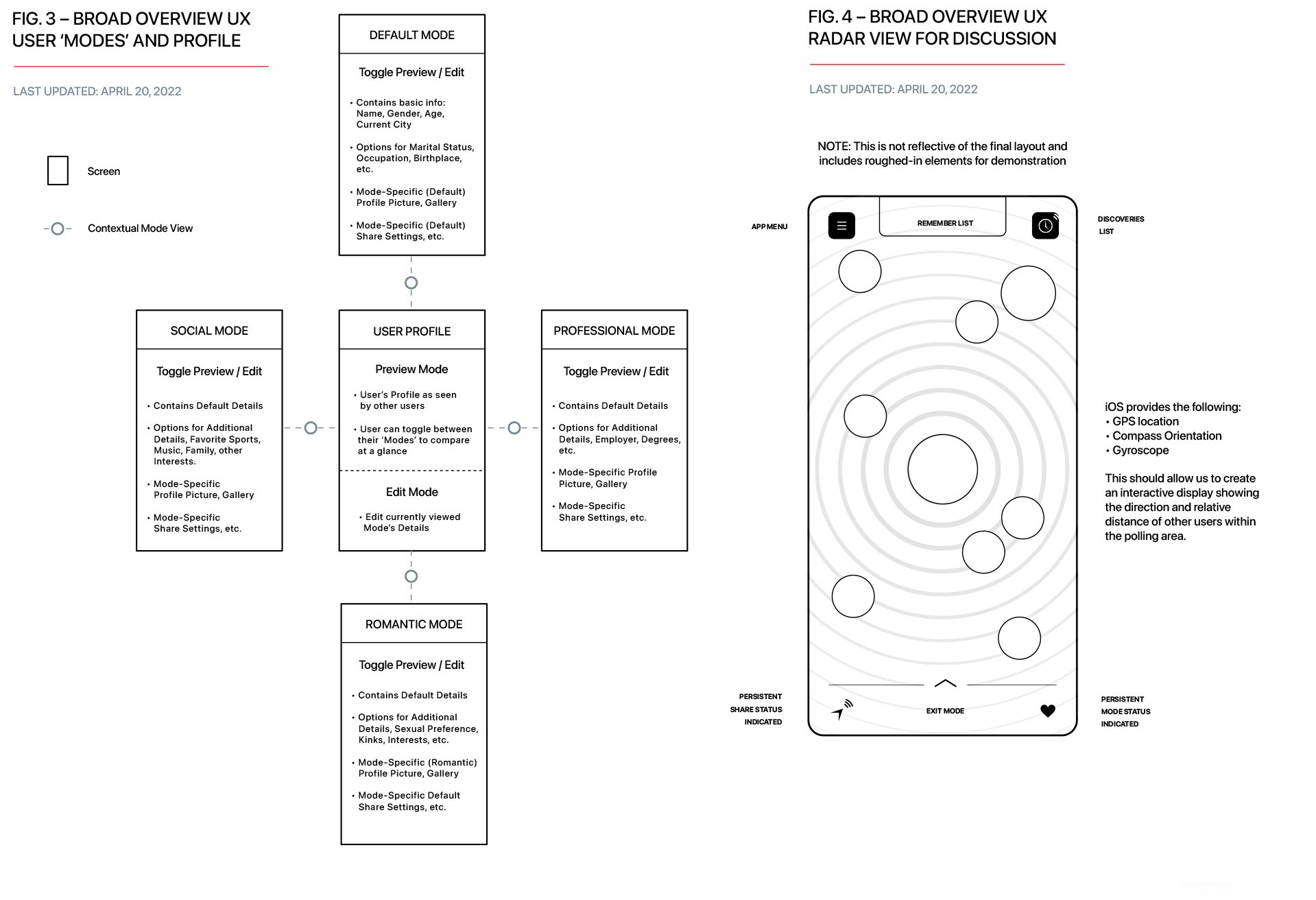
Broad Overview User Flow Maps

Low-Fidelity Wireframes
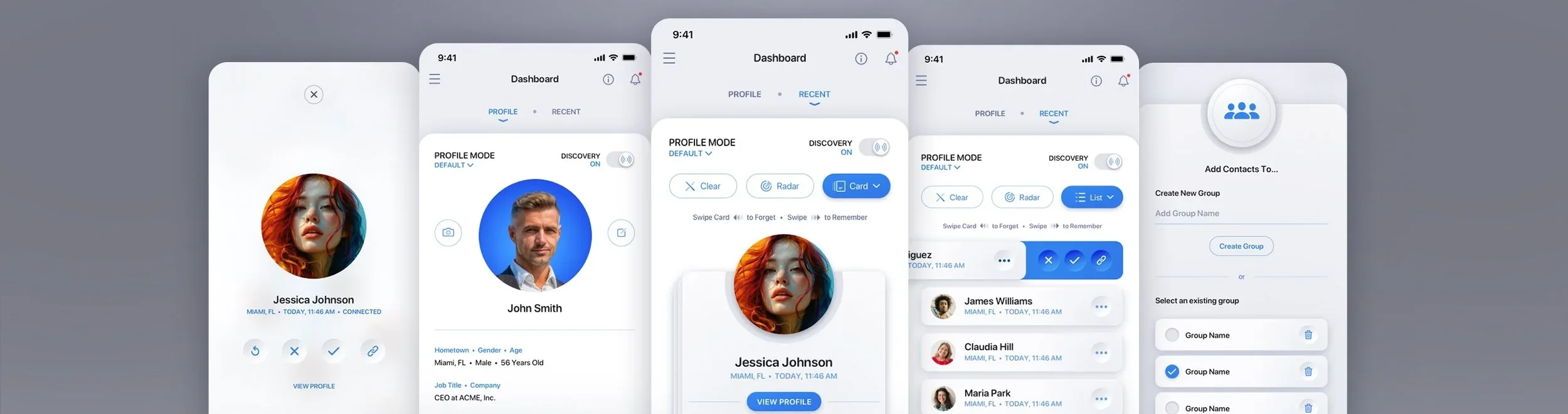
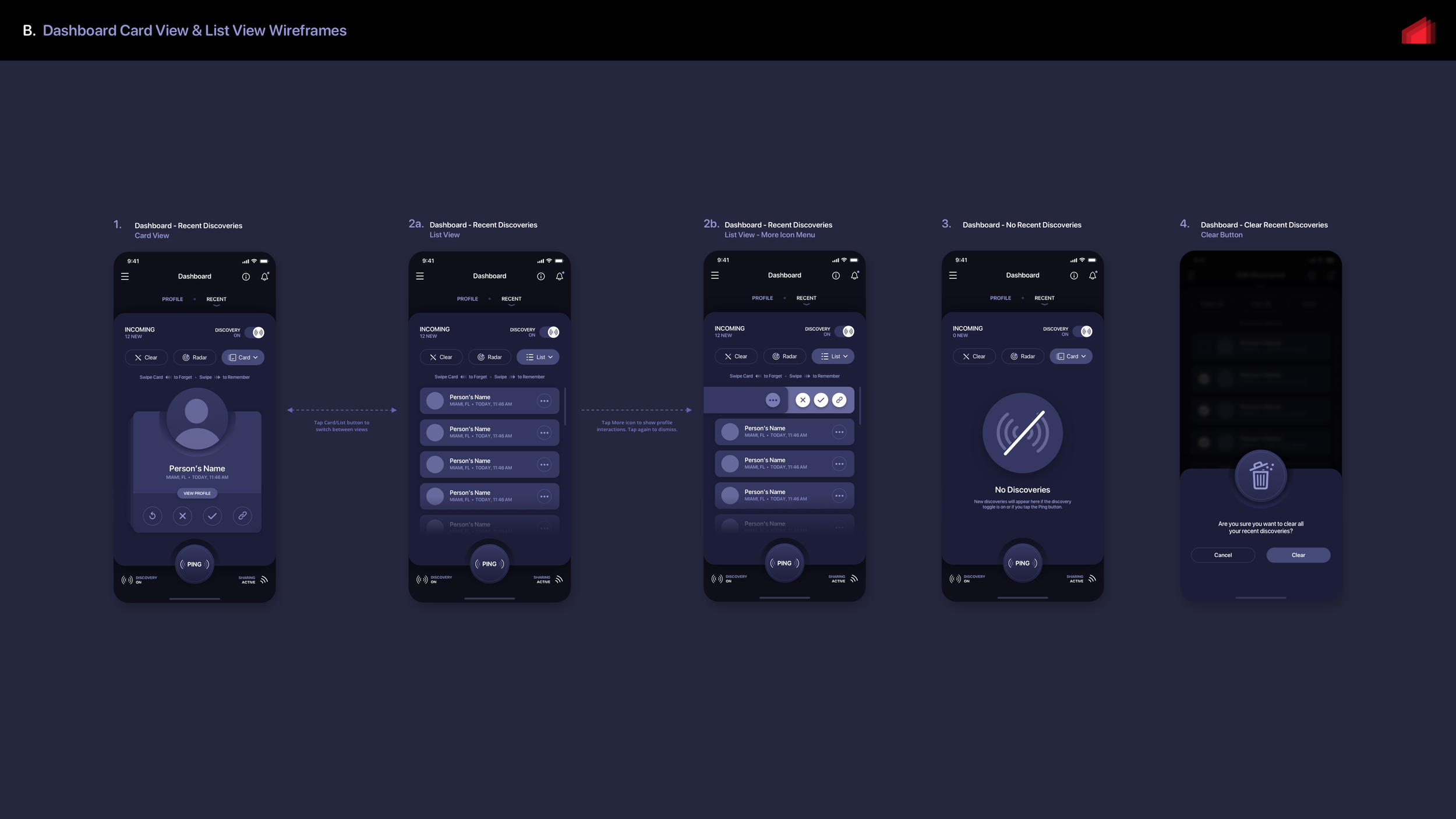
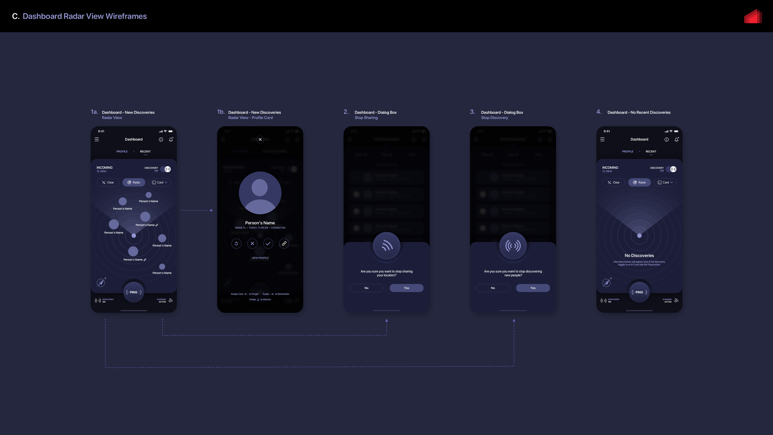
Once our team designed the user flow maps, we started designing the main Dashboard screen and several subsequent screens internally. As part of our design, we incorporated a Discovered List feature that displays all collected users within a certain radius of the user. Users have the option to add any discovered individuals to a Remembered list, which serves as a repository for their information. In later iterations we added a "Ping" button. When tapped, this would send out a pulse pulling in users within a certain proximity.
Visual Functionality Brainstormer: Low-fidelity Wireframes
Dashboard Brainstorm: Basic Relative Layout + Functionality Brainstorm
High-Fidelity Wireframes / Mockups
High-fidelity mockups always play a crucial role in showcasing the potential appearance of an application's user interface and convey our design vision to project stakeholders. Throughout our time at The Skins Factory, we have consistently produced exceptional mockups that captivate our clients. Our proficiency in implementing neumorphic tactility design language predates its current trendiness. In fact, if you examine our body of work from the early 2000s, you will realize that the skins we crafted for media players and user interfaces were always pioneering and ahead of their time.
With that said, let's delve into some of the diverse mockups we created. As our journey progressed, so did the look and feel of our designs. By the end of this blog post, you will be able to view the final iterations of all the meticulously crafted mockups our user interface designers created.
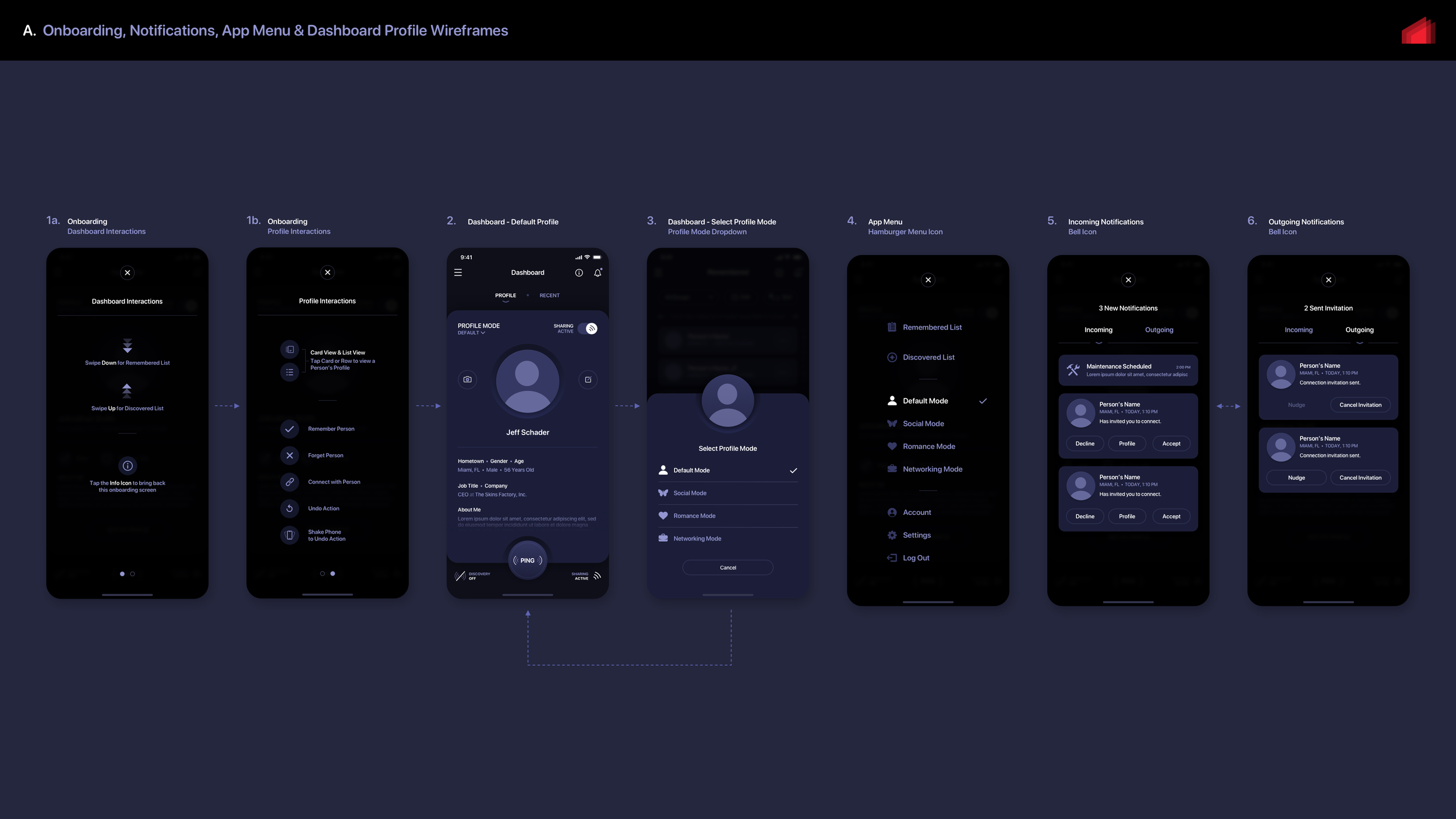
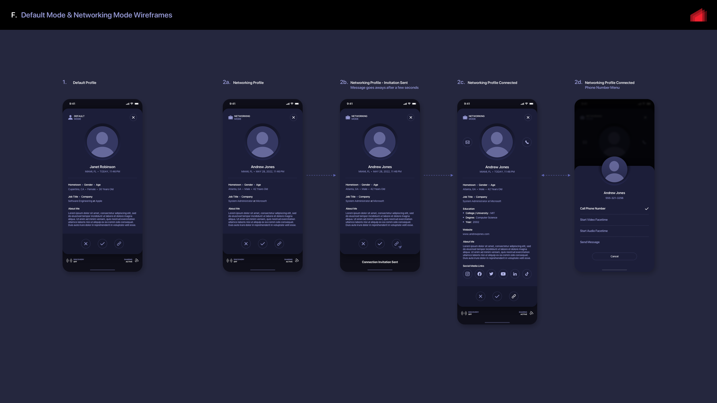
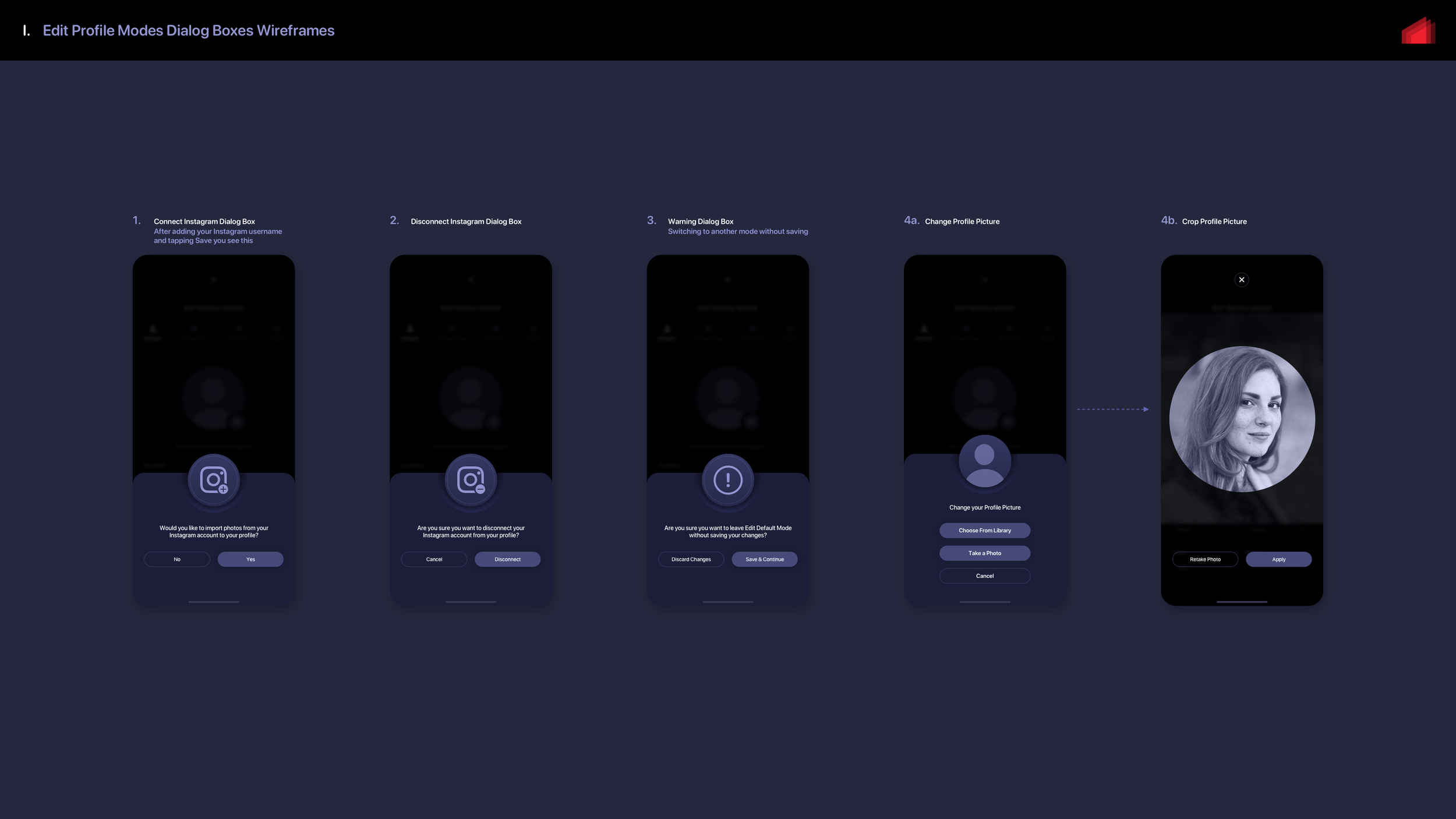
Throughout the entire project, the Client which included four partners, had difficulty reaching a consensus on a name. As a temporary solution, they settled on using the placeholder name "Recognize Me." Internally, we developed our own working title: nām. Presented below are initial wireframes that serve as a starting point for further improvement. The purpose of wireframing mockups is to refine the design, functionality, and user experience before final artwork is produced. Please note that these are just a few examples of our mockup designs.

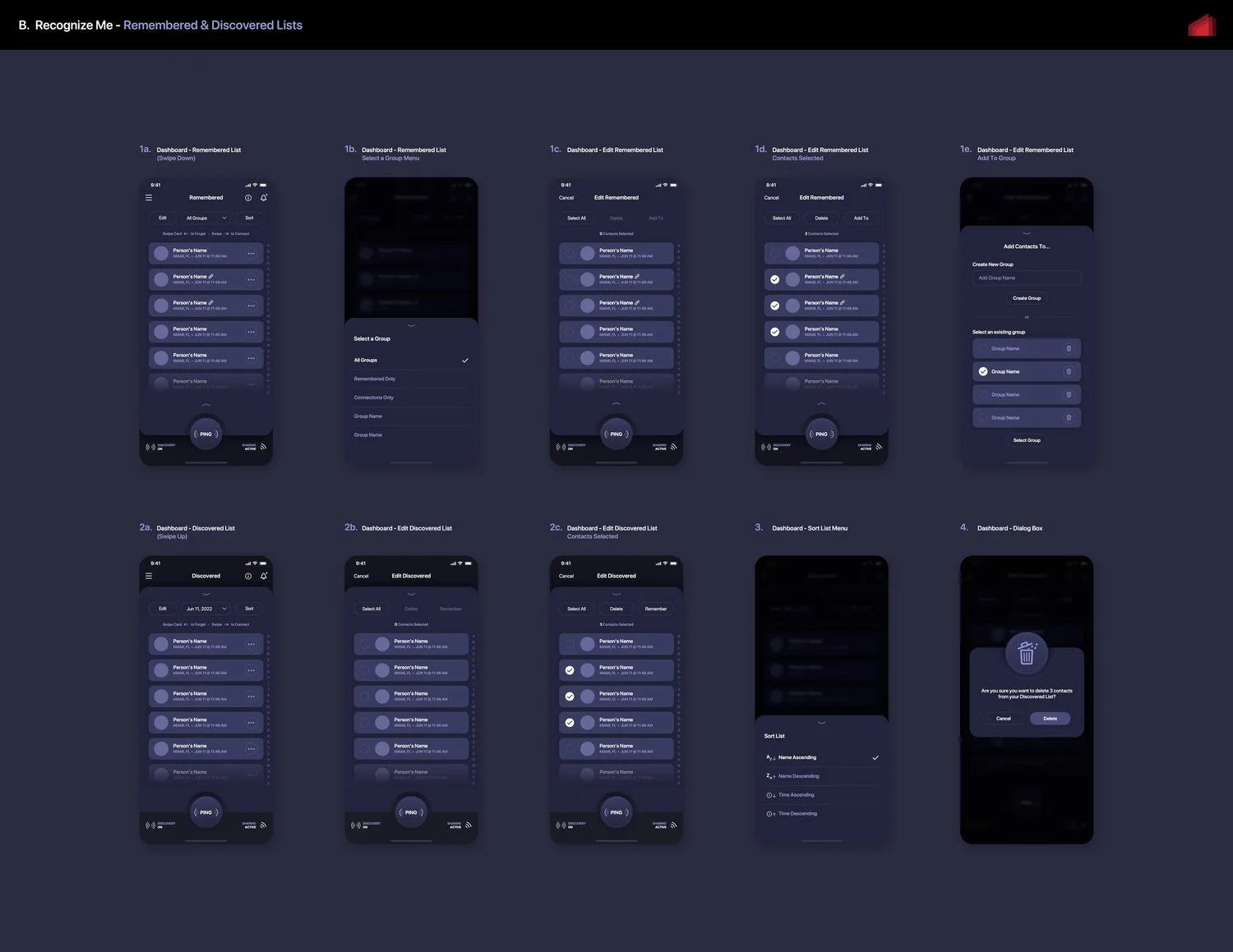
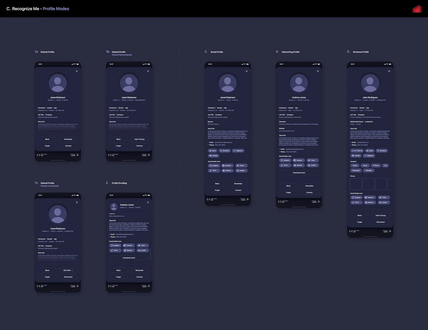
At the conclusion of the wireframing phase, all screen layouts were meticulously developed to visually represent a polished and intuitive user experience design. Additionally, custom iconography design was finalized during this crucial stage. As part of our decision-making process, we determined that most modals would smoothly slide up from the bottom of the screen to maintain focus and minimize distractions.
The Final Wireframes / Mockups


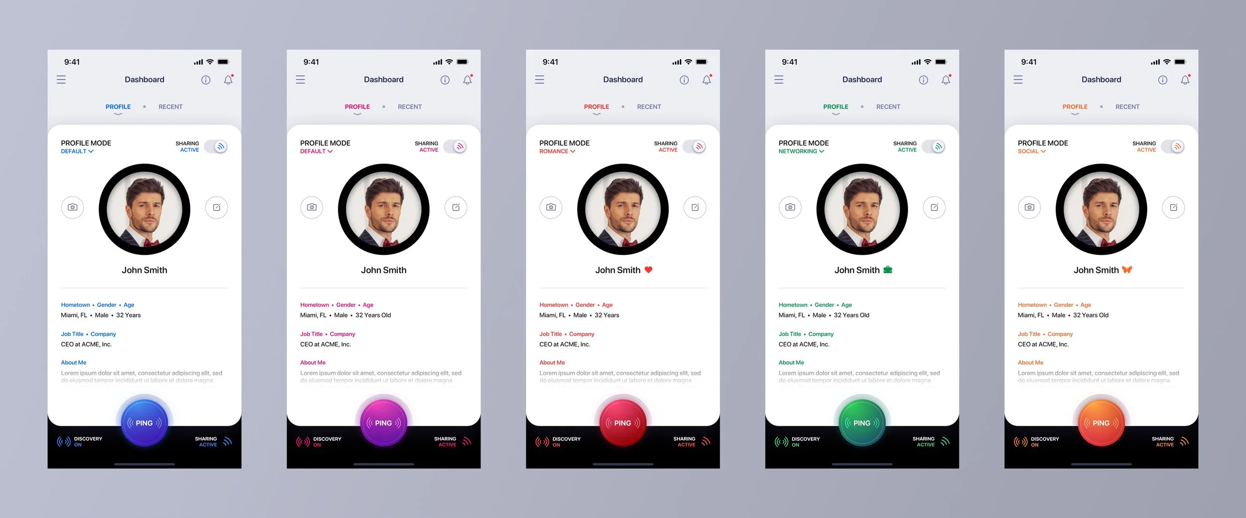
Once the wireframing phase was mostly completed, we moved on to creating marker comps to establish the final design language of the app. We didn't need to wireframe every single screen since we were working under a "time and materials" cost model initially. Our goal was to avoid using unnecessary hours for elements that could be designed during the final phase, which followed a fixed cost pricing model. What you're about to see are early comps that didn't meet our standards. Although this project hasn't been fully incorporated into our portfolio yet, we can offer you a glimpse of where we ended up. Our portfolio will showcase numerous screens, featuring both light mode and dark mode with 5 color themes for each. Now, let's take a look at the internally rejected comps first..
Early Marker Comp Tests: Dark Mode Version
Design is a process of experimentation and refinement. During the initial stages, we explored various ideas, some of which were successful while others were not. One approach we took was incorporating neumorphic elements into the 2D flat design to add depth and dimension. As UI/UX Designers, it is crucial to maintain a clear vision while also considering the practicalities of working with a self-funded start-up. Every design must be implemented through coding, and the more complex the design, the higher the cost. With this in mind, we attempted to distinguish between different profile modes by highlighting the Ping button and using vibrant text and accents. However, we felt that these changes were not impactful enough.
"Are We There Yet? Nope, But Much Closer"
In this round of visual comps, we have introduced distinct colors for each mode in the user interface. The colors are now much more noticeable, although they do not appear to be overly vibrant. Nonetheless, we started from a solid foundation and built upon it. As you can observe, we have yet to incorporate the second default color option. The color utilized below for the Romance mode will eventually become the 2nd default color, while a fresh color theme will be introduced specifically for Romance. Take a look at these mockups showcasing our progress.
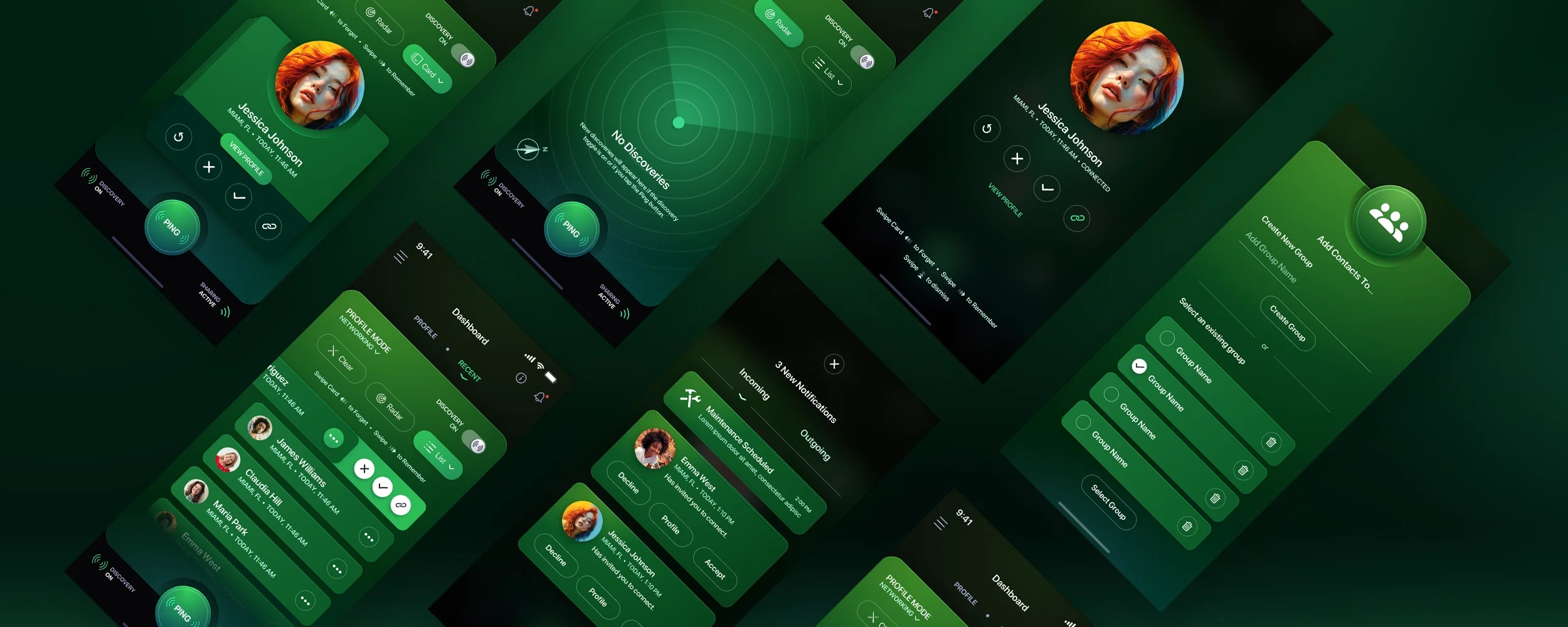
Final Versions for Dark Mode


Early Marker Comp Tests: Light Mode Version
But what about the Light Mode version? That was a completely separate journey much like the Dark Mode version was. Let's look at an early version. So our Creative Director and our user interface designers decided to isolate the colors to the Ping buttons, all the "hero" text and iconography. The base panel would stay white, the header turned into a light grey and the footer a jet black so that colors would pop off of it. The neumorphic design embellishments were still present with the early comps.
That black ring around the profile photo had to go…
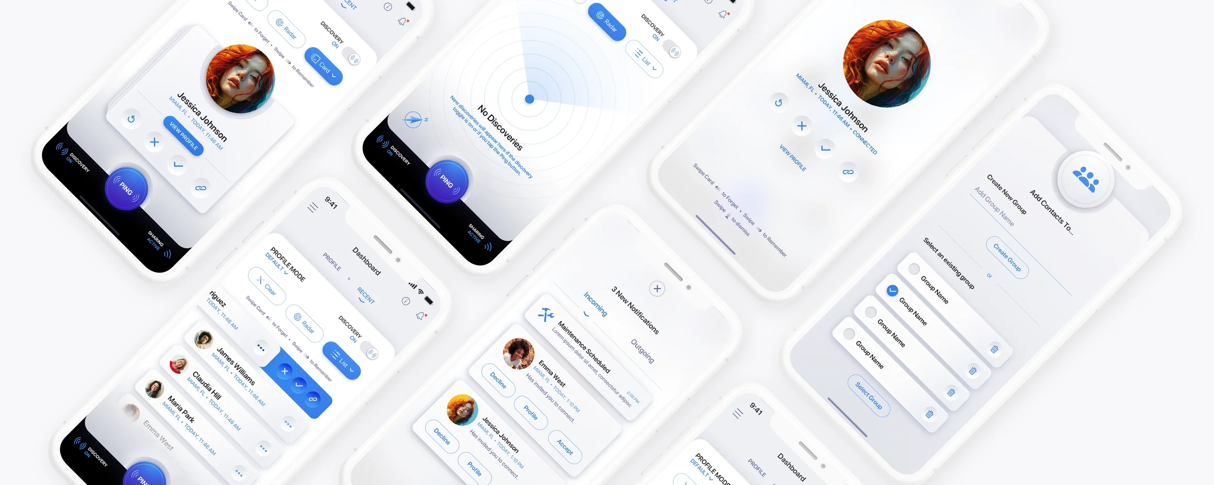
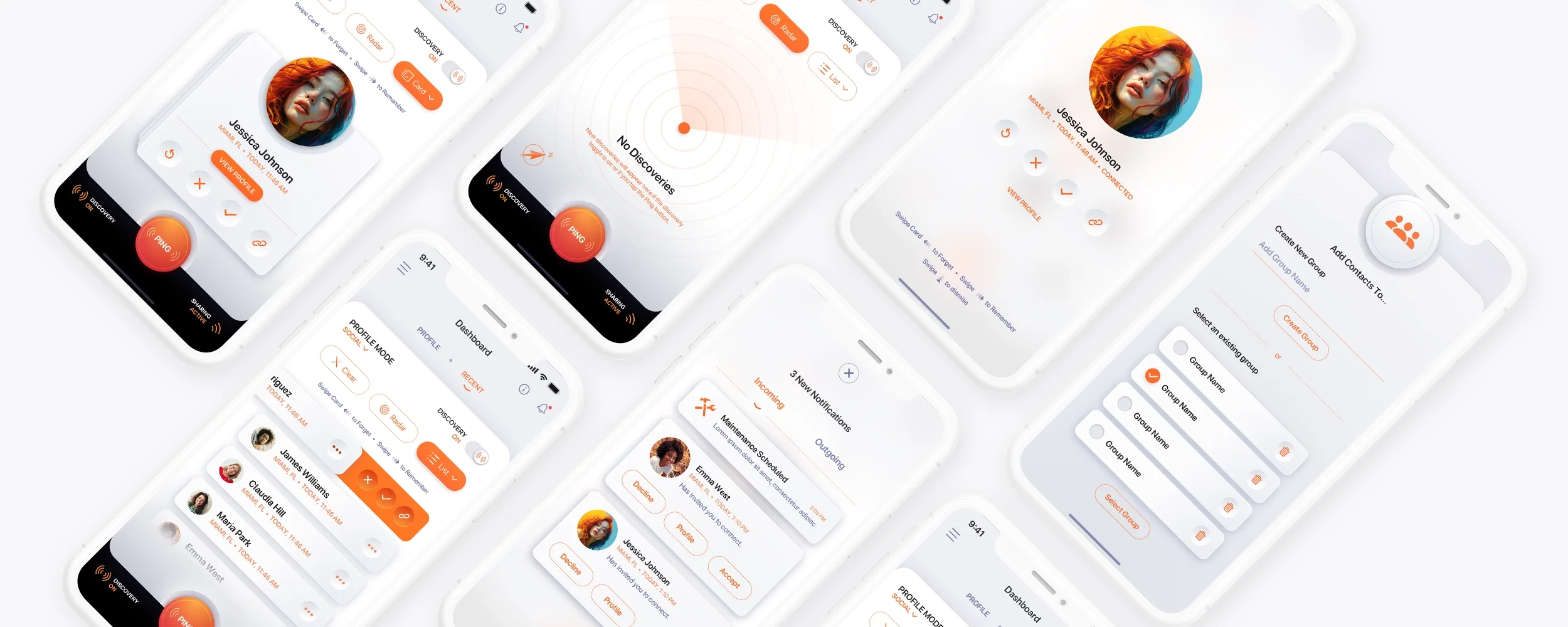
Final Versions for Light Mode
We made the decision to go for a more minimalistic approach, eliminating the black ring around the profile image. To enhance the visual design, we incorporated neumorphic design elements into the white panel and on-panel contents, providing a tactile design - a hallmark of The Skins Factory's two-decade-long reputation. The visual design boasts a perfect contrast, exuding a sleek elegance and cleanliness, while the subtle 3D elements add just the right amount of depth for optimal visual appeal.


Final Sketch Output for Dark Mode
Here's a look at the deliverables for the Dark Mode version only.


This was an overview of the process behind designing a user interface and user experience from just a single concept. We appreciate your interest in this behind-the-scenes glimpse. So if you’re looking for the best UI/UX design services in the USA, please feel free to reach out to us. Consulting with us about your project and obtaining a cost estimate comes at no charge.
Have a project in mind? Let's talk.
Thank you for reaching out.
We will be in touch within one business day.
About Jeff Schader
Jeff Schader is the founder and CEO of The Skins Factory, a UI/UX design studio he started in 2000, based in the Miami/Fort Lauderdale area. He has designed software for some of the biggest names in tech and entertainment, including Microsoft, Disney, the NFL, Bank of America, and Intel, along with SaaS, fintech, healthcare, cybersecurity, and enterprise platforms. Jeff runs The Skins Factory lean and stays hands-on across client work, strategy, and design. He writes about UI/UX, AI interfaces, and what actually makes software usable.