
How to Reduce KYC Onboarding Drop-Off: 6 UX Problems to Fix
Your Onboarding
Is Leaking Users. Here's Where.
KYC onboarding has unavoidable regulatory requirements, but the experience around them is still a product decision. This guide walks through six places where friction can build, in the order users encounter them, and shows you how to identify which part of your flow deserves attention first.

Why Users Abandon KYC Onboarding
If you run product at a bank, a payments company, a lender, or an exchange, you have seen the funnel. A large number of people start signing up. A much smaller number finish. Somewhere in between, users begin to disappear. The usual explanation is that compliance makes the friction unavoidable. You have to collect sensitive information. You have to verify identity. The process asks a lot of the user, so some degree of abandonment starts to feel inevitable.
But that explanation misses the larger point. Compliance determines what must be collected, verified, retained, and reported. The product team still has decisions to make about how the flow is structured, how requirements are explained, what the user sees while they wait, and how recoverable problems are handled.
Those design decisions determine whether a difficult process feels clear and manageable or confusing and unnecessarily frustrating. And unlike the underlying regulatory requirements, they are decisions you can actually work on.
Compliance sets the constraints. Design shapes the experience inside them.
The Six Places Onboarding Leaks
In our experience designing account creation, identity verification, and funding flows for banking and payment products, the same six areas repeatedly create friction. They are listed here in the order users encounter them.
Where Friction Builds
The First Ask
Everything is requested before the user has seen anything the product does. Maximum trust demanded at the point of minimum trust.
Document Capture
The user started on a laptop. Their ID is in their wallet. There is no camera pointed at it, and no path across devices.
The Wait
A spinner with no context. The user cannot tell whether this takes ten seconds or two days, or whether closing the tab loses everything.
Rejection and Retry
Different verification outcomes collapsed into one generic message. The user is given no specific issue to fix and no clear next step.
Data Entry Friction
Address fields that reject valid formats. Date pickers that take twenty taps. Sessions that expire silently and lose the work.
The Gap After Approval
The user is verified, then nothing happens. No first action, no reason to return. Invisible in the funnel, visible in activation.
Each one has a different cause, a different fix, and a very different cost to repair. The sections that follow go deeper on the first four, then show you how to diagnose all six in your own flow.
Asking for Everything Before Anything Is Given
A common structural mistake is front-loading the entire request. Full legal name, date of birth, residential address, government ID, source of funds, all before the user has seen a dashboard, a balance, or a single screen of the actual product.
We understand you need all of that information. But how and when you collect it matters.
We worked on a healthtech mobile app that couldn’t produce a health score or personalized plan without first asking a series of questions. Users faced twenty mandatory questions plus five optional ones, on top of account setup, a digital wallet, and security phrases, all before reaching the dashboard. The burden bordered on ridiculous, but the questions themselves were necessary.
Since we couldn’t remove them, we designed the UI to create a constant sense of forward momentum. The color theme changes every five questions, cycling through gradients inspired by sunrises, ocean water, and other calming palettes, so the experience visibly changes as the user progresses. The ring around each question’s icon doubles as a progress indicator. And on every mandatory question, we removed the Next button entirely: once an answer is selected, the interface automatically advances to the next panel, reducing both mental friction and repetitive tapping.
What Regulation Actually Requires
The exact line varies by product and jurisdiction. In U.S. banking, Customer Identification Program requirements call for certain identifying information before account opening, while identity verification may occur at account opening or within a reasonable time afterward under the bank's risk-based procedures.
That distinction is enough to show why product teams should not assume every question, document, and setup step has to happen in one uninterrupted block. Map what is truly required at each stage with your compliance team before you decide the order of the experience.
What Progressive Onboarding Looks Like
Progressive onboarding does not have to mean postponing information that regulation requires at account opening. It means separating what must happen now from what can legitimately wait. Collect what is required for the current stage, let the user see as much of the product as your rules permit, and defer later-stage questions, funding details, permissions, optional profile information, and product setup until they become relevant.
Then ask for any additional verification at the point the action requires it, when the reason for the request is clear and the user understands what it unlocks.
Ask for the hard things at the moment the user most wants what is on the other side of them.
Common Question
Can we delay KYC until after account creation?
Sometimes, but do not assume so. In U.S. banking, certain identifying information must be obtained before account opening, while identity verification may be completed at account opening or within a reasonable time afterward under risk-based CIP procedures. Other products and jurisdictions differ. The practical design question is which pieces truly must happen before opening, which can follow, and which can wait until a later action. Confirm that boundary with your compliance team.
Document Capture and the Desktop Trap
Document capture introduces a different kind of friction, and the problems are usually mundane rather than dramatic.
They started on a laptop. Their ID is in their wallet in the other room. There is no camera pointed at it. The user now has to find a scanner, photograph the document with their phone and email it to themselves, or stop what they are doing and come back to the process later. None of those are particularly good options.
The Device Handoff
One solution is to let the user capture the document with the laptop or desktop camera itself. The interface should show a live camera preview with a clear framing area so the user can see exactly where the ID needs to be held. Real-time feedback can then warn about glare, blur, poor positioning, or missing edges before the image is accepted.
If the desktop camera is unavailable or simply not the best tool for the job, the capture step can move to the phone without moving the entire onboarding experience with it. A QR code or SMS link opens a mobile capture screen, while the original desktop session remains active and updates when the upload is complete. The user takes the photograph on the device designed to do it and then continues exactly where they left off on the desktop. A desktop-first flow can easily miss the fact that document capture may need to cross devices in the middle.
Prevent the Rejection Instead of Explaining It
The secondary problem is capture quality. If your interface tells the user the image was unclear only after they have submitted it, you have added a full round trip to a step that already asks for extra effort and sensitive information.
Our solution is to validate the capture on the phone before the image is ever sent back to the website. If the photo is blurry, poorly framed, obscured by glare, missing an edge, or otherwise unlikely to pass verification, the mobile experience should tell the user immediately and prompt them to retake it while the camera is still in their hand. Real-time edge detection, glare warnings, and framing guidance can help prevent a bad capture before it is submitted.
Only after the image passes those checks should it be transmitted back to the desktop session for verification. That avoids the far worse experience of returning to the website, waiting for processing, being told the image failed, and then having to pick up the phone and start over. Catch the problem at the point of capture, where the user can fix it in seconds.
Common Question
Why does document upload become difficult on desktop?
Because the document is physical while the onboarding experience is digital. If the computer has a usable camera, a live capture interface can let the user photograph the document without leaving the desktop experience. If it does not, a QR code or SMS link can move only the capture step to the phone and return the completed image to the original desktop session without requiring the user to restart the flow.
The Waiting State, Where Silence Reads as Breakage
Verification time can range from a near-instant automated response to a longer manual review. What the interface communicates during that window determines whether the wait feels expected or whether the product looks broken.
An unlabeled spinner is one of the weakest options. The user does not know the expected duration. They do not know whether the check is still running. They do not know whether closing the tab loses their progress. A normal wait starts to feel like a failure because the interface provides no context.
What a Waiting State Has to Communicate
An Honest Range
State the expected duration your own system can support, including the slower manual-review path.
Permission to Leave
Confirm explicitly whether closing the window is safe and whether progress will be preserved.
A Named Channel
Tell the user how and when they will hear back. Email, push, or SMS, with a timeframe attached to it.
Something to Do
Give them a limited but real version of the product to explore while the check runs, rather than a blocked screen.
A delay is easier to understand when the user knows what is happening, how long it may take, and what happens next. An unexplained spinner communicates none of those things.
Rejection and Recovery, Where One Message Is Not Enough
A verification check does not return a clean pass or a clean stop. It returns unclear image, name mismatch, expired document, address not verified, additional documentation required, or under review. Each is a different situation requiring a different next step. When those outcomes are collapsed into one generic message, the user is told something went wrong without being told what they can do about it.
A user who receives a specific instruction can act on it. A user who receives a generic apology has nothing to do but leave.
Design for Every Verification State
The work here is unglamorous and unusually high value. List every outcome your identity provider can return. Write a distinct screen for each one. Make sure each screen names the specific issue and the specific next action in plain language. Preserve everything the user already entered. Never make someone restart a six-screen flow because one field did not match a database record.
The Disclosure Boundary Is More Narrow Than You Think
There are real disclosure limits. For example, FinCEN prohibits financial institutions from telling a person involved that a Suspicious Activity Report has been filed, or from providing information that would reveal its existence. That does not mean every recoverable verification problem needs vague copy. An expired license, an unreadable image, or a missing document can often be explained plainly unless your compliance team has a specific reason not to. The point is not to expose sensitive fraud controls. It is to be as specific as the rules allow.
From the Work
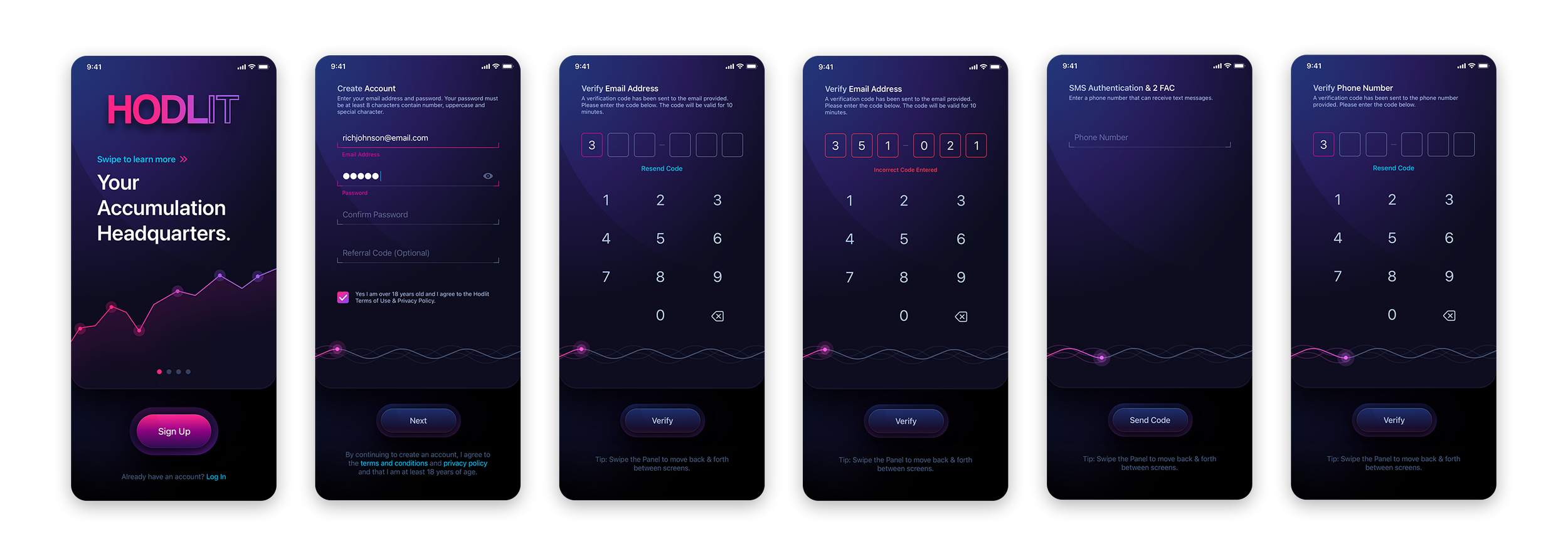
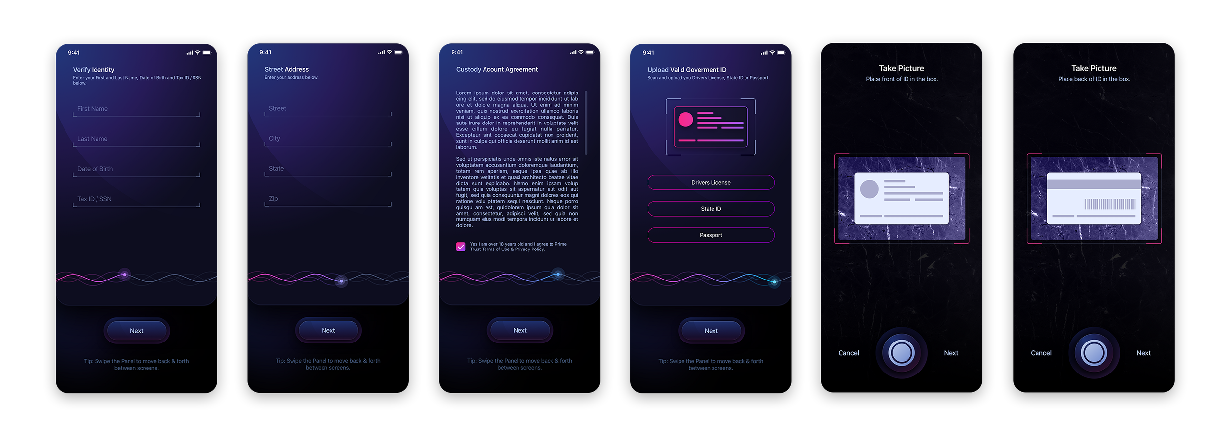
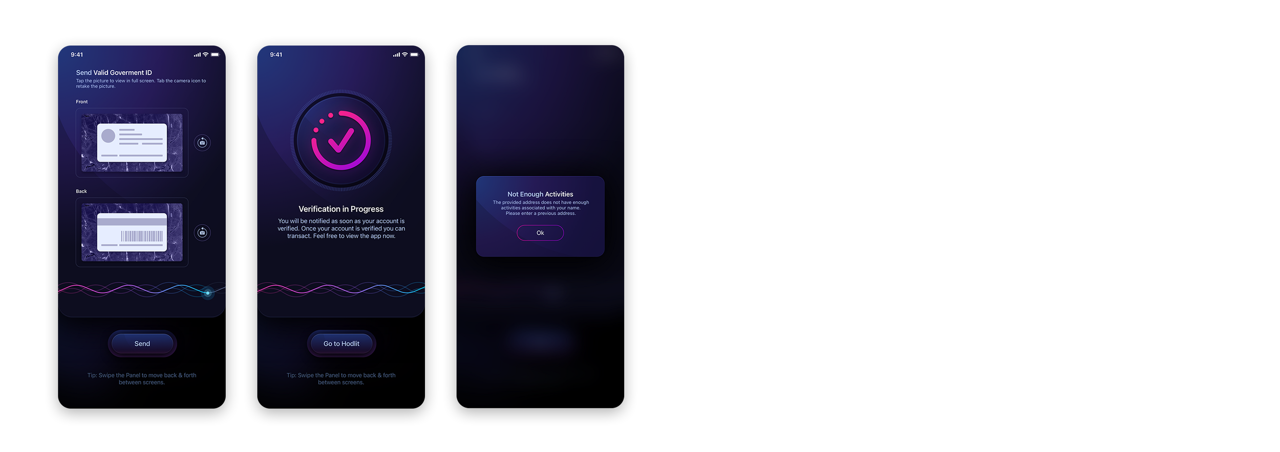
The HODLIT Onboarding Experience
View HODLIT ProjectWhen The Skins Factory redesigned HODLIT, a mobile cryptocurrency exchange, we rebuilt the onboarding experience end to end. The screens below cover document type selection, guided ID capture with front and back framing, the verification waiting state that tells the user they will be notified and can browse in the meantime, and a rejection screen that names the specific problem and the specific next step.

Compliance sets the constraints.
You still design the experience.
How to Find Which One Is Costing You Most
Before redesigning anything, instrument what you already have. The six leaks have very different fixes and very different costs, so knowing which one you actually have changes the scope of the work dramatically.
Six Things To Measure
Step-Level Completion
Completion rate for every screen in the flow. This shows whether the loss is concentrated at a particular step or spread across the experience.
Time Spent per Step
High completion with long dwell time can signal confusion even when the step is not directly blocking users.
Device at Each Step
If exits or device switches cluster at document capture, look closely at the capture mechanics and the handoff between desktop and mobile.
Verification Outcome Mix
Track what share pass, soft-reject, hard-reject, or route to manual review, then measure how many recoverable outcomes actually lead to a successful retry.
Retry Rate After Rejection
A low retry rate points you toward the rejection messaging and recovery flow, but compare it with vendor outcomes before assigning the cause.
Approval to First Action
Measure the time between verification and the first meaningful action. This shows whether the problem continues after the identity check is complete.
Support tickets are another useful source because they capture problems users were motivated enough to report. Read a representative sample alongside the analytics and you can often see patterns that the funnel alone does not explain.
Common Question
What should we measure to find onboarding drop-off?
Start with step-level completion for every screen, then layer in time spent per step, device at each step, verification outcome distribution, retry rate after rejection, and time from approval to first transaction. Together these help distinguish whether the problem is ordering, capture, waiting, recovery, or post-approval activation.
What Compliance Actually Constrains
This section matters because the assumption that regulation dictates the entire experience can block improvements before the product team even explores them.
What It Typically Dictates
What information must be collected. What must be verified and to what standard. What records must be retained and for how long. What must be reported, and when.
What Is Often Still a Design Decision
How the interface explains what is happening. How the user moves between steps. How a delay is communicated. How a recoverable rejection is worded. What can be safely shown while a review is pending. The exact boundary depends on the product, jurisdiction, and your own compliance program.
The right move is not to guess where the line sits. Sit down with your compliance team, walk the flow screen by screen, and ask specifically which elements are mandated, which are internal policy, and which are simply the way the product was originally built.
For U.S. banks, the FFIEC Customer Identification Program guidance is a useful example of why that distinction matters: required identifying information is obtained before account opening, while identity verification may occur at account opening or within a reasonable time afterward. Other financial products and jurisdictions have different obligations, so the flow has to be reviewed against the rules that actually apply to your product.
In our experience, some of what feels immovable turns out to be product convention or an old implementation decision that can be revisited once compliance, product, and design look at the flow together.
Common Question
Does KYC regulation force a poor user experience?
No. Regulation creates real constraints, but it does not prescribe every interaction in the experience. The exact boundary varies by product, regulator, jurisdiction, and internal risk policy. In U.S. banking, for example, CIP rules specify identifying-information and verification obligations while still leaving product teams decisions about explanation, interface behavior, waiting states, and recovery. Review those decisions with compliance rather than assuming the current flow is the only compliant one.
Where to Start
Start by finding out where the loss actually is. Do not assume it is spread evenly across the flow. Measure step by step and find out whether there is a clear cliff, a recovery problem, a device-specific break, or cumulative friction across the entire experience.
Once you can see the pattern, you can decide what deserves to be fixed first.
What the Drop is Telling You
Users Quit at Document Capture
Look at the capture mechanics and device handoff first. If desktop users are breaking here, test whether direct camera capture or a QR/SMS handoff removes the friction.
Users Quit After Submitting
Audit the waiting state before changing anything upstream. Make sure it explains what is happening, how long it may take, and what the user can safely do next.
Users Get Rejected and Never Return
Compare rejection outcomes, retry rate, and recovery copy. The issue may be an unclear next step rather than the verification decision itself.
Users Quit Evenly Throughout
If there is no clear cliff, examine the cumulative burden and ordering of the flow. Progressive onboarding may be the larger conversation to have.
Common Questions About KYC Onboarding Drop-Off
Why do users abandon KYC onboarding?
Common sources of friction include asking for too much too early, document capture that does not work cleanly across devices, waiting states with no context, rejection messages with no actionable next step, data-entry problems, and a weak transition from approval to the first meaningful action. The exact cause is different in every product, which is why step-level measurement matters.
Can KYC be delayed until after account creation?
Sometimes, but do not assume so. In U.S. banking, certain identifying information must be obtained before account opening, while identity verification may be completed at account opening or within a reasonable time afterward under risk-based CIP procedures. Other products and jurisdictions differ. The practical question is which pieces truly must happen before opening, which can follow, and which can wait until a later action. Confirm that boundary with your compliance team.
What is progressive onboarding in fintech?
Progressive onboarding separates what must happen now from what can legitimately wait. Required information is collected at the stage where it is required, while later-stage questions, permissions, funding details, optional profile information, and product setup are deferred until they become relevant. The goal is not to work around compliance. It is to avoid asking for everything in one uninterrupted block when the rules do not require it.
How do you reduce document upload friction?
Give the user a capture path that fits the device they are already using. A laptop or desktop with a usable camera can provide a live preview, framing guide, and capture feedback directly in the browser. If the phone is the better camera, a QR code or SMS link can move only the capture step to mobile and return the image to the original desktop session. In either case, validate blur, glare, framing, and missing edges before the image is submitted.
What should a verification waiting screen say?
It should state an honest expected range based on your own system, explain whether a slower manual-review path is possible, confirm whether the user can close the window without losing progress, name the channel they will hear back through, and where possible give them something useful to do while the review is pending.
How should a KYC rejection screen be designed?
Map every verification state your identity provider can return and design the recovery path for each one. When disclosure is allowed, name the specific issue and the specific next action in plain language, and preserve everything the user already entered. Use non-specific messaging only when compliance, fraud-control, or other legal requirements limit what can safely be disclosed.
Does KYC regulation force a poor user experience?
No. Regulation creates real constraints, but it does not prescribe every interaction in the experience. The exact boundary varies by product, regulator, jurisdiction, and internal risk policy. Product, compliance, design, and engineering should review the flow together and separate what is truly mandated from what is internal policy or product convention.
What should we measure to find KYC onboarding drop-off?
Start with step-level completion for every screen, then layer in time spent per step, device at each step, verification outcome distribution, retry rate after rejection, and time from approval to the first meaningful action. Review signup-related support tickets alongside the analytics. Together these signals help distinguish ordering, capture, waiting, recovery, vendor-outcome, and post-approval activation problems.
How do we know whether the problem is our UX or our identity verification provider?
Separate the provider decision from the product response. Look at pass, soft-reject, hard-reject, and manual-review rates from the provider, then compare those outcomes with retries, exits, support contacts, and successful recovery in your interface. A high rejection rate may point toward provider rules or input quality. A low retry rate after a recoverable rejection points toward the recovery experience. You need both sets of data before assigning the cause.
Can we redesign KYC onboarding without replacing our current identity provider?
Potentially, yes. Much of the experience sits around the provider: sequencing, document handoff, capture guidance, waiting states, status communication, error handling, and recovery. The first step is to document exactly what your provider returns and what your current integration exposes. If the provider is creating the problem itself, the data will make that visible before you commit to a replacement.
How long does a KYC onboarding redesign take?
It depends on what the diagnosis finds. Reworking a small set of waiting, capture, or recovery states can be a focused engagement measured in weeks. Reordering a larger onboarding flow can touch product, compliance, engineering, analytics, and vendor integration, so it takes longer. Diagnose the problem before scoping the redesign.
Should we start with an audit or a redesign?
Start with an audit when you know completion is poor but do not yet know where the problem is concentrated or whether the provider is part of it. Our focused UX audit is a fixed-cost $5,995 engagement that reviews the flow, identifies the highest-priority friction, and gives you findings you can act on whether or not The Skins Factory handles the redesign.
Design Services, Specialties, and Related Reading
UI/UX Services
View Specialty Pages
Losing users in onboarding
and not sure where?
Our focused UX audit identifies where the flow is creating friction, what is likely contributing to lost completions, and what to change first.
Progressive onboarding, device handoff, waiting states, and a distinct recovery screen for every outcome your identity provider returns.
We offer Design-as-a-Service. Add experienced fintech design capacity without another permanent hire. Limited engagements welcome.
Find out exactly where your onboarding is leaking users.
The Skins Factory has designed onboarding, identity verification, payment, and account management flows for banking and payments platforms since 2000. Tell us what you are seeing and we will tell you what is likely causing it.Have a project in mind? Let's talk.
Thank you for reaching out.
We will be in touch within one business day.Fintech UX Design Articles
In-depth guides on fintech onboarding, KYC flows, payments and compliance-driven design, plus the common pitfalls of building financial digital products, from The Skins Factory. See our Fintech UI/UX Design Agency page for the complete picture.






The Definitive Guide
The Fintech UI/UX Design Guide: How Great Financial Products Actually Get Designed

About Jeff Schader
Jeff Schader is the founder and CEO of The Skins Factory, a UI/UX design studio he started in 2000, based in the Miami/Fort Lauderdale area. He has designed software for some of the biggest names in tech and entertainment, including Microsoft, Disney, the NFL, Bank of America, and Intel, along with SaaS, fintech, healthcare, cybersecurity, and enterprise platforms. Jeff runs The Skins Factory lean and stays hands-on across client work, strategy, and design. He writes about UI/UX, AI interfaces, and what actually makes software usable.
Have a project in mind? Schedule a 30-minute call with Jeff. Jeff also publishes The Product Design Insider on Substack.

A practical guide to six common sources of friction in KYC onboarding, from document capture and waiting states to rejection recovery, and how fintech product teams can identify where their flow is breaking down.