

Redesigning the UI/UX Design for a Top Screen Recorder
Revamp and Reimagine: Redesigning Our Past Design
Screen recording has become an essential tool for many individuals and businesses. Whether it's for creating tutorials, capturing gameplay, or conducting online presentations, a reliable and feature-rich screen recorder is crucial. But what happens when a top screen recorder needs a makeover? They come back to The Skins Factory’s UI/UX design agency.
In 2009, The Skins Factory was contracted to redesign a leading screen recording software application. Flash-forward 13 years to the end of 2022, and our client returned seeking a modernized user interface (UI) and intuitive user experience (UX). This is where innovation and user-centric design take center stage. Design trends are constantly changing and 13 years is a very long time in the design universe. So we set out to stylize the application and deploy modern design trends while upgrading some of the user experience design.
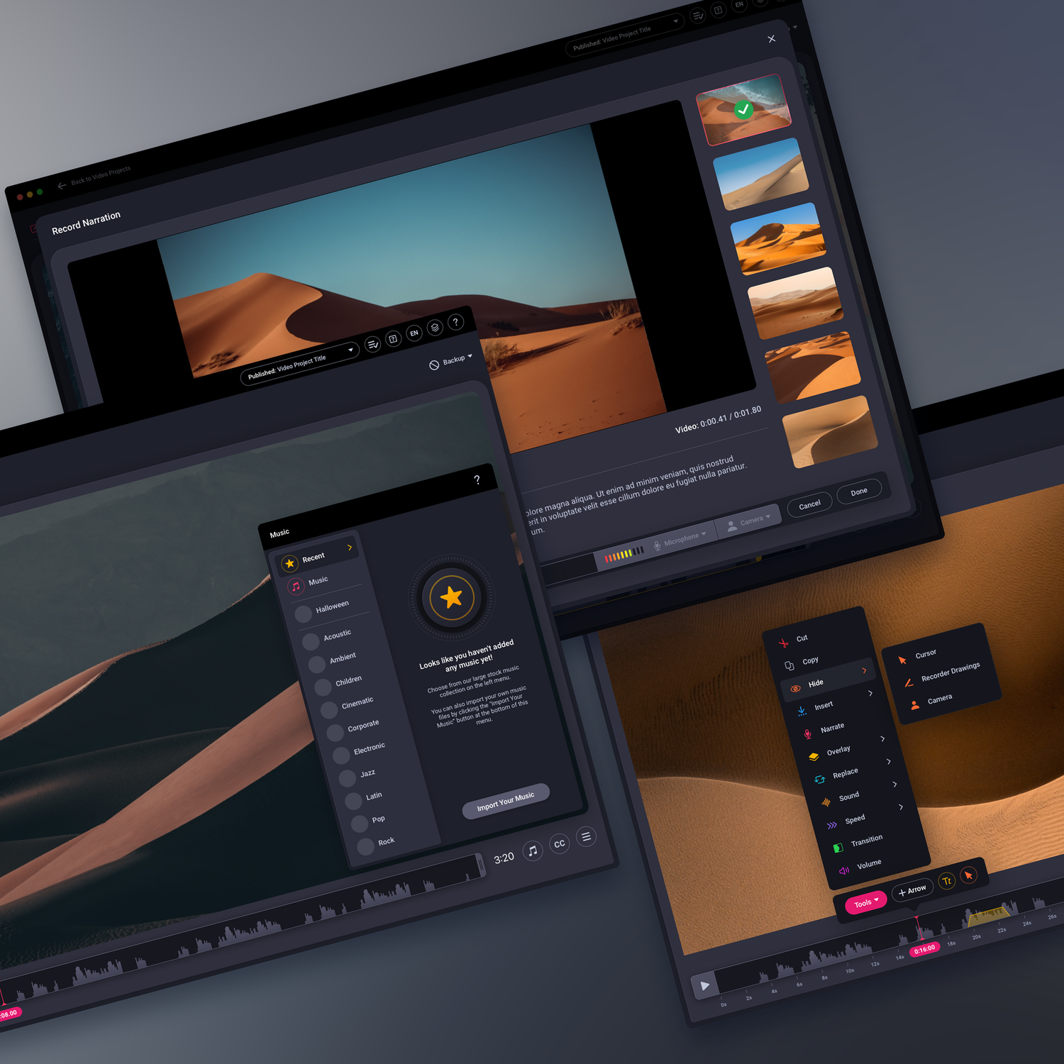
When we first started discussing the redesign, we brought up doing a light and dark mode version of the software application. The client loved the idea but wanted to tackle the dark version first. What you see right now in the portfolio (and in the above image) is the light mode version we just completed. They allowed us to show the light version early as long as the brand identity was removed since it hasn’t been debuted to the public. The dark mode version we delivered to them has been released globally.
We’re going to show some early dark mode design comps. In the end, the deep blue color for the UI is what the client requested and received. While we love the design, we felt a more neutral dark grey would work better. This decision to show a dark grey version is another reason why we voluntarily removed the branding. More on that later. Let’s look at some early menu tests.
Early Dropdown Menu Tests
Early Test. Notice how the progress fill is part of the dropdown button.
Early Test: Dark, contrasting menus.
Final Version
As you can see above, this is the deep blue final version of the recorder application’s user interface. We may be biased, but we think it’s stunning.
Revamping Menu Icons: A Vibrant and Functional Makeover
One of the tasks we were assigned was a complete overhaul of the menu icons. The sheer number of menu icons can be overwhelming for both designers and users. Streamlining and unifying the icon set can simplify the user experience and create a cohesive visual language throughout the interface.
Among the various options our design team explored, was a floating, multicolor style which often stands out as a visually striking choice. This was what we designed originally back in 2009. This style brings a sense of vibrancy and playfulness to the interface, instantly capturing users' attention.
There were both internal and external discussions with the client, regarding the level of uniformity in color usage among menu icons for the revamp. While internally we prefered a more uniformed look by default, the client advocated for individual colors that correspond to each icon. Our design team felt that if colors were activated on hover or click, it would add a dynamic element to the menu icons while keeping them uniformed which was a less busy design language overall. Ultimately the client chose the far left version of the icon set.
Deciding to Showcase Original Intent: A Designer's Perspective
Designers live by their portfolios. It's an opportunity to showcase our skills, creativity, and original intent. However, often the work presented in a portfolio doesn't reflect what makes its way into the real world.
The Client Comes First, Always
As designers, our primary goal is to serve the client. We aim to bring their vision to life and create an impactful user experience. Our portfolio acts as a testament to our capabilities and expertise. It's a glimpse into what we're capable of achieving. But what if we disagree with the direction of say the application’s overall color or design embellishments? Simple. We give the client exactly what they want and then we have the option to go back and modify the user interface in a way we originally intended for showcasing in our portfolio.
We love the dark blue design, but we also feel in an environment that is populated by screen recordings, videos and images, a dark, neutral visual design would function best. It’s a subjective opinion with no right or wrong point of view. In the realm of design creation, original intent plays a pivotal role in establishing our credibility, uniqueness, and value. It refers to the idea of presenting information in a way that reflects our perspective, knowledge, and expertise. By showcasing our original intent, we differentiate ourselves from competitors, build trust with our audience, and strengthen our brand identity.
So we took the time to recolor the application and are showcasing it in our portfolio as we originally intended. You can view it via the image link at the bottom of the page.
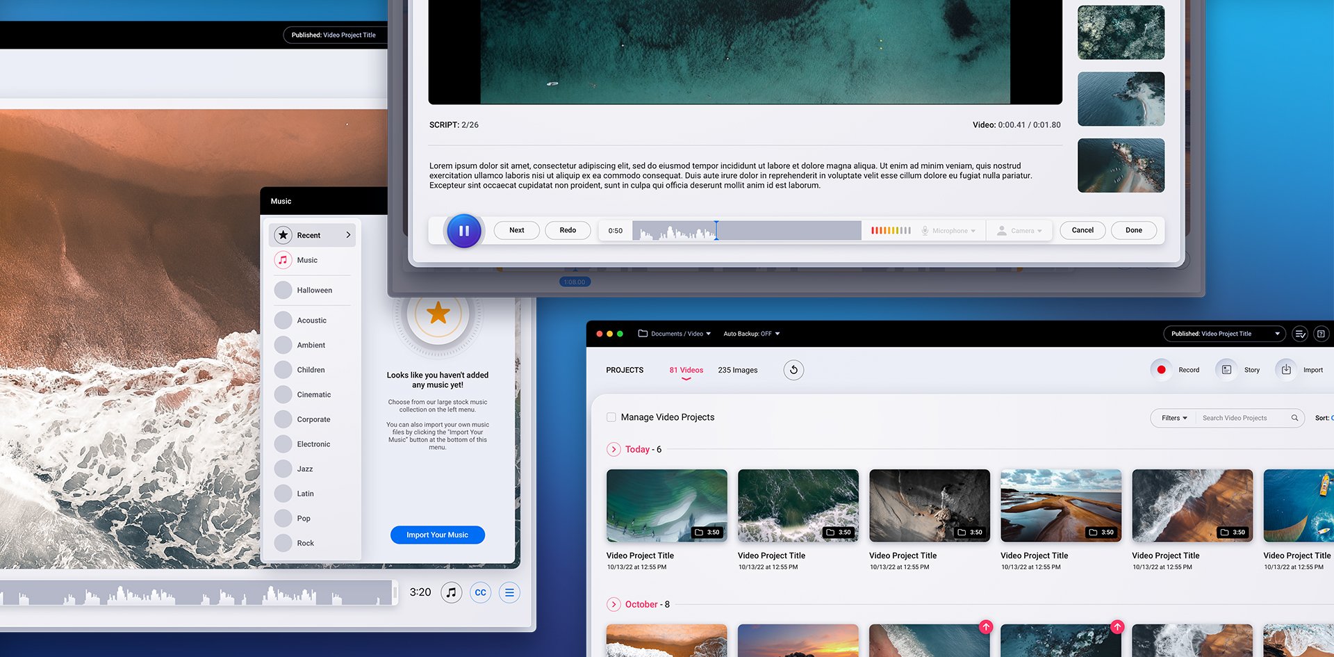
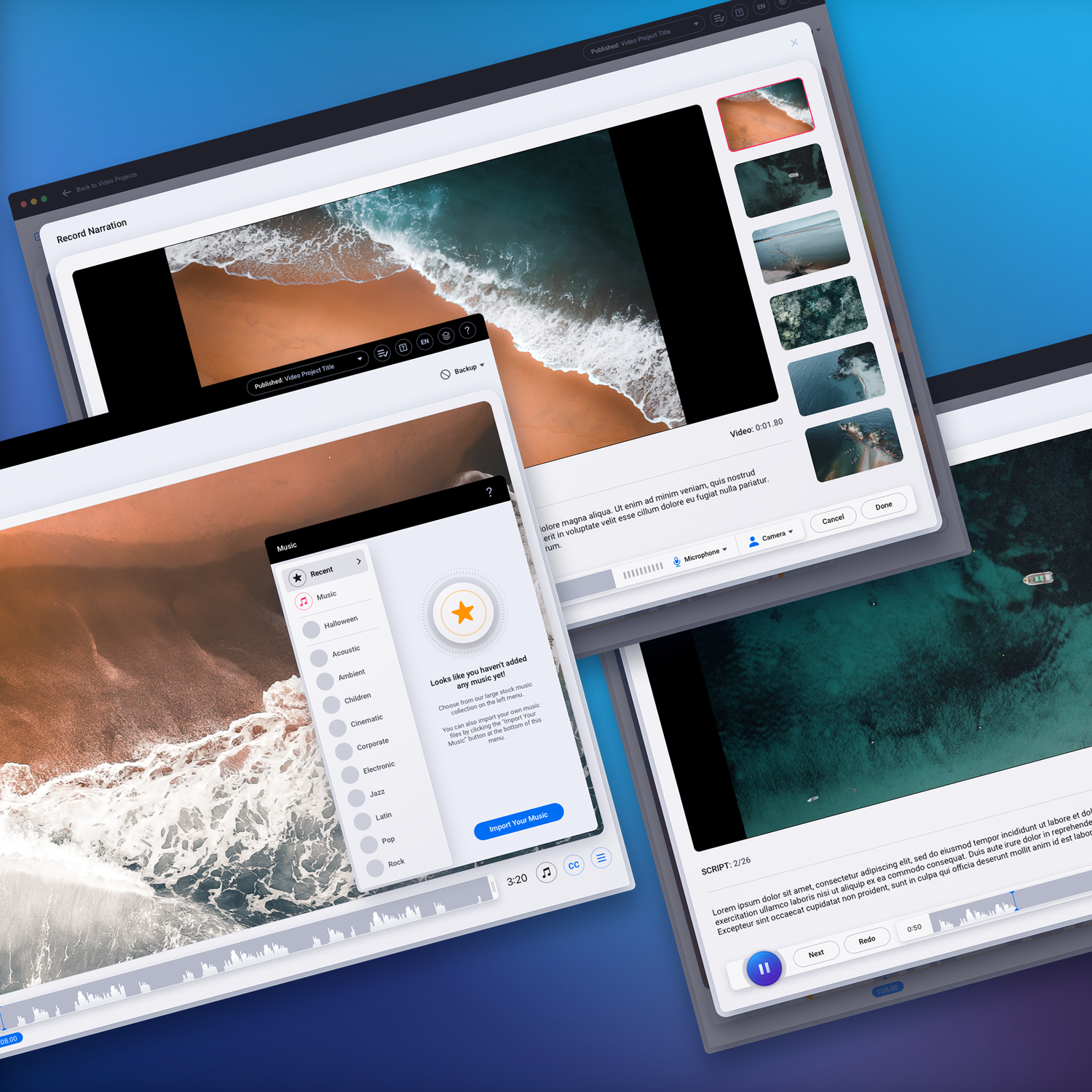
The Delivered User Interface
We’re presenting images of the final user interface we gave our client. This is close to the version that went live. There are still some minor details we’ve kept in for presentation purposes that we modified per the client’s request. We’re very proud of the work we gave them. We think it looks stellar. Here’s a sampling of that work…
Project Manager Application Dashboard UI/UX Design
Video Editor Base - Tools - Menu
Video Editor Base - Music Menu
Narration Tool Recording Screen
Importing Audio UI/UX Design
Publish Project Modal Design
Story Creation UI/UX Design Utilizing a Neumorphic Design Language
Screen Recorder Editor Base - Menus Design
Screen Recorder Editor Base - Menus Design
The Final Portfolio Versions
To View in Light Mode and Dark Mode (as we originally intended) click an image below.
Light Mode Version: Click or Tap to View
Dark Mode Version: Click or Tap to View
Have a project in mind? Let's talk.
Thank you for reaching out.
We will be in touch within one business day.
About Jeff Schader
Jeff Schader is the CEO and Founder of The Skins Factory, a leading UI/UX, web, and brand creation design studio based in the Miami/Fort Lauderdale area. With over 28 years of experience (25+ years running The Skins Factory) in the design and technology sectors, Jeff has built a reputation for innovation, excellence, and customer-centric solutions. As the driving force behind The Skins Factory, he oversees every aspect of its operations, ensuring meticulous attention to detail and a commitment to exceeding client expectations.
Under Jeff’s leadership, The Skins Factory has evolved from a modest startup into a renowned name in the industry, known for its cutting-edge design capabilities and unwavering quality. His keen eye for design and passion for technology have fueled the company’s growth, attracting a loyal client base that includes major brands and industry leaders worldwide.
