

CareCentrix Discharge Printable Template
BY JEFF SCHADER
Streamlining Discharge Processes:
How CareCentrix & The Skins Factory Collaborated to Make Patient Discharges More Efficient
As the healthcare industry continues to evolve, there's a growing need for more efficient and streamlined processes, especially when it comes to patient care. Discharge processes, in particular, have historically been a pain point for both patients and healthcare providers. But now, thanks to the innovative collaboration between CareCentrix and The Skins Factory, the future of healthcare discharge processes is looking brighter than ever. By leveraging CareCentrix’s cutting-edge technology and a commitment to quality patient care, and The Skins Factory’s seasoned, user experience design studio, together we’ve worked hand-in-hand to revolutionize the way patients are discharged from hospitals and other medical facilities.
Project Overview
Two years after designing HomeFirst for CareCentrix, The Skins Factory was again tasked by our client. This time it was to design a discharge template for HomeFirst in two formats. One to be printed in the A4 format to be delivered to patients and a version to be viewed on a iPad or tablet by the Nurses.
For the printable versions, our design team created them in two formats - Color and B&W. We understood that a color version couldn’t be a drain on the printer’s ink supply. One of the key elements of efficient design is the use of color. Color can help to organize information, highlight important details, and make printed materials more visually appealing. So we used it sparingly, but effectively.
We carried over some of the design language from the iPad user interface we designed, and made subtle changes for this new format. One of the embellishments we brought over were subtle neumorphic design touches that lifted pertinent information off of the background, creating a stylistic approach to an otherwise 2D, flat design.
The version you see below is the single page format in color. A two-page design was created that allowed for the Options Tables to contain more entries with each option table on their own page.
The Deliverables
Color Print Design Template
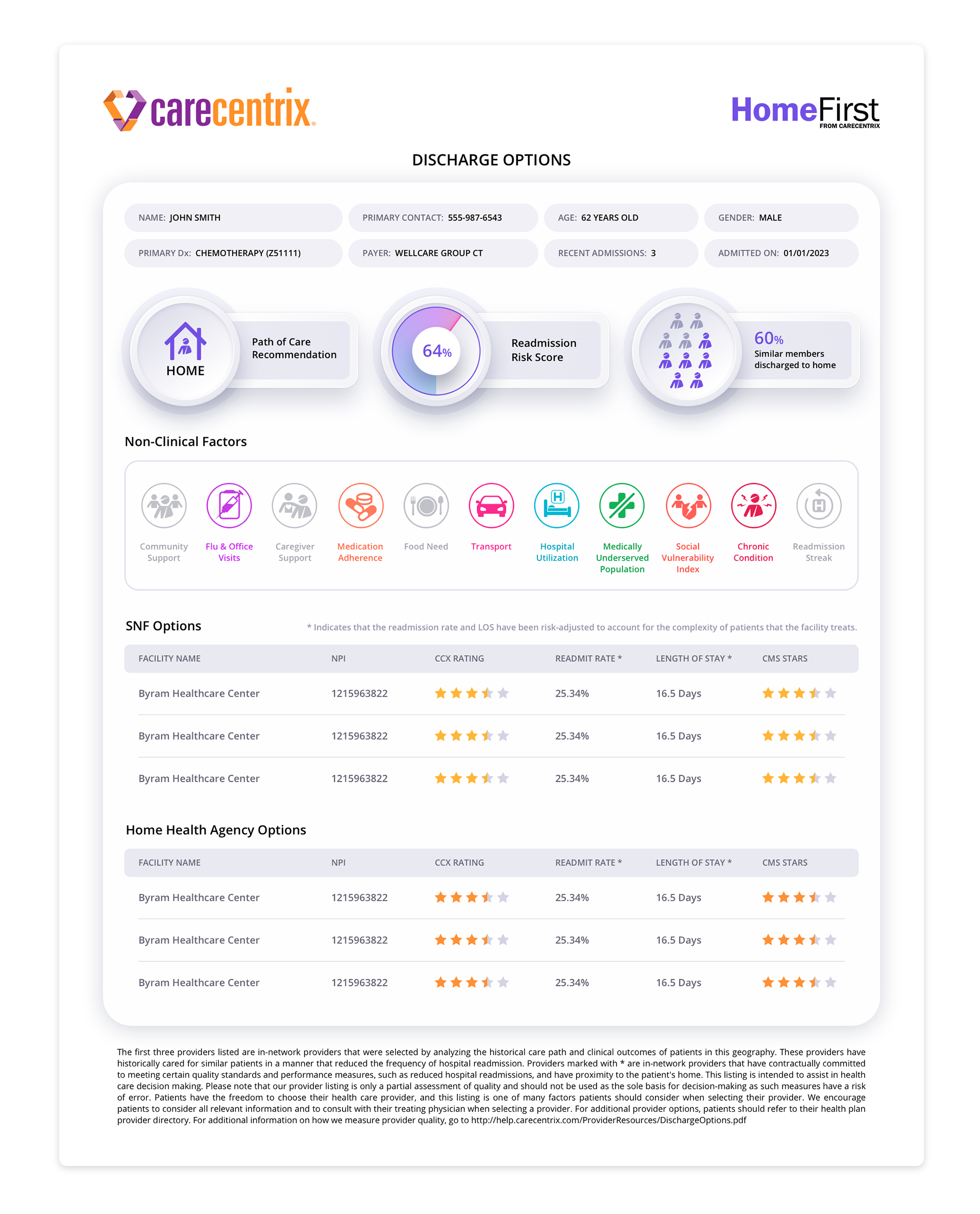
Non-Clinical Factors Iconography Design for Color Print
Considering that the original Home First iPad app icons resided on a dark background, our UX designers opted to use vibrant gradients for the new icons in order to make them visually stand out. The utilization of gradients added depth and dimension to the icons, capturing the attention of the users and creating a more engaging experience. By employing vibrant gradients, our designers were able to create a visual contrast that made the icons "pop" off the screen, ensuring that they could be easily noticed by the users.
Creating New Icons
Part of the new task at hand was to develop four new icons to be added to the existing icon set of the Home First iPad app. With this goal in mind, we set out to create icons that would be visually striking and easy to understand for the users while merging seamlessly with the icons we created for the app.
Enhancing Legibility with a Singular, Vibrant Color
During the process of adapting the icons for print purposes, our team faced the challenge of maintaining legibility and aesthetic appeal. We decided to convert all active icons to a singular, vibrant color that would not only improve legibility but also create a consistent visual language. This design choice, allowed for a harmonious integration of the new icons into the existing icon set, providing users with a seamless experience.
Distinguishing Inactive Icons through Graying Out
In the context of patient-centered design, it is crucial to provide clarity and avoid confusion. To achieve this, we took a thoughtful approach to icons that did not apply to the patient. These icons were visually differentiated by graying them out, clearly indicating their inactive nature. This design decision ensured that users could easily distinguish between the active icons and those that were not relevant to their clinical needs.
B&W Print Design Template
Black and white printing may not seem like a complicated task, but achieving the perfect balance between contrast and clarity can be an art form in itself.
We ran multiple printing tests to fine-tune the contrast and legibility of the discharge document, while taking into account the amount of printer ink that would be used.
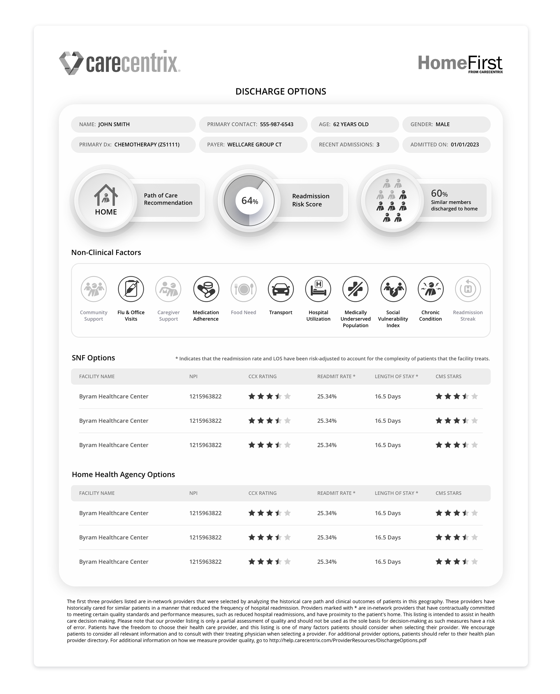
Non-Clinical Factors Iconography Design for B&W Print
With color, you can differentiate between active or inactive by using color and grayscale. With B&W we didn’t have that ability. So active icons became pure black and inactive icons stayed muted and grayscale.
Color Tablet Design Template
The final task was to create a tablet version of the print template. To achieve this, the design team took design cues from the original application design and updated them slightly to reflect current trends. As a result, the layout of the tablet version is crisp, sleek, and modern. One of the design elements that make the all versions stand out is the use of neumorphic embellishments. They help to lift the content off the screen, making it more engaging and visually appealing.
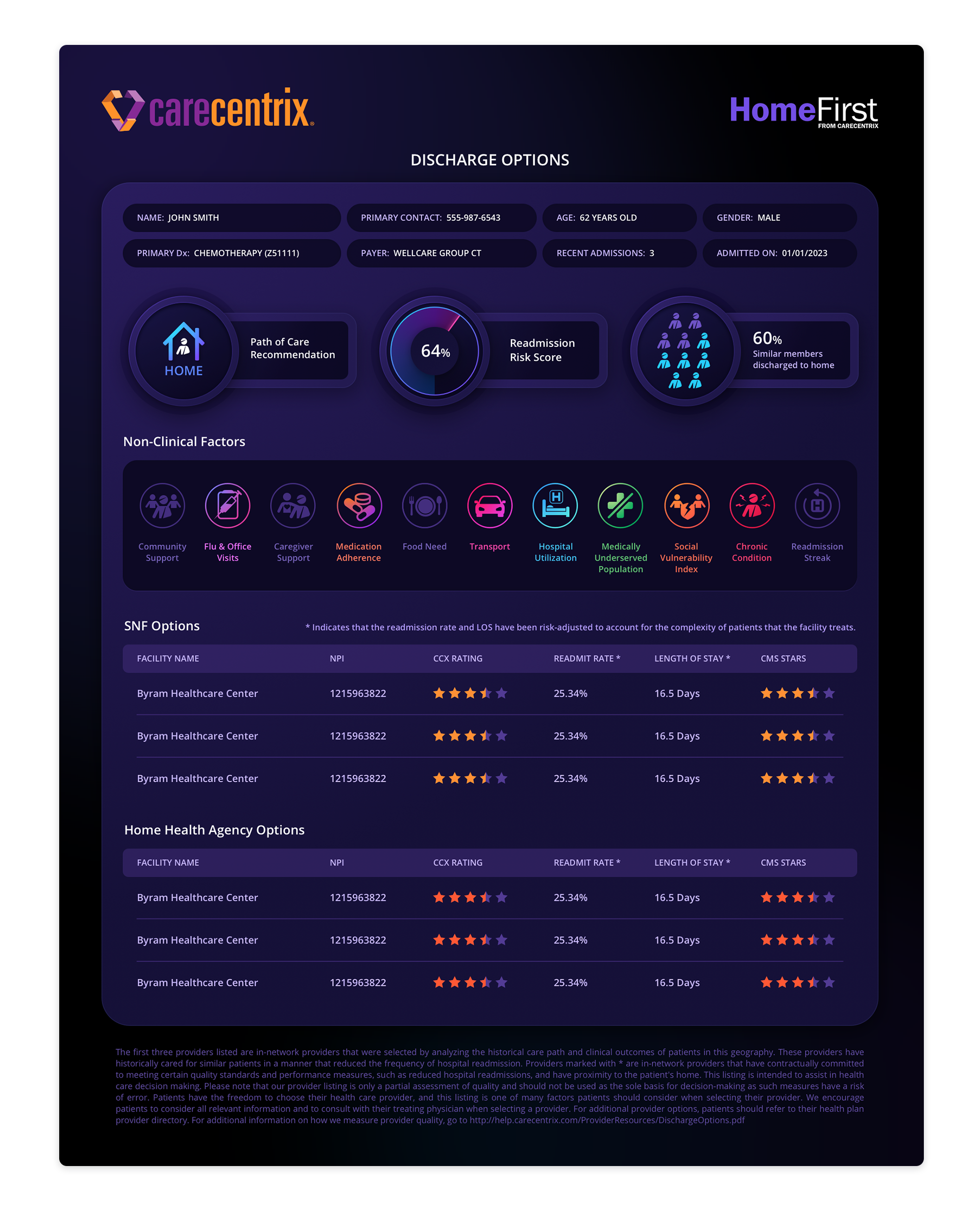
Non-Clinical Factors Iconography Design for Tablet
We stayed true to the original iPad icon design infusing them with rich gradients while creating new ones for the additional 4 icons. Inapplicable icons use the original muted, deep purple design language.

The Previous Project
It started back in late 2021, when CareCentrix contracted The Skins Factory to design HomeFirst, an iPad application designed to help streamline the discharge process for Nurses. It was during the coronavirus pandemic that we were tasked with creating the user interface and user experience design for the HomeFirst application. Nurses in hospitals work under constant pressure and intense, fluorescent lighting, so we opted for a darker visual design that would deliver a sense of calm and purpose. We felt it was our mandate to create a tool that would not only expedite the tasks they had to perform, but also be intuitive and endearing to use. Click the image below to view the project.
★★★★★
”The design they delivered was incredibly well done; it was visually awesome.”
Michael Ducharme, VP of Product & Analytics, CareCentrix

