We Design Extraordinary Things

SaaS Guide

The Skins Factory  ·  The Definitive Guide

The SaaS UI/UX Design Guide: Designing Software Products That Earn the Renewal

Written by Jeff Schader, Founder, The Skins Factory. 25+ years designing trust-critical software for fintech, healthcare, cybersecurity, and enterprise SaaS. Clients include Microsoft, Intel, and ACI Worldwide. A practitioner guide, not a theory piece. Everything here comes from designing real enterprise platforms, dashboards, and SaaS applications that shipped.

The SaaS UI/UX Design Guide banner image

A Working Guide Built From Real Projects

Designing Software Products That Earn the Renewal

Most SaaS products do not lose customers at the renewal meeting. They lose them months earlier, in the interface, one confusing screen at a time. A user who cannot find the feature they are paying for, dreads opening the dashboard, or quietly returns to spreadsheets has already churned. It's not a matter of "if" they will cancel, only when. In a subscription business, the interface has to earn the customer again every day.

That is what makes SaaS UX different from ordinary product design. Traditional software was sold once; SaaS is rented. Every screen either deepens the habit that leads to renewal and expansion, or feeds the quiet disengagement that ends in a cancellation action. The interface is the sales team after the contract is signed.

We were discussing this internally the other day. How we miss the days of "owning the software" instead of renting it. It used to be that you bought a software license and could keep using that version indefinitely. If you stopped paying for upgrades or maintenance, the software still worked, you just didn't get new features. That's the fundamental difference with SaaS. Customers aren't just paying for new features. They're paying to continue using the software they already have. Which means the user experience has to justify that expense, month after month.

In SaaS, the interface is not how users access the product. It is the reason they keep paying for it, or the reason they stop.

This guide explains how to design SaaS products that earn renewal. It covers onboarding and activation, trials and conversion, dashboards, data tables, empty states, navigation, feature adoption, notifications, admin consoles, permissions, billing, integrations, cancellation, AI, design systems, accessibility, procurement, and redesigning a live product. It is written for heads of product, CTOs, founders, and design leaders building or rebuilding SaaS software. If you're looking for a team to design or redesign a SaaS application, see how our SaaS UI/UX design agency approaches enterprise applications, complex workflows, dashboards, and scalable software platforms.

Guide Overview

What This Guide Covers

01 Why SaaS UX Is Different The subscription economics that reshape every design decision. 02 Onboarding, Activation, and Time to First Value Getting users to the moment the product proves itself. 03 Trial, Freemium, and Conversion UX Designing the path from curiosity to paid. 04 Dashboards and Data Visualization Turning stored data into decisions. 05 Data Tables and Complex Grids The unglamorous workhorse of enterprise SaaS. 06 Empty States, Loading States, and Zero-Data Design Designing the moments before the product has anything to show. 07 Navigation and Information Architecture at Scale Keeping a growing product findable. 08 Feature Adoption and Discoverability Getting shipped features used without nagging. 09 Notifications and Digest Design Earning the right to interrupt a workday. 10 Settings, Admin Consoles, Roles, and Permissions The surfaces that win and keep enterprise accounts. 11 Pricing, Upgrades, Billing, and Paywall UX Designing the moments where money changes hands. 12 Integrations, Marketplaces, and Extensibility Designing the product's place in a larger stack. 13 Churn, Cancellation, and Offboarding UX The flow almost nobody designs honestly. 14 AI in SaaS Interfaces Copilots, agents, and automation users can trust. 15 Design Systems for SaaS at Scale The infrastructure that keeps a growing product coherent. 16 Accessibility and Enterprise Procurement Designing for every user, and for the buyers who check. 17 Redesigning a Live SaaS Product Changing software people use every day without losing them.
Also Included Ship-ready checklists for every section, an extended FAQ, and a glossary of SaaS UX terms.

The Subscription Changes Everything

01. Why SaaS UX Is Different

SaaS demands a different design approach because the business model changes what the interface is for. Subscription products carry pressures most software never faces, and those pressures shape every design decision that follows.

The Product Is Rented, Not Owned

When software is bought once, a frustrating interface becomes a sunk cost. When software is rented, the user keeps asking whether it is still worth paying for. That decision happens formally at renewal and informally every time the product opens. Design quality is therefore not a launch concern; it is a retention variable that compounds throughout the subscription. Want to lower churn rates? Fix your user interface.

Adoption Is the Real Product

Enterprise software has a word for licenses that are purchased and never used: shelfware. A SaaS product that is bought but not adopted is a cancellation with a delay on it. Design must do more than make tasks possible. It must make the product worth using week after week, despite the spreadsheet or competing tab users can return to. Every section of this guide ultimately serves adoption.

The Buyer and the User Are Different People

In consumer software, the buyer and user are usually the same person. In enterprise SaaS, a VP may sign the contract while an analyst lives in the product all day. The buyer needs control, reporting, and proof of value; the daily user needs speed, clarity, and minimal friction. Serve only the buyer and the product becomes shelfware. Serve only the user and it can stall in procurement.

The Product Never Stops Growing

SaaS ships continuously. Every sprint brings a reasonable case for another menu item, setting, or notification. Without design governance, the elegant product launched in year one becomes a junk drawer by year three. Information architecture, progressive disclosure, and an authoritative design system are permanent disciplines, not periodic cleanup projects.

The Core Principle

SaaS products are built to function. The best ones are built to become habits. Every technique in this guide serves that single goal.

The job is not to make the product look modern. It is to make a capable, growing, often complex product feel so clear and useful that renewal is never really a question.

The Path to First Value

02. Onboarding, Activation, and Time to First Value

Onboarding is where SaaS products lose many of the users they worked hardest to acquire. Marketing, sales, or word of mouth already earned the signup. The next few minutes decide whether it becomes an active customer or a dormant account. The central measure is simple: how quickly does the user reach the moment when the product visibly proves its value?

Define the Activation Moment Before Designing Anything

Every SaaS product has an activation moment: the first report generated, project shared, or automation completed. Until the team can name it precisely, onboarding design is guesswork. Treat every screen between signup and activation as a cost to justify. Anything that does not move the user toward value should be removed, deferred, or automated.

Shorten the Path Ruthlessly

The most common onboarding failure is front-loading configuration. Products ask for integrations, teammates, workflows, and profile details before showing anything useful, demanding maximum effort at minimum commitment. Invert the sequence. Defer what can wait, infer and pre-fill what you can, and let defaults work. Users who have experienced value will configure the product afterward; users who have only seen forms may never return.

Personalize the Path Without Interrogating

A few signup questions, such as role, team size, and primary goal, can route users to the right setup path and templates. But each question must visibly change what happens next. A questionnaire whose answers change nothing is friction disguised as personalization.

Design for the Team, Not Just the First User

Most SaaS value is collaborative, yet onboarding is often designed only for the account creator. The first user is a scout. Design the invitation moment carefully, then design the invited teammate's arrival as a separate experience. That person enters a workspace they did not create, without the creator's context or exposure to the marketing site. Their first five minutes matter just as much.

Make Progress Visible and Resumable

Setup gets interrupted by meetings, missing credentials, and ordinary work. If returning means starting over or facing a blank screen, many users do not return. Persist progress across sessions and show one clear next step. A resumable checklist turns onboarding from a gate into a path and gently pulls the user back toward activation.

Common Questions

What Is a Good Activation Rate for a SaaS Product?

There is no universal activation benchmark because products define activation differently and require different amounts of setup. The useful comparison is internal: define the moment precisely, measure every stage from signup to value, and find the screen where the largest share of users stall. That cliff is usually a specific design problem, and moving it matters more than comparing your number with another company's.

How Long Should SaaS Onboarding Take?

Onboarding should take exactly as long as the shortest honest path to first value. That may be minutes for a simple tool. For a data-heavy platform, value may depend on an import or integration; make the wait productive with honest progress, sample data, and a clear notification when real data is ready. Duration matters less than continuous forward motion.

From Signup to Paid

03. Trial, Freemium, and Conversion UX

The stretch between signup and payment is the most commercially loaded part of the product. Trials and free tiers are often treated as pricing strategy, but users experience them as design: what they can use, what is locked, how the product asks for money, and what happens when time runs out. Each decision moves conversion.

Match the Model to How Value Is Discovered

A time-limited trial works when the product can prove its value quickly and fully, so complete access plus a deadline creates focus. Freemium works when value grows through sustained use or collaboration, keeping future customers inside until their needs expand. Choose based on the path to activation and whether a clock helps users reach it or merely punishes slow starts.

Anchor the Trial to Activation, Not the Calendar

A trial measured only in days treats every signup alike, including the person who started before a vacation or a busy week. Design the trial as a guided path to activation, with the deadline as a backstop rather than the mechanism. Emails, checklists, and prompts should move the user toward value. A user who reaches value can convert; more time does little for one who never does.

Show What Paid Looks Like Before Asking

Locked features should remain visible. A disabled capability with a one-line explanation of what it does and which plan unlocks it teaches the plan structure in context. Hiding paid features until the pricing page turns an upgrade into an abstract leap. Showing them makes it a concrete decision about a capability the user has already wanted.

Make the Upgrade Moment Contextual, Not an Ambush

The best upgrade prompt appears when the user reaches the exact limit the paid plan removes: the next project, an additional teammate, or a longer report history. In that moment, the prompt is useful information. The same message as a recurring banner, login interruption, or countdown becomes pressure. Placement and frequency both matter.

Design the End of the Trial as a Landing, Not a Cliff

Trial expiration is a designed experience whether anyone planned it or not. Do not lock users out of their own work. Let them see and export what they created, close paid capabilities clearly, and provide one obvious path to upgrade or move to a free plan. Users who leave respected are more likely to return when the timing improves.

Common Question

Should a SaaS Product Use a Free Trial or a Freemium Tier?

Use a trial when users can reach meaningful value within days and full access helps them prove it. Use freemium when value compounds over time or grows as teammates join. Many products combine both: a permanent individual tier with a trial of team features. The wrong choice is copying competitors instead of designing around your own activation path.

Turning Data Into Decisions

04. Dashboards and Data Visualization

The dashboard is where a SaaS product performs its value or fails to. It is usually the first screen after login, the screen executives see when they ask whether the tool is worth keeping, and the screen screenshotted into the renewal deck. Yet most dashboards are designed backward, starting from the data the system happens to have rather than the decisions the user needs to make.

A Dashboard Answers Questions, It Does Not Display Data

The difference between a dashboard and a status wall is intent. Before layout begins, the design should name the handful of questions this screen exists to answer: is anything wrong, what changed, what needs my attention today, are we on track. A widget that merely shows a number because the number exists is decoration with a query cost, and enough of them together bury the answers users came for.

From the Work

Designing the Dashboard for a Cybersecurity Company

View FortifyData Project

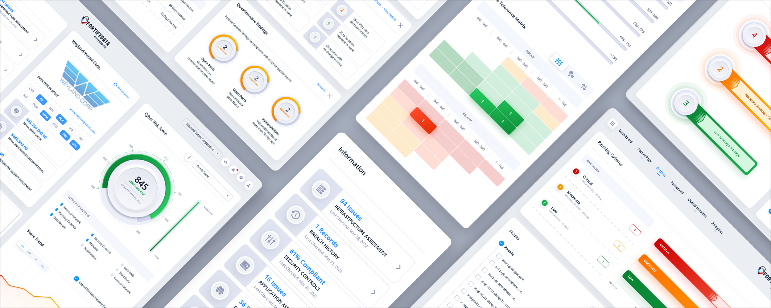
We organized the experience around the questions security teams needed to answer: where exposure was increasing, what was driving the risk score, which assets or vendors required attention, and what action should happen next. Risk scores became entry points into the findings beneath them, while contextual slide-in panels let users review, filter, and act on information without losing their place in the platform.

FortifyData cybersecurity application dashboard and risk visualization UI/UX design

Hierarchy Follows Consequence

The most important information is whatever the user would act on first, and the layout should make that unmistakable before a single label is read. Size, position, and contrast should track consequence: exceptions and anomalies above steady-state confirmations, current status above historical context, the metric tied to this user's responsibility above the ones tied to someone else's. When everything on a dashboard is presented with equal weight, the design has quietly declared that nothing matters more than anything else, which the user knows is false.

Progressive Disclosure for Depth

A dashboard is a summary, never a dead end. Every aggregate should open into its detail: the number into its trend, the trend into its records, the alert into its cause. Users accept a compact top level when one click reliably takes them deeper. A worrying number with no way to investigate it makes the entire summary less trustworthy.

Charts That Clarify, Not Decorate

Chart choice is a legibility decision. Trends want lines, comparisons want bars, parts of a whole want treatment with restraint, and many things presented as charts want to be a single large number with a delta. The test for every visualization is whether a user in a hurry draws the correct conclusion in a couple of seconds. If the honest answer is no, the chart is working against the product.

Defaults Are the Real Design

Customizable dashboards can serve products with diverse roles, but customization often becomes a place for design responsibility to hide. Most users never rearrange anything, so the default layout is the product for the majority. Design role-based defaults with conviction, then offer rearrangement to the minority who need it. Powerful editing tools do not excuse a weak starting point.

Common Question

What Makes a SaaS Dashboard Actually Good?

A good dashboard lets its user answer their most important recurring questions at a glance, and interrogate anything surprising within one or two clicks. In practice that means it is built around named questions rather than available data, it visibly prioritizes what deserves action, every summary drills into its underlying detail, and the default view works for the user's role without any configuration. If a user still exports to a spreadsheet to understand their own data, the dashboard has not done its job yet.

The Workhorse of Enterprise SaaS

05. Data Tables and Complex Grids

Nothing in enterprise SaaS gets less design attention relative to how much it is used than the data table. For operations teams, analysts, and administrators, the grid is not a component on a page, it effectively is the product: the place where records are found, compared, edited, and acted on for hours a day. Designing it as an afterthought, or shipping a component library default untouched, wastes the surface where power users decide what they think of the product.

Density With Hierarchy

Professional users want more rows on screen, not fewer, and the answer to their needs is never to strip data out. The answer is disciplined typography and alignment: tabular figures so digit columns line up, numbers right-aligned and text left-aligned, one strong emphasis level for the column users scan by, consistent formats for dates and quantities, and generous but not wasteful row spacing. Density is not the enemy in a working grid. A dense, well-set table reads faster than an airy, inconsistent one.

Design the Operations, Not Just the Display

A table's real interface is what users do to it: sort, filter, search, group, and save. Filters deserve first-class design, visible as removable chips rather than buried in a panel, combinable without a query language, and honest about what is currently hiding rows, because a forgotten filter is one of the most common ways users conclude the product lost their data. Saved views turn a repeated thirty-second setup ritual into one click, and for daily users they are among the highest-loyalty features a grid can offer.

From the Work

Pharmacy Management Data Tables

View Pharmacy Management Project

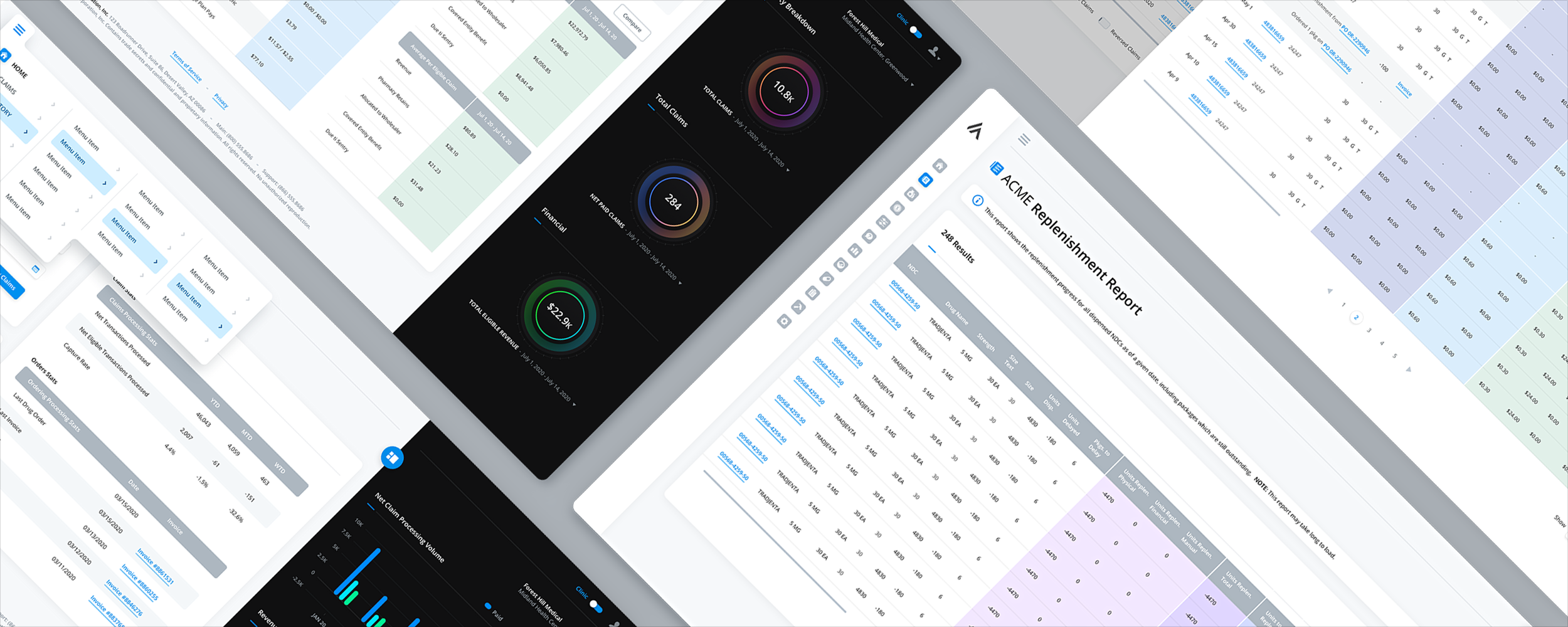
Replenishment, claims, financial, and inventory workflows involved large tables with dozens of columns, extensive search filters, and related actions. Conventional layouts would have meant too much horizontal scrolling, while opening secondary tasks on separate screens or in modals would have made it harder for users to keep their place.

We designed the tables for wide displays and used colored column groups to make long datasets easier to scan. Our Column Edit feature let users choose and rearrange columns, with search filters in collapsible sidebars. Related workflows opened in slide-in panels so users could work without leaving the table, while compact, expandable navigation gave the data more room.

Pharmacy management software with wide data tables, grouped columns, inventory and claims workflows

Bulk Actions and the Exception Workflow

Real operational work happens in batches: approve these forty, reassign these twelve, export this filtered set. Selection needs to survive pagination and filtering, the action bar should state plainly how many records it is about to affect, and destructive bulk actions deserve confirmation proportional to their reversibility. Make problem rows findable in one step, or watch users build a spreadsheet on the side to track them.

Editing in Place, Honestly

Inline editing removes an enormous amount of friction, and it introduces an obligation: the interface must always make save state legible. Users need to know whether a change is saved, saving, or failed, especially when optimistic updates put the new value on screen before the server confirms it. A failed save that looks identical to a successful one is silent data loss from the user's point of view, and in an operational tool that is the fastest possible way to destroy trust in the grid.

Performance Is a Design Feature

At tens of thousands of rows, speed becomes part of the interface. Virtualized scrolling, responsive column operations, and honest progress indication on slow queries are design decisions, not just engineering ones, and the design should be tested against realistic data volumes rather than the tidy twenty-row fixture in the prototype. Loading states that acknowledge the wait, and never block the parts of the screen that are ready, keep long operations from feeling like failures.

Common Question

How Much Data Is Too Much to Show in a SaaS Interface?

Professional users rarely suffer from too much data; they suffer from data with too little structure. Hiding useful columns adds clicks to every task. Organize what remains with hierarchy for scanning, alignment for comparison, filters and saved views for focus, and progressive disclosure for row-level detail. Simplify the presentation, never the truth.

Before the Data Arrives

06. Empty States, Loading States, and Zero-Data Design

A SaaS product spends far more of its life without data than its design mockups admit. Every new account, new project, new teammate, cleared queue, and over-narrow filter produces a screen with nothing to show, and for new users these screens arrive at exactly the moment opinions are being formed. The states between nothing and something are not edge cases. They are the product's first impression, repeated over and over.

The Empty State Is a Fork in the Road

When a user meets an empty screen, they either see what to do next or they see a dead end, and the product rarely gets a second chance at that moment. Every empty state should carry three things: what this space is for, what it will look like when alive, and the single action that starts filling it. An empty state with a clear promise and one obvious button is onboarding, delivered exactly where and when it is needed.

Teach, Seed, or Demo

There are three honest ways to fill emptiness. Teach with a compact explanation or template gallery. Seed the workspace with clearly labeled sample records that are easy to remove. Demo realistic dashboards while real data imports. Mature products use all three deliberately so the first experience is exploration, not doubt.

Skeletons Over Spinners, Honesty Over Tricks

Loading states shape the perception of speed as much as speed itself. Skeleton screens that sketch the incoming layout feel faster and calmer than spinners, because they promise structure rather than signaling uncertainty. What they must never do is lie: a progress bar that stalls at ninety percent or restarts teaches users to distrust every progress indicator in the product.

No Results Is Not the Same as Nothing Yet

A search with no matches, a filter that excludes everything, and an account with no data yet are three different situations, and collapsing them into one generic empty screen creates real confusion. The no-results state should restate what was searched or which filters are active and offer the obvious repair, clear filters, broaden the range, check spelling. When the user's data exists but the current view hides it, the interface must say so plainly, because the alternative conclusion users reach is that the product lost their work.

Zero-Data Charts and Dashboards

Dashboards have their own zero-data problem: one-point charts, two-day trends, and metrics with no meaningful comparison. Rendering them as mature visualizations looks broken or misleading. Acknowledge the product's youth, explain what the chart will become and what data it needs, and substitute a useful interim view where possible. Handling infancy honestly keeps new accounts confident when churn risk is highest.

Don't forget to check out the blog post in the Related Reading section below. We go into detail about how empty space can be used as an onboarding opportunity.

Common Question

Why Do Empty States Matter So Much in SaaS Specifically?

Because in a subscription product, empty states cluster at the point of maximum vulnerability: the beginning, when a new account is deciding whether the product was the right choice, and the user has the least knowledge and the least invested. In owned software a rough first screen is a bump on the way into something already purchased. Well-designed empty states are retention work done at the cheapest possible moment.

Keeping a Growing Product Findable

07. Navigation and Information Architecture at Scale

Every successful SaaS product is on a collision course with its own navigation. Features accumulate release after release, each with a sponsor and a defensible claim to visibility, and the structure that was obvious with eight features is a labyrinth with eighty. What actually happened is that growth outpaced architecture, and no one was empowered to say no to another menu item.

Structure Around Intent, Not Org Chart

The most reliable diagnosis of aging SaaS navigation is that it mirrors how the company is organized rather than how users think. Features cluster by the team that built them, names come from internal vocabulary, and related tasks live three sections apart because different departments shipped them. Good architecture starts from user intent: the jobs people arrive to do, grouped the way users themselves group them, validated with real users sorting real tasks rather than executives reviewing a sitemap.

The Junk Drawer Is a Governance Failure

Navigation decays through a hundred reasonable exceptions: a promoted feature here, a temporary top-level link there, a second settings area because the first was crowded. Healthy products treat their information architecture as a governed system with explicit rules, what earns top-level placement, what nests, what gets retired, and someone with the authority to enforce them. Without that authority, navigation is decided by whoever argued most recently, and the product drifts toward junk drawer one sprint at a time.

Respect Muscle Memory

In a tool people use daily, navigation placement stops being information and becomes reflex. Users do not read the sidebar, their hands know where things are. Moves can still be worth it, but they should be batched into deliberate, well-communicated restructures rather than dribbled out, and the payoff should be obvious enough to survive the grumbling.

Search and Command Palettes Are a Valve, Not a Fix

Global search and keyboard-driven command palettes have become essential in serious SaaS, letting power users jump anywhere and invoke anything in a keystroke. They are also the most seductive way to avoid fixing architecture, on the theory that findability problems disappear if everything is searchable. Search requires knowing what to look for, and the users hurt most by bad architecture, newcomers and occasional users, are precisely the ones who do not know the words yet. Fix the structure for everyone else.

Simple by Default, Powerful on Demand

The durable answer to feature sprawl is progressive complexity: a default experience organized around the common cases, with advanced capability revealed where it is relevant rather than displayed permanently. Role-based navigation, workspace-level feature toggles, and expandable advanced sections let one product serve the analyst who needs twelve capabilities and the administrator who needs eighty, without either seeing the other's clutter. The measure of scaled navigation is that the product feels appropriately sized to every user, no matter how large it actually is.

Common Question

How Do You Fix Navigation in a Product That Has Grown for Years?

Start with evidence, not opinions: usage data showing where people actually go, support tickets asking where things are, and a card-sorting exercise with real users to learn their mental groupings. Design the target architecture against that evidence, then migrate in planned stages, batching relocations, keeping temporary signposts from old locations to new ones, and telling users what moved and why. The failure mode is rearranging based on internal aesthetics and shipping it as a surprise, which converts an architecture problem into a trust problem.

Did You Know?

We’re a small studio that does big things. Always have.

The Skins Factory’s work has been installed on more than two billion PCs worldwide, having shipped on over one billion PCs across Windows Vista and Windows 7. We also designed Intel’s Graphics and Media Control Panel, which was installed on over one billion PCs worldwide.

In SaaS and enterprise software, we've designed complex applications for companies including Microsoft, Infor, and LionDesk. For LionDesk's CRM platform alone, we designed more than 120 application screens.

That same experience goes into the SaaS products we design today, from onboarding and activation to complex dashboards, data tables, navigation, design systems, and complete application redesigns. If you're building a new SaaS product or modernizing an existing one, let's talk.

Making New Features Discoverable

08. Feature Adoption and Discoverability

A feature nobody uses does not exist, no matter what the release notes say. SaaS teams ship constantly, and the gap between what the product can do and what customers know it can do widens every sprint. Closing it is a design discipline of its own, with real failure modes on both the too-quiet and too-loud ends.

Announce in Context, Not in a Blizzard

The default announcement pattern, a modal at login describing whatever shipped this week, interrupts everyone to inform almost no one, because it reaches users at the moment they came to do something else. Contextual announcement inverts this: the new export option appears as a subtle marker on the export menu, the new automation is introduced on the workflow screen it improves, discovered at the moment of relevance by exactly the users it serves. Announcements at the point of login convert to dismissals.

Every Interruption Spends Trust

Tooltips, tours, badges, and banners all draw from the same finite account: the user's willingness to be interrupted. Products that spend it freely, with a tour for every release and a badge on every menu, train users to dismiss everything unread, and then the one announcement that genuinely matters dies with the rest. One well-placed contextual prompt for a feature the data says this user needs will outperform five broadcast messages, and it leaves the account balance intact.

Meet Users at the Moment of Need

The highest-converting discovery moments are the ones where the product recognizes what the user is trying to do the hard way. The user who exports the same report every Monday is describing a scheduling feature. When the interface offers the capability at that moment, adoption feels like the product being helpful rather than marketing being loud. This kind of discovery has to be designed feature by feature, trigger by trigger, and it is worth every bit of the effort.

Design for the Returning User's Glance

Not every capability warrants a prompt, and users need a calm place to browse what is new on their own schedule. A well-maintained changelog or what's-new panel inside the product, skimmable, dated, and written in user language rather than release-note language, serves the curious without taxing the busy. It also carries a quieter signal that matters for renewal: visible, steady improvement. Customers renew products that are obviously alive.

Measure Adoption, Not Impressions

The metric that flatters is how many users saw the announcement. The metric that matters is how many used the feature in their real work more than once. Adoption tracking also feeds the harder conversation, retiring features that no amount of discovery work can justify, which is how the product stays navigable at all.

Common Question

Why Do Users Ignore New Features?

Usually because the announcement arrived at the wrong moment, in the wrong place, or aimed at the wrong person. Users are not opposed to new capability, they are protective of their attention while working. Features get adopted when they are introduced in the context where they apply, to the users whose behavior shows they need them, one interruption at a time.

Protecting the User's Attention

09. Notifications and Digest Design

Notifications are where a SaaS product either respects its users' working day or becomes part of the noise they resent. Every product team wants engagement, every feature wants to announce its events, and the sum of all those reasonable requests is an inbox and a badge count that users learn to ignore. Notification design is mostly the discipline of not sending, applied carefully enough that what does get sent still means something.

Interrupt Only for Action

The bar for a real-time interruption should be simple: something happened that this user needs to act on, soon, and would regret learning late. An approval waiting, a job failed, a teammate blocked. Products get this backward when engagement metrics reward interruptions, and users answer by turning everything off, taking the genuinely urgent down with the trivial.

Digest by Default

The digest is the workhorse of respectful notification design: a scheduled summary that batches the informational layer into one skimmable view at a predictable time. A good digest is prioritized rather than chronological, leads with anything actionable, and reads meaningfully in ten seconds. For collaborative products it is often the single most valuable retention surface, the quiet daily proof that things are happening and the product is where they happen, delivered without costing a single interruption.

Respect the Channel Hierarchy

Channels carry different weights of intrusion. An in-app feed item costs the user nothing until they look. Escalation up that hierarchy should track urgency, with the highest tier reserved for events the user would want to be pulled out of a meeting for. Sending routine activity over the interrupting channels reads as the product prioritizing its engagement over the user's attention, because that is what it is.

Give Users Real Controls, With Honest Defaults

Notification preferences deserve first-class design: per-category and per-project granularity, channel choice per type, mute and snooze that are easy to find at the moment of irritation, and plain language throughout. But controls do not excuse defaults. Most users never open settings, so the out-of-box configuration is the notification design, and it should be conservative enough that nobody feels compelled to hunt for the off switch in their first week. A user hunting the master toggle is a warning.

Fatigue Is a Churn Signal

When users disable notifications wholesale, they cut the product's legitimate voice along with the noise, missing the approvals, failures, and mentions the product genuinely needed to deliver. Disengagement follows quietly from there. Watch mute rates, notification-settings traffic, and open rates by category as leading indicators, and treat a spike in muting as a design defect in what is being sent, not as user misconfiguration to be won back with another announcement.

Common Question

How Many Notifications Should a SaaS Product Send?

As few as the product can defend, on the interrupting channels especially. The durable rule is that interruptions are reserved for events the user must act on promptly, everything informational is batched into digests and feeds, and the default configuration errs quiet. A product that over-notifies gets muted, and a muted product has lost its voice for the moments that matter.

The Other Side of Enterprise SaaS

10. Settings, Admin Consoles, Roles, and Permissions

Behind every polished SaaS workspace sits an administrative layer that can quietly decide the account's fate. Administrators run evaluations, manage rollout, absorb complaints, and influence renewal, yet they often work in consoles assembled feature by feature with far less design attention than the primary product.

The Admin Is a User, and a Kingmaker

Admin consoles get built as internal-facing afterthoughts because admins are few and end users are many. The arithmetic is backward. Designing the console with the same care as the primary product, coherent architecture, legible tables, humane workflows for the tasks admins repeat daily, is among the highest-leverage design work in enterprise SaaS, precisely because so few competitors bother.

Permissions People Can Reason About

Role-based access control falters when nobody can easily tell what each role actually allows. Admins end up assigning roles based on assumptions, often granting more access than necessary just to avoid support tickets. Then someone gets access to something they shouldn't, or can't access something they need. Permissions should be easy to understand, with a clear breakdown of what each role allows and who has access to what.

Never Let Users Wonder Which Tenant They Are In

Consultants, agencies, and enterprise staff routinely work across multiple organizations or workspaces in the same product, and acting in the wrong one is the multi-tenant version of sending money to the wrong account. Current context should be persistently visible, switching should be fast and unambiguous, and anything consequential, inviting users, changing billing, deleting data, should restate which organization it affects at the moment of confirmation. This is cheap design insurance against the class of error users find hardest to forgive.

Provisioning Is a First Impression Too

For enterprise accounts, the first real experience of the product is often the IT team connecting single sign-on, configuring SCIM provisioning, and mapping directory groups to roles. These flows are usually documentation-driven ordeals, which is a missed opening: guided connection flows, configuration tests that diagnose failures in plain language, and visible sync status turn a feared afternoon into a competent hour. The impression left on the people who run the deployment travels directly into how the rollout gets championed internally.

Visibility Is an Admin Feature

Much of what administrators need is simply the ability to see: who has access, who is actually using their seat, what changed recently and who changed it, where the account stands against its limits. A legible audit log, usage visibility per seat, and clear consumption displays serve daily governance, security review, and the renewal conversation all at once. An admin who can demonstrate the product's footprint and value from the console is an admin armed to defend the line item.

Common Question

How Is Enterprise SaaS UX Different From Small-Business SaaS UX?

The core workflows may be similar, but enterprise adds a second product around them: governance. Enterprise accounts bring administrators, compliance reviewers, and IT into the user population, and they bring requirements, SSO, provisioning, granular permissions, audit trails, data controls, that small teams never touch. Products that treat governance surfaces as checkbox features pass the demo and struggle in deployment, which is where renewals are actually decided.

Pricing Without Surprises

11. Pricing, Upgrades, Billing, and Paywall UX

Every subscription product contains a second, smaller product: the surfaces where money changes hands. Plan pages, upgrade prompts, seat management, invoices, payment failures. These screens get a fraction of the design attention of the features they fund, yet they are where customers form their sharpest judgments, because nothing is scrutinized like an interface that is asking for money. Clarity here compounds into trust. Cleverness here compounds into resentment.

The Paywall Is a Promise, Not a Wall

A paywall moment done well tells the user three things: what this capability does, what it would change about their work, and exactly what unlocking it costs. Locked features presented with that honesty become ambient education about the plan structure. Locked features presented as bait, prominent buttons that reveal the price only after a click, or worse after a form, convert curiosity into the feeling of being hustled. Each encounter either builds the case or erodes it.

Make the Meter Legible

Seat-based and usage-based pricing both put a meter inside the product, and an illegible meter breeds billing anxiety. Current consumption, remaining allowance, and the date the meter resets should be visible without a support ticket, approaching limits should warn early enough to act calmly, and the moment of overage must never be a silent charge discovered on an invoice. Predictability is the entire game: customers forgive costs they saw coming and litigate the ones they did not.

Design Plan Changes in Both Directions

Upgrades get designed lovingly and downgrades get designed never, which customers notice. A downgrade flow should state plainly what will be lost, what happens to existing data that exceeds the lower plan’s limits, and when the change takes effect, then execute without ceremony or guilt. Proration, plan-change timing, and what happens mid-cycle should be stated in the flow itself, not discovered on the next invoice.

Payment Failure Is a Retention Flow

A meaningful share of churn is not a decision at all, it is an expired card plus a poorly designed recovery. Involuntary churn deserves real design: unmissable but calm in-product notice, an update-payment flow that takes seconds, a grace period that does not hold work hostage while the card gets fixed, and messaging that treats the customer as someone with a lapsed card rather than a delinquent. This unglamorous flow routinely recovers more revenue than the promotional banners that received a hundred times the design attention.

The Dark Pattern Tax Always Comes Due

The tricks are well known: the pre-checked annual toggle, the hidden downgrade path, the cancellation buried behind chat with a retention agent, the price that appears only at the final step. Each one buys a short-term metric and charges it against the account the whole business runs on. Design them as if the customer will read them twice, because before renewal, they will.

Common Question

Where Should Upgrade Prompts Appear Inside a SaaS Product?

At the moment a user encounters the specific limit or missing capability the higher plan resolves, and almost nowhere else. Contextual prompts arrive as useful information: here is the thing you just reached for, and here is what it costs. A product confident in its value lets the moments of genuine need make the case, and keeps the volume down everywhere else.

Connecting to the Rest of the Stack

12. Integrations, Marketplaces, and Extensibility

No SaaS product lives alone anymore. Customers evaluate not just what a product does but how it fits the stack they already run, and a missing or broken integration is a disqualifier before features are even compared. Yet integration surfaces, the connection flows, the sync status screens, the marketplace listings, are chronically underdesigned, treated as plumbing when they are in fact trust moments involving the customer’s data flowing between systems.

Connecting Is a Consent Moment

Every integration begins with an authorization screen where the user grants one product access to another, and users have learned to be wary of it. The flow should name plainly what will be read, what will be written, and what will never be touched, in the user’s language rather than API scope names. Ask for what the integration needs now, and request more later when a feature actually requires it, with the reason attached.

Syncing Needs a Visible Pulse

Once connected, an integration disappears into the background, which is precisely the problem: when data flows silently, users cannot tell working from broken, and the failure mode is discovering weeks of missing records after decisions were made on incomplete data. Every integration deserves a visible pulse: when it last synced, what moved, whether anything failed and what to do about it. Silent success and silent failure look identical, and that ambiguity is what erodes trust.

The Marketplace Is a Shop Window, Run Like One

Once integrations number in the dozens, findability and credibility become design problems. A marketplace needs honest categorization, search that matches user vocabulary, and listings that state clearly what each integration does, what it requires, and what data it touches. A marketplace padded with broken or abandoned listings to inflate the logo count damages the platform’s credibility more than a shorter, curated catalog ever would.

Developer Experience Is UX

For platforms with APIs and webhooks, developers are users. Their experience follows the same rules as any interface: fast first success, honest errors, and legible state. Provide runnable examples, self-service scoped API keys, webhook logs that show what fired and failed, and errors that identify the real problem. A developer who integrates in an afternoon becomes an advocate; one blocked for days becomes the opposite.

Common Question

How Many Integrations Does a SaaS Product Actually Need?

Fewer than the logo wall suggests, and deeper than most products build. What customers need is the handful of connections central to their workflow, built reliably, with visible sync status and honest failure handling. Depth on the connections customers depend on daily beats breadth across a hundred they will never touch, both in evaluations and in renewals.

What Happens When Customers Leave

13. Churn, Cancellation, and Offboarding UX

No flow reveals a company’s character like cancellation. It is the one interaction where the product’s interests and the user’s appear directly opposed, and it is designed under exactly one temptation: make leaving hard. Cancelled customers talk, review, return, and sit on buying committees at their next company. The cancellation flow is the last impression, and last impressions are the ones people repeat.

Cancellation Is Designed Whether You Design It or Not

A buried cancel link, a forced call with a retention agent, a maze of confirmation screens: users read these instantly as what they are, and the resentment they generate outlives the subscription. The baseline is simple: cancellation findable where account and billing live, achievable in a handful of honest steps, effective when the user expects. A company confident in its product does not need to barricade the exit.

Ask Why, Once, and Make Answering Optional

The exit survey is genuinely valuable, churn reasons are among the highest-signal product feedback that exists, but it must be designed as a courtesy, not a toll. One screen, honest options including “prefer not to say,” and no gating of the cancellation behind completion. Users forced through three screens of justification convert mild disappointment into active hostility, and poison the data besides.

Offer the Right Alternative, Once

Many cancellations are not rejections of the product: the project ended, the budget paused, the team shrank. For those cases a well-placed alternative, pause the subscription, drop to a cheaper tier, move to the free plan, genuinely serves both sides. The difference between an offer and an obstacle is whether the user can decline it in one click and proceed.

Make Leaving Clean

What happens after confirmation matters as much as the flow itself. State plainly when access ends, what happens to the data and for how long it remains recoverable, and whether any further charges are coming. Holding data hostage or letting it silently evaporate converts a neutral departure into a grievance. A clean exit closes the account while leaving the relationship intact, and the relationship is what the win-back email will later depend on.

The Best Cancellation Flow Is Upstream

By the time a user reaches the cancel button, the decision is usually weeks old. The signals appeared earlier: fewer logins, idle seats, untouched features, or the departure of an internal champion. Products serious about retention respond there, resurfacing dormant value, easing re-entry after absence, and warning admins about underused seats before renewal. Honest cancellation and earlier churn prevention are the same discipline at different moments.

Common Question

Should Cancellation Be Hard to Find in a SaaS Product?

No. Obstructed cancellation trades a brief revenue delay for durable reputational damage, hostile reviews, chargebacks, and customers who leave angrier than the product ever made them while using it. Easy cancellation, paired with one respectful alternative offer and a clean data exit, loses very little revenue that was genuinely retainable and preserves the goodwill that drives returns and referrals. The energy spent hiding the button is better spent on the disengagement signals that precede it.

Designing AI Into the Product

14. AI in SaaS Interfaces

AI has moved from a differentiator to an expectation in SaaS, and the interface problems have moved with it. The challenge is no longer simply whether a model can summarize or draft. It is where assistance belongs, how uncertainty is communicated, what the human controls, and how the product accounts for actions taken autonomously. Products are increasingly separated by how thoughtfully their models are presented and governed.

Put Assistance Where the Work Is

The reflexive pattern is a chat panel bolted to the side of the product, and for open-ended questions it has a place. But most AI value in SaaS is delivered closer to the work: the suggested reply inside the ticket, the anomaly flagged on the chart it appears in, the draft generated inside the document. A chat window that requires users to describe what they are looking at is assistance taxed by narration.

Communicate Confidence, and Show the Sources

An AI feature that is right most of the time and always sounds certain is a trust liability, because the user cannot tell which answers deserve scrutiny. The interface should distinguish the reliable from the tentative, hedge honestly where the system is unsure, and wherever possible show provenance: which records, documents, or data points an answer was drawn from, one click away. Provenance converts blind trust into checkable trust, which is the only kind that survives the first visible mistake.

Match Autonomy to Consequence

Let reversibility determine when AI may act without asking. Drafting, suggesting, and reformatting are cheap to undo and can happen generously. Sending, deleting, paying, or notifying other people are consequential and belong behind human review: a preview of exactly what will happen, explicit confirmation, and an undo path whenever possible. Friction should rise with consequence.

Agents Need a Visible Ledger

As AI moves from suggesting to doing, working across records, running multi-step tasks, acting between sessions, the interface takes on an accounting duty. Users and admins need a legible record of what was done on their behalf: what the agent did, what it touched, why, and what it declined or failed to do, reviewable after the fact and interruptible during. Autonomous activity without a ledger reads as the product doing things behind the user’s back, and one unexplained change can undo months of accumulated trust in the feature.

AI Features Still Need Adoption Design

Teams assume AI features sell themselves, and the usage data says otherwise: assistants ship to fanfare and settle into single-digit usage because nobody designed the discovery. Everything in the feature adoption section applies with extra force here, because users carry both skepticism and inflated expectations. An AI capability nobody uses is the most expensive kind of shelfware yet invented.

Common Question

Should Every SaaS Product Add an AI Assistant?

Every product should ask where AI genuinely removes work, which is a narrower question than whether to add an assistant. The strongest implementations usually look less like a chat companion and more like invisible competence: better defaults, drafted starting points, anomalies surfaced, tedious steps collapsed. Adding one because the category demands it produces a demo feature that real usage abandons, and its idleness quietly tells customers the product chases trends.

Building Consistency Into a Growing Product

15. Design Systems for SaaS at Scale

SaaS burns through visual and behavioral consistency faster than almost any software category. Multiple teams ship into the same product every week, and every sprint creates another chance for a new button, table, or interaction pattern to appear. Without a system, the product begins to feel stitched together and users must relearn the interface module by module. A design system keeps a growing SaaS product feeling like one product.

Consistency Is a Trust Signal Users Cannot Name

Users rarely articulate inconsistency, they feel it. When date pickers behave three ways and confirmation dialogs phrase themselves differently by module, the product reads as less finished and less reliable, and in enterprise evaluations that feeling costs deals to more coherent competitors. Consistency also carries the learning: a user who has mastered one area of a systematic product has partially mastered all of it, which flattens the curve every new feature would otherwise steepen.

Cover the States, Not Just the Components

A component library that shows only the happy path is half a system. SaaS interfaces live in loading, empty, error, disabled, read-only, and overflow states. Specify those states, along with permissions, validation, and realistic content extremes, so teams do not improvise them under deadline. Those improvised answers are where inconsistency grows fastest.

Density, Themes, and Dark Mode as First-Class Citizens

Serious SaaS systems handle dimensions consumer systems can ignore. Data-heavy products need density modes, comfortable and compact, defined at the token level rather than hacked per screen. Products used in long sessions need a dark mode that is designed, with adjusted hierarchy and legible data visualization, not merely inverted. Building these into the system’s foundations from the start is dramatically cheaper than retrofitting any of them across an aging codebase.

A System Is an Organizational Agreement

The artifact is the smaller half of a design system. Governance is the larger half: who owns it, how components are proposed and approved, how changes are versioned and released, and what teams do when the system lacks an answer. Without authority and a contribution path, the library slowly becomes another set of optional suggestions.

What This Looks Like in Practice

When we design enterprise platforms at The Skins Factory, the system and the product take shape together rather than in sequence. Designing real screens surfaces the components, states, and density questions the system must answer; codifying the answers keeps the next dozen screens coherent by default. Our work on large biller and payment platforms for clients like ACI Worldwide followed exactly this shape: the delivered system is what allowed a product spanning many modules and years of subsequent development to keep feeling like one deliberate piece of software.

Accessibility Is Part of Getting the Deal

16. Accessibility and Enterprise Procurement

In SaaS, accessibility stopped being a courtesy long before most product teams noticed. Enterprise and public-sector buyers now ask for conformance documentation as a standard step in procurement, legal exposure around inaccessible software keeps widening, and workforces include people using assistive technology as a matter of course. The practical reality for a SaaS company is blunt: accessibility gaps are deal blockers, and remediation under deadline is the most expensive way to do work that was cheaper done right.

The Buyer Will Check Before the User Ever Logs In

Procurement teams request accessibility conformance reports, the VPAT being the common format, and route products through security-and-compliance review where accessibility increasingly sits alongside data handling. A vendor that cannot produce credible documentation loses evaluations silently, without ever learning accessibility was the reason. Treating WCAG conformance as a product requirement with an owner, rather than a wish, is what makes those documents honest, and honest documents are what survive the customer’s own audit.

Keyboard-First Serves Everyone

Full keyboard operability is a WCAG requirement, and in professional software it is also simply what power users want: the analysts and operators who live in the product all day are the same people demanding shortcuts and hating the mouse. Logical focus order, visible focus states, sensible tab paths through complex tables and dialogs, and shortcuts for repeated actions serve the accessibility mandate and the power-user experience with one effort. In SaaS, these audiences overlap so heavily that keyboard design is never single-purpose.

Color, Contrast, and States in Data-Heavy Interfaces

Data-dense products lean hard on color, status dots, chart series, red-versus-green deltas, and color alone excludes users with color-vision deficiency while failing everyone under glare or a cheap projector. Meaning needs a second channel: icons, labels, patterns, position. Contrast standards apply with extra force to the small text and subtle grays that dashboard aesthetics favor, and interactive states, focus, selection, error, must remain distinguishable in every theme, including the dark mode where contrast discipline most often quietly collapses.

Design for Real Working Conditions

Accessibility overlaps with something broader: the actual conditions of professional use. Screens viewed at a distance in operations centers, laptops in bright rooms, users in their fifties with ordinary presbyopia, non-native speakers parsing interface language under time pressure. Designing for the marginal condition reliably improves the median experience, which is why accessibility work so often gets mistaken for general polish after the fact.

Test Assistive Technology on the Money Paths First

Conformance checklists cannot substitute for using the product the way assistive-technology users will: a screen reader through onboarding, keyboard-only through the core daily workflow, magnification across the dashboard. Prioritize the paths where failure costs most, signup, activation, the primary loop, billing, and test them with real assistive tools each release, not annually. Automated scanners catch perhaps the shallow half of issues; the rest, focus traps, unlabeled dynamic content, unreachable modals, only appear in use.

Common Question

What Accessibility Standard Should a SaaS Product Target?

WCAG 2.1 AA is the level enterprise procurement, regulators, and courts treat as the practical baseline, and the level a VPAT is expected to address, with newer WCAG revisions worth tracking as buyers update their requirements. But the standard is the floor, not the strategy. The durable approach is building conformance into the design system, components accessible by default, states specified, contrast tokenized, so every new feature inherits compliance instead of re-earning it, and the conformance report stays true without a fire drill before each deal.

Redesigning Without Disrupting Customers

17. Redesigning a Live SaaS Product

Sooner or later every successful SaaS product faces the redesign question, dated visuals, accumulated debt, an architecture that no longer fits what the product became. What makes SaaS redesign uniquely dangerous is that the product is occupied. Thousands of people have built daily muscle memory, saved workflows, and trained colleagues inside the current interface, and they experience change to it the way anyone experiences a stranger rearranging their desk: as a violation first, and an improvement only maybe later.

The Backlash Is Rational, Plan for It

Users who protest redesigns are not resisting progress, they are paying a real cost: relearning taxes their working day immediately, while the benefits arrive gradually and mostly accrue to future users. Any honest redesign plan accounts for that asymmetry instead of dismissing it as change aversion. The goal is not avoiding all disruption, which is impossible, but making the disruption legible, bounded, and visibly worth it, so existing users are treated as stakeholders in the change rather than obstacles to it.

Audit Before You Touch

A live product is full of load-bearing details nobody documented: the workflow a major customer built around a quirk, the export a whole department schedules around, the seemingly redundant setting that one industry depends on. Before design begins, map actual usage, which features carry daily work, which paths power users travel, what support tickets reveal about pain versus preference. Redesigns fail most expensively not on aesthetics but on unknowingly breaking things that mattered, and the audit is the only insurance available.

Rebuild the Foundation, Then Migrate in Stages

The pattern that works is sequence: establish the new design system and information architecture first, then migrate the product onto that foundation in planned stages, starting where impact is highest or risk is lowest. Staged migration lets each phase absorb feedback before the next, keeps the team from maintaining two full products indefinitely, and spares users a single overwhelming discontinuity. The alternative, redesigning everything in secret and shipping it at once, maximizes both the surprise and the blast radius of everything the audit missed.

Version the Transition Honestly

For significant changes, users need agency in the timing. A preview period where the new experience is opt-in, a stable window where returning to the old one is possible, and a clearly communicated sunset date respect the reality that customers are mid-project, mid-quarter, mid-audit when your redesign lands. Silence, or worse a cheerful announcement that ignores the disruption, converts a manageable transition into a public revolt.

Measure the Transition, Not the Launch

A redesign is not done when it ships, it is done when the numbers that justified it move. Task completion times, support volume, feature adoption, and retention in the redesigned areas should be watched through the transition and compared honestly against the old baseline, with an expected temporary dip as muscle memory rebuilds. The discipline matters because it distinguishes a redesign that worked from one that merely looked newer, and it tells the team where the new design needs correction while correction is still cheap.

Common Question

Should a SaaS Redesign Ship All at Once or Incrementally?

Incrementally, in almost every case, with the design system and architecture established first so the stages accumulate into a coherent whole rather than a patchwork. The big-bang launch is tempting for marketing and brutal for users, who absorb every relearning cost in one day, and for the team, which discovers every missed dependency at once and in production. Past that size, staging is not caution, it is how the redesign survives contact with its users.

Frequently Asked Questions

The questions above appear throughout the guide alongside the sections they belong to. These are the ones that come up when companies are deciding whether and how to invest in SaaS UX itself.

How much does SaaS UI/UX design cost?

Cost is driven by scope more than anything else: how many workflows and platforms are involved, whether a design system needs to be built or extended, how complex the roles and admin surfaces are, and how much research and validation the product warrants. A focused engagement on one retention-critical flow is a very different investment from a full product design across web and mobile with a delivered design system. The practical advice is to scope around the surfaces where adoption and renewal concentrate first, onboarding, the core daily workflow, the dashboard, because that is where design investment returns fastest.

How long does a SaaS product design engagement take?

It depends on whether the work is a targeted redesign of specific flows or a full product effort, and on how quickly stakeholder and engineering review cycles move, which in larger organizations is often the real schedule driver. Well-run engagements move through discovery and audit, structure and flow design, detailed interface design, and design system documentation, with development able to begin on early flows while later ones are still being designed. Scoping the activation path and core workflow first also shortens the path to visible results.

Do we need a designer with SaaS experience specifically?

A strong general product designer can learn SaaS, but the learning happens on your users and your timeline. A designer fluent in the constraints, activation and time to value, data-dense dashboards and grids, roles and multi-tenancy, billing surfaces, the politics of redesigning an occupied product, starts at the second conversation instead of the tenth, avoids patterns that enterprise buyers will reject, and recognizes the failure modes before they ship. In a category where disengagement compounds monthly toward a cancellation, that fluency is usually the difference between a redesign that retains and one that merely looks better.

Should we redesign the whole product or improve it incrementally?

It depends on how sound the foundation is. If the information architecture and core workflows are healthy, incremental improvement focused on the highest-traffic surfaces is faster and less disruptive. The common middle path is to rebuild the design system and the retention-critical flows first, then migrate the rest of the product onto that foundation in planned stages.

How do you measure whether SaaS UX is working?

Watch the funnel at the moments this guide is about: activation rates from signup to first value, trial-to-paid conversion, feature adoption in the weeks after release, and retention in the workflows that were redesigned. Watch support volume and its themes, because recurring where-is and how-do-I questions are direct measurements of design failure. Improvement in those numbers after a design change is the clearest evidence the design is doing its job.

Can good design actually reduce churn and support costs?

Yes, through mechanisms that are easy to trace. Faster activation gets more accounts to the value that supports renewal. Clear navigation and self-explanatory workflows reduce recurring support contacts. Better billing and payment-recovery flows prevent avoidable revenue loss. Honest onboarding and empty states reduce early abandonment. In these moments, design quality is both an operational cost lever and a revenue lever.

Should our SaaS product be designed web-first or mobile-first?

Start where your users do their real work. Most professional SaaS remains web-first, because the daily work happens in long sessions with large screens, keyboards, and dense data. Mobile then deserves deliberate design as a companion surface, approvals, alerts, quick checks, capture in the field, rather than a shrunken copy of the desktop product. Either way, the design system should span both surfaces from the beginning, so the product stays coherent as it extends.

How does design differ between product-led and sales-led SaaS?

In product-led growth the interface carries the entire commercial motion: it must attract, activate, convert, and expand accounts with no human in the loop, which puts enormous weight on onboarding, contextual upgrades, and self-serve billing. In sales-led products, buyers see demos before users see screens, so evaluation surfaces, admin consoles, and deployment experience carry more of the weight, and the interface’s job is to make the sold promise true in daily use. Most companies live between the two, and the design priorities should follow wherever the next dollar of revenue actually comes from.

What is the biggest mistake teams make in SaaS UX?

Designing for the demo instead of the Tuesday afternoon. The flows that get design attention are the ones shown to prospects: the polished dashboard, the happy-path setup, the flagship feature. The daily reality of the product, the grid where the work happens, the empty states, the permission errors, the payment failure, the fourth month of use, is left to defaults. Teams that design them deliberately build products users defend at budget time.

What should we prepare before engaging a SaaS UX partner?

Bring whatever funnel data exists, especially drop-off through signup, activation, and trial conversion, plus retention and feature-adoption numbers. Support-ticket themes reveal where the interface repeatedly fails. Also bring existing design assets, the current system or component library, a candid view of every role the product serves, and a ranked list of the flows that matter most to the business. Strong engagements start where adoption and revenue concentrate.

Glossary of SaaS UX Terms

Short, working definitions of the terms used in this guide, written for product and engineering leaders rather than growth marketers.

Activation
The moment a new user first experiences the product’s core value. The single most important milestone in SaaS onboarding, and the event the entire signup flow should be designed around.
Time to Value (TTV)
How long it takes a new user to reach activation. The metric that onboarding design exists to shorten.
Aha Moment
The informal name for the instant a user understands, viscerally, why the product is worth paying for. Activation is the measurable proxy for it.
Product-Led Growth (PLG)
A go-to-market model where the product itself acquires, converts, and expands customers through self-serve experience rather than a sales team. Puts maximum weight on interface quality.
Sales-Led Growth
The model where human sales drives acquisition and the product’s design weight shifts toward evaluation surfaces, admin experience, and making the sold promise true in daily use.
Freemium
A permanently free tier alongside paid plans, keeping future customers inside the product until their needs grow into a purchase.
Trial-to-Paid Conversion
The share of trial accounts that become paying customers. Driven far more by whether users reached activation than by trial length or prompt volume.
Feature Gating
Restricting specific capabilities by plan. Best practiced visibly, so locked features teach the plan structure in context rather than hiding it.
Paywall
The interface moment where a user meets a plan limit or locked capability. A designed surface that either builds the upgrade case or erodes trust, one encounter at a time.
Usage-Based Pricing
Pricing metered by consumption rather than seats. Obligates the interface to make current usage, remaining allowance, and reset dates continuously legible.
Churn
The rate at which customers cancel or fail to renew. The number every retention-focused design decision in this guide ultimately serves.
Involuntary Churn
Cancellations caused by payment failure rather than decision, typically expired cards. Recoverable largely through well-designed dunning and payment-update flows.
Expansion Revenue
Additional revenue from existing customers through upgrades, added seats, and increased usage. The commercial payoff of adoption design.
Shelfware
Software that is purchased but not used. The fate of SaaS products that win the sale and lose the daily user, and a cancellation with a delay on it.
Empty State
Any screen with no data to show yet. In SaaS these cluster at the start of the customer relationship, which makes them onboarding surfaces rather than edge cases.
Skeleton Screen
A loading state that sketches the incoming layout in placeholder shapes. Reads as faster and calmer than a spinner because it promises structure.
Progressive Disclosure
Showing the essential first and revealing depth on demand. The core technique for keeping feature-rich products approachable without removing capability.
Command Palette
A keyboard-invoked search-and-action interface that lets power users jump anywhere and invoke anything. A pressure valve for navigation, never a substitute for architecture.
In-App Messaging
Announcements, tours, and prompts delivered inside the product. Effective in proportion to how contextually and sparingly it is spent.
Design System
The shared library of components, patterns, states, and rules, plus the governance around it, that keeps a continuously shipping product coherent.
Design Tokens
The named foundational values, color, type, spacing, elevation, that a design system builds on, enabling theming, density modes, and dark mode as systematic capabilities.
Multi-Tenancy
One product serving many customer organizations with isolated data. Creates the design obligation to keep the user’s current organizational context unmistakable.
RBAC (Role-Based Access Control)
Governing what users can see and do through assigned roles. Succeeds or fails on whether administrators can predict what a role actually grants.
SSO (Single Sign-On)
Authentication through a customer’s central identity provider. A standard enterprise requirement whose setup experience shapes IT’s first impression of the product.
SCIM
The provisioning standard that syncs users and groups from a customer’s directory automatically. Turns user management from a manual chore into a configured flow.
Audit Log
The reviewable record of who did what, when, in an account. A governance requirement for enterprise buyers and an admin trust surface.
VPAT
The standard document format for reporting a product’s accessibility conformance, routinely requested in enterprise and public-sector procurement.
WCAG
The Web Content Accessibility Guidelines, the standard referenced by regulators, courts, and procurement teams as the practical baseline for digital accessibility.
Dark Pattern
An interface design that manipulates users into actions serving the business at their expense, hidden exits, pre-checked options, pressure tactics. In a subscription model, a direct withdrawal from the trust renewals run on.

Working With a SaaS UX Specialist

SaaS UX is a distinct discipline at the intersection of subscription economics, daily-use habit, organizational complexity, and continuous change. Experience carrying a real platform from activation through admin, keeping dense workflows legible as features accumulate, and building systems that survive multiple shipping teams creates judgment that general product design experience does not automatically provide.

The Skins Factory has spent 25+ years designing trust-critical software, including enterprise platforms, ERP, CRM, BI, DevOps, workforce analytics, and the dashboards, grids, and design systems that hold them together. Clients include Microsoft, Intel, ACI Worldwide, and many others. The principles in this guide come from that work, not from observing SaaS from the outside.

If you are building or rebuilding a SaaS product, an enterprise platform, a B2B application, an analytics tool, or a workflow product, and want the experience to be the reason customers stay, we would be glad to talk. Reach out at hello@theskinsfactory.com or +1 954.821.2966.

The Really, Really Short Form

Have a SaaS project in mind? Let's talk.

Thank you for reaching out.

We will be in touch within one business day.