

The 5 Most Common UX Mistakes in Enterprise SaaS
— Design Intelligence
5 UX
Mistakes
I Still See
Every Day
After 25 years designing SaaS and enterprise software at The Skins Factory, you'd think certain UX mistakes would have disappeared by now. They haven't. The same core usability problems keep surfacing in modern platforms, just dressed up in newer design trends and shinier components.
25+
Years in practice
250+
Projects delivered
5.0
Clutch rating
Feature Overload
Disguised as Value
There's a common belief in SaaS that more features equal more value. In practice, the opposite is often true. When users log in and are immediately faced with dense navigation, too many options, unfamiliar terminology, and crowded dashboards, they don't feel impressed. They feel overwhelmed.
Strong SaaS UX is about progressive disclosure - revealing the right capabilities at the right time, based on where the user is in their journey. Apple is famous for this: nesting less-used features so they're out of the way, yet still very accessible. Less, definitely can be more.
In 2016, I pitched ACI Worldwide to redesign their massive banking application, Universal Online Banker. During the pitch, they told us users were being overwhelmed by top-level navigation. On the spot, I proposed customizable navigation menus. Users are now able to move sub-navigation sections and hide unwanted entries. This sped up productivity and empowered the end user. It became one of the most praised features of the redesign.
We deployed the new navigation across their Universal Online Banker platform.
Navigation Built for the Org Chart, Not the User
This one makes perfect sense when you understand how it happens. The product team builds the navigation. The product team is organized into departments. The departments name the features after internal terminology. The nav ships looking like a corporate directory.
"Users don't think in org charts. They think in tasks."
When the nav doesn't match that mental model, users hunt, ask support, or give up. The fix starts with watching users navigate the product before you finalize anything. Where they hesitate, where they backtrack - that's your nav telling you it's broken.
The fix isn't a redesign - it's a rename and restructure based on how users actually describe their own goals. Card sorting is one of the fastest ways to get there: give users the feature list and let them group it themselves. What emerges is usually humbling. The labels your team fought over in Figma mean nothing to the people using the product every day.
Card sorting is exactly what it sounds like - each feature or section gets a card, and users organize them into groups that make sense to them, then name those groups. The result is a navigation structure built from the user's mental model, not yours. Tools like Optimal Workshop and Maze make it easy to run digitally at scale, with enough participants to spot real patterns instead of outliers.
Onboarding That Assumes You Already Know the Product
First-run UX is almost always the last thing SaaS teams think about and the first thing users experience. Bad onboarding takes two forms: no onboarding at all, or a twelve-step modal tooltip tour nobody asked for. Neither works.
"Empty states should never just be empty. They should tell the user what goes there and give them a direct action to take."
What actually works is contextual onboarding - show the user what they need right now, based on where they are and what they haven't done yet. The products that get this right treat onboarding with the same rigor as the core product.
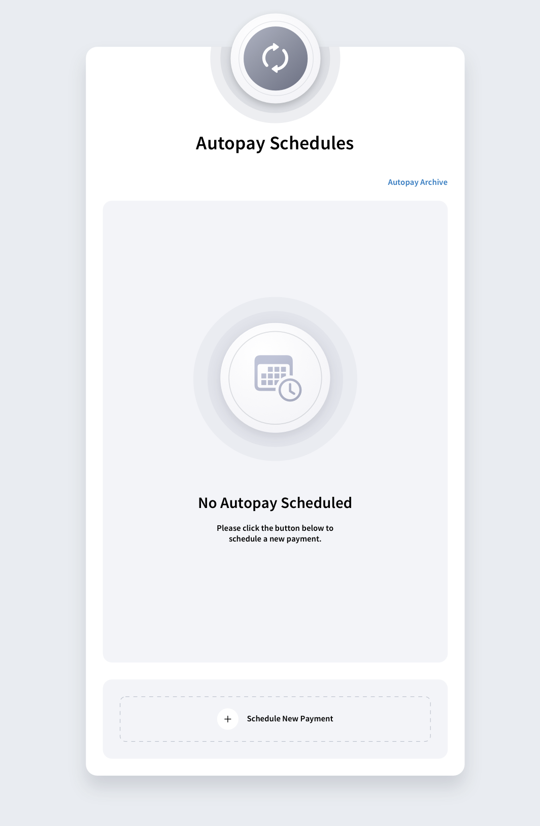
Below is an example where The Skins Factory took what was to be empty space, and turned it into an onboarding experience to direct the user how to fill the empty space.
Designing for the Power User and Forgetting Everyone Else
Every SaaS product has a champion - the person who pushed for the purchase and knows it cold. Product teams love this person. They demo with this person. They get feedback from this person.
"The other 500 seats on that enterprise license belong to people who just need to get something done and get out."
Good SaaS UX serves both. Advanced functionality should be accessible without being in the way. Core workflows - the things most users do most of the time - should be obvious, fast, and forgiving. Power features can live one level deeper. Progressive disclosure, again.
Mobile Treated as a Port, Not a Product
Most enterprise SaaS products still treat mobile as a compressed version of the desktop UI. The team shrinks the layout, makes the buttons slightly bigger, and ships it. Mobile box: checked. Users know the difference immediately.
Desktop and mobile aren't just different screen sizes. They're entirely different contexts of use. Desktop is where users sit down to do deep work. Mobile is where they check a status, approve a request, or take a quick action between meetings.
At The Skins Factory, this is a conversation we have with almost every SaaS client we work with. Our recommendation is consistent: build the mobile experience as its own product, not a derivative of the desktop.
"Yes, that means two code bases and more upfront investment. The payoff is a product that actually works on both platforms instead of one that works on one and tolerates the other."
The teams that get this right design mobile and desktop in parallel - distinct experiences that share a design language. Port vs. product. It's not a subtle distinction.
Still seeing these in
your product?
The Skins Factory has spent 25 years fixing exactly these problems for enterprise SaaS teams and Fortune 500 companies. Let's talk about what we'd fix in yours.
SaaS & Enterprise UX Design Articles
In-depth guides on enterprise UX audits, legacy software redesign, and the common pitfalls of building B2B SaaS and enterprise digital products, from The Skins Factory. See our SaaS UI/UX Design Agency for Enterprise Software page for the complete picture.


About Jeff Schader
Jeff Schader is the founder and CEO of The Skins Factory, a UI/UX design studio he started in 2000, based in the Miami/Fort Lauderdale area. He has designed software for some of the biggest names in tech and entertainment, including Microsoft, Disney, the NFL, Bank of America, and Intel, along with SaaS, fintech, healthcare, cybersecurity, and enterprise platforms. Jeff runs The Skins Factory lean and stays hands-on across client work, strategy, and design. He writes about UI/UX, AI interfaces, and what actually makes software usable.

Every software company is racing to add an AI Copilot. The feature ships, the demo looks magical, and then real users touch it and something falls apart. They don’t trust the output. They can’t tell when the AI is confident or when it’s guessing. The model was never the problem. The interface around it was.