
Pharma Analytics Application
Healthcare SaaS UI/UX Design Responsive 340B Management Application
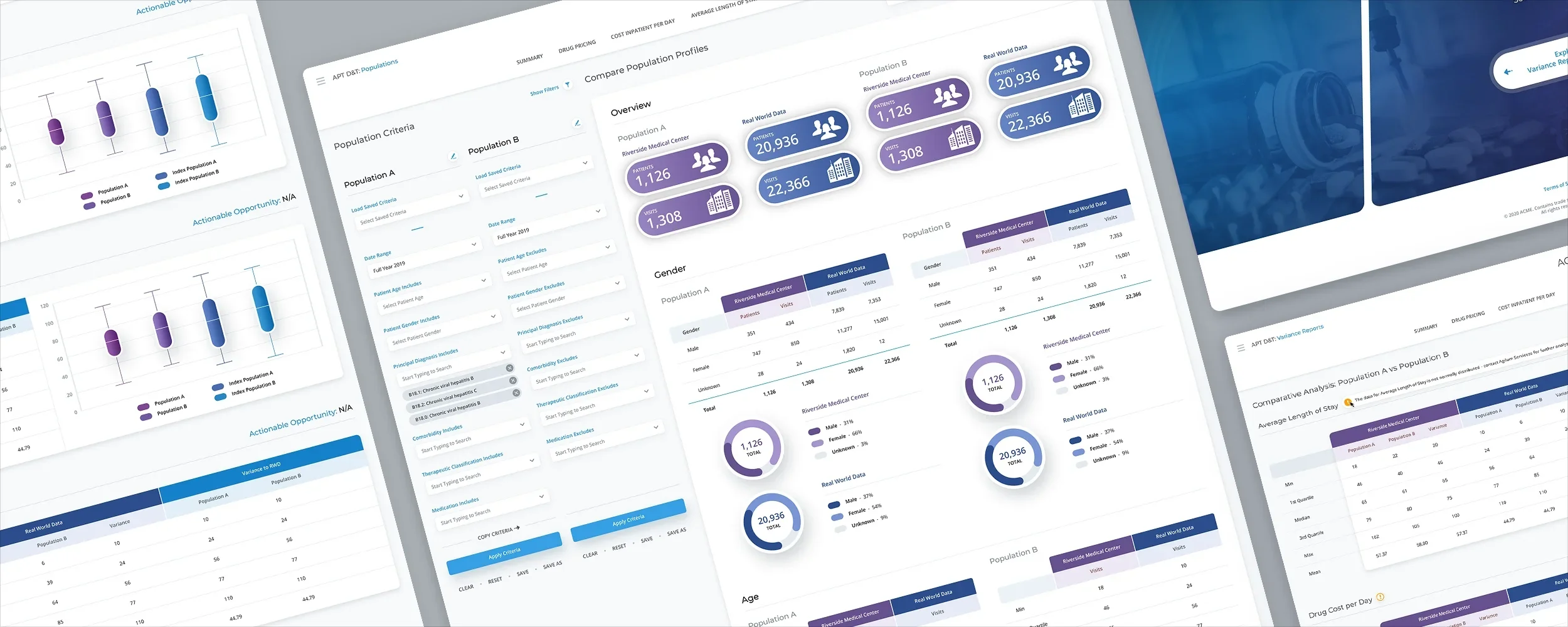
The Skins Factory redesigned the UI/UX of a responsive 340B management application used to investigate complex pharmaceutical and healthcare data. The work extended across variance reports, population analytics, comparative analysis, inpatient costs, drug pricing, population-building tools, navigation, filtering, and the application’s primary landing experience. The objective was not to simplify the underlying analytics, but to make dense information easier to scan, understand, and work with.
Confidentiality notice: The client and service names presented in this project have been changed to protect the client’s identity.
The Challenge
Untangling five layers of nested data without losing analytical depth
The most difficult screens contained long, visually monotonous tables filled with detailed healthcare and pharmaceutical data. Variance-report rows could expand as many as five levels deep, with each level revealing additional groups of rows. Population analytics added extensive filtering across two sets of criteria, while pricing, cost, and comparative-analysis screens needed to present substantial amounts of information without making users lose their place or the relationship between values.
Our Approach
Restructuring dense analytics around how users scan and investigate
We separated the first two persistent columns from the main variance table, breaking apart the grid while keeping essential reference information visible. Tree-view controls made nested rows easier to expand and collapse, and color-coded code rows created visual headers that guided users through each level. We tested drag-and-drop and checkbox-based filtering, removed nonessential columns from selected tables, and created separate navigation treatments for smaller displays and wider HD screens.
The Login

The Landing Page
We conducted a thorough search on stock photography sites to source appropriate images for the landing page. Each image is carefully selected to align with the corresponding button's title and color, ensuring consistency with the brand identity. The layout of the Landing Page is designed to be adaptable, with the left panel capable of accommodating additional "hero" images, and pagination implemented to facilitate easy navigation through frames, even without a timer system in place.
Variance Reports
The initial version of this screen was quite disorganized. It contained rows that could expand up to five layers deep, with each layer having multiple rows. To enhance usability, we made the decision to reorganize the cascading rows in a more user-friendly manner. We extracted the first two columns, which were considered persistent, from the main table and visually separated them. This modification helped break up the lengthy, monotonous table. Additionally, we incorporated Treeview icons with plus and minus symbols for expanding and collapsing rows. When expanded, the rows remained well-organized, and the code rows were highlighted in color to distinguish them as header rows. This visually guided users' attention along the extensive table and ensured a smoother scanning experience.
In line with our previous project, we made the decision to incorporate two versions of the navigation for this client. We developed one version specifically tailored for smaller resolutions and another for wider, HD screens. The latter version took on a more traditional sidebar menu approach.


Population
Packed with comprehensive analytics, but more importantly, it boasts a strong collection of filters that can be applied to two sets of criteria columns that significantly impact the overall results.
Empty Data
For the filters, we tried a drag and drop interface and check boxes.


Rapid Analytics
Cost Inpatient Per Day + Drug pricing
The tables for both screens have been designed using the same format. To enhance readability, we decided to remove certain columns from the physical tables and display only the essential ones. This approach effectively breaks up the table and improves its visual appeal.


Population Builder


Have a project in mind? Let's talk.
Thank you for reaching out.
We will be in touch within one business day.