
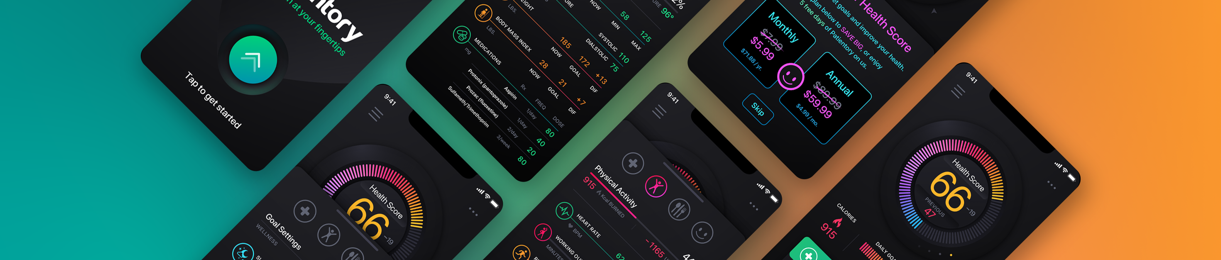
Patientory Healthtech Mobile App
Healthcare UI/UX Design iOS Mobile Application
The Skins Factory designed more than 90 iOS screens for Patientory, a healthtech application created to bring health information, connected devices, wellness planning, and secure digital transactions into one engaging mobile experience. By combining a saturated visual system with interactive dashboards, guided onboarding, and game-like challenges, the product was designed to make managing personal health feel more accessible, motivating, and rewarding.
The Challenge
Making a complex healthcare platform easier to adopt
Patientory needed to introduce users to a substantial ecosystem that included health scores, personalized health plans, digital-wallet setup, security requirements, connected apps, devices, wearables, and a 25-question onboarding questionnaire. Presenting so many steps at the beginning of the experience created a clear risk of fatigue and abandonment before users could reach the application’s core value.
Our Approach
Making a long onboarding process feel manageable
Patientory’s onboarding process required users to complete an unusually large number of steps before entering the application. We used motion, changing color environments, and a persistent progress bar to create momentum and make the experience feel less repetitive. Animated transitions moved users smoothly from one question to the next, while the evolving visual system and clear progress feedback continually reinforced that they were advancing toward completion.
Establishing the Color Palette
Healthcare applications have a tendency to play it safe visually. We didn’t want Patientory to feel like every other healthcare app.
We built the visual language around saturated gradients set against deep black backgrounds, giving the application a much more distinctive personality while allowing important information, controls, and health data to stand out.
The palette also gave us enough flexibility to change the mood of the interface throughout onboarding without making the product feel visually disconnected.
Intro Screen + Onboarding Setup
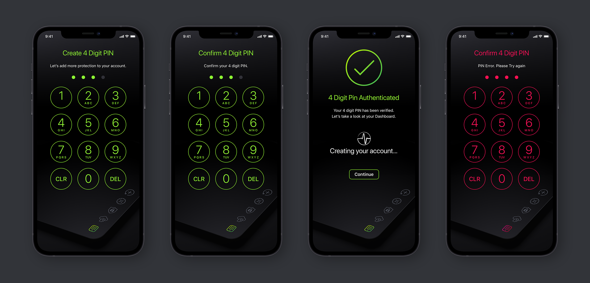
The experience begins with an animated loading sequence that transitions into the Terms of Service and then into the five primary account setup screens. Rather than treating these as a collection of disconnected steps, we designed the transitions as part of one continuous experience, leading the user naturally from launch into onboarding.
Onboarding Screens
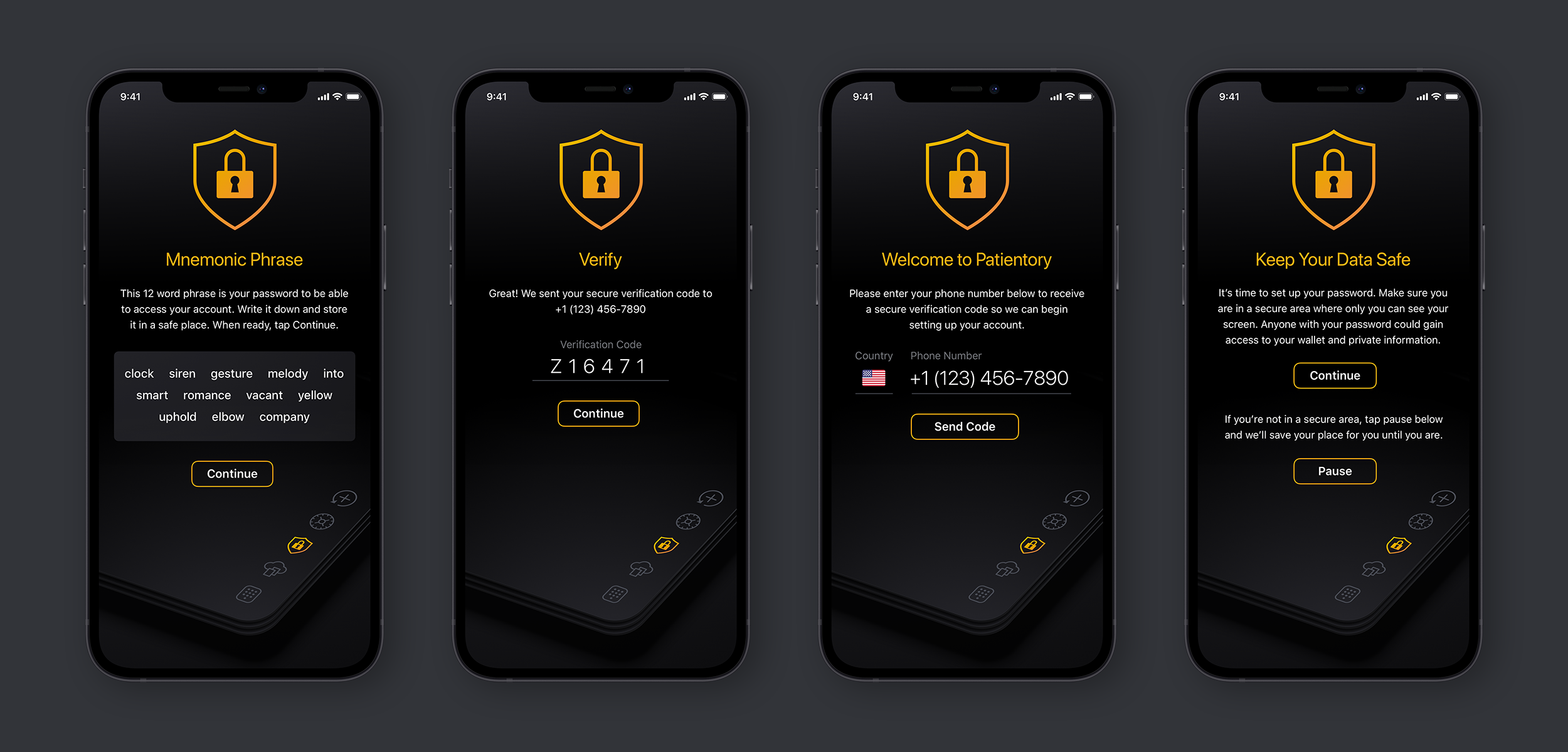
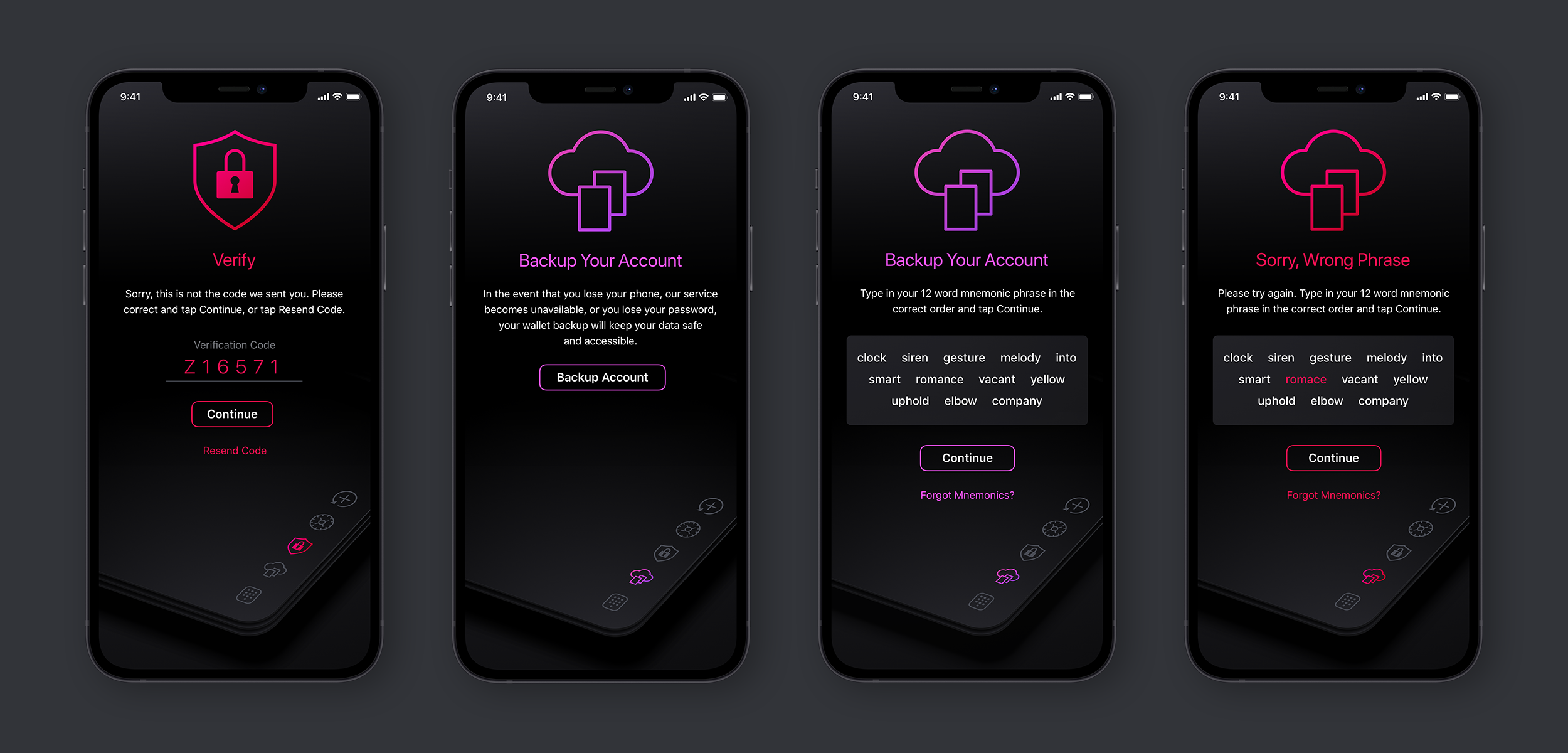
Once the Terms of Service are accepted, the dark interface panels slide into place and the onboarding experience begins. These screens handle the initial account setup before the user reaches the health questionnaire, including the foundational information Patientory needs to begin building the user’s experience.
The goal was to keep every step clear, focused, and visually connected to what came before it.
Dashboard
The Dashboard became the visual center of the Patientory experience. We designed a neumorphic jog wheel that users can drag and rotate to move through previous Health Scores, turning what could have been a simple history control into something much more tactile and engaging.
Color is used against the dark interface to help distinguish different stages of the user’s progress, while both grid and list views give users different ways to review their health categories and underlying information.
Shown Below: The Dashboard Grid View stats. For the List View, the category simply releases the status panel below the category.
Selecting Edit Goals takes the user directly into the screens used to manage and adjust those goals.
Daily + Weekly Challenges
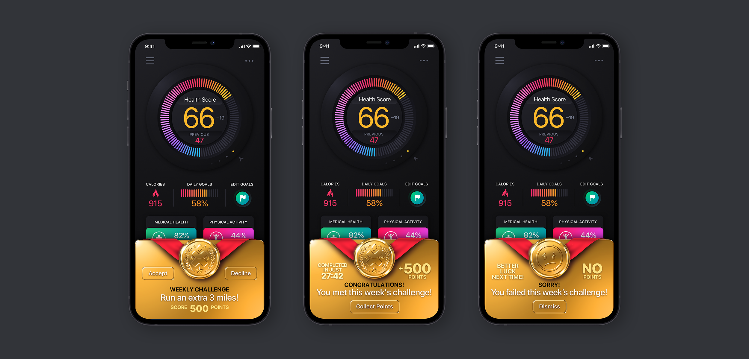
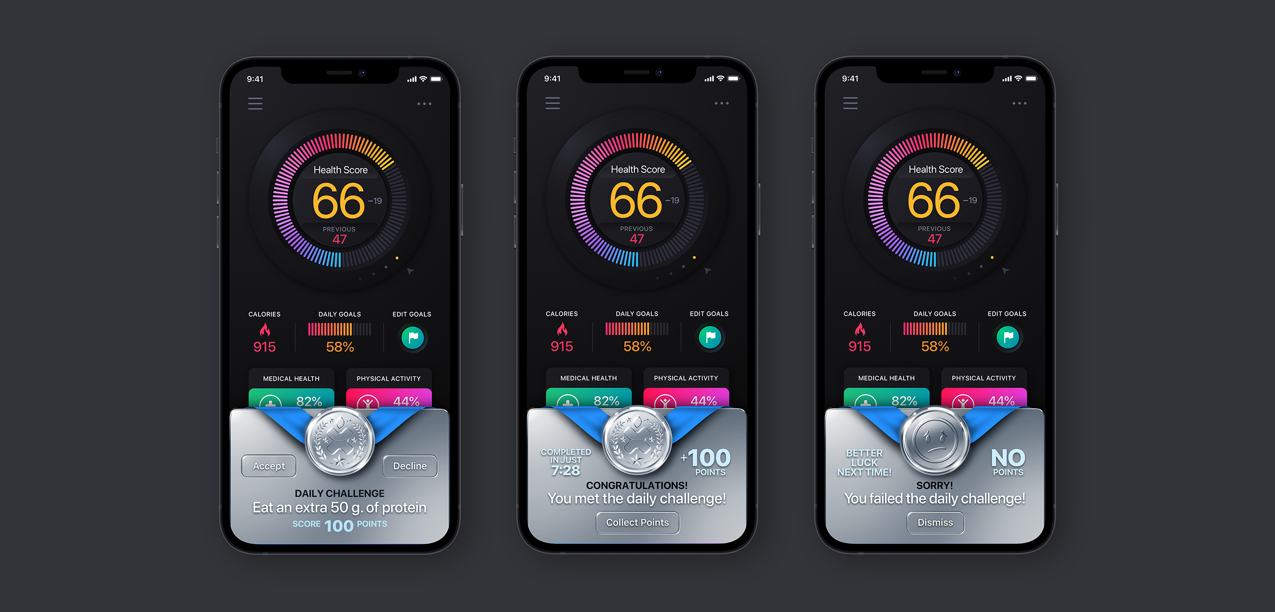
We wanted Patientory to feel like something users would want to come back to, not another health application reminding them about things they hadn’t done. So we introduced Daily and Weekly Challenges and gave that part of the experience a more game-like quality.
Complete a challenge and the user is rewarded with animation and positive feedback. Miss one and the interface responds with a simpler static state and encouragement to try again. The idea was to make progress feel rewarding and eventually allow completed challenges to generate points that could be redeemed for discounts or prizes.
If people enjoy interacting with a product, they’re much more likely to keep using it.
The Onboarding Questionaire
Designing Around 25 Questions Without Exhausting the User
Before reaching the main Dashboard, users had already gone through account setup, digital wallet configuration, security, and mnemonic phrase creation. Then came the questionnaire: 20 required questions and 5 optional ones. Twenty-five questions before reaching the core application is a significant amount of friction, but Patientory needed those answers to generate the user’s Health Score and personalized Health Plan. So our job was to reduce as much unnecessary friction as possible.
We approached it three ways:
1. Change the environment as the user progresses.
Every five questions, the color theme changes. The gradients move through different environments inspired by things like sunrise, sunset, ocean water, and other calmer color combinations. It gives users a subtle but noticeable sense that they’re progressing through the questionnaire.
2. Make progress impossible to miss.
The ring surrounding each question icon doubles as a progress indicator, giving users an immediate visual reference for how far they’ve come and how much remains.
3. Remove unnecessary interaction.
For required questions, there is no Next button. As soon as the user makes a selection, the interface advances automatically.
It’s one less tap repeated over and over again, which reduces both mental and physical fatigue while keeping the experience moving. Users can still swipe back to change a previous answer, while optional questions include a clear Skip option. It’s a small interaction detail, but across 25 questions, small details matter.
To keep things simple to view, we’ve included 4 screens from each series intermixing idle and selected:
Integrating Apps + Devices + Wearables
Patientory was designed to bring health information from multiple sources into one experience, including connected applications, devices, and wearables. The interface needed to make those connections easy to understand and manage without turning another part of the application into a technical exercise. We kept the experience straightforward, visually consistent, and focused on getting users connected with as little friction as possible.
There are more screens to view, but are redundant visually. Here’s a look at some of them.
The Health Plan
The Health Plan takes the information gathered throughout onboarding and turns it into something useful to the user. We designed a series of screens that organize personalized health information, goals, recommendations, and progress within the same visual system established throughout the rest of Patientory.
The result is an experience that takes a significant amount of underlying health information and presents it in a way that feels understandable, actionable, and far less clinical.
Have a project in mind? Let's talk.
Thank you for reaching out.
We will be in touch within one business day.