
ERP Maestro SAP Security Platform
Enterprise Cybersecurity UI/UX Design SaaS Web Application
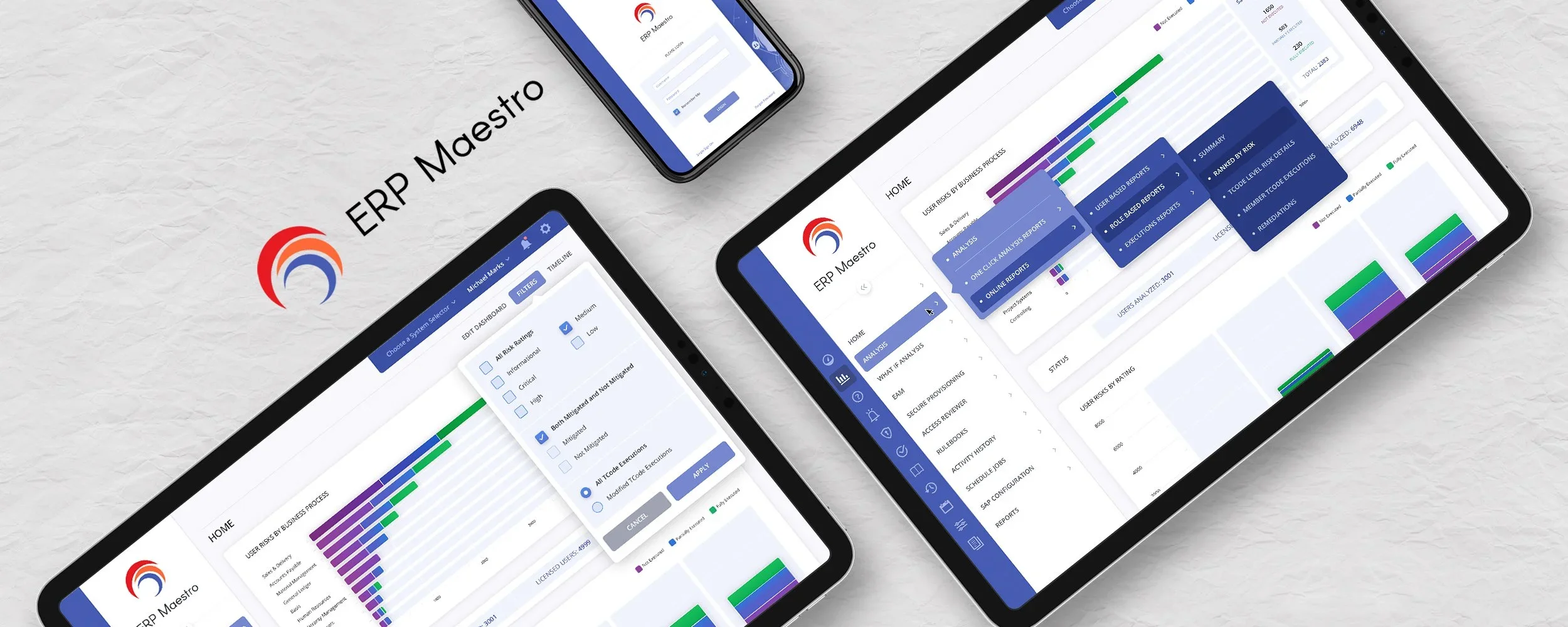
ERP Maestro enlisted The Skins Factory to redesign a select group of screens within its enterprise SAP security SaaS platform. We expanded the engagement beyond a straightforward visual refresh by exploring multiple dashboard themes, customizable module arrangements, alternative analytics interactions, and space-saving navigation patterns. The result demonstrated how a highly specialized enterprise-security application could offer greater visual flexibility without sacrificing clarity or operational focus.
The Challenge
Giving users flexibility without weakening a complex security interface
ERP Maestro's dashboards needed to present security processes, online reporting, schedule analysis, navigation hierarchies, and detailed analytics within a limited amount of screen space. Different users could place different levels of importance on the available data, while persistent navigation and fixed dashboard arrangements reduced the room available for reports. The interface needed greater flexibility while remaining cohesive, professional, and closely connected to the ERP Maestro brand.
Our Approach
Extending a limited redesign into a more customizable dashboard experience
We created multiple color themes so customers could choose the dashboard environment that best matched their preferences. Movable modules allowed users to prioritize the information most important to them, while collapsible navigation reclaimed valuable space without removing access to the application. We also explored alternate chart interactions, including sidebar tallies and cursor-positioned popups, and carried the ERP Maestro brand color into cascading navigation menus to strengthen the connection between the product and its identity.
The Dashboard
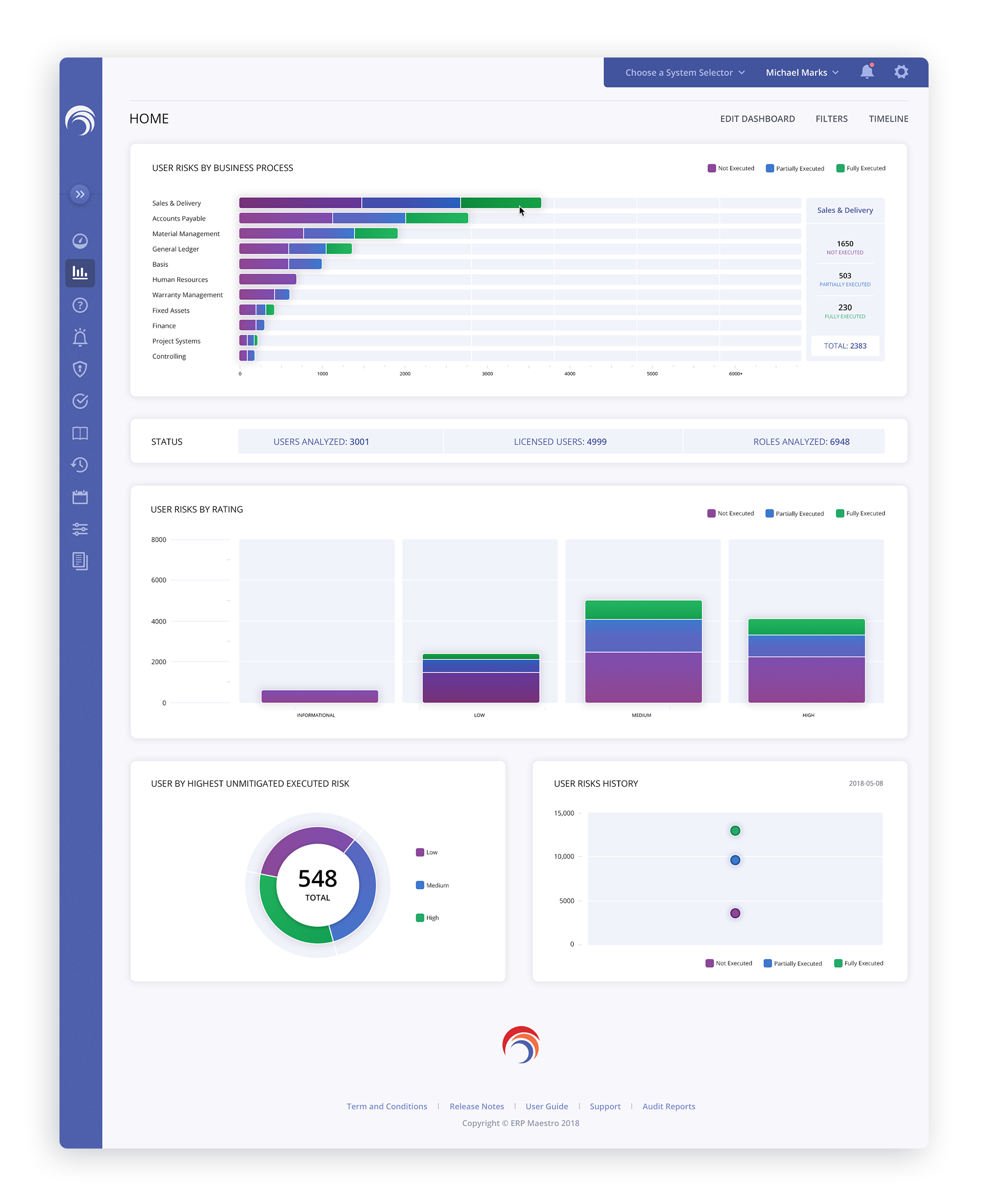
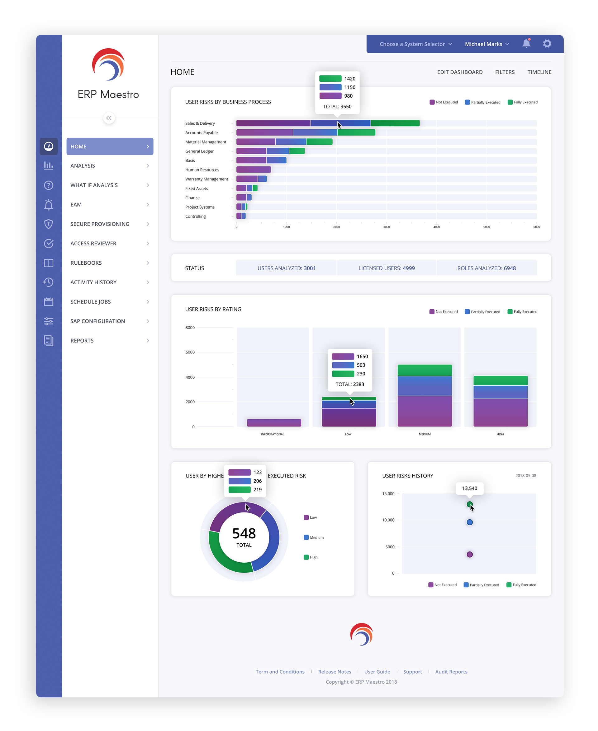
Throughout the creative process, we presented ERP Maestro with two variations of bar graphs. The first version, displayed below, showcases processes with tallies in a sidebar when hovering over a specific row. The second version utilizes a popup display with identical information that appears where the mouse cursor is positioned. We incorporated the ERP Maestro brand's color into the navigation fly-out menus, resulting in visually impactful cascading menus. This integration effectively reinforces the brand identity and enhances its ties to the user interface.
Below Left Image: Shows the Main Navigation in its collapsed state, allowing the user to reclaim valuable screen real estate while still having access to the entire Navigation.
Below Right Image: Shows the alternate popup displaying values for a selected row.
Dashboard Main Menus
The design team at Skins Factory has a strong background in customization, as it has been part of our core focus since 2000. We initially specialized in creating skins for media players, which allowed us to appreciate the significance of personalization. Today, there is clear evidence that end-users still desire and even anticipate having options when it comes to the appearance and functionality of their user interfaces. For instance, platforms like iOS and Facebook now offer a "Dark Mode UI" for users to choose from. Therefore, when our creative team develops a dashboard, we recognize that certain data holds greater importance than others. With ERP Maestro, we have implemented movable dashboard modules to cater to this understanding.


Dashboard Chrome Menus


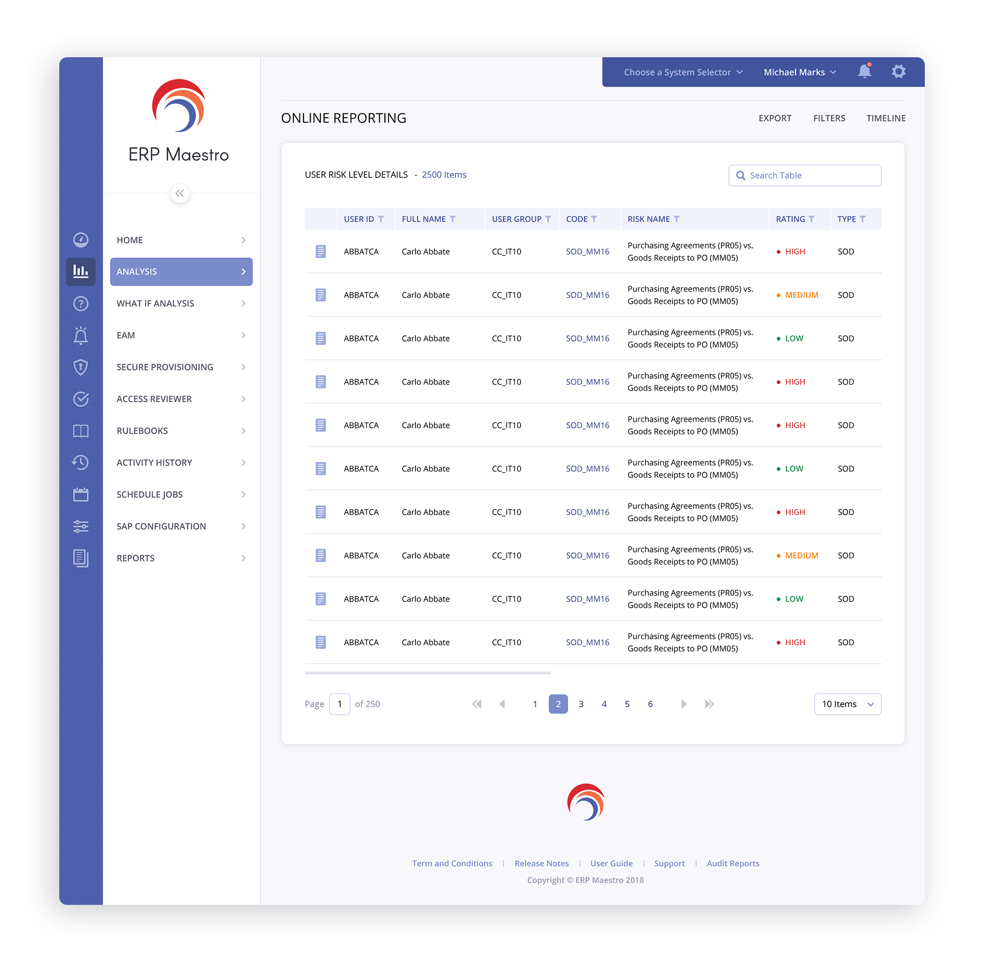
ONLINE REPORTING + SCHEDULE ANALYSIS


Login Screens


DASHBOARD ALTERNATE COLOR THEMES


Have a project in mind? Let's talk.
Thank you for reaching out.
We will be in touch within one business day.