
340B Contract Pharmacy Management
Healthcare SaaS UI/UX Design Responsive Web Application
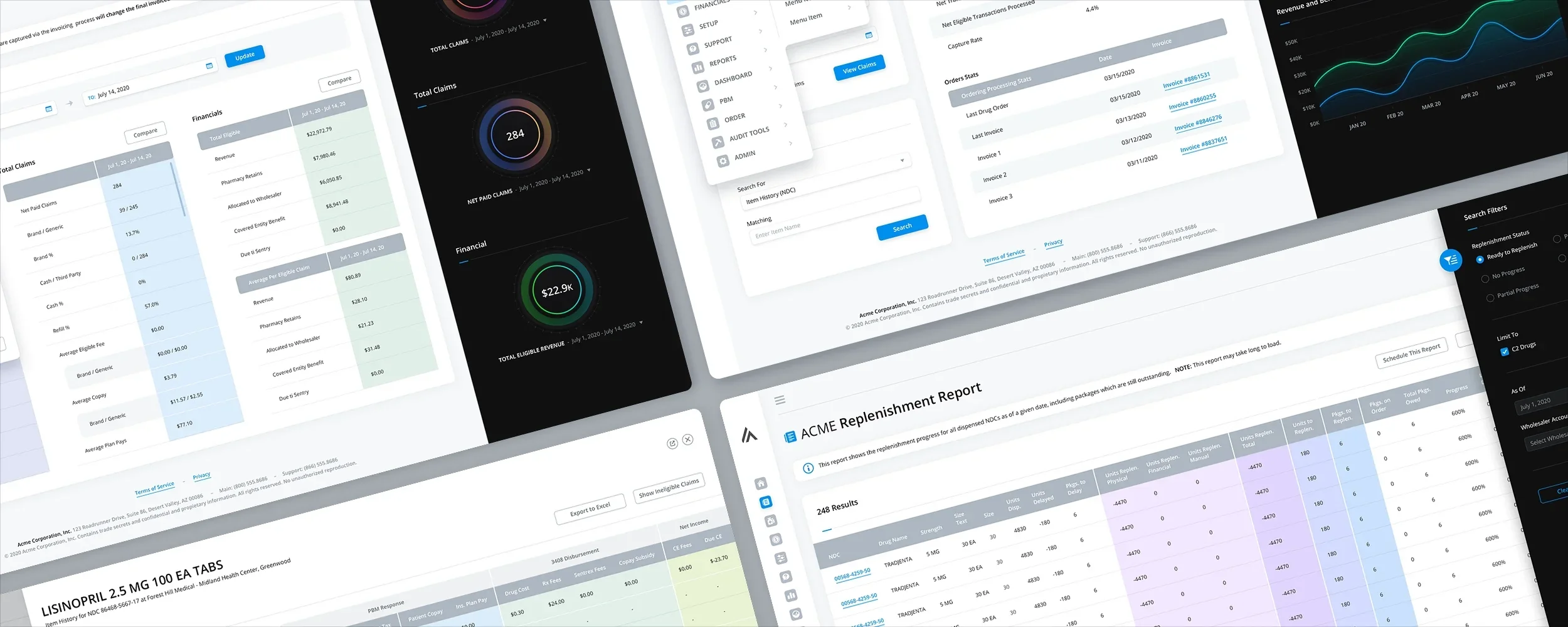
The Skins Factory redesigned a responsive 340B contract pharmacy management application spanning dashboards, replenishment and claims reports, blacklisted drugs, financials, general setup, and patient and provider tools. The work focused on making exceptionally wide, data-heavy workflows easier to navigate while preserving the detailed information hospital and pharmacy teams needed to manage their day-to-day operations.
Confidentiality notice: The client and service names presented in this project have been changed to protect the client’s identity.
The Challenge
Designing around tables too wide for conventional enterprise layouts
Replenishment, claims, financial, and inventory workflows required users to work with unusually large numbers of columns, extensive search filters, secondary details, and related actions. Conventional table layouts would have produced excessive horizontal scrolling and page height, while opening each secondary workflow in a separate screen or modal could interrupt the user’s work and make it harder to maintain context.
Our Approach
Giving dense information more room while keeping users in context
We designed key table views at 3840 pixels wide and used colored vertical column groups to visually break apart long horizontal datasets. A Column Edit feature allowed users to select and reposition the information displayed in each table, while search filters were contained in collapsed overlay sidebars. Secondary workflows opened in responsive slide-in panels instead of modals or separate pages, and compact, expandable navigation preserved additional space for the application’s data.
The Home Screen
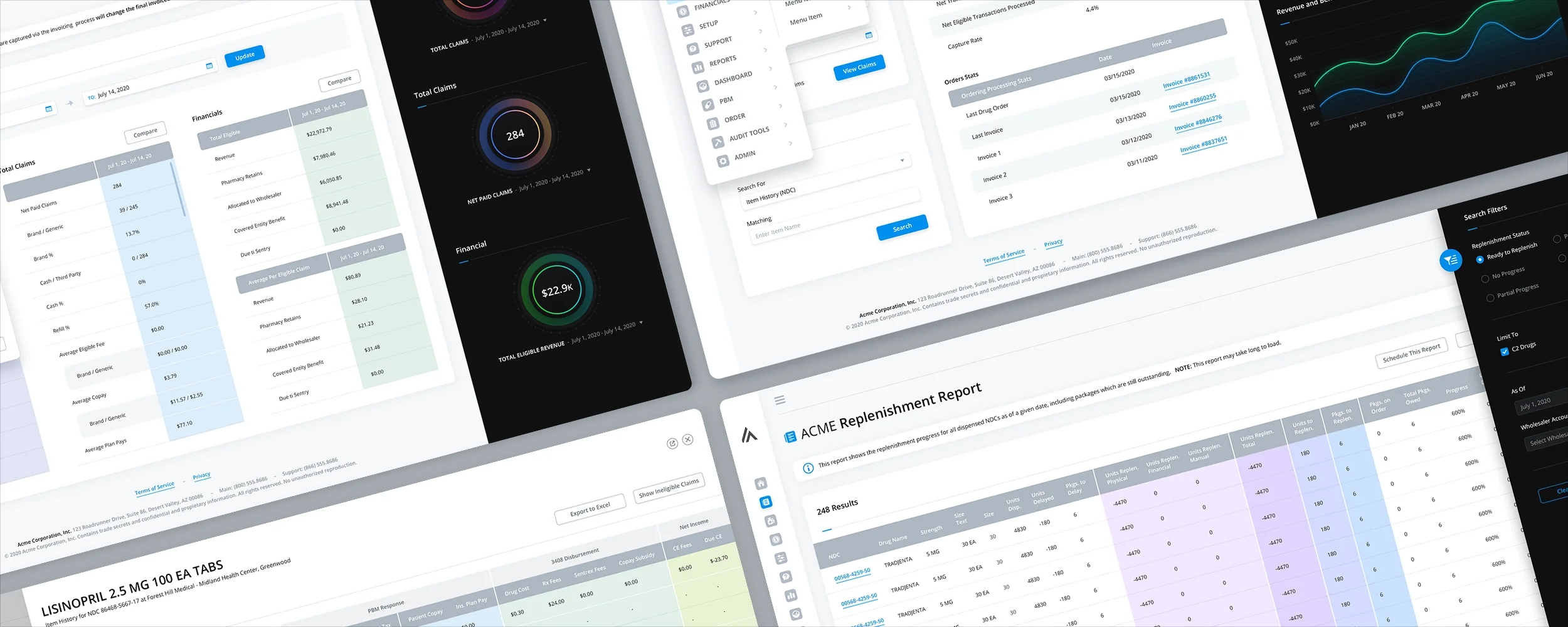
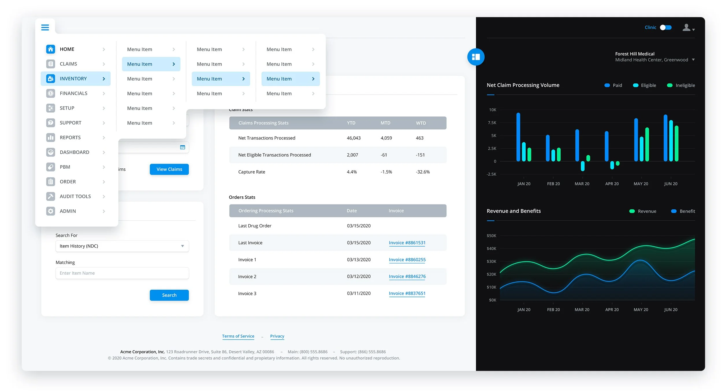
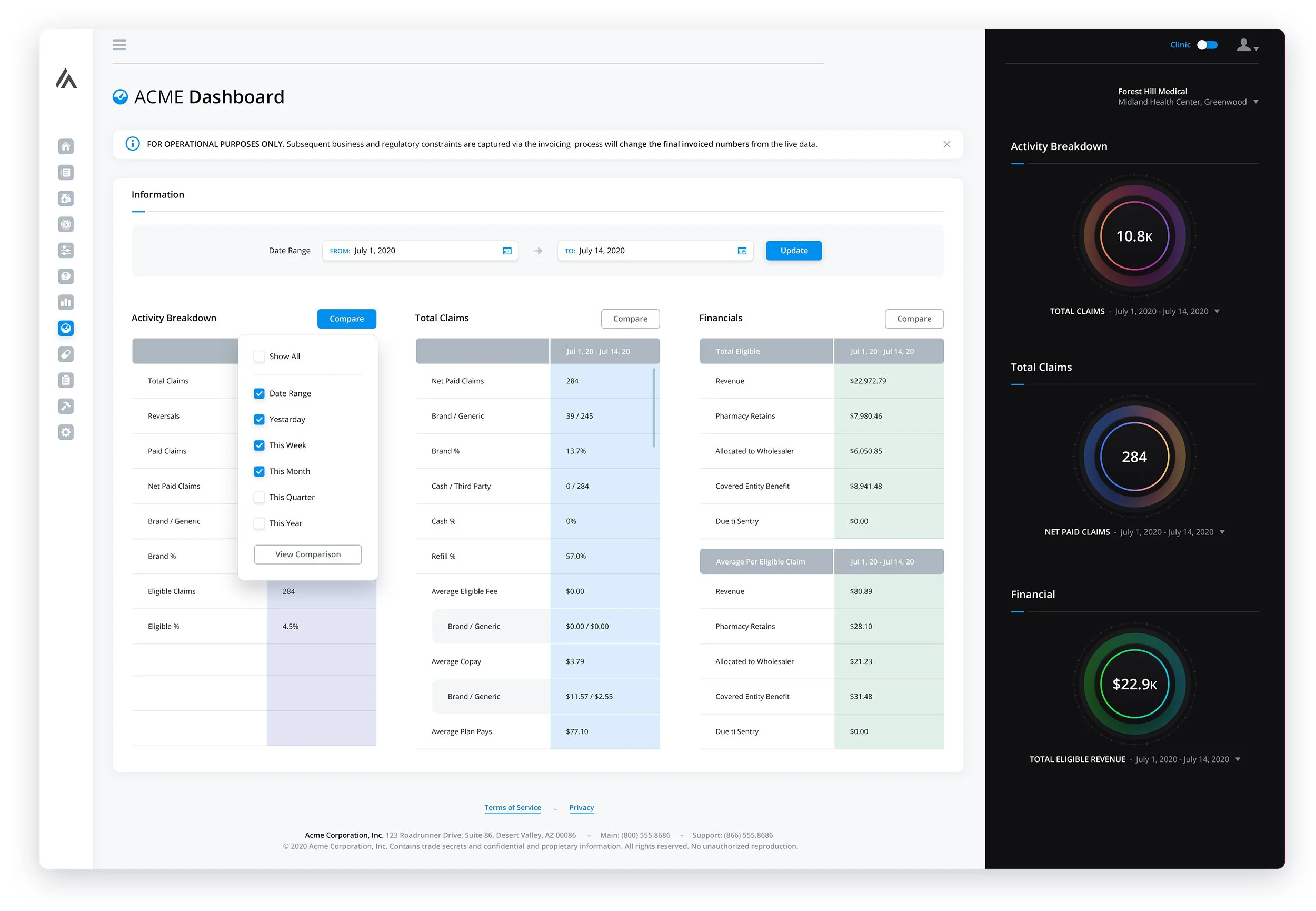
The hybrid design of this display effectively blends light and dark panels, resulting in a visually captivating presentation of analytics. In order to maximize the available space for content, we have incorporated a sleek navigation sidebar that remains concealed until hovered over, at which point the navigation title is revealed. The expanded menu can be accessed by clicking on the hamburger icon situated in the top left corner.
Navigation + Menu Systems
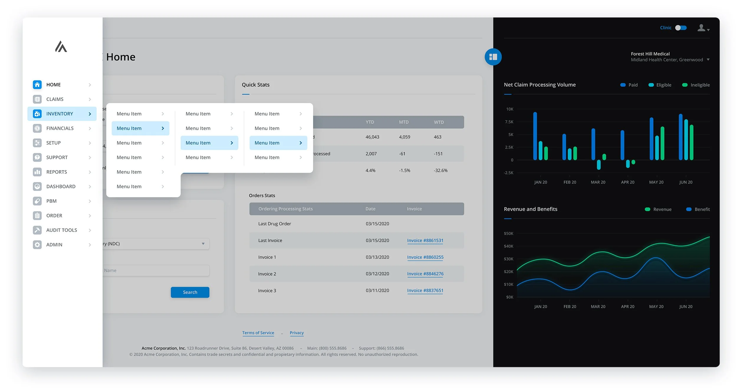
- Image 1 shows the various menus and dropdowns deployed
- Image 2 shows an expanded sidebar navigation with extended menus
- Image 3 show an alternative navigation w/menus with users are on smaller displays
The Dashboard
Double column informational panels flanked by simple, color-bursting analytics, breathe life into the screen. When a user views one of the sections of the Dashboard, a slide-out panel appears instead of taking them to a separate page.

Replenishment Report
As you can see by the large amount of columns, to try and eliminate as much side scrolling and page height as possible, we placed the Search Filters in a collapsed sidebar which overlays the table when expanded.


Claims Report
In this particular set of screens, we encountered numerous challenges regarding sizing. To address these issues effectively, we decided to reintroduce slide-in panels and even incorporate a sidebar in one of the screens. As previously mentioned, one of the key advantages of using slide-in panels is their ability to adapt seamlessly to various screen sizes, all while ensuring that users remain on the same screen they are actively engaged with. Given the potentially extensive widths of certain tables within this context, there was a possibility for them to occupy the entire screen if deemed necessary. Additionally, we opted to collapse the Search Filters within a sidebar and employed a color gradient for visually appealing symmetry between these filters and the table itself.


Blacklisted Drugs


Financials
General Setup
Patient / Provider Tool
Have a project in mind? Let's talk.
Thank you for reaching out.
We will be in touch within one business day.