
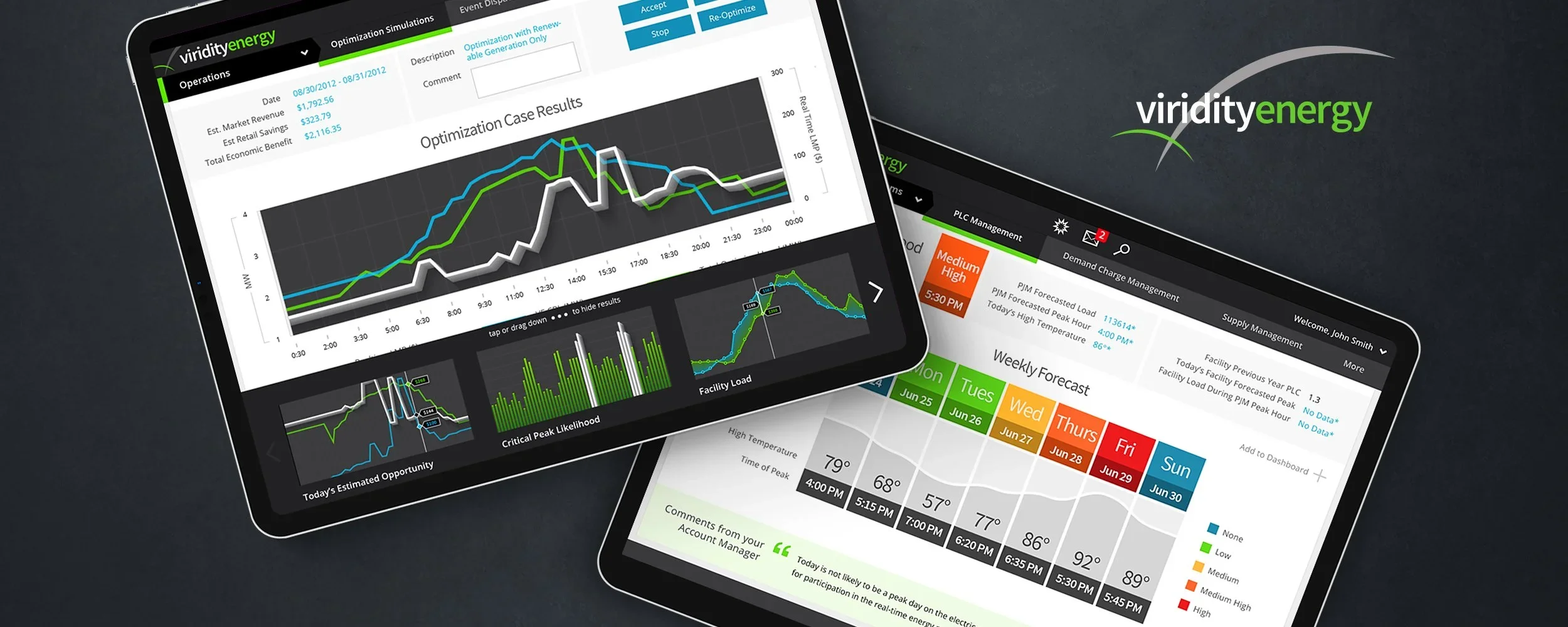
Viridity Energy VPower
Energy Management SaaS UI/UX Design Web + iPad Application
The Skins Factory completely redesigned Viridity Energy’s VPower, an energy-management SaaS platform that monitors equipment, energy-management systems, electricity prices, and weather to help building owners participate in demand-response markets. Beginning with a 27-screen interaction-design overhaul, we created separate browser and iPad experiences and followed them with a custom design system that gave Viridity Energy’s developers a scalable framework for expanding the application.
The Challenge
Making complex energy operations and analytics easier to interpret
VPower brought together energy-market programs, energy-saving programs, operational dashboards, equipment and resource administration, notifications, electricity pricing, weather, and multiple forms of analytical reporting. The application needed to present dense operational data clearly across both desktop browsers and tablets while giving users a consistent way to understand performance, conditions, and available actions throughout the platform.
Our Approach
Redesigning the experience once, then building a system that could scale
We first overhauled the interaction design and created purpose-built browser and iPad interfaces rather than simply shrinking the desktop experience. 3D line style baselines and dimensional line graphs, bar charts, combination charts, and histograms gave the analytics greater visual depth while preserving readability. We then documented the reusable components and visual standards in a custom design system, enabling Viridity Energy’s developers to construct recurring screens themselves and remove 10 screens from our original scope of work.
The Browser Version
One of the benefits of working with our UI/UX design teams, are our innate ability to think outside of the norm. This comes from over 20 years of experience designing digital products and user interfaces. Take for example, using a semi-transparent, isometric baseline on the graph. Instead of relying on 2D elements, we lift off the baseline, imbuing it with depth and weight.
Energy Market Programs + Energy Saving Programs
Analytics are fun to design. They just are. In this project we designed a lot of different styles - from line graphs, bar charts & combo charts to histograms like you see below, only this time we used isometrics.


My Vpower


Operations + Dashboard


Notifications + Resource Admin


The Tablet Version
A look at the port from browser to iPad iOS.
operations screens


Notice how we infuse the isometrics in multiple graph types. Click or Tap an image to see it at a larger size.


