
VCE VBlock
ANIMATED Windows DESKTOP CLIENT APPLICATION UI/UX DESIGN
VCE, the Virtual Computing Environment Company contracted The Skins Factory to design a futuristic UX/UI Design for their VBlock brand. Vblock is VCE’s hyper-converged infrastructure (HCI) product family. Vblock systems are made up of storage, provisioning and data protection services from EMC, switches and servers made by Cisco, along with VMware VSphere virtualization. Support services are provided by VCE.
The Skins Factory’s creative team worked closely with the product team from VCE as we designed dynamic, animated constructs. Using a combination of Cinema 4D and Adobe Photoshop, the results were an animated, holographic-styled application user interface design. Pulse runtime effects and motion graphics breathe life into this futuristic, desktop & tablet application.
This was a very small project in terms of screens. It took us 8 weeks to design 2 main screens. The bulk of the time was spent designing the constructs, the user interface platform and then the animations.
A montage of the different animation sequences we modeled, rendered and animated.
The Early Constructs
Visual art is all about trial and error. We end up doing comp after comp until we get it just right. We knew early on that we wanted to design the virtual VBLOCKS as solid light constructs, drawing creative inspiration from such blockbuster movies as Tron: Legacy and the highly underrated Tom Cruise movie… Oblivion. Here’s a look at some of the early versions of the user interface design:
Above: We nailed the layout of the screen environment early on. The constructs however, took a few tries. The issue with this version was… well let’s face it, it was too tall & rather dull. We knew we could do better.


Above: These next versions were getting closer, though they still had some slight issues. The shape was a bit too sharp & boxy. It needed to have a more organic feel, while still portraying a futuristic, virtual data container. We decided the light mesh was too white & bright and needed to be more “glowy.”


Above Left: If the constructs before this were too white, these versions were too blue. It needed to be somewhere in the middle. Above Right: Color corrected. The organic nature of the constructs’ look & feel had began to take shape.
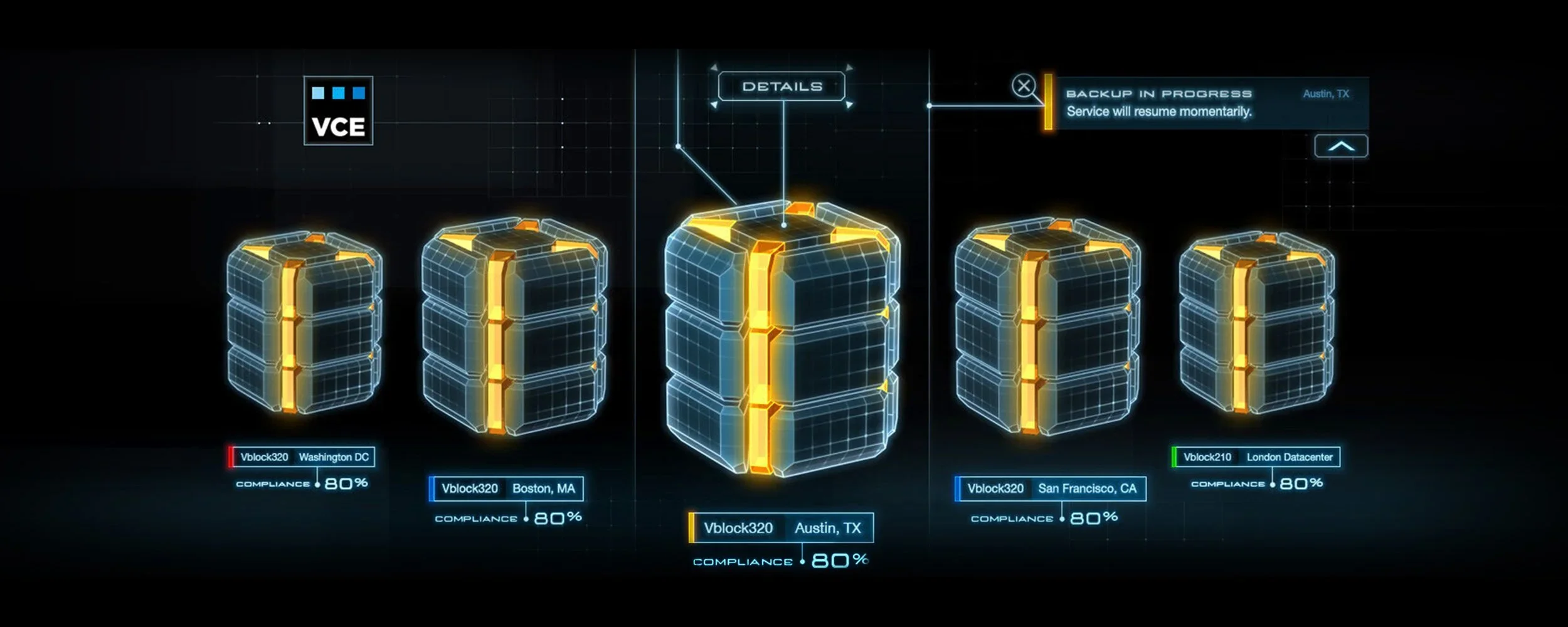
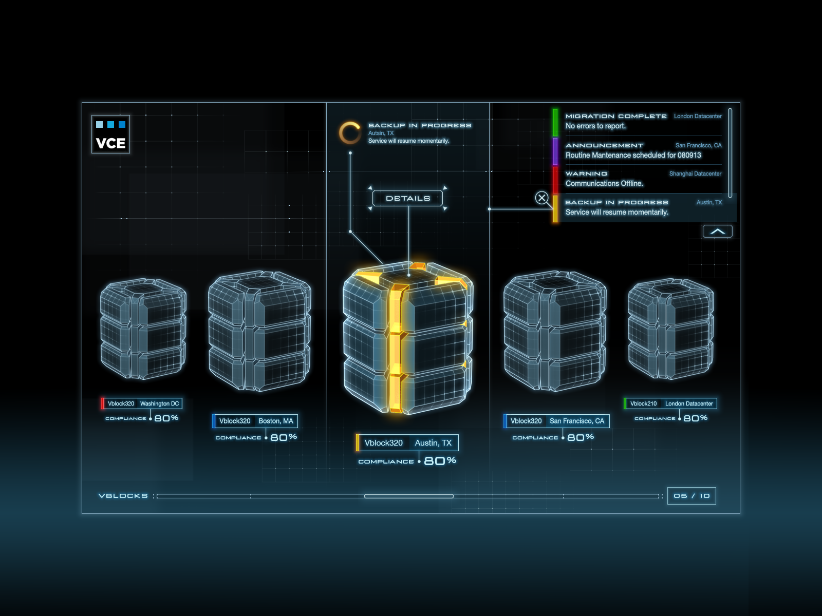
The Final Screens
This is the final shape of the VCE VBLOCKS Constructs. Not too sharp, not too round…just right.
