
Designing a Video Game Brand Identity
Travian Games contracted The Skins Factory to create the logo & online game user interface for their strategy game - Imperion. Our team focused on the dynamics of gameplay to steer the direction of the logo's design language. Imperion has three species fighting for domination over space. We created an iconic symbol of three blades influx to denote conflict that hover over a ring which symbolizes worlds. The deep alloy interior with sculpted bevel and sharp typeface carries over the danger & strength of the logo's symbol.
Project Introduction
In 2009, The Skins Factory was approached by Travian Games to design the online game site and create a brand identity for their game Imperion. During the Discovery phase, we researched the core game assets via client-driven briefs & overviews and conducted interviews with stakeholders to establish a foundation on which to build the logo and subsequently the online game site.
About the Game
Imperion is an epic space building game from the makers of Travian (TravianGames). Players build up bases, construct fleets, research technology, colonize other planets, and fight for control of the galaxy. Players pick one of three races the Terrans, Xen, or Titans. Remember that last sentence as it played a strong role in designing the logo.
Designing the Typeface
Our Creative Director at the time, W. Bart, began designing a custom typeface that represented the essence of the combative & science fiction nature of the game. William designed numerous candidates for the Travian to choose from - each one more dangerous looking than the next. Use the arrows to navigate between the 8 custom typeface candidates we presented to Travian Games.


Establishing the Typeface Alloy Composition
Once the client selected the typeface (Style 6), William began designing the visual design language comps. While it appears the typeface was modeled & rendered using a 3D application, all versions were done as vectors with post-processing in Adobe Photoshop.
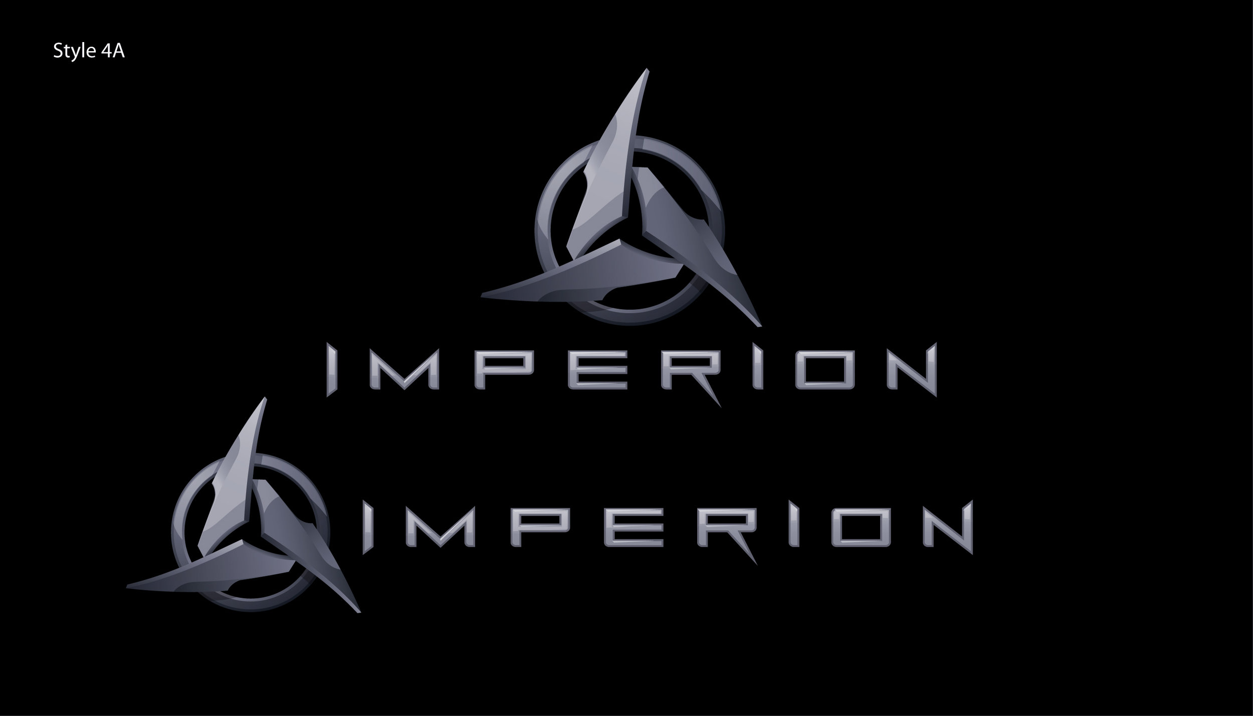
Six different materials based on metallic alloys were applied to the typeface. The deep alloy interior with sculpted bevel & sharp typeface carries over the danger & strength of the logo's symbol, a design you would expect from a game of combat. After a lengthy review, the client selected Style 4 (as shown below). To view the rejected comps. click or tap the arrows.


Designing the Emblem - Initial Vector Images
Our team focused on the dynamics of gameplay to steer the direction of the logo's design language. Imperion has three species fighting for domination over space. We created an iconic symbol of three blades influx to denote conflict that hover over a ring which symbolizes worlds. In some of the comps we used 3 colors that symbolize the 3 species to create visual symmetry between the logo and the game. There were multiple derivative candidates presented to the client. Each version presented in a stacked & horizontal format.


Establishing the Final Graphics
As we mentioned previously, the symbol was not modeled & rendered in a 3D application. Our brand identity designer created the realistic lighting effects, battle-worn alloy texture, and deep beveled text in the post-processing Photoshop phase. It’s a testament to our design process.
Here’s a look at the final deliverables:
Imperion Logo Design
Resolution: 5952 x 3660 Pixels
Format: TIFF Print + EPS Print + PSD + Vector Source
Style: 3D + 2D Negative White + Positive Black
Orientation: Stacked + Horizontal

If you’re looking to get some Brand Identity or Logo Design, work done, simply contact us here on our Contact Page.
All Imperion Images © Copyright Travian Games GmbH. All Rights Reserved.
