BioMojo.com
RESPONSIVE WEBSITE DESIGN
BioMojo, a biomedical performance solutions company specializing in integrated software and hardware solutions contracted our web design team to design the latest iteration of their main website - BioMojo.com.
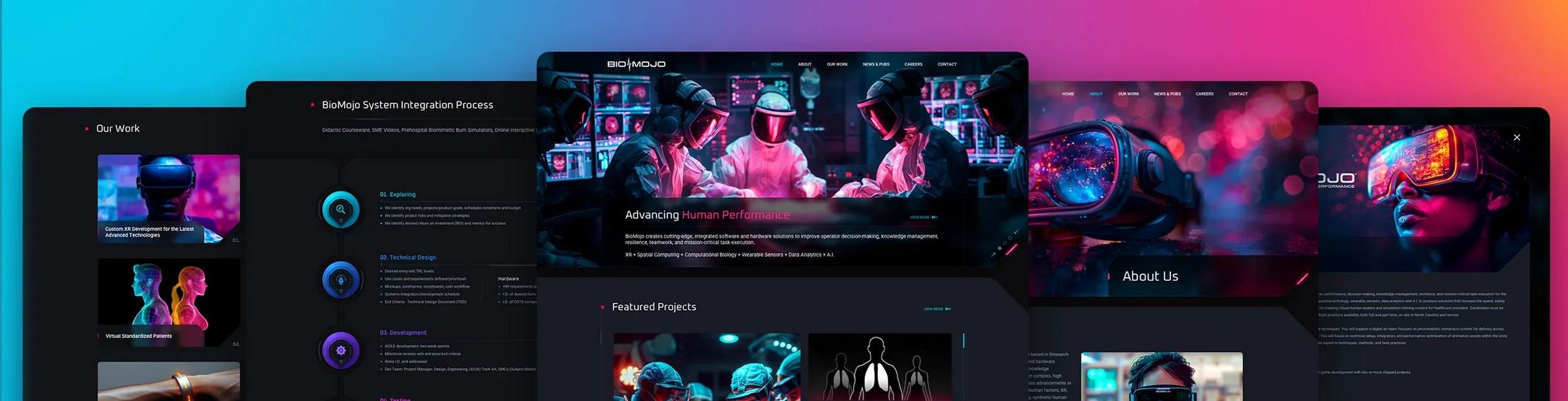
From the outset, we designed the website with a dark color palette for the background, complemented by cyan and magenta as the hero colors, reflecting the revised brand identity we created. We incorporated neumorphic & glassmorphic design elements to add depth and make the flat design stand out. Additionally, we utilized slide-in panels for web pages with minimal content, ensuring a cohesive and streamlined user experience without the need for full pages. Generative AI artwork played a crucial role in creating rich and captivating images throughout the web design.
Additional design elements included: a small revision to the brand identity we originally created, a small collateral package consisting of business card design & letterhead design, a revision of the patch we previously designed and generative AI artwork images for social media marketing.
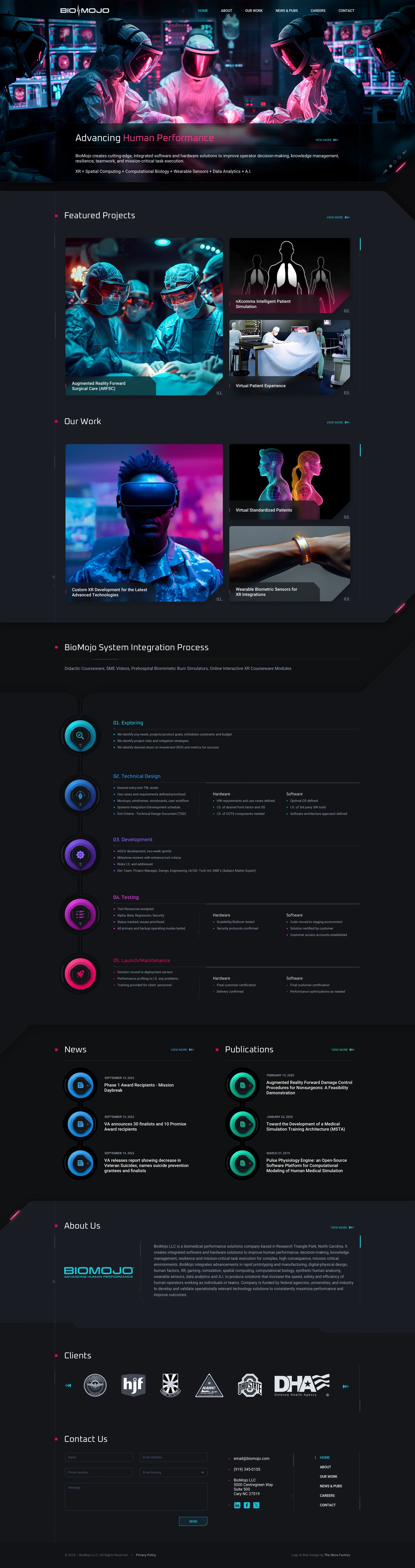
Main Landing Page
Our design team implemented a dark color palette to make the rich colors stand out against the deep backgrounds. Since our recently redesigned brand identity prominently features cyan, we paired it with magenta as a secondary hero color, creating an exciting and dynamic range of hues. While modern web design trends lean towards 2D aesthetics with rounded corners, we embraced these trends but also drew inspiration from past designs that utilized angular elements and visual line work. This fusion of modern and retro styles ensures that BioMojo stands out from its competitors, offering a unique and visually striking web identity. We positioned the masthead pagination circles at an angle to avoid a clichéd look, highlighting them with a magenta "light bar" to draw attention.
Almost all the images we used for the website design were generative AI artworks we created using Midjourney, with extensive post-processing in Adobe Photoshop. Although this was a time-consuming process, the outstanding results made it worthwhile.
We designed the neumorphic elements in the System Integration Process graphic as a timeline-styled, step-by-step image, using 3D neumorphic bases to house the custom icons we designed. This approach not only brings vibrant colors to the website design but also symbolizes BioMojo’s core competency: 3D mixed-reality software solutions. We then deployed the same design language to News and Publications icons.
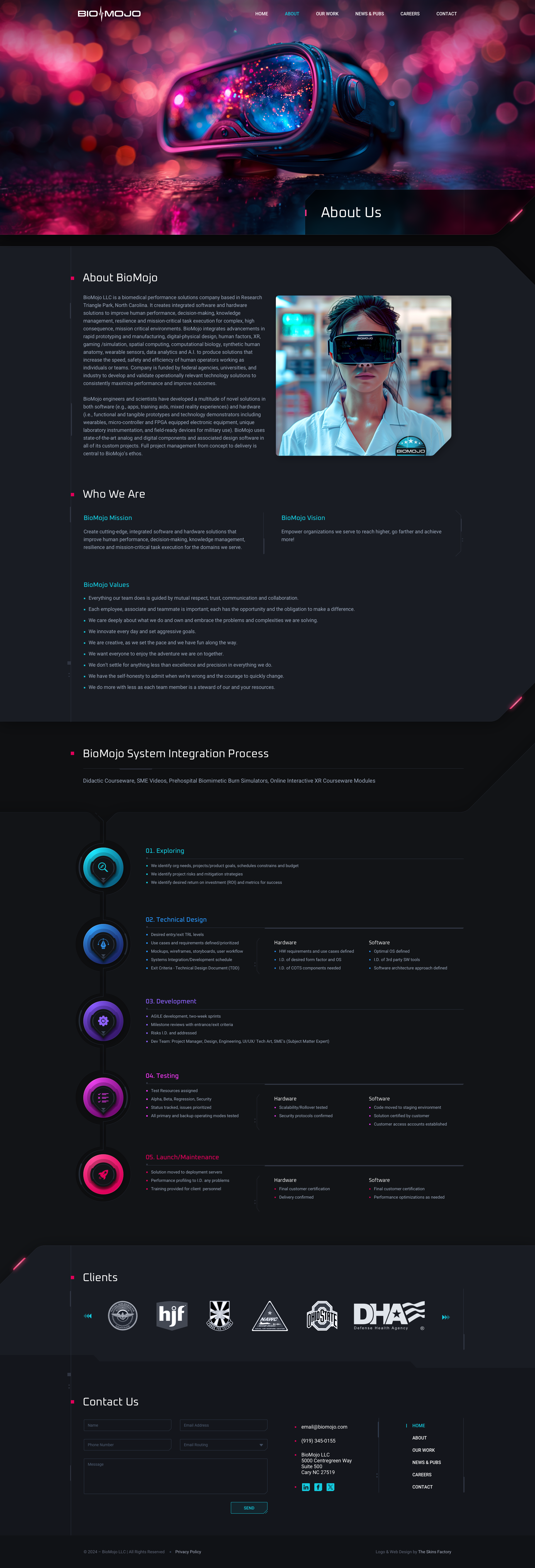
About Us
Part of the website redesign process involves acknowledging what worked and what didn’t in the client’s previous design. For example, dedicating an entire page to a single paragraph does not provide the greatest user experience. To improve this, we consolidated multiple pages into one for both About Us and Our Work pages, thereby increasing the content and information delivered in a quicker and more efficient manner.
Click the About Us image to view at full size.
SOCIAL MEDIA MARKETING IMAGES
Shown below are the generative AI art images we generated to be used on the website design as well as deployed for social media marketing. Extensive work was then done for the generated images in Adobe Photoshop to correct anomalies, regenerate areas using Adobe’s Generative Fill tool, color correction and other modifications.
Each social media company uses a different size and format, so our team ran tests to make sure the logo would present without obstruction by social media profile images and when possible, the switch between desktop browser and mobile versions.
Details matter.
FACEBOOK COVER IMAGES


LINKEDIN COVER IMAGES


X COVER IMAGES


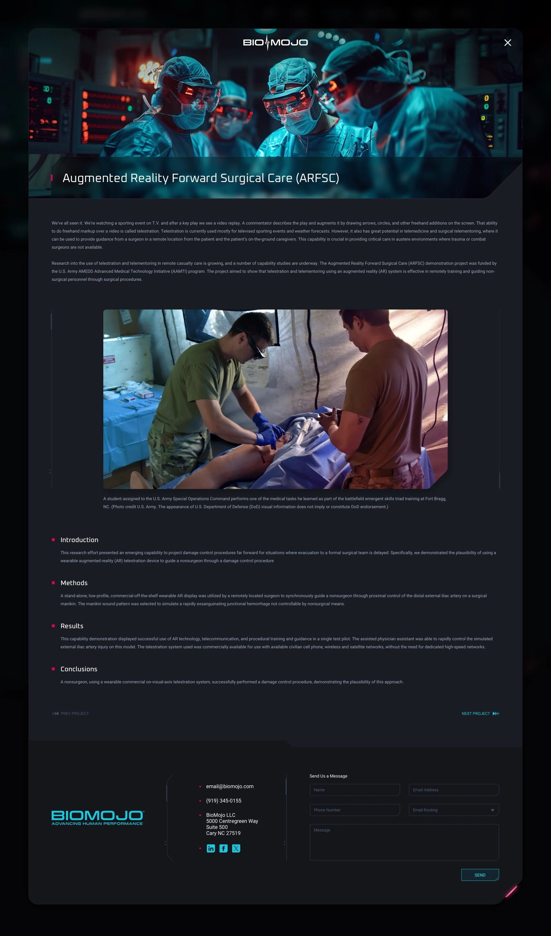
Our Work + Project Template Pages
Similar to the About Us page, the Our Work page consolidated multiple related pages into a single, cohesive page. Additionally, we designed a template for the Projects & Our Work sections that can be used for current and future projects. This templated layout helps the client save costs over time by streamlining updates and ensuring consistency.
Click the images below to view at full size.
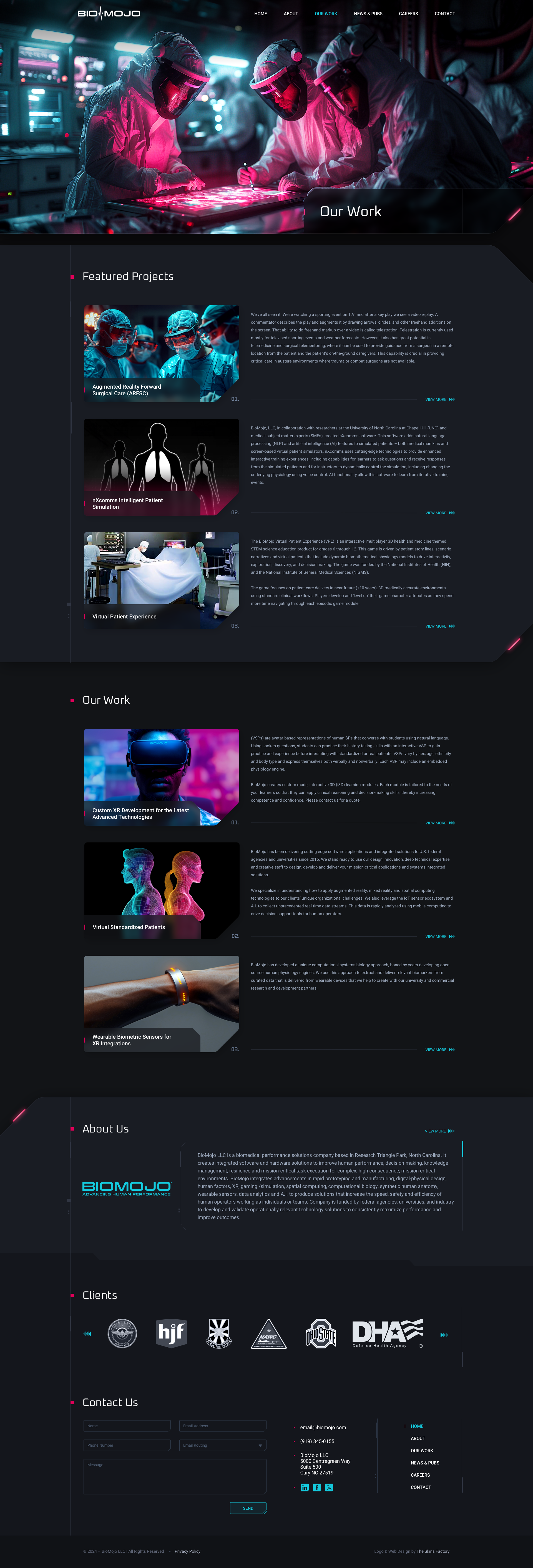
OUR WORK WEB PAGE DESIGN
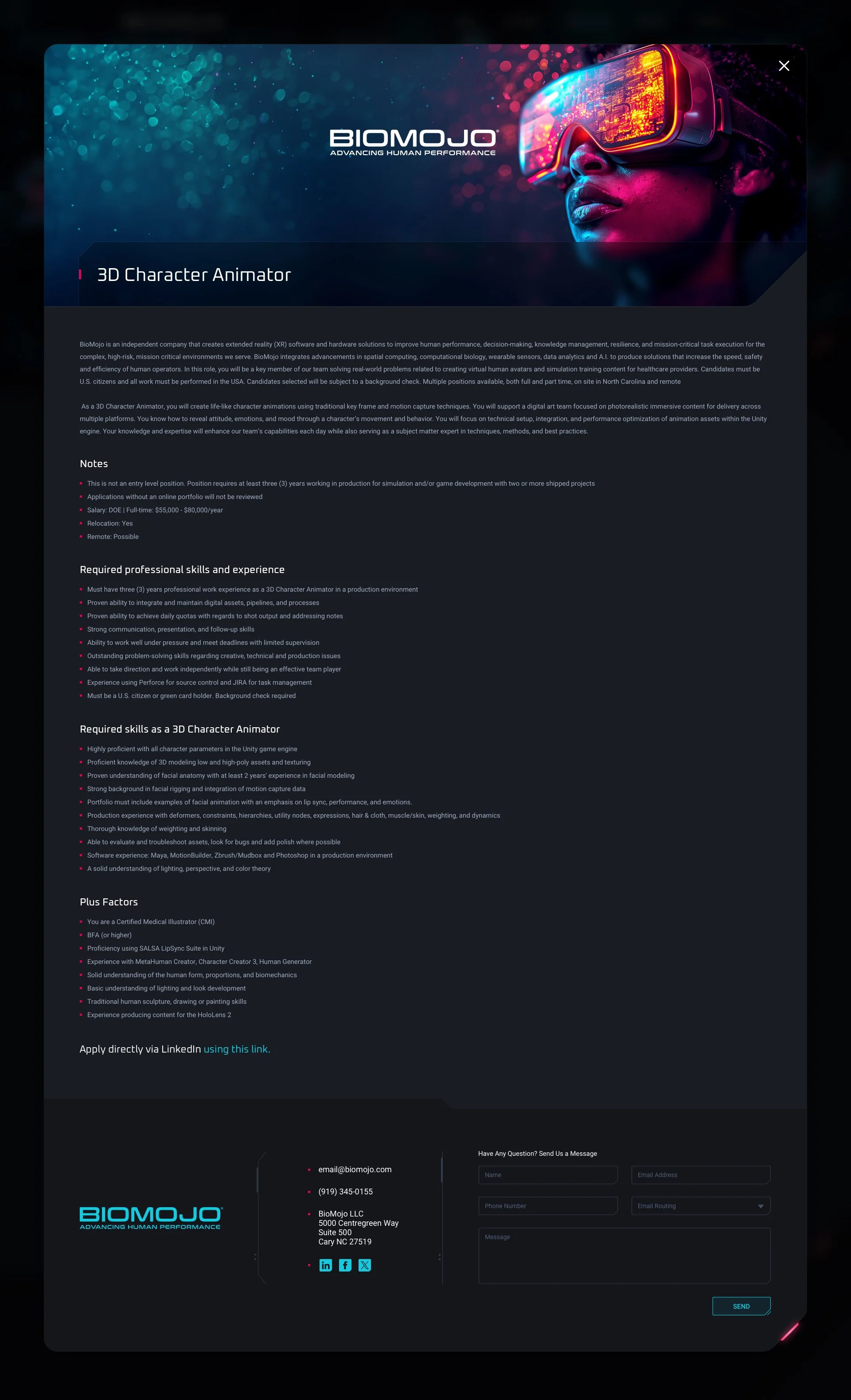
Careers + Job Position Template Page
We decided that some of the web pages with minimal content that couldn’t be combined into one page, would be better presented as slide-in panels. This approach allows visitors to access information without navigating away from their current page. The design language is focused on one side, with the background subtly dimmed to direct attention to the relevant content. The slide-in panel’s flexible width and vertical scrollability make it a versatile solution for various content needs. For the Job Position Template page which houses far more information than even the Careers page does, we designed a template layout for present and future positions.
News & Publications
Similar to the Careers slide-in panel, the News and Publications sections, which were originally hosted on separate web pages, have been consolidated into a single slide-in panel. This decision was made after considering the current posting frequency of both sections. By combining them, we ensure that visitors can easily access the latest updates without navigating away from the main page. Each section within the panel is scrollable, allowing users to explore content seamlessly. As the frequency of updates increases, these sections can be easily separated into their own dedicated slide-in panels if necessary. This flexible design ensures that the website can adapt to changing content needs while maintaining a streamlined user experience.

Contact US
We ensured that Contact Us information is prominently displayed in the footer of every page on the website for easy accessibility. However, we also recognized the need for a dedicated "Contact Us" section. Given that the content was not substantial enough to warrant a full page, we implemented a slide-in panel instead.
To enhance the visual appeal of this panel, we included a photo of the client's offices and applied a color gradient overlay of cyan and magenta. This added a vibrant and engaging element to the image, making it more visually interesting and aligned with the overall design aesthetic. This approach provides users with quick access to contact information without disrupting their browsing experience, while also incorporating a unique and visually appealing design element.

Need a website designed? Let's talk.
Thank you for reaching out.
We will be in touch within one business day.