

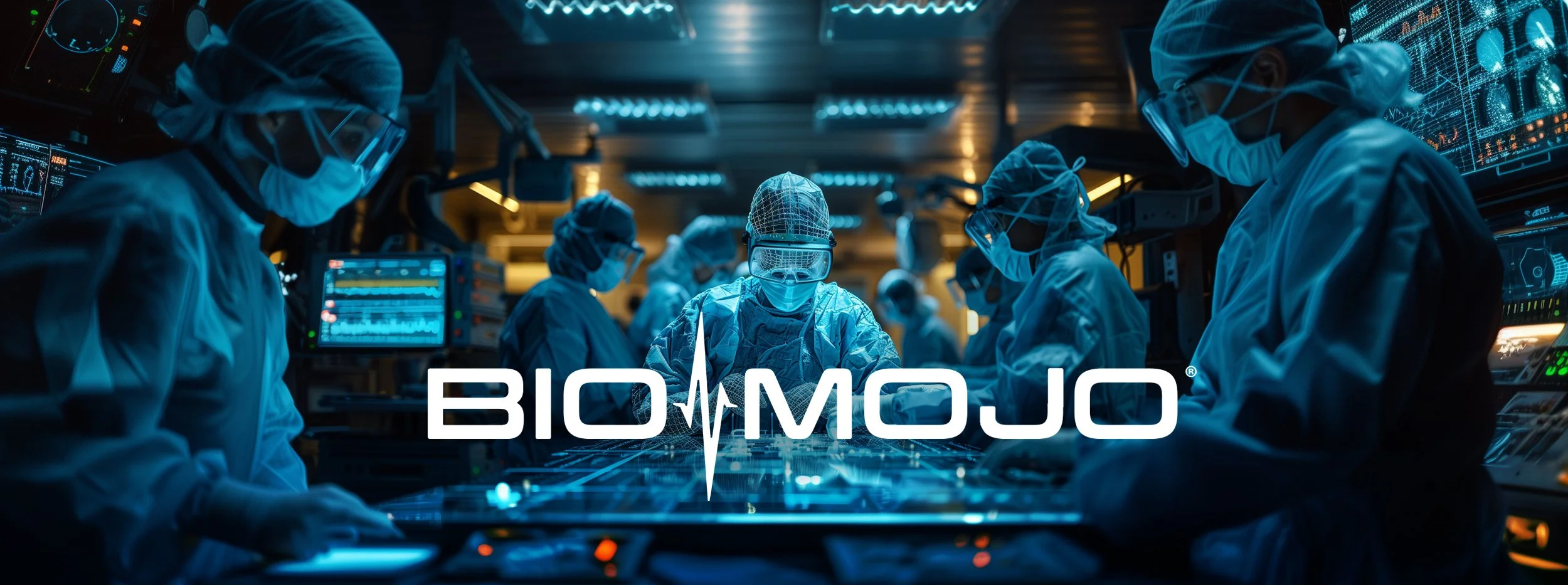
BIOMOJO
Brand identity + Patch design + Collateral
Our third outing with our client spanning 14 years and 3 brand identity designs across 3 companies. BIOMOJO creates cutting-edge, integrated software and hardware solutions that improve the safety, efficiency, capacity and delivery of healthcare. Our brand identity design team designed 2 core logos, with & without a symbol, 3 gradient color themes which share the same logo, but deliver a unique look & feel for each of their 3 verticals, plus a patch design to be used on jackets or uniforms. Let’s take a look…
★★★★★
”Superior to what we previously had. We're extremely happy with everything they’ve done and look forward to working with them again.”
- Co-Owner & Chief Design Officer, BioMojo
UPDATED
Logo Modification & a New Collateral Package
BioMojo brought us back to modify the color scheme and the descending “J” in the original logo we designed for them. They also tasked our design team to modify the patch to reflect the new logo and color, design a business card & letterhead and redesigned their website. Below is a look at the newly redesigned logo & patch, plus the collateral.
Revised Logo & Patch Design


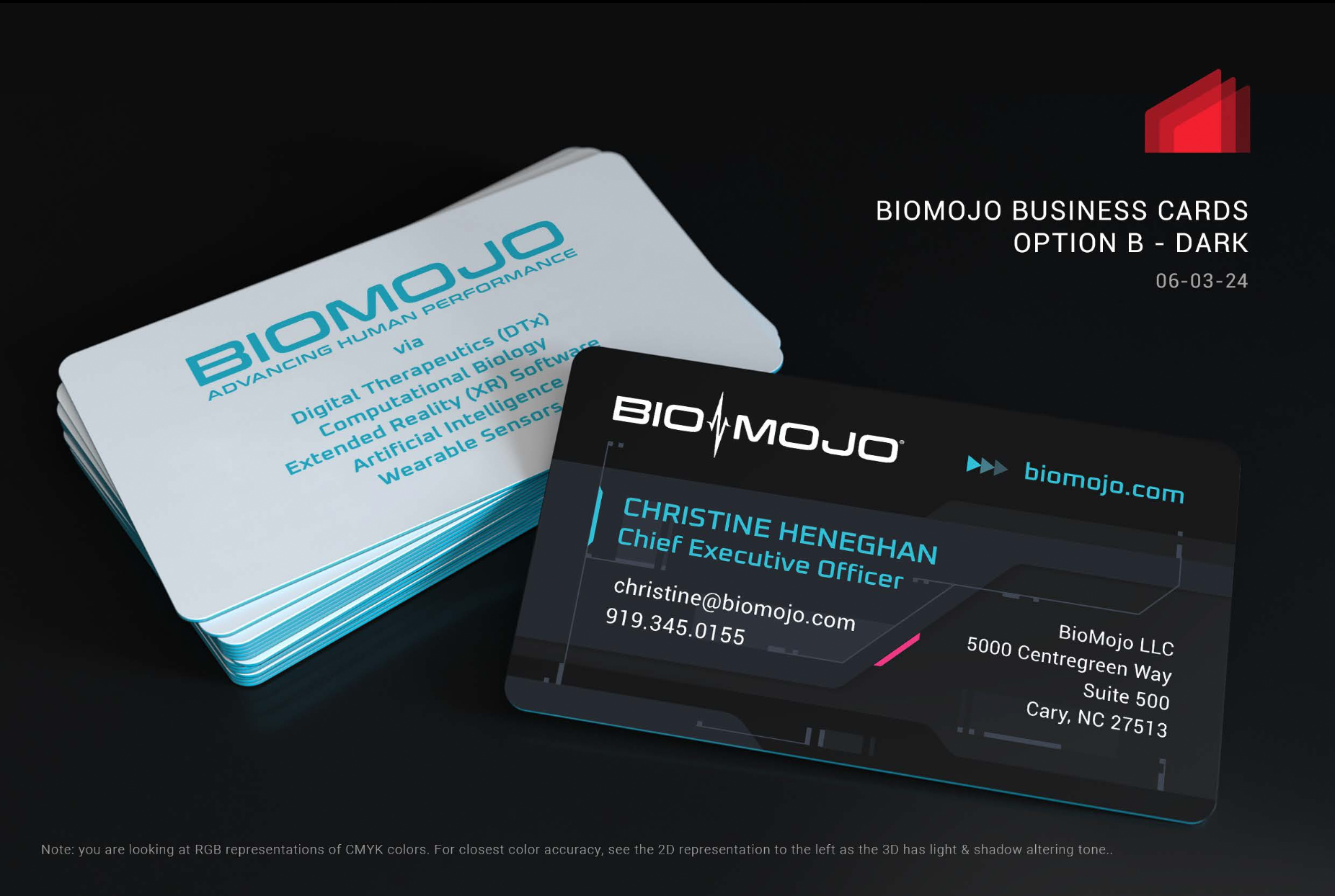
Collateral Design: Business Card
We utilized the design language of the new web design we worked on to create the business cards for BioMojo. As per our usual process, we developed numerous comps and variations for the client to choose from.
FINAL SELECTED BUSINESS CARD DESIGN
BUSINESS CARD DESIGN COMPS


ORIGINAL DESIGN
Discovery + The Initial Comps
One of the first things you do when designing a new brand is discovery. Understanding modern brand identity trends is important if you don’t want your client looking “old and tired” when they launch the new logo. The modern trends are bold, bright colors & color gradients. Most design studios don’t display their rejected work, but we’re proud of these, even if they weren’t selected as a final candidate. And because The Skins Factory always owns its rejected comps, we can design something similar for your brand, product or service.
So let’s take a look at a few of them:
Candidate 1: This was one of our Agency’s favorite comps. Deploying modern trends of bold, vibrant colors with hints of gradients and subtle depth. Because it wasn’t selected, we didn’t have a chance to fine tune her like we would have wanted. The potential for this style is endless. She’s a beauty.
Candidate 2: With its organic, rounded font, this screams modern tech. The colors were always considered transient for this one. With 7 letters, the color transition begins with the 4th character giving it balance and symmetry.
Candidate 3: Blending the design language of Candidate 1, with more of an emphasis on the shading giving a more 3D look and without the color transition on the 4th letter of Candidate 2.
The Final Logo Candidates
We designed 2 versions of the approved logo. One with no symbol and one with a stylized EKG splitting the word mark in two. Each of those 2 versions were given their own color gradient so that BIOMOJO’s 3 vertical industries had their own version of the logo and personality, while maintaining a unified look. The 3 verticals cover Digital Health, Augmented Reality and the United States Military.
The deliverables included both print-ready and web versions which included color, grayscale: negative and grayscale: positive. For the camera-ready art, the pantones were assigned for solid ink separation.
Final Version 1: Vapor
Final Version 2: Chroma
Final Version 3: Ghost in the Machine
The Patch Design
This was our first foray into the world of designing stitched assets. Unfortunately, the company that was going to handle the patch manufacturing, couldn’t deal with gradients, so we had to color separate everything. Let’s look at some of the rejected designs:
The Final Versions
In the end, we gave BIOMOJO two versions of the patch, each one with a set of white and and a set of black internal elements.
Final Version: Set 1
Final Version: Set 2

