
JobHub
Brand identity / Logo design
The Skins Factory’s brand identity design team was tasked with creating a modern, brand identity for an upcoming staffing / job hub company. Using the latest trends in color gradients fused with a customized font design, the results are an ultra-hip, gender-neutral design language, that will make JobHub stand out from their competitors.
Discovery + The Initial Comps
We started the process by doing a lengthy discovery - viewing JobHub’s competitors and discussing the brand’s design direction internally and externally with the client. What you’re about to see are the initial comps we came up. One thing to note, while we offer a client multiple options, we don’t get to select the “winning” candidate. So while we may favor specific comps, in the end it’s ultimately decided by the client.
So let’s take a look at a few of the comps:
Candidate: This design language was based off a rejected comp we did for another client that this client really liked as did we. Since it was simply a comp, it still resides in a rough state and would have been fine-tuned had it been ultimately selected. We love this design language and look forward to trying it again with a future client.
Candidate: We went for a more neumorphic style with the lettering bringing more depth and emphasis to the letters. A bold, modern design language. At this point in the design, we kept with the all-inclusive color palette while instructing the client, that the colors were fluid and could be changed to a different palette.
Final font style + color variants
Candidate: While we don’t show you every single, bespoke font style and color variation we tried, and there were many, the Client ended up selecting this font style and wanted to see color variations. Above you can see 6 candidates our team designed.
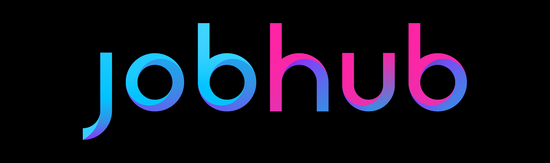
Final Logo
The Client opted for this color combination and font style as the final logo.
