The Iterative Process of User Interface Design
BY JEFF SCHADER
The HODLIT Project
Cryptocurrency Mobile App UI/UX Design
Over the last 23+ years, The Skins Factory has consistently proven why we’re on of the top UI/UX design services companies in the USA, but that doesn’t mean we haven’t occasionally encountered instances where clients questioned the time it would take to complete a project after receiving our cost proposal. When it comes to redesigning an existing app, clients often fail to grasp the complexities involved and solely focus on what they had before, disregarding the time and efforts required to elevate it to its full potential.
Now we’re really good at costing out projects. Like scary good. We designed a browser and tablet application for a company called Viridity Energy, an energy management platform, where we redesigned the UI/UX for 28 browser application screens. then ported our designs to iPad and created a comprehensive Design System. Our proposal had the production time at 21 weeks. We literally finished on the 21st week. Scary good.
So this blog post will delve into the iterative design process of the HODLIT mobile app our user interface and user experience designers worked on. HODLIT is a mobile cryptocurrency exchange platform application. We’re going to show you the initial comps for different screens and where we ended up. You will probably think most of the initial comps look good. But could they be better? That’s the question we always ask ourselves when we do our internal design reviews. The goal of this blog post is to explain how much work goes into designing a user interface, especially at the beginning of a project when you’re establishing the visual DNA of the application.
User Interface (UI) & User Experience (UX) design is an iterative process that involves continuous refinement. Designers create prototypes, conduct internal design reviews, and collaborate in identifying areas for improvement before ever showing the Client. It would be the easy way out to accept the first few comps our designers turn in, and to be honest, even the comps we internally reject are better than the vast majority of other UX design studios’ output, but we have spent well over two decades never settling. We have an innate need & passion to exceed our clients’ expectations and also our own.
So let’s take a look at design by iteration for the HODLIT project starting with the Sign Up screen:
Prototyping the Sign Up screen
Below you see the design prototypes The Skins Factory designers worked on for the Sign Up screen. This was the first screen we worked on for the project. Click or tap the images to view them larger.

Above:
Set 1 is definitely visually appealing. It utilizes a dark panther black or black foundation, which provides a strong contrast that allows the content to stand out. This design closely resembled the Client's original app, as this was a hybrid project involving both a graphical refresh of the previously launched app screens and brand, new features sent to us as very low-fidelity wireframes. Set 2 showcases The Skins Factory's design team's creativity by introducing a departure from what was previously established, exploring new visual designs. At the request of the client, we included a placeholder logo with simple text and styling, anticipating that they would be redesigning their flame logo. We chose not to present to the Client these prototypes because, quite frankly, we felt they weren’t ready. We believe that our clients deserve the absolute best from us, and these didn’t meet that requirement. However, internally we knew we were on the right track and they would serve as a solid foundation for future prototypes.


Above:
The design direction in Sets 3 & 4 clearly showcases our intention to incorporate more contrasting colors, gradients, and embellishments into the user interface. To add depth to the visuals, drop shadows were applied to the upward trending analytic graph line, along with color effects and a content plate in some of the compositions. A gradient was utilized for the Sign Up button across most of the designs; however, it was ultimately determined to be too extreme in terms of contrast—being too bright on one side and too dark on the other. You’ll notice in Set 4 we went back to the upward trajectory graph line of the earlier comps, as it was an embellishment we were fond of.


Above:
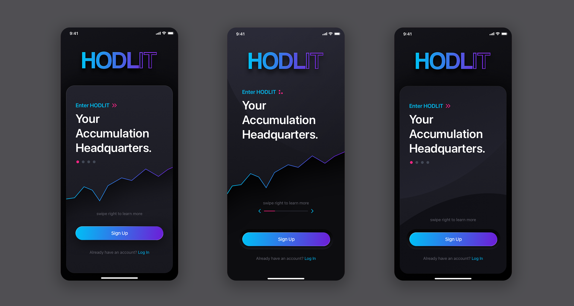
Set 5 was very close to where we wanted to end up. For the placeholder logo, we decided to apply a pink/purple gradient, resulting in a much more eye-catching effect. Because there was going to be a Sign Up and Login button both occupying the same space, we decided on using the logo’s vibrant color gradient for Sign Up to bookend the visual design, build excitement and to differentiate between the 2 buttons. In Set 6, you can see the final transformation from the initial design provided to us to the final artwork. Beauty is subjective, and although all of the earlier designs would have sufficed, we ultimately reached a point where we felt the application design needed to be.
Prototyping the Create Account Screens
It is common practice for us to work on multiple screens simultaneously at the beginning of a project. This approach enables us to determine if the design language will effectively carry over throughout the entire application. As a result, you may notice similarities between some of these screens and the Login screen in terms of their design language. This is usually a very small subset of screens.


Above:
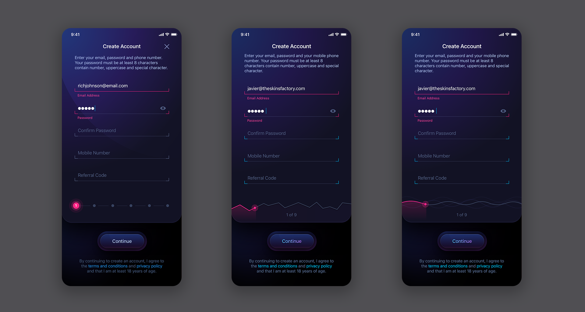
As you can see from the Create Account screens above, they mirror some of the the initial login screens since as they were created at the same time. One thing missing from Sets 1 thru 3 is a progress bar. Given that there are 6 steps involved in creating an account on HODLIT, we believed it was important to provide users with an indication of their progress throughout the process.
Above:
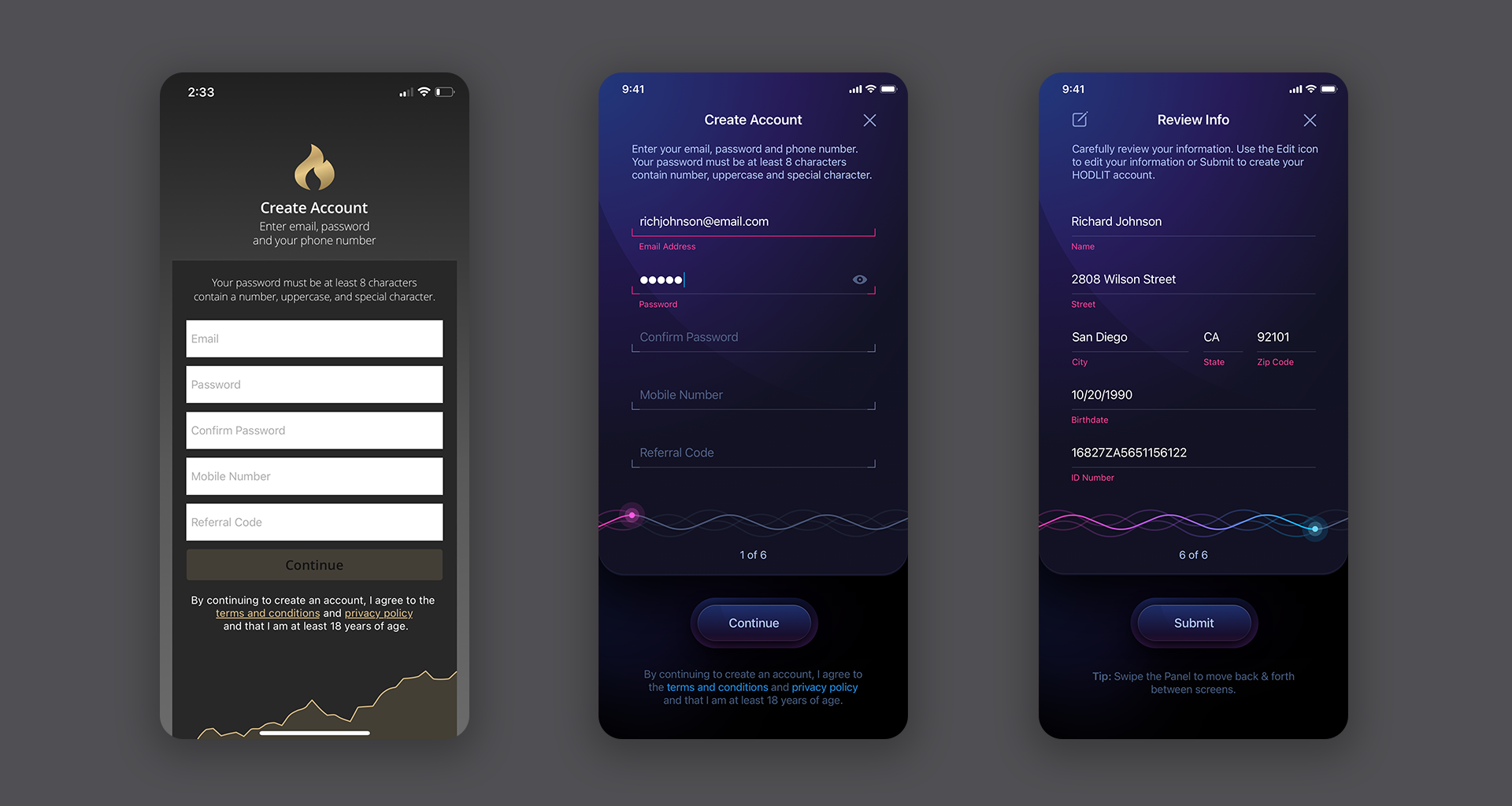
Set 4 sees our designers implementing a progress bar on the bottom of the form. The final visual design had been established so it was just a matter of deciding how what the progress bar would look like. The third screen is the closest to the final version with just some minor tweaks. Set 5 demonstrates the transformation from before to after - a remarkable difference. As users progress through the steps, the progress bar steadily fills in, ensuring a clear indication of their advancement.
The Dashboard Prototype
There were 3 types of scope screens given to us before we started the project. The first were actual app screens from the released version of the app that you viewed above. The second type of screens were low-fidelity wireframes, and the third was an attempt by another designer. These mostly represented the Dashboard screens and some of the isolated crypto coin screens. We liked the concept of the ring, so we ran with it.


Decisions, Decisions
Sometimes the design process is less about iteration and more about making a decision as to which version to select. It can be a daunting task to decide when variations all look visually arresting. In the examples below, for both the Roundup and Autopilot screens, there could only be 1 selection among the 3. Both sets are identical in terms of design, differentiated only by color. So we had to select one version for each screen. One of the comps was easy to strike from the selection process… the middle one was a bit too busy with 3 separate parts and really didn’t work all that well. So it was nixed.
Internally we felt that the blue/green gradient progress ring worked better with the all while jog wheel and the violet/orange progress ring worked nicely in terms of contrast with deep blue jog. It could have easily gone the other way. Both worked exceptionally well. Let’s take a look at the comps. The images will transition automatically or you can click the Next/Previous arrows:


So this was a brief look at what it takes to design an application. It’s an iterative process that takes time and is all about “trial and error.” While beauty is always subjective, our clients rely on our over 2 decades of experience and trust in our ability to know what works and what doesn’t. To take a look at the complete HODLIT project, click the image below. Thanks for reading. Let us know what you think about this post in the comments. And if you need an app, website or brand designed, don’t hesitate to contact us. Doesn’t cost anything to discuss your project.
★★★★★
”The Skins Factory’s work exceeded my expectations.”
Drew Optebeke, Founder, HODLIT

This was a look into the software application design process by The Skins Factory, a top UI/UX Design Studio based in the Miami/Fort Lauderdale area.