
Cybersecurity UI/UX Design: Why Cybersecurity UI Design Fails When Users Don't Trust It
Designing for Cybersecurity:
Why Security UI Has to
Earn Trust Before It Can Do Its Job.
There is a category of software where the interface itself is part of the threat model. Where a cluttered dashboard is not just a usability problem, it is a risk. Where a missed alert is not a minor annoyance, it is a breach. That category is cybersecurity.
The Argument
After 25 years designing across a cybersecurity risk management platform, a cyber prevention and defense SaaS, an enterprise SAP security solution, a managed security application, and AI-powered security tooling, we know what makes security UI work, and what makes it fail at exactly the wrong moment.
The Cybersecurity UI Problem Nobody Talks About
Security products are built by security people. That is both their greatest strength and their most consistent design liability.
The teams building these platforms understand the threat landscape with a depth that no external designer can match out of the gate. They know what the data means, what the alerts represent, what the risk scores imply. That knowledge is invaluable.
But domain expertise does not automatically produce usable interfaces. And in cybersecurity, the gap between what a platform can do and what an analyst can actually act on in real time is often enormous.
The result is an industry full of products that are technically sophisticated and operationally overwhelming. Dashboards packed with data but lacking hierarchy. Risk scores presented without noticeable context, forcing users to make decisions based on numbers they cannot interpret quickly enough. We have worked on cybersecurity applications not shown in our portfolio where the interfaces were so saturated with data and components that they had become functionally broken. Not broken in the sense that they crashed. Broken in the sense that analysts would have to unintentionally slow down to digest what they were viewing.
This is not a feature problem. It is a design problem. And it is one that the industry has been slow to take seriously, because the buyers are technical and tend to evaluate on capability first and usability second. There is a second reason the UI is so often broken that rarely gets discussed: security companies pour resources into engineering, infrastructure, and threat research, as they should. The interface those investments are delivered through gets a fraction of the attention and budget. The result is products that are technically formidable and visually dated. Users notice. Buyers are starting to notice too.
Security platforms serve multiple distinct user types.
Most products design for one while neglecting the others.
What Cybersecurity Users Actually Need
01
The SOC Analyst
The frontline user. Monitoring dashboards, triaging alerts, making rapid decisions under time pressure with incomplete information. They need immediate clarity on what is critical versus what is noise. They need to move from alert to context to action in seconds, not minutes. Every extra click, every ambiguous label, every poorly prioritized piece of information is cognitive load they cannot afford during an active incident.
02
The Security Engineer
Configures and maintains the platform. Needs depth, control, and precision. Comfortable with complexity, but complexity still needs to be organized. A settings architecture that requires three levels of navigation to reach a commonly used configuration is not sophisticated. It is poorly designed.
03
The CISO
Needs a completely different view. Not in the weeds of individual alerts. Needs posture, trend, and exposure at a glance. A risk score that a SOC analyst can drill into is not the same interface that a CISO needs to walk into a board meeting with. Different user. Different mental model. Different job to do.
Most security platforms give all three of these users some version of the same interface. The analyst drowns in the depth the engineer needs. The CISO cannot find the summary the board wants. The engineer cannot get to the configuration the analyst is waiting on.
The right answer is role-aware design. Not three separate products, but a single platform with clearly differentiated views, each calibrated to the cognitive demands and decision-making context of its user. The next evolution of that model is an AI layer that does the role differentiation dynamically. Rather than static views toggled by user type, the interface surfaces what each user needs based on their behavior, their role, and what is happening in the environment at that moment. The SOC analyst sees what is on fire right now. The CISO sees what the board needs to hear. The engineer sees what needs to be configured. Same platform, same data, different lens, assembled in real time rather than designed in advance. That is not a distant possibility. It is where the best security platforms are headed, and the ones investing in that direction now will be very difficult to displace.
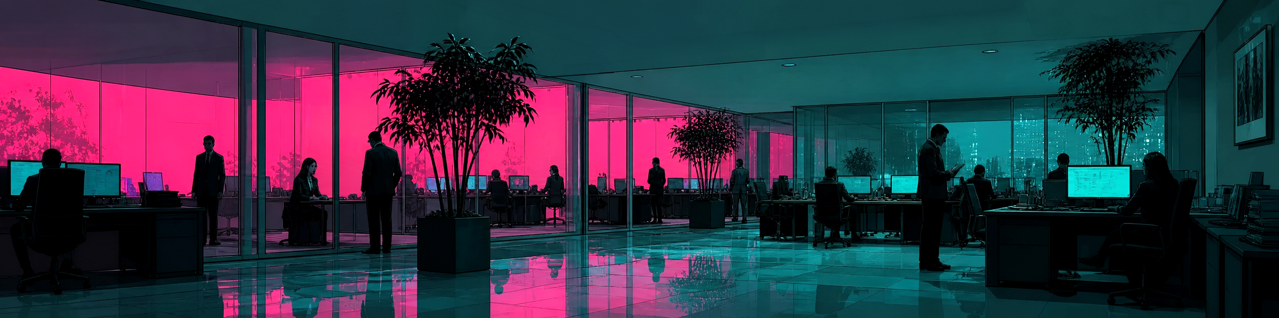
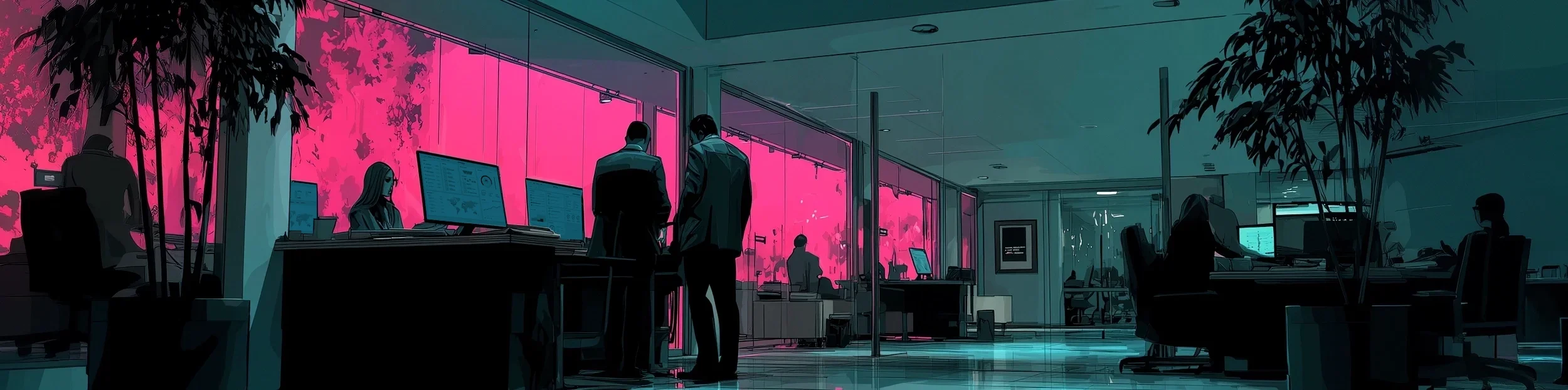
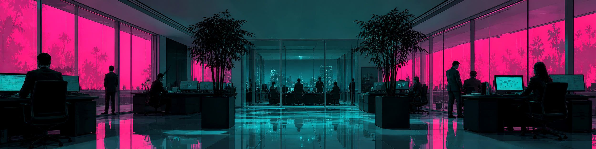
The Color Problem in Security UI
Red means critical. Yellow means high. Green means clear. Every security platform in existence uses some version of this convention, and most of them use it excessively.
The problem is not the convention itself. Red for danger and green for safe is deeply embedded human cognition. The problem is what happens when you apply it without discipline.
A dashboard where thirty percent of the items are red is not a useful dashboard. It is noise. When everything is urgent, nothing is urgent. Alert fatigue is not a user behavior problem. It is a design failure that has been misattributed to the people using the product.
We confronted this directly in our work with Pareto Cyber. The scope of work was to redesign their platform for mid-market and enterprise, and one of the most significant decisions we made was to break the red, yellow, green paradigm entirely. We designed an alternative color scheme to denote critical, high, medium, and low risk that separated visual urgency from emotional alarm. The result was a dashboard that communicated priority without inducing the chronic low-grade stress that conventional security color systems create.
Analysts spending eight to twelve hours in front of a security dashboard are subject to the cumulative psychological weight of the color environment they work in. A system that is permanently screaming red, trains analysts to unintentionally stop hearing it.
There is a second dimension to this problem that the industry almost never addresses. Red/green colorblindness affects approximately one in twelve men and one in two hundred women. For security teams with dozens or even hundreds of analysts, a meaningful number of users cannot reliably distinguish the color system their platform is built on. A status interface where green means the system is running and red means it has stopped is not just a convention, it is a potential point of failure.. For a colorblind analyst, it is a barrier. In our work with Runzheimer, we designed an alternative version of their application that uses yellow and blue in place of red and green specifically to address this. It is a small decision with significant operational impact.
Color in security UI is not decoration. It is signal architecture. And signal architecture that excludes part of your user base, or that has been applied without discipline, is not doing its job.
Designing for High-Stakes, High-Density Data
Cybersecurity platforms are among the most data-dense interfaces in enterprise software. Network traffic. Vulnerability scores. Threat intelligence feeds. Incident timelines. Compliance posture. Risk exposure across the entire attack surface.
The temptation is to respond to that complexity by simplifying aggressively. Hide the data. Surface only the top-level metrics. Make it approachable. That trades one problem for another. Security users did not come for a simplified view. They came for the right information, structured so they can act on it. The goal is not simplicity. It is structured density. Every data point earns its place in the hierarchy by the action it enables. If seeing a piece of information does not lead to a decision or an action, it does not belong on the primary view.
This is what we mean when we say that hierarchy is a security decision, not a UX preference. In our work on FortifyData's risk management platform, redesigning 40-plus screens meant making continuous decisions about what belonged in the primary view, what lived one level deeper, and what could be surfaced only on demand. Those were not aesthetic choices. They were operational ones.
The interface that shows an analyst exactly what they need to act on, and nothing else, is doing more security work than any feature the platform could add.
Bad security UI has measurable operational consequences.
What Bad Security UI Costs
The business case for investing in cybersecurity UI design is unusually direct. Bad design in this category has measurable operational consequences. And consequences lead to churn in a vertical that is growing exponentially. Customers will move to products that are easier to use, and losing one to a competitor is a costly mistake.
Alert fatigue. According to a survey conducted by IDC in partnership with FireEye, more than one in three SOC analysts ignore threat alerts when their queue is full — not because the alerts are not real, but because the volume and presentation make it impossible to distinguish signal from noise in real time. Every uninvestigated alert is a potential incident that went unexamined. Source: Cybersecurity Dive / IDC + FireEye
Mean time to respond. An analyst who has to navigate three screens to get from an alert to the context needed to make a decision is slower than one whose platform surfaces that context automatically. In a breach scenario, minutes matter.
Analyst turnover. SOC work is already high-stress. Interfaces that compound that stress with unnecessary cognitive load contribute to burnout. The talent shortage in cybersecurity is real and well-documented — according to the 2025 ISC2 Cybersecurity Workforce Study, the global cybersecurity workforce gap stands at 4.8 million unfilled positions, and the workforce would need to grow by 87% to meet current demand. Platforms that are miserable to use make it worse.
These are not soft UX concerns. They are operational and financial risks that show up in incident reports, staffing costs, and breach post-mortems.
What Great Cybersecurity UI Actually Looks Like
Across our work in the security space, the products that work share a specific set of design characteristics.
Hierarchy reflects operational priority, not data availability. What surfaces first on a security dashboard should be determined by what requires the most urgent attention, not by what data is easiest to display. This sounds obvious. It is rarely practiced.
Color is a signal system, not a decoration system. Every color decision in a security interface should be justified by the action it is intended to trigger. If red means act now, then red should only appear when immediate action is required. If it appears everywhere, it means nothing.
Role-aware views reduce cognitive load for everyone. A platform that shows the same interface to a SOC analyst, a security engineer, and a CISO is not a benefit, it is an issue. In that scenario, everyone sees everything, which means everyone is drowning in what does not apply to them and hunting for what does.
Speed is a security feature. An interface that slows down incident response is a problem. Every interaction should be designed for the moment when time is the most critical constraint, not the median use case.
Trust is communicated visually before it is proven functionally. Security buyers are skeptical by default. A platform that looks and feels unpolished signals that the same attention to detail may not have been applied to the underlying product. First impressions in security software carry disproportionate weight because the buyer's default posture is doubt.
Our cybersecurity and risk management design practice covers all of these principles in depth. See how we approach cybersecurity UI/UX design.
The security product landscape is shifting in ways that will make interface design even more critical.
The Future of Cybersecurity UX
The security product landscape is shifting in ways that will make interface design even more critical over the next several years.
01
AI Moving from Feature to Core
The next generation of security platforms is not just analyzing data. It is interpreting it, prioritizing it, and in some cases acting on it autonomously. The design challenge is transparency and trust. An analyst needs to understand not just what the AI is flagging but why, with a clear path to review, override, or escalate. If an analyst cannot understand why the system flagged something, they cannot make a confident decision, and in security, unconfident decisions get delayed or ignored.
02
Attack Surface Expanding Faster Than Teams
Cloud, remote work, IoT, and shadow IT have expanded the attack surface faster than most organizations can staff for it. Security platforms that help smaller teams manage larger threat surfaces need interfaces that multiply analyst effectiveness, not ones that require a specialist to interpret. Design is part of the solution to the talent gap.
03
Compliance and Reporting as Primary Use Cases
As regulatory requirements around cybersecurity mature, CISO-level reporting and compliance documentation are moving from edge use cases to core product requirements. Platforms that treat reporting as an afterthought are leaving a significant user need underserved.
Clarity under pressure
is not a nice-to-have.
It is an operational requirement.
What surfaces first is a security decision, not a UX preference. Getting it wrong creates conditions for missed incidents.
Signal architecture that is applied without discipline or that excludes part of your user base is not doing its job.
Either makes the analysts, engineers, and leaders using the platform more effective — or gets in their way at exactly the wrong moment.
Ready to build a security product that analysts actually trust?
Whether you are a startup trying to break through in a crowded market or an established product trying to close the usability gap on newer competitors, contact us today, we'd love to talk. Click below to complete our product inquiry form. In a rush? Use the quick form below, and we’ll take it from there.Have a project in mind? Let's chat.
Thank you for reaching out.
We will be in touch within one business day.
About Jeff Schader
Jeff Schader is the founder and CEO of The Skins Factory, a UI/UX design studio he started in 2000, based in the Miami/Fort Lauderdale area. He has designed software for some of the biggest names in tech and entertainment, including Microsoft, Disney, the NFL, Bank of America, and Intel, along with SaaS, fintech, healthcare, cybersecurity, and enterprise platforms. Jeff runs The Skins Factory lean and stays hands-on across client work, strategy, and design. He writes about UI/UX, AI interfaces, and what actually makes software usable.
