HomeFirst by CareCentrix
Tablet APP UI/UX DESIGN + Printable Patient Discharge Template
Empowering Nurses: Unveiling the Game-Changing iPad App Designed by The Skins Factory for CareCentrix
CareCentrix, a leading home and health benefits management company, contracted The Skins Factory’s design team to create an iPad iOS application to be used by Nurses in hospitals, which provides them analytics on patient outcomes and makes recommendations for patient discharge.
One of the most important aspects to designing a user interface (UI) and user experience (UX), is understanding the demographics and environment of those who will be utilizing the application you’re designing. Nurses in hospitals work under constant, intense, fluorescent lighting, so we opted for a darker visual design that would deliver a sense of calm and purpose. During the pandemic, hospital Nurses have been under a lot of pressure, and we felt it was our job to create a tool that would not only expedite the tasks they had to perform, but also be intuitive and endearing to use. Fusing a hybrid design of flat, 2D elements with more tactile, neumorphic styling, the app is a testament to The Skins Factory’s ability to not only execute the latest design trends, but to exceed them.
★★★★★
”The design they delivered was incredibly well done; it was visually awesome.”
- VP PRODUCT & ANALYTICS, CARECENTRIX
Dashboard: Path of care
It is vitally important for the Nurses to make sure they were working with the correct patient, so we designed the left sidebar of the Dashboard with a traditional white background / dark text. It’s a known fact that dark text on a white background is the easiest combination to read with , causing the least amount of eye strain. For the rest of the Dashboard (and subsequent screens) we used a deep purple background with neumorphic enhancements, vibrant color gradients and large text & iconography to enhance usability.


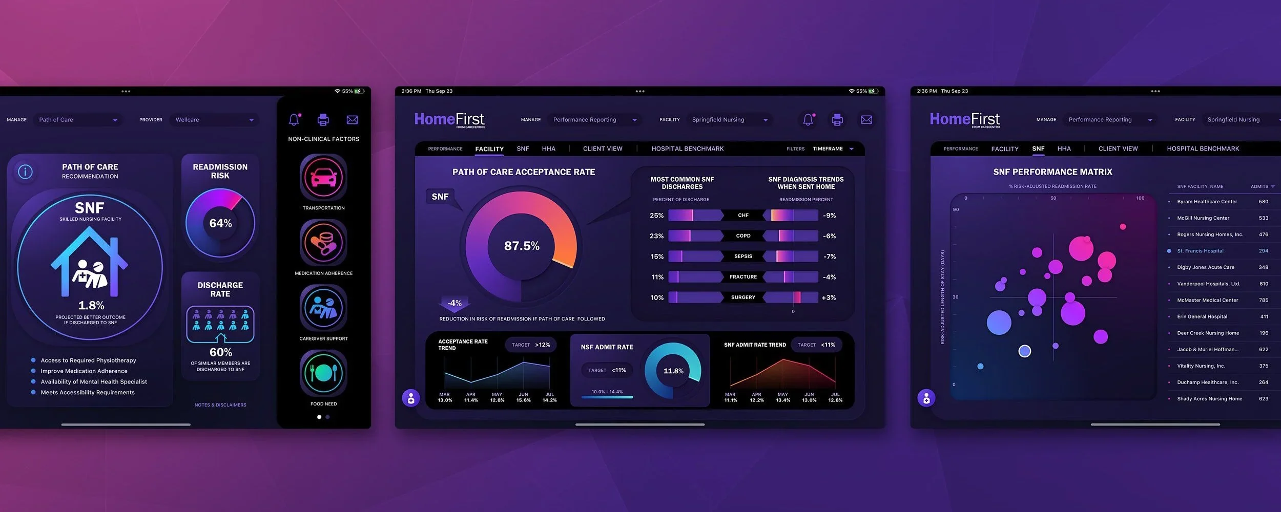
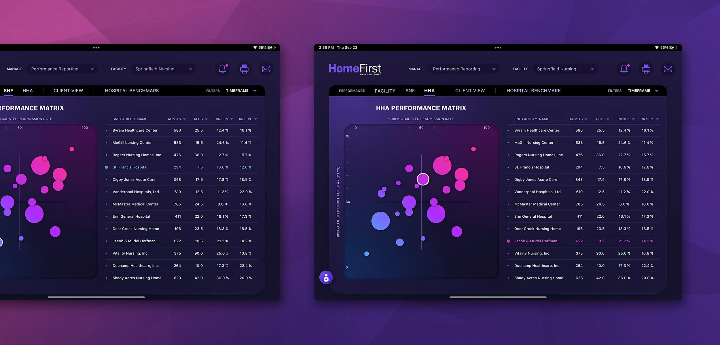
Performance Reporting
The Performance Reporting screens are heavy in analytics and were a joy to design. We wanted to really make the various graphs “pop” off the screen and add an element of fun to them. From Line & Radial Graphs to Scatterplot Graphs, information is delivered to the Nurses in a colorful, enjoyable way.

Dashboard: Provider Recommendations
One of the core features of the HomeFirst application is figuring out whether or not patients can be discharged and to where. We had a lot of internal discussions figuring out the best way to increase the size of the map area without sacrificing functionality.
Above: Default Layout
The left sidebar delivers the Medical Facility and Patient information. In the center, the map with touch points and the table delivering pertinent metadata about the Providers with the filtered distance. The far right sidebar is the the filtering system a Nurse can slide the scrubber to alter filtering results. You’ll notice the pink, double chevron arrow icons. Those are for collapsing the table and / or right sidebar.
Above: Right Sidebar Collapsed
As you can see, the right sidebar has been collapsed, but the functionality has stayed intact. We transitioned the circular scrubbers to vertical ones. The 3 icons at the top have been collapsed into a MORE icon with easy accessibility.
Above: Table Collapsed
The table has been collapsed down, freeing up more vertical room for the map. With the table collapsed, the user can touch map points and glean the same information shown in the now collapsed table.
Login
The Login Screen design was designed to be a 2D, digital diorama creating a sense of shallow depth.
CareCentrix Discharge Printable Template Design
Streamlining Discharge Processes: How CareCentrix and The Skins Factory Collaborated to Make Patient Discharges More Efficient
As the healthcare industry continues to evolve, there's a growing need for more efficient and streamlined processes, especially when it comes to patient care. Discharge processes, in particular, have historically been a pain point for both patients and healthcare providers. But now, thanks to the innovative collaboration between CareCentrix and The Skins Factory, the future of healthcare discharge processes is looking brighter than ever. By leveraging CareCentrix’s cutting-edge technology and a commitment to quality patient care, and The Skins Factory’s seasoned, user experience design studio, together we’ve worked hand-in-hand to revolutionize the way patients are discharged from hospitals and other medical facilities.
PROJECT OVERVIEW
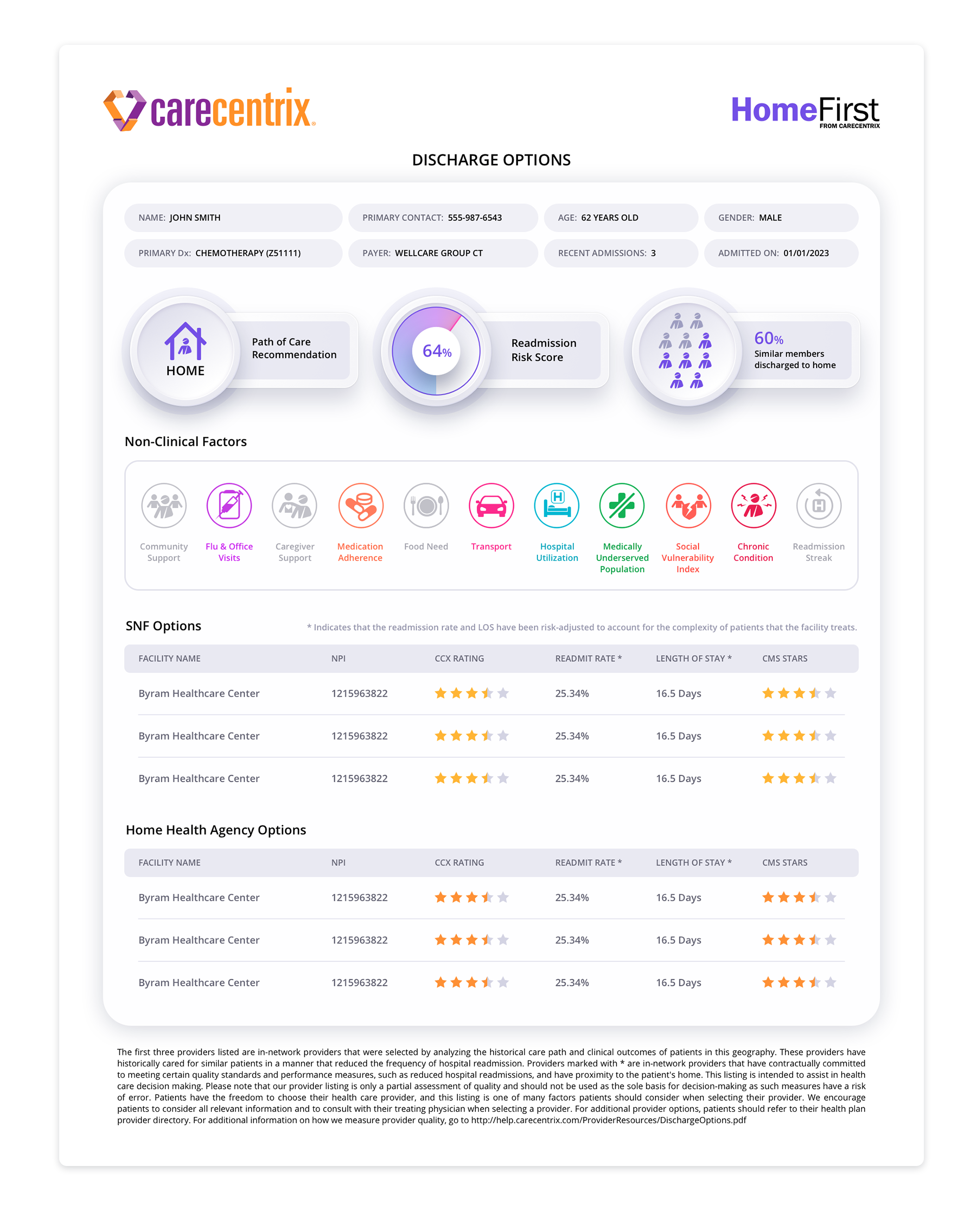
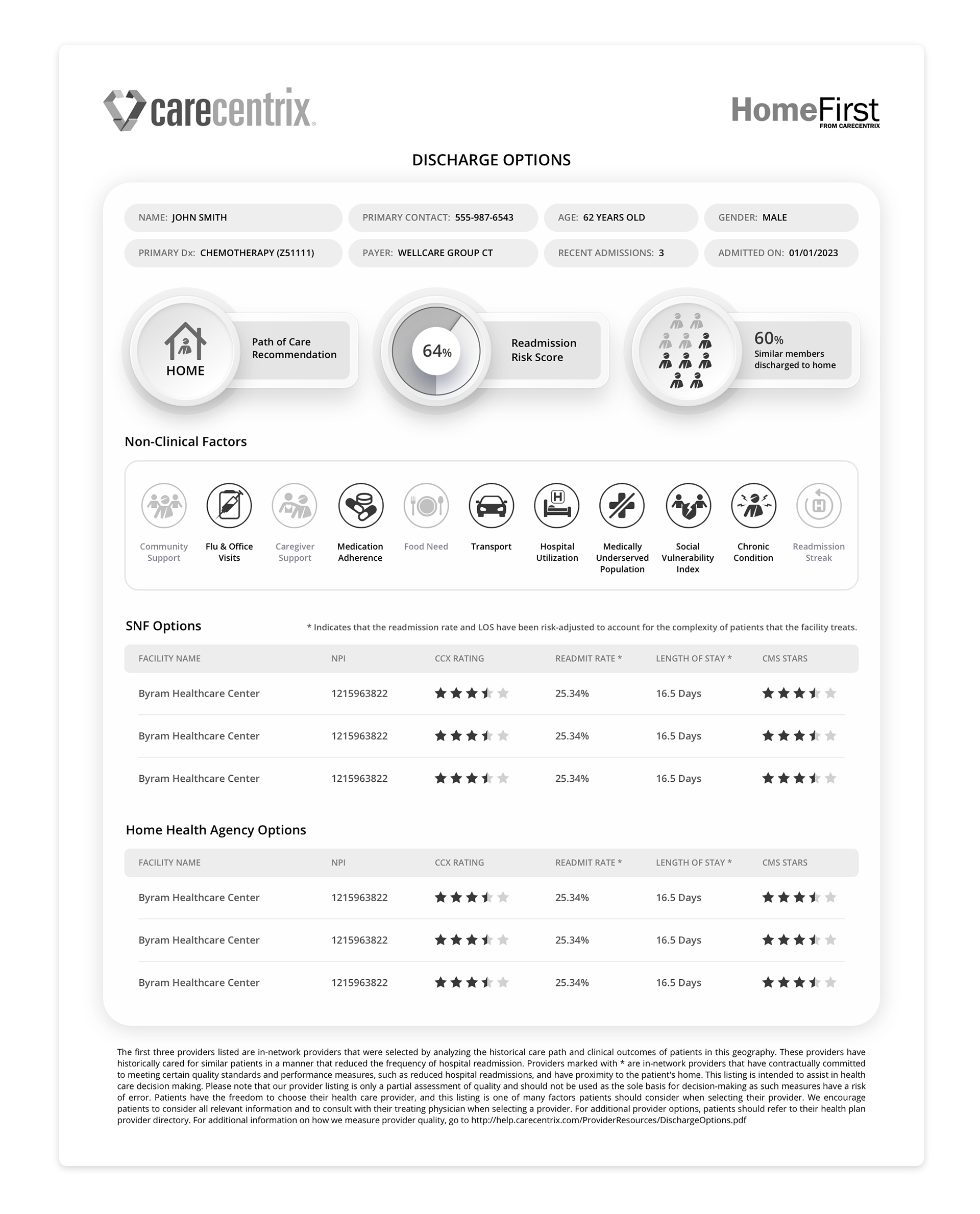
Two years after designing HomeFirst for CareCentrix, The Skins Factory was again tasked by our client. This time it was to design a discharge template for HomeFirst in two formats. One to be printed in the A4 format to be delivered to patients and a version to be viewed on a iPad or tablet by the Nurses.
For the printable versions, our design team created them in two formats - Color and B&W. We understood that a color version couldn’t be a drain on the printer’s ink supply. One of the key elements of efficient design is the use of color. Color can help to organize information, highlight important details, and make printed materials more visually appealing. So we used it sparingly, but effectively.
We carried over some of the design language from the iPad user interface we designed, and made subtle changes for this new format. One of the embellishments we brought over were subtle neumorphic design touches that lifted pertinent information off of the background, creating a stylistic approach to an otherwise 2D, flat design.
The version you see below is the single page format in color. A two-page design was created that allowed for the Options Tables to contain more entries with each option table on their own page.
THE DELIVERABLES
Color Print Design Template
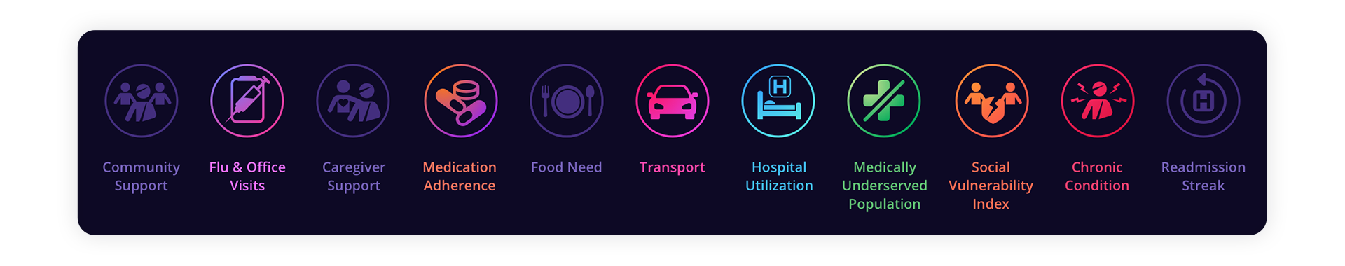
Non-Clinical Factors Iconography Design for Color Print
Considering that the original Home First iPad app icons resided on a dark background, our UX designers opted to use vibrant gradients for the new icons in order to make them visually stand out. The utilization of gradients added depth and dimension to the icons, capturing the attention of the users and creating a more engaging experience. By employing vibrant gradients, our designers were able to create a visual contrast that made the icons "pop" off the screen, ensuring that they could be easily noticed by the users.
Creating New Icons
Part of the new task at hand was to develop four new icons to be added to the existing icon set of the Home First iPad app. With this goal in mind, we set out to create icons that would be visually striking and easy to understand for the users while merging seamlessly with the icons we created for the app.
Enhancing Legibility with a Singular, Vibrant Color
During the process of adapting the icons for print purposes, our team faced the challenge of maintaining legibility and aesthetic appeal. We decided to convert all active icons to a singular, vibrant color that would not only improve legibility but also create a consistent visual language. This design choice, allowed for a harmonious integration of the new icons into the existing icon set, providing users with a seamless experience.
Distinguishing Inactive Icons through Graying Out
In the context of patient-centered design, it is crucial to provide clarity and avoid confusion. To achieve this, we took a thoughtful approach to icons that did not apply to the patient. These icons were visually differentiated by graying them out, clearly indicating their inactive nature. This design decision ensured that users could easily distinguish between the active icons and those that were not relevant to their clinical needs.

B&W Print Design Template
Black and white printing may not seem like a complicated task, but achieving the perfect balance between contrast and clarity can be an art form in itself. We ran multiple printing tests to fine-tune the contrast and legibility of the discharge document, while taking into account the amount of printer ink that would be used.
Non-Clinical Factors Iconography Design for B&W Print
With color, you can differentiate between active or inactive by using color and grayscale. With B&W we didn’t have that ability. So active icons became pure black and inactive icons stayed muted and grayscale.

Color Tablet Design Template
The final task was to create a tablet version of the print template. To achieve this, the design team took design cues from the original application design and updated them slightly to reflect current trends. As a result, the layout of the tablet version is crisp, sleek, and modern. One of the design elements that make the all versions stand out is the use of neumorphic embellishments. They help to lift the content off the screen, making it more engaging and visually appealing.
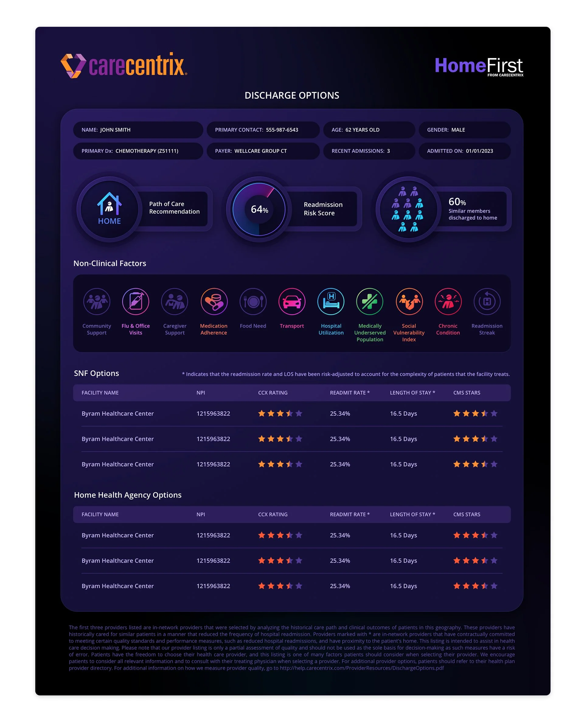
Non-Clinical Factors Iconography Design for Tablet
We stayed true to the original iPad icon design infusing them with rich gradients while creating new ones for the additional 4 icons. Inapplicable icons use the original muted, deep purple design language.