

Designing a Task Management App for ASD / Special Needs Individuals
BY JEFF SCHADER
Establishing the Neumorphic Visual Design Language of an Autism/Special Needs Mobile App
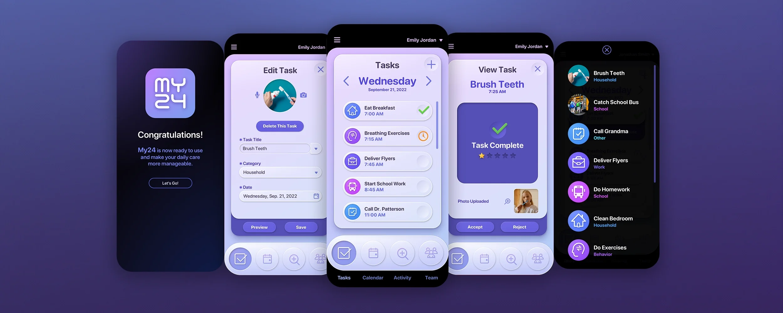
In this blog post, we will delve into the visual design prototypes of the MY24 Task Management app The Skins Factory worked on for our client, Get2It. This project held a particularly significant meaning to our CEO as the Father of a high-functioning Special Needs daughter on the Spectrum.
Great care was taken by our UI/UX Designers in selecting the visual materials colors for the mobile application. We made a conscious decision to avoid using bright reds and stimulating yellows, as they can be overwhelming. Instead, we opted for calming greens and blues that are known to have a soothing effect on individuals with sensory conditions. Additionally, soft pinks, oranges, and neutral colors were chosen for their comforting properties. By keeping the color palette muted in pastel tones, we aimed to create a sense of tranquility and promote a calm state of mind.
During the initial phase of the visual design process, we conducted thorough experiments with different textures, colors, and shapes. Ultimately, we settled on incorporating a tactile visual experience into the main navigation and integrated that fun design language throughout the user interface. Below, you will find a comprehensive overview of some of the concept designs we developed.
The neumorphic protoypes
If you’ve spent time on The Skins Factory, you’ll run across the term “neumorphic” quite often. It’s the successor to skeuomorphism. While The Skins Factory has set many trends, it's important to recognize that Apple, Microsoft, and Google hold significant influence as gatekeepers in user interface design. These tech giants control operating systems and play a pivotal role in defining what is considered fashionable in the realm of UI design.
What is Skeuomorphism?
”Skeuomorphism is a term most often used in graphical user interface design to describe interface objects that mimic their real-world counterparts in how they appear and/or how the user can interact with them. A well-known example is the recycle bin icon used for discarding files.” - The Interaction Design Foundation
The skeumorphic design language remained in use until the early 2010s when Microsoft made a shift to a more streamlined and user-friendly design for Windows. Following suit, Apple embraced this trend in early 2013 under the leadership of Jony Ives, who took over from Scott Forstall. Later, in 2014, Google would introduced Material Design as their own flat design language.
What is Neumorphism?
If you ask Wikipedia they’ll tell you “It is commonly identified by a soft and light look with elements that protrude or dent into the background rather than float on top of it.” We reject that definition. If neumorphism is a medium between skeumorphism and flat design, then really any 3D type design that’s not using real world materials (like skeuomorphism uses) should fall under that category. We define “neumorphic” as a 3D visual design not based on real world materials.
Let’s take a look at a series of design prototypes we created for MY24 using neumorphic, claymorphic and glassmorphic design styles. We really wanted the UI to be playful & fun with large, easy to hit navigation buttons and colorful UI elements.


The Claymorphic protoypes
What is Claymorphism?
Claymorphism is built on top of neumorphism and looks exactly how you think it would look with it’s soft, white matte style. Here are a few of the comps using a claymorphic design language we developed for the MY24 app.


The Glassmorphic Protoypes
What is Glassmorphism?
Glassmorphism has been around since Microsoft launched the Windows Aero interface for Windows Vista. In 2008, we were designing Intel’s Graphics & Media Control Panel using a semi-transparent glass effect. So the effect has been around for a very long time.
The client would end up selecting the glassmorphic design language for application. They change da few of the color themes against our advice for the final artwork, but here are our original comps.


So that’s a look at the initial prototype of this Autism & Special Needs Task Management mobile application designed by The Skins Factory. As you’ll see in the final work, some of the color gradients we initially came up with were changed by the client, during the application design. To see this amazing app, click or tap the image below.
MY24
AUTISM & SPECIAL NEEDS CAREGIVER TASK MANAGEMENT MOBILE APP
Have a project in mind? Let's talk.
Thank you for reaching out.
We will be in touch within one business day.
About Jeff Schader
Jeff Schader is the CEO and Founder of The Skins Factory, a leading UI/UX, web, and brand creation design studio based in the Miami/Fort Lauderdale area. With over 28 years of experience (25+ years running The Skins Factory) in the design and technology sectors, Jeff has built a reputation for innovation, excellence, and customer-centric solutions. As the driving force behind The Skins Factory, he oversees every aspect of its operations, ensuring meticulous attention to detail and a commitment to exceeding client expectations.
Under Jeff’s leadership, The Skins Factory has evolved from a modest startup into a renowned name in the industry, known for its cutting-edge design capabilities and unwavering quality. His keen eye for design and passion for technology have fueled the company’s growth, attracting a loyal client base that includes major brands and industry leaders worldwide.
