
Pharma Analytics Application
Web App UI/UX Design
Revamping the User Experience: A Look at How The Skins Factory Transformed Acme's 340B Management Application
Acme (the Client and service names have been changed to maintain strict confidentiality) enlisted the expertise of The Skins Factory for two UI/UX redesign projects. Our main objective was to enhance the usability experience and revamp the visual design language of their responsive browser applications, specifically their 340B management application. We prioritized creating a sleek and modern design that incorporated subtle contemporary elements, all while ensuring an enhanced level of usability compared to previous versions.
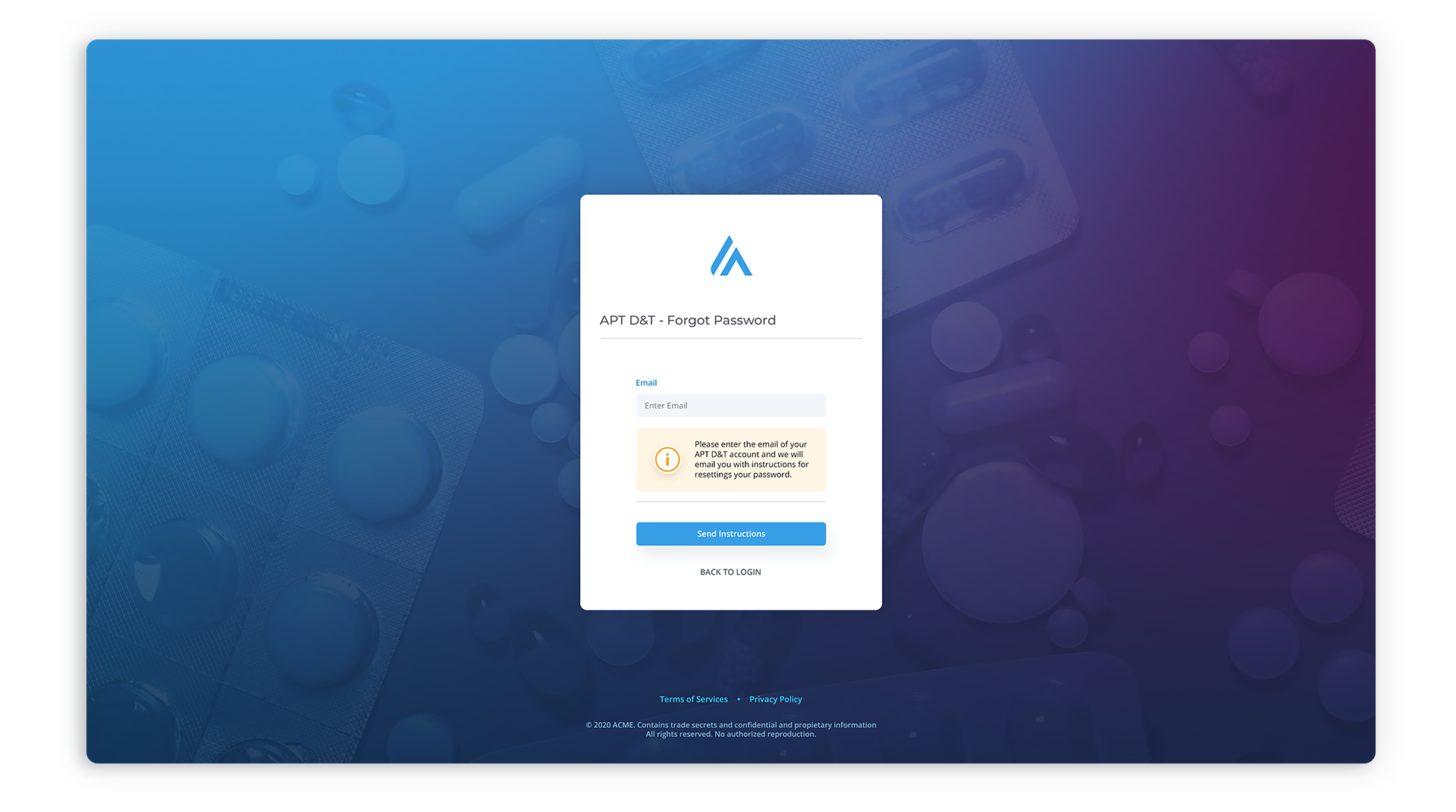
The Login


The Landing Page
We conducted a thorough search on stock photography sites to source appropriate images for the landing page. Each image is carefully selected to align with the corresponding button's title and color, ensuring consistency with the brand identity. The layout of the Landing Page is designed to be adaptable, with the left panel capable of accommodating additional "hero" images, and pagination implemented to facilitate easy navigation through frames, even without a timer system in place.
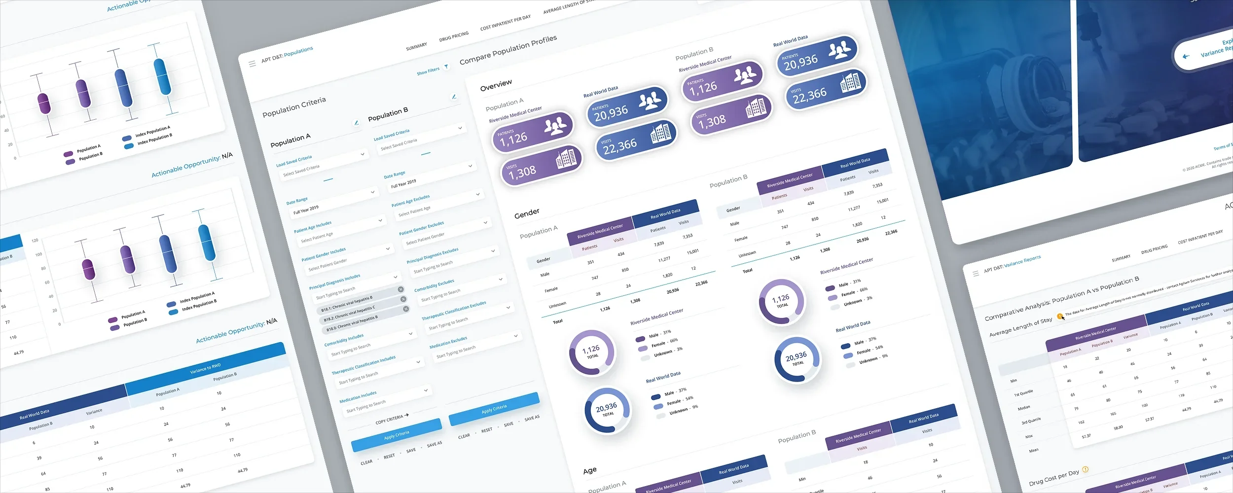
Variance Reports
The initial version of this screen was quite disorganized. It contained rows that could expand up to five layers deep, with each layer having multiple rows. To enhance usability, we made the decision to reorganize the cascading rows in a more user-friendly manner. We extracted the first two columns, which were considered persistent, from the main table and visually separated them. This modification helped break up the lengthy, monotonous table. Additionally, we incorporated Treeview icons with plus and minus symbols for expanding and collapsing rows. When expanded, the rows remained well-organized, and the code rows were highlighted in color to distinguish them as header rows. This visually guided users' attention along the extensive table and ensured a smoother scanning experience.
In line with our previous project, we made the decision to incorporate two versions of the navigation for this client. We developed one version specifically tailored for smaller resolutions and another for wider, HD screens. The latter version took on a more traditional sidebar menu approach.


Population
Packed with comprehensive analytics, but more importantly, it boasts a strong collection of filters that can be applied to two sets of criteria columns that significantly impact the overall results.
Empty Data
For the filters, we tried a drag and drop interface and check boxes.


Rapid Analytics
Cost Inpatient Per Day + Drug pricing
The tables for both screens have been designed using the same format. To enhance readability, we decided to remove certain columns from the physical tables and display only the essential ones. This approach effectively breaks up the table and improves its visual appeal.


Population Builder


Have a project in mind? Let's talk.
Thank you for reaching out.
We will be in touch within one business day.