ACI Pay for Consumers
Modernizing the Digital Payment Experience for Web & Mobile
The Skins Factory partnered with global payments leader ACI Worldwide to design a modern and intuitive user interface for ACI Pay, the company’s next-gen, advanced digital payment platform. Our design team was tasked with reimagining how users interact with ACI’s enterprise-grade payment technology - simplifying complex workflows while elevating the visual design to match the sophistication of the brand.
We developed a flexible, tactile 2D and neumorphic UI design language that seamlessly adapts across desktop and mobile, supported by a consistent iconography set and modular components. Each section of the UI features a unique colorway, paired with complementary secondary and tertiary hues to enhance visual hierarchy and create a dynamic, yet cohesive system.
Desktop Web Screens
Our design team began with initial concepts, exploring both light and dark modes. ACI ultimately selected the dark mode direction. Given the content's natural horizontal structure, we implemented a left-side navigation and a two-panel layout. This approach maximizes desktop and laptop screen real estate, creating a more efficient and visually balanced experience than a traditional top-down interface.
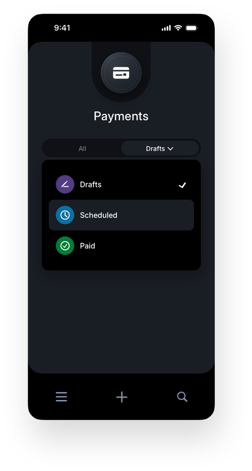
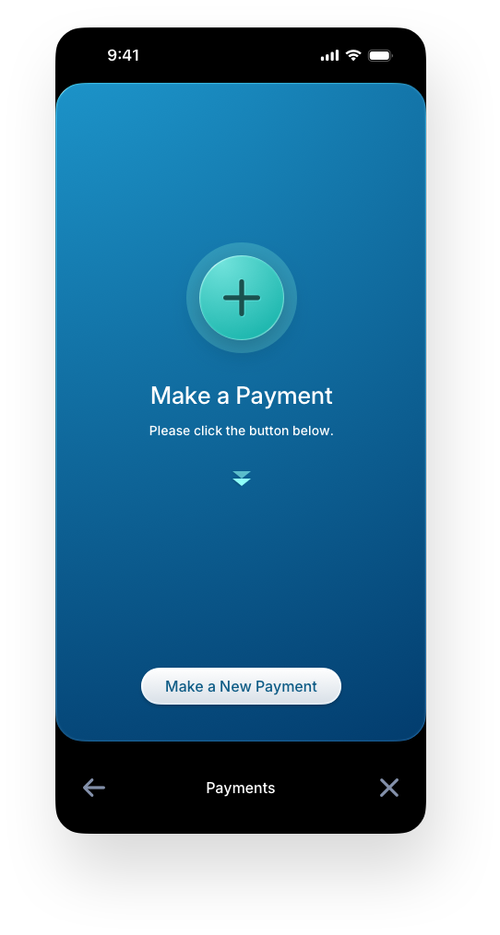
Payments
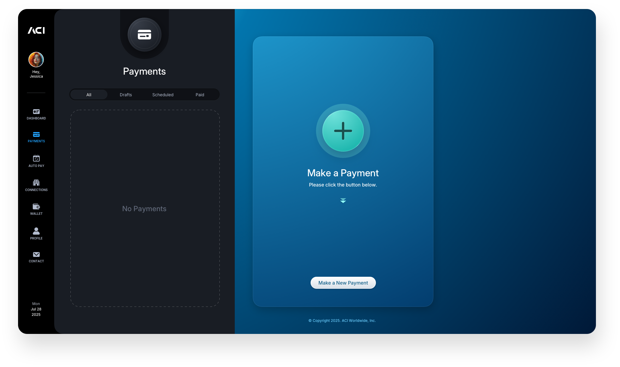
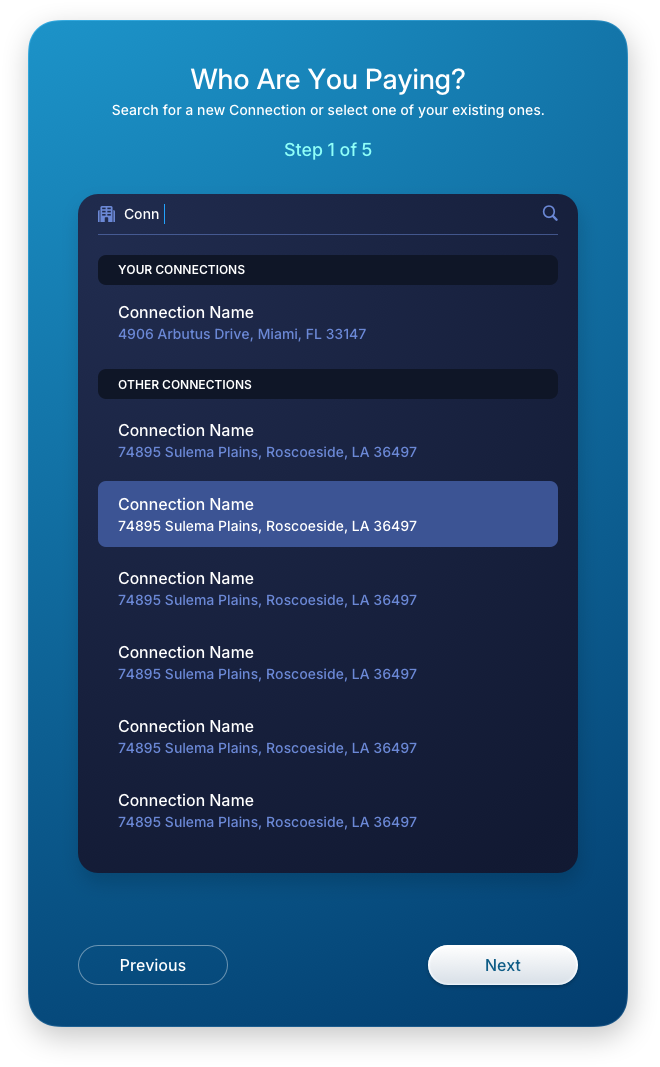
The payment screens were our starting point, serving as the foundation of the entire application. This is where users enter their information, set up payment methods, select a company to pay, review their transaction, accept the terms, and receive confirmation.
Empty space should not be empty, it is an onboarding opportunity. If a user lands on a blank area or screen and does not know what to do, the design has failed. Every gap should show what belongs there and provide a clear next action. That is how you guide users in real time and eliminate friction at the source.
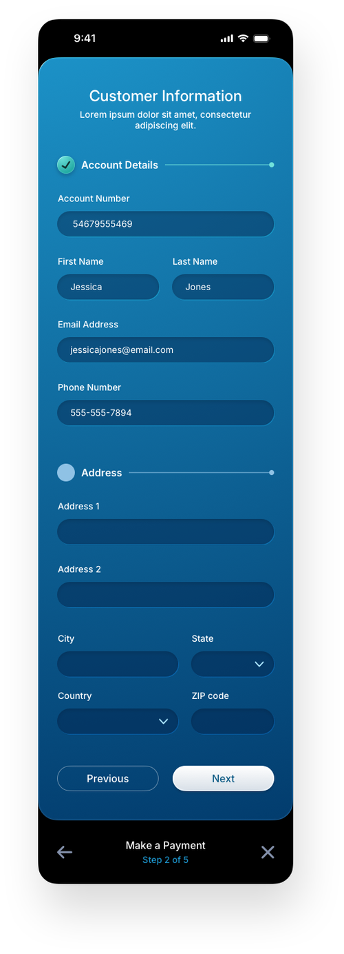
In the first image below, the user has just arrived in the app. The Payments area is empty, but the right panel reinforces the next step by onboarding the user to "Make a Payment," immediately starting a clear, step-by-step journey reflected in the panels that follow.

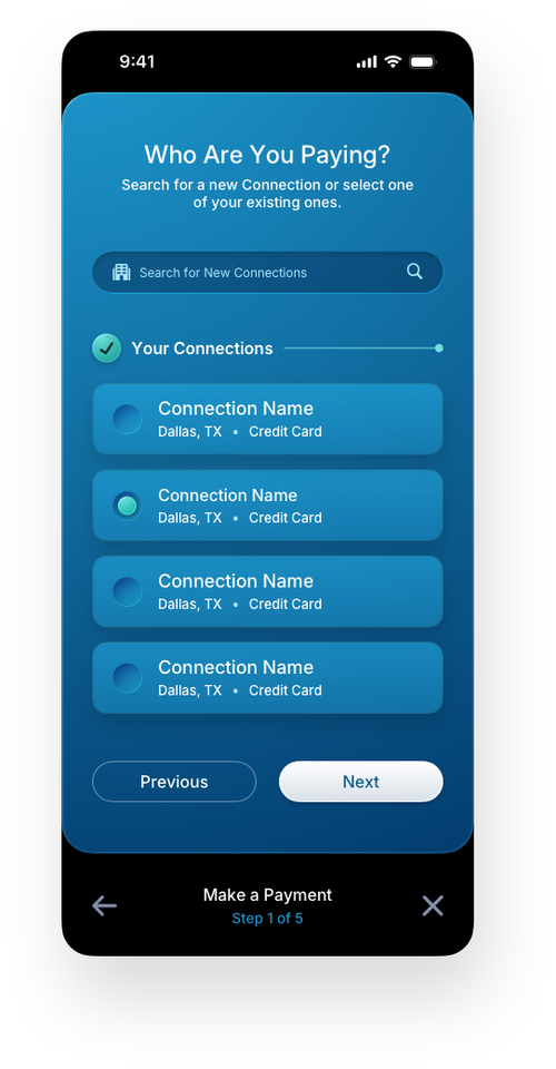
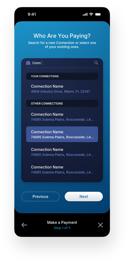
Make a Payment: Onboarding Steps Panels
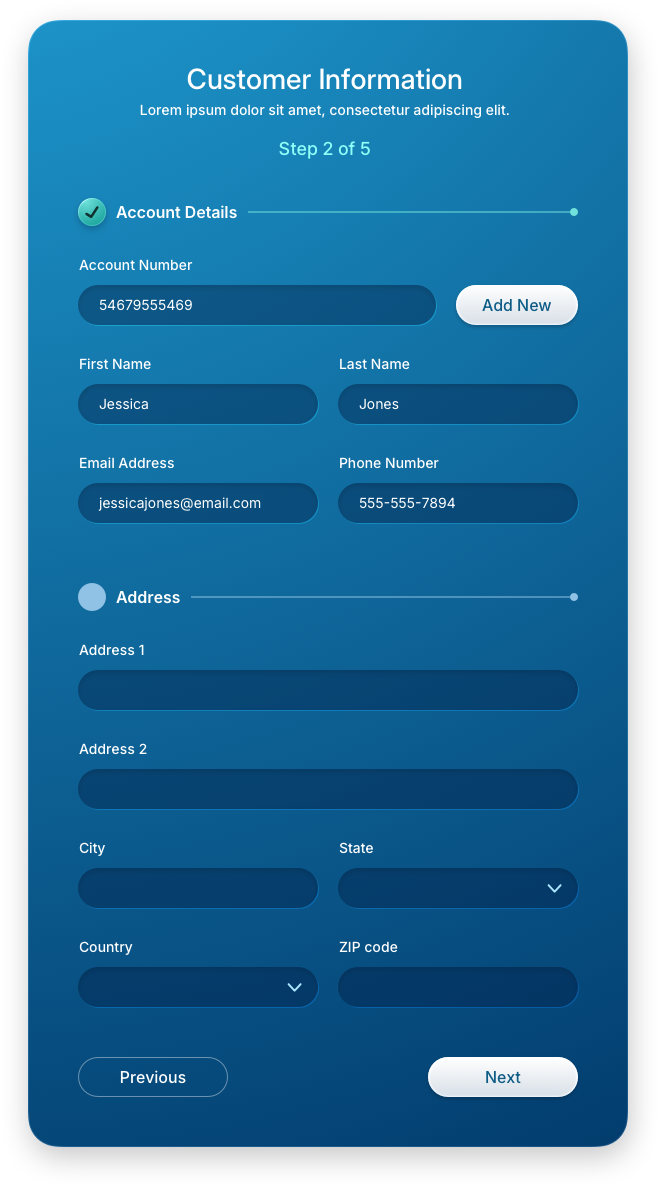
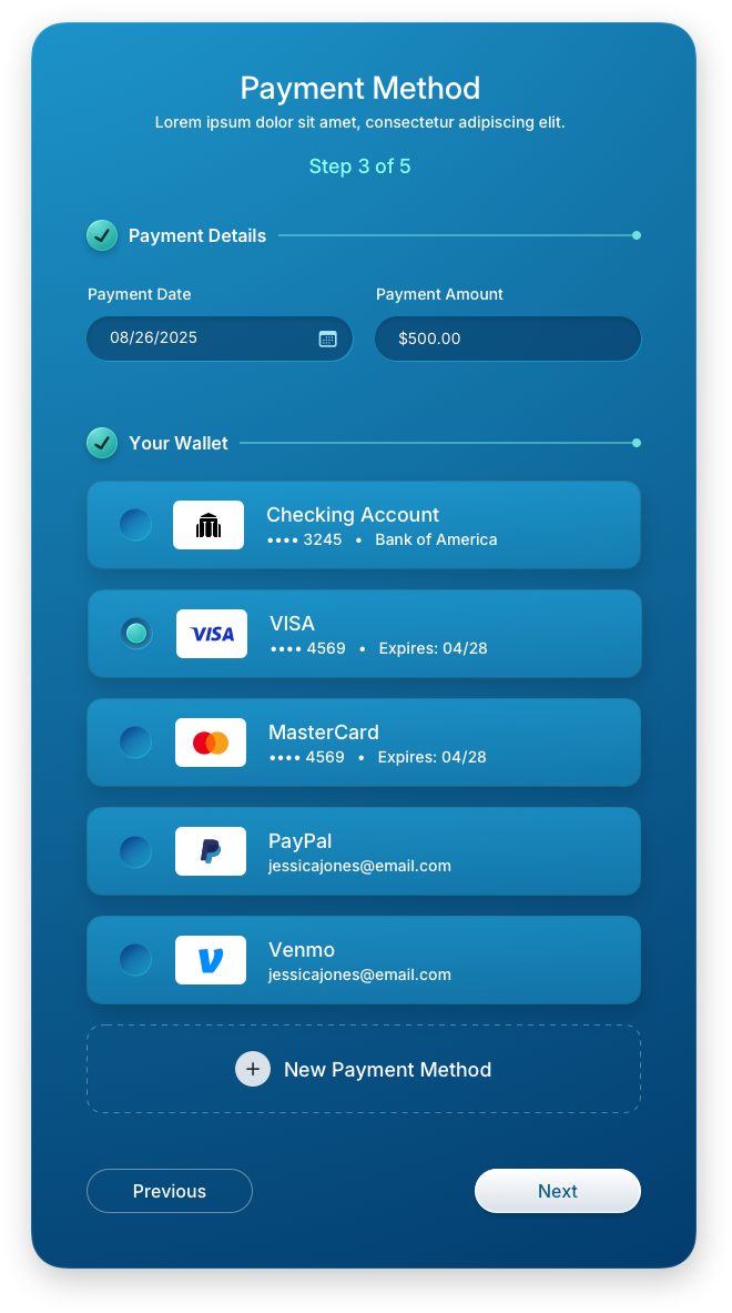
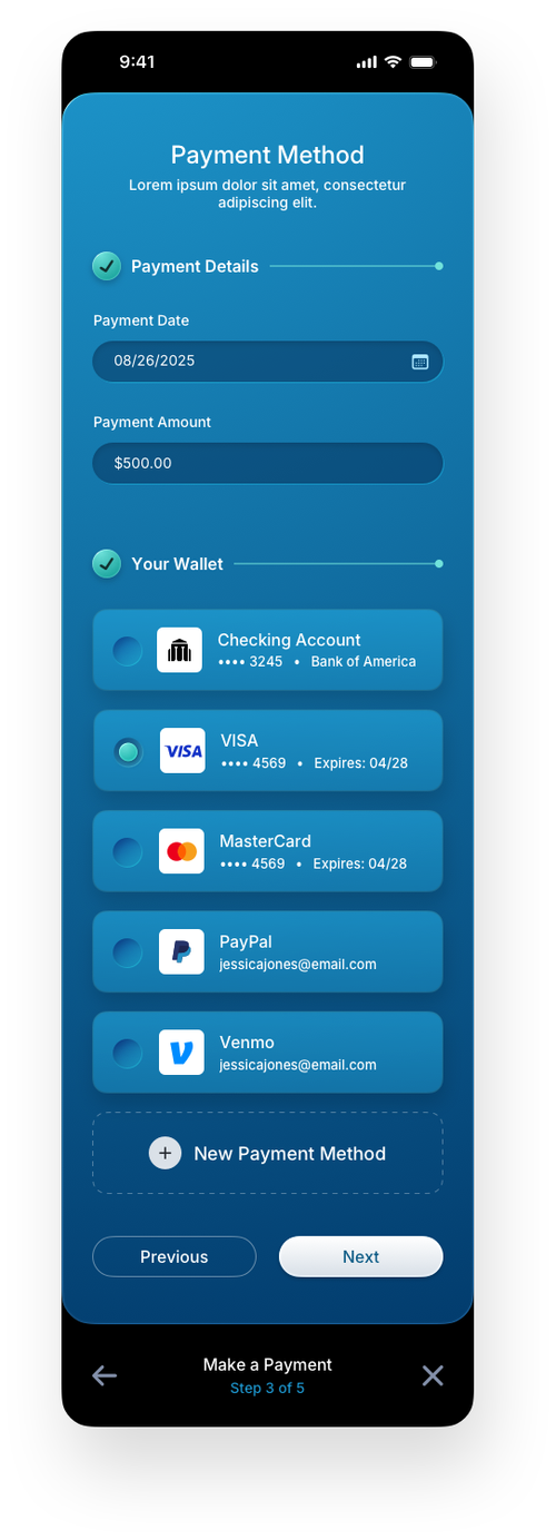
Each step in the payment flow is presented as a focused right-panel experience, guiding the user forward without overwhelming them with the full form at once. The progressive disclosure model breaks a complex transaction into digestible stages, from live business search and customer information entry to wallet selection, keeping the user oriented and confident at every point. This stepwise approach is a proven pattern in fintech UX design for reducing abandonment and increasing payment completion rates.

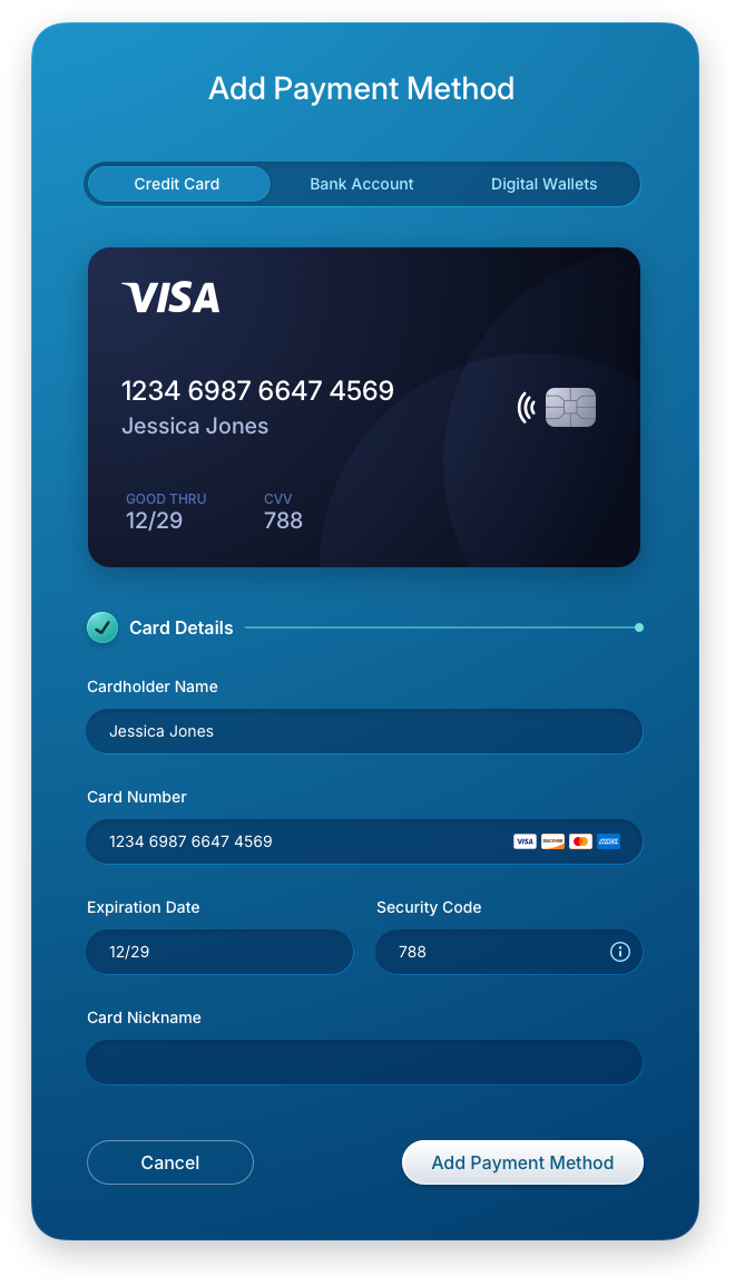
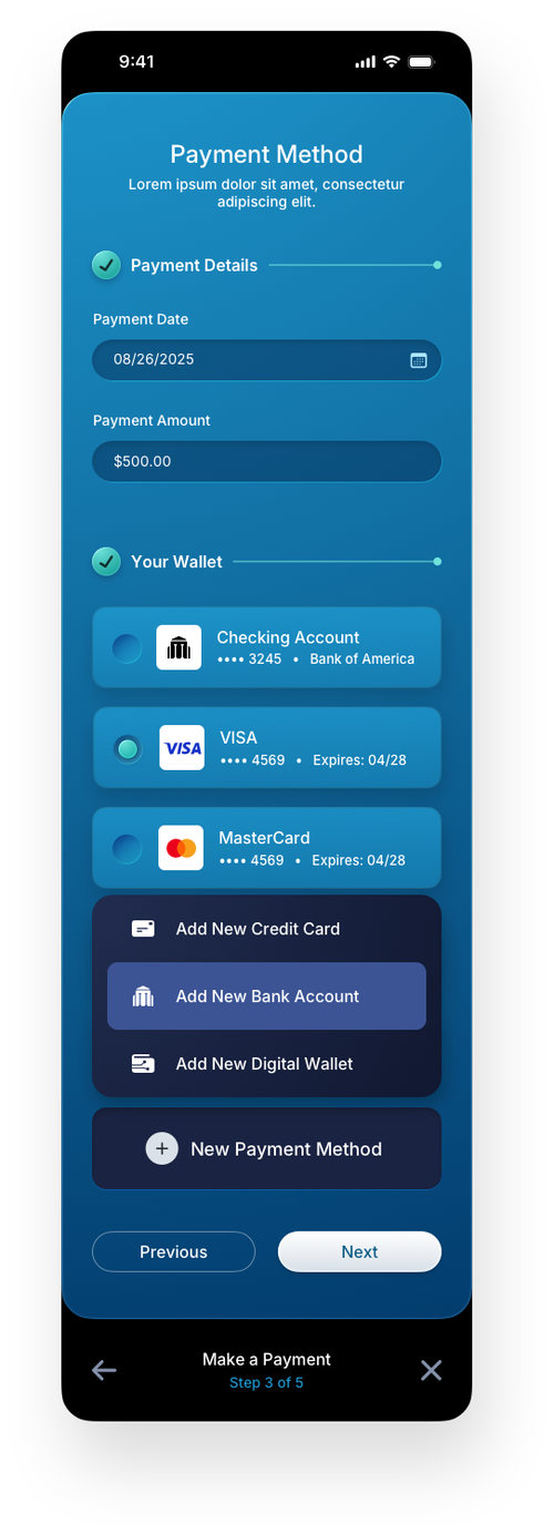
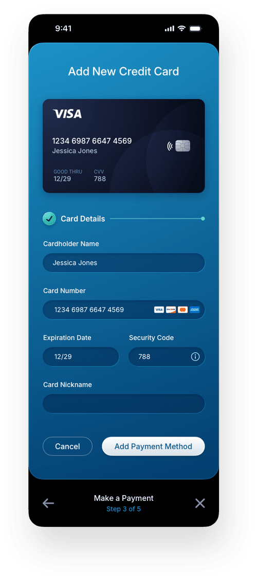
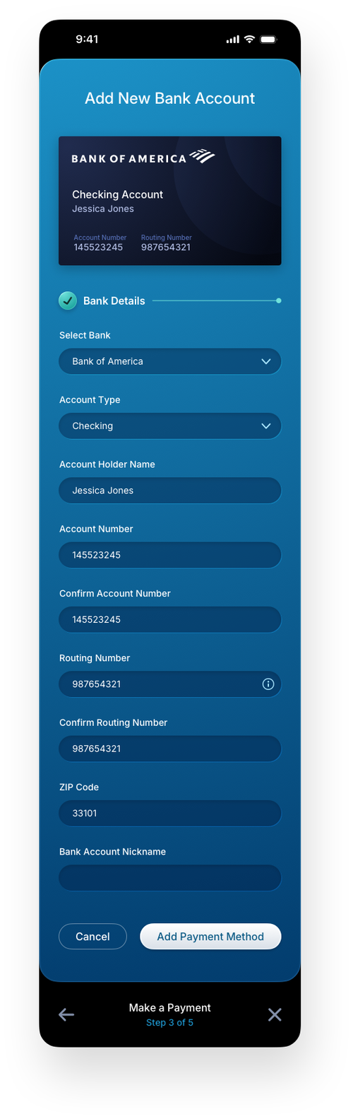
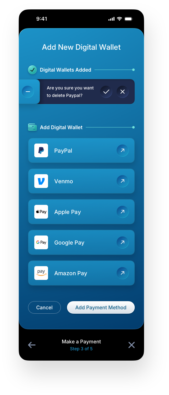
Step 3: Additional Add New Payment Method Panels
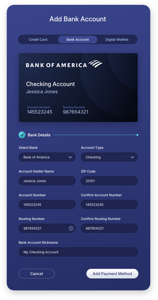
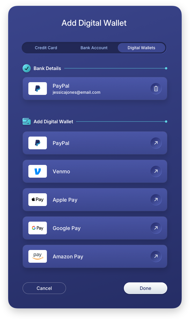
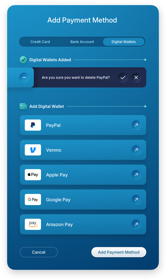
These screens handle the three core payment method types within a single consistent interaction pattern, ensuring users never have to relearn the interface regardless of which method they choose. The credit card, bank account, and digital wallet forms each adapt their field structure to the specific data required while maintaining the same visual language and layout rhythm. The inline destructive confirmation pattern shown here is a deliberate UX decision, surfacing the delete action in context rather than triggering a modal that interrupts the user's focus.
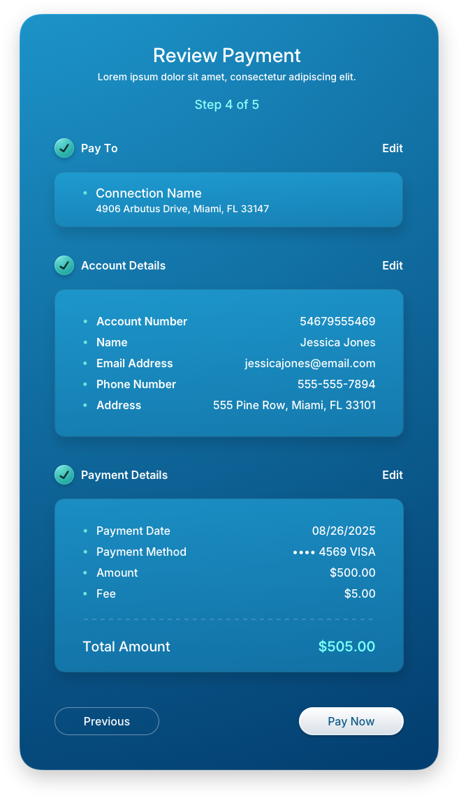
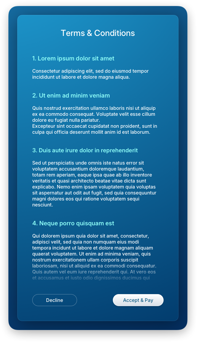
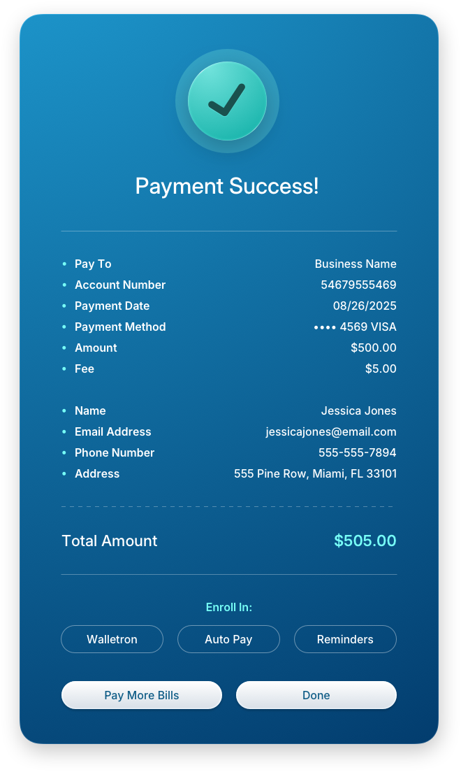
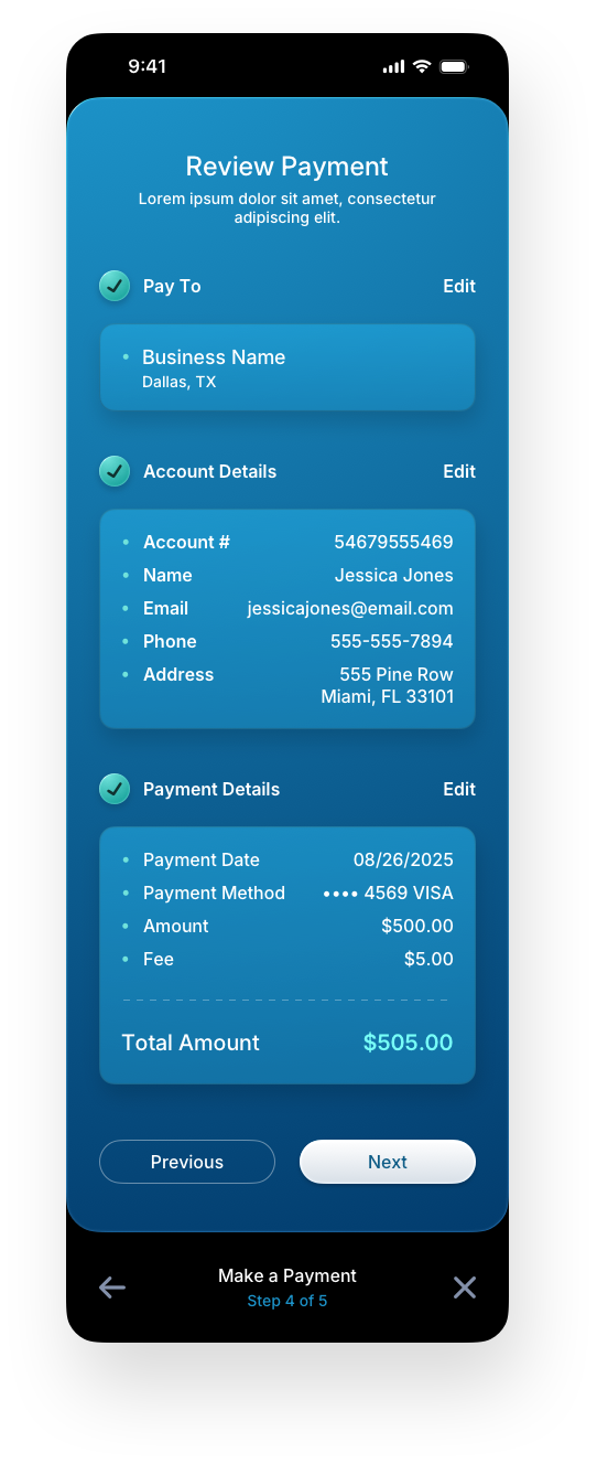
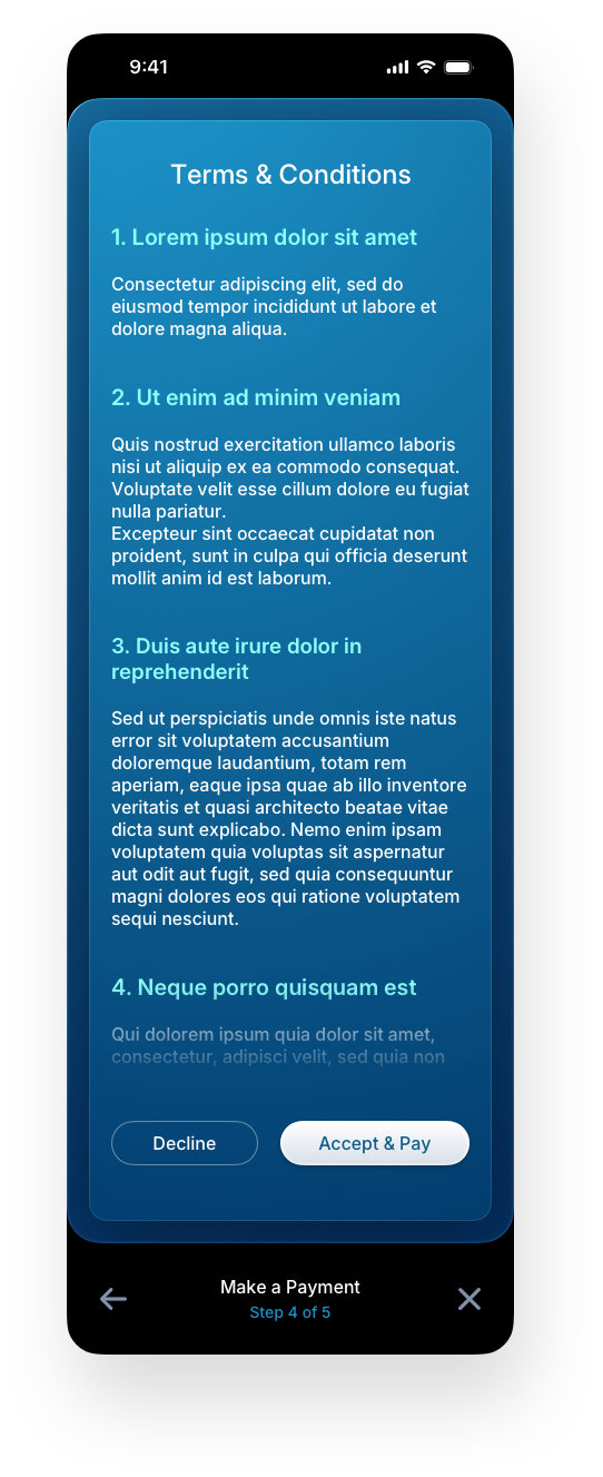
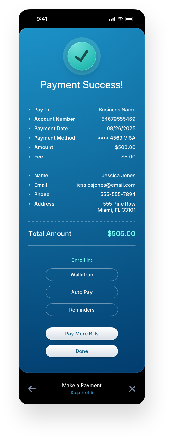
Steps 4 & 5: Review, Terms & Confirmation Panels
The final steps of the payment flow prioritize clarity and confidence. The review screen gives users a complete summary of their transaction before commitment, the terms panel presents legal content in a readable format without hiding it, and the confirmation screen closes the loop with a clear success state and immediate next-action options. In fintech UX design, the confirmation moment is also a retention opportunity, which is why the design surfaces wallet enrollment, auto pay, and reminders directly at completion.
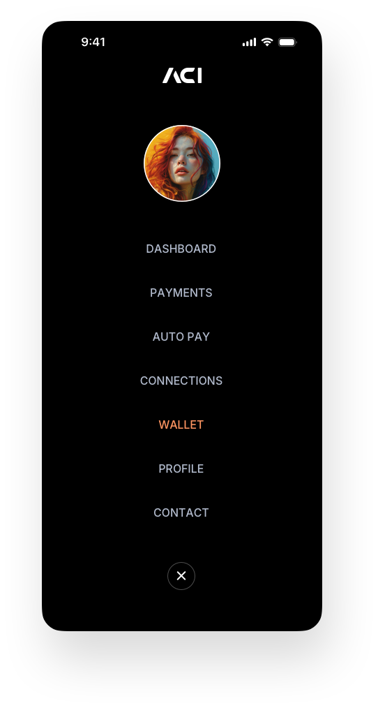
Mobile Web Screens
Designing mobile-first is the wrong approach when you're building both a desktop and mobile version of the same application. As we've covered in our blog posts, it compresses every design decision around the smallest screen, which produces a desktop experience that feels like an afterthought. We start on desktop, where the full complexity of the interface can be properly worked out. Mobile is designed separately, adapted to how people actually use their phones, not scaled down from a compromised starting point. The visual language, terminology, and flow stay consistent across both, with the layout and interaction patterns adjusted to fit the platform. Mobile versions of each section appear at the bottom of their respective desktop counterparts.
Payments — Mobile Version
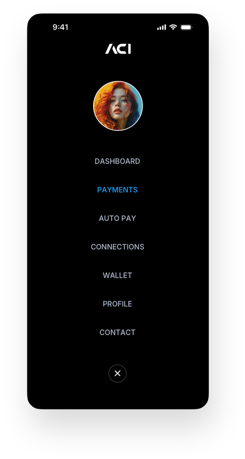
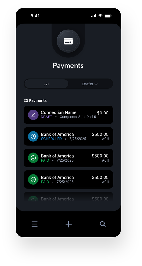
The mobile payment screens translate the full desktop flow into a focused, thumb-friendly experience without sacrificing any of the steps or logic that guide users through a transaction. Navigation shifts to a bottom tab bar and a compact hamburger menu, keeping key areas accessible without crowding the screen. The same progressive disclosure model drives the payment flow on mobile, moving users through live search, customer information, wallet selection, payment method entry, review, terms, and confirmation one focused step at a time. Empty states carry the same onboarding intent as their desktop counterparts, ensuring first-time users are never left without direction regardless of the device they are on.

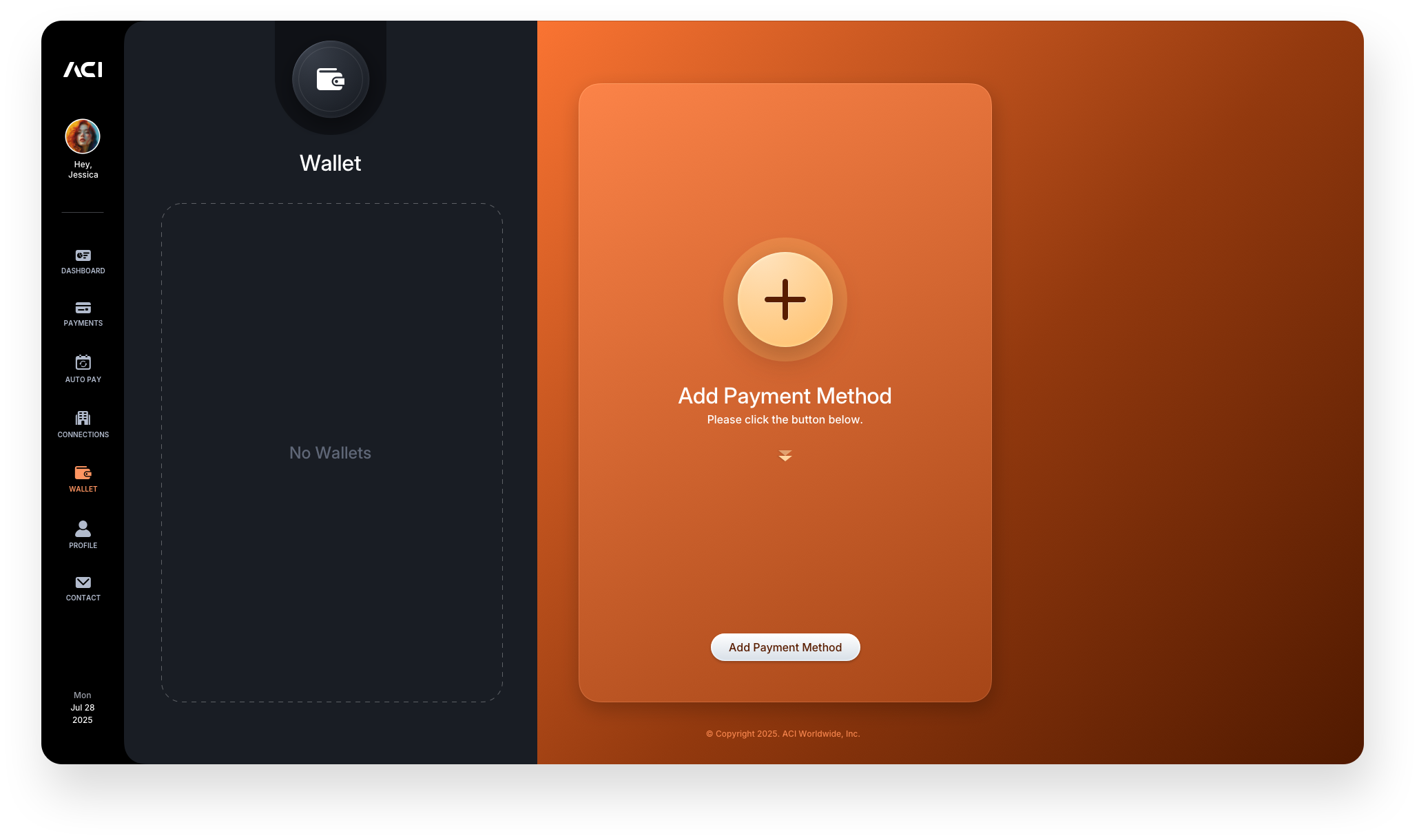
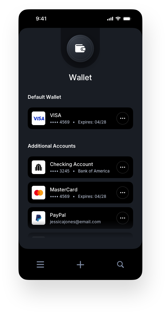
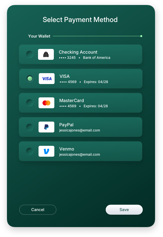
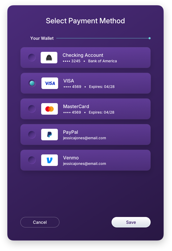
Digital Wallet
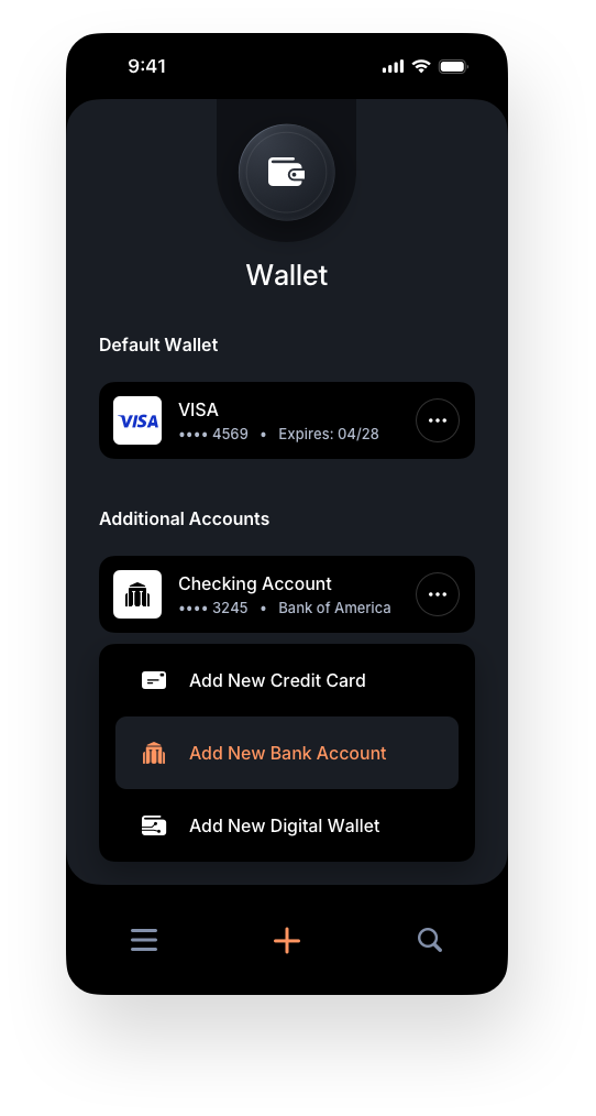
The Wallet screens build on the same foundation as Payments, using empty states as intentional onboarding moments rather than dead space. A new user is immediately guided by a dedicated panel that walks them through adding payment methods and activating their wallet. Instead of leaving the interface blank, the design clearly communicates what belongs there and what to do next, eliminating hesitation from the start.
Below, we contrast the first-time user experience with an active, populated state to show how the system evolves as engagement increases. Distinct colorways are introduced to signal a shift in context, giving users an immediate visual cue that they've moved into a different area of the fintech application while maintaining overall system cohesion.
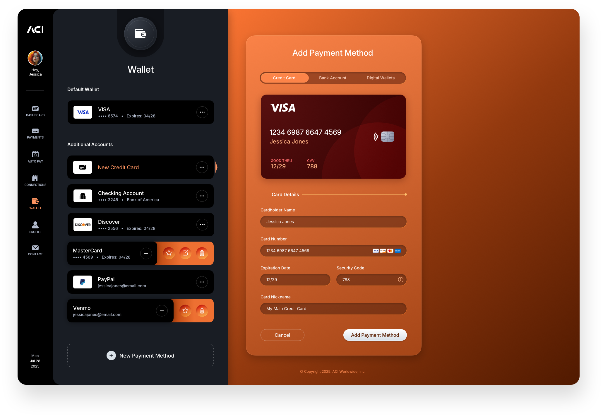
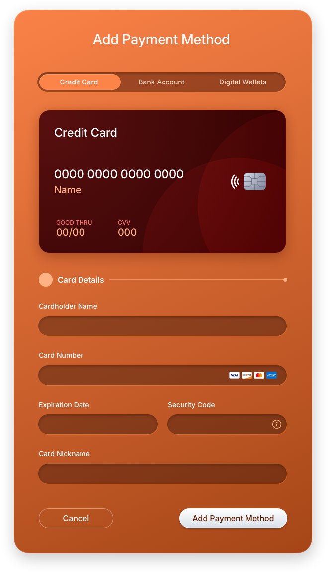
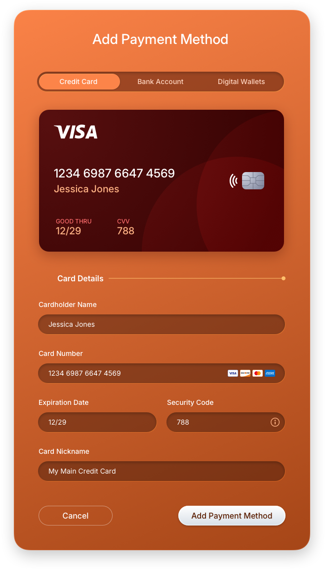
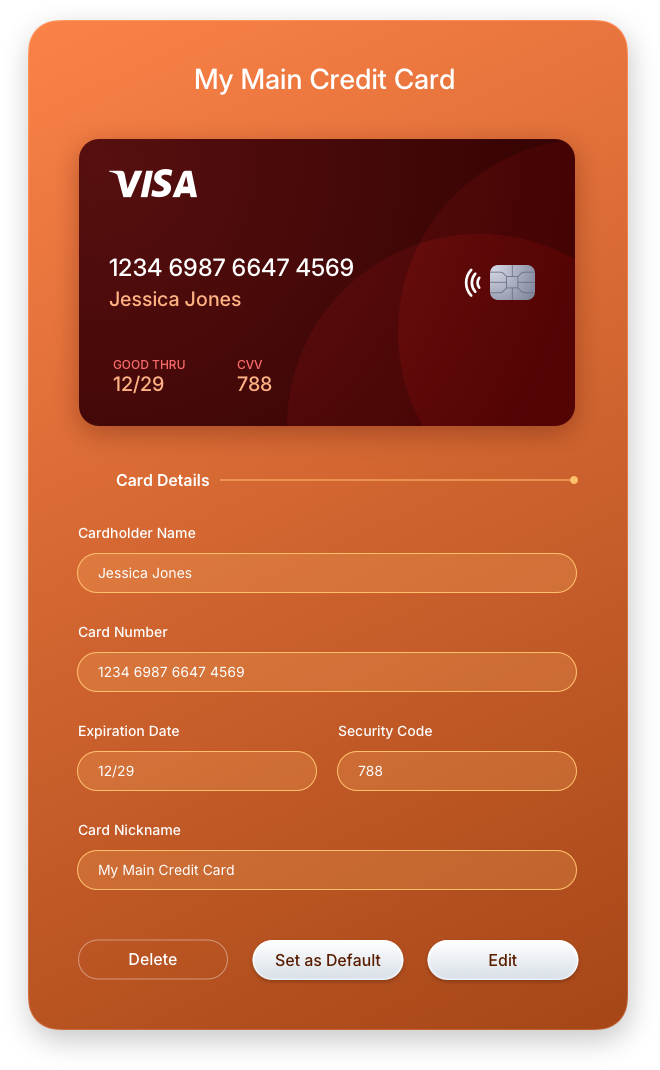
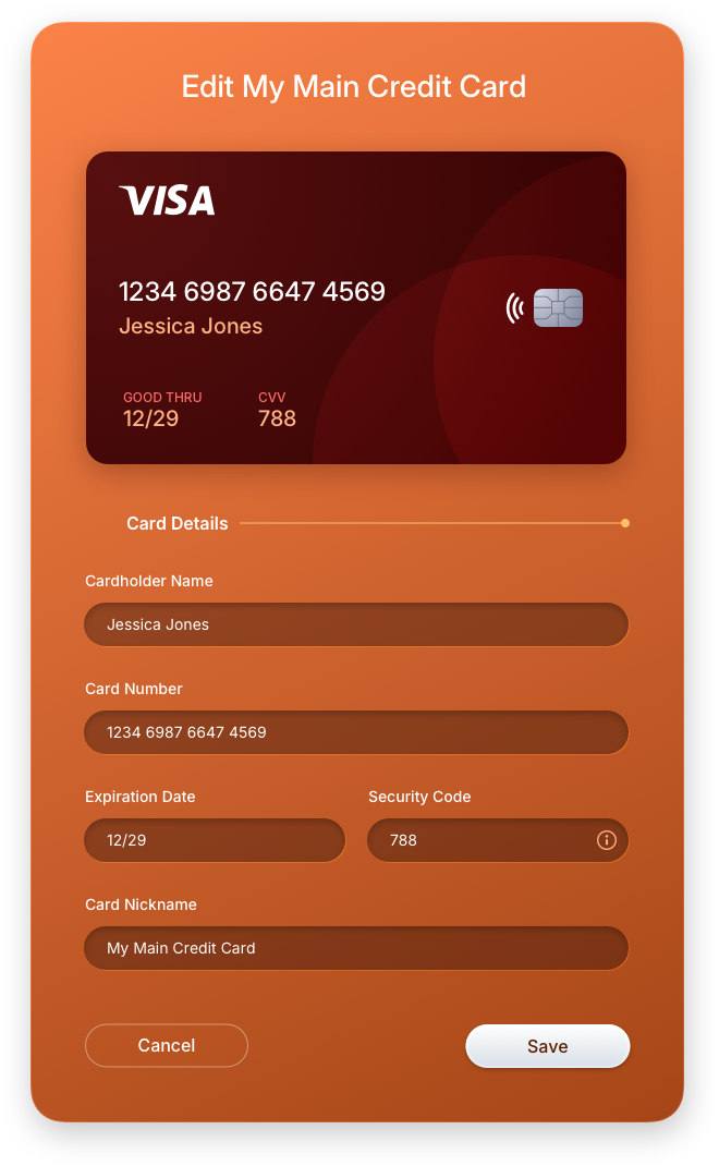
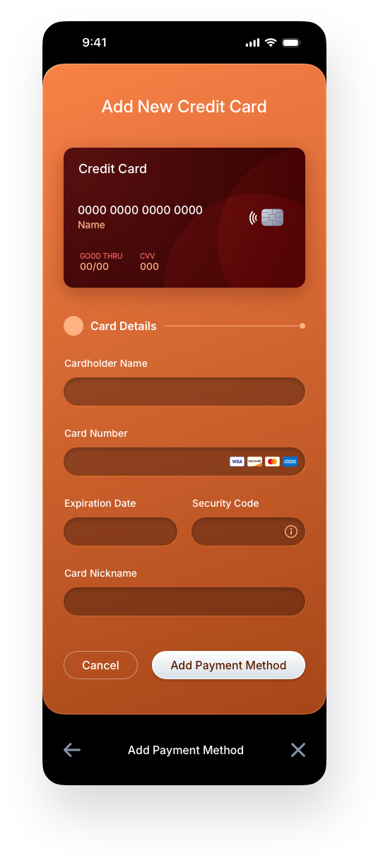
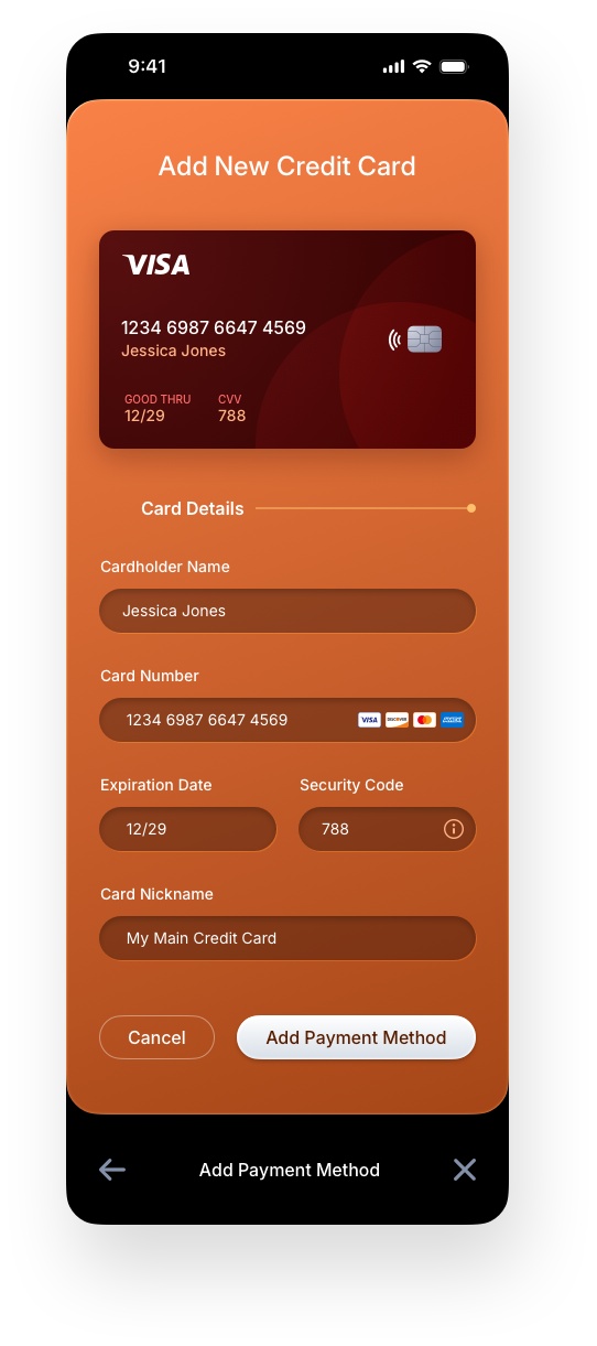
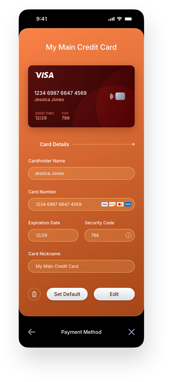
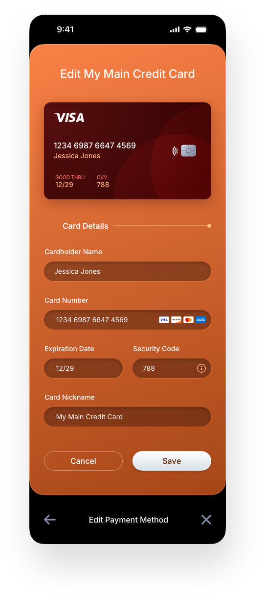
Add Payment Method: Credit Card Panels
The credit card screens walk users through every stage of the card management experience, from initial entry to saved state to editing and deletion. The add form captures all required fields with clear inline validation, while the view-only state presents saved card details in a clean, readable format. The inline edit and delete pattern keeps destructive actions contextual and confirmable without breaking the user out of their current flow.
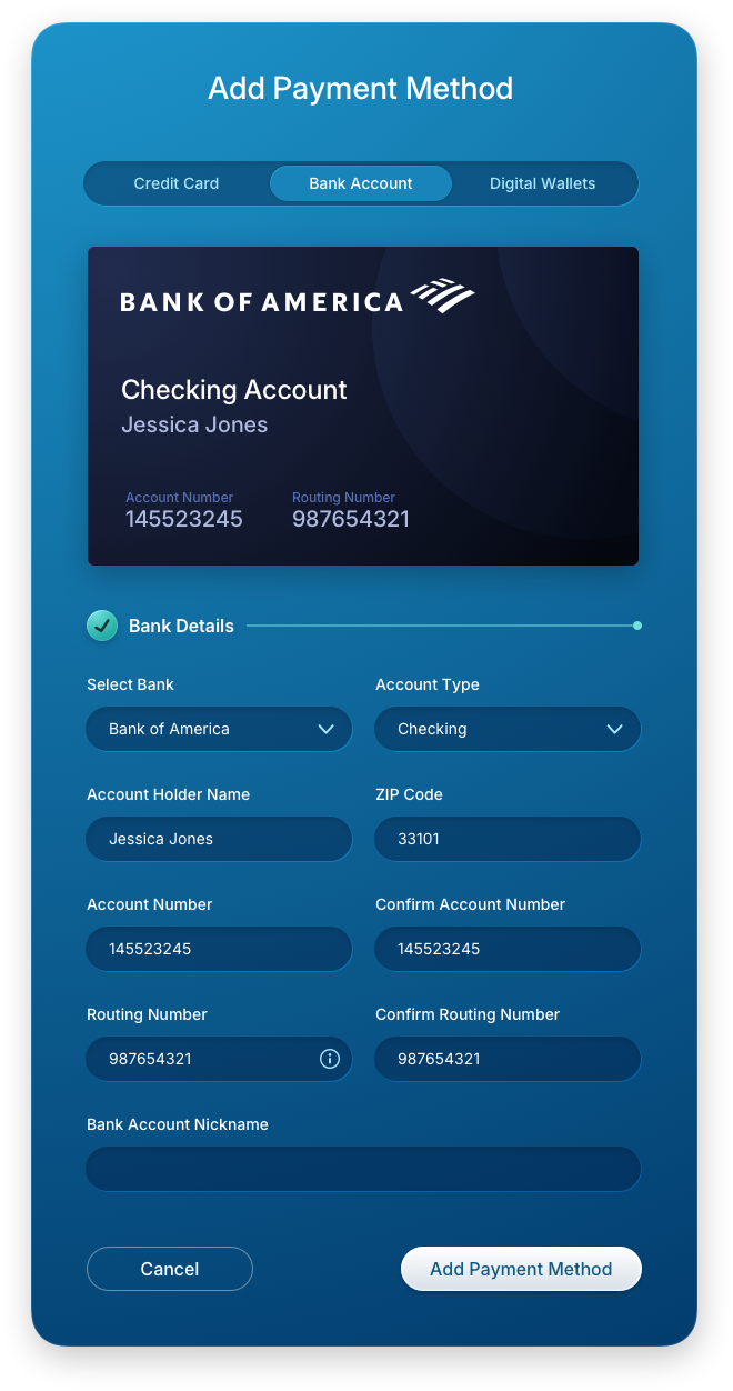
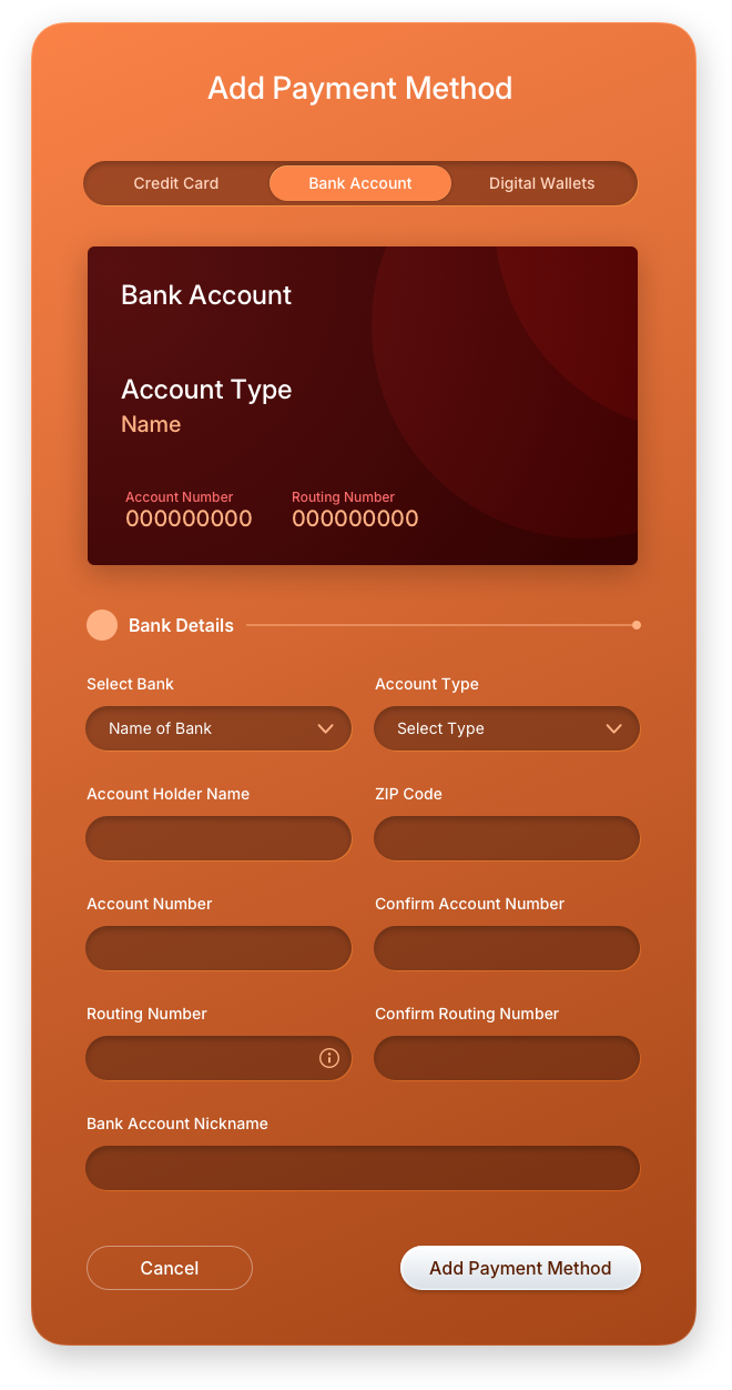
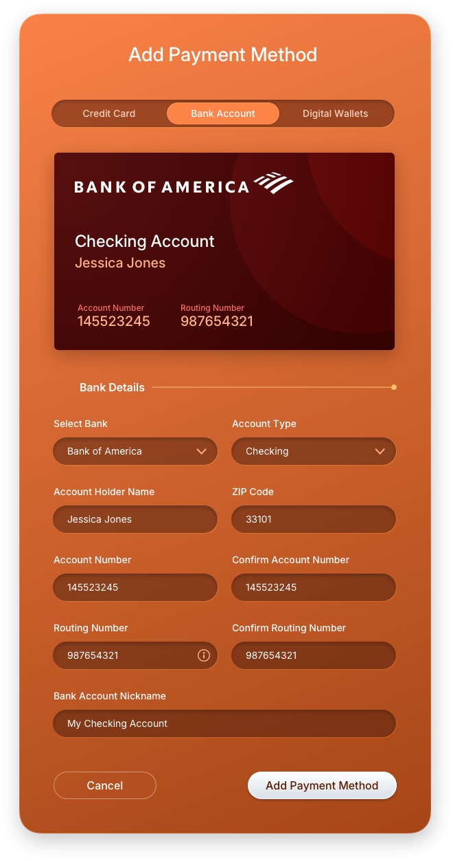
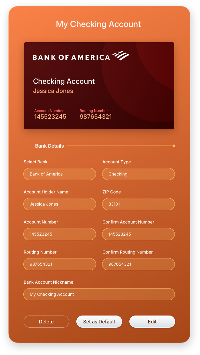
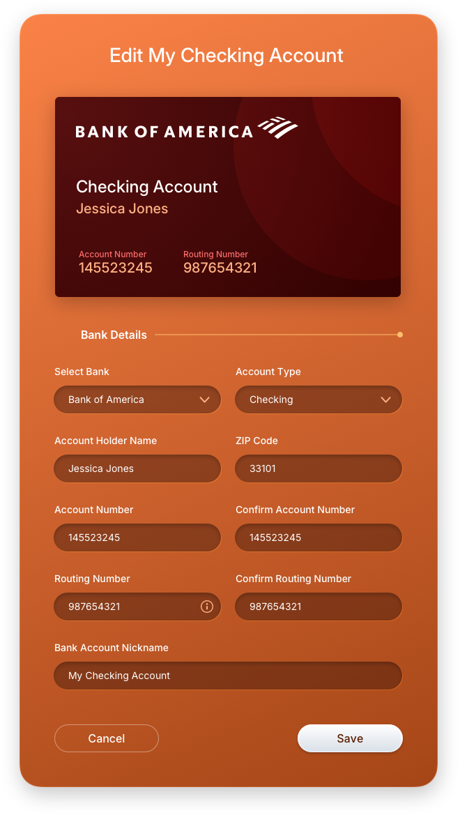
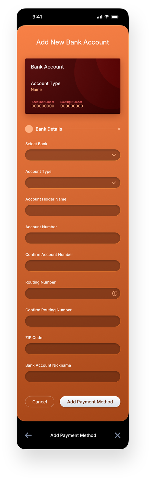
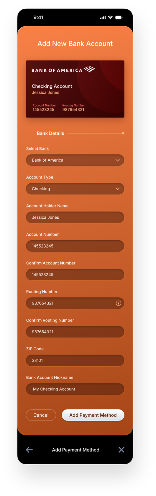
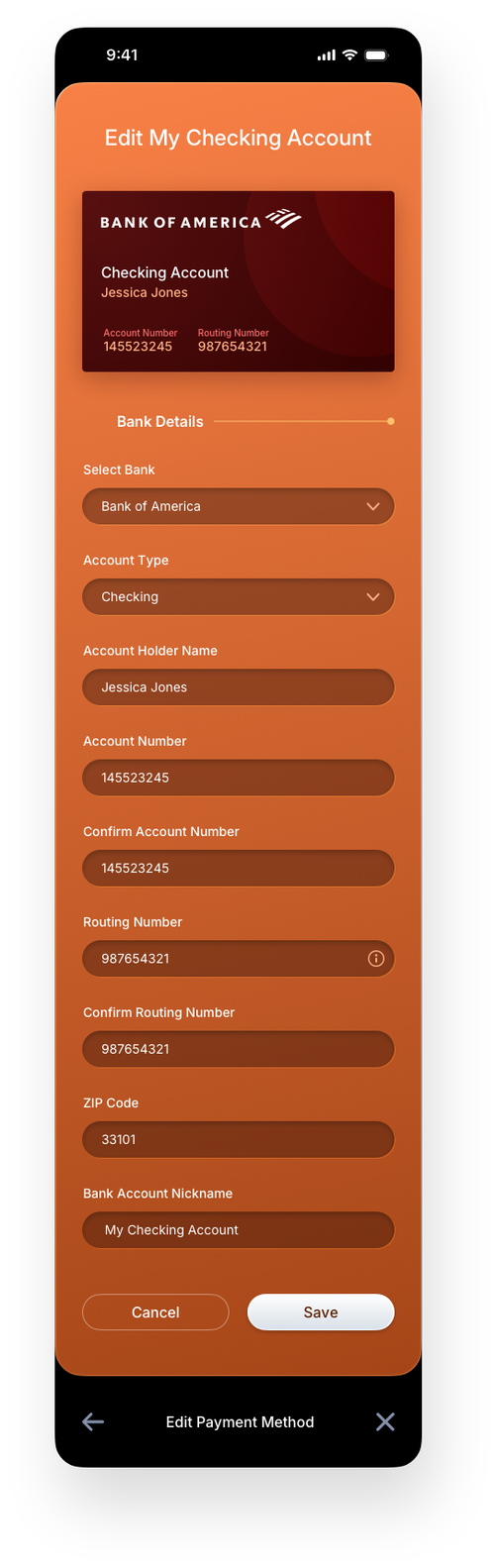
Add Payment Method: Bank Account Panels
Bank account management follows the same interaction model as credit cards, maintaining consistency across all payment method types. Users can add a new account with guided field entry, view saved account details in a protected read-only state, and edit or remove accounts directly within the wallet. This unified approach reduces cognitive load and reinforces trust, two critical factors in fintech UI/UX design.
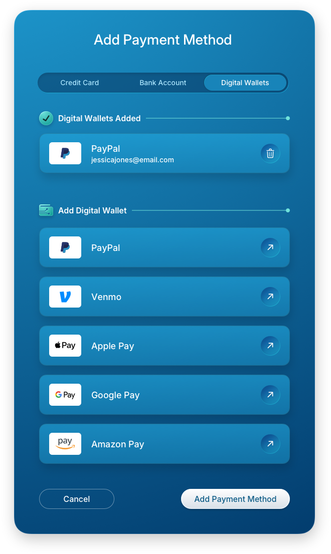
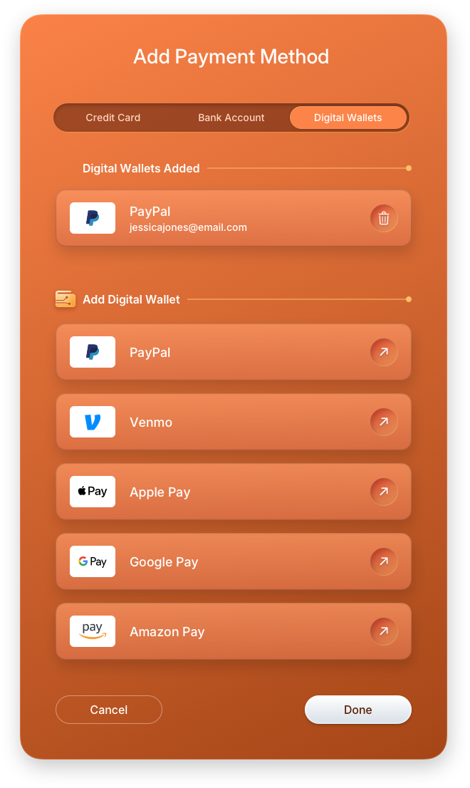
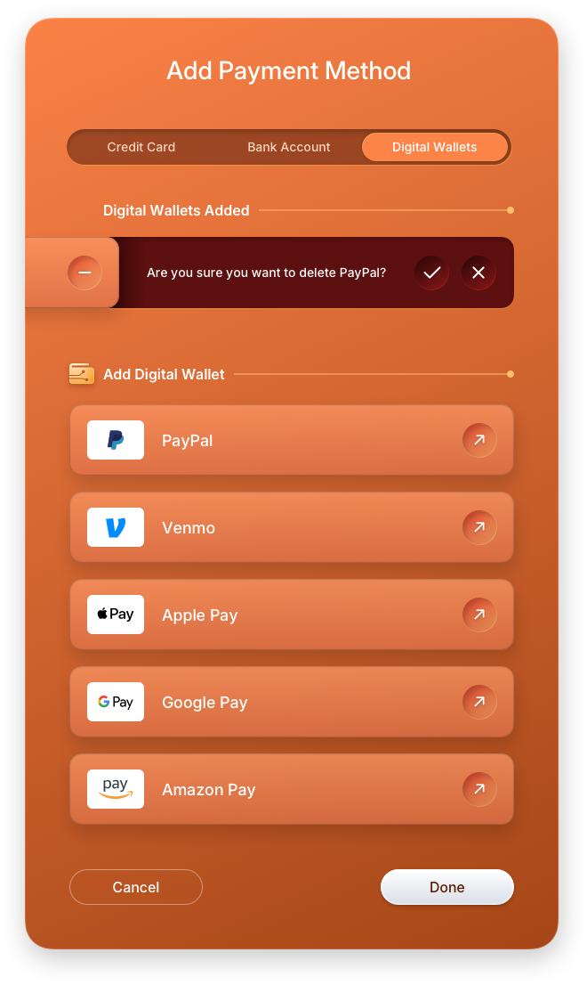
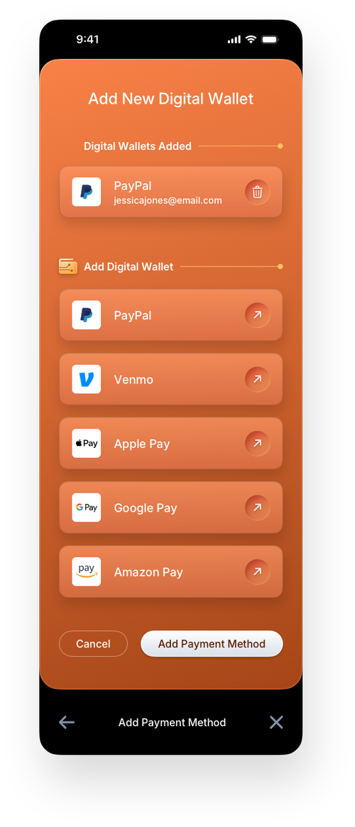
Add Payment Method: Digital Wallet Panels
The digital wallet screens extend the payment method system to support third-party wallet integrations alongside traditional card and bank options. The add screen guides users through linking their preferred wallet service, while the row functionality reveal surfaces quick-action controls inline, keeping the interface clean until they are needed. Offering multiple payment types within a single wallet gives users the flexibility modern fintech applications demand.
Digital Wallet — Mobile Version
The mobile wallet screens carry the same structure and intent as their desktop counterparts, adapted for a single-column, thumb-first experience. The empty state guides new users directly to adding a payment method, while the populated state surfaces all saved methods in a compact, scannable list. Row functionality reveals keep quick actions available without cluttering the default view, and the hamburger menu provides fast access to all sections of the application. Adding a credit card, bank account, or digital wallet each follows a focused full-screen form flow, with view-only and edit states giving users full control over their saved payment methods at any time.


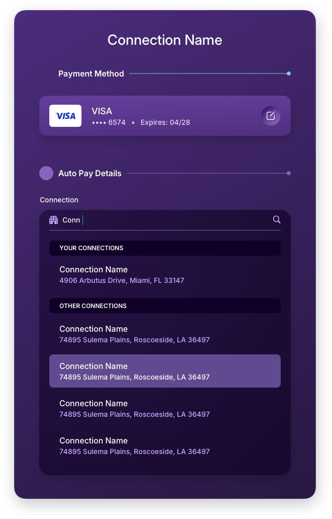
Connections
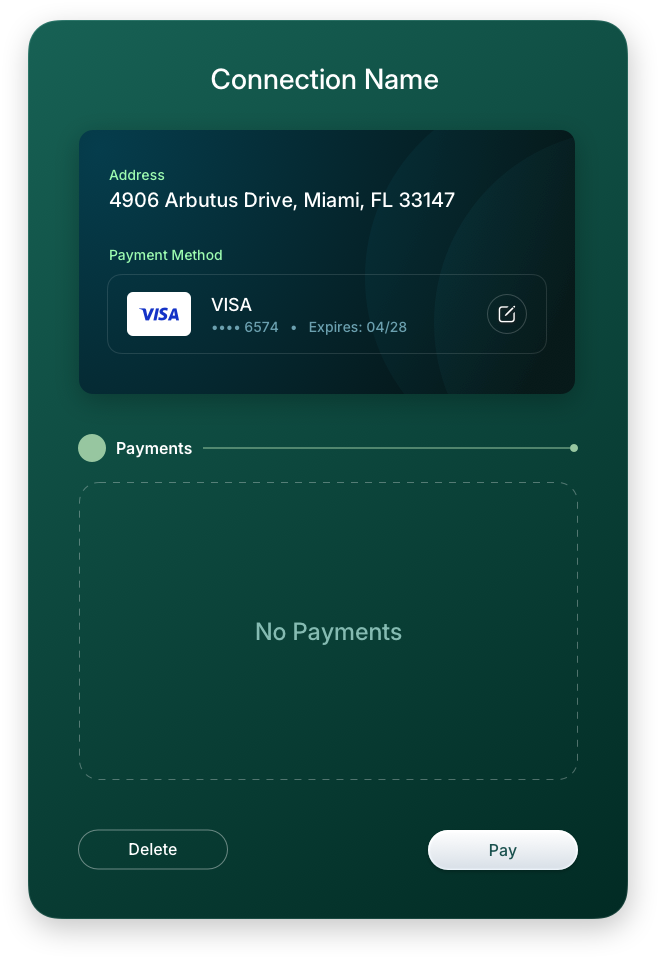
The Connections area gives users control over which businesses they have established payment relationships with, surfacing all active connections in a clean list with inline row actions. Like its counterparts in the Payment and Wallet sections, a new user is met with a dedicated onboarding screen that guides them to add their first connection rather than landing on a blank interface. The row functionality reveal keeps the experience uncluttered by default, exposing edit and remove controls only when the user initiates interaction. This pattern scales well across large connection lists without adding visual noise to the default state.
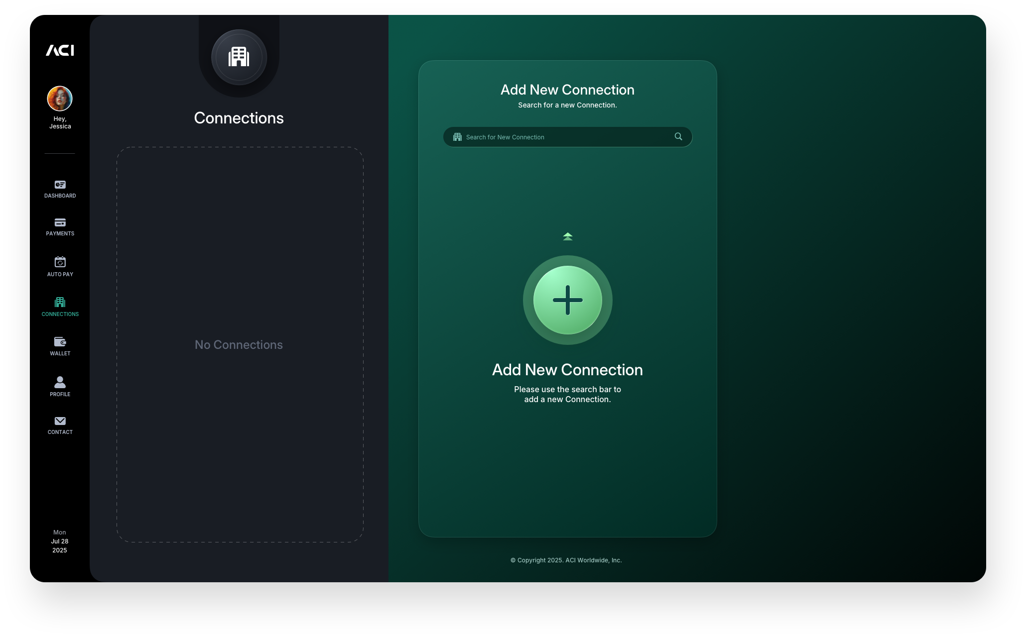
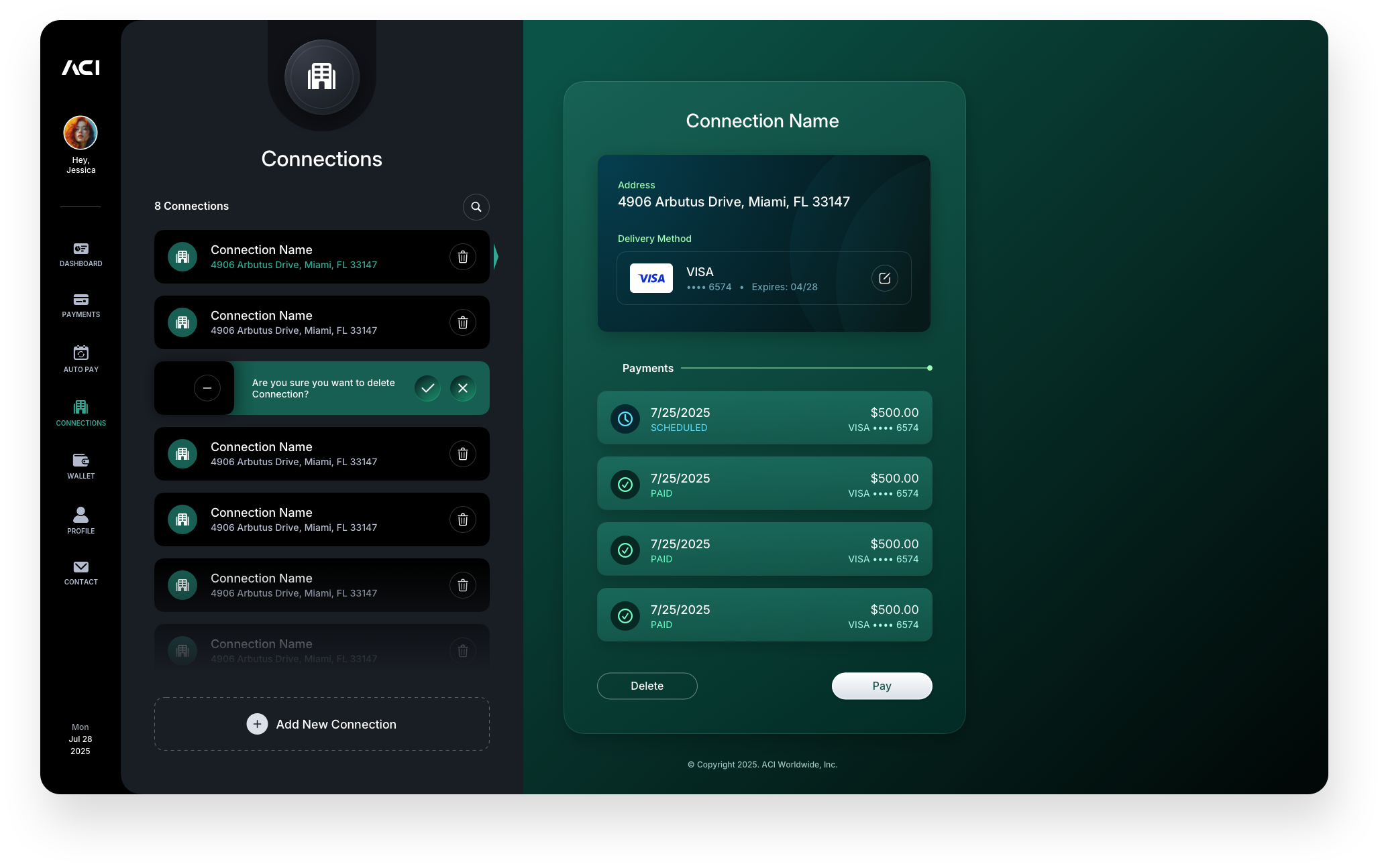
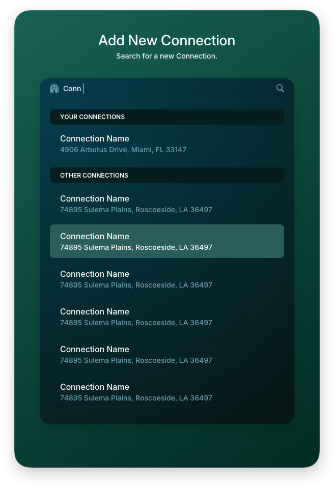
Add New Connection Panels
Adding a new connection follows the same live search pattern introduced in the payment flow, giving the experience a consistent feel across the entire application. Users search for a business, select it from the results, and are guided through linking their preferred payment method to complete the connection. The edit panel allows users to update the assigned payment method at any time, keeping their connections accurate as their wallet evolves.
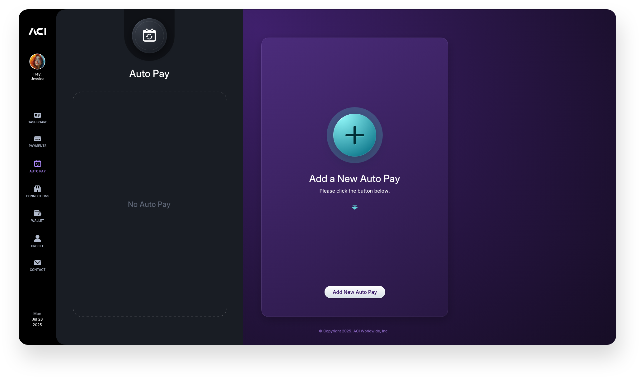
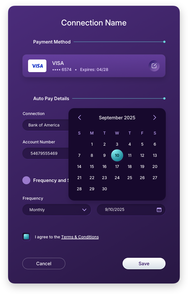
AutoPay
AutoPay brings recurring payment management into a single focused area, giving users visibility and control over all scheduled payment relationships in one place. As with every major section in the application, a new user lands on a purposeful empty state that guides them to set up their first AutoPay rather than confronting a blank screen. Once active, the list view surfaces all scheduled connections with the key details users need at a glance, keeping recurring payments transparent and manageable.

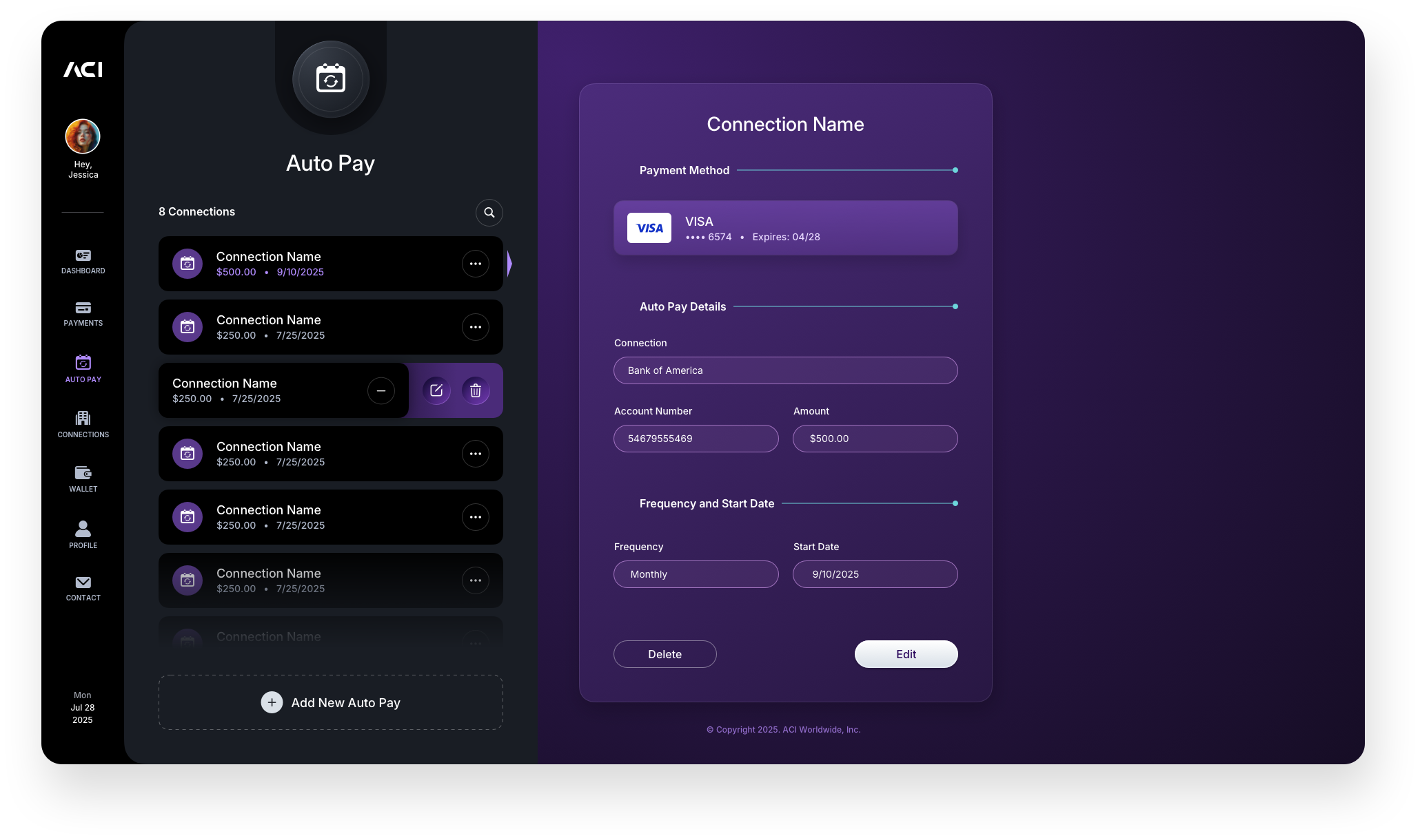
AutoPay: Edit Connection Screen & Panel
The row functionality reveal and edit panel give users direct control over existing AutoPay connections without navigating away from the main screen. Exposing actions inline rather than through a separate page keeps the interaction lightweight and the context intact. The edit panel allows users to update the payment method or schedule for any active connection, ensuring AutoPay stays accurate as account details change over time.
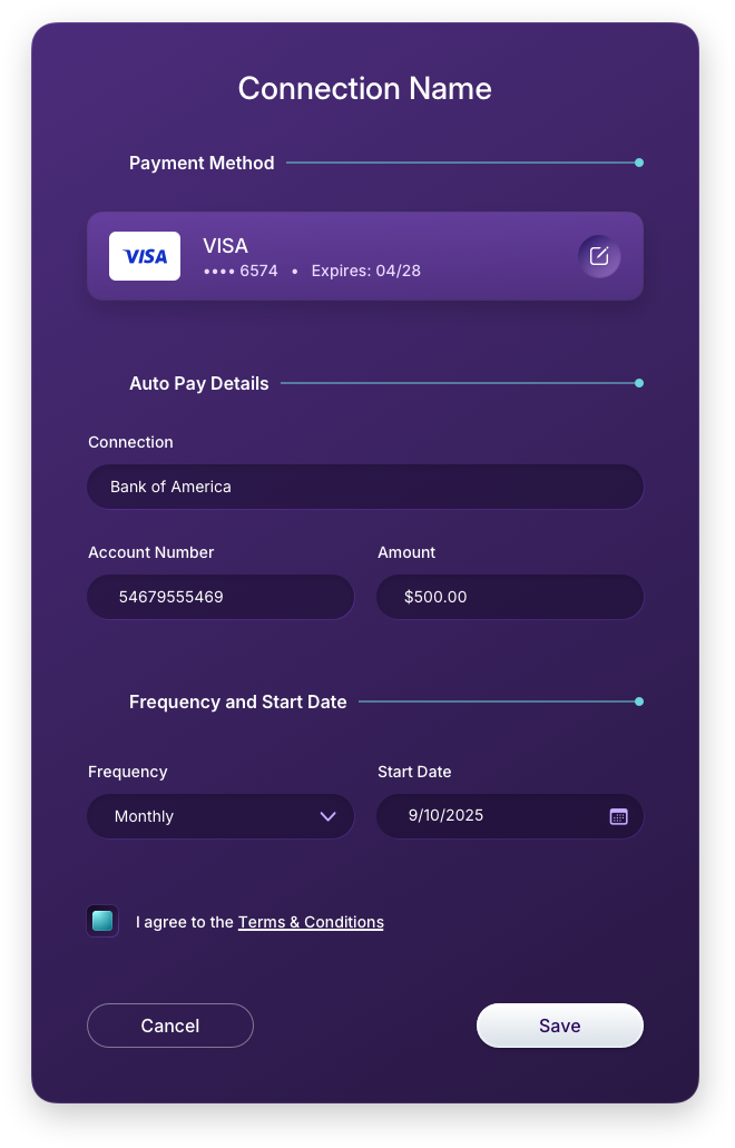
AutoPay: Add Connection & Select Payment Panels
Setting up a new AutoPay follows the same live search pattern used throughout the application, keeping the experience familiar regardless of where a user is in the product. From business search through date selection, amount entry, and payment method assignment, each step is handled within the right panel without disrupting the user's orientation. The calendar dropdown and filled form states shown here reflect a deliberate effort to make scheduled payment setup feel as frictionless as a one-time transaction.

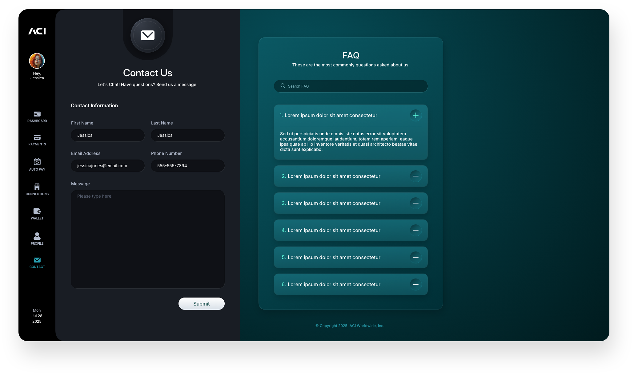
Contact Us
The Contact screen keeps support accessible without pulling users out of the application. Rather than routing users to an external page or a generic help center, the design surfaces a direct contact form within the same two-panel layout used throughout the product. This keeps the experience contained and consistent, so users never feel like they have left the application to get help. The form is intentionally lean, capturing only what is needed to route the request and set a response expectation, respecting the user's time while giving the support team the context they need to respond effectively.
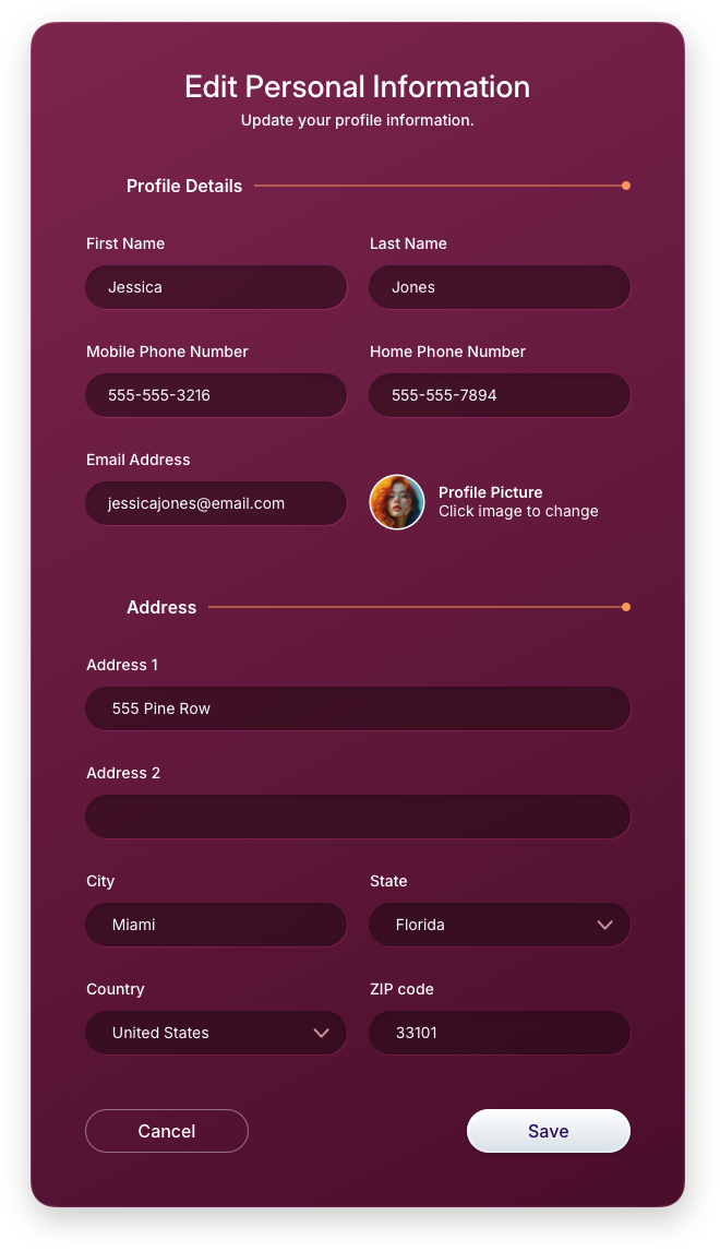
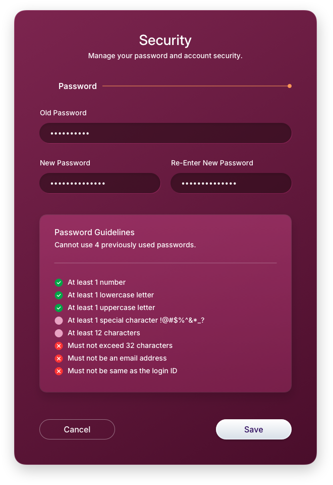
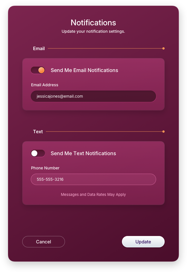
Profile
The Profile screen gives users a centralized place to manage their identity, security, and preferences within the application. Rather than scattering account settings across multiple areas, everything is surfaced in one focused view, keeping account management straightforward and accessible without disrupting the user's primary payment workflow.
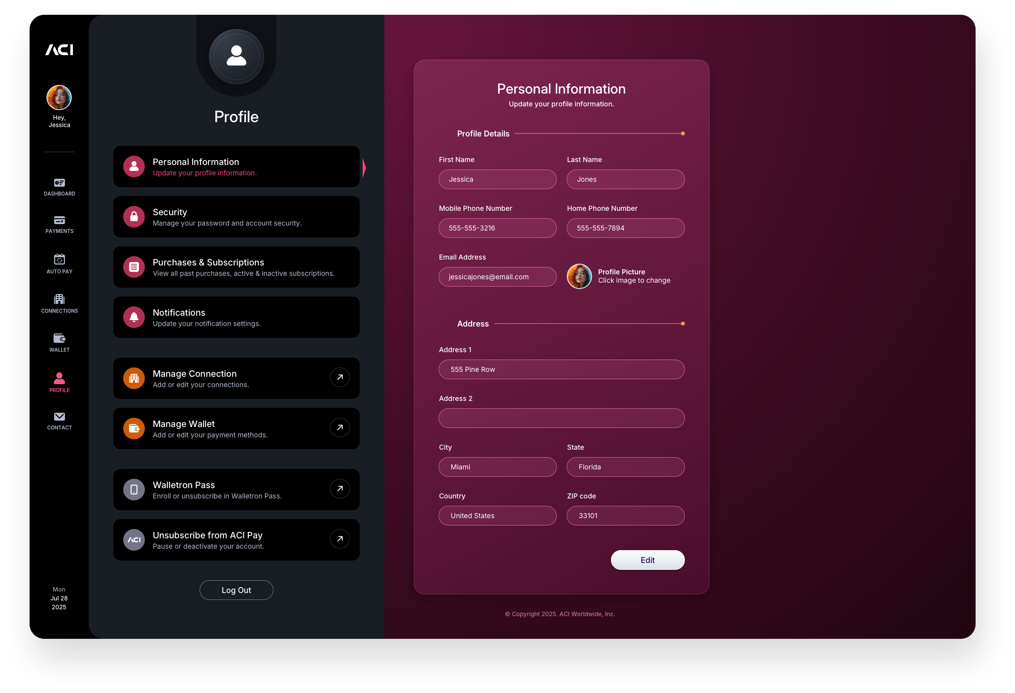
Edit Profile Information Panels
The profile editing panels cover the three core areas of account management: personal information, security credentials, and notification preferences. Each category is handled within its own dedicated right-panel experience, maintaining the same interaction model used throughout the application. Users can update their details, change their password, or configure alerts without ever leaving the context of their profile, keeping the experience tight and consistent.
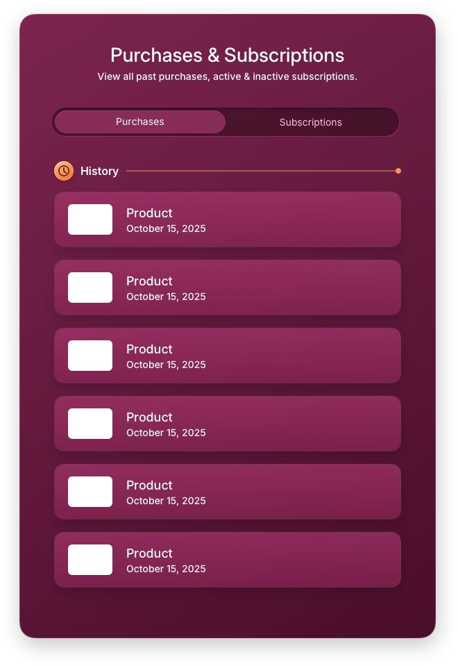
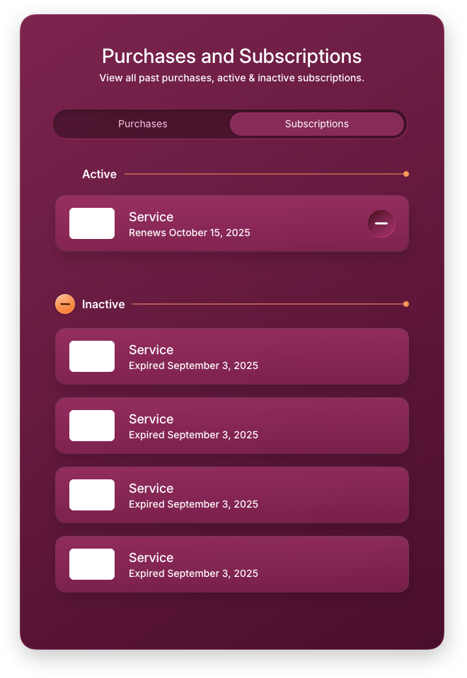
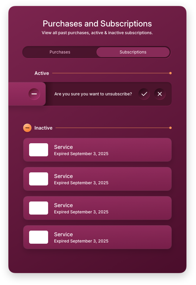
Edit Purchases & Subscriptions Panels
The Purchases and Subscriptions panels give users full visibility into their transaction history and recurring commitments in one place. The purchases view surfaces past activity in a clean, scannable format, while the subscriptions view lists all active recurring relationships with clear status indicators. The unsubscribe flow is handled inline with a direct confirmation state, keeping the action contextual and reducing the friction that typically causes users to abandon cancellation flows entirely.
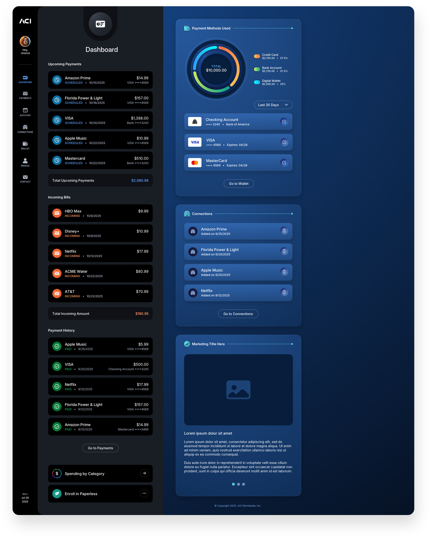
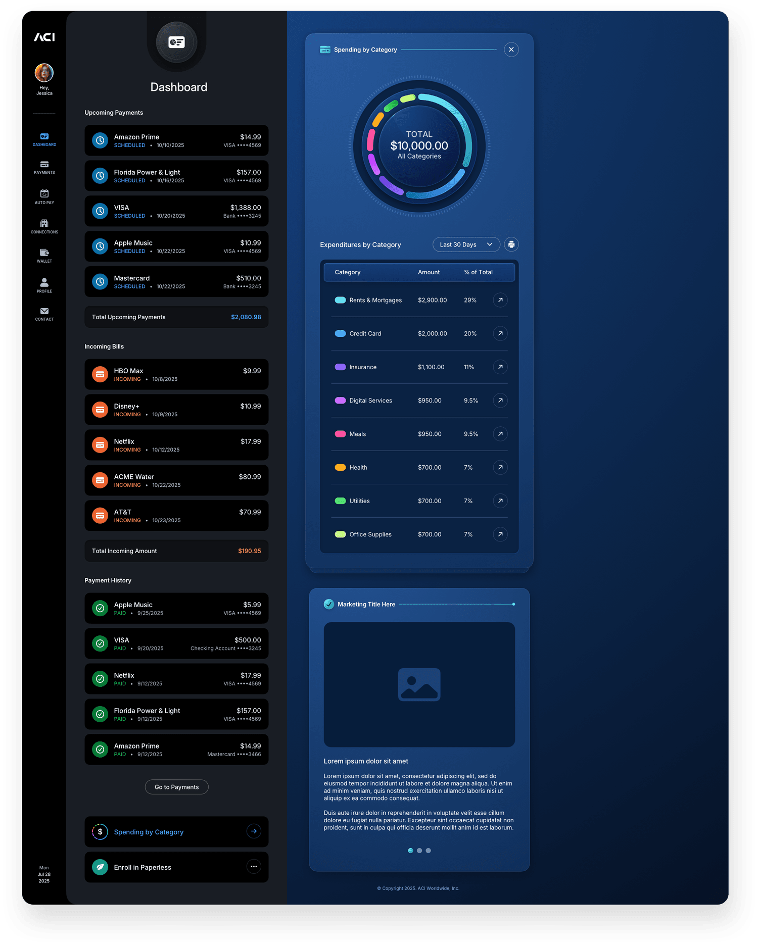
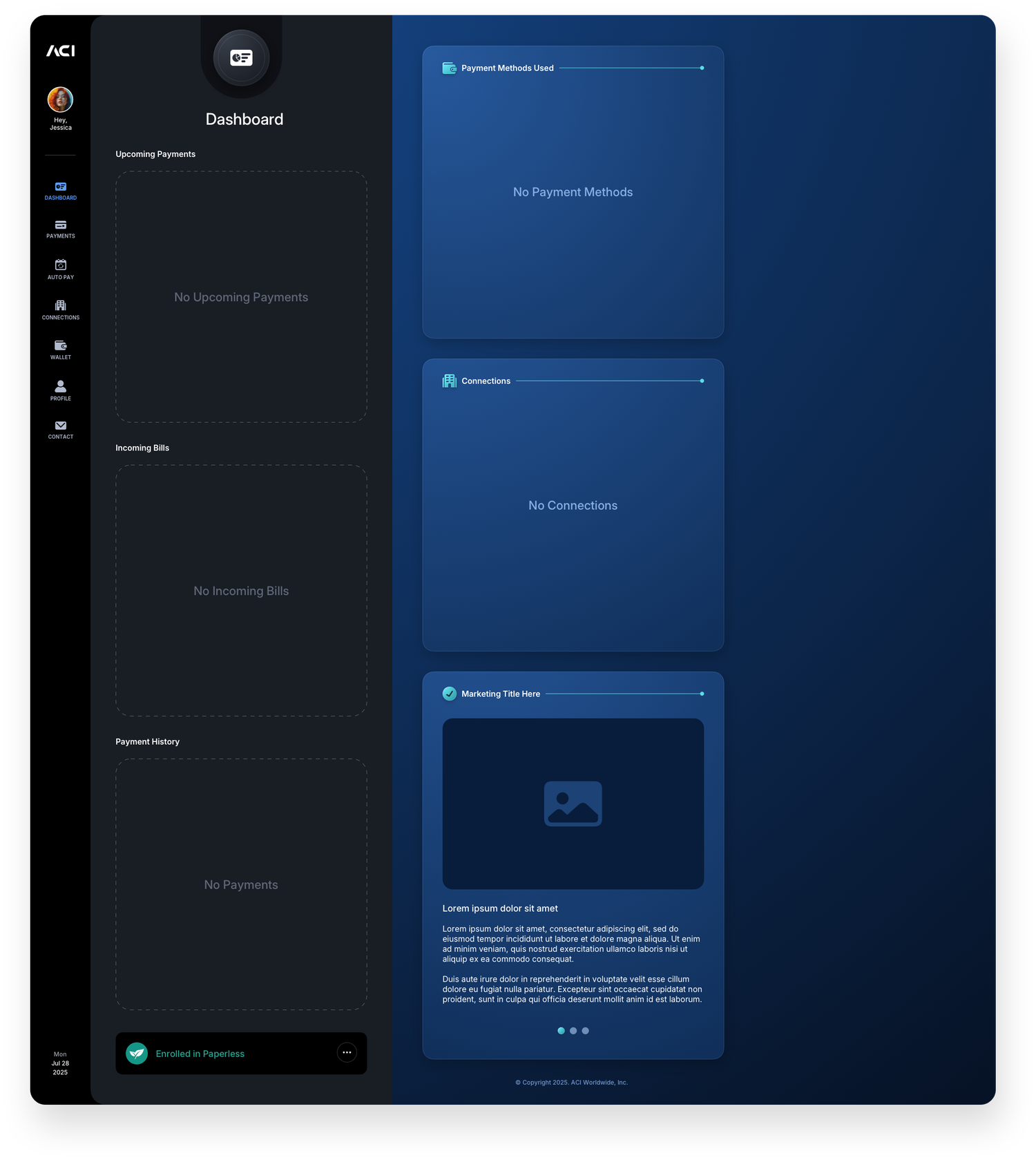
Dashboard
The Dashboard gives users an at-a-glance view of their payment activity, recent transactions, and account status the moment they log in. Unlike every other section in the application, empty space here is intentional and expected. Users cannot manually populate the dashboard panels, the data surfaces automatically as activity accumulates. The bottom right panel is a reserved placement for ACI's marketing team, serving as a placeholder for promotions, announcements, or product messaging that will be managed and updated on their end. The three states shown below reflect a new account, a partially active account, and a fully populated experience.
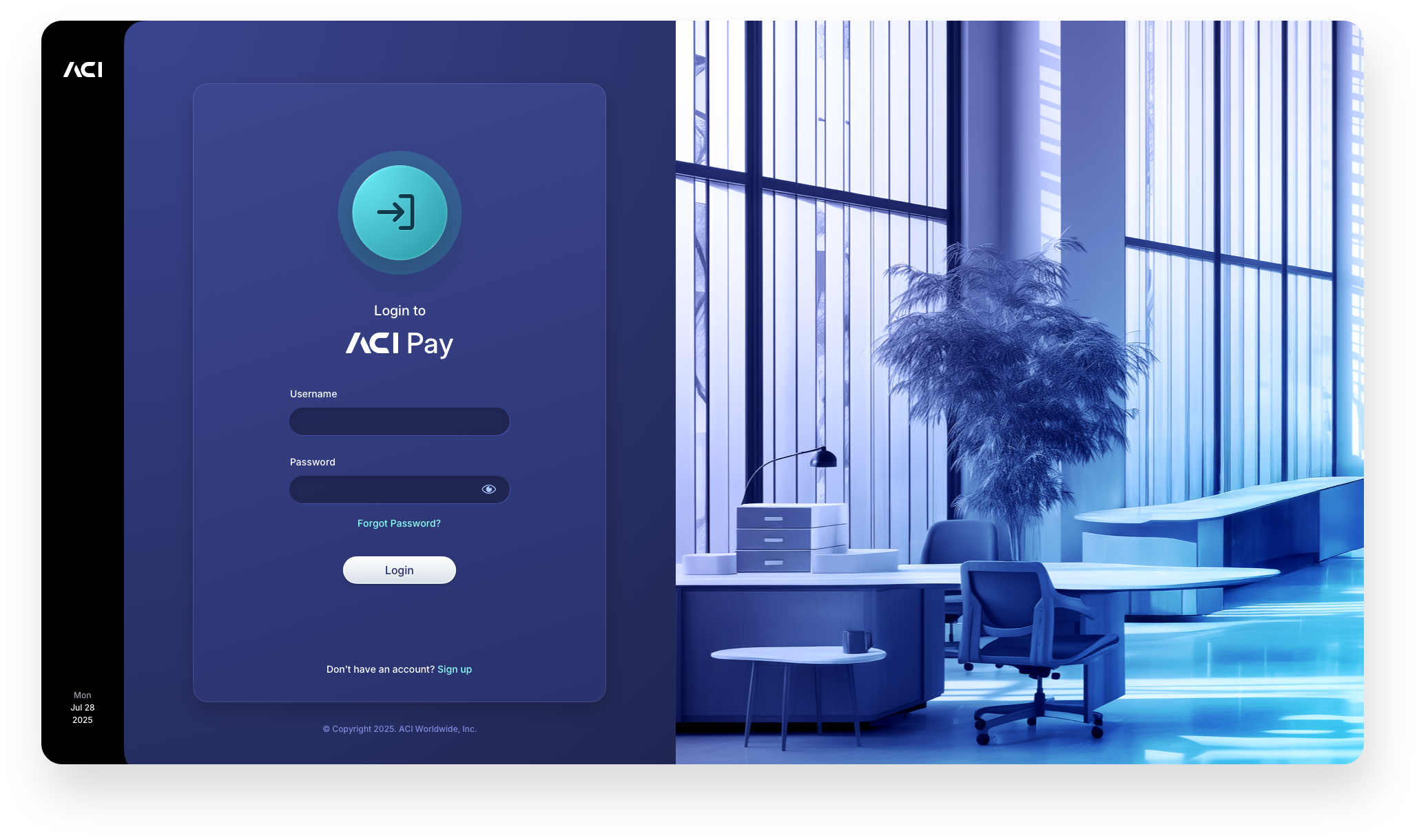
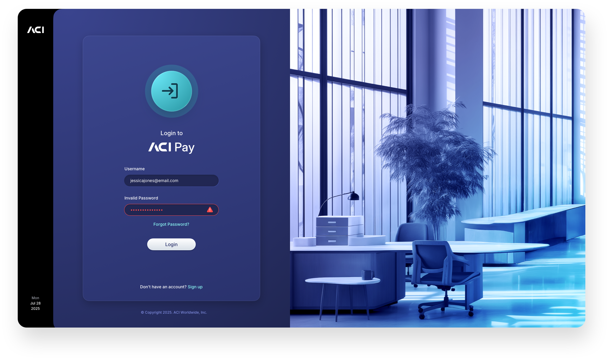
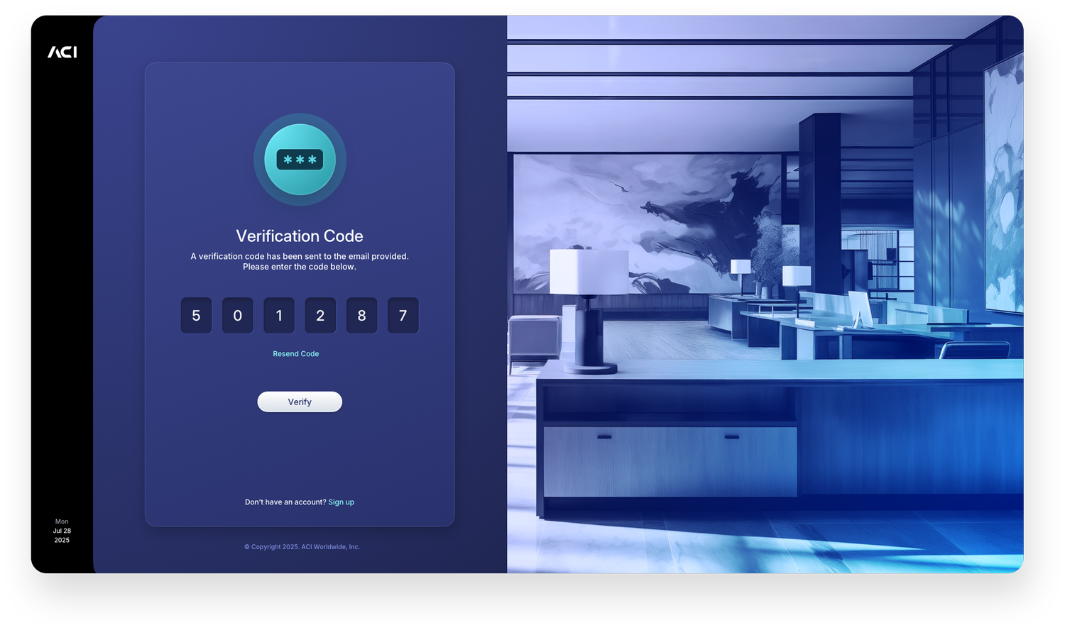
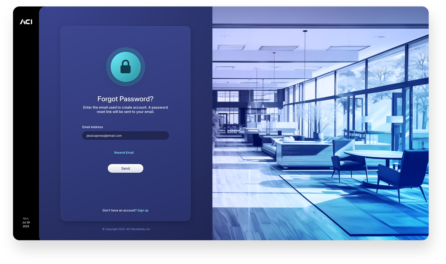
Login
The login experience sets the tone for the entire application. The default state presents a clean, focused entry point with clear credential fields and a prominent sign-in action. The invalid password state handles errors inline without disrupting the layout, surfacing a direct message that keeps the user on track rather than sending them elsewhere. The verification code, forgot password, and reset password screens complete the full authentication flow, each maintaining the same two-panel structure to ensure the experience feels continuous from first touch to successful entry.

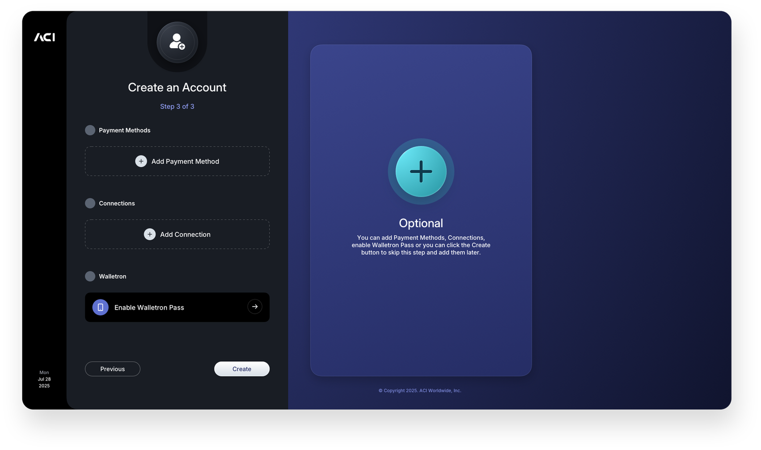
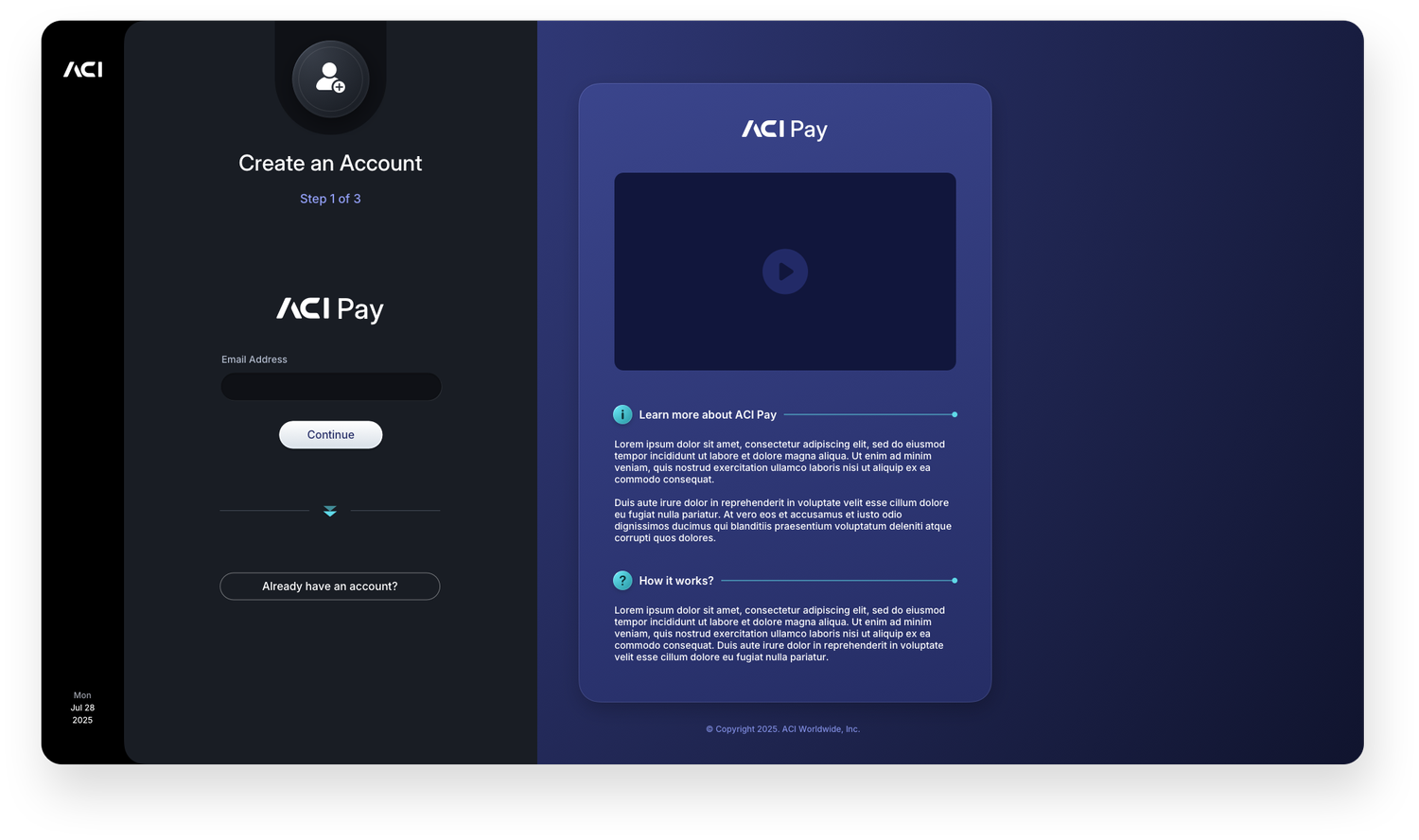
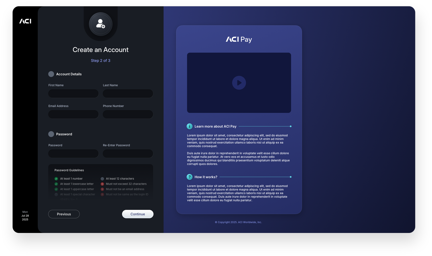
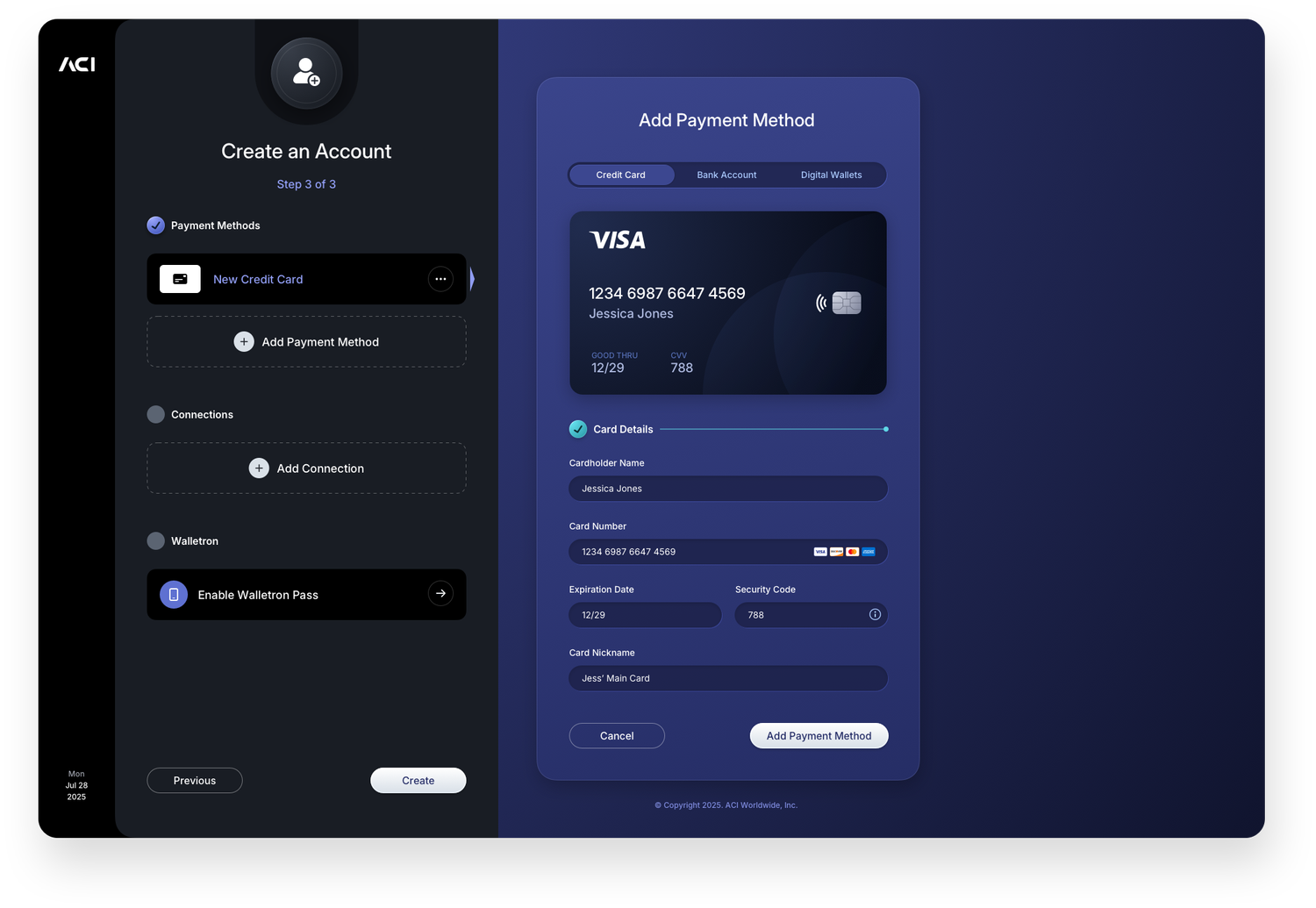
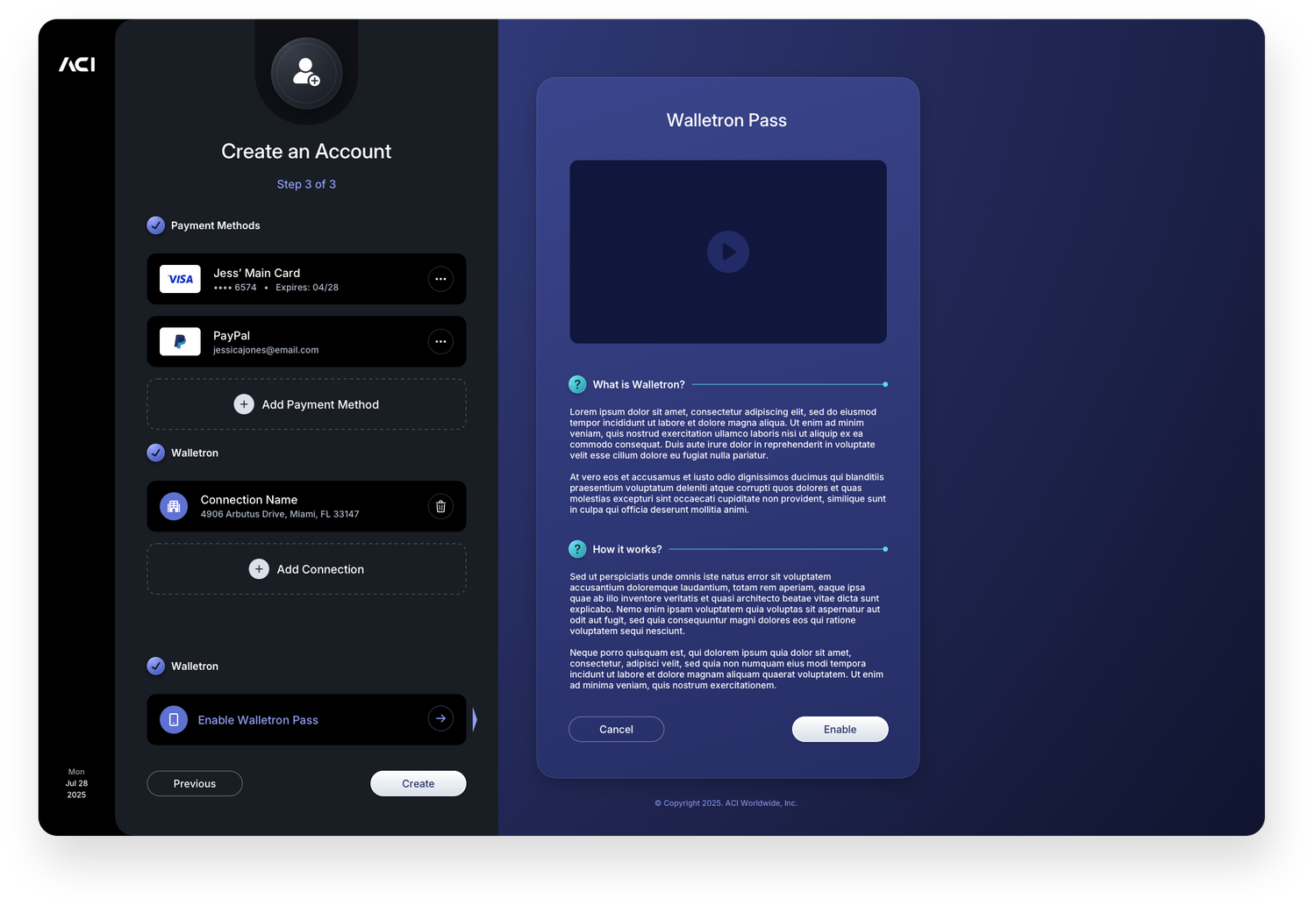
Create an Account
The account creation flow walks new users through every step of onboarding in a structured, progressive sequence. The initial screen captures core identity information before moving into address entry, payment method setup, and wallet activation. Each stage builds on the last, with the right panel adapting its content to reflect exactly where the user is in the process. Offering payment method options including credit card, bank account, and digital wallet at the point of account creation reduces friction later, getting users set up and ready to transact from the moment they complete registration.