DocPanel
Radiology Reading Services
Healthcare Application UI/UX Design
LIGHT MODE VERSION
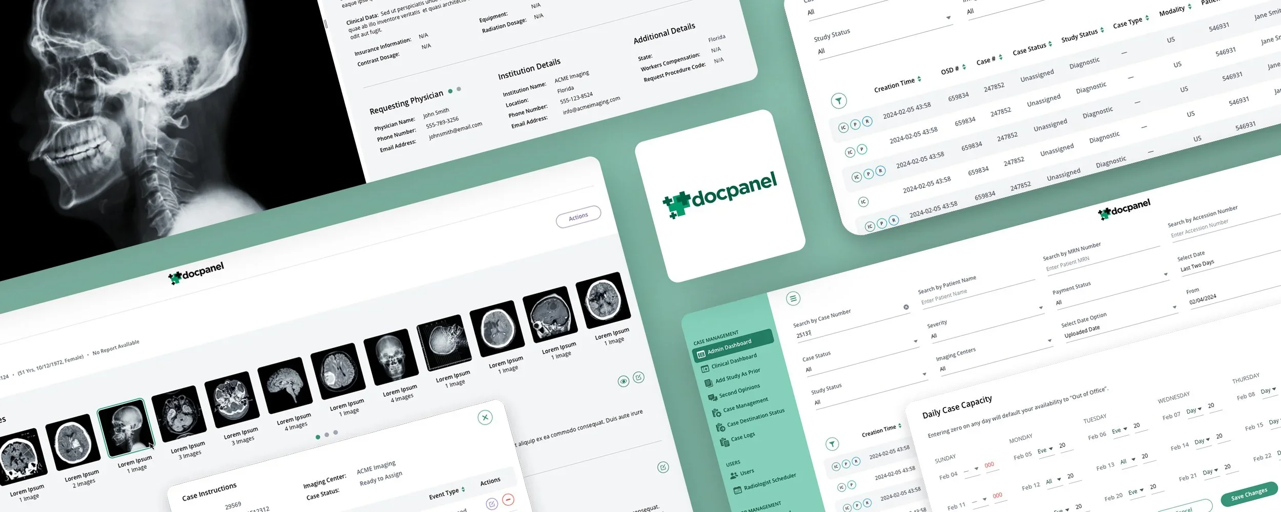
Redesigning the World's Largest Radiology Marketplace: A HealthTech UI/UX Case Study by The Skins Factory
DocPanel, the world’s largest radiology marketplace connecting imaging providers and patients to a network of over 700 US-based academic and subspecialty radiologists who provide final reads, protocol optimization support and more, contracted The Skins Factory to redesign the user interface of their outstanding healthcare service. Our design team seamlessly integrated a clean, sleek visual design language, strategically employing generous white spaces to enhance the UI and combat eye fatigue. Drawing inspiration from the timeless elegance of mid-century design, we curated a sophisticated color palette. Shades of refreshing light mint green interplay with white and light greys, imbuing the interface with a sense of understated professionalism.
Furthermore, our strategic use of color extends beyond mere decoration; each hue is carefully chosen to complement the hero color, creating a cohesive and visually pleasing composition. This cohesive integration ensures that every element of the user interface contributes seamlessly to the overall user experience, enhancing usability and engagement.
Disclaimer: All patient names & non-patient names appearing in these works are fictitious. Any resemblance to real persons, living or dead, is purely coincidental.
★★★★★
”They created a stunning design that our clinicians and staff love. It was no easy task, but they pulled it off.”
Nirish Mathias, Co-Founder, DocPanel
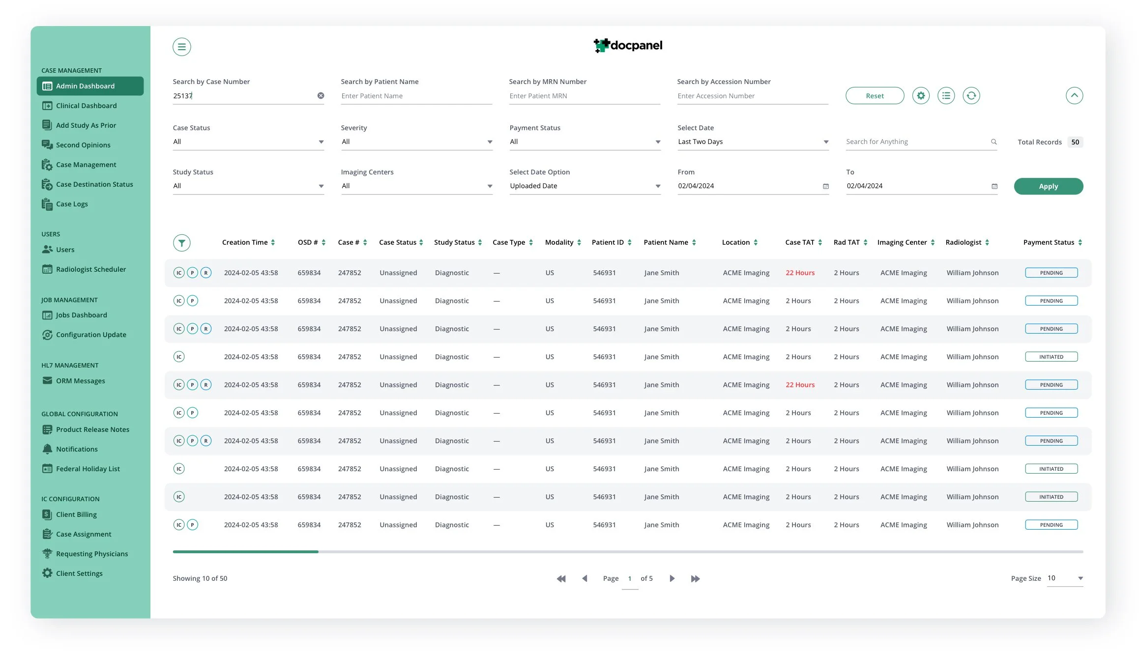
The Admin Screens
The software had undergone several iterations prior to our involvement. Our focus primarily revolved around enhancing the visual aesthetics and user interface. However, altering a design without enhancing its functionality can prove challenging. For The Skins Factory, usability remains the utmost priority, so even when a project is primarily focused on redesigning the visual aspects, usability adjustments are often necessary. One glaring observation was the lack of spacing, hindering the UI's clarity and flow. Additionally, the utilization of a monochromatic, warm grey palette appeared somewhat dull and lackluster in our opinion.
We revamped the color scheme by adopting a base palette of pure black and charcoal grey, while refining the green hero color to a timeless, mid-century mint green. To enhance readability and visual appeal, we expanded the table row height spacing and increased the surrounding white space. Additionally, we made both the sidebar and top filter bar collapsible, providing users with flexibility. When the sidebar is collapsed, a simple mouse hover expands it over the content area, ensuring quick access to the main navigation.
MAIN Admin DASHBOARD


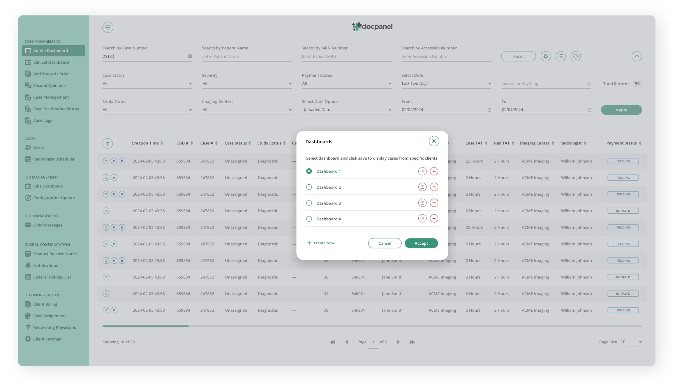
DASHBOARD MENUS + MODAL

DASHBOARD, TABLE FILTERS SIDEBAR PANEL
In the previous version of the application, each column on the table featured its own filter icon in addition to the main filter system for the entire table. While this setup enabled users to delve deeper into specific columns, our design team found that it cluttered the column title row, consumed excessive space, and necessitated too many clicks. To streamline the filtering process and alleviate table congestion, we introduced a sidebar slide-in panel, enhancing efficiency without compromising functionality.
The Radiologist Screens
While maintaining a predominantly consistent layout with the Admin screens, we repurposed the header area to accommodate crucial Radiologist information. This involved incorporating new navigation items within the chrome, along with onboarding information placed beneath the page title. Purposefully, we opted to keep the header open, providing ample white space on the screen, which serves to frame the content-heavy table below.
New Requests Screen
Recognizing the paramount importance of the Expedited and Stat statuses, we implemented a color coordination strategy. By aligning the checkbox and case number with the color of their respective status label, we ensured these critical elements stand out prominently, enabling Radiologists to swiftly identify and prioritize those cases while maintaining a clean layout.
Overflow Cases SCREEN
Completed Cases SCREEN + Active Cases SCREEN + Daily Case Capacity Modal


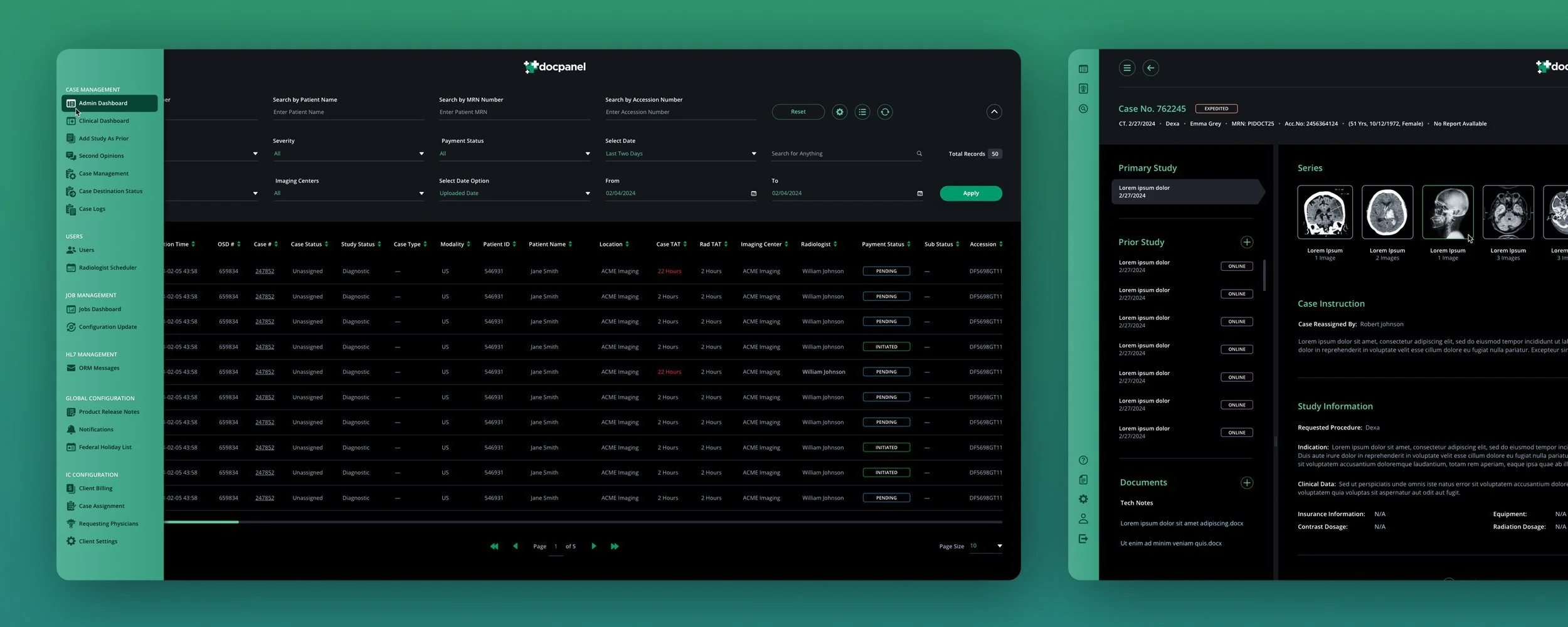
Main Case Screen
In our redesign of the Case screen, we not only focused on enhancing its overall appearance, we also streamlined functionality by consolidating the Studies and Document sidebars (which resided on opposite sides of the Case screen) into a unified panel. This consolidation was driven by a desire to optimize screen real estate, particularly in cases where there were few or no attached documents, minimizing wasted space.
To ensure efficient information management, we implemented a segmented approach within the single sidebar, incorporating scroll bars for each section. This allows users quick access to information displayed, maintaining clarity and usability even when dealing with extensive data sets.
CASE SCREEN MODALS


EDIT CASE SCREEN MODALS
The initial scope screen provided to our design team featured a single edit icon for the entire page. Although utilizing a single edit icon isn't inherently problematic, considering the wealth of information users could add or modify for specific sections, the page appeared somewhat overwhelming.
Upon closer examination, we found that the primary section, Case Instructions, contained vital information that users could only access by initiating an edit. To address this issue and improve user accessibility, we opted to split this section into two distinct modals. Additionally, we introduced a view icon specifically for that part of Case Instructions, enabling users to easily access this essential information without the need to edit the section.
This information is now viewable without having to edit the section.


The Client Screen
READY TO ASSIGN SCREEN
The Profile Card Template
We touched on how usability inevitably becomes a key consideration, even in visual user interface redesigns. DocPanel's approach to profile pictures includes utilizing banners to indicate a Radiologist's availability status. However, they went further by introducing banners to signify pending license cancellations or unavailability in specific states directly over the profile images.
As we redesigned the textual portion of the card, we observed that it already displayed the states where a Radiologist holds a license, listed with their abbreviations. Leveraging this existing data, we opted for a more streamlined approach. Instead of introducing additional banners, we introduced color-coded indicators. We used red to denote canceled licenses and amber for pending cancellations, directly on the state abbreviations. This not only maintains consistency but also enhances clarity and efficiency in conveying important information to users.
Additionally, we developed four color gradients specifically intended for use with the initials of Radiologists' names in cases where they haven't uploaded a photo for their profile. Each gradient has been carefully crafted to complement the mint green hero color that we've integrated consistently across the user interface design. This ensures visual cohesion and enhances the overall aesthetic appeal while maintaining a professional and harmonious look and feel throughout the platform.
VIEW DARK MODE VERSION
Have a project in mind? Let's talk.
Thank you for reaching out.
We will be in touch within one business day.